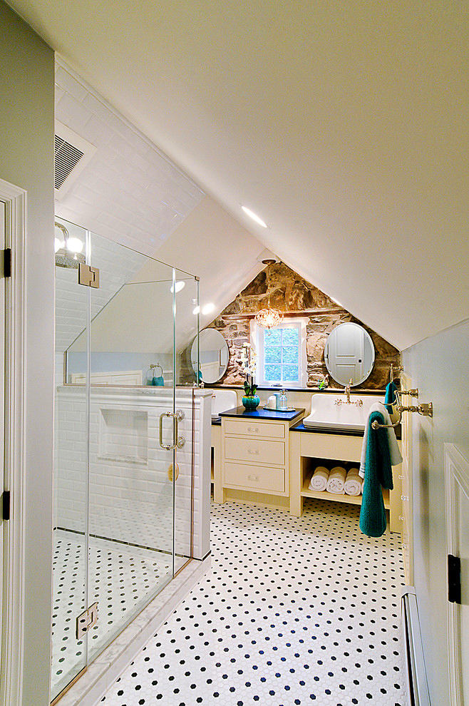
Today we will show you very unusual bathroomsrooms: large and small. They amazed us with their color scheme, selection of finishing materials and layouts. Something to take note of How much time do we spend in the bathroom and/or toilet? Not much, if we talk about men. A lot, if we talk about women. But these considerations should not in the least affect the quality of the interior design of the room, which is usually called a "common area". Your imagination or the professionalism of the designer will help to turn even the most unsuccessful bathroom and toilet layout into a stylistically bright corner. Interestingly, the most remarkable finds in the interesting embodiment of sanitary and hygienic functionality often happen precisely under the most difficult circumstances. Let's consider 11 successful solutions that turned "bathrooms" into real masterpieces of interior art. Please note that most of the examples are budget-friendly and realistic in implementation. Choose what can be used in your conditions. A surprisingly expressive bathroom with a shower and a separate toilet. The interior uses natural wood and polished stone tiles to the maximum extent, which are used to cover the walls of the shower cabin and the countertop under the sinks. In terms of color, the stone and wood are identical and support each other. The interior's "chips" are a deliberately visually lowered ceiling in wood, powerful beams and racks, a massive mirror frame and the same window frame with a classic layout.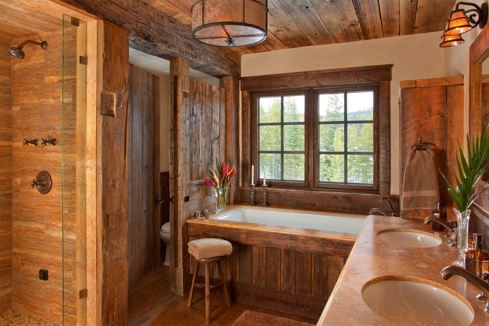 Ideal use of atticspace for a full bathroom with a shower cabin and two (!!!) sinks. The gray-blue color of the walls and the snow-white tiles of the cladding, which are brought to the top on the left slope of the ceiling, add visual space. The most interesting thing in the interior is a narrow island stand at the end of the shower cabin and a fragment of the end wall with imitation of wild stone (or with natural). A bright contrast in colors and textures.
 Eclecticism? A mix of several styles?Imitation silk wallpaper? "Stone" apron behind the towel holder, the sink on the Provencal-looking cabinet-shelf and in the shower cubicle. The gray-steel range of all these elements is diluted with a golden figured-symmetrical mirror and two double wall sconces. One of the most budget-friendly options we found that wants to look luxurious. You can't deny the designer a sense of humor.
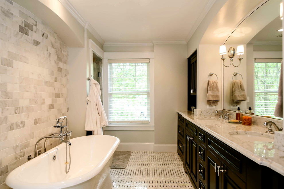
 Wonderful contrasting bathroom solutionrooms in a "trailer". Symmetrical massive arched beams of a delicate light ash color, an American sash window, a wall made of marble tiles above the bathtub, echoing in color with the small-tiled floor and marble countertop. Accents are a dark brown built-in shelf-cabinet with an open lower compartment and a long solid wood cabinet. One of the main elements is a mirror, completely inscribed in the under-beam opening above the countertop, equipped with a pair of sconces.
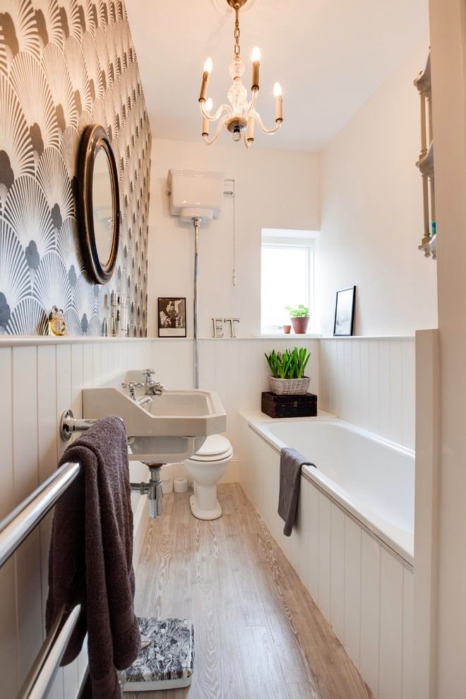
 An example of very rational usean inconvenient narrow space, in which it is not possible to install a standard bathtub crosswise under the window. The designer made a paradoxical decision - to further emphasize the narrowness of the space. The situation is helped by the presence of a small window, providing natural light. Interesting elements are the sink and toilet with an overhead flush tank made in a retro style. A mini-flowerbed with daffodils adds a Franco-Dutch touch.
 If we talk about the interior in styleconstructivism, then in this project it is present in all its glory. Additionally enriched by the use of modern materials and the application of a unique kinematic scheme for swinging the door of a volumetric mirrored column cabinet. The vertical abutment of the window glass on the left side to the "monolith" is amazingly successfully solved. Bravo!
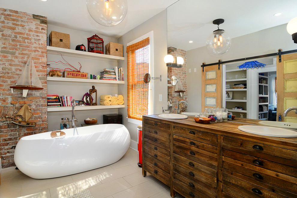
 Amazing design solution "on"The lover". This interior has it all: an artificially aged cabinet-table with partially false pull-out small shelves, a huge mirror plane, a fragment of a natural brick wall, gray-white walls and floor, a scarlet-colored trash cabinet and the execution of hanging sliding doors "under the gate". Probably, the customer liked it. But what does the bathtub have to do with it?
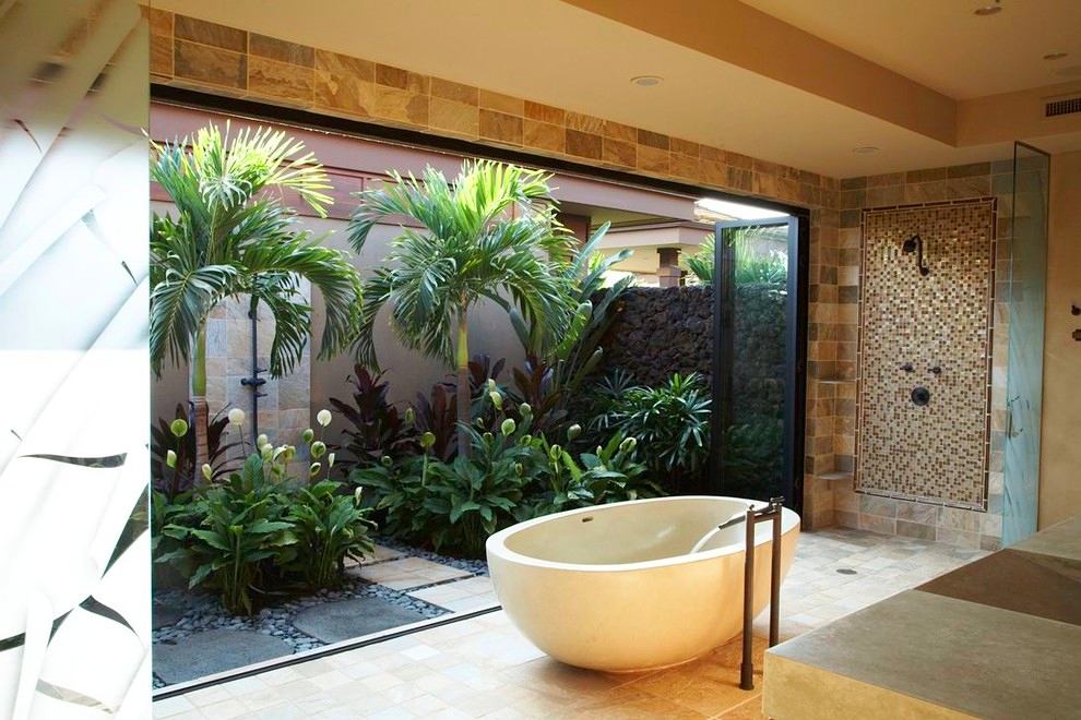
 Can this interior be called luxurious?Hardly. If it weren't for the hinged wall that spans the entire opening, opening up to a small courtyard-patio, then nothing special would be observed. Except for the large space around the bathtub and the interestingly designed shower, which is practically not fenced off from the rest of the room. But it is obvious that the interior is actually very expensive, because only natural materials were used. In addition to the patio, the two-tiered ceiling attracts attention. If it weren't for this solution, then there would be a feeling of a too squat room with imperfect proportions.
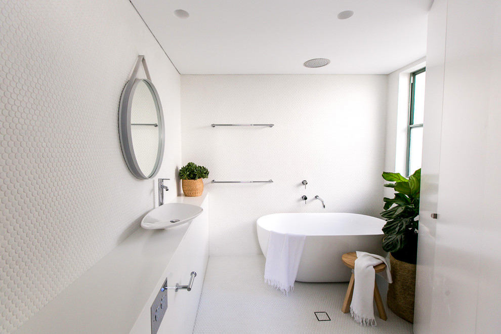
 An extremely laconic solution in terms of color scheme.Minimalist "sterile" high-tech may not appeal to everyone. But someone is certainly drawn to such an extreme option. If you remove color and style accents in the form of flowers and a stool from such a bathroom, the interior will become completely dead and cold. As usual, the window saves the day.
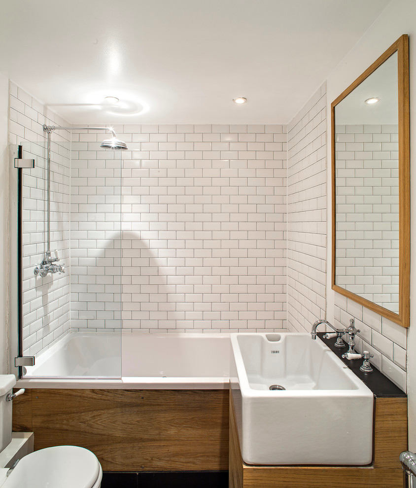
 A very stylish solution for a very compact spacebathroom and toilet room, which can be placed even in an ordinary apartment. The unique shapes of the bath bowl and sink with a monolithic teak cabinet and an overhead false panel of the bath in combination with the illusion of solid brickwork from the facing of tiles "in a staggered manner" create a stunning effect. The design is complemented by a stretch matte ceiling with built-in spotlights and a large mirror of a strict form. Style and functionality, nothing superfluous. Excellent!
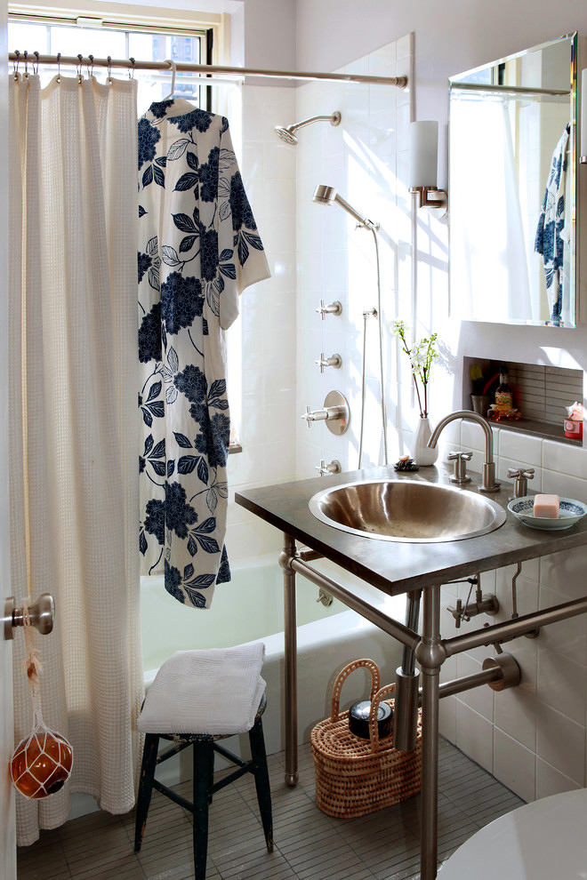
 Everything would be banal and boring in this tiny placebathroom and toilet room, if not for the designer sink of an unusual appearance made of matte steel on designer tubular legs with a piping in the upper part, echoing the control fittings of the upper head, flexible shower and, probably, a simple spout (not visible). The matte ribbed Mettlach tiles on the floor and in the niche are strict, but elegant in this version of use. An obvious drawback is the rectangular shape of the table under the sink. In the front part, the countertop should have been semicircular. In its current form, it is obviously dangerous both from the bath and from the toilet side.
 pinterest.com
Unusual bathroom design: 11 interesting solutions
