Tired of the fact that beige is the only one (andboring) versatile option for a neutral interior? We will prove that you have at least 10 reasons to prefer gray - a fashionable, interesting and very beautiful color. In the world of fashion every season, a color is declared “new black”, meaning versatility, but in interior design, beige has been confidently occupying a position for a long time a shade that goes with everything. In practice, this is a safe choice made out of a desire to avoid mistakes. But living without experiments is boring. Gray is more difficult to handle, but the result is literally captivating. Gray in the interior is so popular now that the famous English manufacturer of wallpaper and paints Little Greene, which has been operating since 1773, recently released a separate palette of 28 shades of it - and you will not call one of them dull. The collection is based on 4 basic tones and 7 intensity options for each, the lightest ones remind of ash and ivory, the dark ones - of chocolate and soot. There are also exotic things, like the skin color of a toad or a dolphin. At the same time, the company uses 40 percent more pigment in production than others, which ensures durability and special saturation. In Russia, paint can be purchased at chain stores. 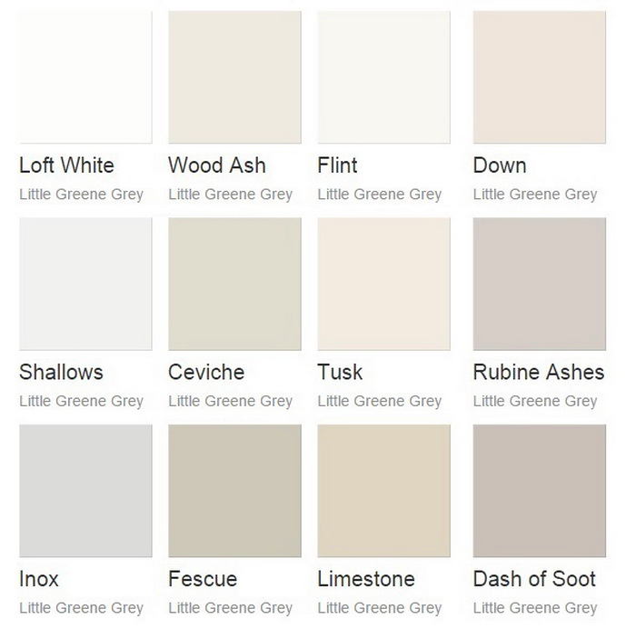
 Alexey Eliseev, head and co-owner of the chainManders stores: - The popularity of gray came to interior design from the world of fashion. Interestingly, now more and more preference is given to its cold shades and their effective combination with white decor. The demand for gray paints for the design of kitchens has also increased, where they used to choose mainly warm beige tones. manders.ru
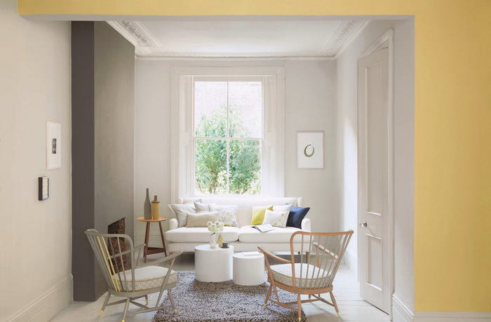
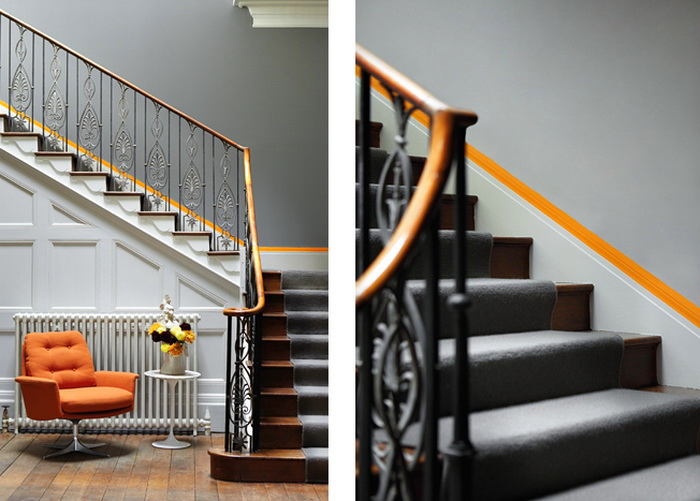
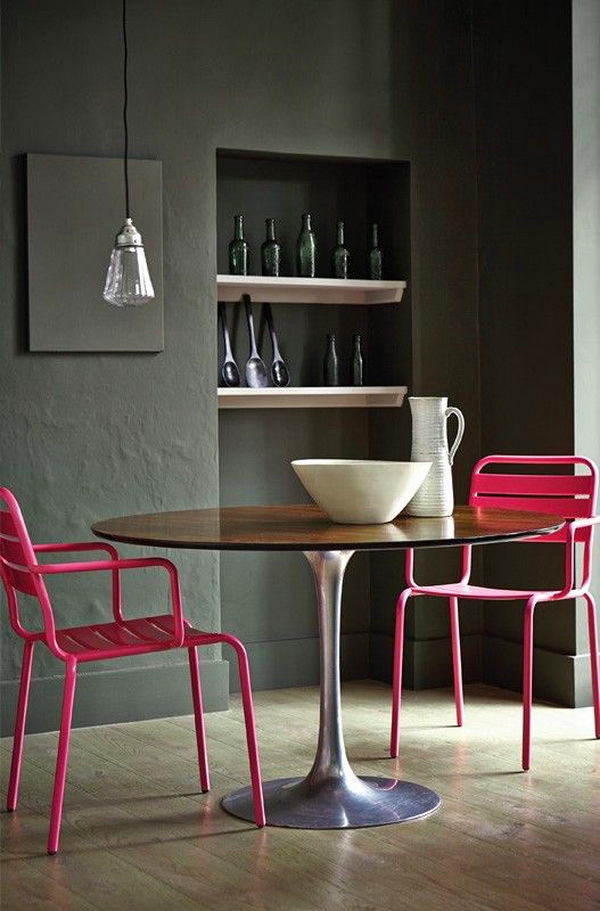
Gray is combined with any color
Scientists call this effect simultaneouscontrast - gray highlights the adjacent color, fading into the background and not causing satiety. Active tones, such as red, lose obsession and aggressiveness next to it. Cool blues and greens look nobler and more interesting. Combining with warm neutrals such as beige, the interior is finished and balanced. An unexpected and successful option - a combination that is energetic and fresh. 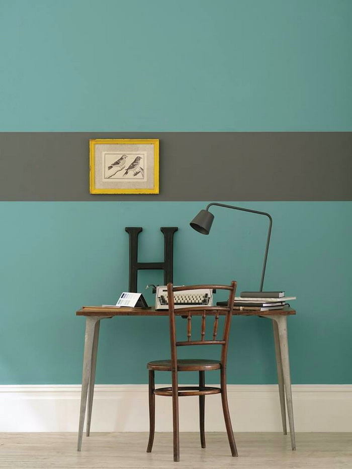
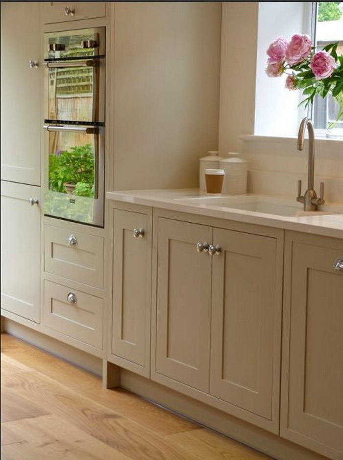
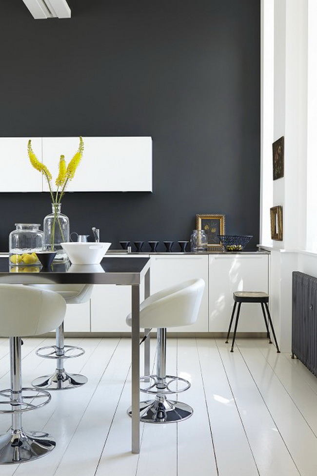
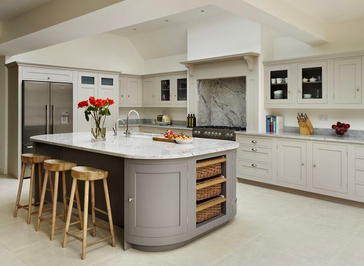
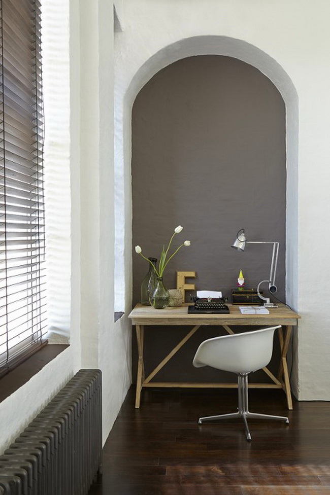
Gray color is practical
Gray color is not as fine as white and beige. There are no prints or scratches on it, like on black. It does not burn out like bright colors. All this makes it suitable for painting kitchen fronts and use in work areas, such as offices and workshops. 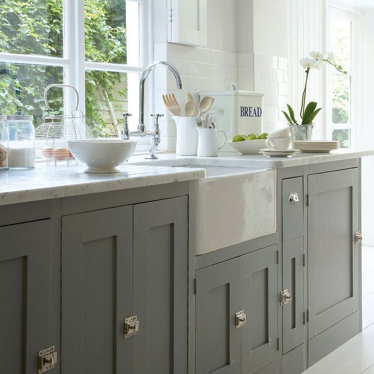
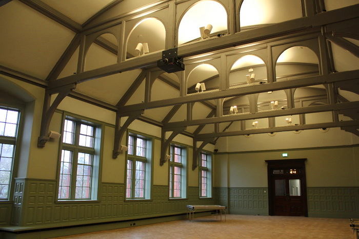
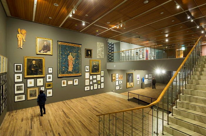
Gray - perfect background
When Little Greene commissioned the designThe restored picture gallery in Manchester, it was gray that was chosen as the optimal background for the display of all kinds of art - from sculpture to photography. The paints were chosen by the curators of the museum, depending on the lighting of each particular room and the features of the expositions. For example, the walls of the portrait gallery are painted with a touch of lead. The main hall combines different colors of soothing gray-green. 
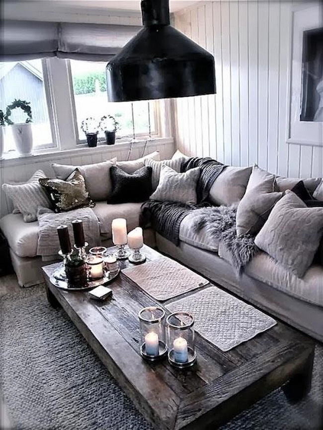
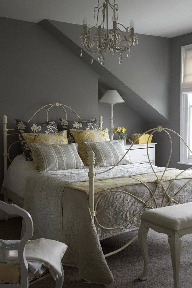
Gray color soothes
Yes, it is a passive shade that can bedepressing for melancholic. But he "grounded" people who live at a fast pace and work until they lose their strength. Gray brings them back in touch with the present moment, consoles and cools a hot head. In the interior, it evokes a sense of calm, serenity and stability - just choose a color that matches yours and your lifestyle. 

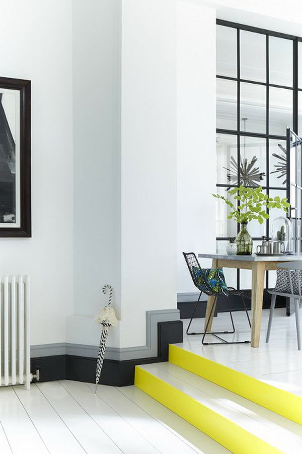
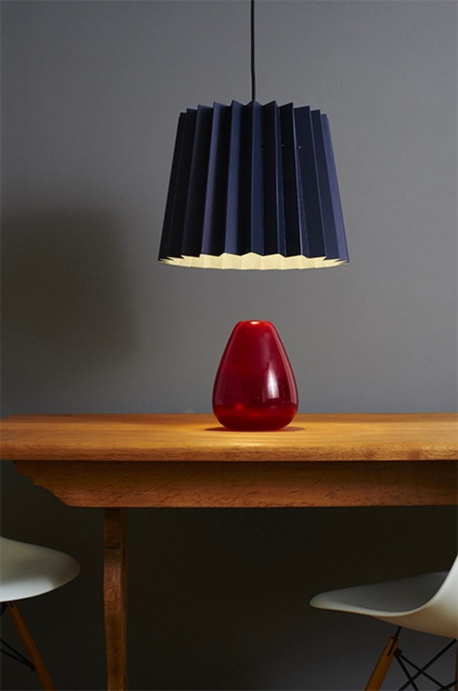
Gray is diverse and dynamic
Gray varies with lighting andEnvironment. It can be unobtrusive and saturated, warm and cold. Natural light helps it to be easier and visually to increase space, a bright artificial light can brighten a couple of shades. But remember that gray in itself - the color of twilight and shadow, without lighting it disappears. 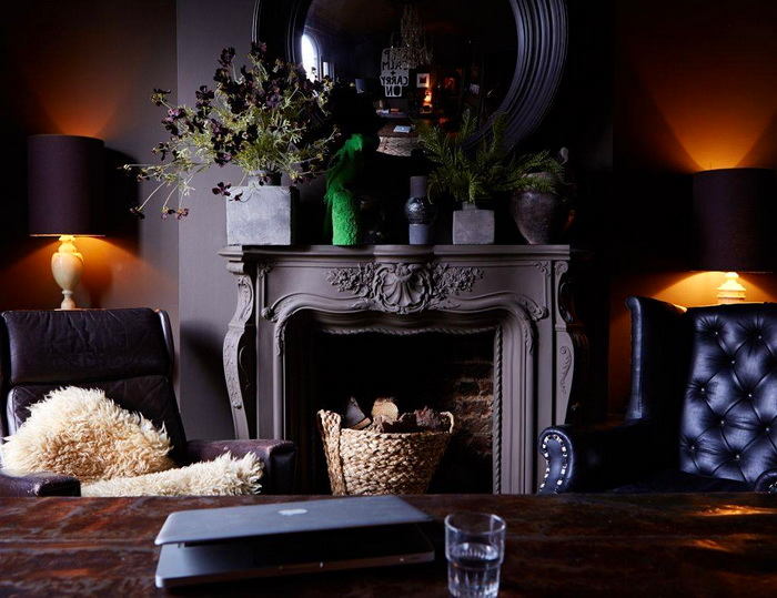
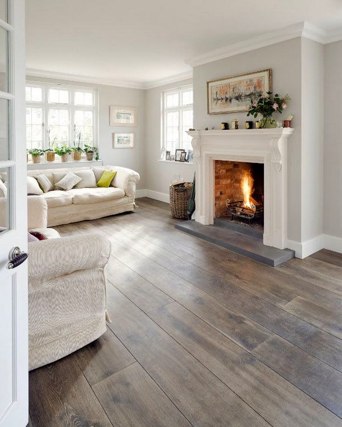 Our opinion: - Light gray floor, for example, can make visually more spacious room, cluttered furniture. And the gray walls are cooled - in a hot summer in such a room you will be cool and comfortable. If, on the contrary, you want to create a warmer space - choose rough loose textures and shades of paint, which are based on a red and brown pigment.
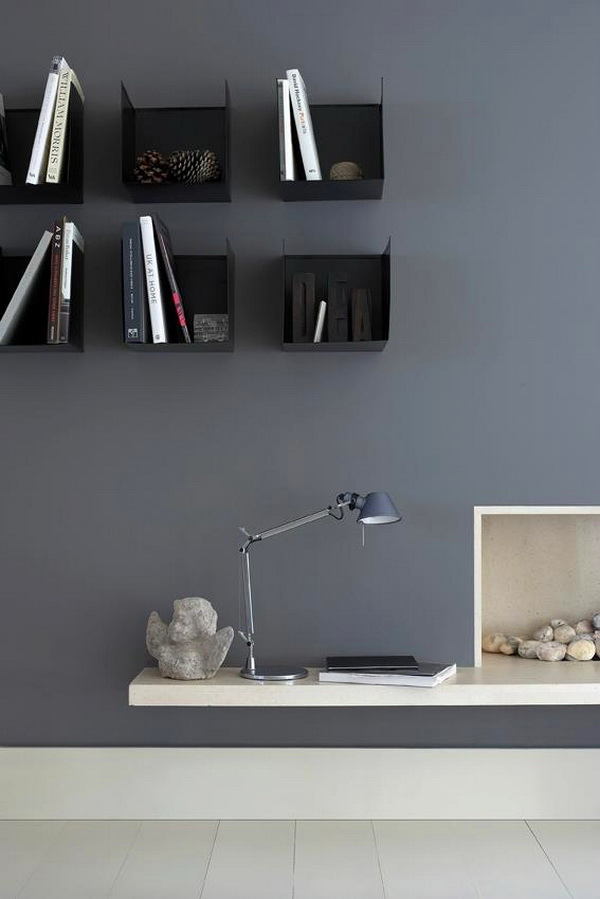
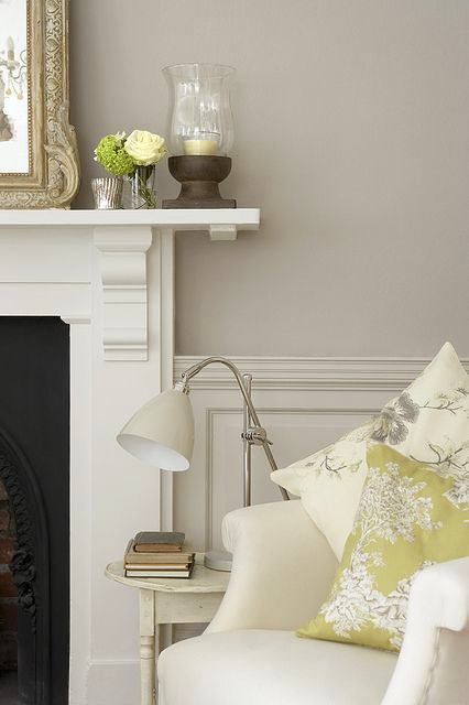
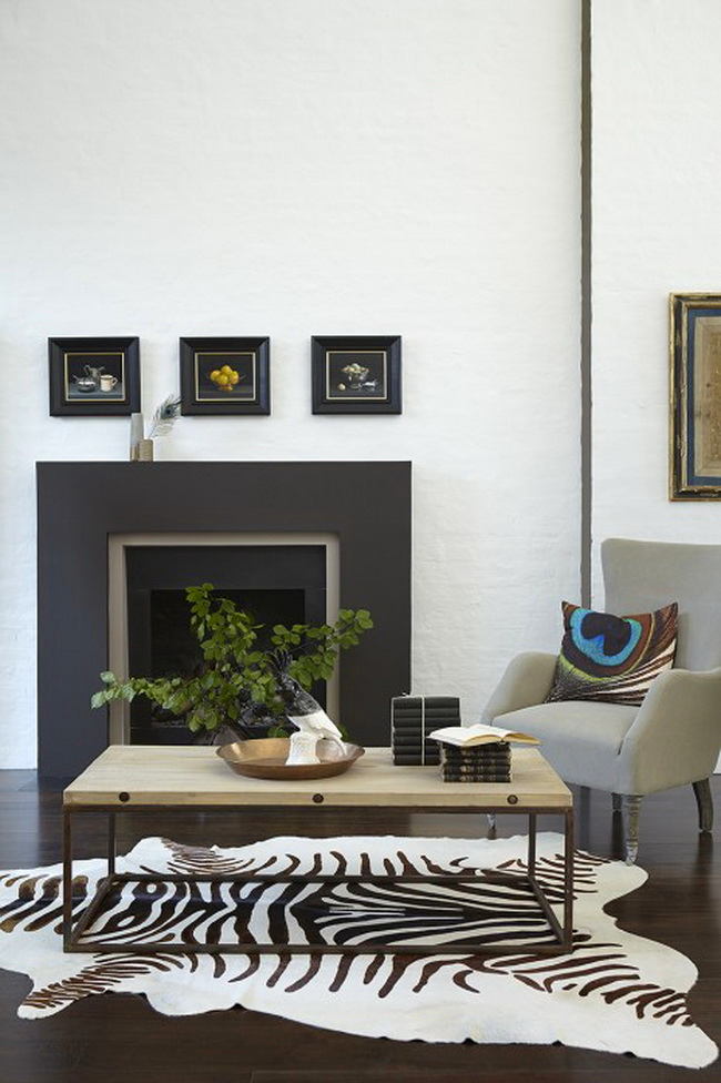
Gray noble
Just remember the shades of pearls, silver and steel. Sometimes it's worth adding a little shine, and no one will call your interior "ordinary", the epithets that you will hear - strong and elegant. Gray is unobtrusive, but unlike beige, which is often just invisible against the background of other colors, remains in the perception field of the viewer and does not lose its individuality. Bonus: furniture made in gray, it seems more expensive than white, black or beige. 
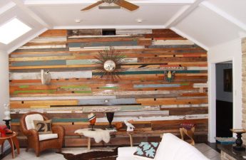
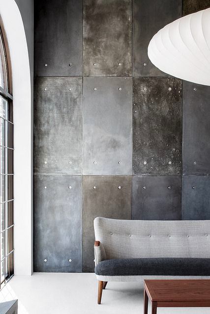
Gray fits into different styles
High-tech, loft and minimalism are the most obviousOptions. But it is worth softening the steel to ashy and replacing the smooth textures with loose ones - gray works and in cozy rustic interiors. A lot of materials associated with industrial and urban design have gray shades - chrome, concrete, cement. But fluffy fur, expressive old wood and soft fabrics also look great in gray. Classics will go pearl tone, and oriental style - gray-blue scale. 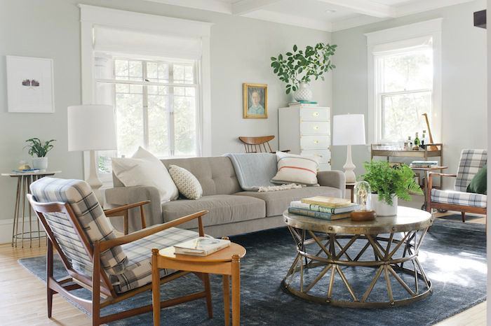
Gray is good in different rooms
Even in children's gray combined with brightDetails will create a more solid and adult atmosphere, and this is excellent for a room that is equipped "for growth". In the kitchen, gray will emphasize the freshness and purity. In the bedroom quickly calms down and makes it easier to fall asleep. In the office or office will create a serious, businesslike atmosphere. 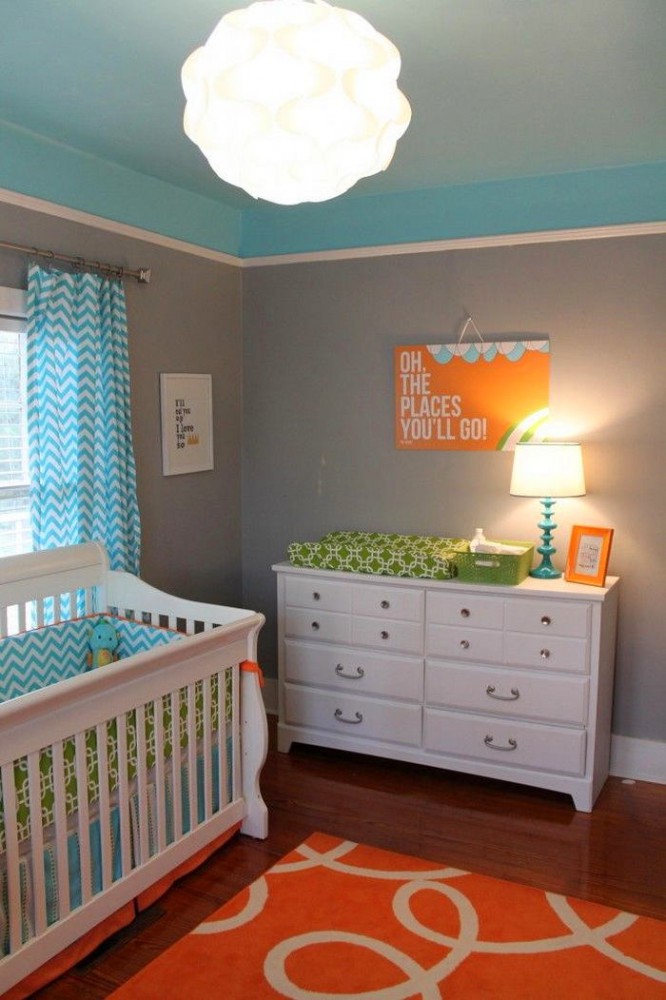
Gray is in fashion
You can trust the data of paint manufacturers:caught up with beige - if not overtaken. The growing interest in Scandinavian interior design will undoubtedly lead to a further increase in its demand - the combination of gray, black and white has become one of the signature techniques of this style. Another reason is that the stress of city life requires calm and pacifying tones. Angela Fawcett, PR Manager at Little Greene, says: “At first we just wanted to create one perfect gray shade. But after studying the market, we realized that this would not be enough and conceived a whole collection. " 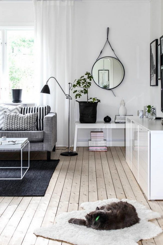
There is always a suitable shade of gray
There are many more color pigments in gray thanit seems, therefore, there is always a shade suitable for your purposes. There are excellent options for light and dark rooms, north and south, large and small, interiors filled with black and white photographs or orange textiles. One tip - be sure to buy a test paint and look at the sample under different lighting conditions. Alexey Eliseev, head and co-owner of the Manders chain of stores: - The Gray collection by Little Greene is based on four tones of pigment - green, yellow, red and brown. Thanks to this, having determined to which group a particular shade belongs, it is easy to understand how it will be combined with the rest of the interior. You just need to attach the sample to the selected surface - and everything will become clear. manders.ru 

 Our opinion:- For example, Urbane Gray is based on a green pigment, so it is favorably combined with blue tones. Dolphin color is based on red pigment, which means it is good next to pink. Be sure to pay attention to the base of the shade so as not to overshoot when fitting it into the interior. littlegreene.eu, marylebonejournal.com, pinterest.com