Photography is a great way to decorateyour interior. And photography is also a great advisor. After all, photographers have several pieces of advice on how to properly decorate a room from the point of view of photography. There are five of them in our article! Photographers are creative and inspired people. And they always have something to share with the world. And with the world of design too. That's why we decided to collect five brilliant ideas suggested by photographers that are perfect for creating the perfect interior. Especially since design and photography have long been going hand in hand, complementing and enriching each other. So, five ideas and 25 variations on the theme: how to apply the rules of photography in your interior.
1. Leave room for perspective
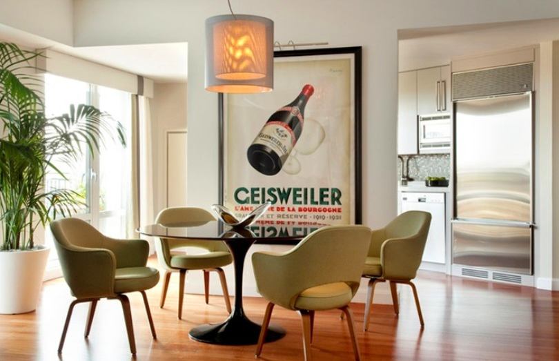
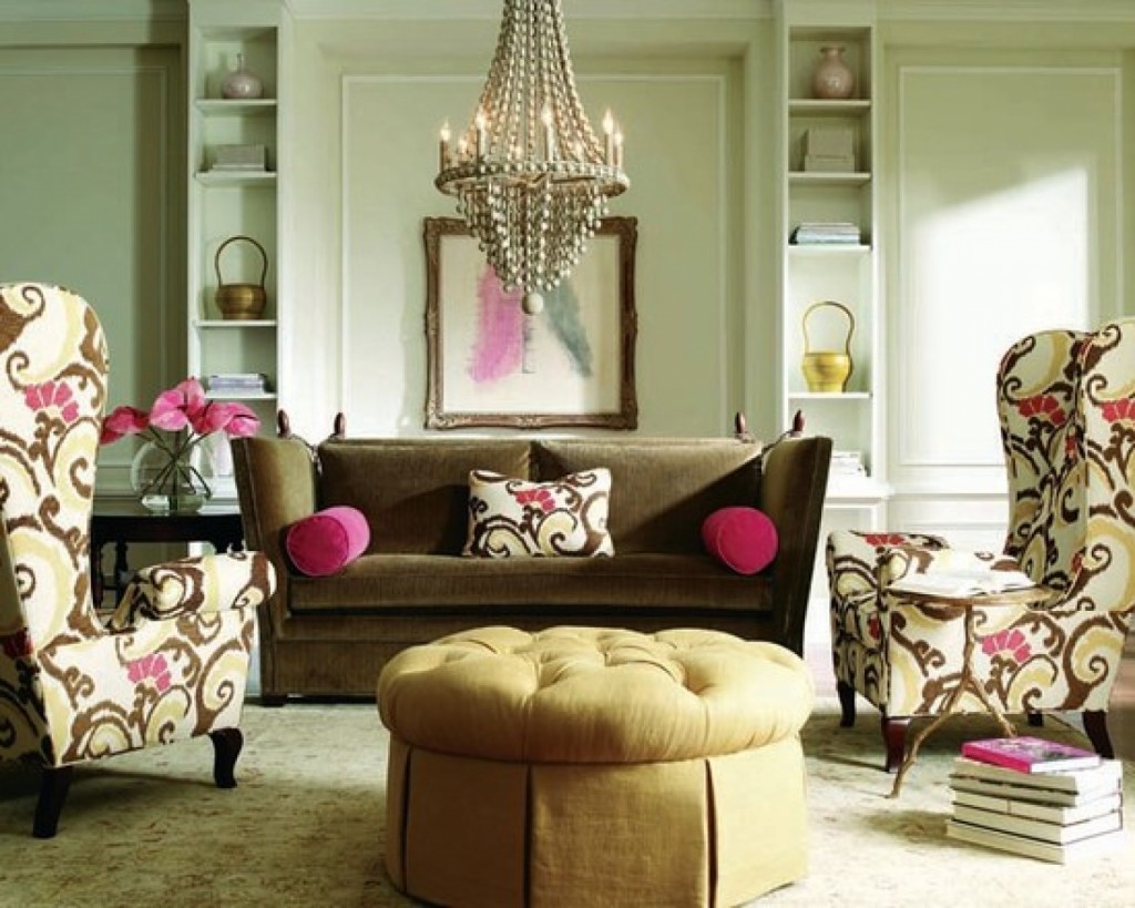
One of the famous techniques of photographers isindicating perspective. For example, if you have a cyclist in the frame, he should be either in the middle of the frame or on the side. At the same time, there should be space in front of him - "air" into which the hero of the frame rides. Such photographs or paintings are very convenient to use when decorating rooms. Since you can always "extend" this space by correctly positioning the photo. If the hero of your photo is looking to the right, then try to place the frame with the left side to the wall so that his gaze is directed into the distance, beyond the frame, and does not rest against anything large.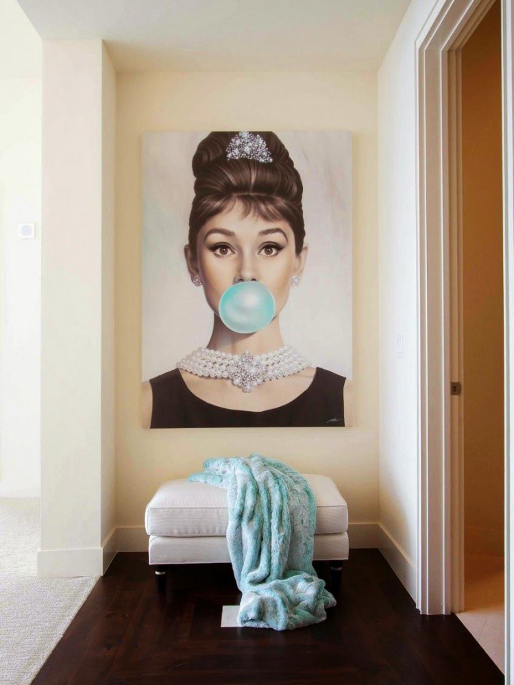
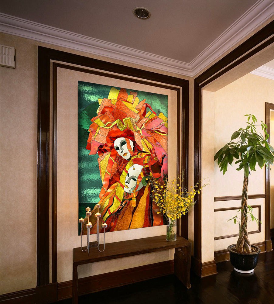


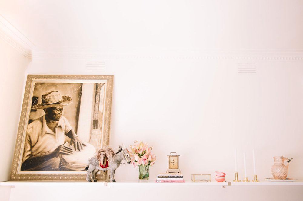 Our opinion: - If the hero of the frame or painting is looking straight ahead, then such a work of art should be placed in the middle of the wall.
2. Don't forget to indicate the direction
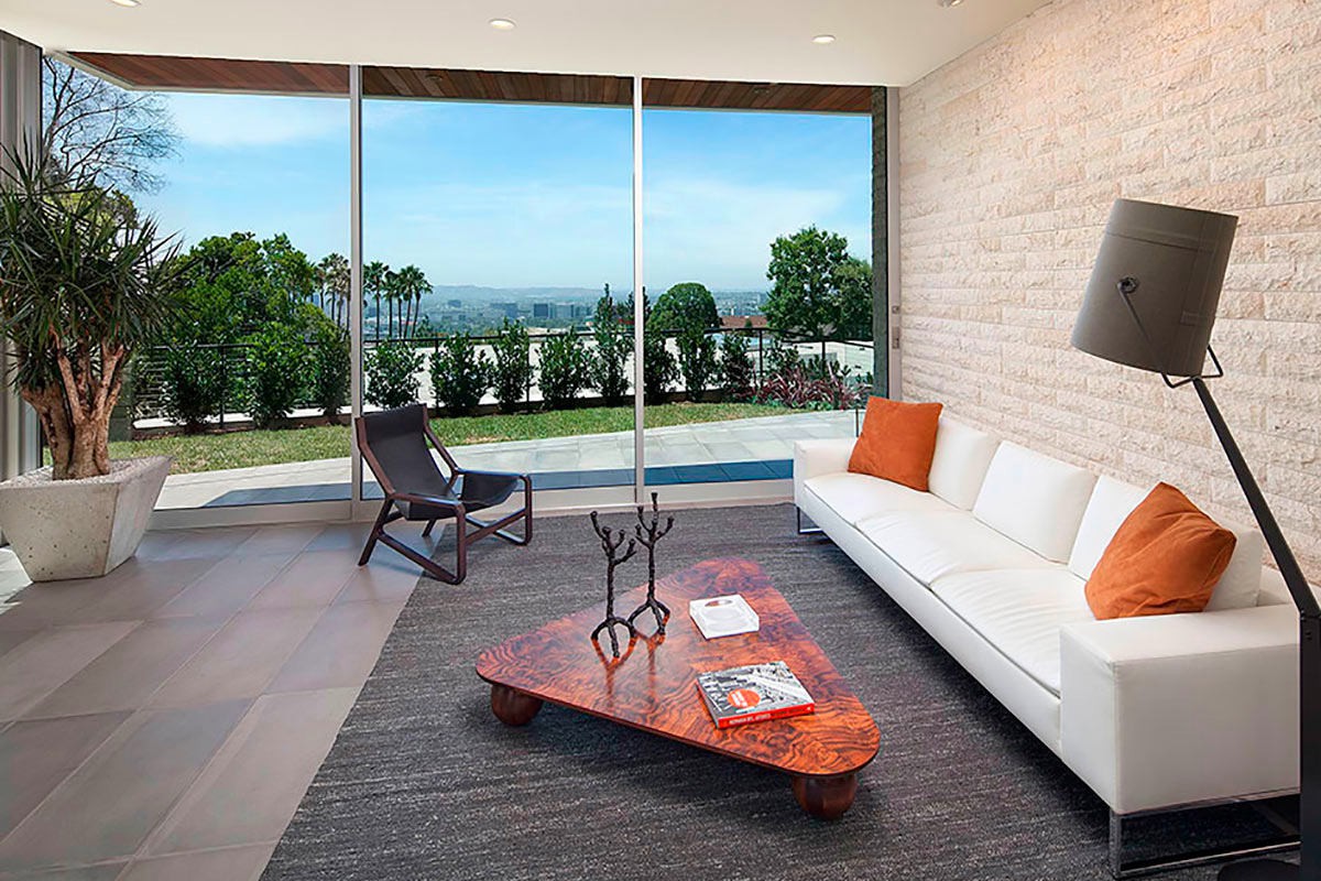
To achieve harmony, it is important to placedecorative objects at a certain angle. They should point to other objects. Houseplants tilted towards the room, a triangular rug pointing to an armchair in the living room, or, say, a painting that disrupts the overall lines of the interior can be used as "pointers".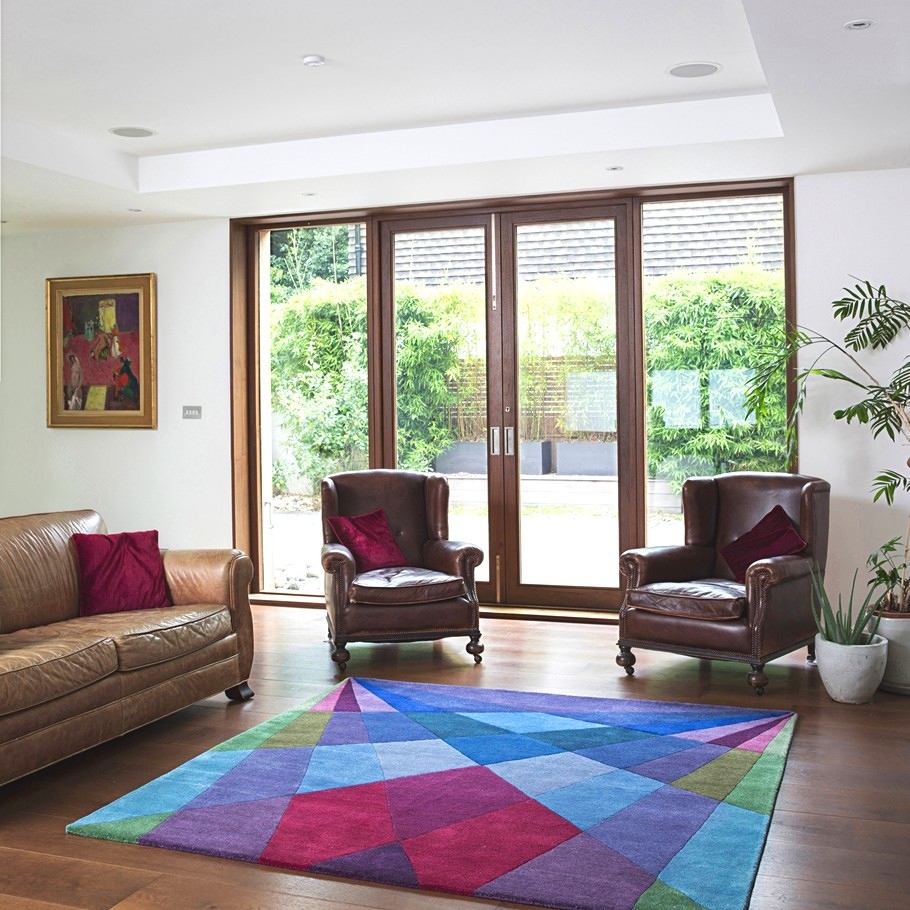
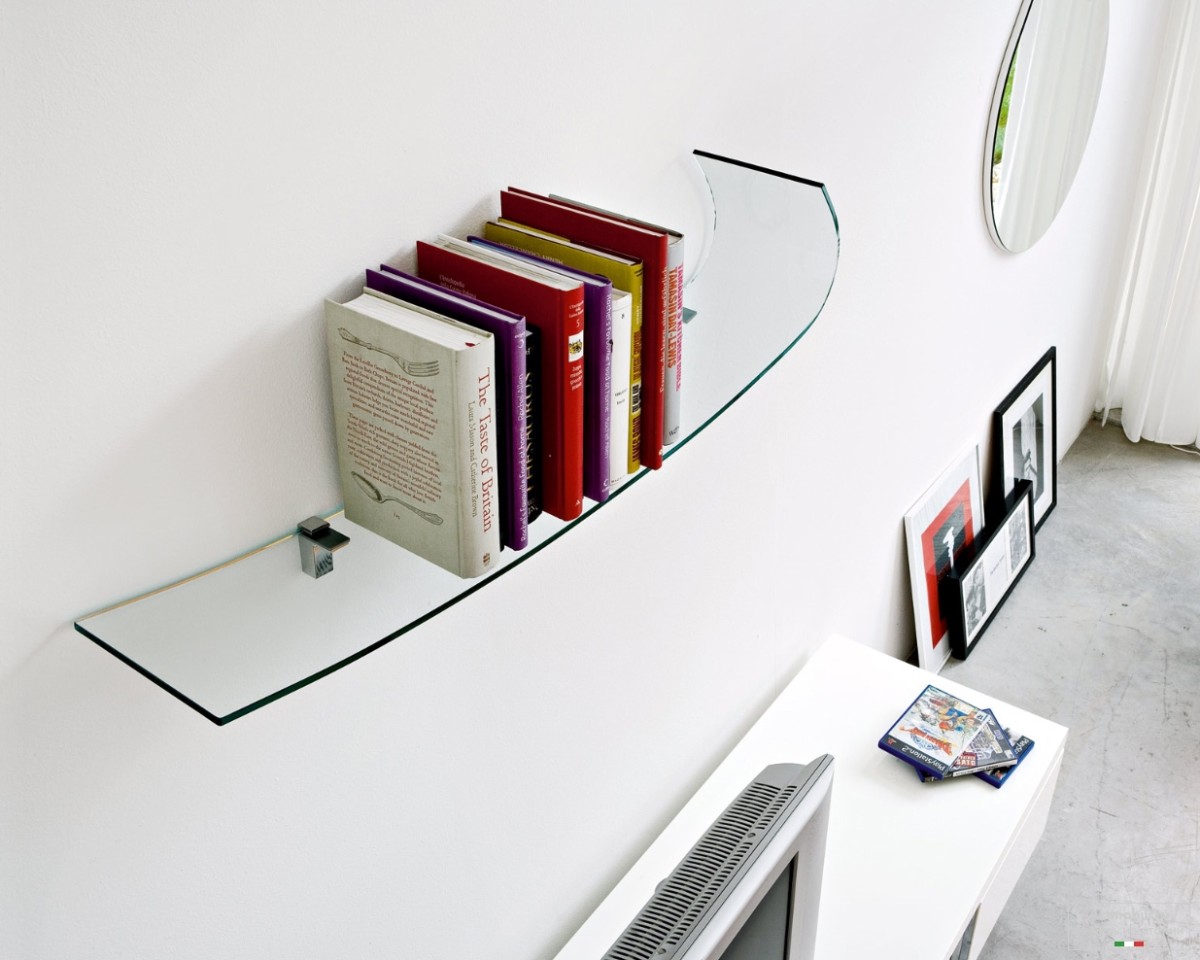
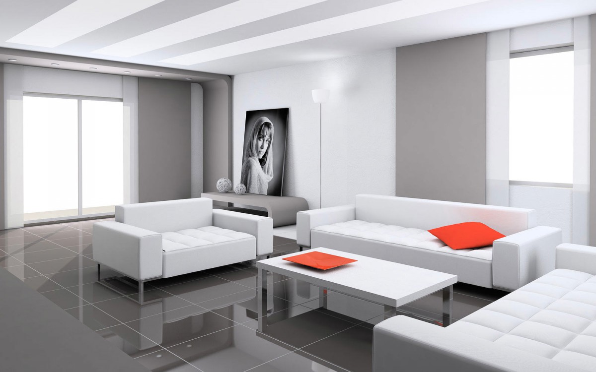
3. Follow the rule of thirds
The rule of thirds is a simplified version of the rule"golden section". It has been used by photographers and artists since time immemorial. And it is more than applicable in design. Its essence is that objects look most attractive if they fall at the intersection of imaginary lines that divide space into thirds vertically and horizontally.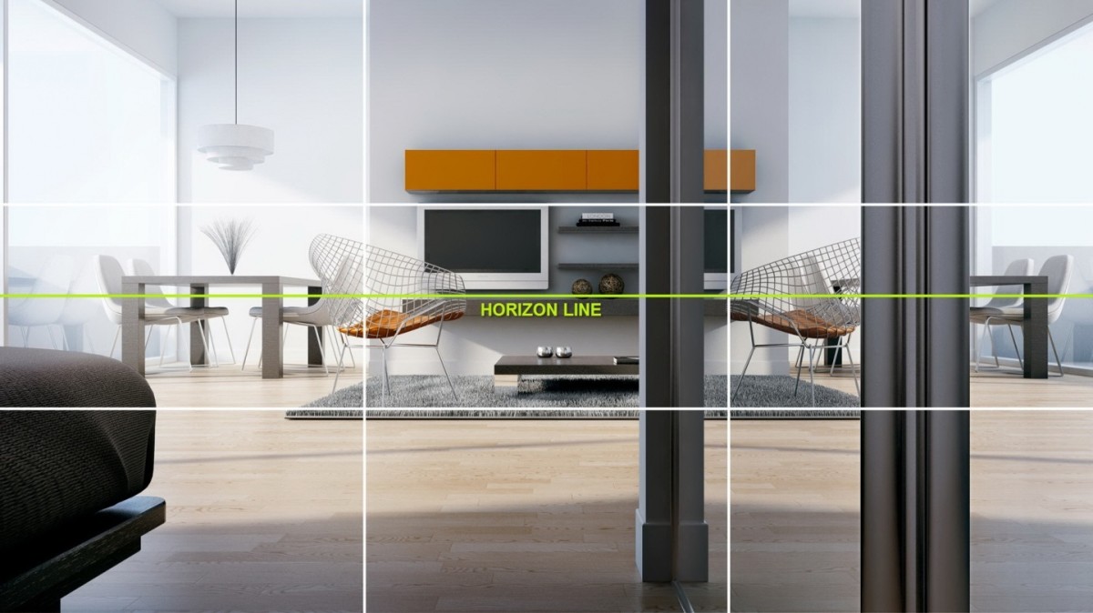
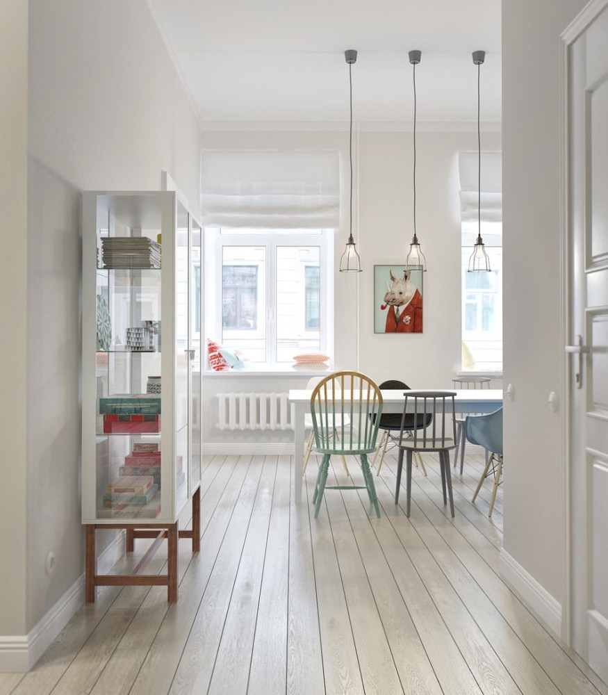 Our opinion:— The rule of thirds is great for both furniture placement in a room and small decorative items. If they are located at the intersection of lines, they will attract much more attention.
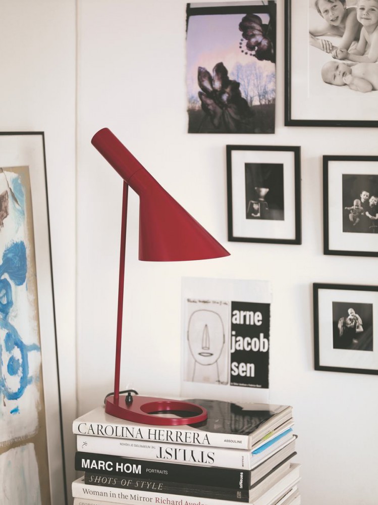
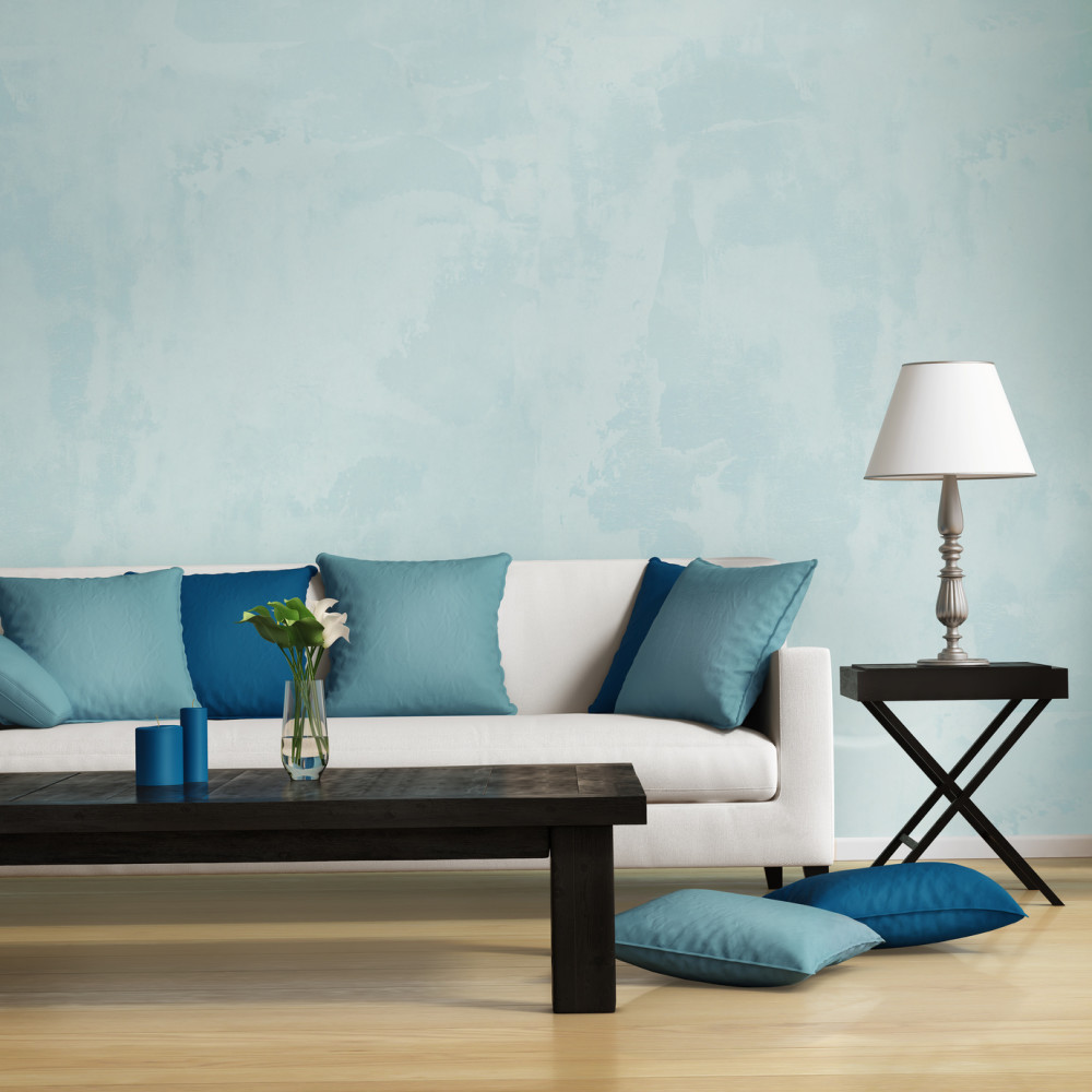
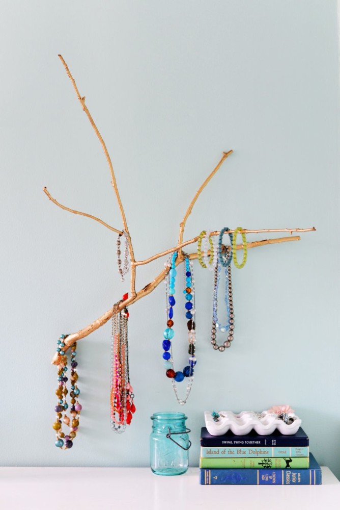
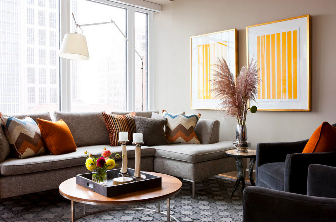
4. Combine large and small objects
Compensating large objects with small ones isA favorite technique of photographers and designers. Leave more white space around small details, and you will see how much they will start to attract attention. Effective, original and, most importantly, beautiful.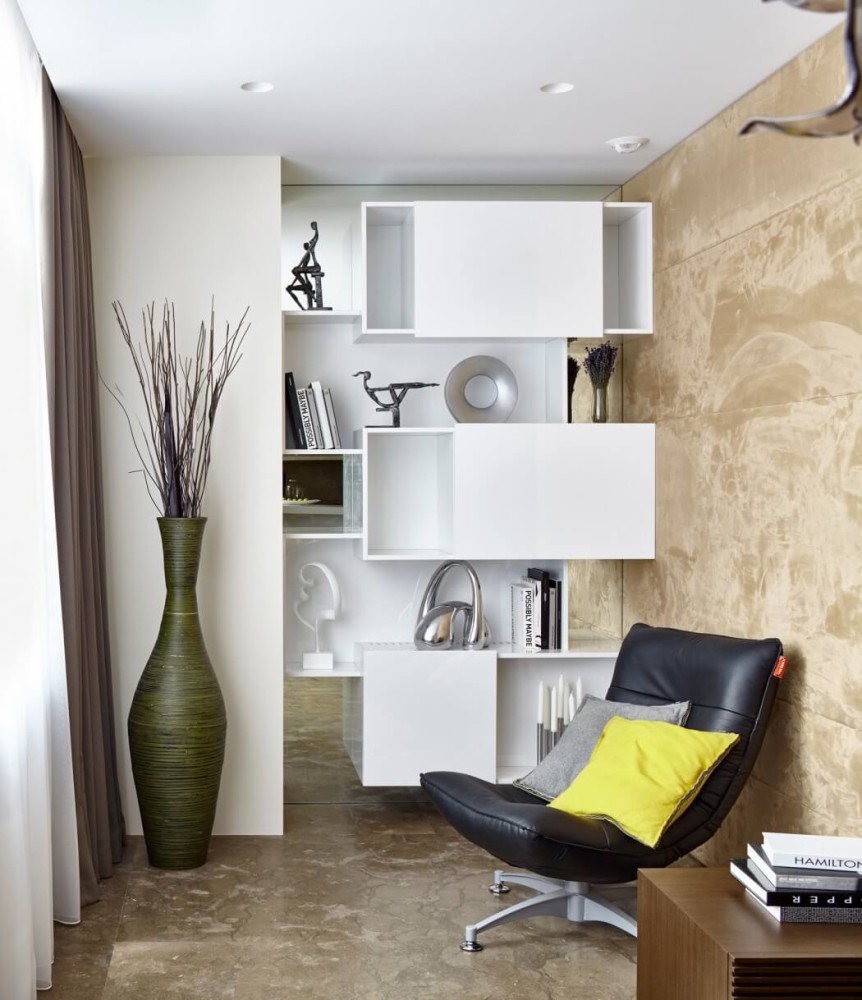

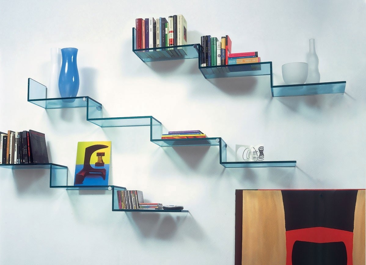
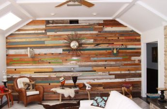
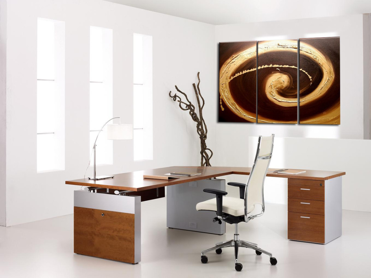
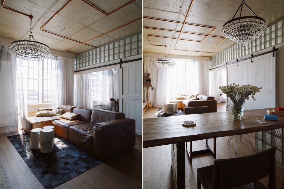
5. Follow the leading lines with your eyes
Anything that can act as leading lines,can be the perfect tool to create the perfect design. Pipes, furniture, abstract designs, parquet and many other things are great for creating a "running track" for your eyes.
![]()
 pinterest.com