The two most influential companies involved inthe development of color solutions, Pantone and AkzoNobel, named their versions of the "color of the year". What shades did they prefer? What do designers and decorators like? We decided to figure this out. What color is worthy of being the best this year? Specialists of the Pantone research center are sure that they should have the color of strong dessert wine Marsala. At the Institute, the colors of AkzoNobel came to a different opinion - here they preferred a warm pastel orange-copper shade of Copper Orange. We conducted our research, asked the opinion of designers, artists and decorators, sorted out the pros and cons of each of the colors and decided to share with you the results of our labors.
In captivity of wine shade
Velvet burgundy color captivated hearts this yearPantone specialists. The past year, with their light hand, passed under the auspices of a refreshing purple, which was known in the design sphere as Radiant Orchid, which means “shining orchid”. This year, the color designers decided to move away from cold shades and plunged into the world of the captivating wine shade Marsala, which owes the famous heady drink not only to its name, but also to its rich velvet trail of color. The Pantone company is one of the main "dictators" in the world of color fashion. Here not only professional standards are born in various areas of design, but also special color catalogs and professional devices are created to help determine the exact color. Since 2000, the Pantone Color Institute has taken responsibility for naming the color of the year. The history of Pantone begins in 1963, when its founder, Herbert Lawrence, created the world's first color guide, which is used by designers around the world to this day. Herbert collected many shades, numbered them and gave each an individual name. This idea came to him when he started working in a printing house. He noticed that people call the same colors differently, without adhering to a single standard, and decided to fix the situation. Alexey Essi-Ezing, creative director of CEOffice: - Burgundy color has a wide range of perception and incredibly bold combinations with other shades. Saturated like a burgundy, carrying emotion and experience at the same time, it combines nobility and sophistication. No wonder this color was so popular during the Renaissance, harmoniously combined with gold, champagne and overseas silks. Centuries later, color has returned to fashion, to fashion-platforms and interior lines. In the office segment, this color is also in great demand - soft zones and wall decoration in this color instantly attract attention, place soft accents in the middle of working days. 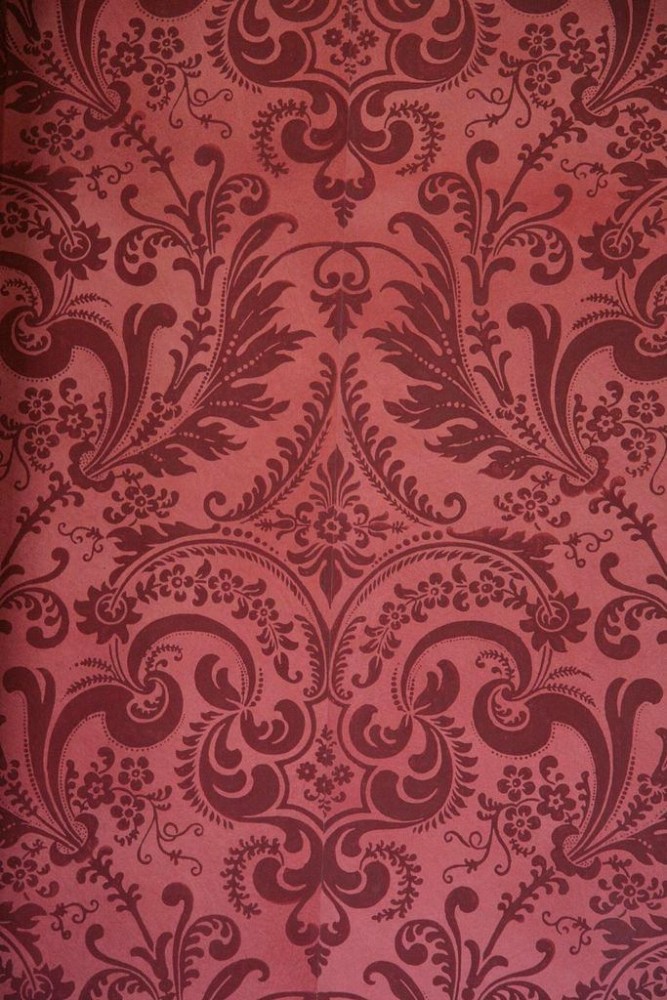
Pink sparkle of bronze
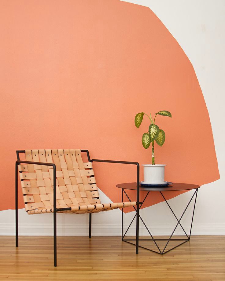
The color of the year, according to AkzoNobel, has become a delicatepastel Copper Orange, which contains sunny orange and colorful copper shades. Together they form a warm color ensemble. It adjusts to pleasant communication, disposes to relaxation and creates harmony in the interior. This year's selection differs significantly from last season's main fiddle, the pastel blue teal. AkzoNobel is the "shark" of the global coatings and paints industry. The corporation includes world-famous Dulux, Eka, Sikkens. For 12 years, AkzoNobel has launched Color Futures, a collection of colourists, designers and artists at the AkzoNobel Color Institute. They define the main directions in which the design world will develop in the coming year, and also announce the color of the year. 
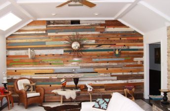
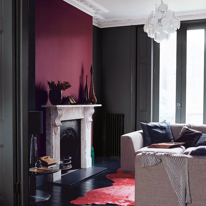
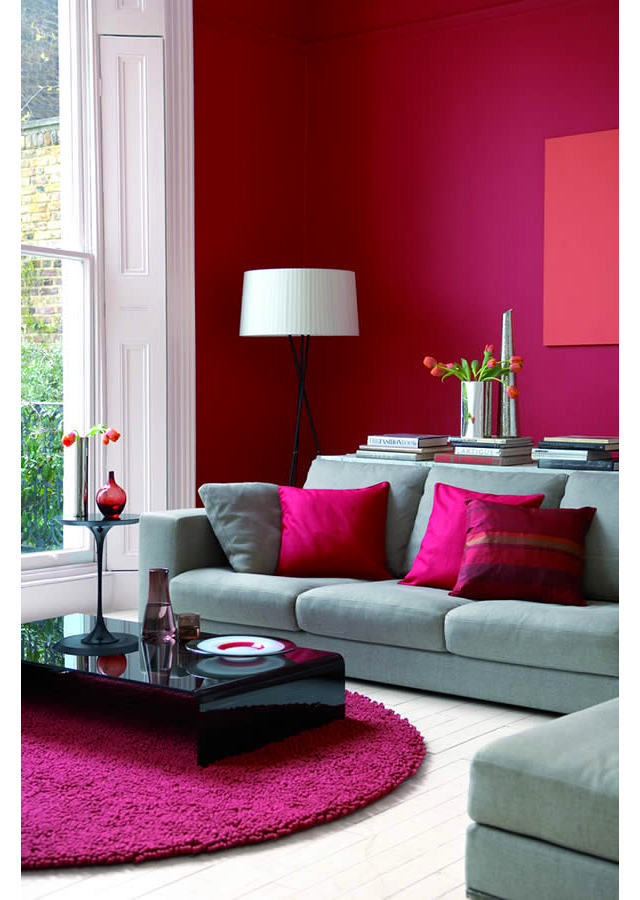
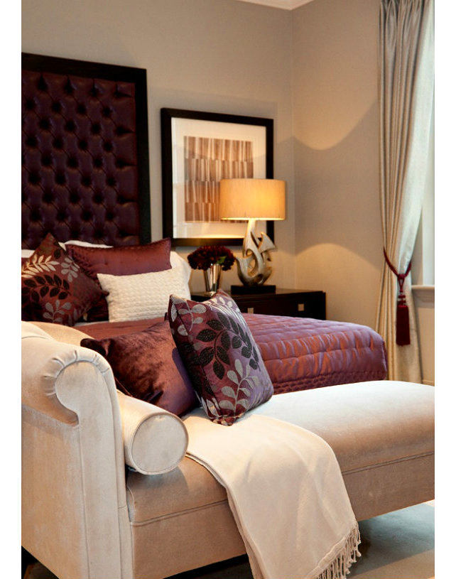
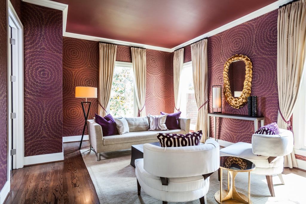
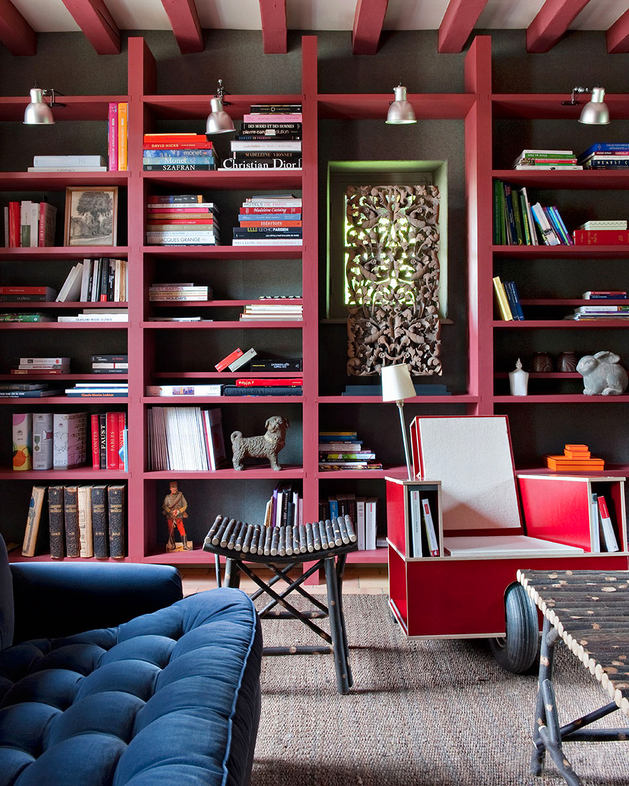
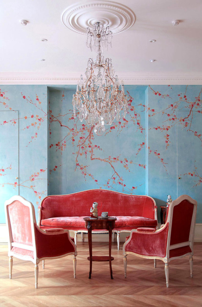
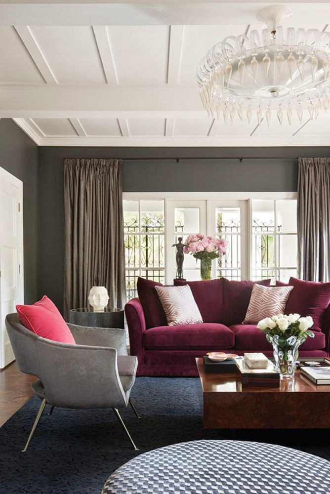
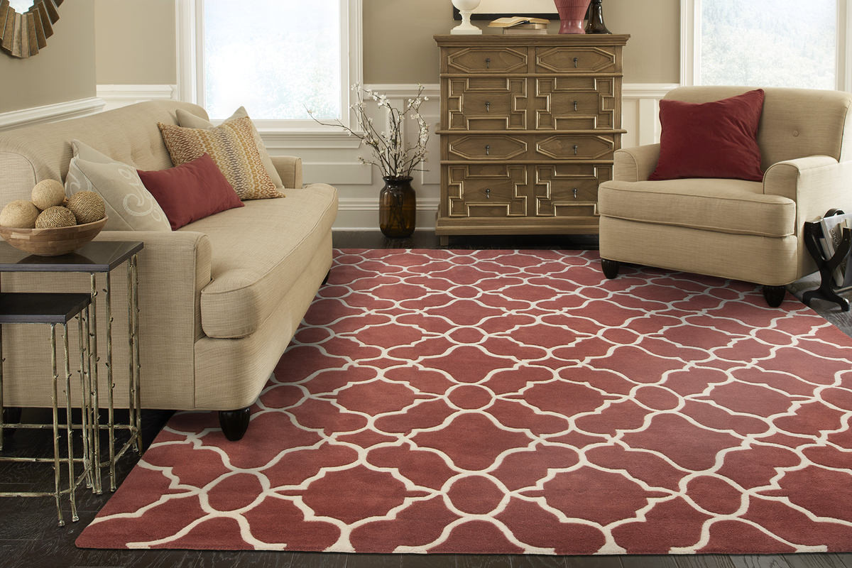
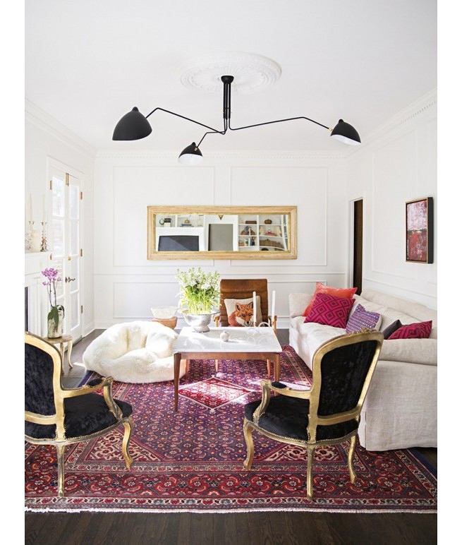
Marsala in the interior
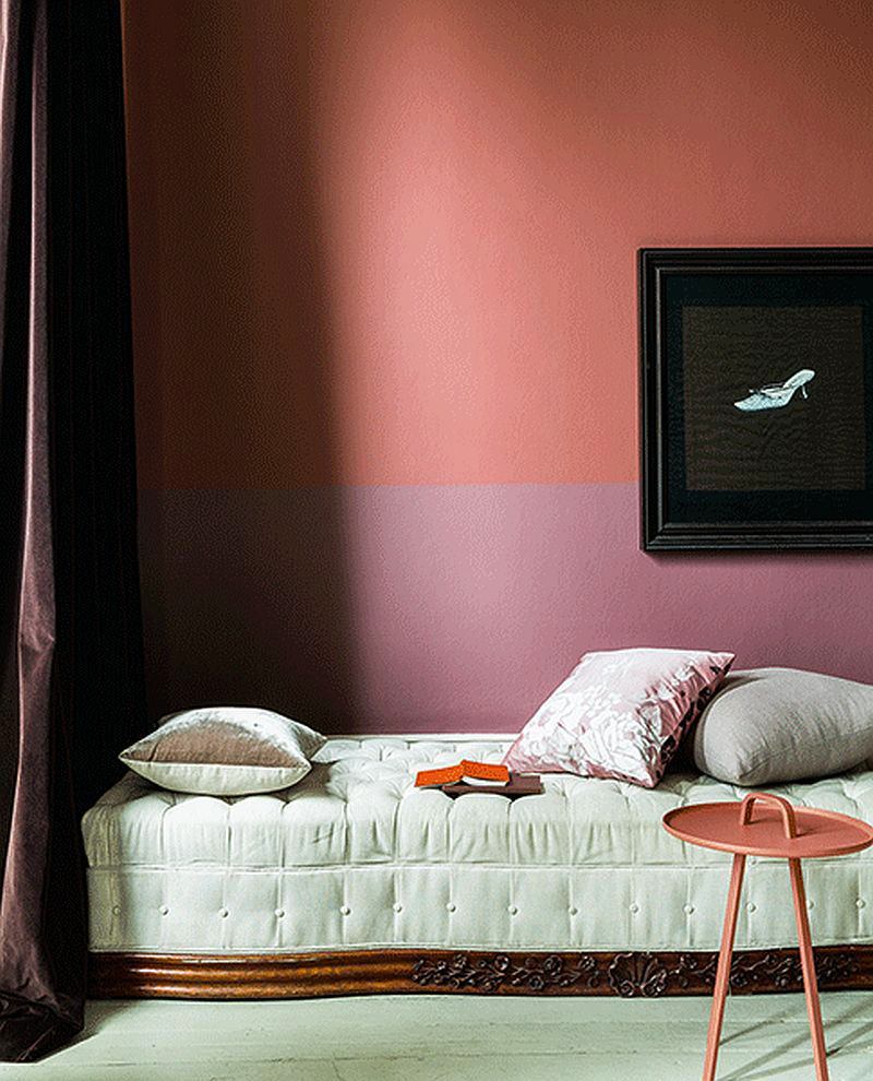
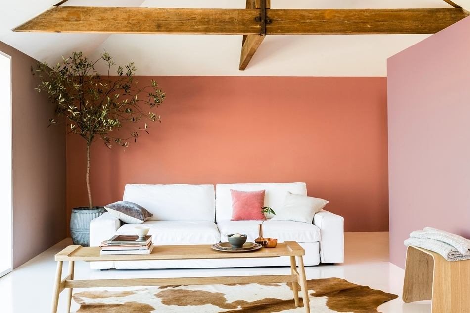
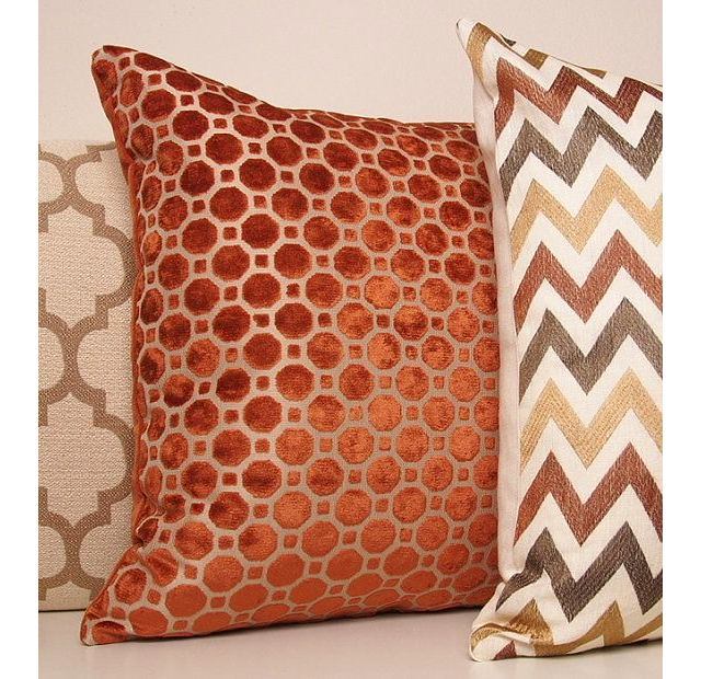
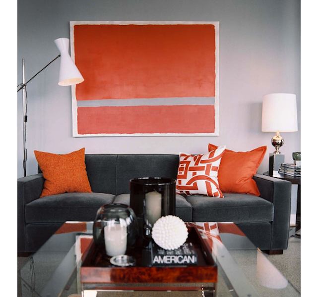
The burgundy color creates a solemnfurnishings, therefore ideal for living rooms. Armchairs with velvet upholstery in Marsala color look attractive and status-oriented. Since this color is distinguished by its saturation, you can use it as an accent color in accessories, art objects, furniture, textiles or wallpaper. Not everyone will dare to paint the walls in such a shade - creative and bright personalities who are not afraid of experiments can do this. This technique is best suited for the office, since Marsala stimulates brain activity. Part of the Marsala color can be applied in the kitchen or dining area. Here it will be appropriate, as it is able to awaken the appetite. But in the bedroom it is undesirable to use it, since it has an exciting effect on the psyche. Only small references to it are possible in the form of a bedside lamp or a blanket with burgundy-brown inserts. Anastasia Zakharova, artist and interior designer: - Marsala - muted burgundy, wine color. After last year's Radiat Orchid, bold and cold, it definitely warms and gives a feeling of comfort and luxury. Perfect for oriental (Moroccan) interiors, for example, as plaster or carpets, and for the traditional English style, where it is reflected in textiles, wallpaper, and accessories. It goes well with cold shades of gray, wood, copper and complex textures. Marsala-colored walls will look great, and furniture with a touch of patina will give a sense of history. It is worth remembering that this shade is not as active and aggressive as red, but nevertheless it is quite exciting, so be careful with its amount. 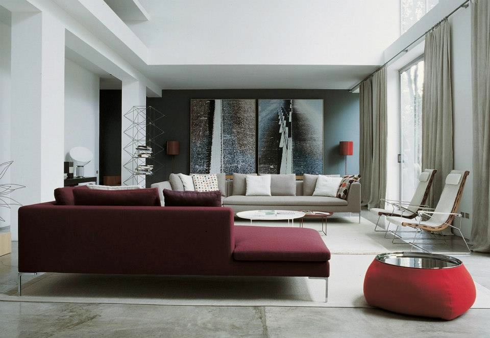
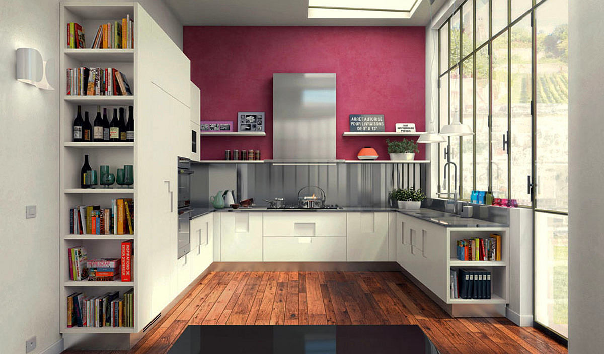
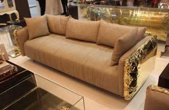
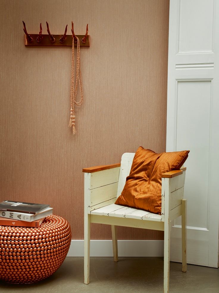
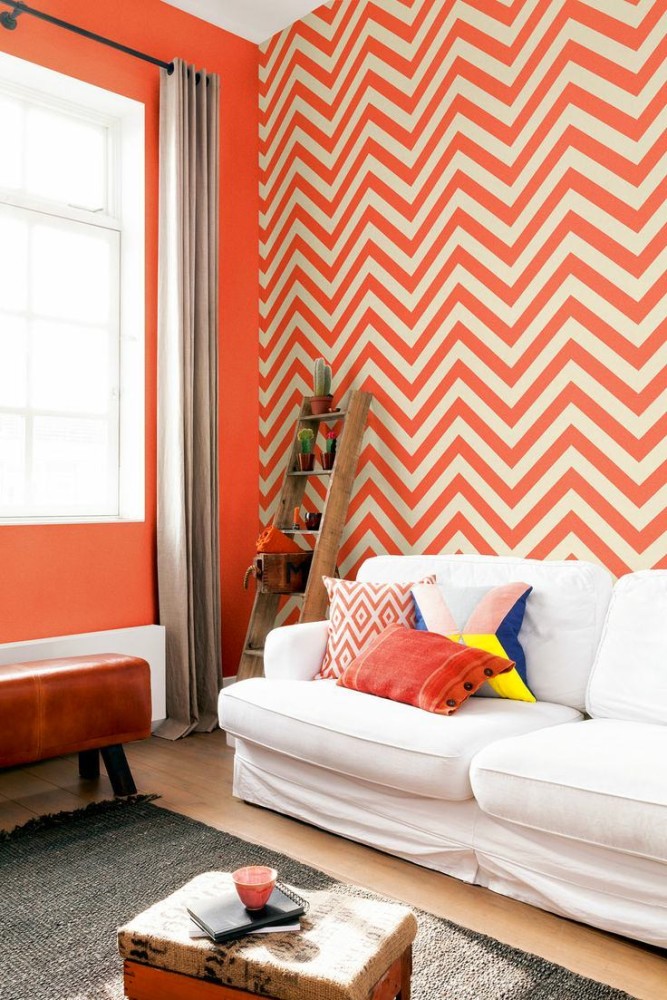
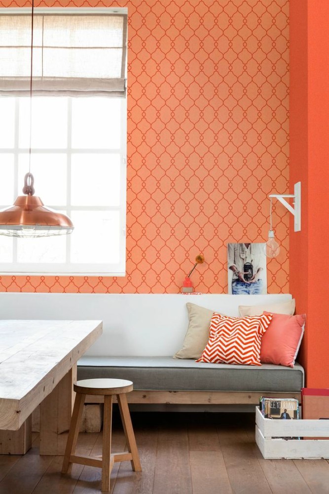
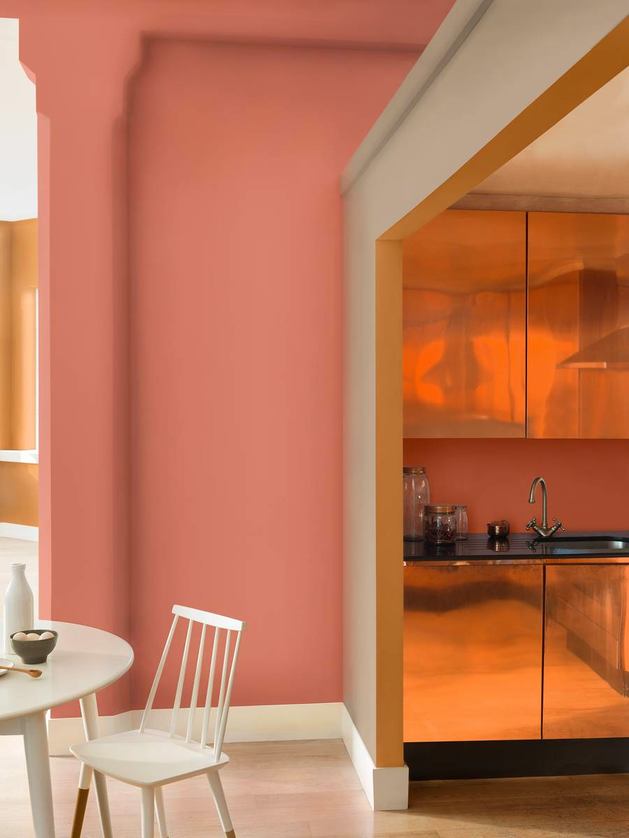
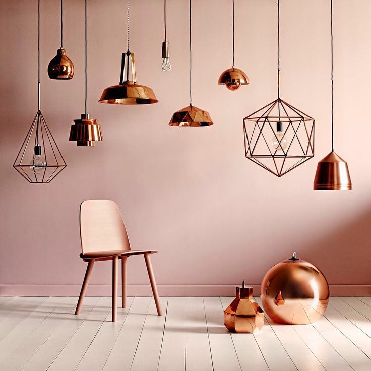
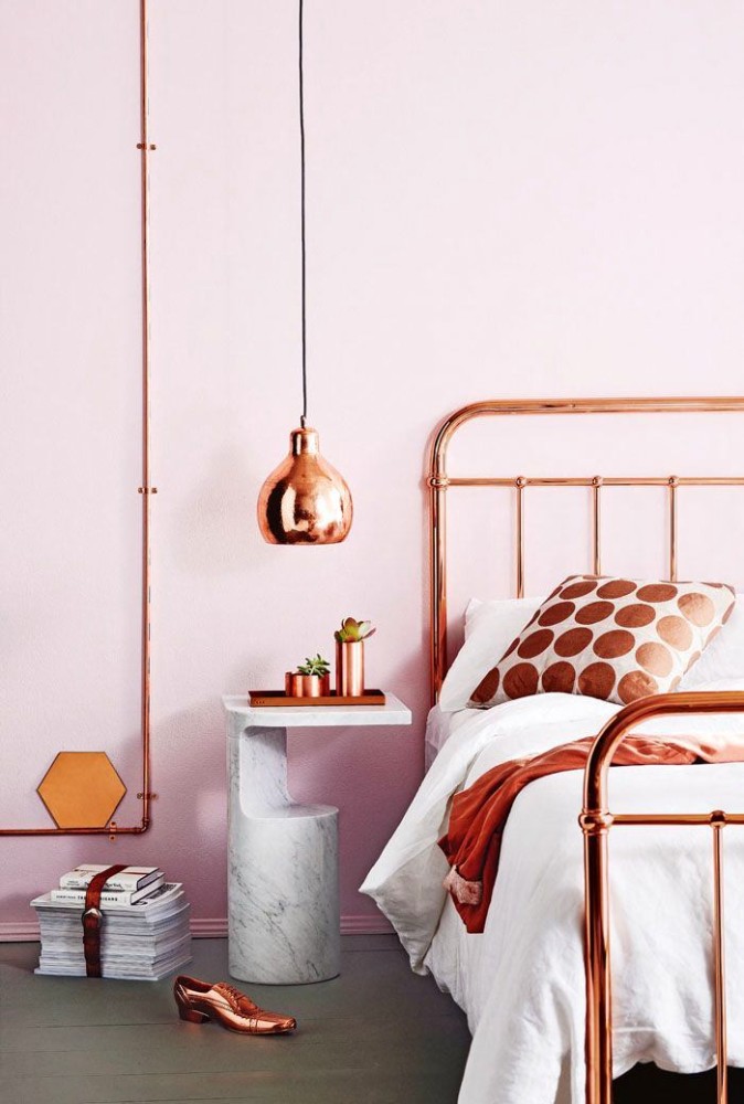
In captivity of bronze bliss
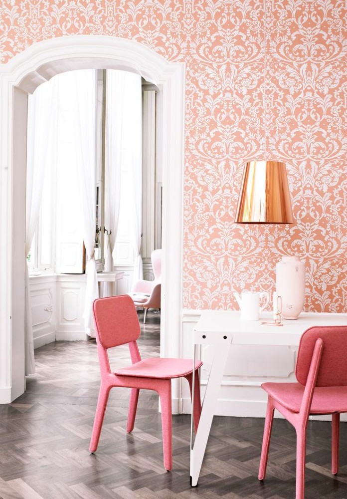
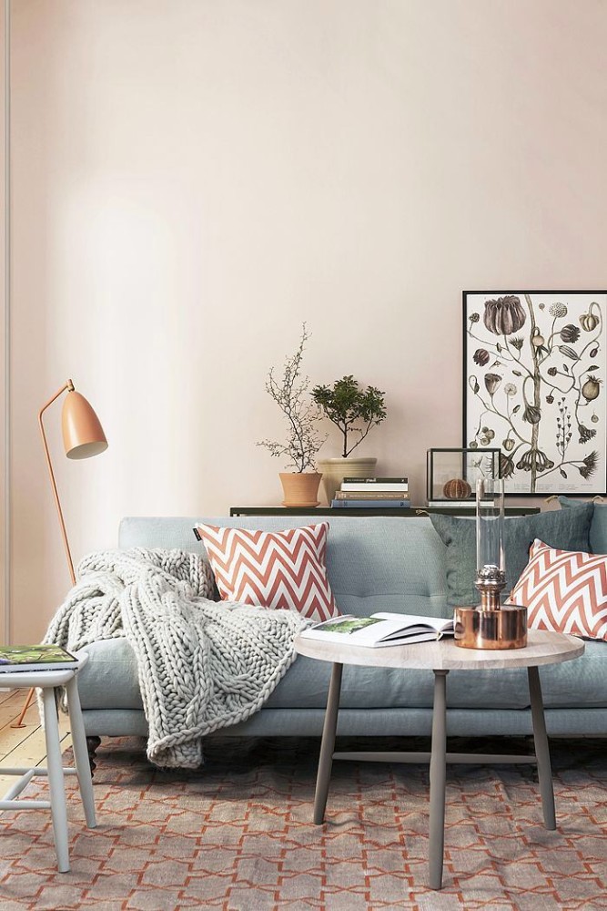
Soft and enveloping Copper Orangeimmerses you in an atmosphere of comfort. One wants to be in such an interior and feel the warm influence of the orange-copper hue. He does not oppress, creates a positive atmosphere, has a pleasant pastime. Copper Orange is somewhat similar to the color of pink pearls - it has the same shining overflow, which is largely due to the bronze hue. Orange color, mixing with it, turns into a delicate peach-pink tone. If we consider light shades of this color, then they are most suitable for relaxation areas - bedrooms, bathrooms. For living rooms and social areas, it is better to use rich colors. A kitchen or dining room made in this color will look good. Copper Orange will be equally good both independently and in combination with orange, white, pink shades. Copper accessories that accentuate the overflow and depth of color will become a harmonious addition to such an interior. Anastasia Zakharova, artist and interior designer: - Copper has not given up its positions in the field of interior design since last year. European brands began to actively use copper in the interiors of the kitchen, living room and bedroom - these are dishes, fittings, furniture parts, lamps, and decoration elements. Copper is great for trendy styles like loft and vintage. In addition to private interiors, copper perfectly complements the space of cafes and restaurants, modern offices and shops. 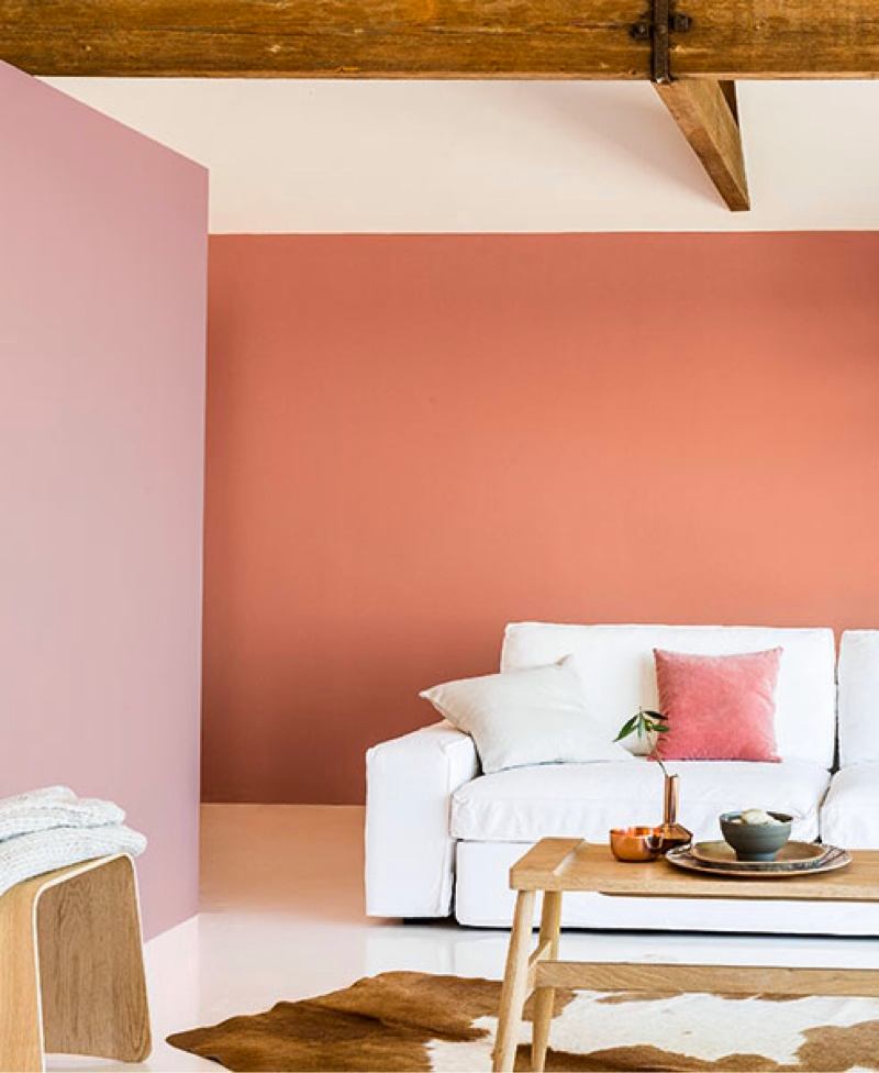
Who is whom: claret against copper
What color deserves to be the best?Marsala makes the interior noble, orange-copper creates a friendly atmosphere. Both colors are non-irritating, self-sufficient, and can be used solo and as accents. Warm and enveloping, these shades cannot resist each other, on the contrary, their merger in one interior will look interesting and even advantageous. And here is what our permanent experts think about the colors of the year. Alexey Essi-Ezing, creative director of CEOffice: - Copper elements are very popular now, they have replaced the bright gold ones that give off philistinism and pseudo luxury. Vintage and fascination with things with history, a bold combination of cold and aged turn copper and bronze shades into a stormy "mixture" of cultures and generations. But one must be careful with copper shades, because copper is not only a valuable element of the table, but also can harm its owner in large quantities. Therefore, make copper accents, but do not give this color the main role. Ekaterina Volkonskaya, CEO of DECORHOME: - Most of all I am impressed by Copper Orange. I think the combination with turchese color is relevant this season. Burgundy is beautiful, but I would not call it the color of the year. 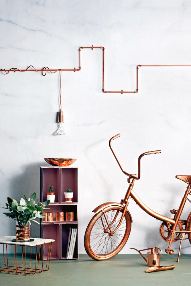
 pinterest.com, pantone.ru, akzonobel.com