A cozy, light, slightly cool interior for a young family, where you can get a lot of ideas for your own home - regardless of its style
Interior designer Stepan Bugaev is happy totook on an unusual task: to design a room not in the open layout of a new residential complex, but in the conditions of secondary real estate. As a result, the project turned out to be stylish, comfortable and light, including a large number of wooden elements that fit perfectly into the overall picture of a cozy room. Stepan Bugaev, interior designer Graduated from Moscow Institute of Physics and Technology with a master's degree in physics and from the Higher School of Economics with a master's degree in business informatics. Has his own design studio, under his leadership more than 500 design projects have been implemented. Included in the top 100 best designers, according to the leading interior publication AD. He is a teacher at the HSE School of Design, teaches his own course "Interior Design. Rules for Creating a Successful Project." Gives open lectures on interior design and writes articles for leading interior magazines and portals.
— For a young married couple with a small child,living in a new building in the South-West Administrative District of Moscow, the designer created an interior in the Scandinavian style. The distribution of responsibilities in the family is as follows: the husband spends a lot of time at work, and the wife raises the child at home. The family prefers an active pastime, but also spends a lot of time at home. Thus, for them, the house is an important space that needed to be made as cozy as possible and in line with the customer's requirements.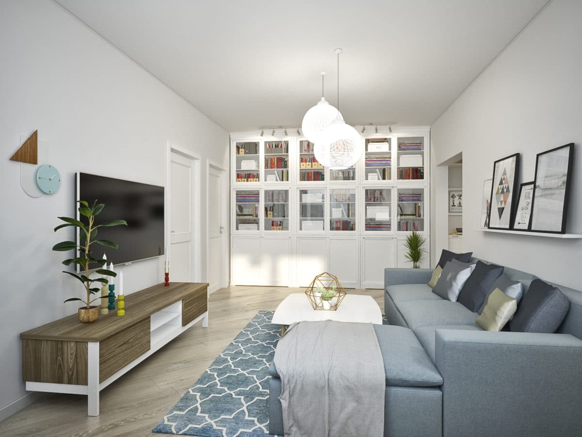 The general idea is as follows:The designer conceived the idea of creating a light interior, but not pure white, but with the addition of various light shades. Thanks to this, each room has a special look. The diagonal layout of the flooring creates dynamics and visually expands the small space.
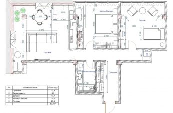
The allocation and separation of the kitchen space has becomean important point of the layout. Due to the fact that the designer removed the corridor, the living room area was expanded. The apartment has two bedrooms - one for children and one for parents. Thus, the designer planned a comfortable space for a family with children.
When entering the hallway, it is worth noting the light backgroundwhite and grey. The ornamental floor tiles supporting the diagonal slope become an eye-catching feature, while the furniture and paneled door create a feeling of homely warmth and coziness.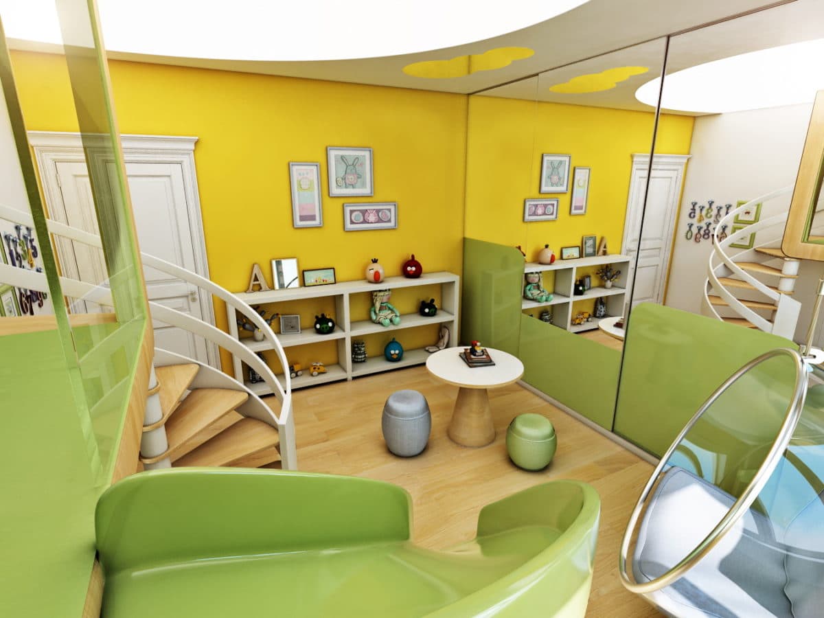 Now let's move on to the kitchen, which is done in a warm style.white color scheme. The designer highlighted the wall behind the dining area in gray, and emphasized the table area with a strip of painted white brick. It is impossible not to note the combination of glass inserts and blind cabinets in the design of the kitchen set: facades with panels are combined with open and closed sections. Light chairs are made of white wood, and colored pillows add an element of variety to the design of the room.

It can be said that the overall white tone of the living roomis ideal for introducing bright accessories such as posters, flowers, bright textiles, bright books. White floor space and indoor plants bring an element of liveliness to the interior, turning it into a warmer and cozier one. In the center of the room, at different levels, there are two lamps of different sizes: they look as if they were woven from threads, creating a feeling of lightness and airiness. If you pay attention to the window, on one side you can see an open shelving unit in which books and souvenirs are stored, and on the other side - a cozy windowsill. The combination of flooring, gray-steel color of the sofa and carpet of natural wood color helps to maintain a calm mood. A huge bookcase, protecting the family library, occupies the space from wall to wall.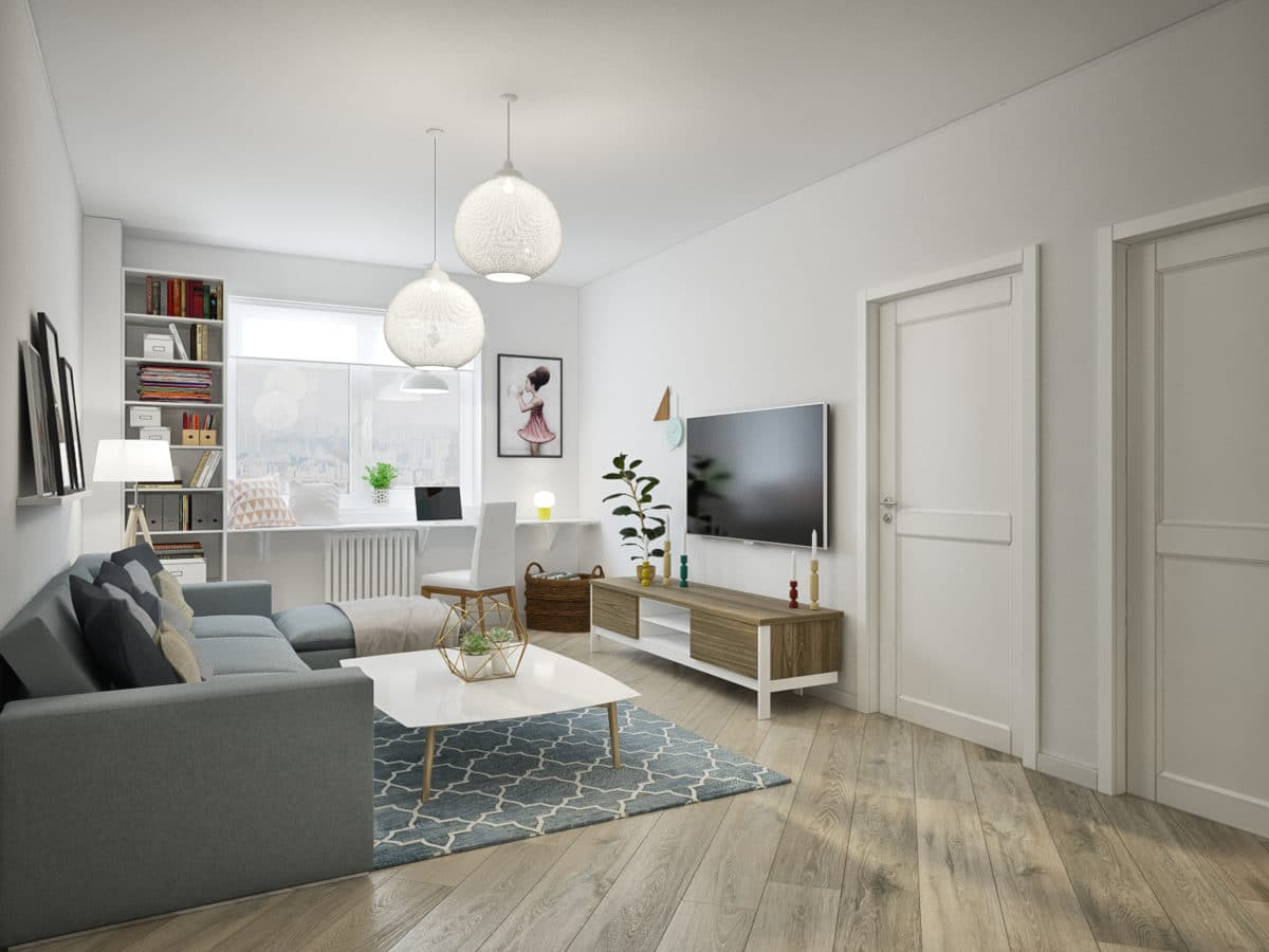
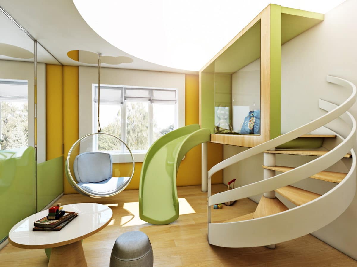
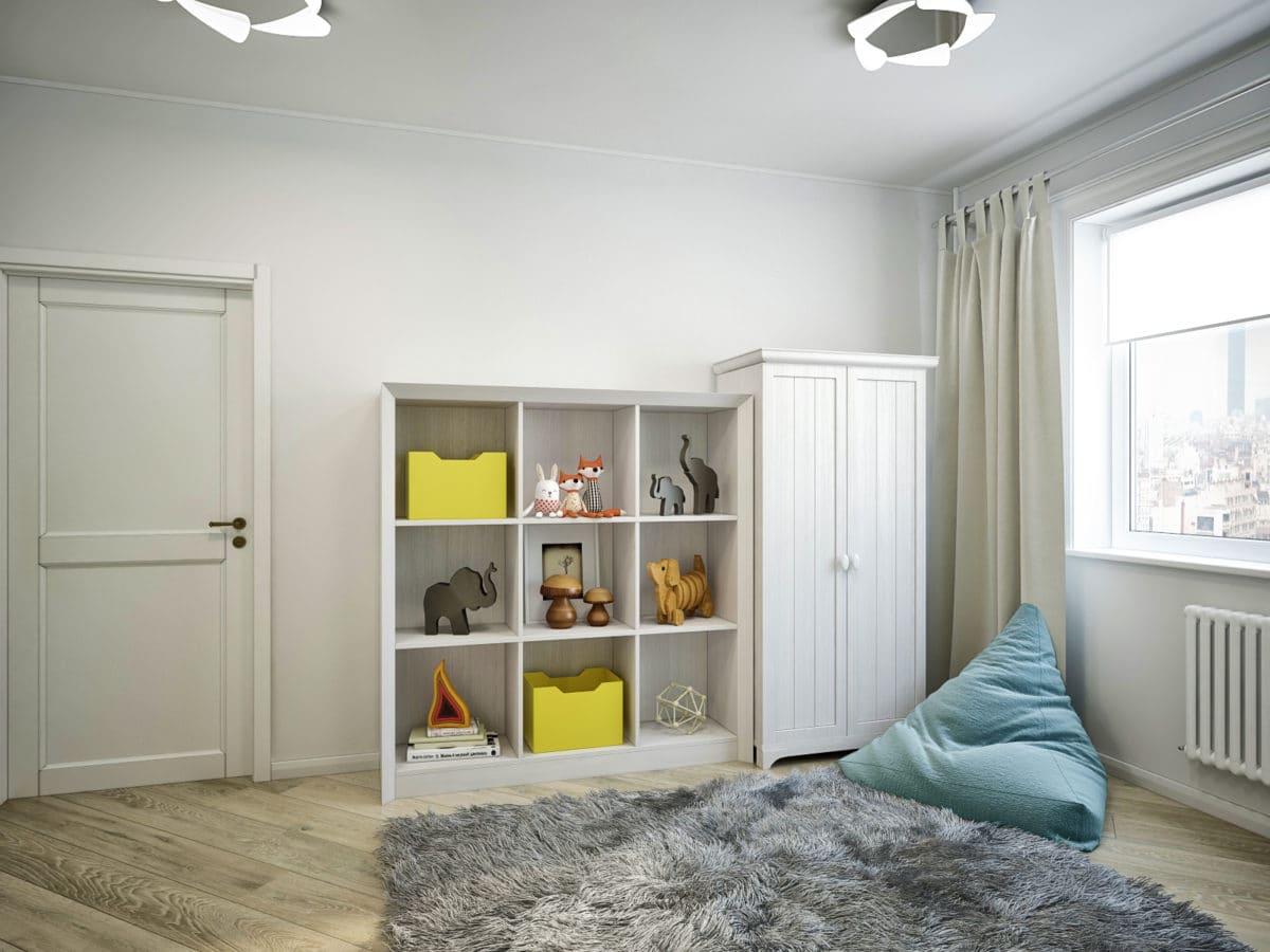
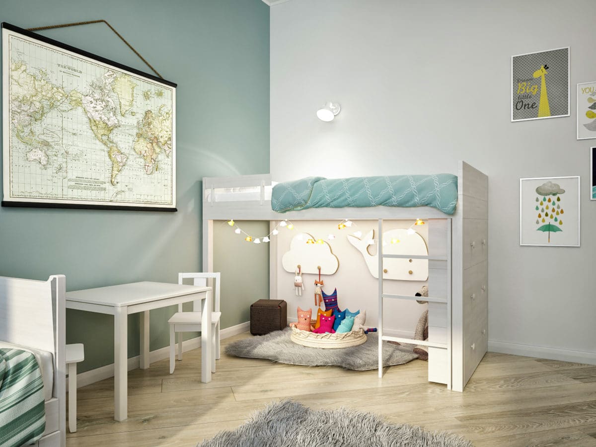
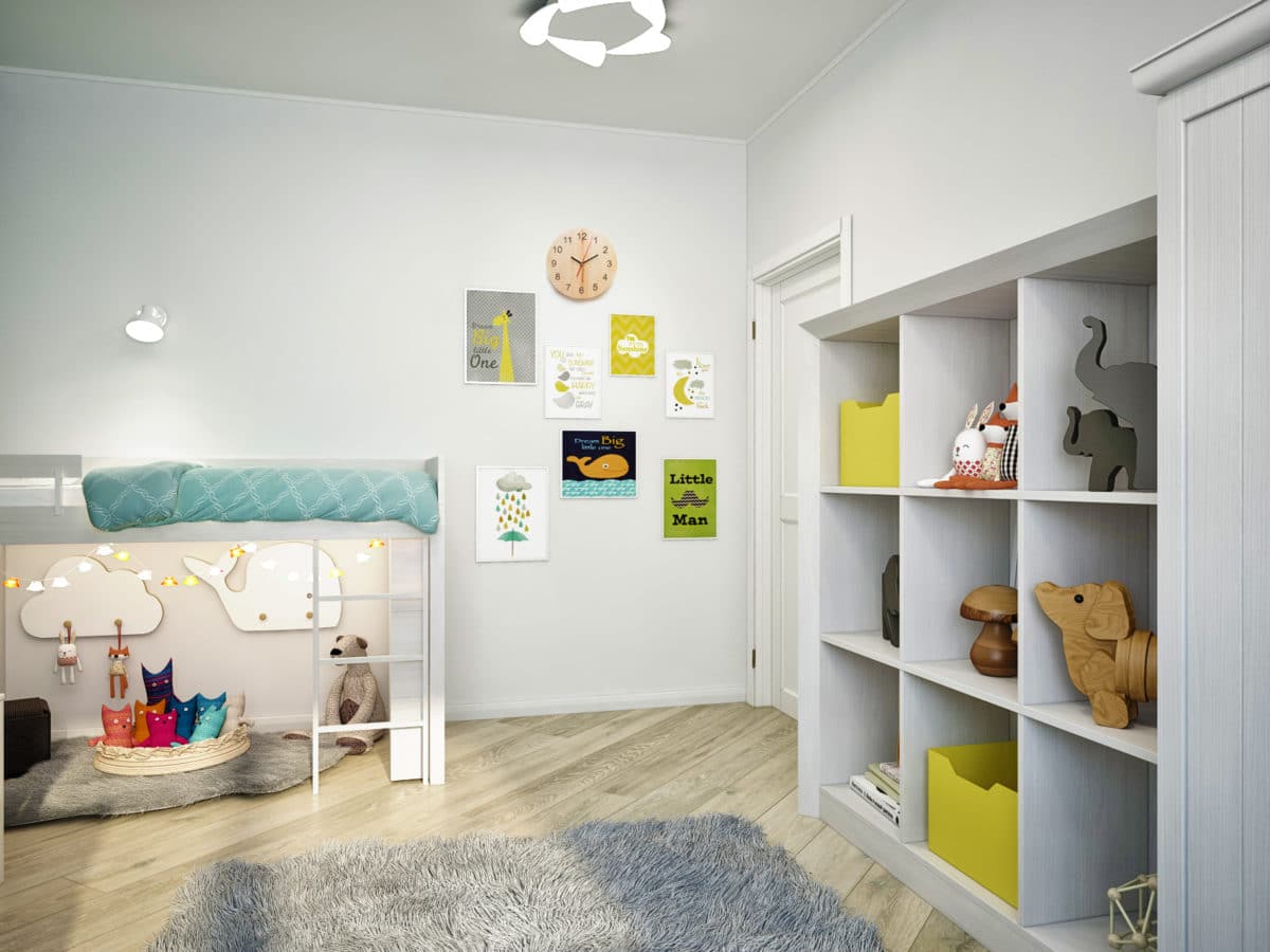
In the children's room, the accent wall is made inmint color, and the white furniture looks like a light outline on it. The lamps attract attention with their unusual shape. The lower level of the bunk bed is given over to the play kingdom and the area where toys are stored, and on the upper level there is a place to relax after fun games.
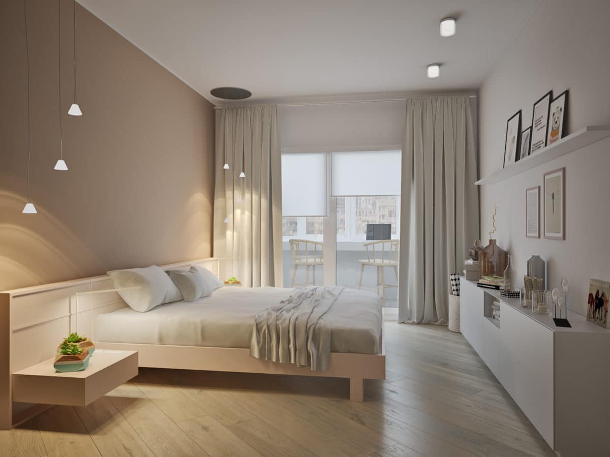
 The parents' bedroom is dominated by a subdued atmosphere.color scheme. A light coffee shade, similar to the color of the door, highlights the wall behind the bed, and the other walls are white. The fronts of the wardrobes are mirrored. The headboard of the bed is combined with bedside tables, and elegant bell-shaped lamps on pendants add variety to the interior.
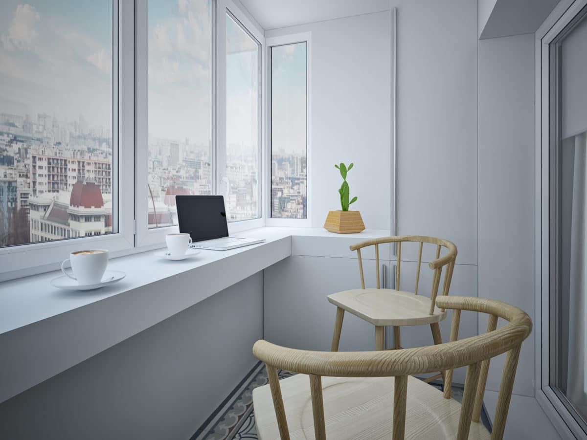
The bedroom has an exit to the balcony.The window sill block gave way to a French window: such glazing presented the interior in a favorable light. On the balcony, bright ornamental tiles and wooden elements serve as accents. Such an ensemble on a white background looks unusual and fresh. Live flowers and an olive tree create the impression of a terrace, which is also facilitated by tiles and wood.
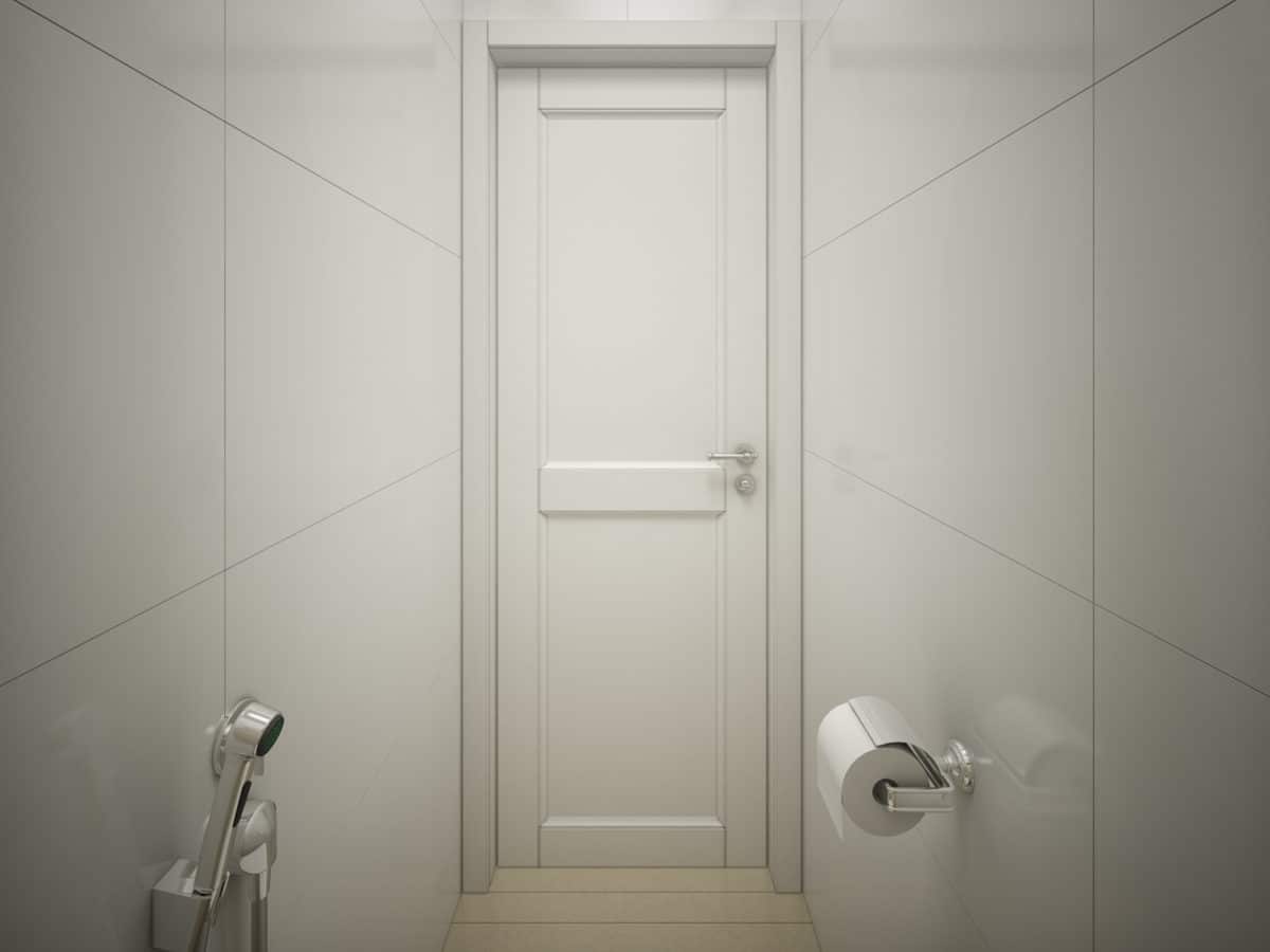
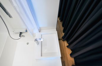
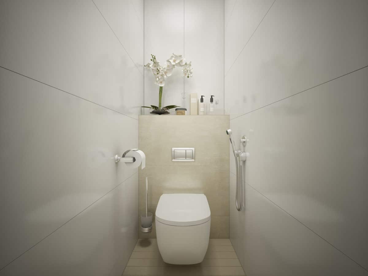
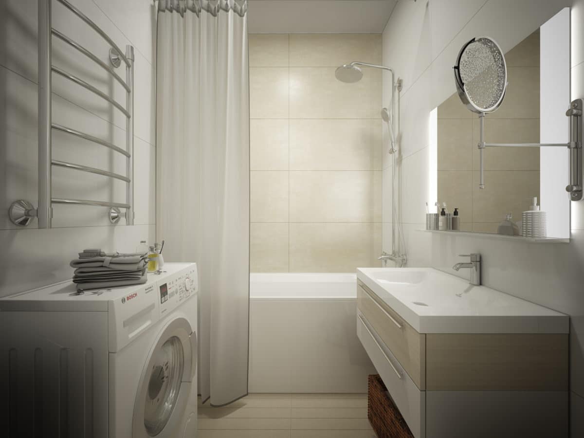
 The bathroom and toilet area are designed in a single style, distinguished by a combination of white, sand and light wood. Chrome is used in the finishing, which is complemented by the laconic form of the plumbing.
Hallway:
- finishing: Equip Ceramicas tiles; Finex solid wood boards; decorative plaster, Novacolor;
- lighting: Vanlight, Dialma Brown;
- doors: Union;
- custom-made furniture, "Natural selection".
Kitchen:
- finishing: solid board Finex; decorative plaster Novacolor;
- headsets: Scavolini;
- furniture: Dialma Brown;
- lighting: Vibia, Flos.
Living room:
- finishing: solid Finex board, decorative Novacolor plaster;
- furniture: Calligaris, Dialma Brown, "Natural selection";
- lighting: Moooi.
Bedroom:
- finishing: solid board Finex; decorative plaster Novacolor;
- furniture: Mobilfresno alternative;
- lighting: Vibia, Mobilfresno alternative.
Children's:
- finishing: solid board Finex; decorative plaster Novacolor;
- lighting: Karman;
- furniture: Aspace.
Bathroom:
- finishing: Atlas Concorde Italia tiles;
- plumbing: Villeroy & Bosh;
- lighting: Delta Light.
