Does the small area of an apartment always meanconstraint in redevelopment and lack of an alternative solution? We asked an experienced architect to comment on 19 small apartment layouts and indicate their pros and cons. Clearly One of the favorite types of design activities for our today's expert is the planning and redevelopment of various objects, but to a greater extent - private housing. It is also worth noting that the layout is not only lines on a plane, a competent solution requires volumetric thinking: this allows you to see both the nuances and features of the problem, as well as new, original options for its solution. For comments and advice, we turned to the architect Igor Bokov. Igor Bokov, architect Graduated from the Faculty of Architecture of SUSU in 2010, in 2015 he defended his master's thesis at the Moscow Architectural Institute. Since 2010, he has been engaged in architectural design, ranging from mobile housing and exhibition stands to projects for commercial buildings, cottages and solutions for urban apartments. Working with redevelopments, I was convinced that “the smaller the area of the projected apartment, the more difficult, but at the same time, the planning tasks become more interesting. And an elegant solution is a reward for both the author and the customer. " The layout of this tiny studio apartment is complicated by the location of the front door and the balcony compartment door close to the longitudinal wall, which makes it difficult to arrange furniture along this wall. And if from the side of the entrance this disadvantage is compensated by the walk-through dressing room, then from the opposite side you have to literally “sleep in the kitchen”. The bed even had to be moved close to the window so that there was enough space for the dining table, because the placement of the kitchen near the opposite wall was fixed with a plumbing connection.  The most controversial in this apartment, of course,Is the placement of an open bedroom right next to the entrance, besides - without natural light. This, however, allowed the organization of a separate zone for a day stay. Subjectively, the straight wall to the entire apartment lengthens the corridor formed by the wall of the bathroom opposite, and the front door at the end makes the space a little uncomfortable.
 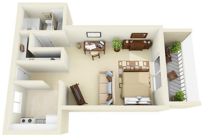 The main advantage here is the spaciousside alcove niches to the left and right of the entrance, but the redevelopment was further facilitated by the presence of a window in one of the niches, as well as separate plumbing risers for the kitchen and bathroom. And if, in the absence of a window, it would be enough to remove the short wall between the kitchen and the living room, then it is much more difficult to stretch communications to the common riser. L-shaped dressing room is original. This is where its merits end. There is an overexpenditure of space and at the same time cramped when using the shelves. A long wardrobe with doors towards the hallway and a short one in the same place, near the bathroom - the solution is more trivial, but practical.
 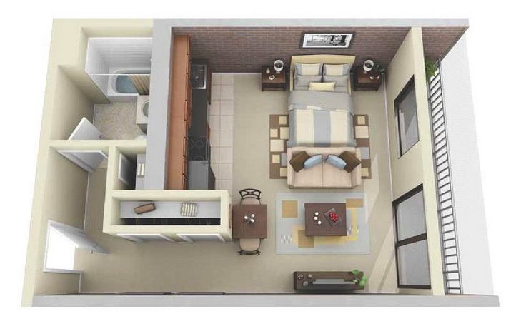 The proposal for separate closets from the previous oneThe example was embodied in this layout, but the rest of the furniture is a little strange: firstly, it's a dining table right on the aisle, and secondly, an open bed instead of a separate bedroom, and even close to the kitchen, which has to be bypassed, along with a sofa , Across the living room. These shortcomings could be attributed to a small footage, but wide aisles and free spaces indicate the opposite ...
 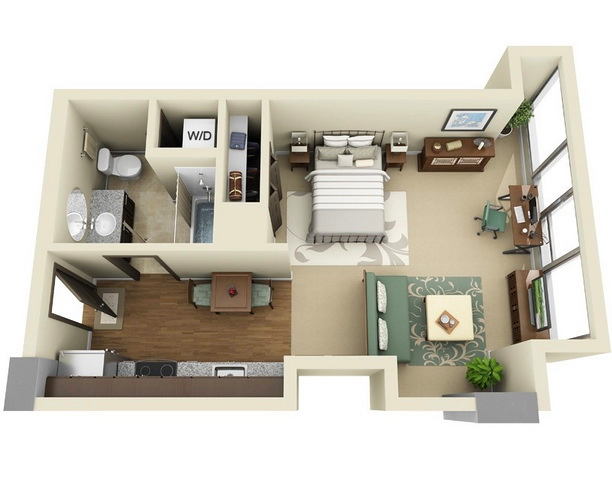 Sliding glass volume at the end of the apartment asWould hint that the existing loggia was insulated and integrated with the living room. Demolition of the remaining walls almost to the bathroom due to the necessity of natural light, and a projection formed two shallow niches very logical shaped kitchen and the living room is not very logichno-: given the lack of closets, could put a couch in niche, and a cupboard with a TV isolate the bedroom area, At the same time releasing the panoramic window.
 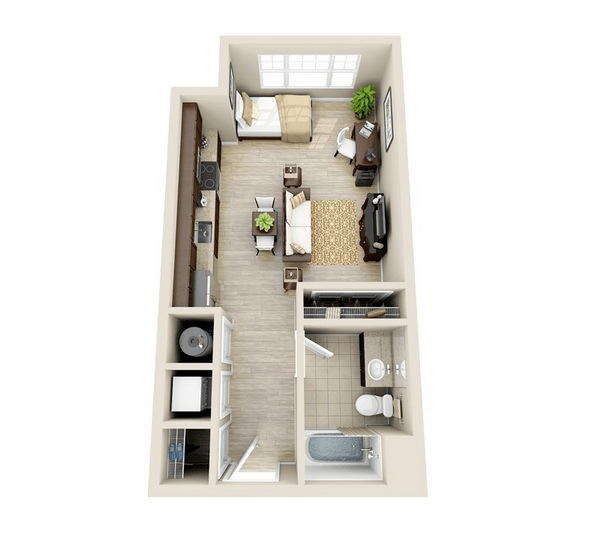 The strength of this simple and successful layout isProportions of rooms. A single bed can easily be replaced by a double bed, mirroring its location with a work table. A small defect is the place at the dinner table with your back to the front door, however, and this can be corrected by simply unfolding the sofa and the television cabinet by 90 degrees - in this case the space between them will allow you to unfold and the dining table.
  A set of classical for small reception apartmentsAllowed to create a harmonious and logical layout. If desired, it is even possible to fence the sleeping area with a wall to the middle of the room. The spacious and empty space behind the back of the sofa, however, shows that it would be possible to arrange the furniture a little more compactly and rationally: the apartment just does not have enough space for a full-fledged dining table, as dining at the bar with a built-in sink, face in a closed kitchen, Not very comfortable.
  Zoning of this apartment is almost indentichnoThe previous example, even the door to the bathroom is in the same recess. However, the sleeping area is visually separated from the living room area, and the plasma panel can be rotated on both sides. It's easy to make room for a dining table, mirroring the kitchen "peninsula" to the front door.
  Good illumination, space, airiness -The first impression at the entrance to this apartment. However, after looking at the layout, it is possible to note a certain overspending of the area to the auxiliary premises - so, because of a separate room near the entrance, there was not enough room to place a sink in a single kitchen front, which could easily have been arranged in L-shaped. Another, perhaps, small remark is the plasma panel covering half of the high window.
 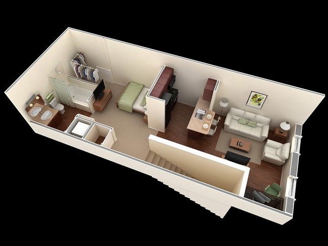 In this, the entrance in the center makes the zones of the premises according tothe edges are more proportional, but at the same time the flight of stairs greatly narrows the central part, which causes a lack of natural light, and the dining area and even the bedroom have to be located right on the aisle. Immediately striking is the place for clothes in the very corner, which could be made more convenient by rearranging the hangers, a bath, a bed and a TV stand - all four elements in the complex.
 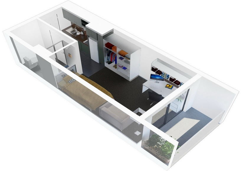 The idea of layout of this apartment is as simple as possible: Everything is arranged sequentially, one by one along the walls, from the entrance to the window. Because of the tiny common area, we had to leave only the most necessary minimum of zones and furniture in them: the entrance kitchen is combined with the hallway, and the only room includes functions at once and a dressing room, and a cabinet, and a bedroom, and a living room.
 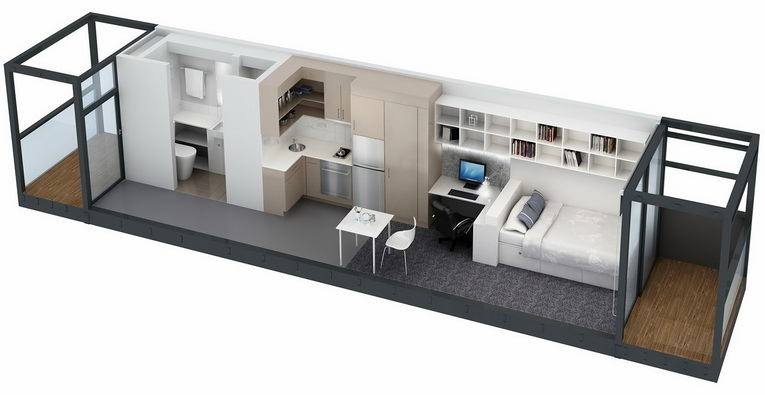 But here is an example of an even narrower apartment, largerresembling a converted 40-foot container. If you look closely, you can see that it was necessary to abandon not only the bath, but even two hob burners, and the places for it are represented only by shelves above the bed and one tall cabinet near the refrigerator. A lonely chair at a tiny dining table brings a touch of sadness to this apartment.
 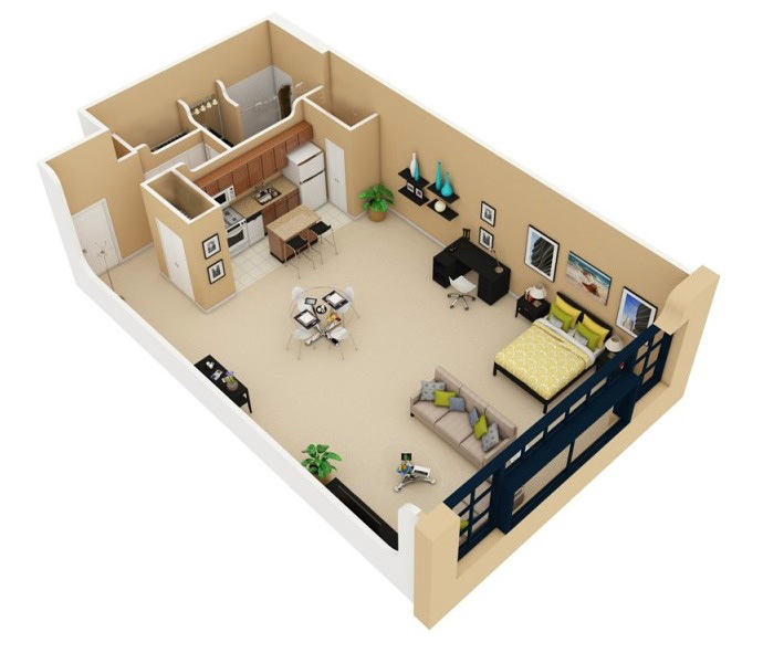 This apartment is well marked by the contrast of the groupSmall rooms on the side of the entrance and a huge single space, ending with a window in the wall. Such areas would make it easy to distinguish individual zones, but the perception of space as a single whole was clearly conceived from the outset. And even an open sleeping place is not striking here simply because of its distance to a sufficient distance and location in the corner, at the very end of the room. Attention to yourself is distracted by a separate sofa and a glass dining table.
 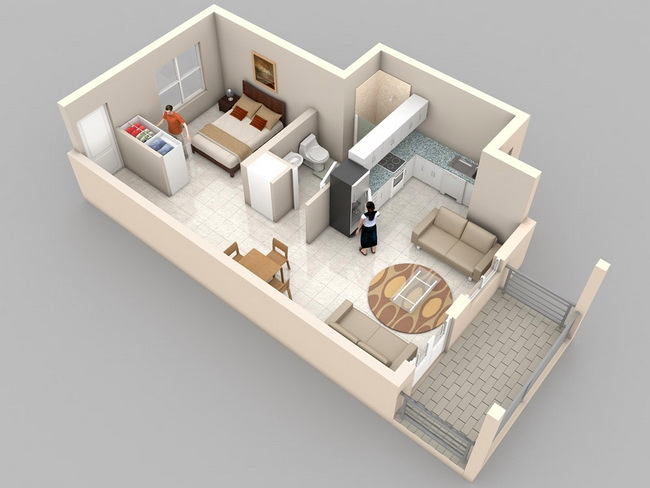 Here, the planning solution began withA spacious niche, which housed not only a corner kitchen, but even a shower. The bedroom, fenced off by a wardrobe, is comfortable thanks to a separate window. A bit uncomfortable is perceived white tiled floor for the entire apartment immediately, especially in the bedroom without a door and a threshold.
 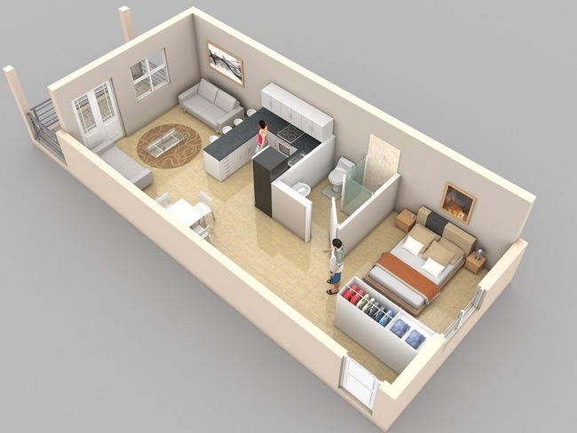 But an example of an almost similar arrangementPremises, but in a rectangular volume, without protrusions and niches. Bilateral orientation of windows in such small apartments is most common in the case of mechanical and angular location dome.Pri desired bedroom with a separate window can be easily separated by a partition with a door that will not worsen neither perception nor ease of use apartment.
 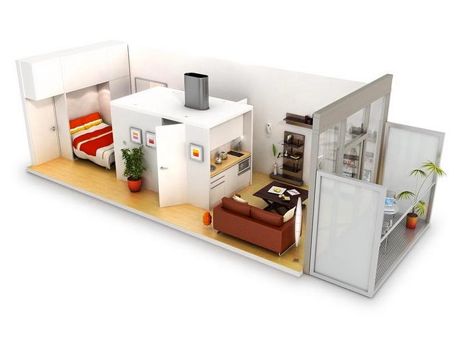 A catchy solution with the location of theCenter of the apartment: it is easy to guess that the central area is a bathroom, and the distance between it and the far wall indicates the presence in it of built-in wardrobes with access from the bedroom. The question about the appointment of a cot for a kitchen set remains open, but judging by the equipment of the kitchen, it is there that the refrigerator will be located. A much larger issue is the sound and light insulation of the bedroom, since the central volume does not reach the ceiling. Of course, in a one-room double apartment this is not so important, especially since the bedroom itself does not even have doors.
 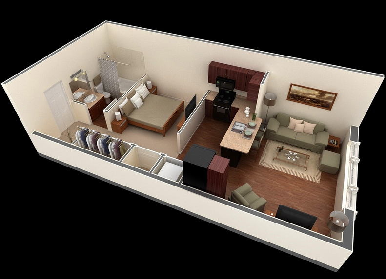 The width of the apartment allowed quite freelyCarry out zoning; Places for storage of things at first glance is enough, but because of the same width of the room, the distance from the couch to the TV in the living room is a bit too big.
 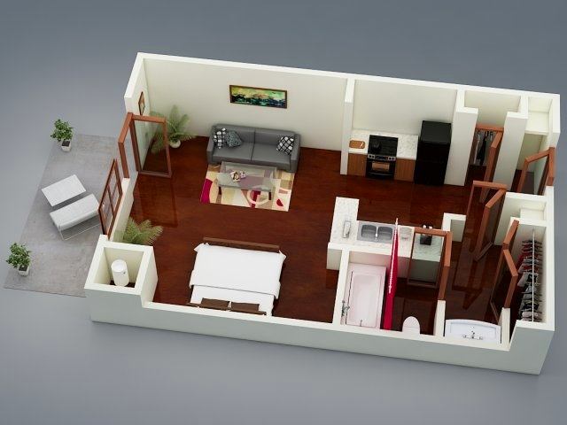 Dividing the kitchen in two is definitely heremakes sense for the sake of compactness of plumbing communications, and the L-shaped countertop "connects" the cooking process, bringing the configuration closer to the U-shaped one. Another original solution is the separate placement of the sink, which allows you to get an almost separate bathroom. The question arises only in the area - why fence so many partitions in order to organize a small hanger and space for shelves or a wardrobe. It is much easier to put a regular wardrobe.
 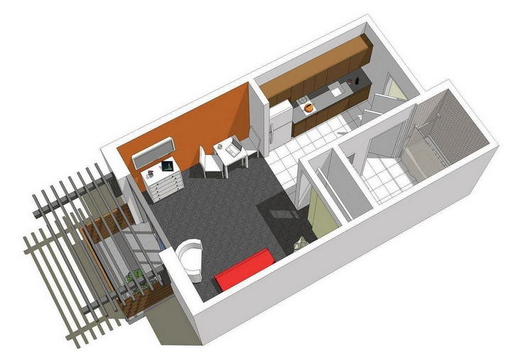 In this apartment - a full set of techniques forThe minimum possible area: a walk-through kitchen with a double-burner stove, an armchair instead of a sofa, a plasma panel fixed to a wall ... A bathroom the size of a kitchen looks even spacious, but the impression is deceptive: the dimensions of the bath give out a real scale.
  Here again we see the division of the kitchen into twozones when the "wet" zone is located close to the bathroom. With this arrangement, it is advisable to make the wall between the kitchen and the living room low, for the penetration of natural light, not forgetting to cover the back of the refrigerator and lead the ventilation box to the hood. One small closet is hardly enough for storing things, and the dining area is not provided here at all. The only room that has enough space is the bathroom. naibann.com
How to plan a small apartment: 19 layouts with expert opinion