How to reconcile the tastes of two generations in onespace? How to create an original and bright interior on 33 meters, fitting everything you need there? In this apartment, you will be amazed by everything: from the design to the layout. Bonus of the article - tips on creating a similar interior and a selection of recommended items Neoclassicism with an artistic touch and exceptional functionality is a rare phenomenon, and in the small space of a one-room apartment, it is generally unique. For the current owners - a married couple who moved to the capital from Novosibirsk - this is temporary housing, arranged for a comfortable wait for the delivery of a new spacious three-room apartment closer to the center of Moscow. In a couple of years, their daughter, who dreams of entering a theater school, will become the main owner. Therefore, designer Alena Timofeeva faced a task in the Turgenev spirit: to reconcile the tastes and needs of "fathers and children", in this case - mother and daughter, in a very modest area of 33 square meters. And she took on this task with the help of neoclassical eclecticism, boldly and freely interpreting tradition for the benefit of her clients.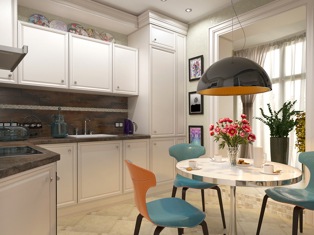 Alena Timofeeva, architect-designer,Head of Studio FD: A graduate of the design department of the Moscow State Stroganov University of Art and Industry, Alena has been designing private and public spaces since 2006. She has dozens of interiors under her belt: private apartments, cottages and townhouses, offices, offices, exhibition spaces. "Design starts with a plan, not with a sofa" is a motto demonstrating the approach to organizing spaces of any kind. "I always build the interior architecture in detail, and then complicate it and fill it with details. Only in the fusion of high-quality design and precise stylistic solutions is a unique interior born," says Alena. studiofd.ru
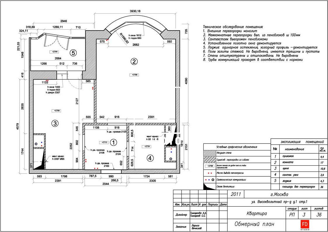 The measured plan of the apartment was provided by Alena Timofeeva
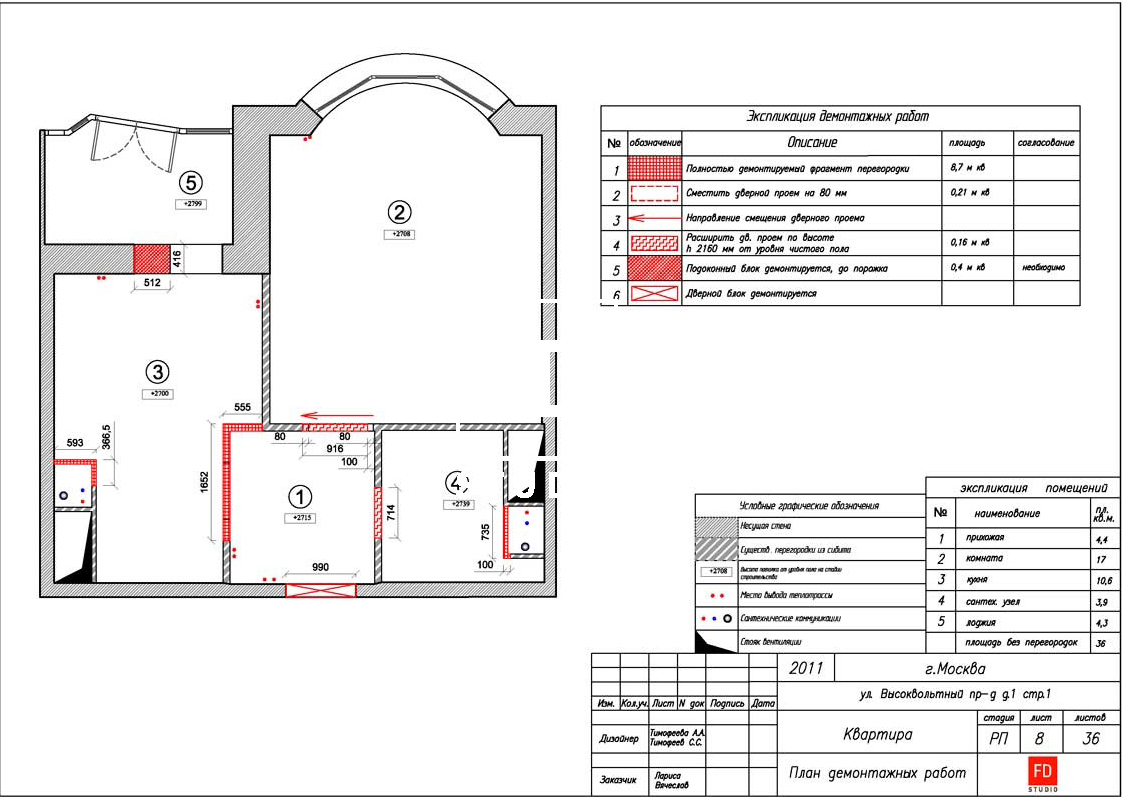 The dismantling plan was provided by Alena Timofeeva
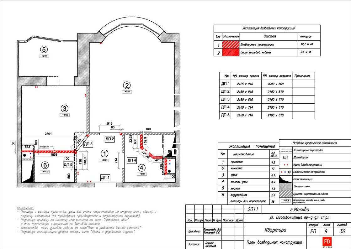 The plan of the structures being erected is providedAlena Timofeeva Organization of space The customers asked not to clutter the apartment with oppressive built-in wardrobes - they were bored with the typical pictures of sliding mirror doors in their friends' houses. They wanted a light and cozy interior. But you can't do without capacious storage systems in such a space: a seasonal wardrobe and bed linen (there is no bedroom!) need to be placed somewhere.
 Alena Timofeeva, Studio FD:— The task is not easy at first glance. But the solution came quickly after a detailed study of the plan. Initially, the kitchen had a complex, inconvenient layout: a ventilation box was cut in where access was needed to service the riser and read the water meters, and the hallway jutted out at an angle. In fact, 10.5 square meters of the original area were of little functionality and uncomfortable. So another room appeared in the apartment — a dressing room, it solved all the difficulties with storage and the unnatural geometry of the room. The area of the kitchen was reduced to 8.5 square meters and acquired the shape of a square with a cut-off corner. Although I do not like the fifth wall, in this case this solution was optimal. studiofd.ru
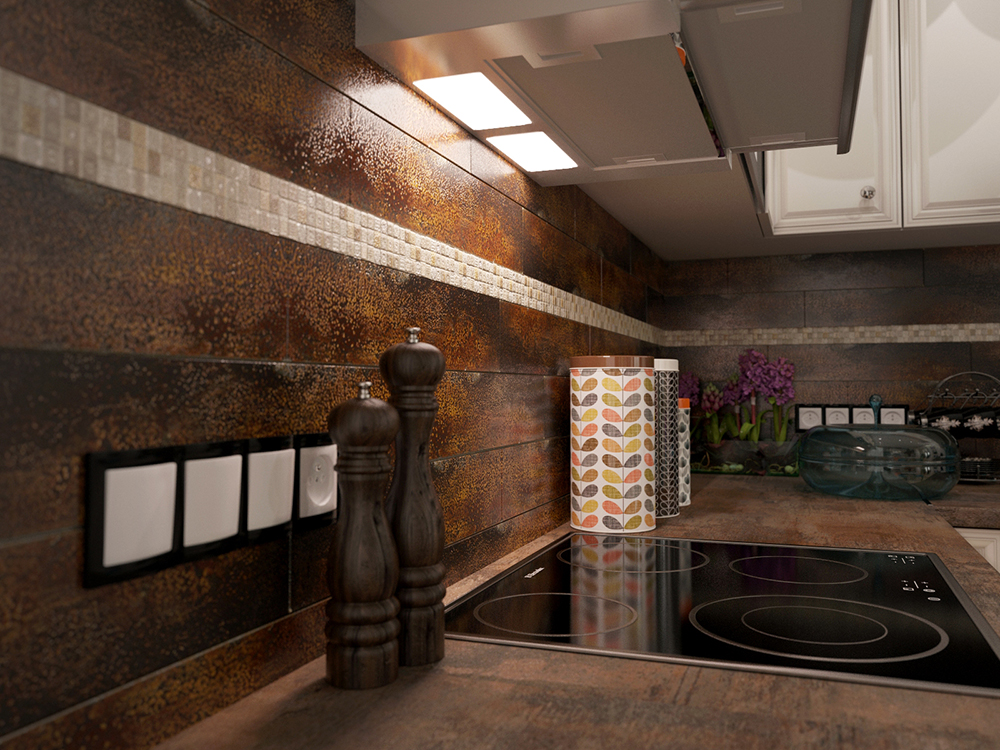
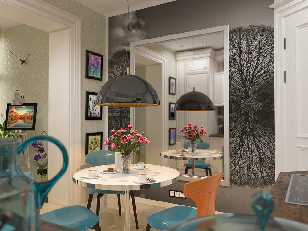
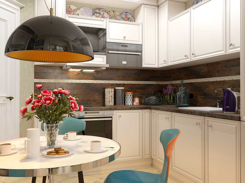
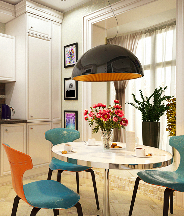
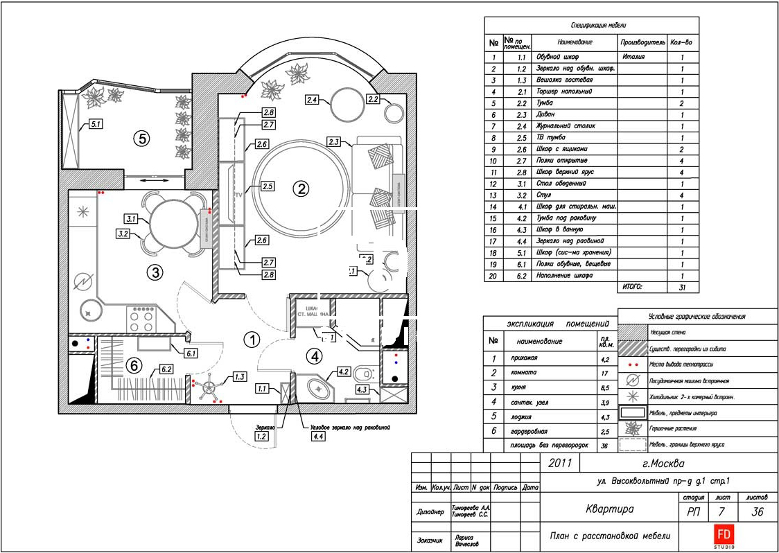 Apartment plan with furniture arrangementprovided by Alena Timofeeva Kitchen An insulated loggia was added to the kitchen, where a storage system and a winter garden were organized (the customer loves flowers). An easel with lighting was also placed there to display paintings and photographs. The kitchen furniture in a classic style was made to order, according to Alena's drawings, to get high kitchen cabinets up to the ceiling and thus visually enlarge the room. The floor is made of porcelain stoneware with marble-like mosaic inserts. The same inserts are repeated on the kitchen apron.
 Alena Timofeeva, Studio FD:— Bright accents — designer chairs, graphic paintings and the hostess’s collection of plates. But the most unusual of them is a black-and-white fresco with an autumn landscape, printed on natural canvas, covering the entire wall. Against the background of the fresco is a mirror in a metal frame, which performs two tasks at once: to accumulate additional light and expand the space. studiofd.ru
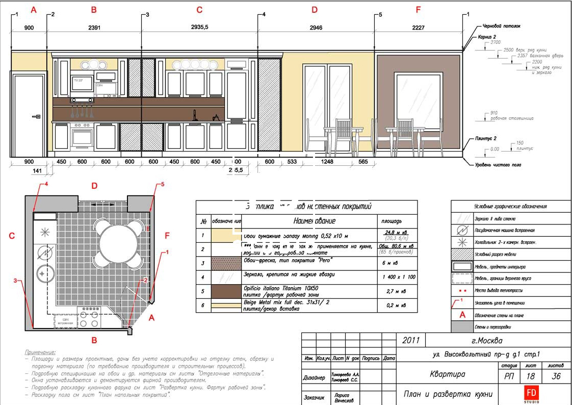 Kitchen plan and layout provided by AlenaTimofeeva Living Room The living room, also known as the bedroom, is rectangular in shape with a bay window, which is “correct” for a classic interior, and is the most multifunctional area of the apartment. A coffee table is pushed into the bay window, where the second winter garden is located, at night. The traditional Italian sofa of graceful proportions turns into a bed of impressive size — it was specially ordered with a large sleeping area. The cabinet furniture was made to order according to Alena’s sketches and drawings, so as to fit in comfortably and accurately, without cluttering up the space.
 Living room plan and layout provided by AlenaTimofeeva In the decorative sense, the living room is the same mixture of modern bright accents with traditional elements. On the floor is oak floorboard, on the walls is wallpaper with a classic print, doors with a hint of a strict classic form. Alena Timofeeva, Studio FD: - The remaining picture was completed with rich colors of interior items in a modern style. The brightest detail is an armchair in luxurious turquoise leather, from the Italian designer Roberto Lazzeroni, in support of which the interior was decorated with paintings of modern artists, orchids and cute figurines brought by customers from their travels. studiofd.ru
 Artist Anna Silivonchik "A Drop in the Sea"
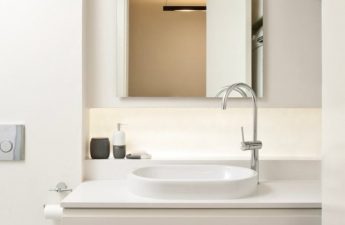
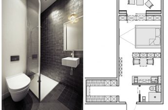
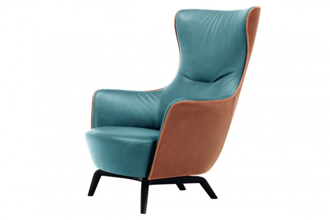 Mamy Blye armchair by Roberto Lazzeroni (Italy)Bathroom The classic base is porcelain stoneware imitating the texture of stone. 3.9 square meters of space forced the customers to make a difficult choice: a bathroom or a closet with a washing machine. As a result, they settled on a spacious shower. To save useful centimeters, a corner cabinet with a sink was made to order.
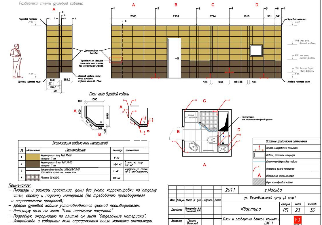 Bathroom plan and layout providedAlena Timofeeva Color and light The first impression of the apartment is not at all the classic richness and play of colors. But in fact, it is created only by correctly selected accents. The overall color scheme is very calm, it is difficult to get tired of it.
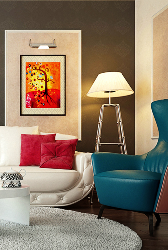 Alena Timofeeva, Studio FD:— Look closely — the walls are in light gray, the ceilings are classic white, and the floor is dark oak. Only the details are bright: the turquoise armchair, the coral pillows, the paintings. Sit on the sofa — and you won’t notice this brightness, only the calming palette will remain. This was done specifically so that when turning into a sleeping area, the living room doesn’t tire you out with its flashy colors. studiofd.ru Carefully thought-out, warm lighting “works” for the functionality of the interior. In the living room, there is an overhead light, a floor lamp, and directional backlighting of the paintings, with light shelves serving as accents. In the kitchen, there is a pendant light above the table, spotlights around the perimeter of the work area, and backlighting of the cornice.
 Alena Timofeeva, Studio FD:— I believe that the project is based on three pillars — functionalism, modern classics and a certain amount of artistry. The owner of the apartment was leaning towards traditional forms, but she understood that she was decorating the apartment for a young girl of a creative disposition. She would hold noisy parties there and welcome guests of her age and circle. The compromise found as a result was liked by everyone. The interior of this small and not very well planned apartment became a vivid example of how you can implement the boldest ideas in a modest area and make the space beautiful, fashionable and practical! studiofd.ru
 The following were used to create the interior: Kitchen
- Kitchen furniture is made to order by Alena Timofeeva's drawings at a private Russian factory.
- Chairs - Poltrona Frau factory (Italy), designer Roberto Lazzeroni.
- Paper wallpaper — Sunday Morning collection, Chesapeak factory (USA). Fresco — photo Aks tabiat ziba, printed on canvas in b/w format.
- Tiles - Arezia (Italy), Fondovolle opificio (Italy).
Living room
- Cabinet furniture and the door are made in a private Russian factory by order and drawings by Alyona Timofeeva.
- Sofa - Monte Carlo, Reltti (Italy), a bed was added to order in Italy.
- Armchair - model Mamy Blye, factory Poltrona Frau (Italy), designer Roberto Lazzeroni.
- Tumba - Creazioni (Italy).
- Kashpo - replica of flowerpots JM Ferrero (Italy).
- Flooring - oak parquet board Par Ky (Belgium).
Bathroom
- Tile - Marazzi (Italy).
To create a bright space in a small area, in which classical and modern elements are naturally mixed, the following techniques will come in handy:
