Does color have a soul and how does it affect us?Does our interior depend on our appearance? What secrets does color hide? Designer Irina Kovylina told us about this. What role does color play in the interior? This question can be compared with another one - how important is comfort for you? And these two concepts are inseparable when it comes to interior design. Color can lift your mood, psychologically set you up for active actions or for peace. Moreover, the color selection for the interior is so individual that it is advisable to do it for a certain personality. After all, one will feel calm and serene in a beige interior, while another will feel bored and sad. We all perceive the world and its colors differently, react differently to the change of seasons - someone loves fiery autumn, and someone is closer to the light pastel colors of spring. How can we recognize this fine line between cold and warm, expressive and peaceful, brutal and gentle? To understand these issues, we turned to expert Irina Kovylina, a designer who is engaged in deep study and analysis of color in the interior and loves to work with shades, creating new projects. She told us a number of interesting and surprising facts about color, after which you will look at the issue of coloristics differently. Irina Kovylina, designer Graduate of Moscow State University and the "Details" school. Pays great attention to working with color on the psychological and emotional levels. Believes that it is necessary to create an interior for specific people and a specific space, and not abstractly: "the creative process that develops in communication with clients and changes me and them is important."
1. On an intuitive level
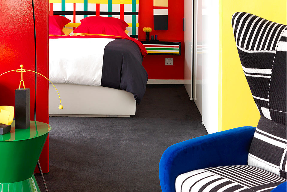
Working with color is primarily based onlevel of intuition. It is necessary to listen to the inner voice, accepting those harmonious waves that tune in to the choice of the right shades. Trust yourself, bet on those colors that come to you from within. A positive result is possible only if you learn to listen to the artist inside you. Are you sure that you do not have such a gift? Everything can be learned, including this!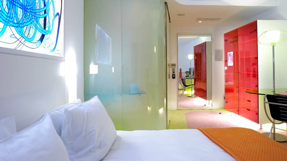
2. Color and light are inseparable brothers
Some designers, when working with color, oftenforget that color and light form a single ensemble. That is why, when mixing shades, they get empty black spaces. If you do not forget about light, work with a rainbow palette and take into account all the nuances regarding lighting in the interior, then the work will ultimately be full, bright and will evoke only positive emotions.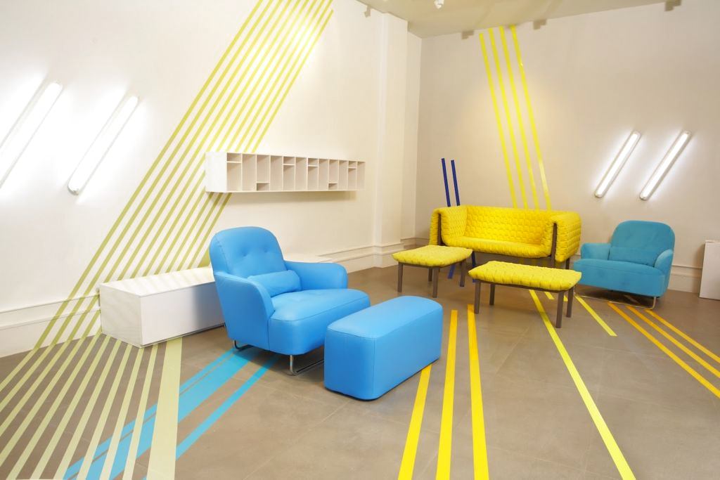

3. Electromagnetic influence on humans
Color has its own energy and is capableaffect a person not only on an emotional, optical or spiritual level - each color emits its own electromagnetic vibrations. In this case, the interaction of the human electromagnetic field with the color occurs, which affects both the well-being and the psychological perception of the interior. Perhaps you have experienced such a situation that in one room only positive emotions arise and you want to be there, enjoying the comfort, and from another interior you just want to run away as soon as possible, there is so much negative energy there.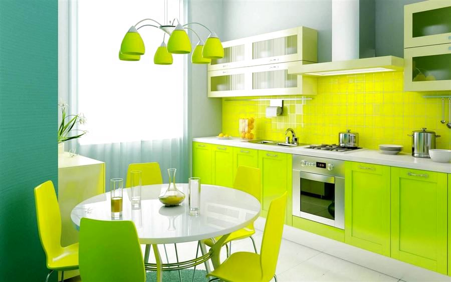
4. Color-light therapy
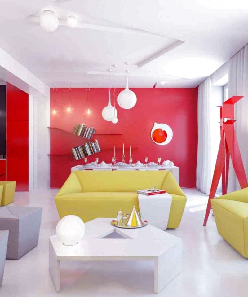
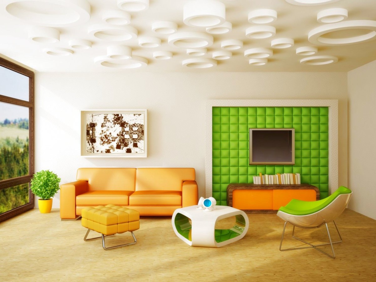
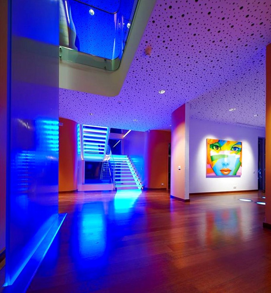
Color therapy has long been used inpsychological practice and alternative medicine, but in the interior, colored light began to be used not so long ago. This practice is especially suitable for those who are afraid of global changes, for example, repainting the walls in bright colors. Even if you have white walls, they can always be decorated with beams of colored lamps. Our opinion: - In addition to the fact that colored light can affect the mood, invigorating or enhancing certain feelings, it can distort the interior. For example, if you illuminate red objects with green, they can become almost black and have a dirty gray shade. But if you illuminate red objects with red light, they will become more expressive and acquire a rich shade. Therefore, it is necessary to play color and light games with caution and prudence.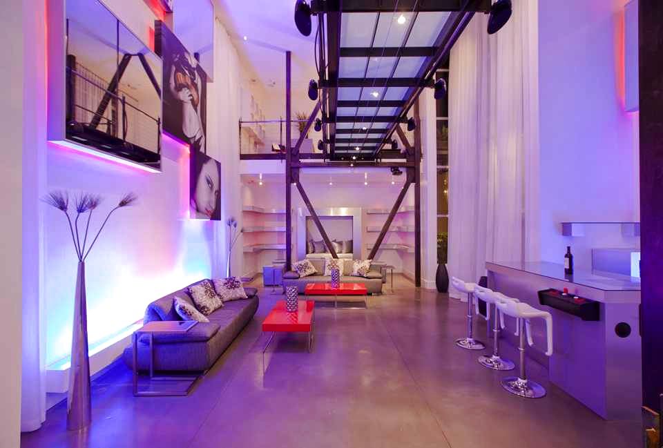

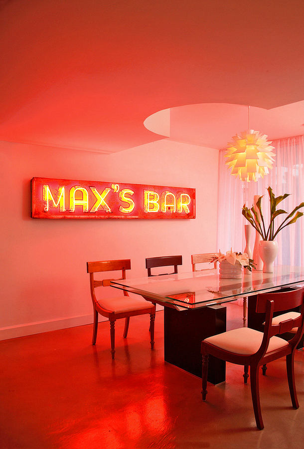
5. The color depends on the person's appearance
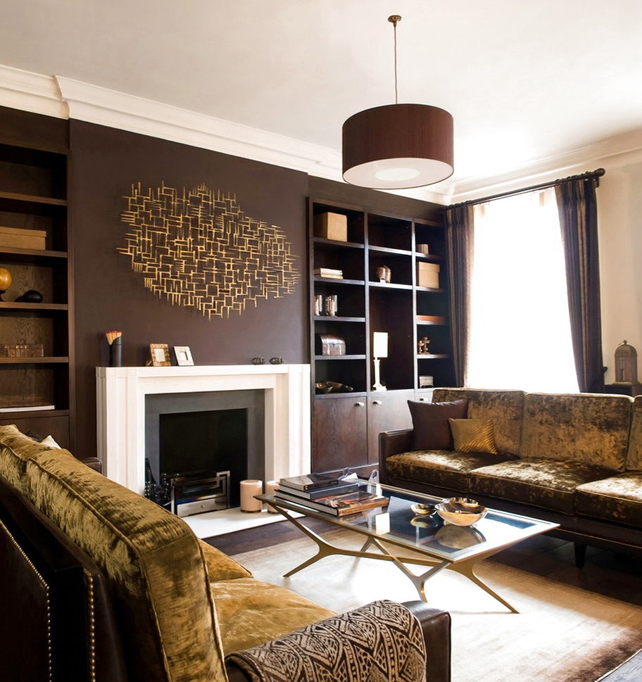
Interestingly, the choice of color palette is stilldepends on the type of the designer or the person who is doing the interior design. Thus, over many years of observation, it has been proven that blondes with blue eyes in most cases will opt for clean, fresh, morning shades - turquoise, light green, soft lilac. With dark-haired, dark-skinned and dark-eyed people, it's a different story - they prefer shades of autumn and night. For example, in the interior of such a designer, you will often see chocolate, red, terracotta colors. Therefore, when choosing a color for the interior, you should pay attention to your appearance and the appearance of your designer in order to end up with a harmonious interior.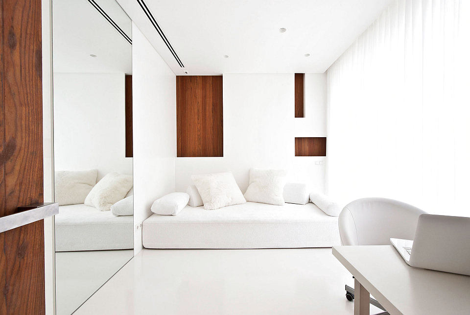
6. Geometry and color
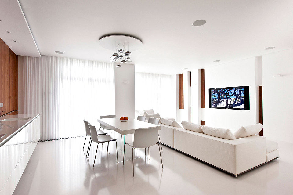
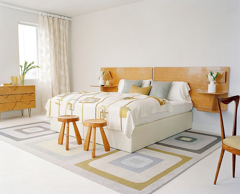
It is interesting that color has its own geometry.Thus, cold shades can emphasize the clarity and angularity of the interior, making the lines of furniture visually sharper. Warm colors act exactly the opposite - they round off the lines and soften the interior. You can create an atmosphere of special coziness, emphasizing the plumpness and softness of the sofa, using furniture fabric in a warm color scheme.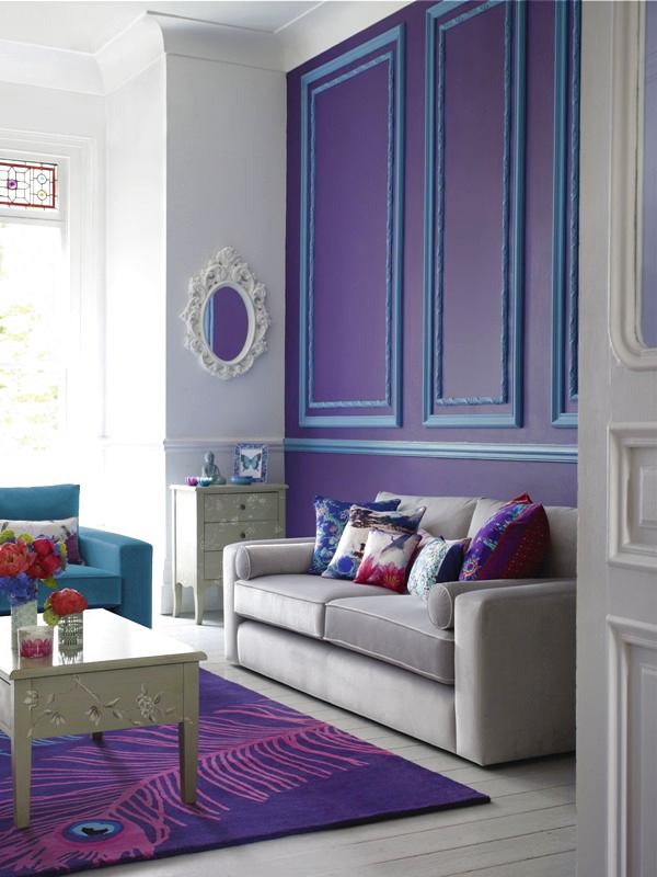

7. Monochrome installations
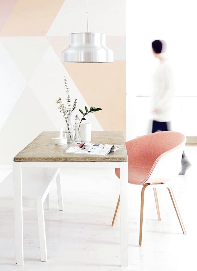
Recently, it has become very popularuse monochromatic compositions of various objects. To prevent them from appearing dull, you need to follow several rules. Compositions made in light or white shades look good. Installations of objects united by some theme, rather than a chaotic set of accessories that come to hand, will also please the eye.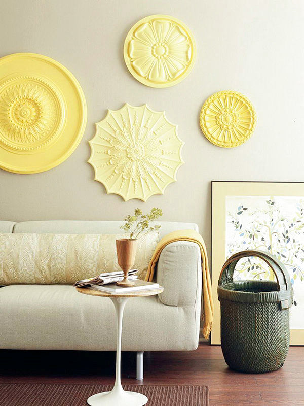

8. Color and variety
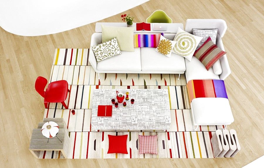
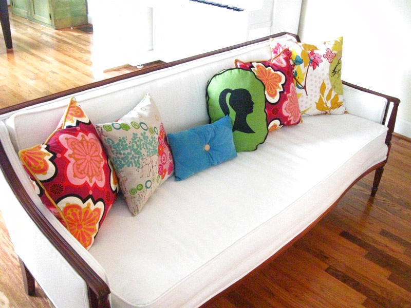
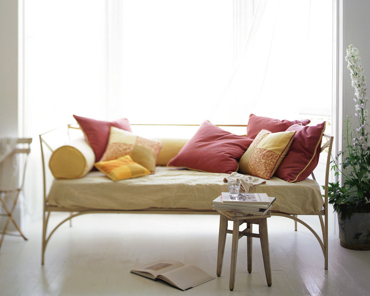
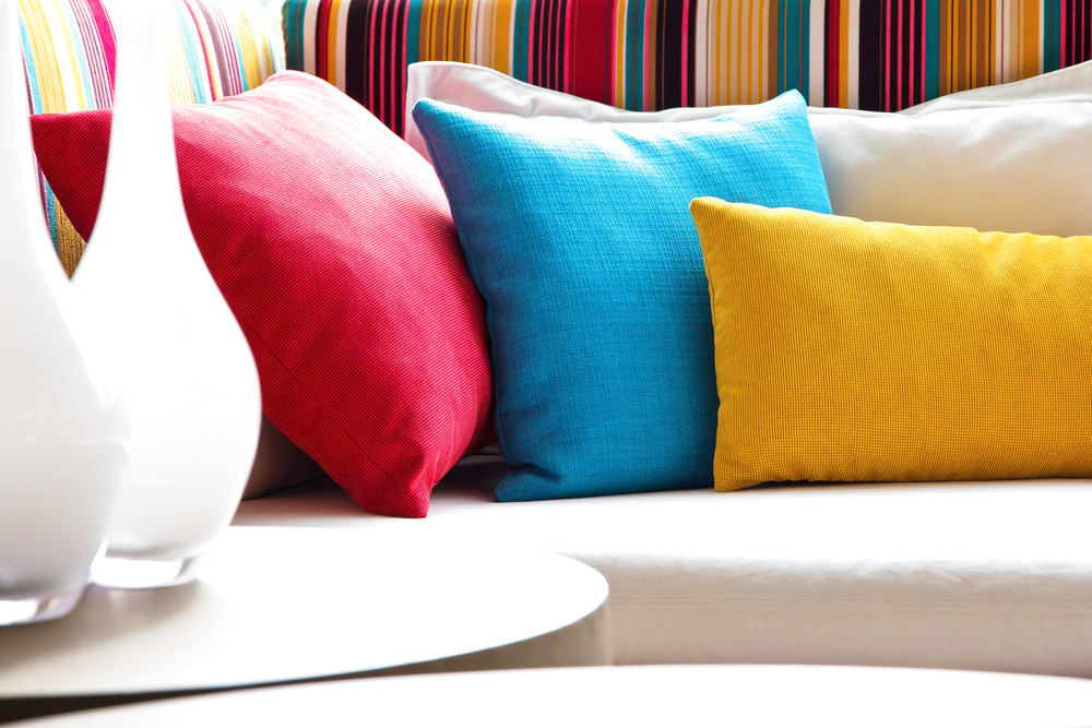
For those who find monochrome installationsboring, there is an alternative - many multi-colored items in one composition. Start the experiment with sofa cushions, this is the simplest and most budget-friendly option, and also spectacular. Of course, if you really want to draw attention to the sofa, which in most cases is a kind of center of the living room.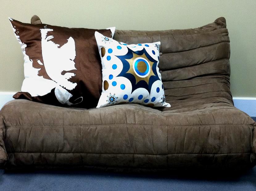
9. Experiments with fabrics
You can try fabrics of differenttextures and materials - the times when sofa cushions were necessarily sewn from the fabric chosen for the window curtains are long gone. If you are a classics enthusiast, and this is a rather bold experiment for you, try adding one cushion from a completely different "opera" to the overall monochromatic-single-fabric composition, which will stand out from the overall picture, thereby enhancing the visual impression of the harmonious combination of companion fabrics.

10. Seasonal mood
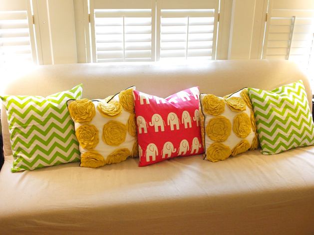
Use specific colors depending onseason. In spring, refresh the interior with turquoise and light lilac pillows, for summer, choose rich, bright shades. Warm colors are suitable for autumn, especially relevant will be terracotta, mustard, chocolate, cinnamon color, coffee with milk. Winter attracts with its pure colors - choose snow-white textiles, add a little frost with the help of blue, make accents on a rich blue color.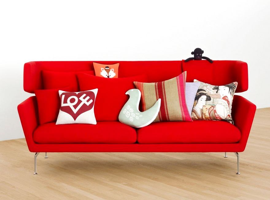

11. Color and shape
If you prefer to mix in onecompositions of different shaped objects and you want to emphasize the exclusivity of each of them, then paint them in different colors. It is the color that will favorably emphasize the advantages of the object, make its shape more expressive.

12. Compositional harmony
When experimenting with shape and color, rememberabout one idea that should unite all the objects. For example, choose different objects and different shapes, but make sure that they are within the same palette, for example, if you like spring shades, then put together a composition based on a fresh palette. That is, stick to one concept, do not take thoughtless steps.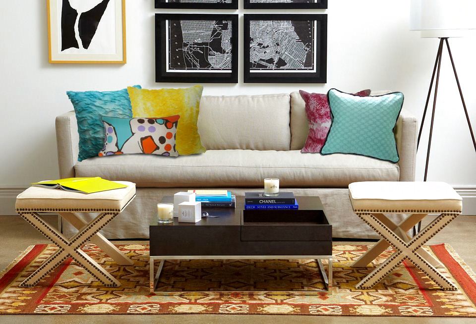
13. Shades of one color
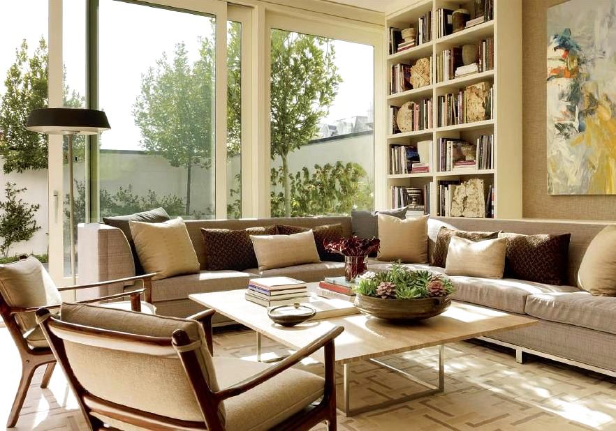
Of course, someone can paint the entire roomone color, but it is rather boring. Another thing is to use one color, but its different shades. This approach is much more interesting. So the interior turns out multifaceted, full and unusual.
14. Bright ceiling
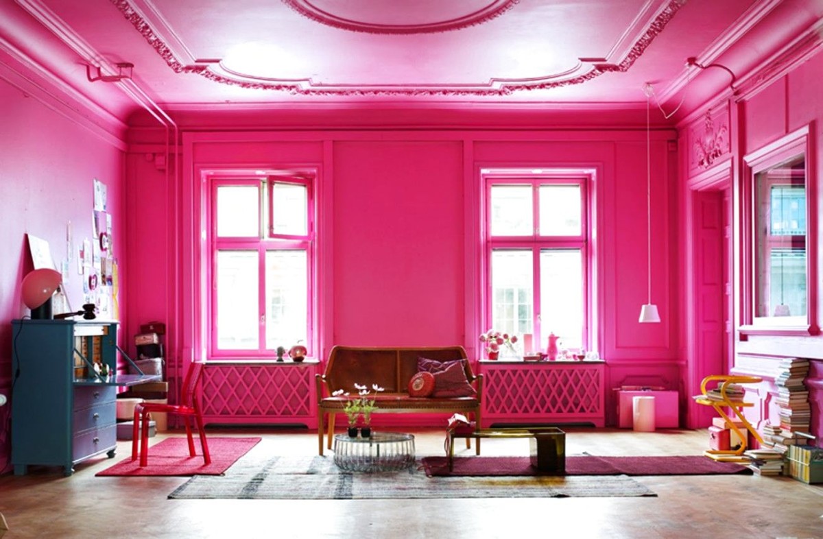
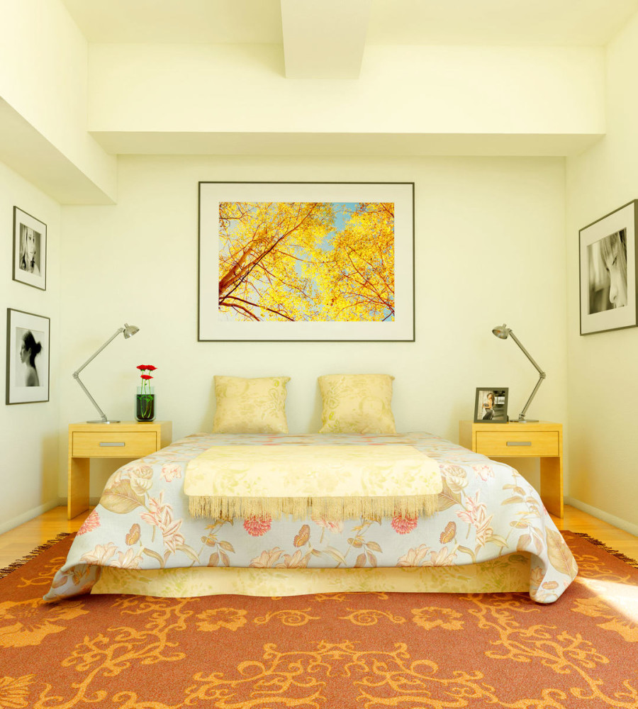
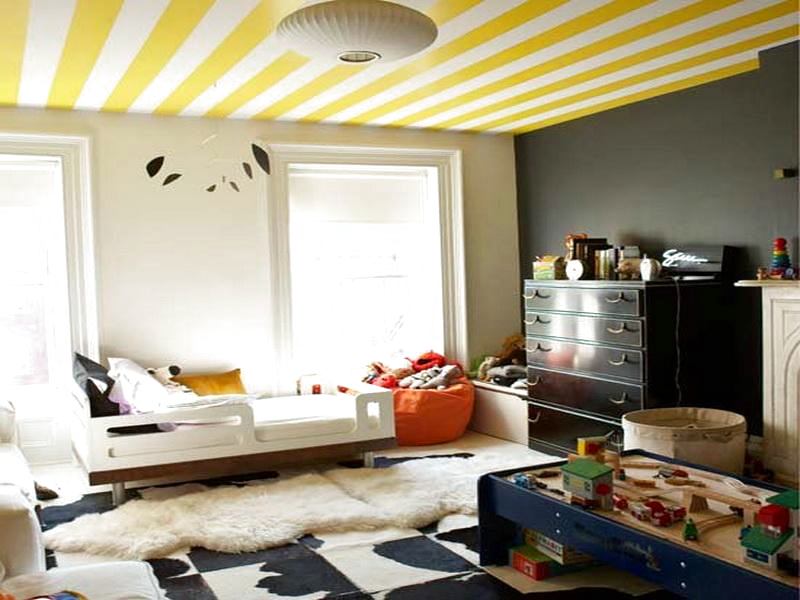
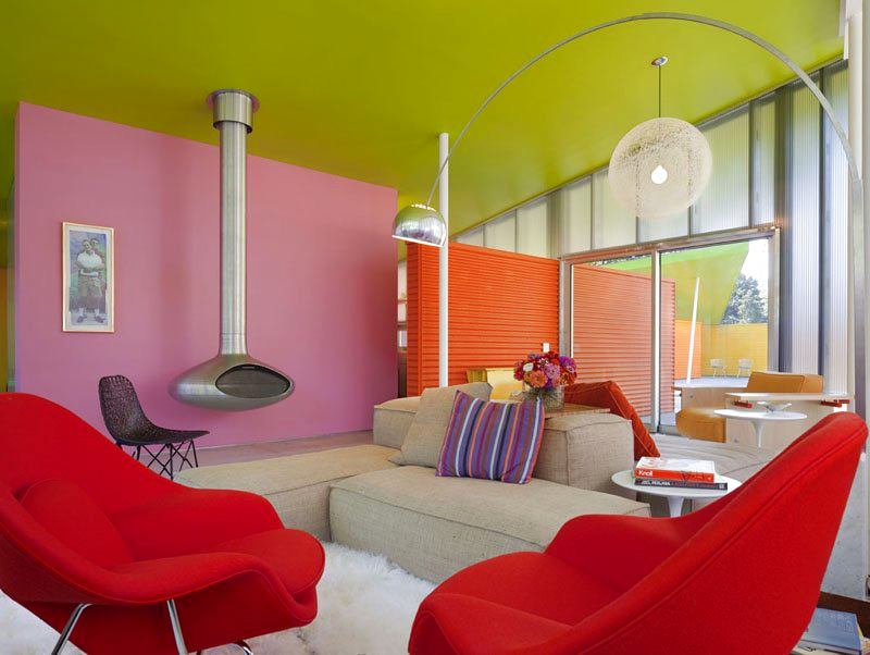
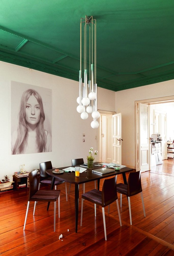
Making the ceiling bright is a technique for the brave.It looks incredibly impressive. The main thing here is to choose the color that you like the most and that has a good effect on you. Our opinion: - A ceiling painted to match the walls visually seems lower. Light shades are good for a room with a low ceiling, and vice versa, a dark color will visually make the ceiling lower. And also - a warm and light color scheme is best used in rooms where the penetration of natural light is limited. In rooms with an abundance of sunlight, you can experiment with blue and silver shades, playing on the contrast with yellow and gold.
15. In Search of Inspiration
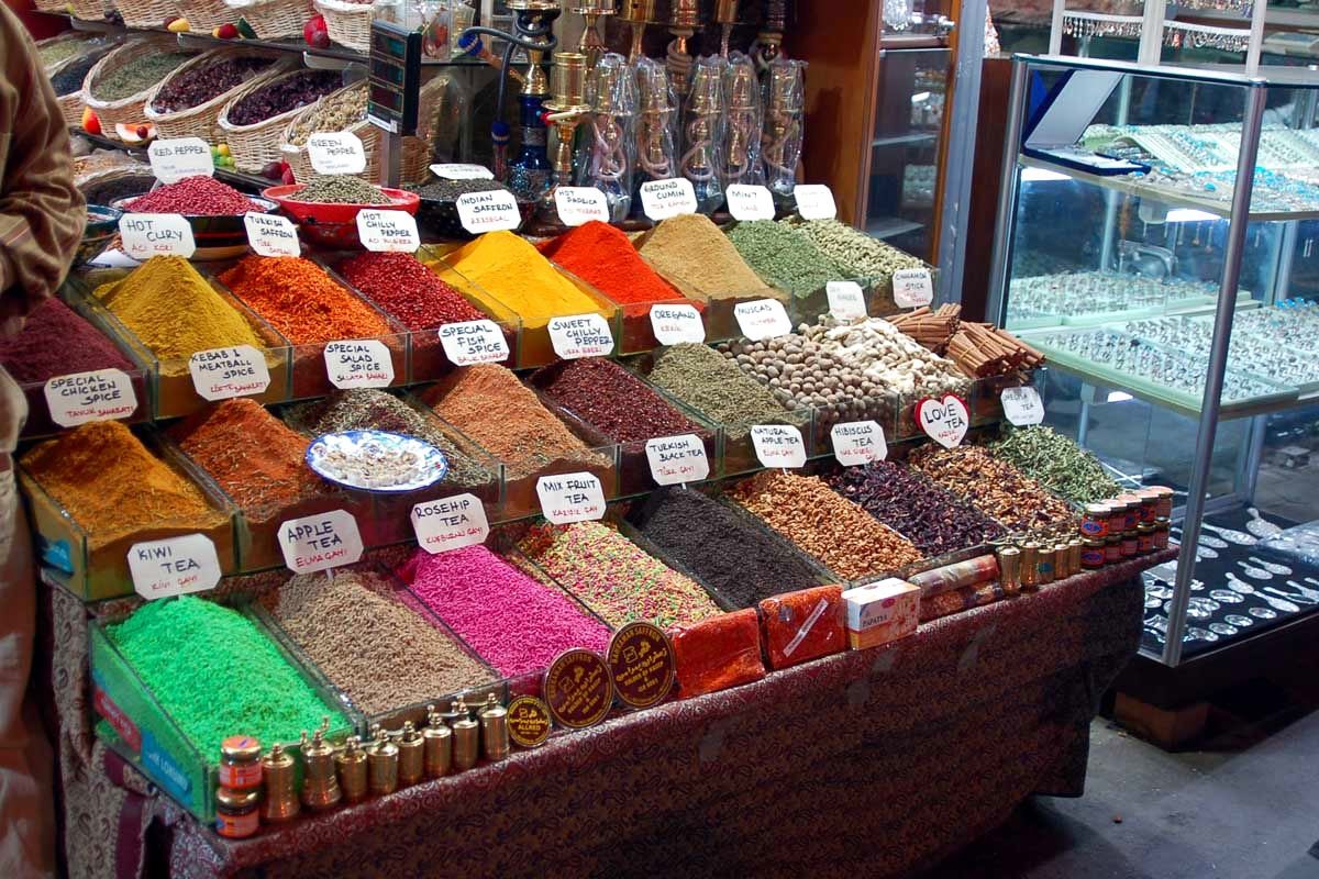
Where can I find inspiration for working with color?was the most productive and effective? For impressions, go to the oriental bazaar with its unlimited color, visit fruit or flower shops, where juicy shades abound, and simply go to the park, draw inspiration from nature.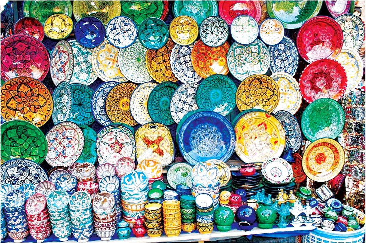

 pinterest.com
