In this bright living room the author managed not onlyplace several functional zones and fill them with color, but also create a traditional Russian atmosphere, albeit in a new, modern way. The traditions of the Russian manor are alive and well. Now they are getting a second life and giving a completely new world to owners of country houses. This is the world that Irina Yezhova created when developing a project for the heroes of one of the TV projects. Irina Yezhova, interior designer
Graduated from the British Higher School of Art and Design.
Specializes in creating harmonious, functional interiors that combine personal and work space.
Often proposes and develops transformable, multifunctional items.
He loves to design interiors in which not only the walls are painted and the textiles are replaced, but every centimeter of space is used. perpetuum-module.com
This living room interior was created for a country househouse belonging to a family of five - mother, father and three daughters. The heroes have lived in a private house since 2011. The house has two floors and an attic. The living room is located on the sunny side, very bright, can safely be considered the heart of the house.
The hostess of the house is a creative person, a make-up artist. The family loves sports and therefore spends their free time actively - cycling, skiing, rollerblading.
The following functional wishes were expressed:was the following: allocation of an office and library area for mom and dad, a room for leisure, receiving guests with the opportunity to watch favorite films and play quiet games for children and adults.
The family treats their nest with love. In the house, everyone wants to have their own corner, a place for creativity. The heroes love to receive guests, so the atmosphere of hospitality was a priority.
The family's style preferences leaned towardsmodern classics, but the customers were also ready for bold style decisions. Color preferences are pastel tones with contrasting color solutions. Natural colors, wood and stone are possible.
The designer divided the living room into threeemotional and functional zones, separating the office. The living room turned out to be a regular rectangular shape. The atmosphere of a family estate with elements of classics was created. In it, the heroes will spend their family leisure time not far from the noisy metropolis.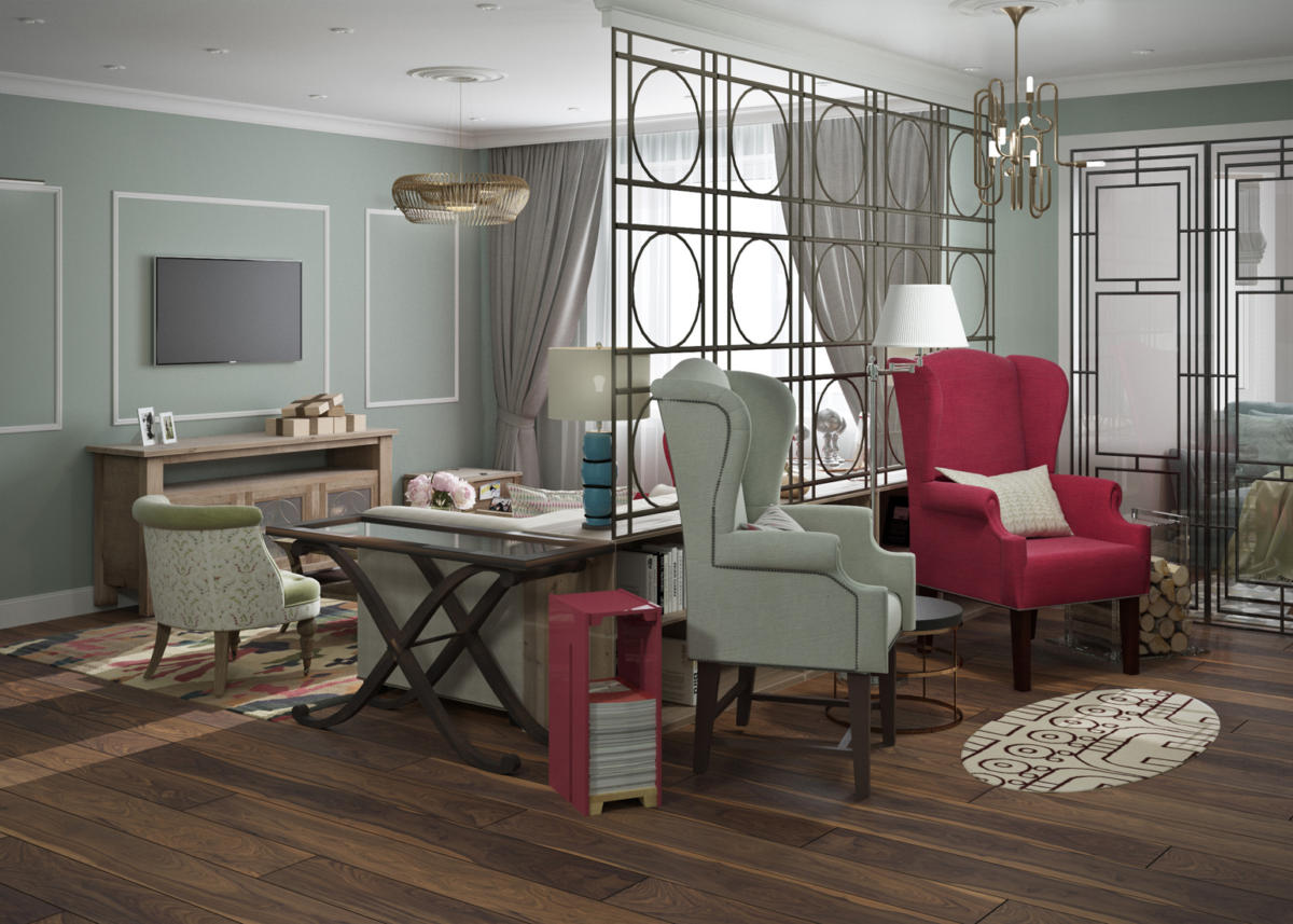
The living room with a bay window was divided into several zones taking into account the wishes of the customers. The result was as follows:
- 7.1 sq. M. m - entrance area with the entrance to the living room, the kitchen and the stairs to the basement;
- 5.1 square meters. m - stairs to the basement and to the 2nd floor;
- 18.6 sq. m — a communication area with upholstered furniture, a coffee table and a TV, including an area near the stairs, where the designer placed a small ottoman and a wine cabinet;
- 9.6 sq. M. m - a fireplace zone with a library and two armchairs;
- 5.5 sq. M. m - cabinet, located in the bay window. From the main living room the designer separated it with a partition with a glass door-compartment.
The total area of the living room is 45.9 sq. m.
The clients have three daughters, many family events that they want to capture, and regular family photo sessions. It was suggested to create a family gallery.
As a zoning elementThe designer used a partition made of lightweight metal construction. It is placed on a bookcase and has become an art object in itself. The advantage of using it is that you don’t have to drill the walls every time; photographs and children’s drawings are placed in a frame and hung on the partition.
In fact, from one living room it was possible to make two rooms with three functional zones: a library with a fireplace for quiet conversations, a family communication and guest reception area with TV, and a private office.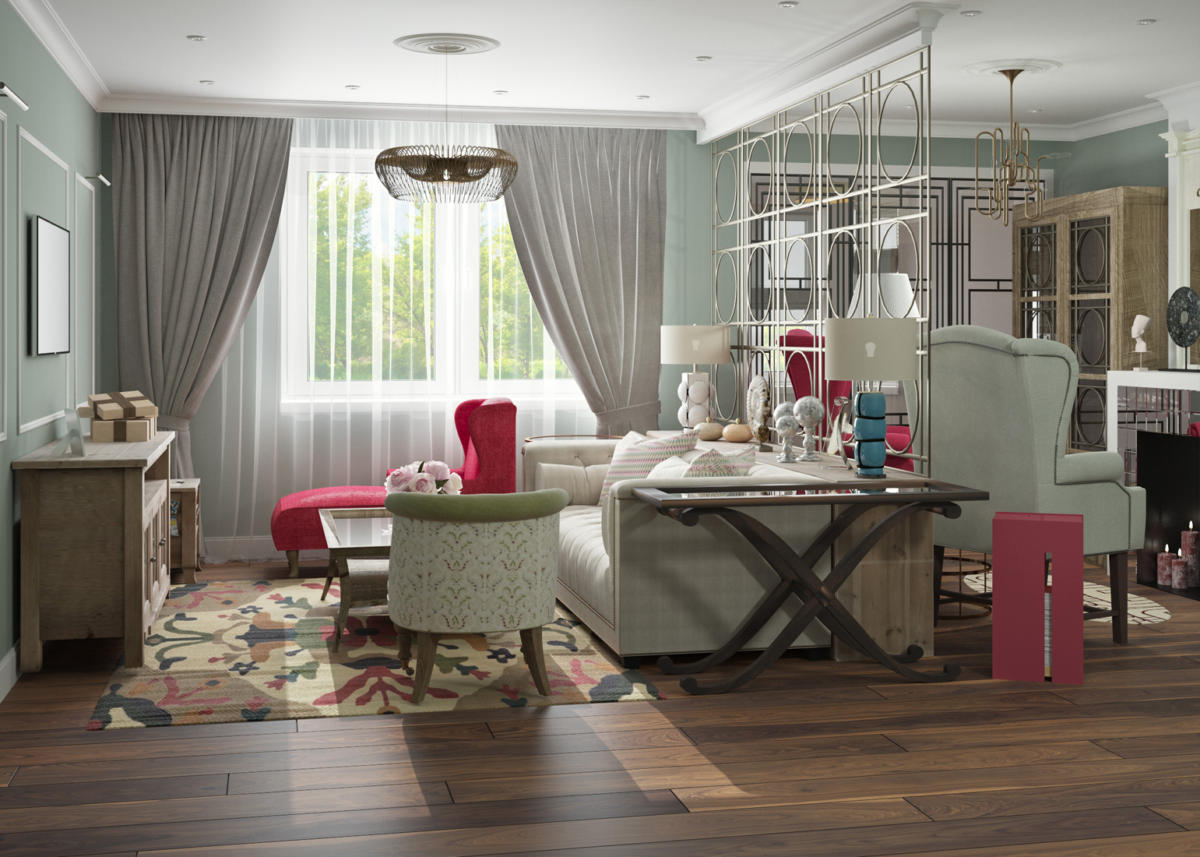
The project uses classical techniques,including symmetry. The family regularly receives guests. Therefore, the designer used some techniques typical of country estates. Each zone turned into a kind of room of interests of the clients. A library with spacious cabinets, next to an office, where the parents can chat, work or read in a private setting. A guest reception area with a large sofa and armchairs.
The designer took into account the wishes of the characters and added small bright accents to the main calm palette in the form of upholstery on some pieces of upholstered furniture.
The color of the walls is pastel, smoky and foggy -Ash-gray with a turquoise tint in the living room and beige with an olive tint in the study. The ceiling and moldings are creamy white. Such shades are close to natural, comfortable for visual perception and help to relax after a hard day.
Bright accents are carpets that unite the range of walls and furniture.
The designer uses traditional objects and interprets them in a modern way.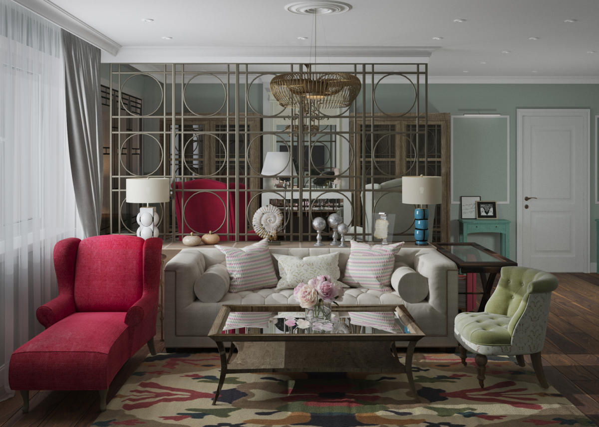
The fireplace is classic in shape, with a built-inchimney: not simple in its essence, it is lined with small mirror tiles, which makes it lighter. Candles are placed in it. In support of the idea of a fireplace, the designer placed a modern plexiglass woodpile next to the chairs, in which logs are kept. Mirrored by another chair is a similarly shaped magazine rack. The client is a professional makeup artist, and probably buys a lot of specialized publications.
Skins are often placed near the fireplace as trophies.hunter, but the owners of this house are modern and involved in sports, so the designer found a rug in the shape of a surfboard, which perfectly highlights their hobbies.
There is a mirror above the fireplace, similar ones could be placedin real estates. The chairs with the classic "ears" stand on modern straight legs, not curved or twisted. A bright spot is the wine cabinet by the stairs, as if brought by the family from travels.
The designer decided to support the idea of the connection between times and instill in children the idea of family values and traditions.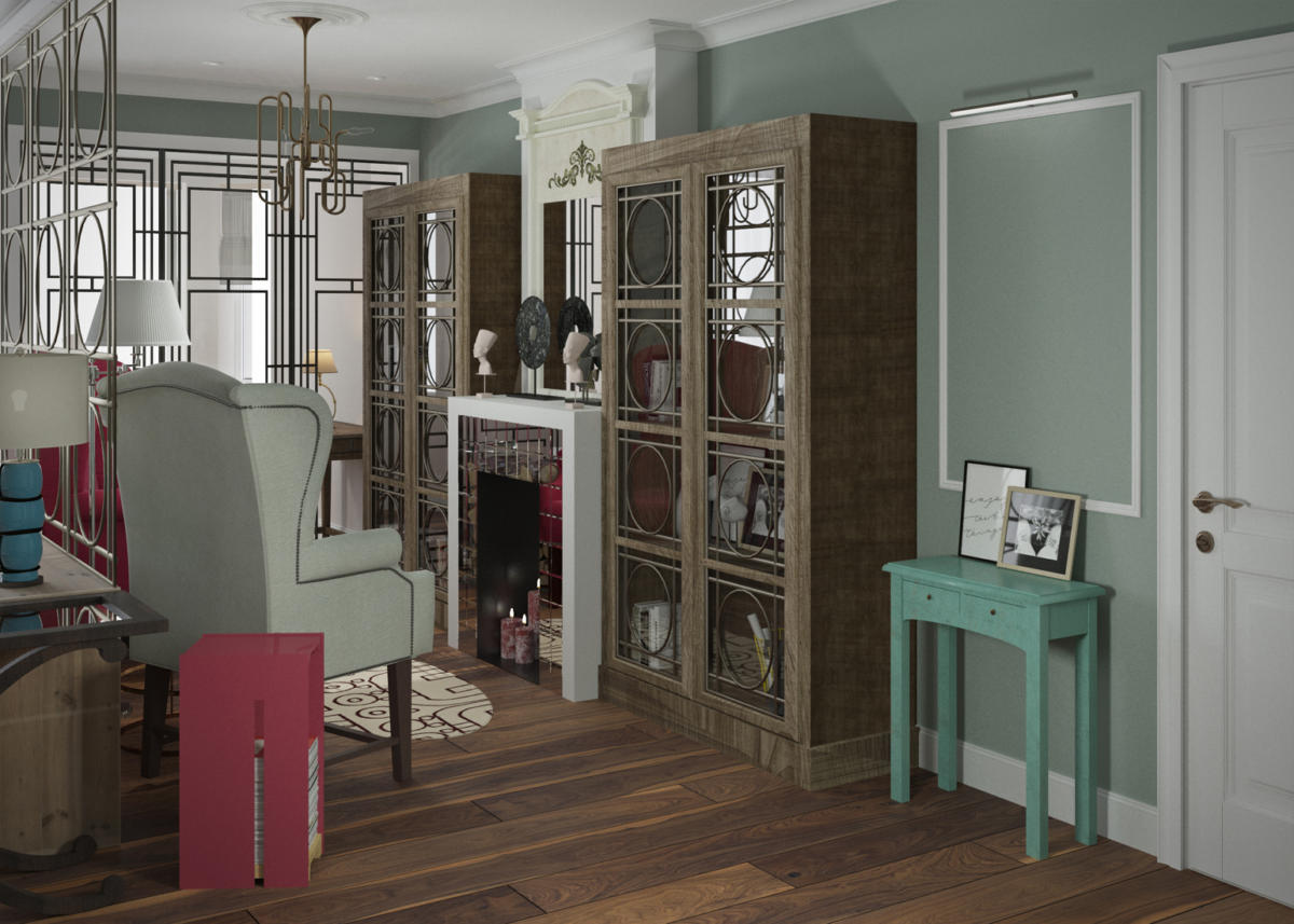
To divide the living room into zones, a custom-made bookcase with a light partition on top was used.
The ceiling in the living room is 2.7 meters, howeverthe designer decided not to lower it, so the main lighting is overhead spotlights. In the library, communication and study areas, they are used as additional light, while the main lighting in these areas is chandeliers. Each area has its own character. They are united by stucco decor - a ceiling rose and a color scheme.
The lighting is two-level. One is ceiling, the other is table lamps and floor lamps.
Several lighting scenarios will allow customersspend time actively using all the elements or have an evening of reading by the light of a lamp or floor lamp, with your feet up on the sofa or couch.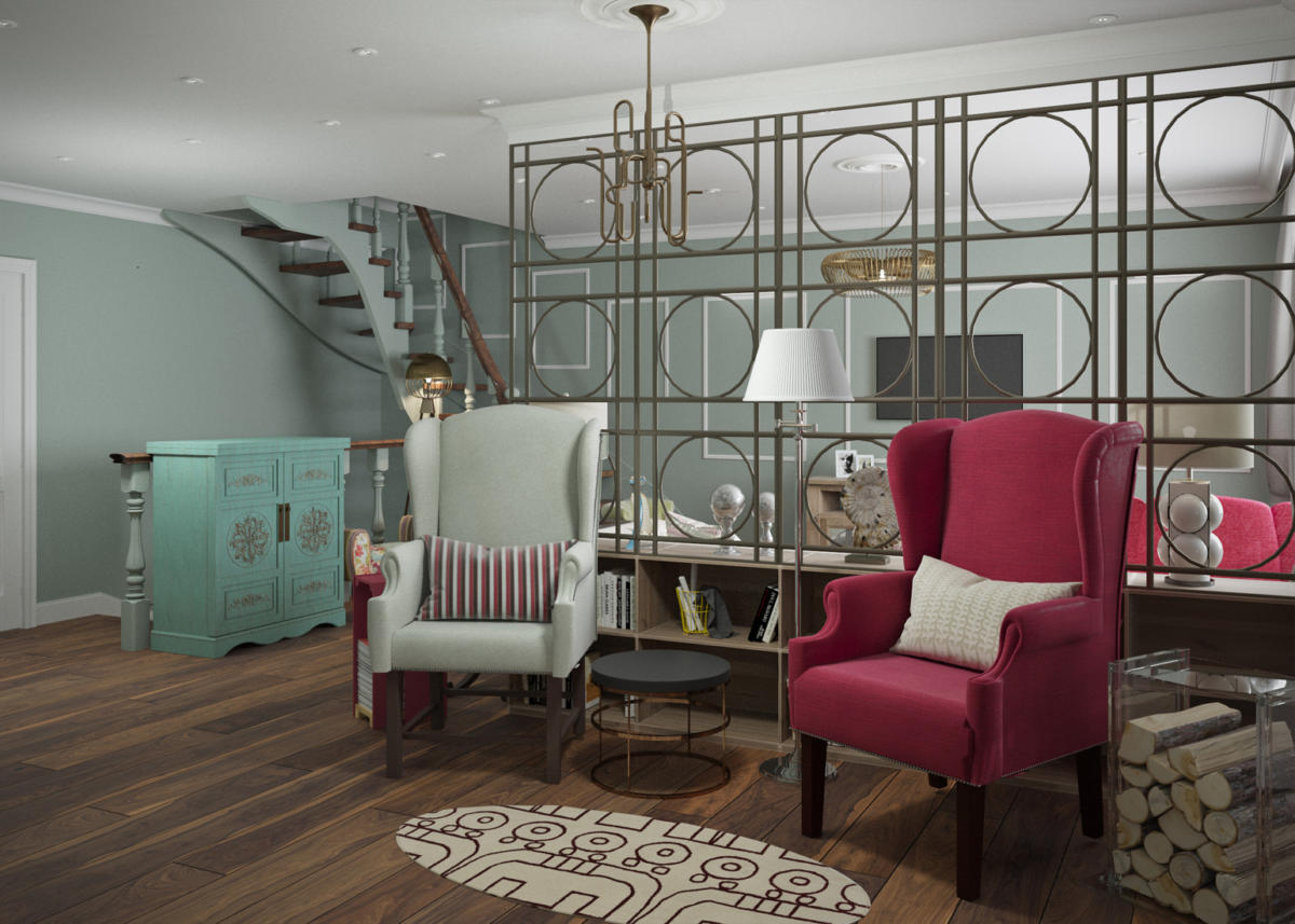
Carpets in each zone have their own character and pattern. In the communication and fireplace zones they are brighter, in the office - pastel colors.
Upholstery fabrics in matching tones. The designer used a mix of solid colors, classic florals and modern geometric patterns.
The living room's social area is a bright spot - a berry-colored couch, a calm sofa with accent pillows. A compact armchair is upholstered in companion fabrics.
The library area also maintains a balance of bright colors.berry chair and calm beige - these are chairs for mom and dad, the upholstery emphasizes masculinity and femininity: the man's chair is made of thick smooth fabric, the woman's - soft, velvet.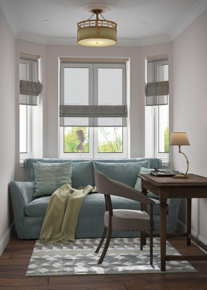
You can watch the Art Lab program on the Tvoy Dom TV channel or on the website tvoydom.live.
