It is very difficult to single out such things in a small areafunctional areas such as a bedroom, kitchen, study, wardrobe, bathroom. Interior designer Stepan Bugaev told us how they coped with this difficult task using the example of a small apartment in the Art Deco style. You will learn about the secrets of non-standard space zoning in our article The diversity of interior designer Stepan Bugaev’s projects is surprising. He approaches his work very creatively. An apartment for , , — each project is maximally “tailored” to the customer and corresponds to his lifestyle, ideas and dreams. Today, the designer told us about an apartment with an Art Deco interior. The project is interesting because during the work, adjustments were made to the layout, and non-standard space zoning solutions were used. “This project was created for a young married couple without children. Taking into account the current pace of life, they asked for help in creating a design project in their additional apartment with a total area of 32.3 sq. m in the Albatross residential complex. In a rather small space, it was necessary to allocate several separate zones - a bedroom, kitchen, wardrobe, bathroom and work area. Project of the studio "Victory of Design"
 Project of the studio "Victory of Design"The customer completely trusted our taste. The owner of the apartment had several wishes regarding the layout: to place the bathroom in place of the supposed dressing room at the entrance, storage systems should be in the entrance area. The interior of the apartment turned out to be cozy and functional. The main style direction of the interior design is Art Deco in light colors and with the use of contrasting colors, due to which the necessary accents are placed. Our opinion: - Signs of the Art Deco style in this interior: interesting ornament, white color, wide surfaces of furniture, the use of chrome. All these materials and techniques are aimed at creating a truly luxurious interior. The interior includes glass, gloss, chrome. The flooring has a glossy structure. Sliding glass doors (possibly frosted glass with a pattern). We are considering radius walls and interior partitions. The ceiling in the entire room is stretch, glossy.
 Project of the studio "Victory of Design"
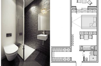
 Project of the studio "Victory of Design" Wewanted to expand the space as much as possible on a visual level. That's why we made some adjustments to the layout. By moving the bathroom to the entrance area, we increased the area of the kitchen-dining room. By using the width of the corridor, we preserved a full-fledged passage from the hallway to the main areas and organized an additional functional unit - a bathroom. The bathroom was located in the place of the supposed dressing room at the entrance, and the storage systems were made in the entrance area. The living room-bedroom area was separated from the kitchen-dining room area with radius sliding partitions. Kitchen-dining room We created a full-fledged kitchen-dining room area with a non-standard solution for the dining area - we highlighted it with flooring, a checkerboard layout of floor tiles and a difference in ceiling height. A contrasting combination of not only textures, but also colors is used. The interior has a non-standard design solution - placement in the middle of the kitchen island, which made it possible to zone the elongated room as conveniently as possible. Our opinion: - A kitchen island is a great option if you want to zone the space. A furniture design of this type can perform various functions: for example, it can accommodate an oven or a dishwasher. Important: think in advance about how to connect all the necessary communications. The designer Elica hood fits well into the overall composition of the lighting fixtures. The semicircular tabletop is unusually fixed to the kitchen base. And the round shapes of the kitchen are supported by designer Tulip chairs. The dining area is highlighted by a checkerboard layout of the floor tiles and a difference in ceiling height.
 Project of the studio "Victory of Design"
 Project of the studio "Victory of Design"
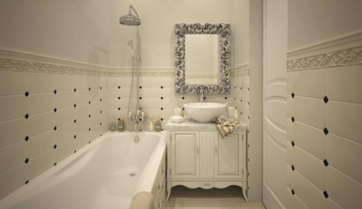
 Project of the studio "Victory of Design"Living room There is little space in the living room area, but it is used functionally. When disassembled, the sofa can be used as a bed. A designer chandelier from the Arte lamp factory acts as a bright accent, bringing golden colors and shades to the interior. In this room, we placed a comfortable fold-out sofa and a comfortable work area, which is maximally illuminated by daylight. Decorative black elements on the tiles add chic to the light interior.
 Project by the studio "Victory of Design" Hallway The composition of mirrors with a beveled layout beautifully refracts the light from the sconces.
 Project by the studio "Victory of Design" Bathroom The bathroom was located in the place of the supposed dressing room at the entrance, and the storage systems were made in the entrance area.
One-room apartment design: zoning space and interior in Art Deco style


