What unites Elena Baturina, a jeweler, perfume,peonies and Swiss furniture? Today you will learn about it by reading our article about just one evening in Milan, spent by our editor-in-chief in the company of design critic Olga Kosyreva. During the Milan Furniture Fair, there are many parties, presentations and various events every day and every night, admission to which is not available to everyone. But for design critic and co-founder of the Design Lectures Olga Kosyreva, nothing is impossible. On April 14, Olga and I visited several closed design parties in Milan. If you want to know what was the best of the best, go here.
Jeans, Switzerland, chairs
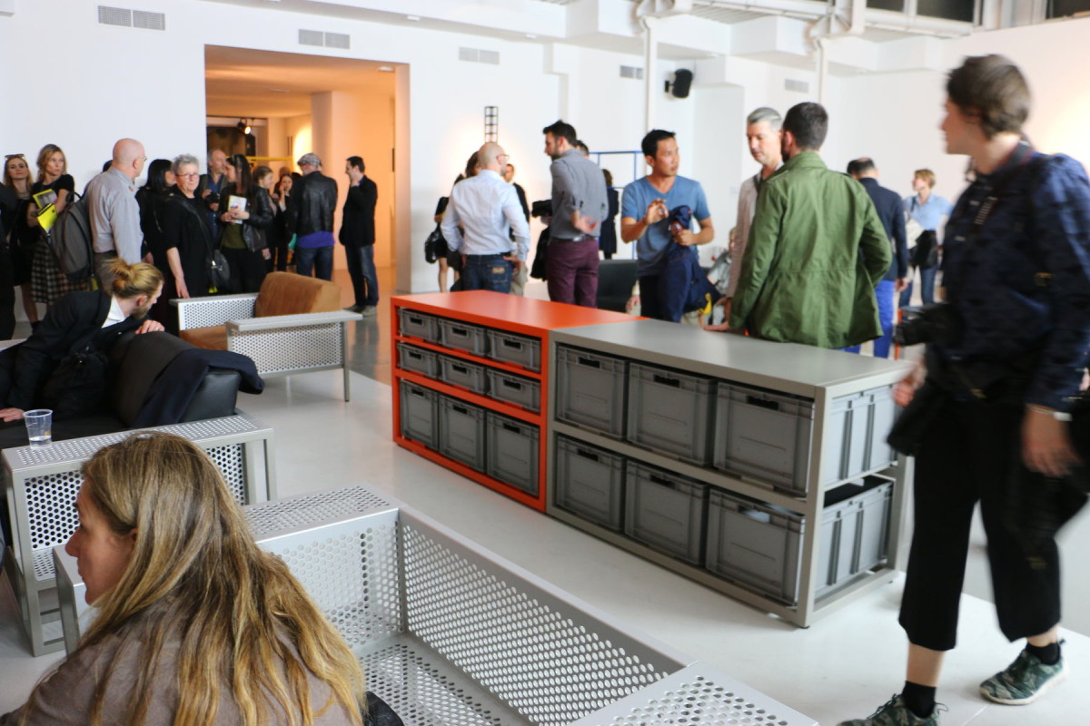
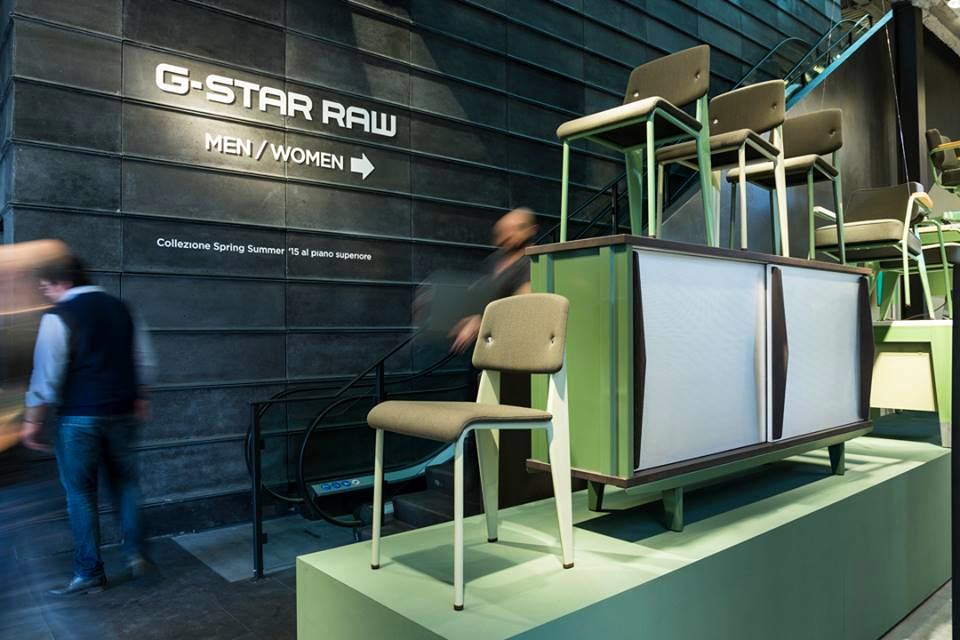
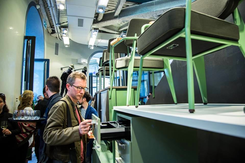
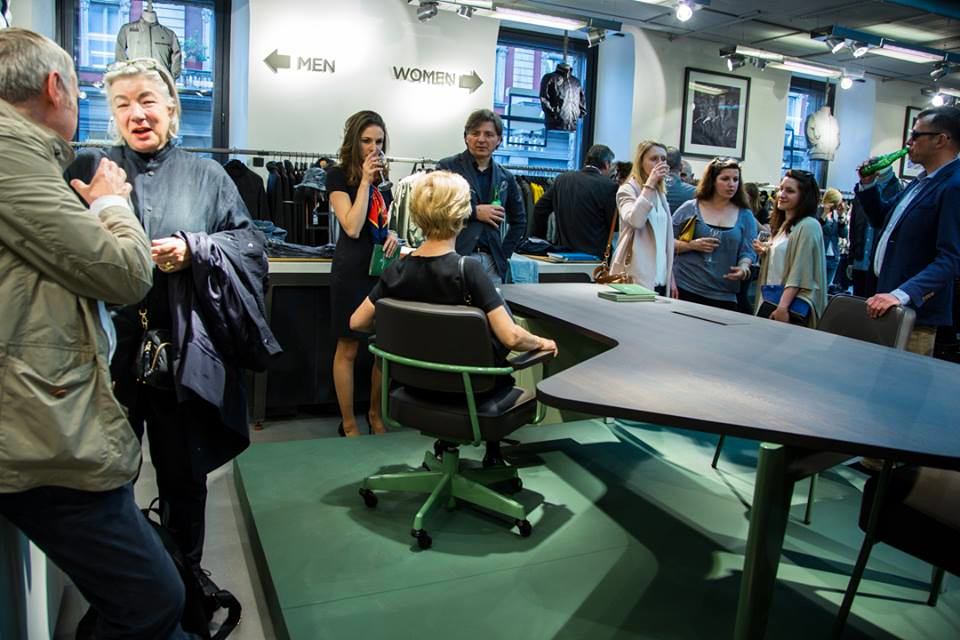
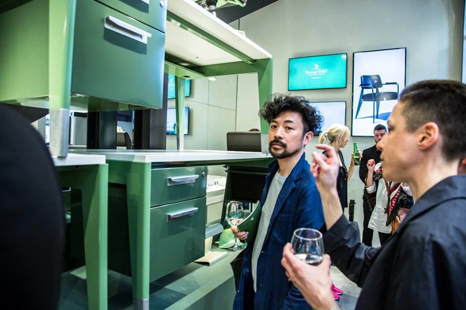
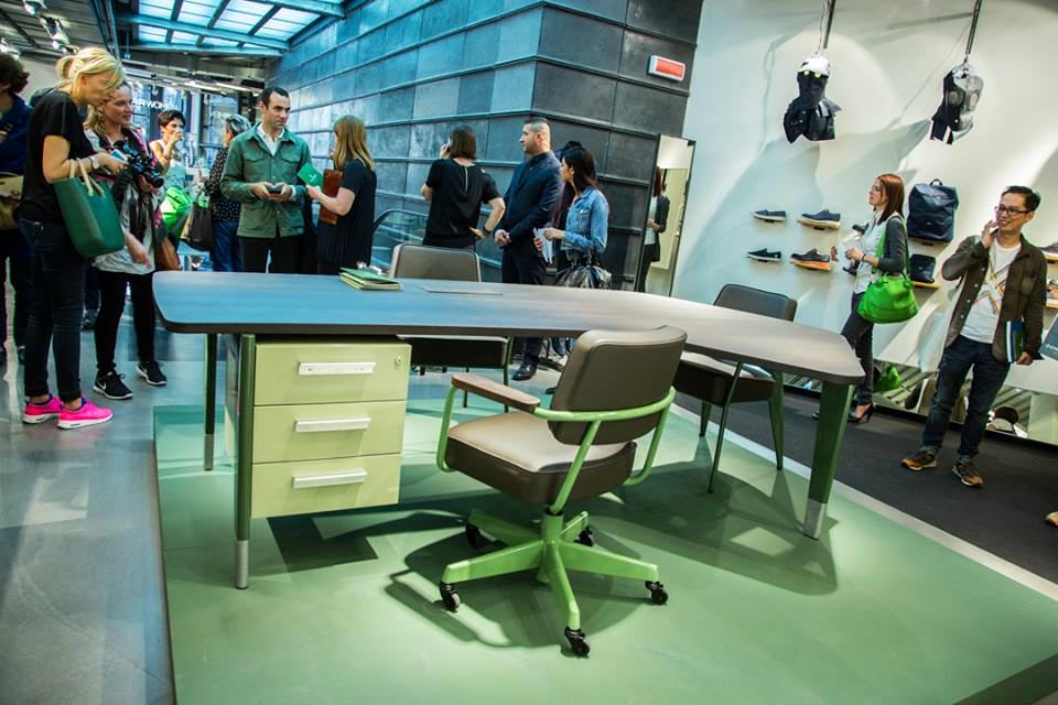
Our route started near the Duomo -the main cathedral of the city. On the corner of the streets in the G-Star RAW store there was a presentation of the new furniture collection of the famous Swiss factory Vitra. The first few minutes of being at the event were shocking: what is Vitra furniture doing among jeans? However... Olga Kosyreva, "Design Lecture Hall": - Vitra has been close friends and cooperates with the Dutch denim brand G-Star for several years, whose owners are simply in love with the furniture of one of the leading designers of the twentieth century Jean Prouvé and invested in the fact that his furniture, which reaches a price of hundreds of thousands of euros at auctions, is reproduced in more or less mass circulation and is available to a greater number of people. The cooperation began with the release of a series of home furniture, and then the management of G-Star wanted to furnish their new office in Amsterdam with Prouvé furniture, which was designed by Rem Koolhaas, a world-famous architectural star. So last autumn, Prouve's office furniture was re-released - Prouve RAW office edition, which G-Star now presents in its Milan store. designlectures.ru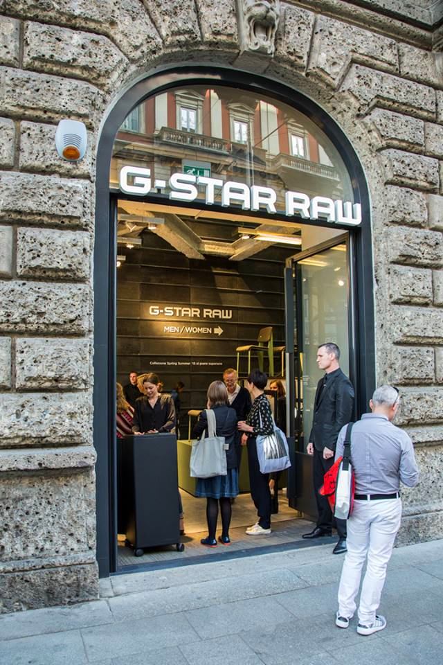

Bvlgari, Zaha, Philippe
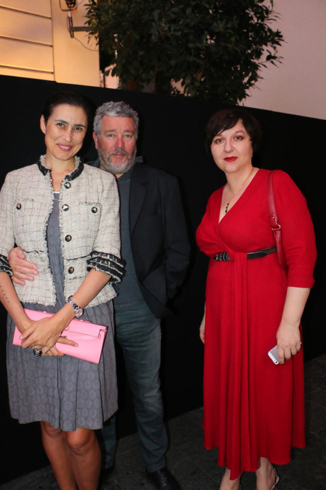
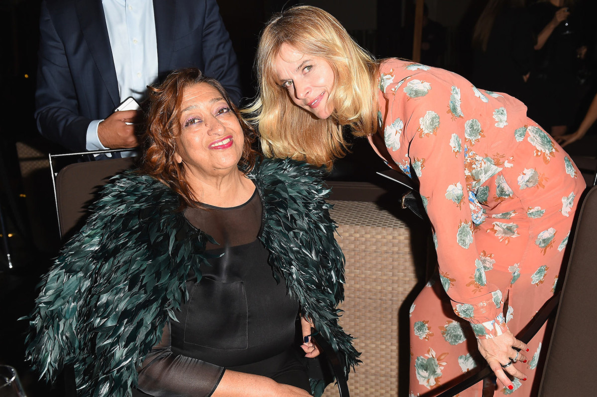
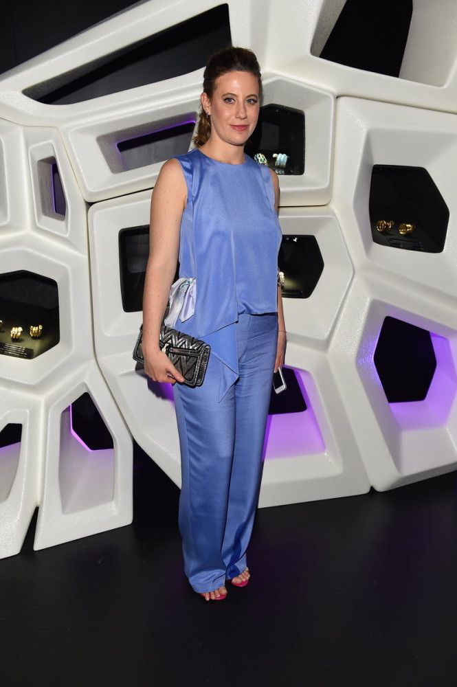
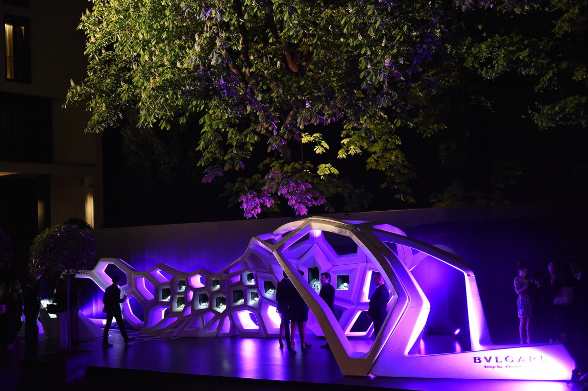
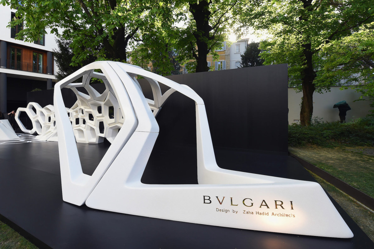
Next we need to get to the super-closed oneparty at the Bvlgari Hotel. Here they presented a new and, as always, and maybe even more, beautiful collection of the famous jewelry brand of the same name. Serpentine - this is the name given to both the collection and the work of modern art created by the architect Zaha Hadid specifically to demonstrate the works of Bvlgari. In a huge snake-display case, the audience was presented with both new and old jewelry of the brand, many of which were bought from collectors for incredibly large sums of money. The party was a great success. The following were spotted here: actress Nastassja Kinski, Francesca Versace, architect Antonio Citterio, designer Philippe Starck, designer Ora Ito and other stars. We were delighted. An excellent example of how smartly and tastefully fashionable - in this case, jewelry - brands enter the adjacent territory of object and architectural design. Salone del Mobile is the time when the cream of the design industry gathers in Milan. The Bvlgari Hotel in a small private street in the very center of the city is an oasis of respectability and relaxation in the midst of all this fuss. And the name of Zaha Hadid is so significant that it is guaranteed to attract the attention of both the public and the press. So the Bvlgari brand simply could not come up with a better combination to show off the treasures from the heritage fund and new jewelry. The visit of Philippe Starck himself is an excellent confirmation of this.
Elena Baturina, gardens, perfumes
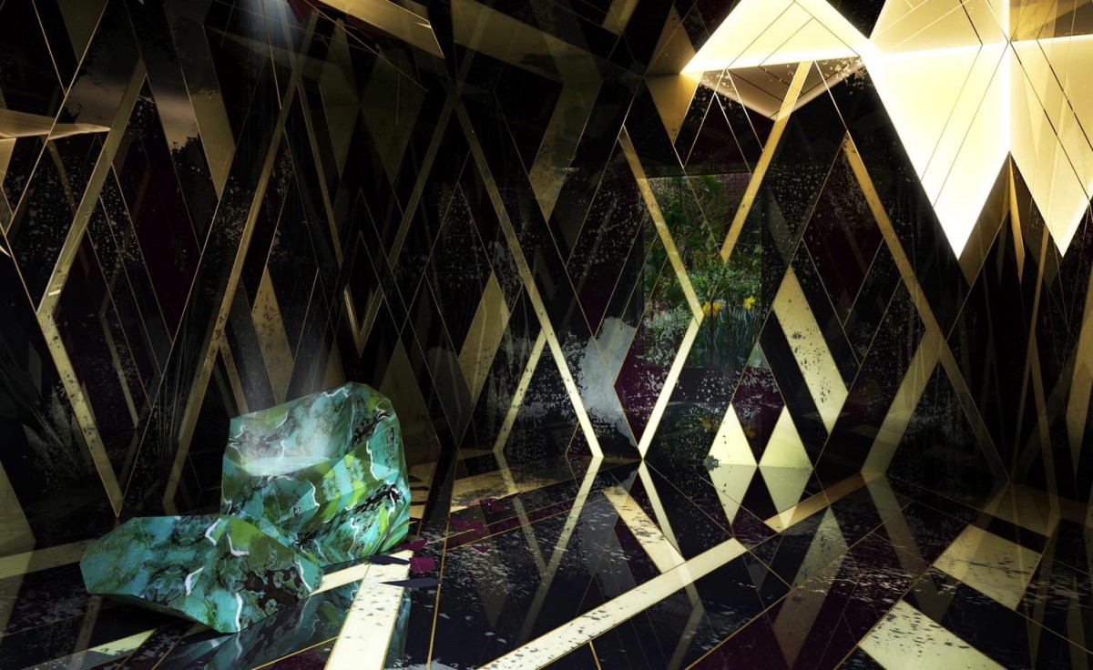
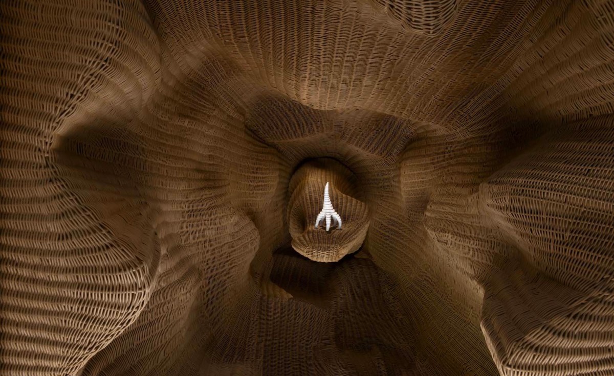
From here on our path had to lie to the sidePontaccio Street, in the area of which many design events took place. Olga, an expert on Milan, decided that the route could be shortened by going through the old botanical garden. And there a new discovery awaited us: pavilions were installed between the irises and peonies, where designers tried to visually present the smells of old perfumes, showed new bottles and told about the history of perfumery in an accessible way, with smells. Such famous architects and designers as Jaime Hayon, the Campana brothers, Jean-Marie Massaud, Nendo, Ludovica and Roberto Palomba and others took part in the project, and all this was carried out by the Elena Baturina Foundation BeOpen, which was positioned here as nothing less than a self-made woman, famous for her reconstruction projects and taking an active part in the "Women of Expo" movement. Yes, if you go to Italy for Expo this year, the Elena Baturina Gardens will be open for viewing until May 25. Olga Kosyreva, Design Lecture Hall: - This old botanical garden in the Brera district is one of Milan's best-kept secrets. You'll never stumble upon it by accident, and even if you look for it, you're not sure you'll find it on the first try. But it's beautiful, especially now that the flowers are in full bloom after early spring. And a project involving fragrances is especially appropriate. Not to mention that it certainly marks the cutting edge of contemporary design - anything that engages the senses is especially in demand now. Humanity is tired of things, I never tire of repeating this. It wants impressions, emotions, new experiences - including design. designlectures.ru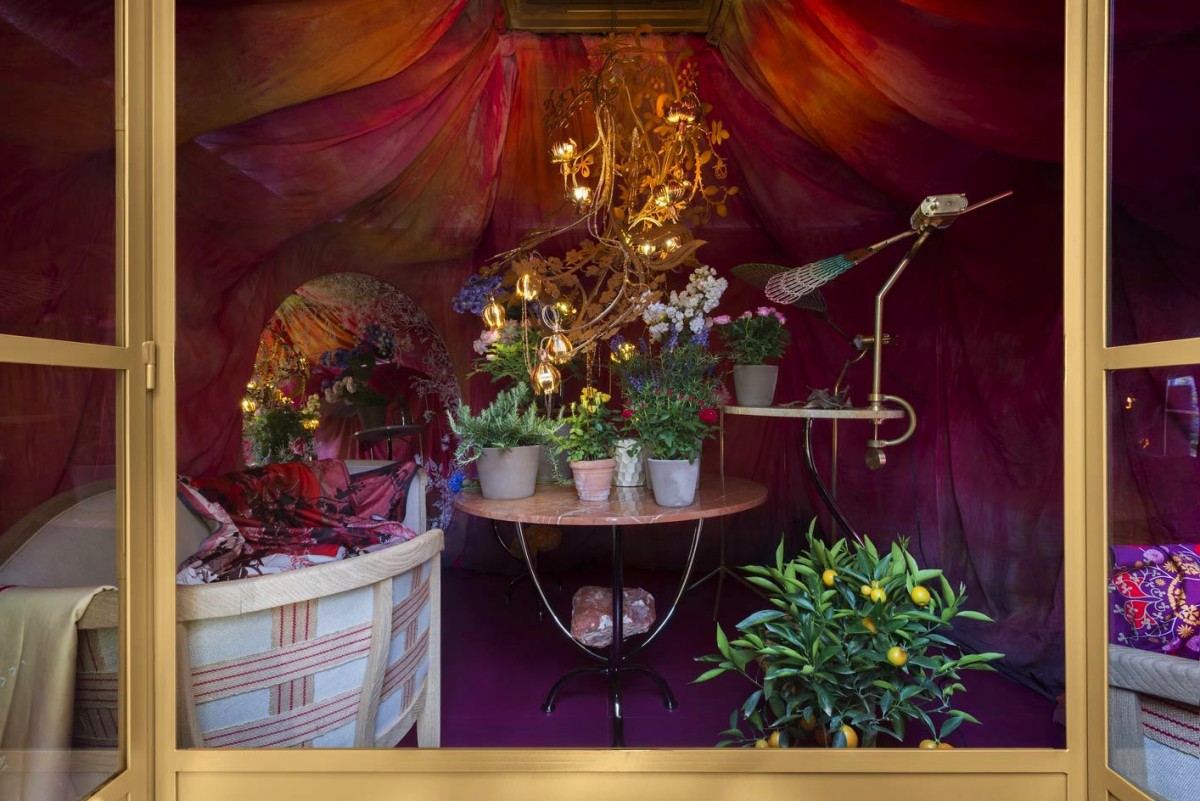
Plastic containers, rigid frames and soft pink
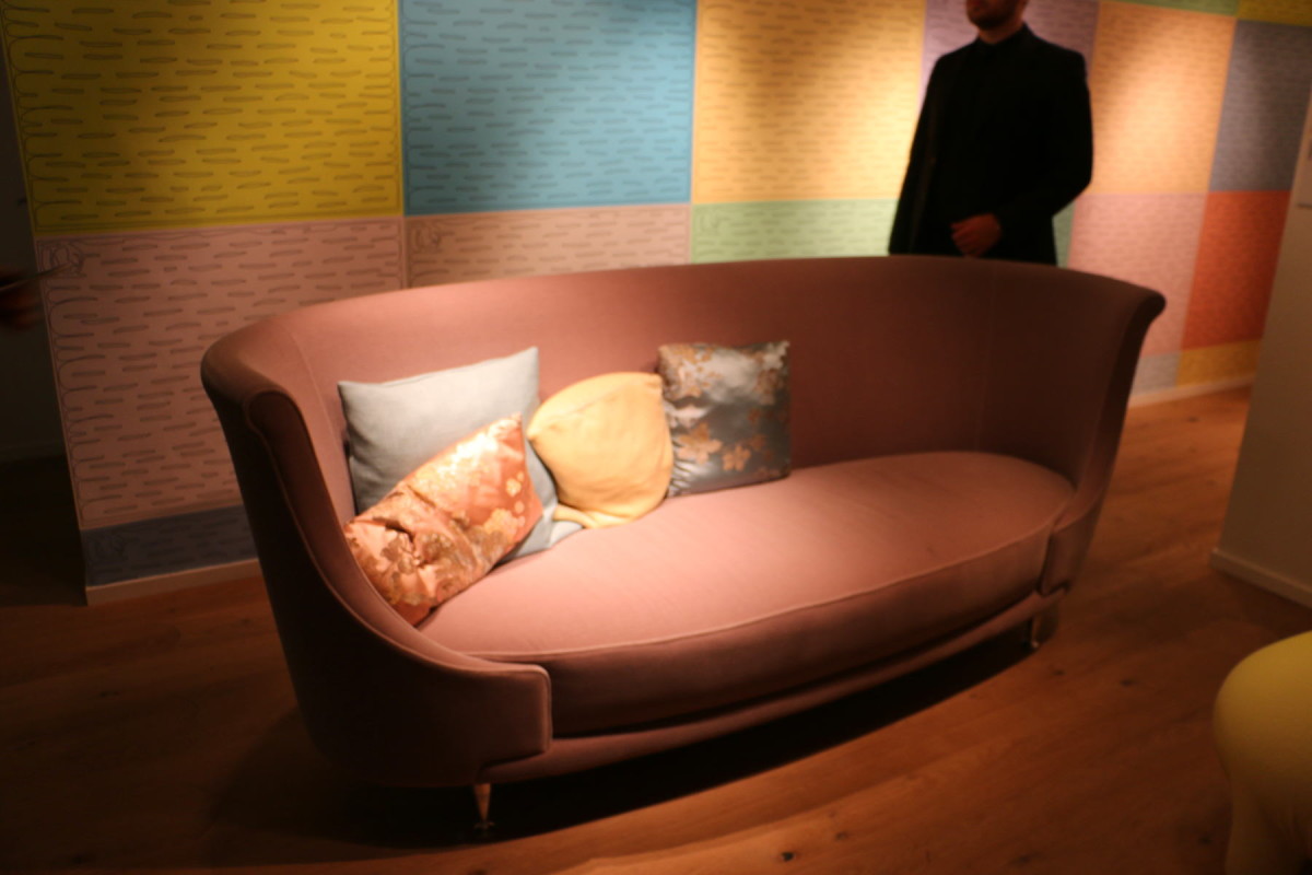
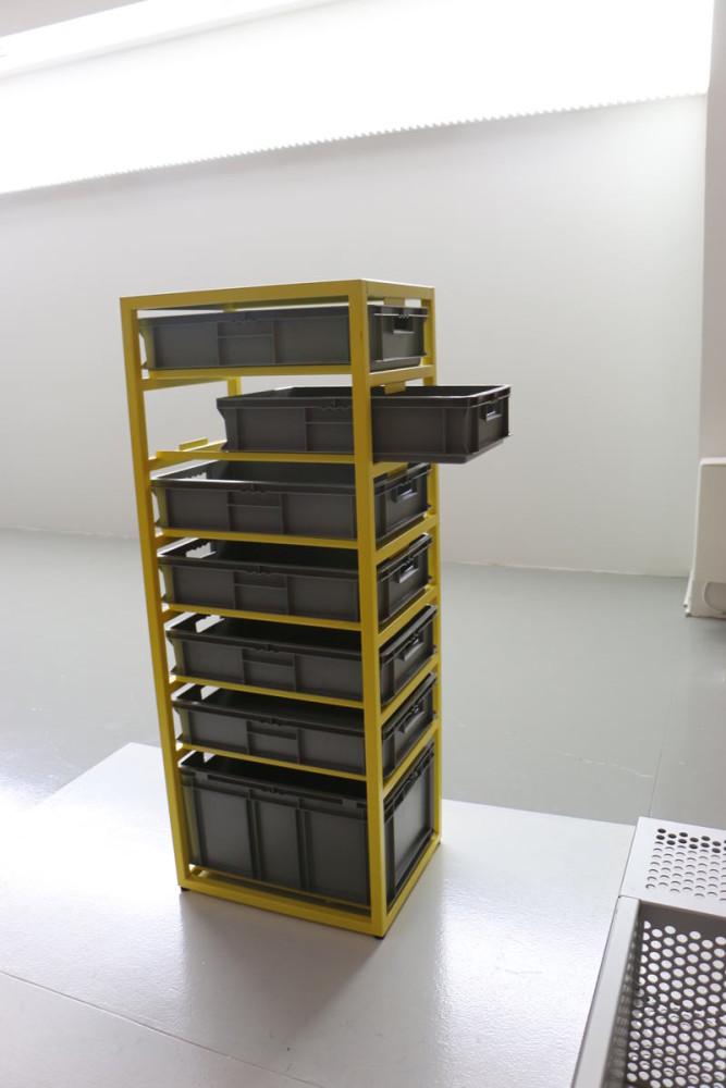
At the presentation of the new collection of the Moroso factory,To be honest, we weren't planning to at all. After all, it could have been seen at the exhibition. But our feet, accustomed to stomping along the paths of design, led us to the showroom of the famous upholstered furniture factory. Which, in fact, in the Moroso version is not at all soft: the technology of producing sofas and armchairs on rigid metal frames, patented by the factory many years ago, remains practically unattainable for most other manufacturers. In the showroom, we liked the best-selling sofa embroidered with a floral pattern, and also the delicate pink colors in the new furniture collection. But our opinions about the shelves made of plastic containers were divided: Olga liked them as an idea, we didn't, our editorial team loves cozy things. I am a big fan of this brand, not least because my favorite designer and wonderful person Patricia Urquiola constantly works for it. But Moroso presents its newest and most interesting products at its stand in the Salone del Mobile pavilions, and the showroom usually hosts an exhibition of something avant-garde, radical and highly artistic. And now - frame wardrobes with typical plastic mailboxes inserted into them - this is not something that everyone would like to put in their bedroom. But as far as color combinations are concerned, the most important color trends are always shown in the design of the space. Now these are ash-pink, pale yellow, bleached lilac, turquoise, light blue, as well as a combination of brick-orange with muted blue.
Bathrooms, bright colours and transparent plastic
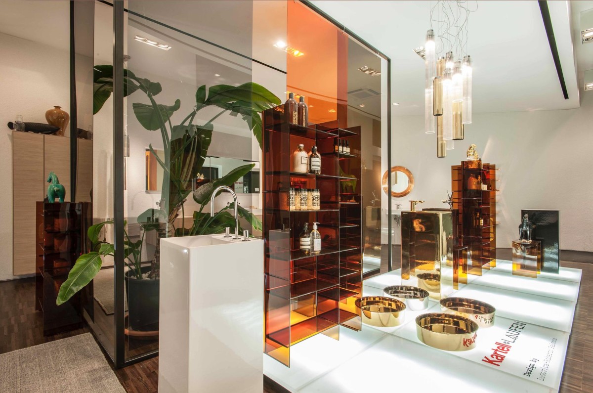
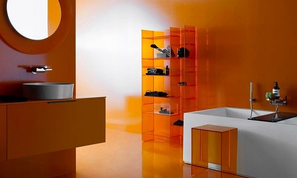
That evening we were also lucky enough to get toopening of the first Kartell by Laufen mono-brand store in Milan. The items of this collaboration were first presented two years ago and since then it has gained many fans all over the world. And here it is — the center of Milan, the Brera district. By the way, if you have ever sat in a restaurant on transparent chairs, most likely these were chairs created by Kartell based on the design of Philippe Starck (if the restaurant was expensive) or these were Chinese fakes of these chairs (if the restaurant was not very expensive). In a word, transparent furniture for sitting Kartell is familiar to almost everyone. And now the famous Swiss plumbing company Laufen decided to release a collection of bathroom furniture together with Kartell. The design of the entire collection and the store was made by famous designers Roberto and Ludovica Palomba, who have previously created a lot for Laufen. To be honest, the furniture turned out to be so beautiful that it eclipsed all bathroom furniture in our minds. Now bathrooms should look only like this. Kartell has always been known for breaking established notions with its products. And so it happened here. Several stereotypes at once: that a bathroom cannot be colored, that plastic has no place in a bathroom, that a bathroom cannot look like a living room - were shattered into pieces.
Carpets, Kandinsky and Eleanor
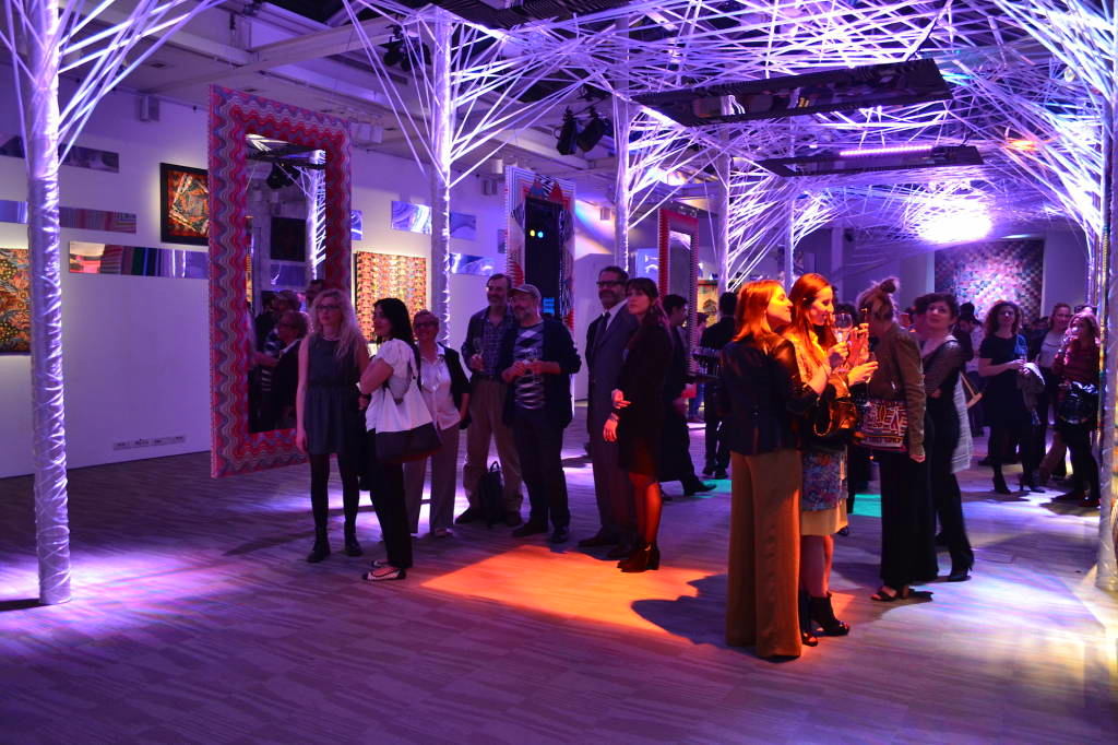
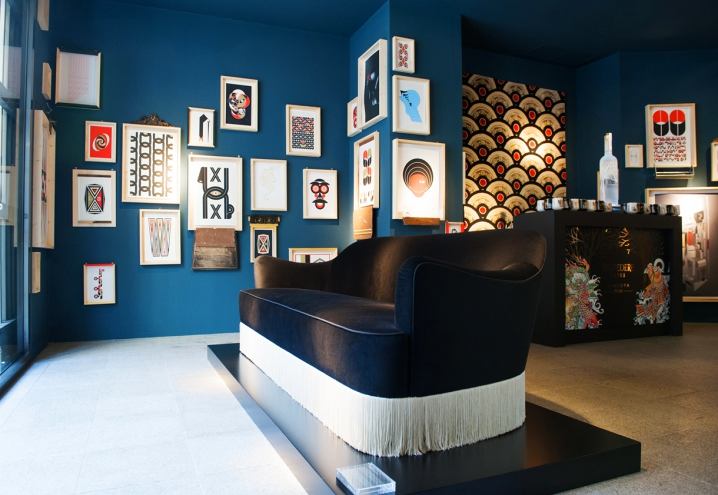
Olga Kosyreva would not be a design critic ifI wouldn’t know about secret places where the best works of modern design are presented. Among them was Spazio Pontaccio — a half-store, half-gallery, founded and run by design enthusiasts, a married couple Eleonora Negri and Alberto Pellini. They presented a furniture collection under their own brand, designed for them by the famous Italian graphic designer Federico Pepe. His magical graphics were hung on all the walls — and there was something from Kandinsky, something from student art works, something from the patterns of kilim carpets. The frames for all the drawings were created especially for each one. In general, the address is written down in a book for recommendation to designers and architects. Olga Kosyreva, “Design Lecture Hall”: — Spazio Pontaccio is a rare, unique format: it seems to be a store, but everything that is sold in it is made by designers, including famous ones, especially for this store. A year ago they made a big splash when, on the opening day of the Salone del Mobile, they hosted a dinner party for 50 people in their shop windows. All the chairs, tables, dishes, and serving pieces were made especially for the dinner, and you can only buy them in this store. The guests included the most famous designers — Tom Dixon, Jay Osgerby, Studio Job, Patricia Urquiola — this list shows how highly they value what the owners of this gallery do. I was also lucky enough to get a seat in the shop window — and it was an unforgettable experience, both from the people, and from the food, and from the fact that, in essence, you feel like you are a participant in a performance. Since then, Eleonora, Alberto and I have been great friends. designlectures.ru
Zigzags, mirrors, face control
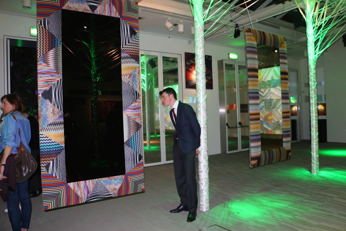
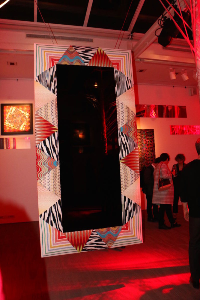
After attending an event with Zaha Hadid andPhilippe Starck seemed to us that the whole city was now open to us. However, at the entrance to the closed Missoni Mirroring party, we had to show proof that Olga and I were famous journalists: we had to take out business cards, press cards and make various calls. And — oh miracle! — we were allowed in here too. The mirrors with frames from Missoni were wonderfully good. But, frankly, almost the same ones were on the company's stand at the exhibition. Therefore, we could not understand why there was such strict face control. I deeply respect Rosita Missoni, I have spoken to her personally on many occasions — she is a rare person who is engaged in developing a home collection under her own brand. And although the signature techniques and patterns — flowers, zigzags, other geometric patterns — are not very diverse, in my opinion, they occupy their niche and bring a pleasant variety to the gray colors of everyday life.
Brass, red and grey
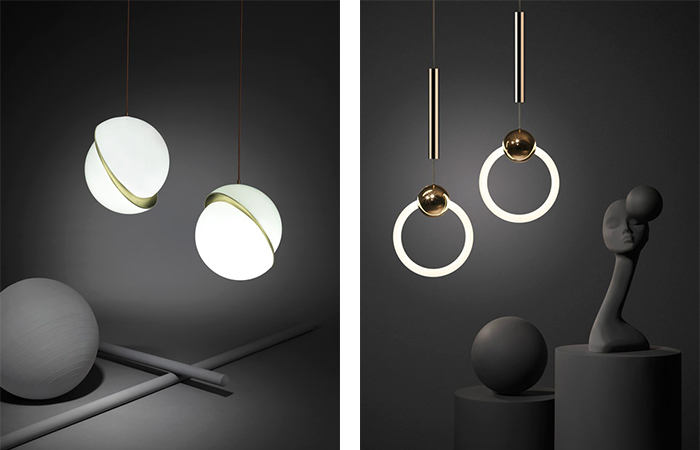
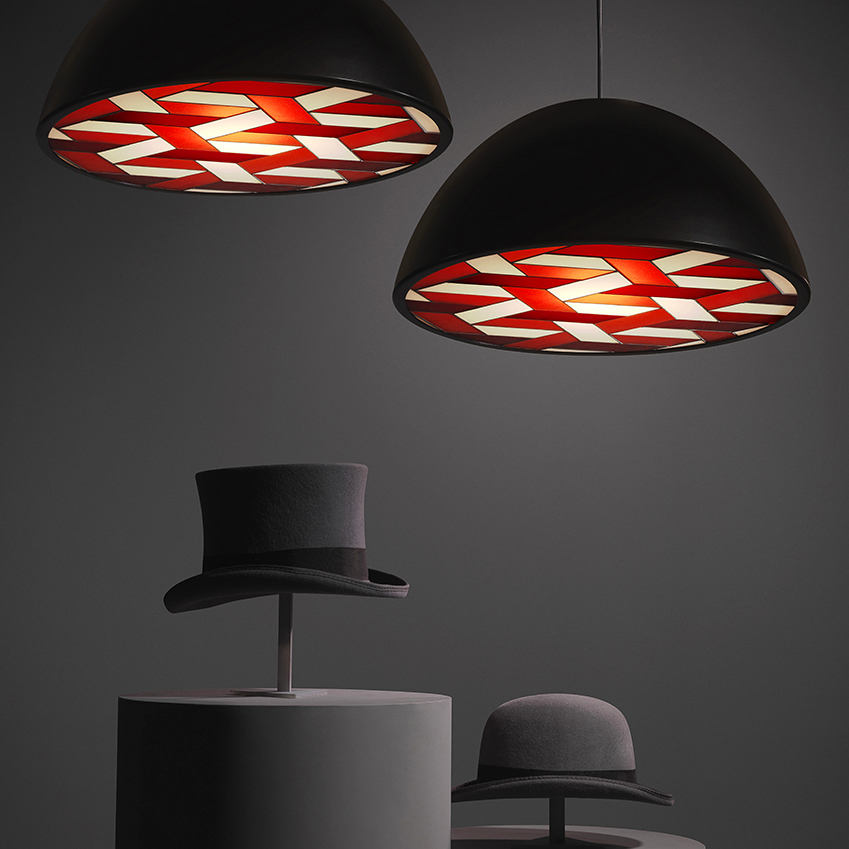
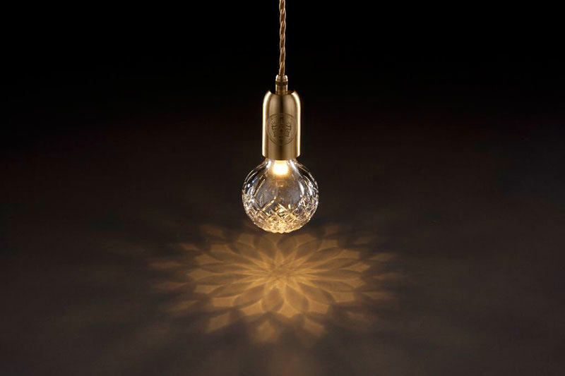
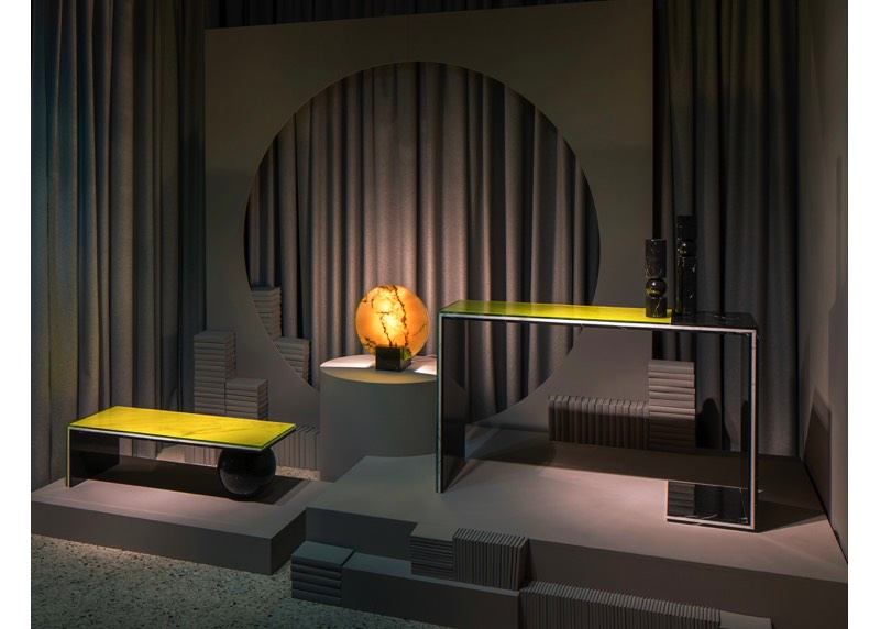
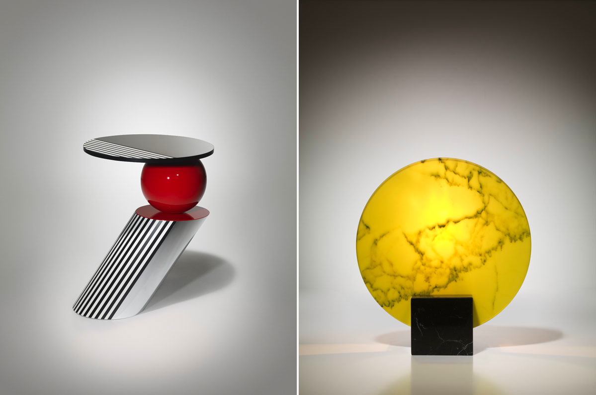
After visiting the exhibition, Olga took usreal back streets, and not very crowded. So when the road led us to a temporary showroom of the Lee Broom brand, there was no limit to our surprise. The brand turned out to be English, all the employees were English, the furniture was in the style of the 1960s and 1980s, the color of the walls and mannequins was exactly the favorite deep gray of the Armani name, and the accessories with their entire appearance said that they must be 20-30 years old and came from the workshop of the famous Ettore Sottsass. All these simple and complex associative series arose, as it turned out, not by chance, but very much planned. It was precisely on them that the owner and designer of the company counted. Here I would like to make a long speech. Firstly, Lee Broom with his collection is located in an area where there has never been any design activity - now it is called San Gregorio Docet and since this year it has been put on the Milan design map. This is significant – the design capital is becoming ever more diverse, and the participants of Milan Design Week are cramped within the framework of long-standing design clusters like the “Zona Tortona”. Secondly, Lee Broom is well known in London, and now, thanks to this exhibition in Milan, the rest of the world has learned about him and started talking about him. Which is personally pleasing to me. Because – and this is thirdly – I really like him as a designer and a person, and his crystal light bulbs with notches have been in my sweet dreams for some time now. And fourthly: the fact that he, a man of refined taste, turned to Italian pop art and early postmodernism for inspiration (and these are the works of Ettore Sottsass and Co.), speaks of a return of interest in this forgotten period. I would venture to suggest that the 1980s style with its active graphics, bright colours, false shine and ironic figurativeness is what is called the next big thing in the design of objects and interiors.
design critic Olga Kosyreva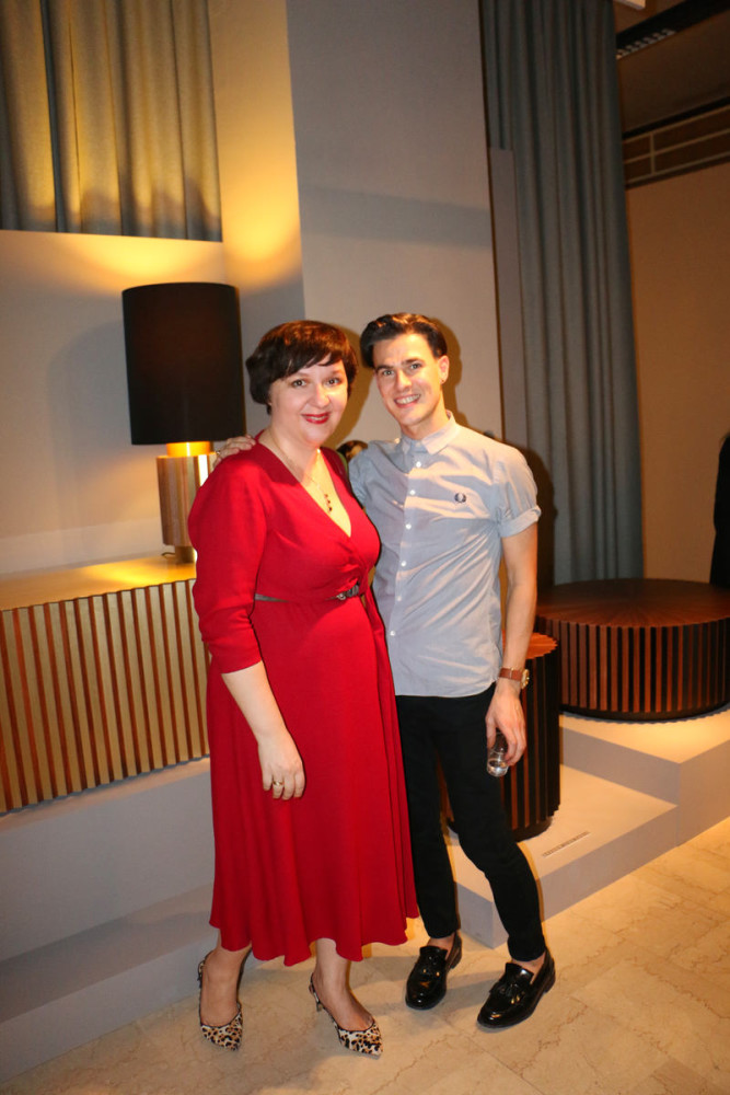

photos: Oksana Kashenko, Philip Eichler, Venturelli
