You didn't make it to Milan this year?You still have time. After reading our article about the best pavilions of EXPO-2015, you will rush to buy tickets immediately. Read about the coolest architecture of the world exhibition here The world anthem of industrialization - the international exhibition "EXPO" - turns 164 this year. This time, the organizers decided to take care of the problem of the food industry and announced the theme of the event as a call to "feed the planet", and as an explanation they used the term "energy for life". We have selected 10 of the most interesting pavilions, looking at which you really want to believe in a bright future.
UK Pavilion
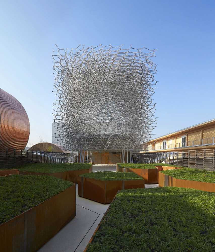
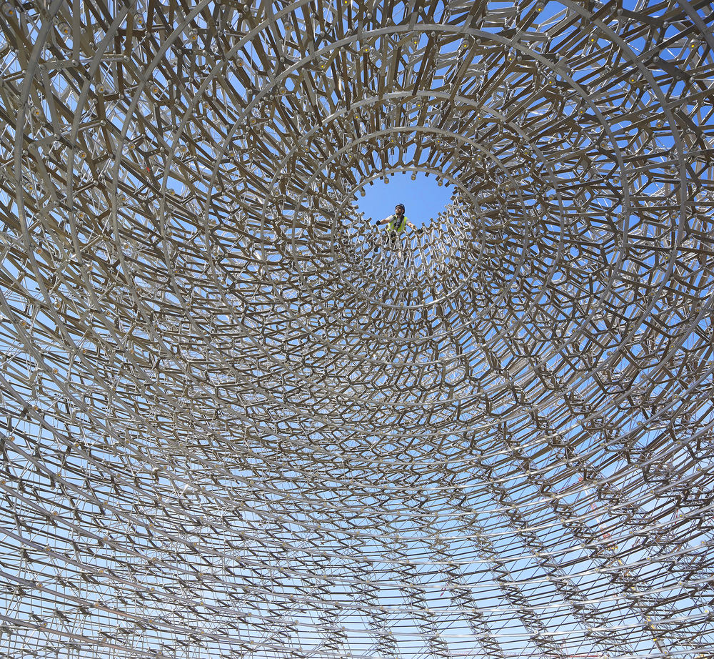
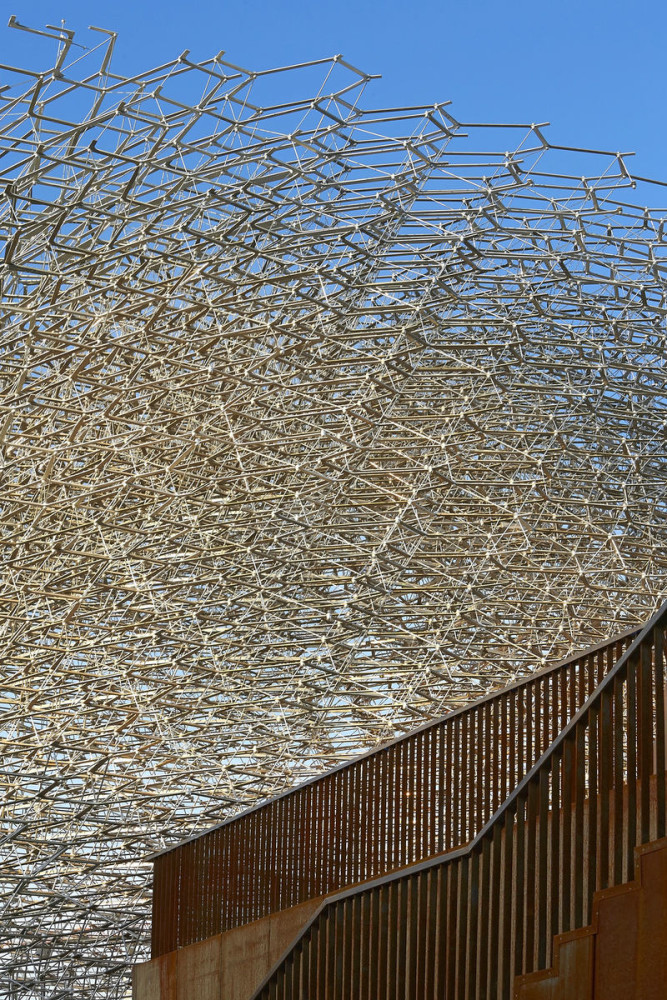
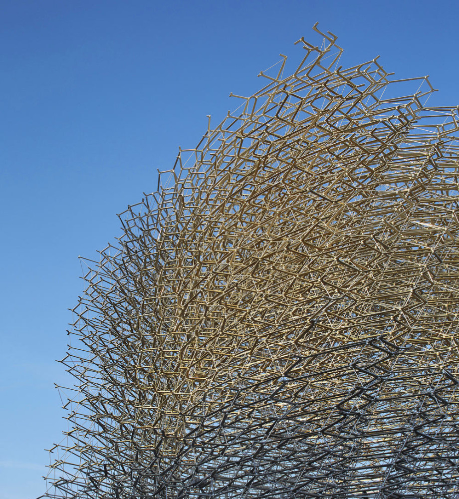
For the British pavilion, architect WolfgangButtress (Wolfgang Buttress) created an aluminum beehive. Almost 170,000 aluminum parts were connected to each other to form a giant lattice structure with a spherical hollow center. After dark, the structure looks especially impressive.

UAE Pavilion
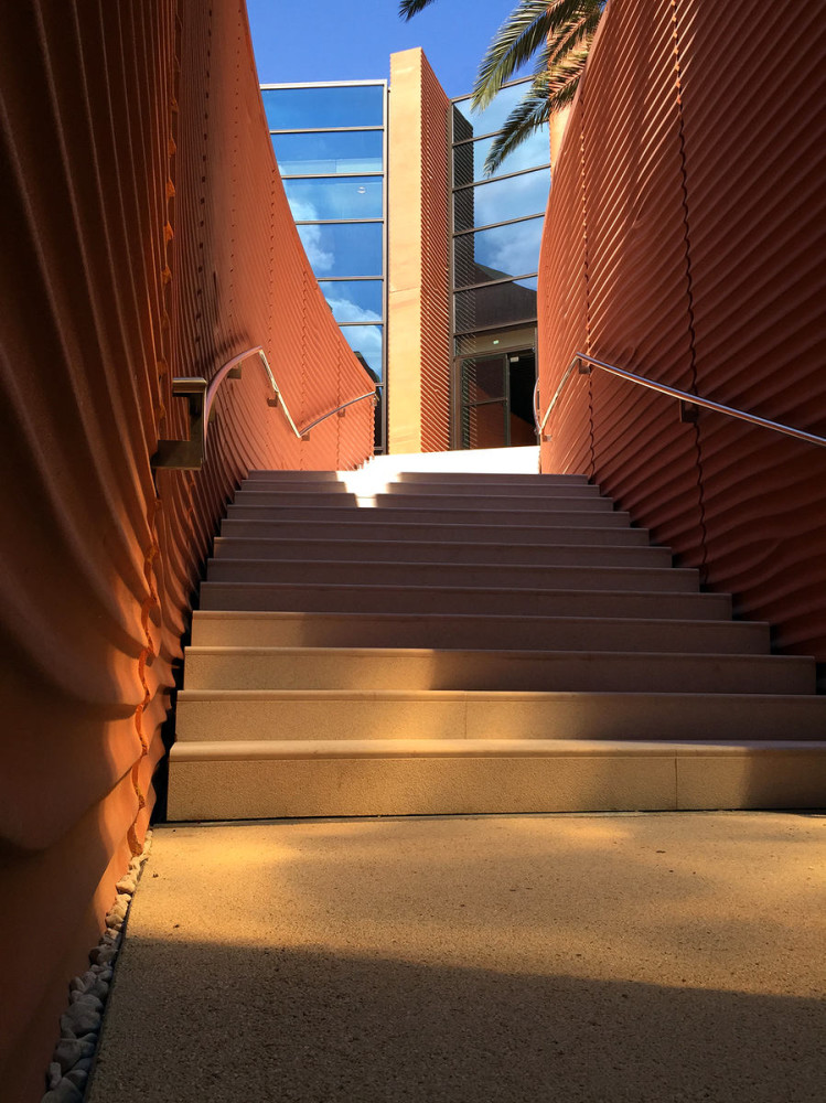
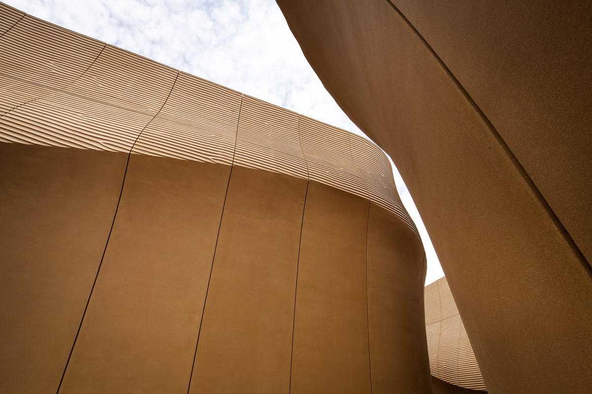
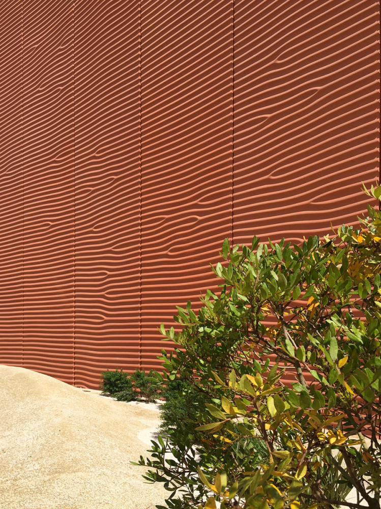
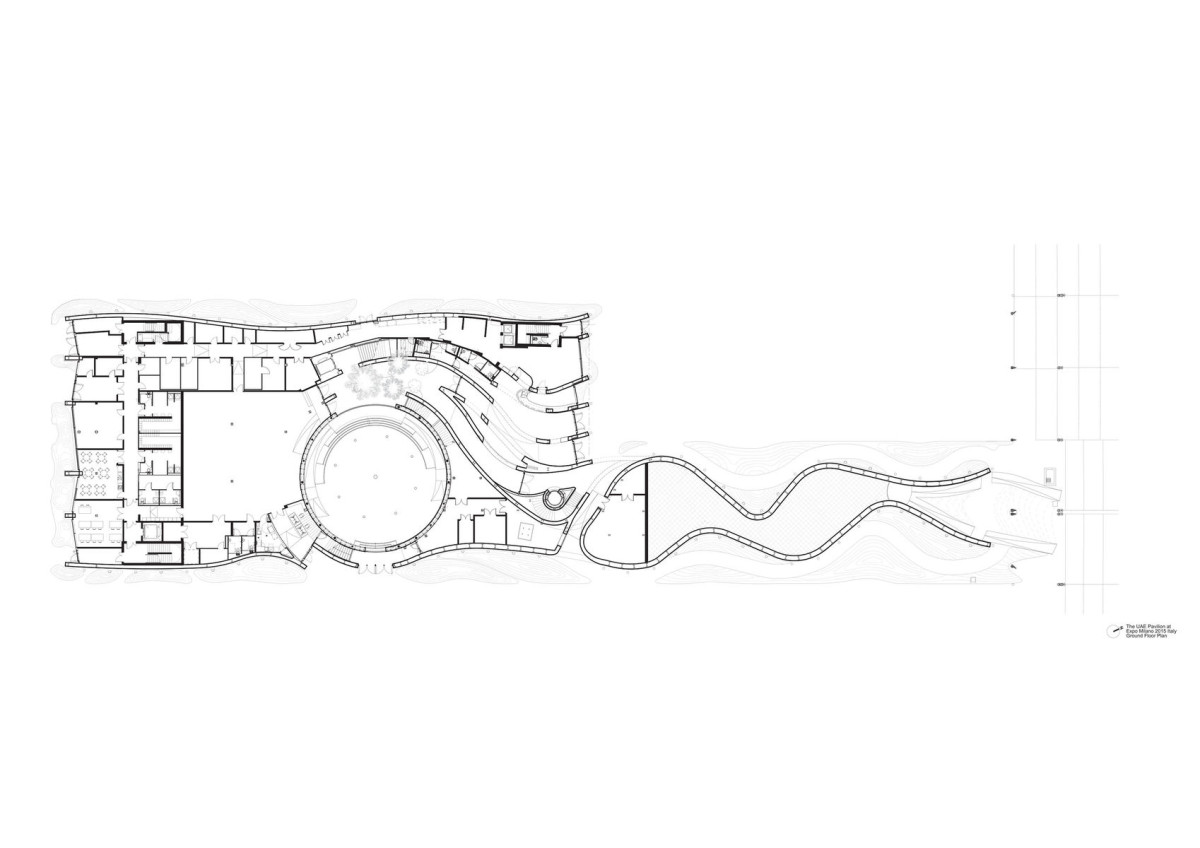
What do you associate with the United Arab Emirates?Emirates? Sand dunes are also the first thing that comes to mind for the architects from Foster + Partners. They brought them to Milan. A wave-like labyrinth with a steel “skeleton” draws visitors to the semantic center – a round oasis.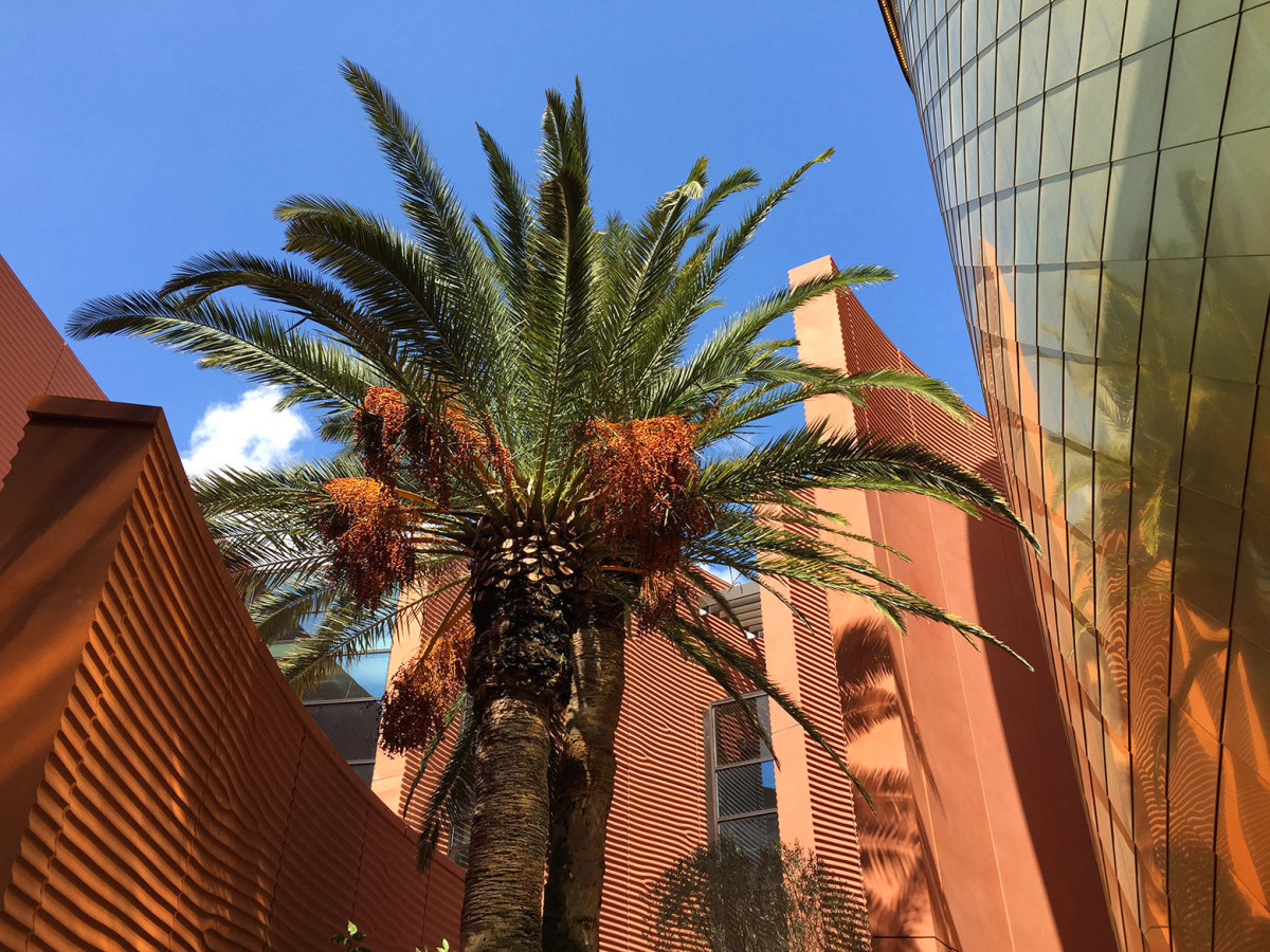

Vietnam Pavilion
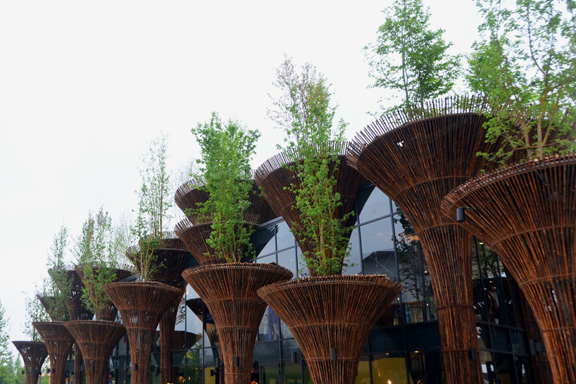
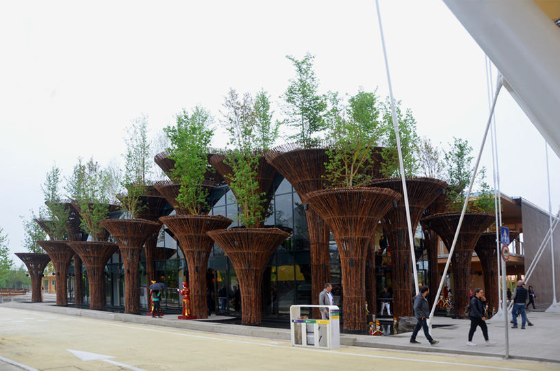
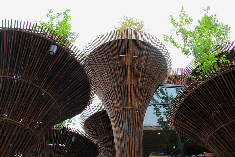
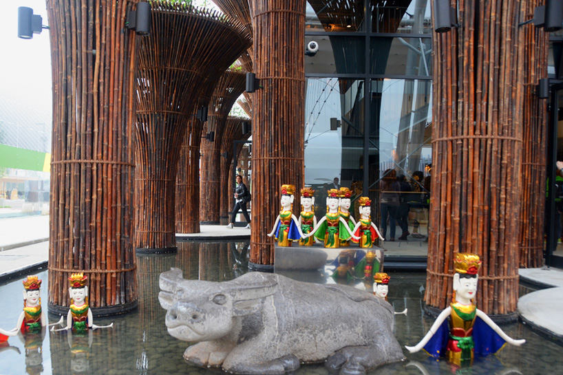
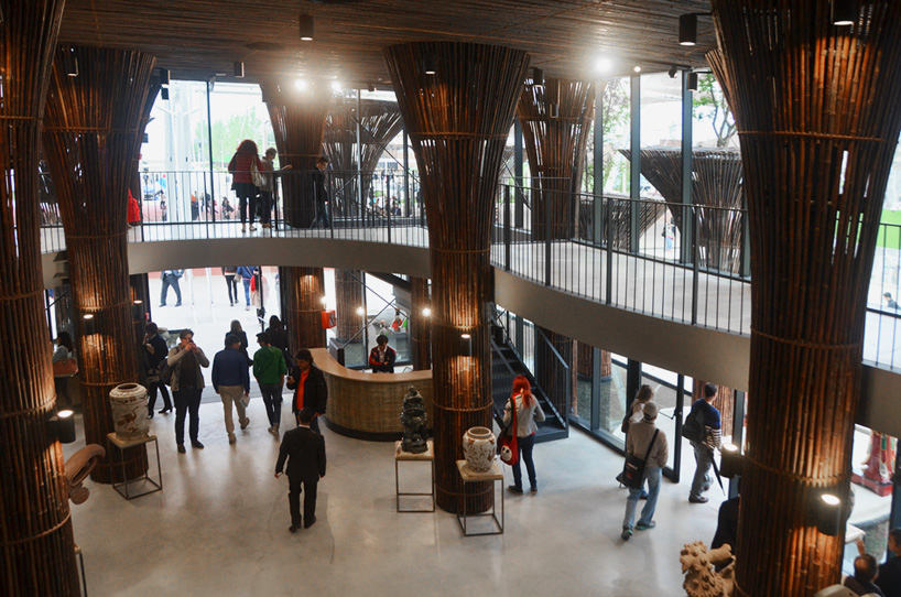
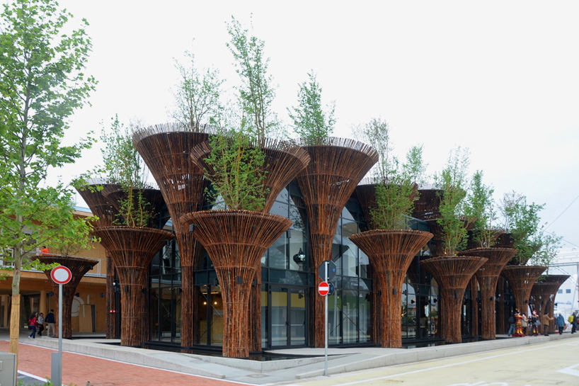
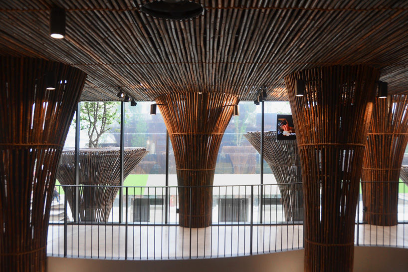
In the pavilion of the Socialist Republic of VietnamThis year, bamboo lotuses have blossomed. The architects from Vo Trong Nghia Architects directly addressed the theme of the exhibition - "feed the planet, energy for life" - and decorated the exhibition with symbols of the country: lotus flowers - symbols of optimism.

Brazil Pavilion
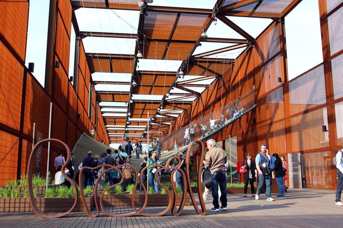
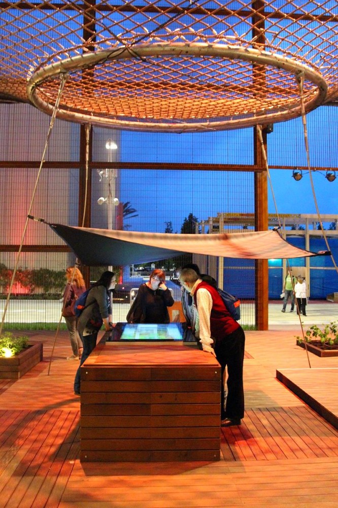
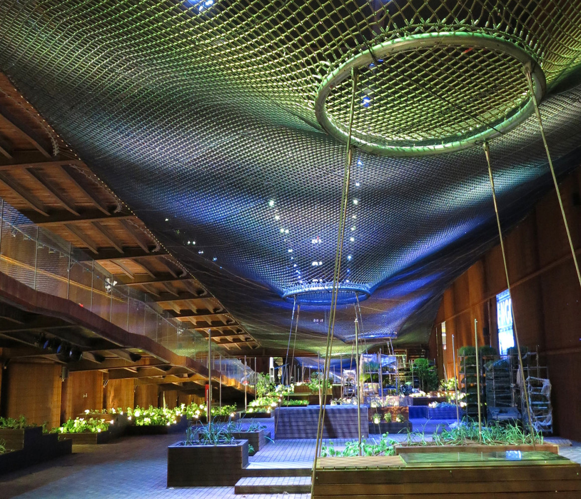
At the Brazilian pavilion, visitors were able toto get perhaps the most powerful emotional experience. On one of the levels, instead of a floor, the architects from Studio Arthur Casas + Atelier Marko Brajovic stretched a rope net. Plants planted in boxes were located directly underneath it. The fragile balance of the modern world in all its clarity.
Malaysia Pavilion
Malaysia turned its pavilion into agigantic palm tree seeds. The 2,000 square meters of the pavilion realize the full symbolic potential - the seeds as an image of growth, development and travel to the future demonstrate the full power of developing Malaysia.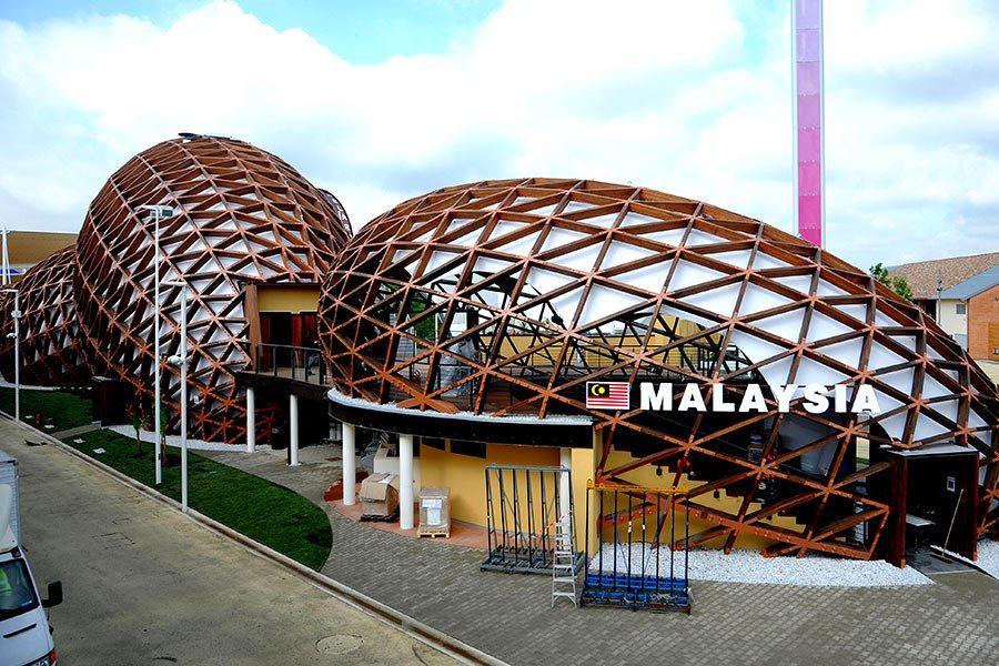

Nikolay Milovidov, architect - I was onlywhat's on the expo. My opinion differs from the article. From an architectural point of view, only the English, French and Chinese really grab you - the rest is either completely secondary (like Palazzo Italia), or simply not worth it (like the same Foster with the Emirates). I didn't see any big architectural discoveries on the whole - everything is professionally solid. From the point of view of exposition design, the South Koreans are beyond competition. unkproject.ru
China Pavilion
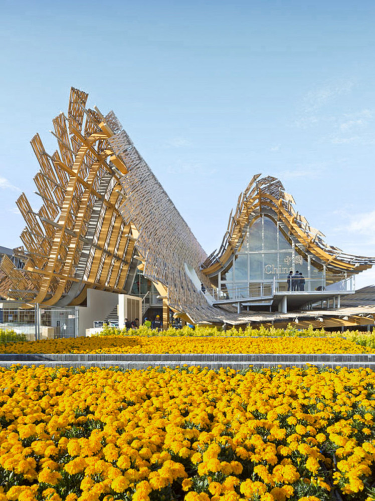
The Chinese Pavilion, designed bydesigned by architects from Tsinghua University + Studio Link-Arc, is an undulating wooden structure covered in lattice bamboo panels. The architects say that the main goal of their work is to convey to visitors a simple idea - technological progress is possible only in alliance with nature.

Italian Pavilion
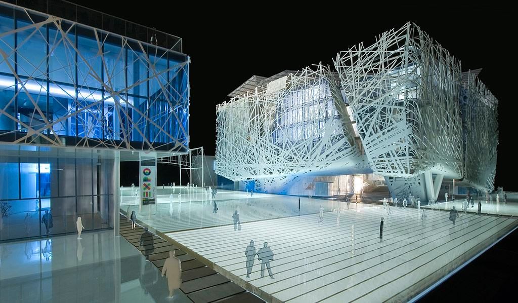
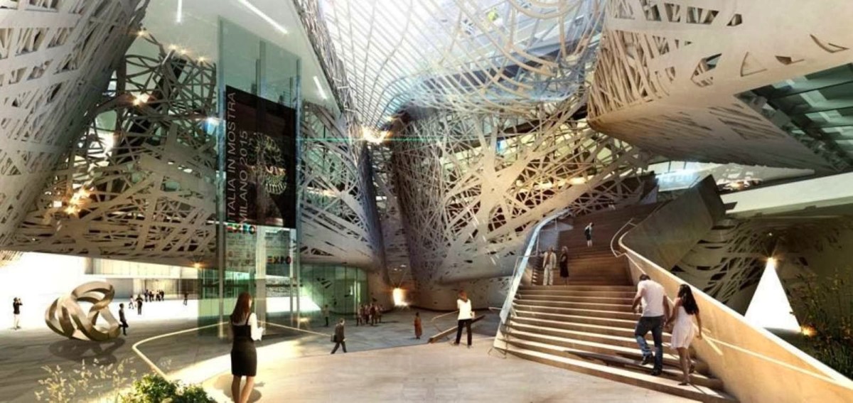
Italy decided to watch this yearexclusively into the future and transformed its Palazzo Italia pavilion into a man-made energy-efficient oasis. Architects from Nemesis & Partners, using biodynamic cement and photovoltaic glass, which are still little known to the Russian eye, created giant trees that convert harmful volatile substances into inert salts, and sunlight into living energy.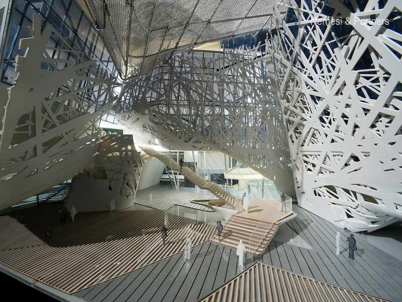
Kuwait Pavilion
The Kuwait Pavilion was designed by StudioItalo Rota demonstrates the long-known, but no less relevant connection between traditions and modern technologies. From the outside, it seems that the pavilion is hovering in the air and is about to break into the sky. The whole point is that, when creating the project, the architects were inspired by the design of traditional Kuwaiti dhow boats.
Vanke China Pavilion
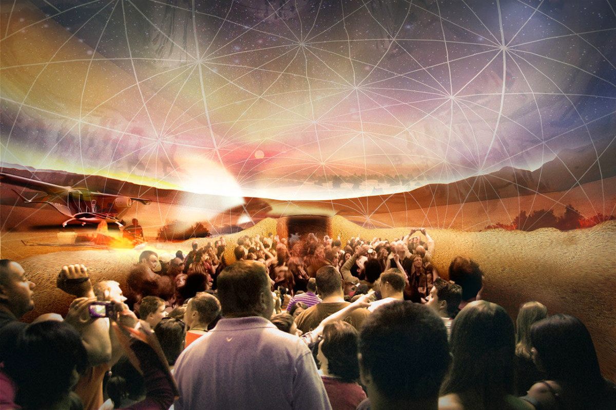
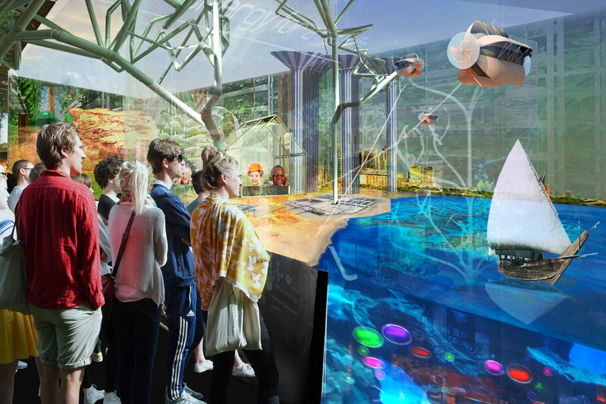
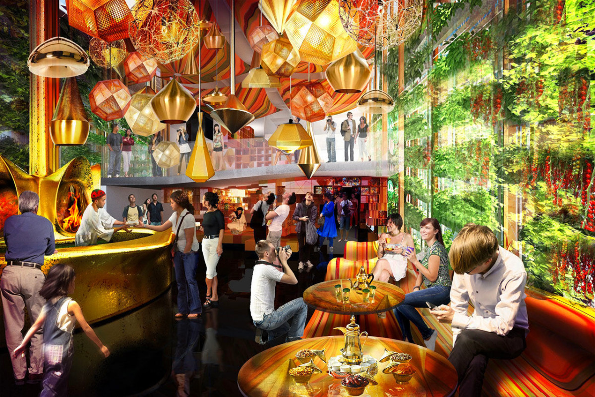
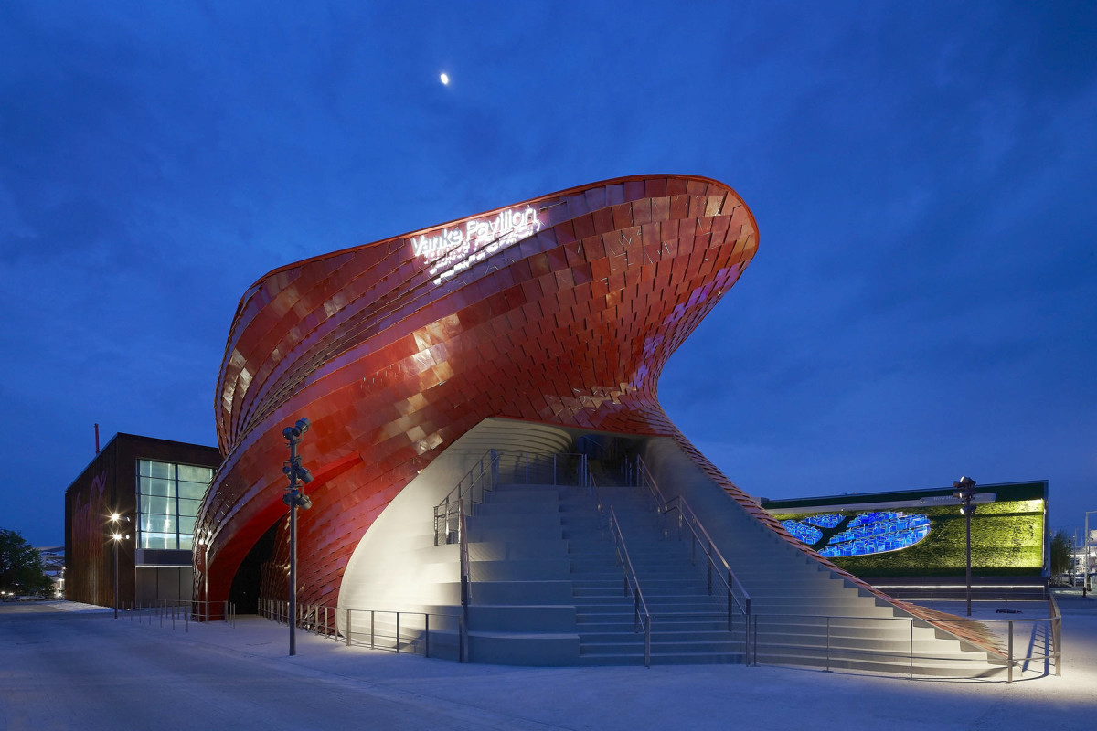
We couldn't ignore Daniel's creation.Libeskind (Daniel Libeskind) for the corporate pavilion of Vanke China. Here three cultural trends of China are intertwined at once - traditional Shi Tang canteens, Chinese landscape and, where without them, dragons. You will hardly be able to distinguish one from the other in this design, and there is no need for this. The main thing is visual impact, and this is exactly what Vanke China tried to achieve.


Russian Pavilion
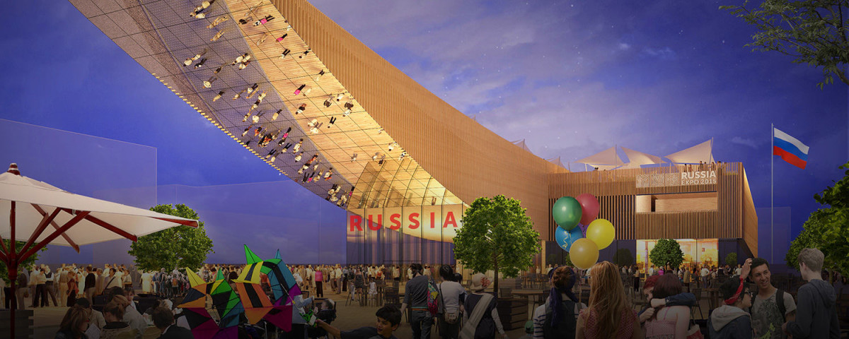
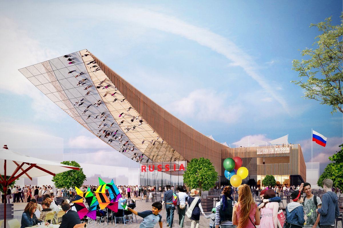
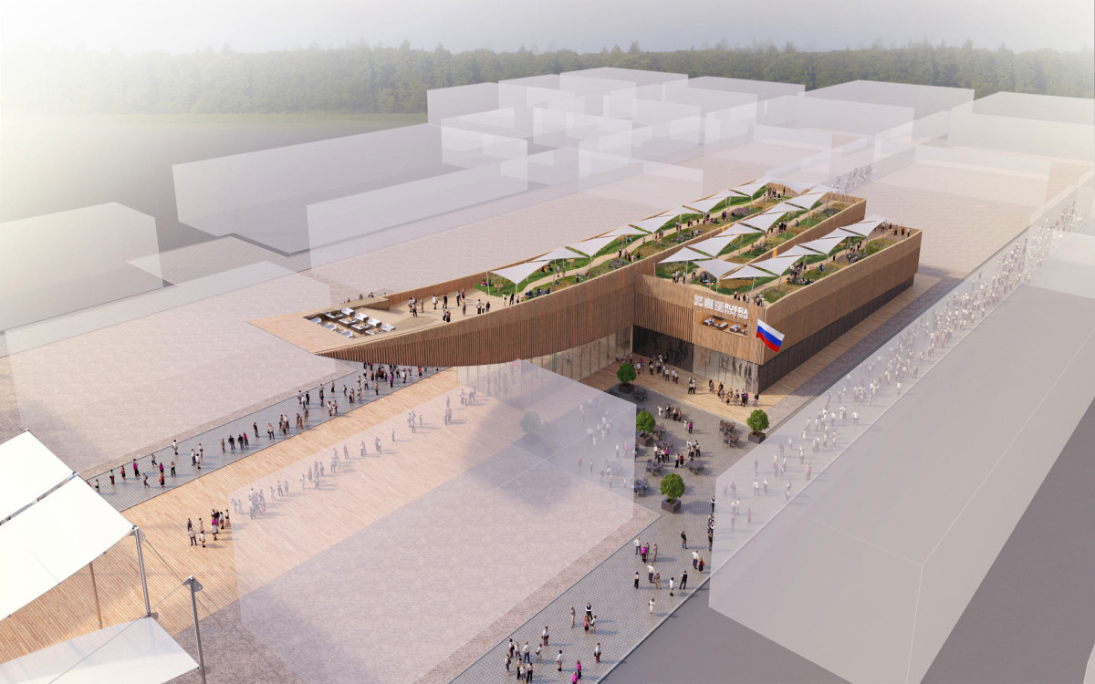
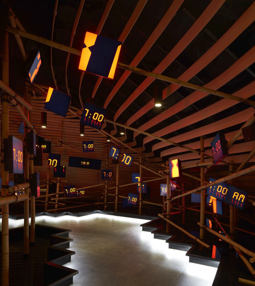
Well, what about us?Our pavilion was designed by architects from the famous Speech bureau, and the main idea of the design was the progressive course of development that has long been familiar to us and has already become our home - forward and upward. Structurally, the idea was a success. The pavilion turned out to be spectacular, dynamic and memorable. Two billion rubles were not spent in vain.