Many customers do not agree on the choice of brightshades of wallpaper or fabrics, preferring calm combinations, discreet tones and light pieces of furniture. The designer tells how to add colors to the interior and not overdo it. Fear of bright colors is a problem known to many. Often, designers even feel that the customer would like to make the interior brighter, but is afraid of color, afraid to make a mistake with a shade, afraid that tomorrow he will get bored with a crimson wall or floral wallpaper ... We turned to designer Victoria Vlasova for advice. Victoria Vlasova, designer-architect: - The reason for this choice is that many clients have no idea how their interior will look and be perceived in a brighter color scheme. However, today the choice of wallpapers, textiles, floor coverings and furniture is very wide, and it is the designer's task to explain and demonstrate interior novelties to the customer. victoriavlasova.ru Let's give an example. If the client prefers a classic interior, many designers offer to arrange it in calm beige shades. However, even for such houses there is a wide choice of color palette of wallpapers and fabrics that will give the interior a freshness and a new sound. For example, interesting Delhine Walls and Textures fabrics with a check pattern or stripes in various shades will look great in a classic style interior. The geometric pattern will give the interior dynamics and make it more sunny. 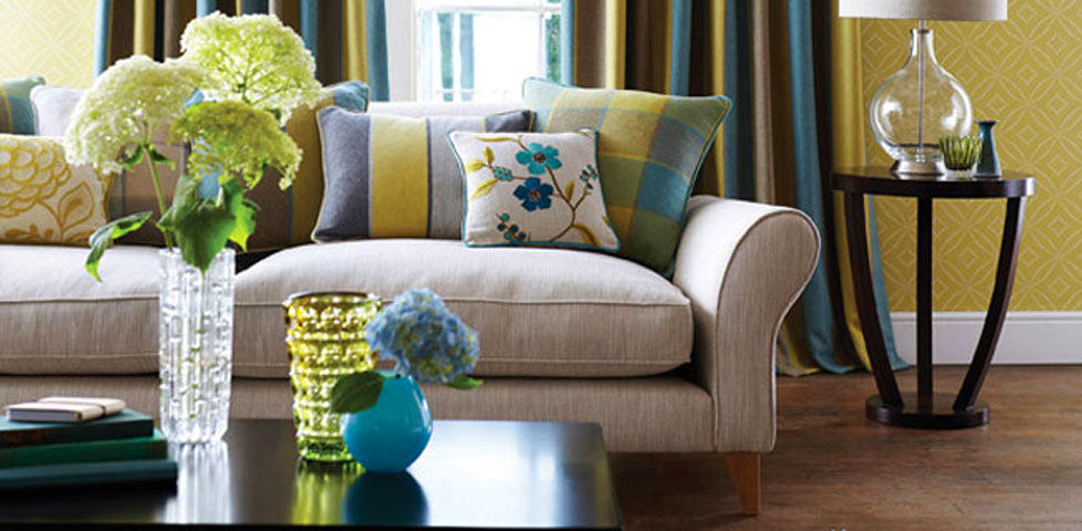
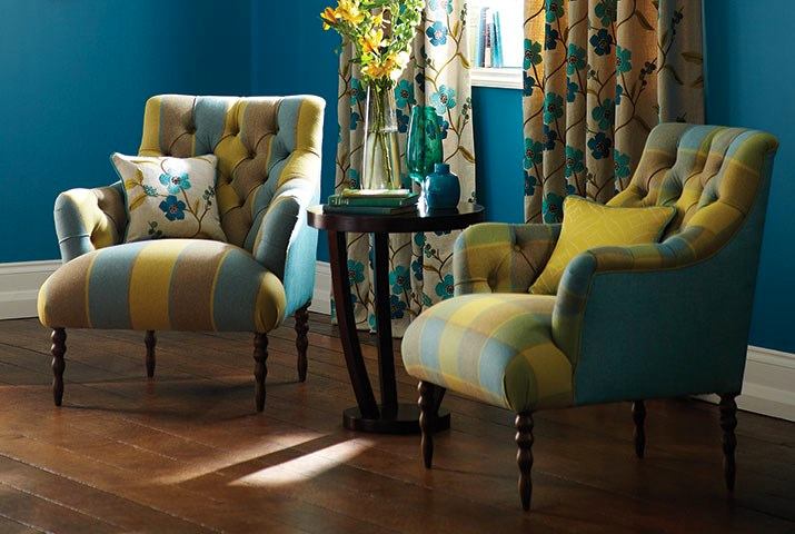
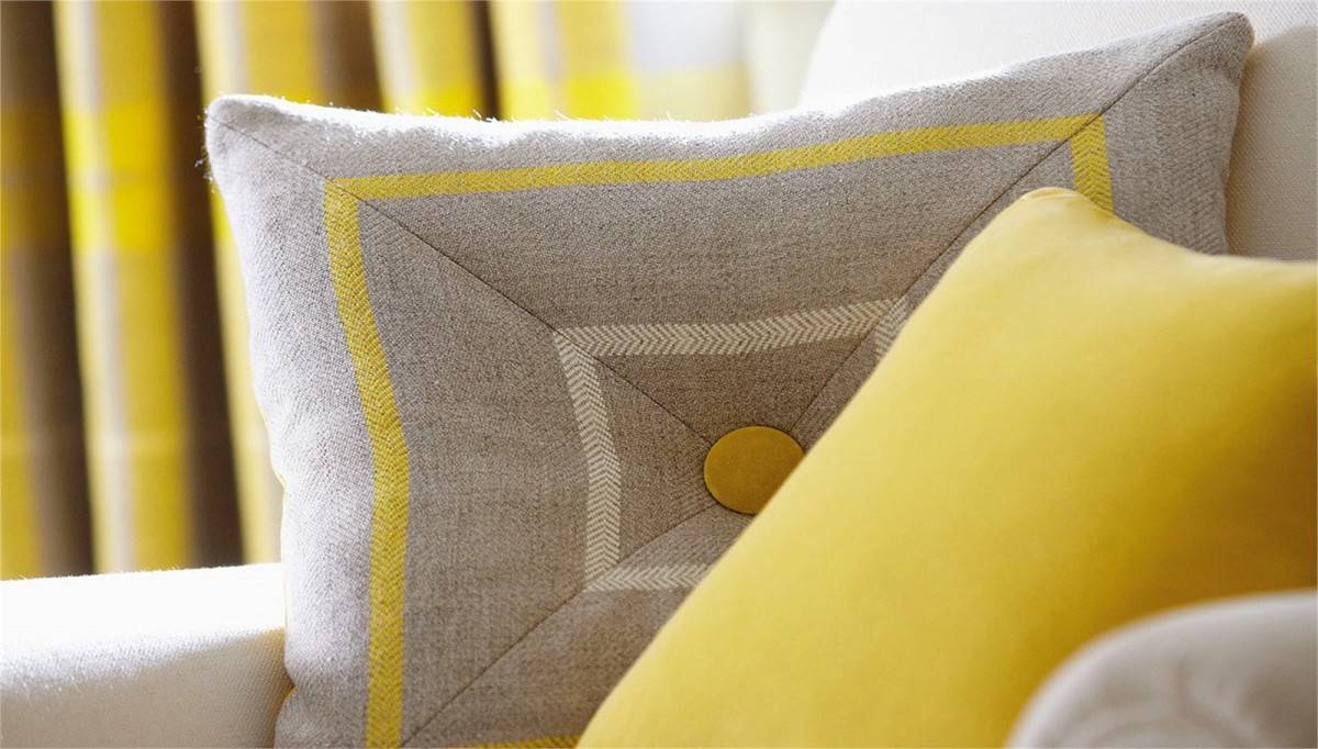
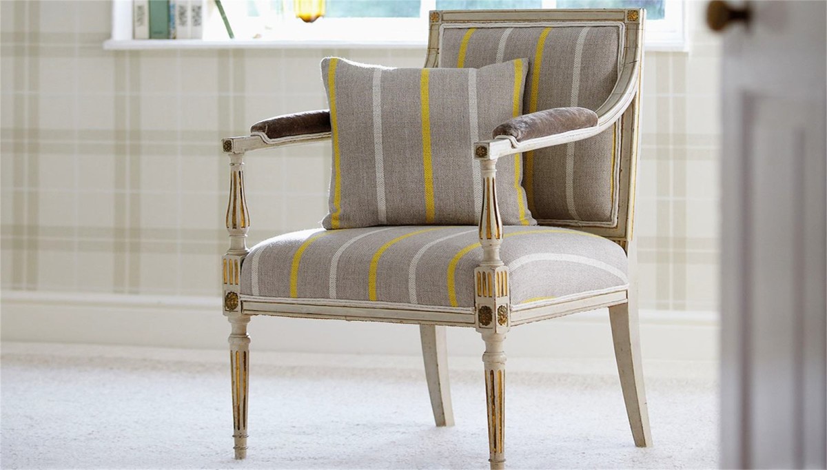
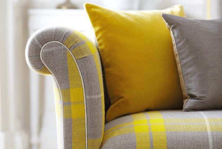
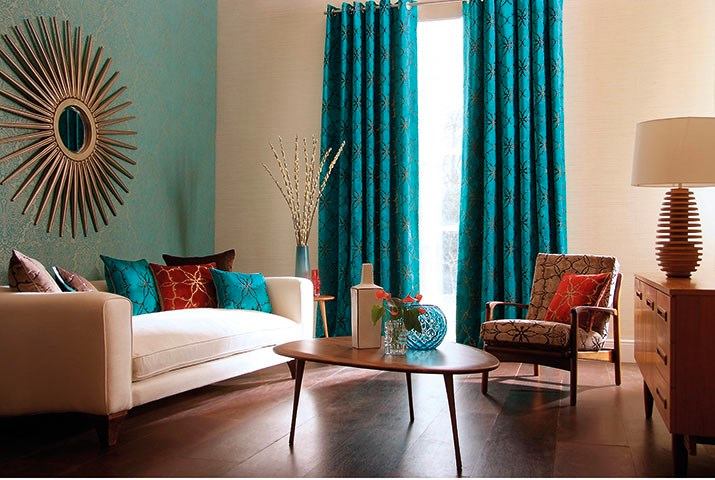
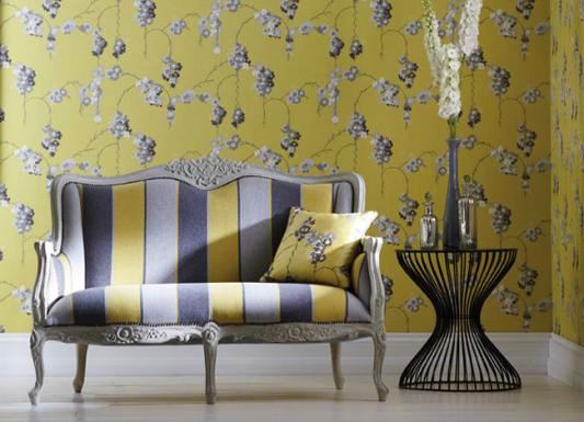 In the interior, made in the English style,The combination of gray and yellow or gray and blue shades will be a perfect addition to architectural rigor. For example, in the interior, executed in calm gray-beige tones, you can add bright details: cushions and curtains created from the fabrics of the Folia Checks and Stripes collection.
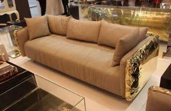
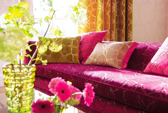
 Those who are ready for bold experiments, you canOffer textiles of deeper shades - noble claret or dark turquoise with a small geometric pattern. Curtains in combination with decorative pillows, made, for example, from the fabric of Pasha Fabrics or Tamika Plains, will become a bright color spot that does not overload the interior and gives it a noble personality.
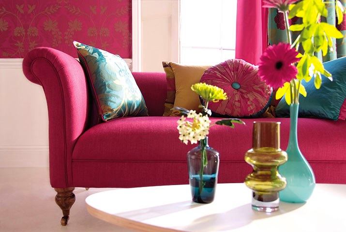

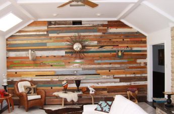
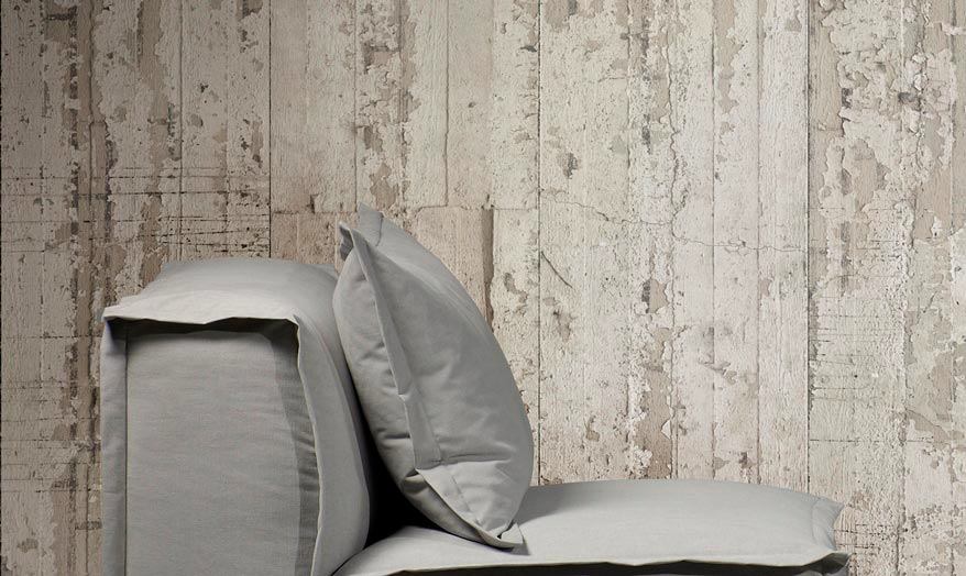
 Playing with color always borders on the theme of choicetextures and patterns of the materials used. You should not fill the interior with both. If a complex pattern is present in the decoration of most of the interior, it can be repeated only in small details, and not try to fill the entire space of the house with active prints and color. When choosing a bright shade of the walls, you should pay attention to quieter furniture. And by creating interior decoration in laconic colors, furniture upholstery can be made more accent. For interiors in a modern style, working with color is familiar. This is where trendy palettes with geometric patterns come to the rescue. In modern interiors, Piet Hein Eek wallpaper, made in the loft style, looks great and gives the house a bright and extraordinary effect. Colored lamps, armchairs or art objects are perfectly combined with such wallpapers.

Practical advice from Victoria Vlasova
Photo: http://www.victoriavlasova.ru/, http://www.designboom.com/, http://www.harlequin.uk.com/