The role of color in the interior is enormous.Our mood and well-being depend on the shades we see every day. What color schemes should we choose for the kitchen so that breakfasts, lunches and dinners bring only positive emotions? We will tell you now The kitchen is the room in the apartment where almost any shades are appropriate. The secret is in their correct use. In addition, you should decide on your desires. What do you expect from the kitchen? Should it bring cheerfulness or calmness? Would you like to see the kitchen interior in a single color or do you like unusual color schemes? You can see a variety of options for colored kitchens . And to make it even easier for you to decide and make an important decision on what color to use in the kitchen, we will share valuable ideas with you.
Let there be light!
You probably know that light colorsvisually expand the space. Therefore, if you have a small kitchen, it is best not to use dark shades in the interior. But to avoid boredom, give preference to brightly colored furniture and accessories.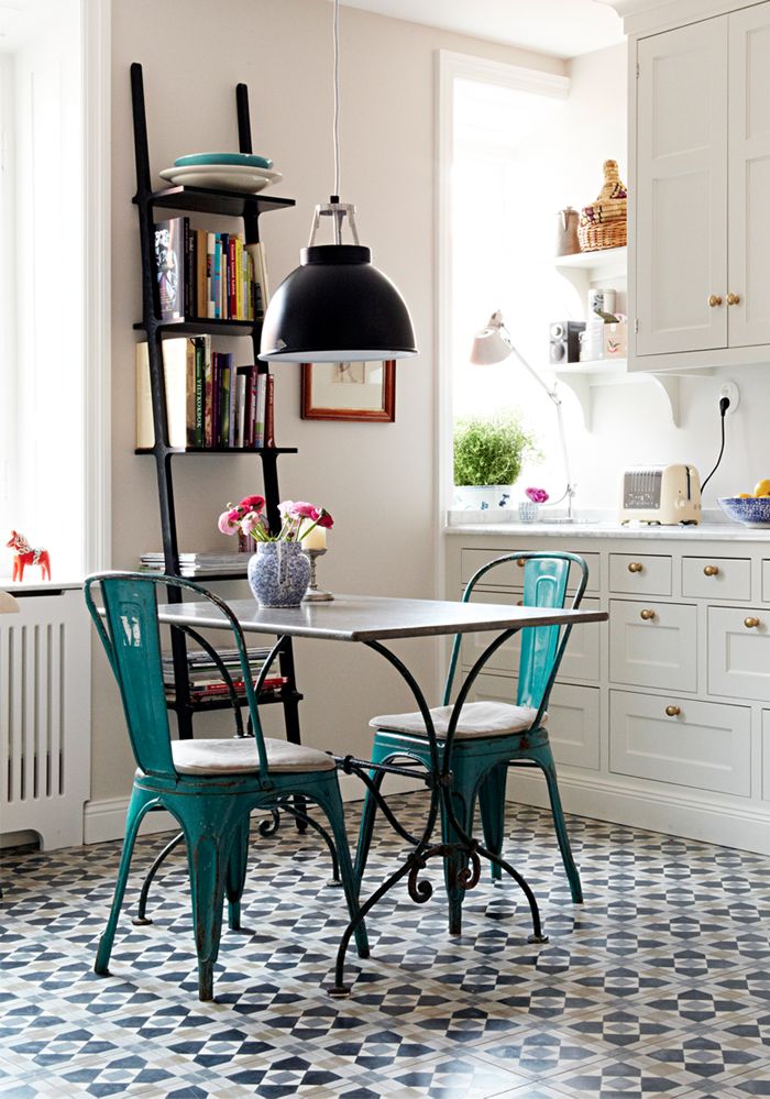
Red kitchen
Red kitchen is an option for the brave.This color stimulates the appetite, which is just what is welcomed in this space. However, a strawberry-colored kitchen is absolutely not suitable for those who are on a diet.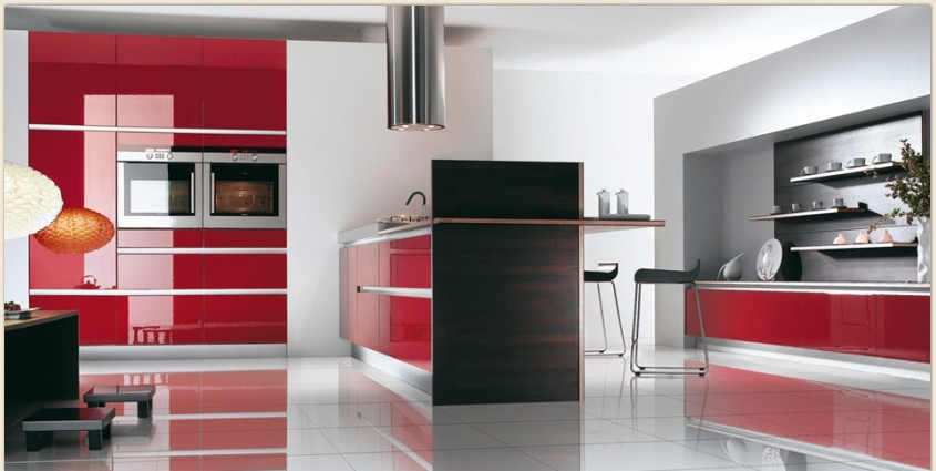 Artur Guchigov, export manager of the Mobalpa brand:— Gray and all its shades are in fashion now. It goes well and easily with many bright colors — for example, with mustard or bright red. There is a tendency now for bright colors to be present next to calm shades. This is due to the crisis: people are busy at work and, when they come home, they want to see something relaxing. This explains the popularity of gray kitchens, as well as the desire to evoke positive emotions with the help of bright spots. But the classic and best-selling color among kitchens is still white and its shades. mobalpa.com
Yellow kitchen
Positive yellow color is quite often used in kitchen design. It really creates a warm atmosphere and makes the room cozy.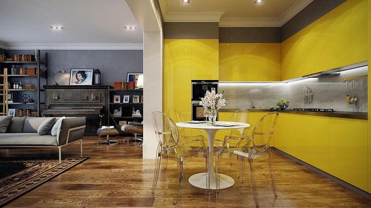
Blue Kitchen
The blue color will create a feeling in the kitchencoolness and freshness. In such a kitchen you will definitely feel calm. However, keep in mind that this color reduces appetite. You can see amazingly beautiful blue kitchens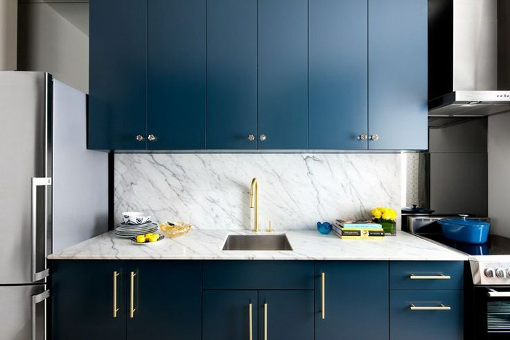
Blue Kitchen
The blue kitchen, just like the blue one, is notpromotes appetite. In addition, such a space may seem too cold to you. However, if you have a small room for cooking, then the blue color will help to visually expand it.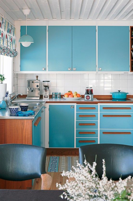
Orange cuisine
Orange is the color of positivity and movement. Such a kitchen will whet your appetite and lift your spirits every day. However, if you are into diets, you should choose another option.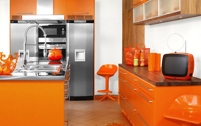
Green kitchen
Green color has many shades, whichallows you to choose the option that you like. It is a calming color that is well suited for the kitchen. It goes well with beige, cream and brown colors.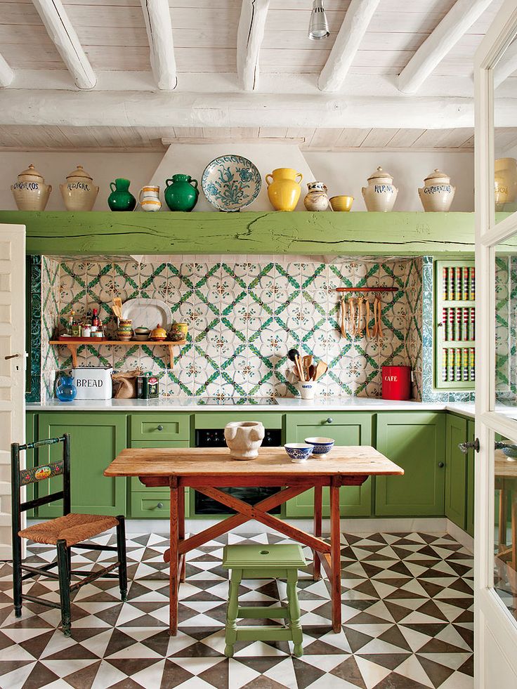 Our opinion:— Turquoise and olive tones are perfect for a Provence-style kitchen, and for a high-tech kitchen, it is better to choose acidic shades. Then your space will truly become harmonious.
Gray Kitchen
Gray is very fashionable now. It relieves tension and can be used as a background for bright details. In addition, it can be used in both compact and spacious rooms.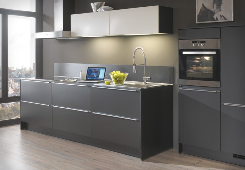
Black kitchen
Black color in the kitchen will help to maximize concentration. However, be careful and still dilute this strong color with light elements.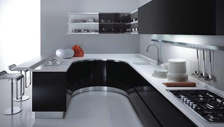
White kitchen
A white kitchen is a fairly common option. It is believed that white has a positive effect on appetite. Our opinion:— White and black go well with almost all other colors. That is why it is very convenient to use them as base colors. Bright and saturated colors will play best against such a background.
Brown kitchen
Brown is a practical and neutral color, it can be called classic. It is found in the design of many apartments. To avoid a boring interior, use unusual details.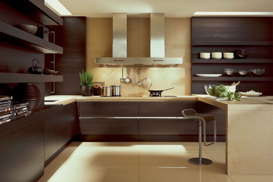
Black and white
The combination of black and white in the kitchen will lead to the fact that the main role in such an interior will be played by the form. In addition, such a duet visually increases the space.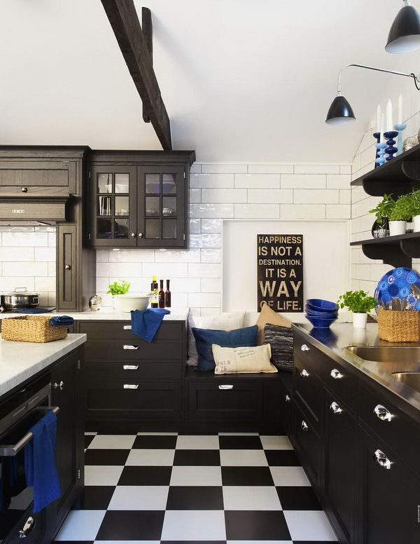
Two-color set
A two-tone kitchen set may wellbecome an interior solution that will make your kitchen interesting and memorable. The main thing is to choose colors in such a way that their combination represents absolute harmony.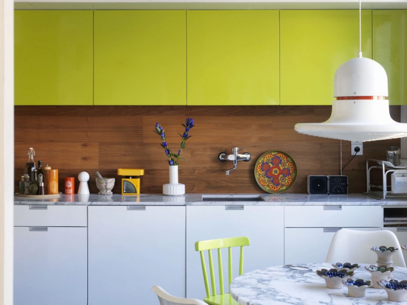
Contrast colors
Contrasting color combinations in the kitchen can make this room the most stylish in your home. Be bold and choose this option.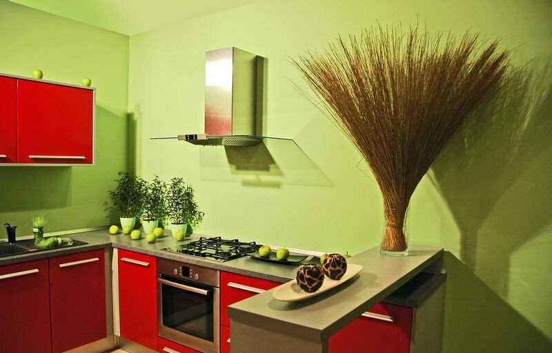 Our opinion: - Use contrasting color combinations only in spacious rooms. Otherwise, your small space will visually become even smaller.
Furniture - darker
If you use the same color for the walls of the room and the kitchen set, then choose furniture for the room that is darker than this shade.
Many colors
A multi-colored kitchen is an option for creative people. However, when creating such a colorful interior, remember that it is best to combine no more than five shades in the space.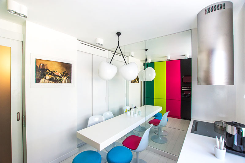
Different shades
Use shades of the same color in the space. In addition, the same color on different textures of materials has a different appearance.
Selecting zones with color
Highlight different functional areas of the kitchen with color. Correct use of this technique will allow you to visually expand the space and correct the shortcomings of the layout.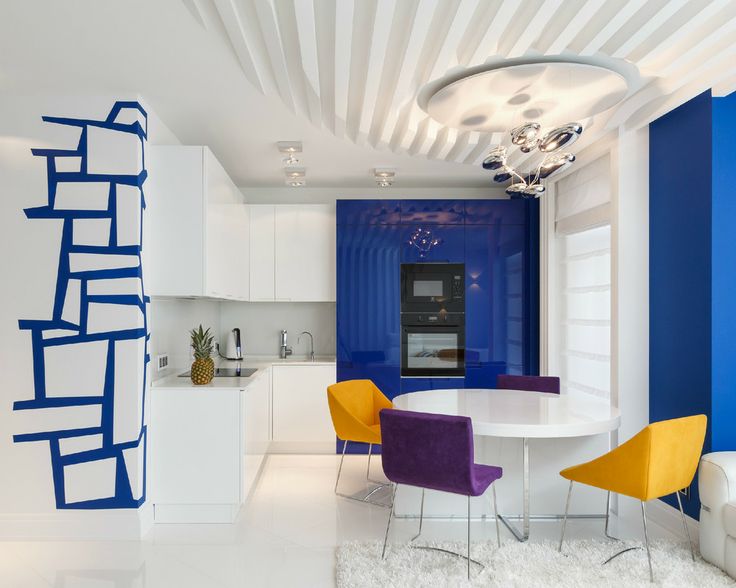 Mito Melitonyan, architect:— I mostly work with apartments where the kitchen space is not separated from the living room or dining room, but is a single whole. In this case, the color scheme is subordinated to the overall palette of the interior, but the kitchen facades can be contrasting. For example, I now have a property where the kitchen is not separated from the living room and dining area. This is not a very large space, about 50 m2 of total area. The tone of the walls and doors is the same — a complex gray color with a coolish blue tint. The kitchen facades are made of natural wood panels. The countertop is made of stainless steel, that is, a very technological solution, and it greatly contributes to a favorable climate in this area. If we again take modern solutions, then I believe that the most important thing is to ensure that the kitchen as a whole does not differ from the rest of the interior, even if there is none in principle (as in ordinary houses). I do not recommend painting the kitchen in beige colors or pasting wallpaper. If you really want creativity, then it is better to make some kind of large graphic drawing on the entire wall. I really like the solutions in American houses, when the kitchen is painted in quite strong and bright colors, for example, dark green, brown, dark red. It looks very bold. The family spends a lot of time in the kitchen, and it should be cozy there, and for this, the colors should not be faded and delicate. It is undesirable to use wood such as pine with a classic layout of glass inside in squares on the doors. Such solutions should be forgotten and never returned to - they are relics of the past, it is better then to have a completely white enamel facade. In general, it is quite difficult to give recommendations on colors, since all decisions are individual, and it is necessary to understand the character of the interior and the owner. What you definitely should not do is realize childhood dreams and paint the kitchen pink. melitonyan.com
Floor and ceiling
Do not decorate the floor and ceiling using the same color - this will visually reduce the volume of the kitchen. Use different colors in the design of these surfaces.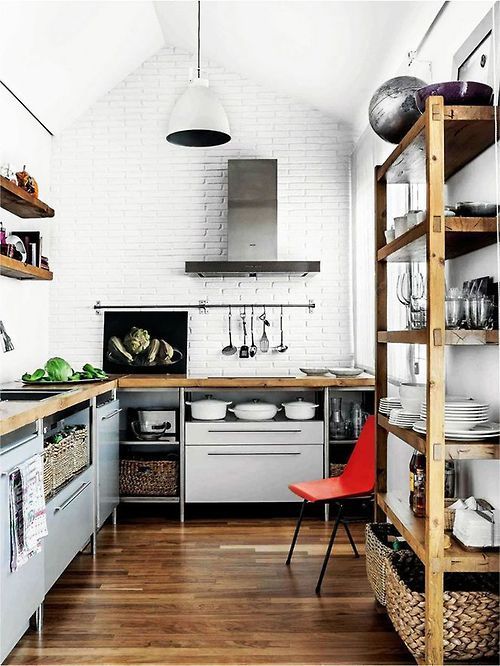
Brightness and calmness
It is best to choose a kitchen set in a calm shade if your walls are painted in a bright color. Then the room will be harmonious.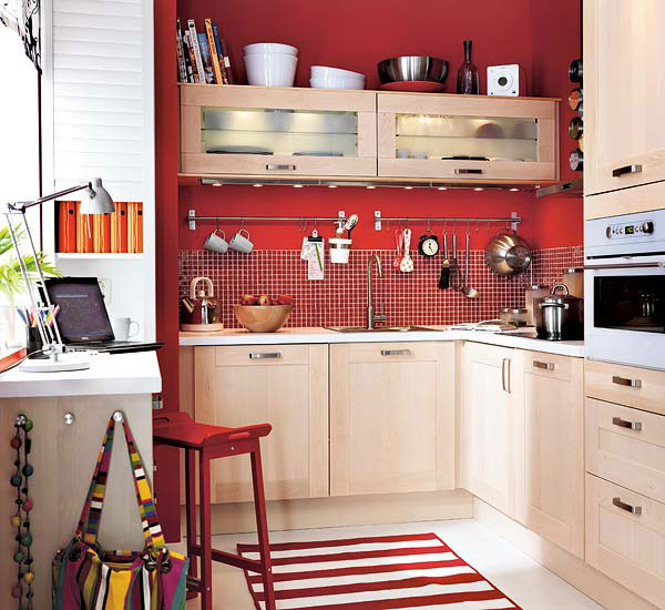
Bold accents
You can choose the following option: a kitchen in a calm color scheme plus many bright color accents. In such a room, you can constantly adjust the color filling of the space. Our opinion An excellent option is to use bright textiles in a white kitchen. Curtains, towels, potholders of intense color will become a real decoration of your kitchen.
Matte or glossy?
Remember that colors sound different in different textures. Thus, gloss enhances saturation, and a matte surface mutes the color.
We make apron
It is best to design the kitchen apron in colors that are opposite to the kitchen set. This will create the necessary color accent.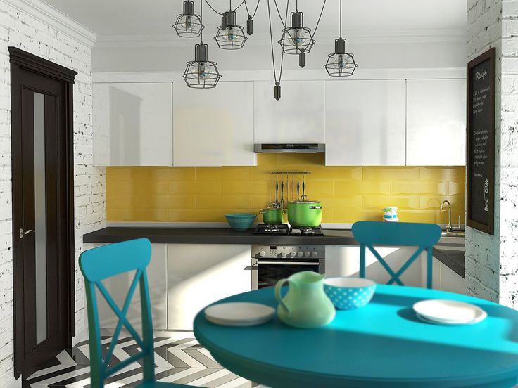
Neighbor colors
To create a harmonious interior, you can use colors that are adjacent in the color wheel. For example, orange, yellow and green.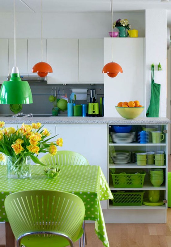
Dilute the color
If an intense color is used as the main color in the kitchen, it can be diluted. This is achieved by using tiles or metal in the decoration of the apron. Our opinion:— Consider the direction of natural light. If the kitchen window is on the sunny side, choose light colors. Otherwise, you should give preference to bright shades.
Laconic metallic
Metallic will make your kitchen unusual. It is best to use it in rooms with light shades.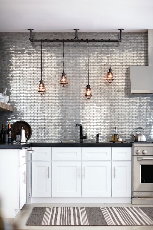
Walls of calm color
If your kitchen has bright furniture, the walls should be calm shades. This rule also works vice versa.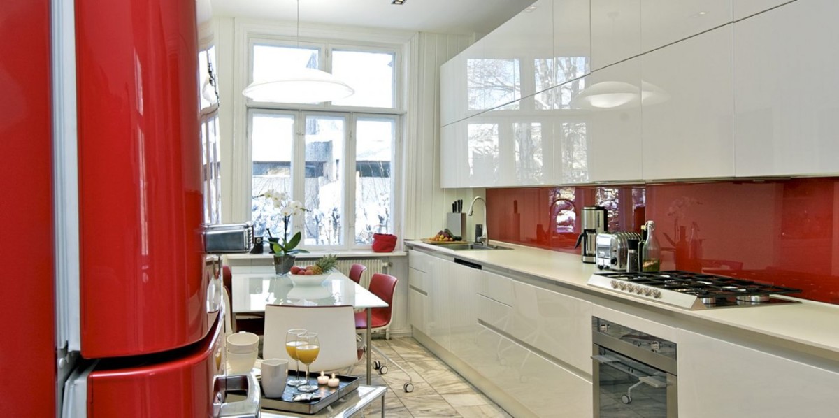
Color accent
Use bright paintings and photographs in the kitchen - these are great color accents. Such beauty will not go unnoticed.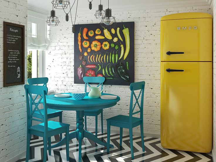
Bright apron
The apron can become the brightest place in the kitchen, for example, due to colorful patterns. Pay special attention to the choice of the apron design - it should not bring disharmony into the space.
Dining area
You can highlight the dining area in the kitchen with color. For example, with a table or lamp in a contrasting color.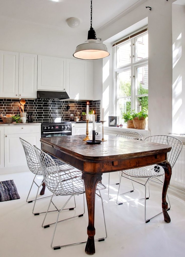
Bright ceiling
The ceiling is another area in the kitchen where you can use a bright color. Read on to find out how to do it right .
Reduce temperature
Because of cooking, the kitchen is often hot. Using cool colors in this room can help change your perception of temperature.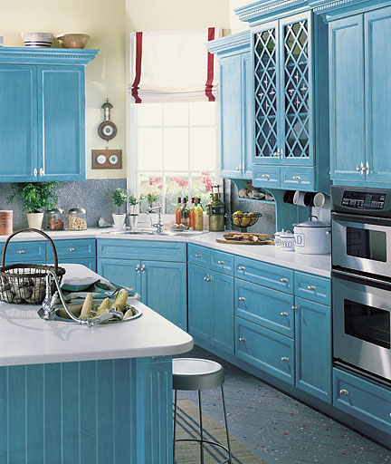
Miscellaneous invoices
Our opinion: - In the kitchen space, you can combine not only colors, but also different textures. This will make your kitchen diverse and original.
Bright tiles
Bright tiles in the kitchen expand the space. In addition, the use of such decor makes the room light and positive.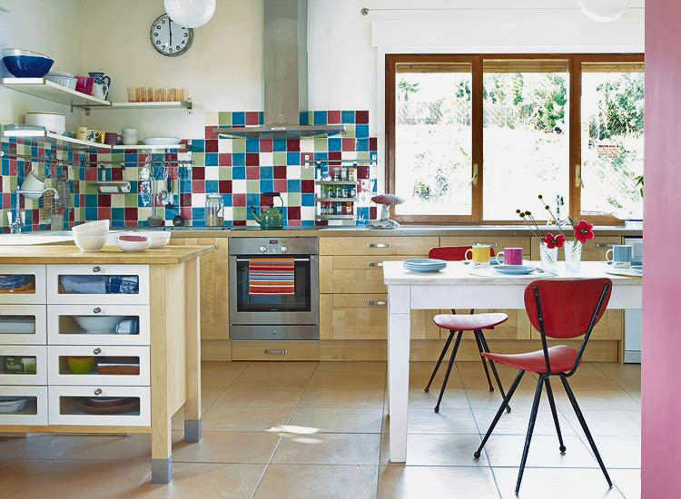
Low ceiling
If your kitchen has a low ceiling, you should paint the walls in light shades of green, yellow or orange. This will visually expand the space.
Tone to tone
Tone-on-tone furniture and tiles in the kitchen are a classic option that will always be relevant. You definitely won’t go wrong!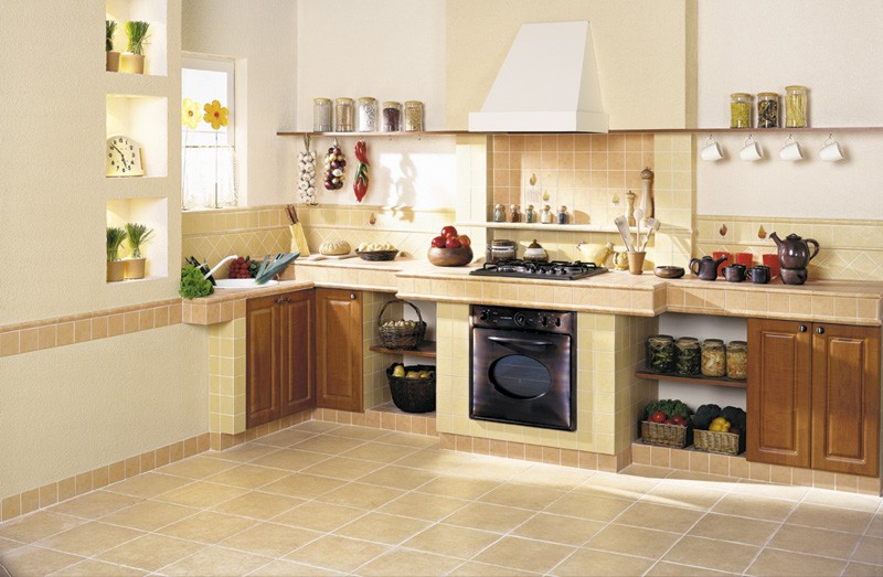
Paint choice
Have you finally decided what color kitchen you want? The next step is choosing the paint. Our . will help you with this too.


