There is little color here, but a lot of ideas and discoveries,which can be used in almost any interior to add coziness and brightness to it Minimalism, coziness and eco-friendliness have acquired a new meaning in this apartment. There are only four shades here, but thanks to the variety of materials and shapes, the interior turned out to be stylish, integral and incredibly warm. The author of the project told us how all this became possible. Tatyana Levina, architect
Member of the Union of Moscow Architects.
Graduated from the Moscow Architectural Institute, specializing in Residential and Public Buildings.
Winner of numerous professional awards and competitions. proektor.biz
— In this project we did a redevelopment. The main area became the living room, combined with the kitchen-dining room. It is large in area and the main one in purpose. All life is concentrated here.
There are three rooms in the private area of the apartment -children's room, study/guest room (future bedroom) and master bedroom with its own dressing room. There is also a bathroom here. In the public area there is a guest toilet. There is also a laundry room and a spacious hall with a wardrobe. There are only two TVs in the entire apartment - in the living room and bathroom.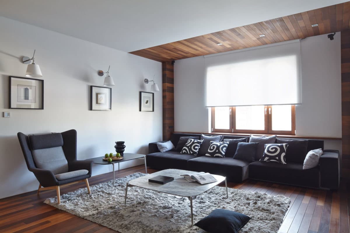
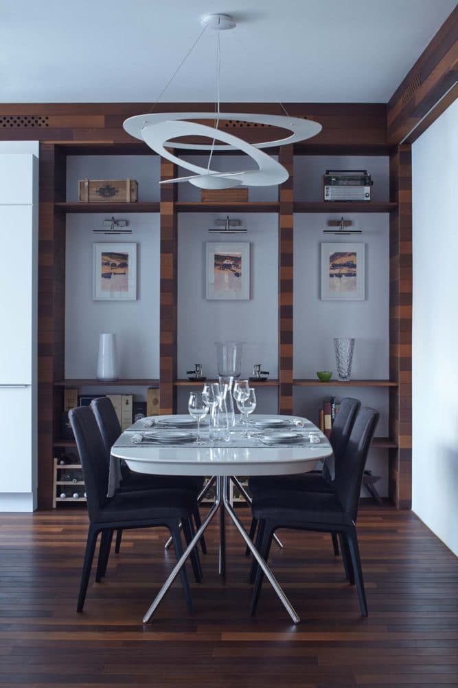
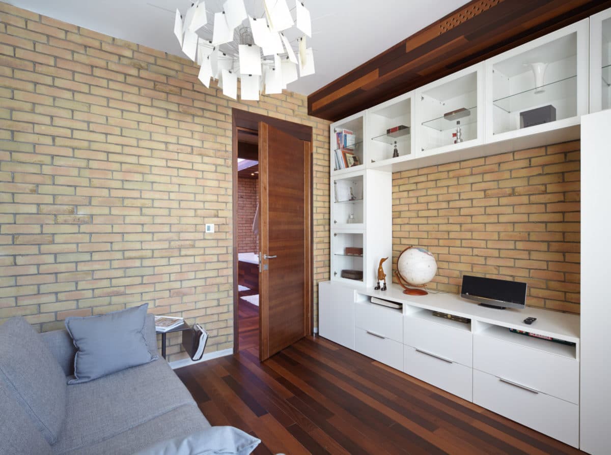
Four colors were chosen for the color schemeBasic shades: brown, beige, gray and white. Brown is thermo-board. Beige is brick. Gray is micro-cement. White is ceilings and cabinet furniture. The kitchen and wooden shelving in the living room are custom-made according to the author's sketches.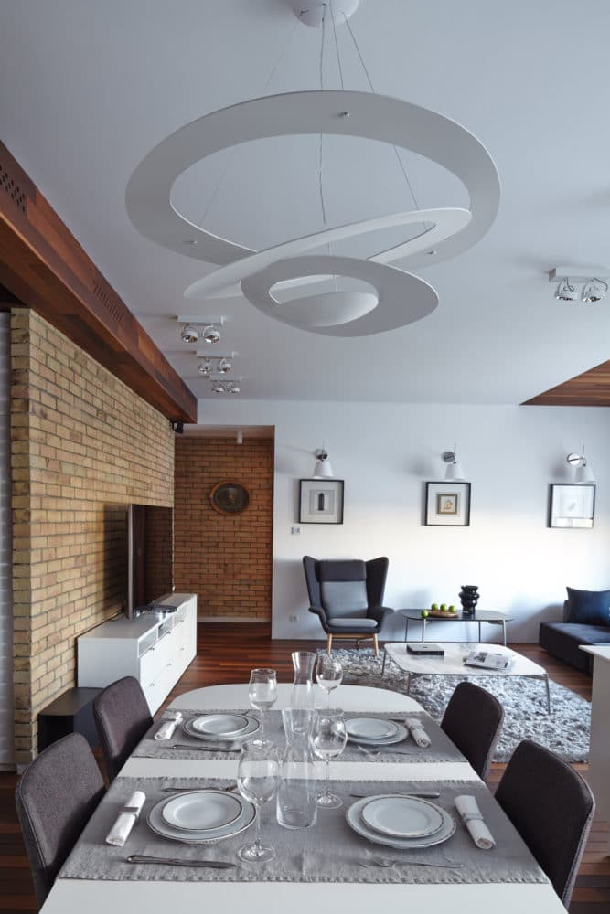
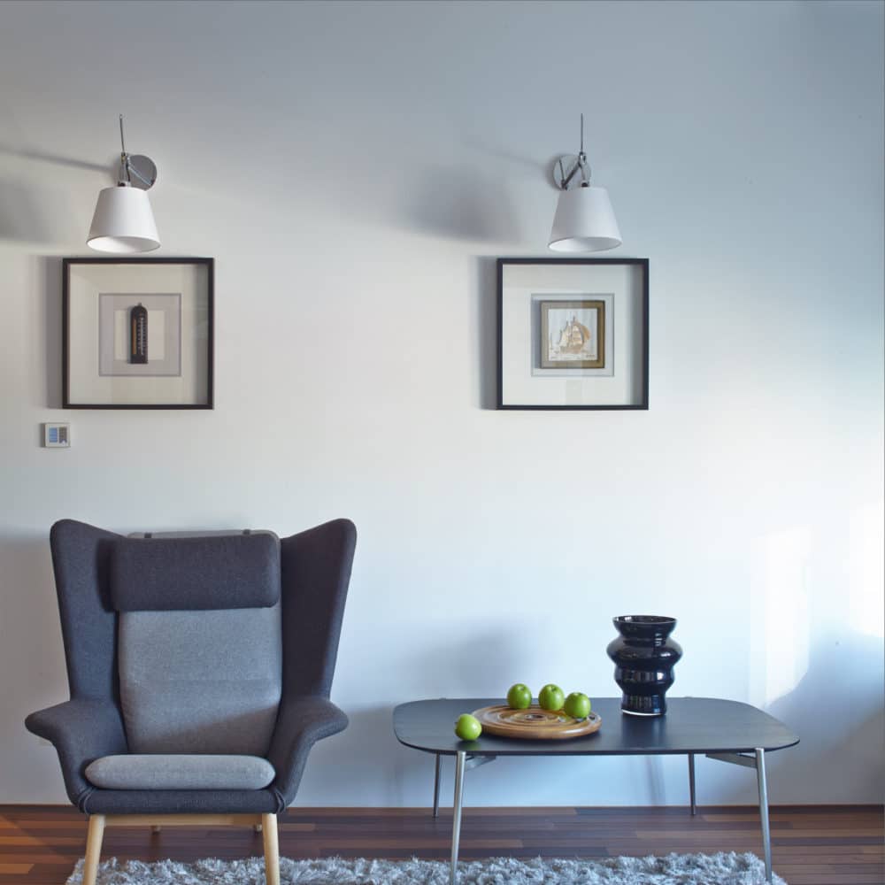
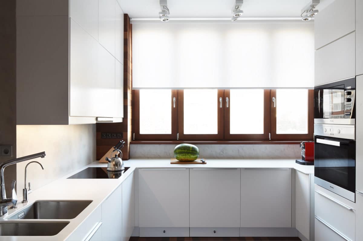
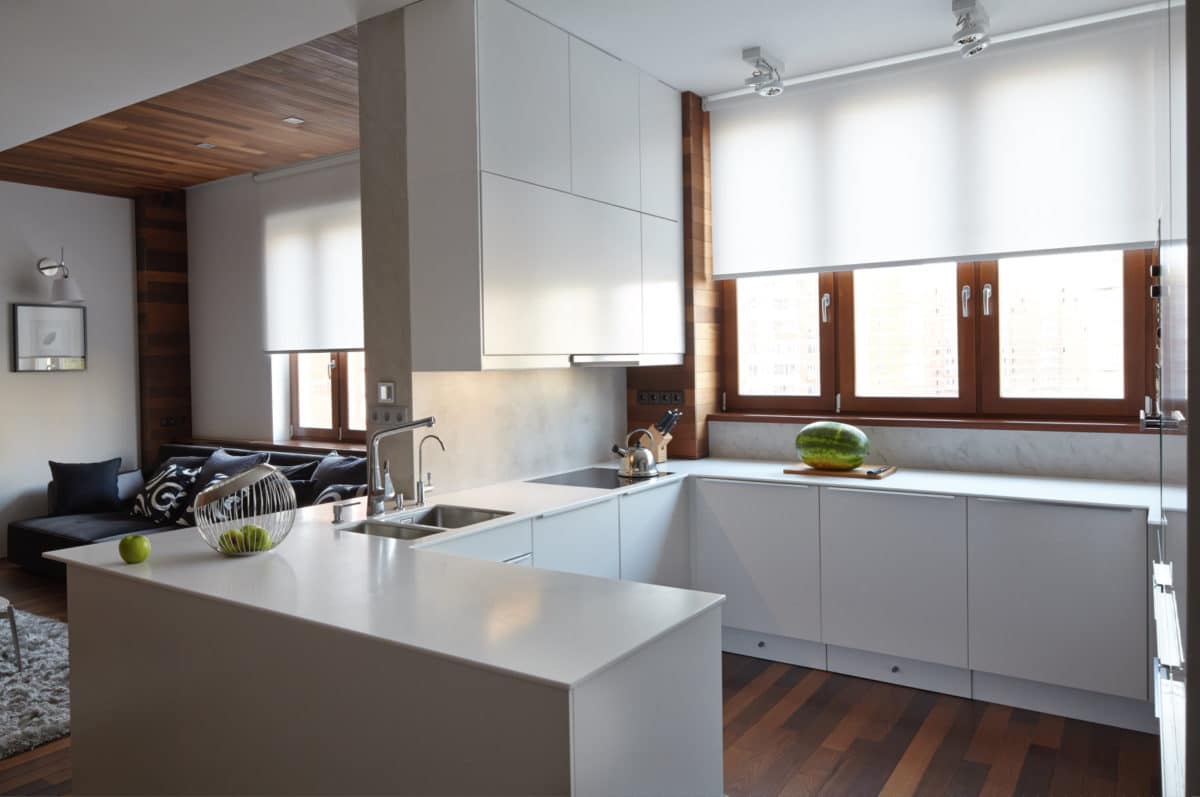
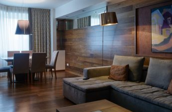
The furniture for the living room was selected based onfunctional needs. It was decided to take white, simple and laconic cabinet furniture. The upholstered furniture had to be luxurious: sofa - B & B, armchairs, dining table and chairs - Bo-Concept.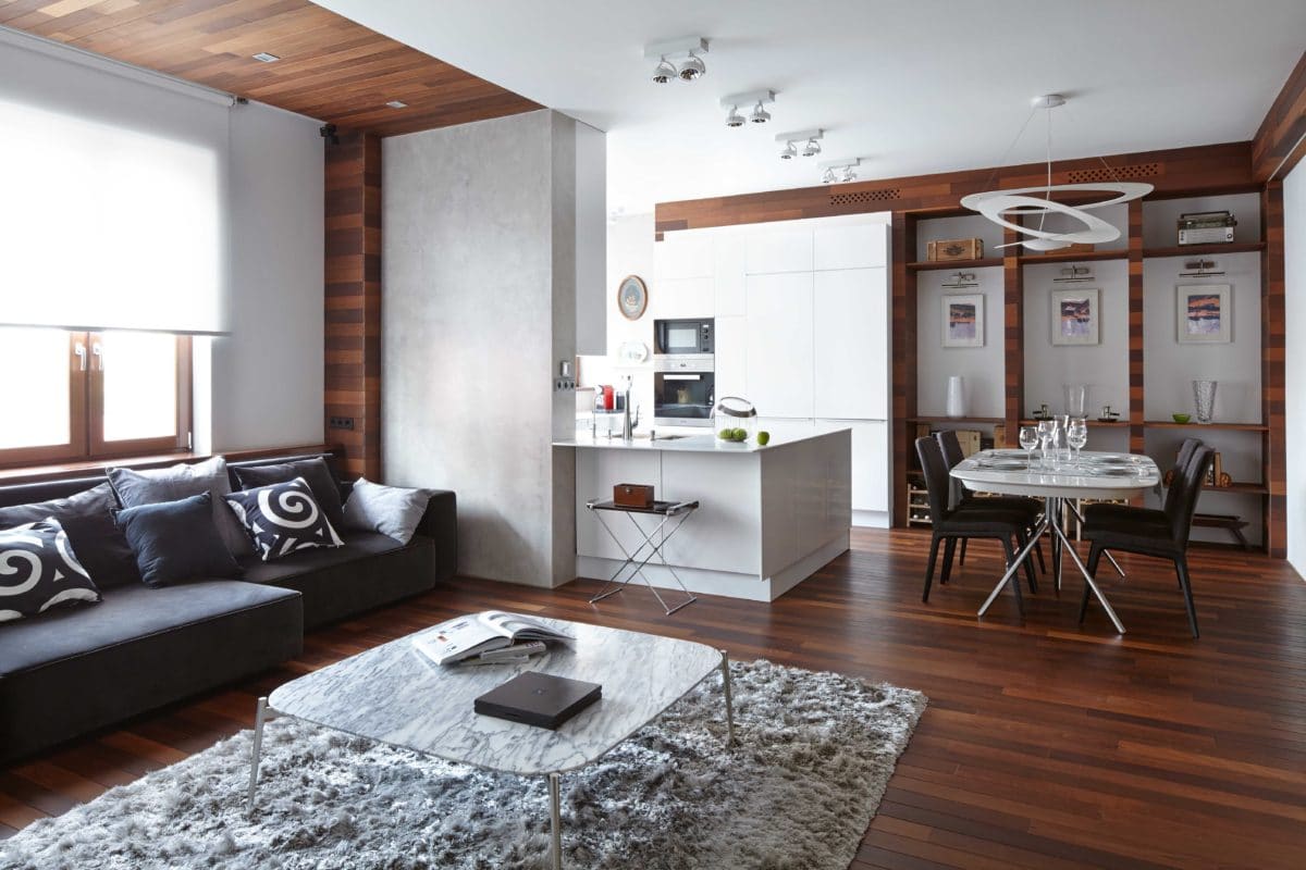
In the bedroom the idea is the same.With a simple and clear design of the space, the bed was chosen from the model range of the brand B & B. In the simple interior of the bathroom, we integrated expensive sanitary faience from Duravit. In other words, we worked with contrast, and not only in color, but also in materials.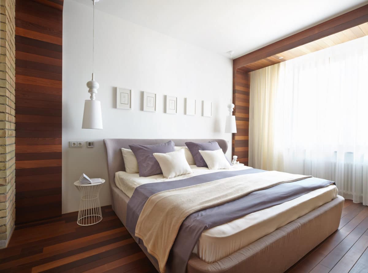
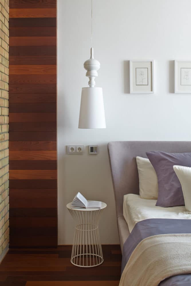
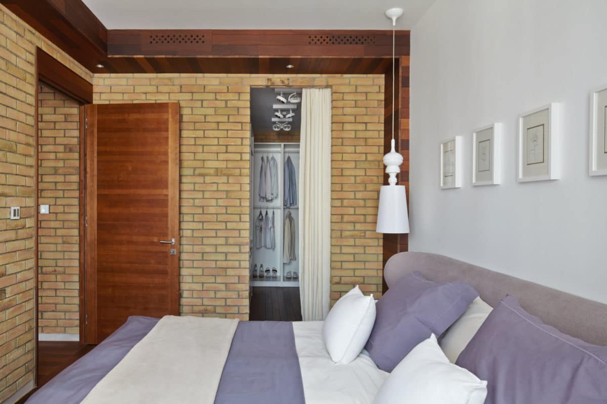

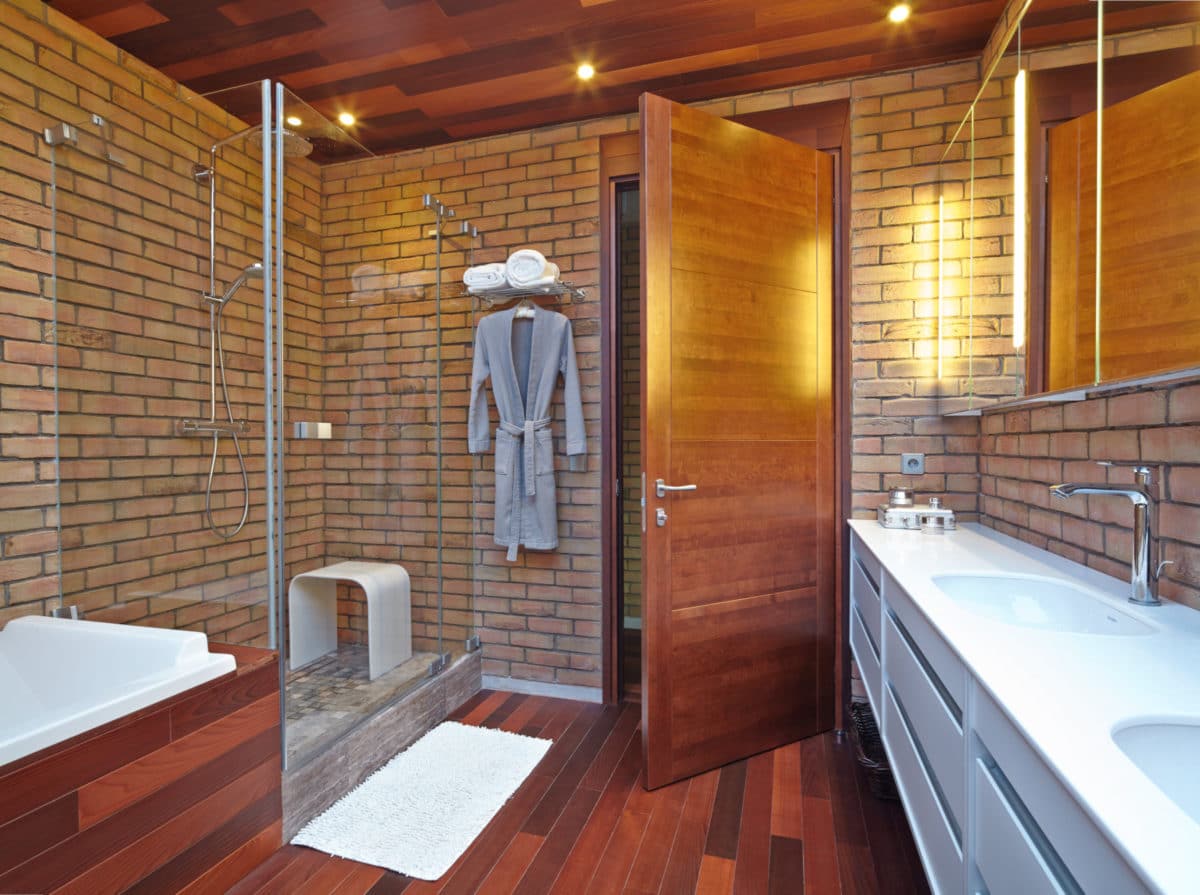
The entire interior space was created with precisiongeometric shapes. The floor finish here extends to the walls and ceiling. The white color of the ceilings goes down to the walls and continues in the design of the cabinet furniture. The gray color is in the microcement on the walls. The sofa and chairs work in contrast.

For finishing the floor in the apartment we chosethermo board, as this material can also be used in the bathroom. The color is rich brown, in different shades. This makes it easier to emphasize the naturalness of the material.