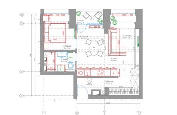
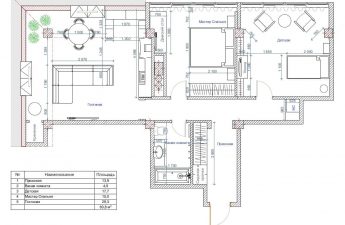
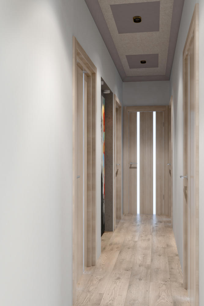
The designer of this three-room apartment projectVictoria Pashinskaya took into account the lifestyle features of the clients and created a cozy modern interior for them, in which it is equally convenient to receive guests, spend time together and relax after work. The owners of this apartment are a young couple leading an active lifestyle. Both are involved in sports: she trains children, he works as a sports doctor. In this regard, there are frequent business trips and emotional stress. That is why the interior of their apartment had to be not only modern and functional, but also as relaxing, calm and conducive to rest after a hard day at work. Designer Victoria Pashinskaya took on the task of bringing this idea to life. Victoria Pashinskaya, designer Victoria is the founder and head of PV Design Studio. In 2011, she graduated from the interior design department of the Stroganov Moscow State University of Art and Industry, and since 2012 she has been a member of the Union of Designers of Moscow. Victoria's works are exhibited at art exhibitions in Russia, and are also published in various Russian and foreign publications. Participant of projects on TNT, MIR and other TV channels. Professional credo: “The success of any project consists of the ability to hear and understand the customer, a well-thought-out volumetric planning solution, compliance with the budget and an interesting plastic and coloristic solution for the space.” www.art-design-victoria.ru Layout In contrast to the currently fashionable open layout, the clients asked Victoria to zone the space so that all the rooms were isolated from each other. That is why the layout turned out to be quite simple - such that when the owners came home, they could relax in a cozy, separate corner. Due to the large hall, the area of the rooms was increased, thus obtaining four almost identically sized rooms: a kitchen-dining room, a living room, a children's room, which for now serves as a guest room, and a master bedroom. On the other side of the hall there is a dressing room, a utility block, a bathroom, a toilet and a guest bathroom. Each room has access to a balcony, which offers a beautiful view of the city.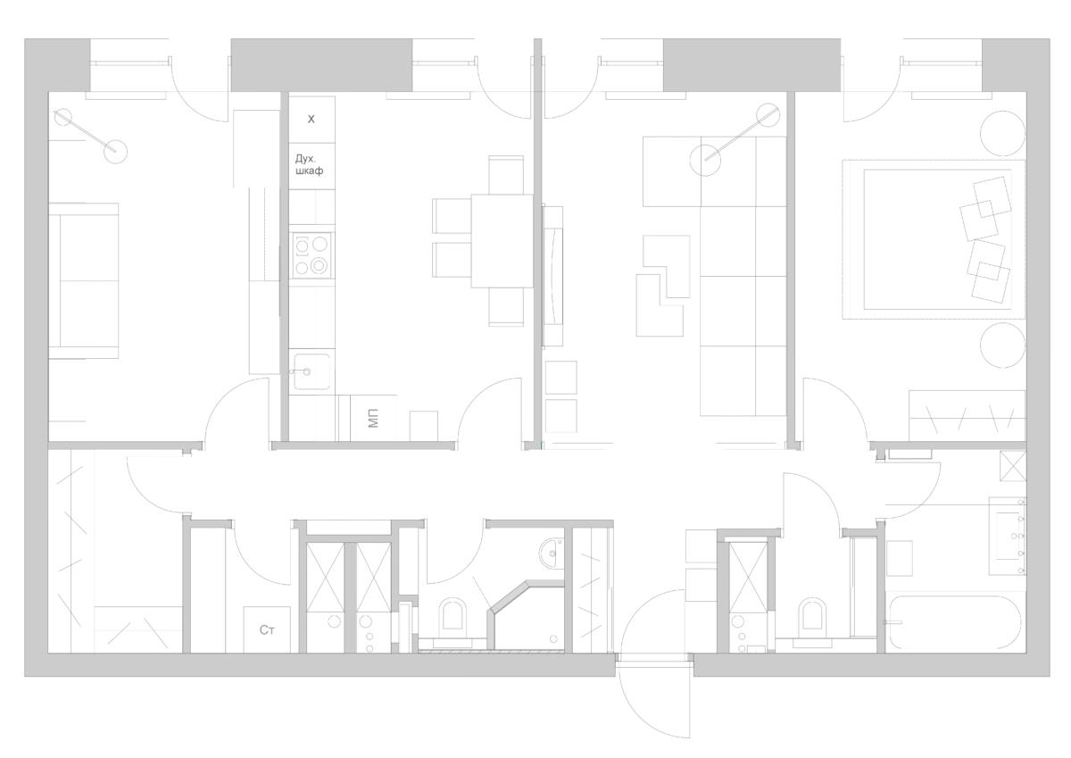 Hall A small corridor flows smoothly intolong and narrow hall. To prevent the latter from looking like a train car, the designer used a special visual technique - vertical division, created with the help of an original door model, which uses vertical matte inserts and a contrasting color. Such doors let in light perfectly, create a play of light and shadow and do not overload the space. The ceiling design laconically completes the composition.
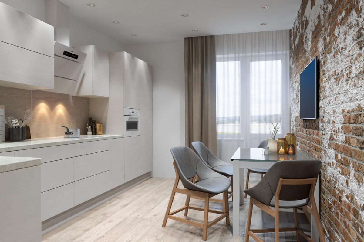
 Kitchen For the kitchen, we chose a single cornera kitchen set with a built-in dishwasher, refrigerator, additional freezer and oven. A dining area with a glass table and comfortable upholstered chairs was arranged against the opposite wall. To avoid a feeling of disorder later, closed storage systems were provided for dishes, cutlery and other small items. The owners really like the loft style, but since the original style requires certain conditions (open layout, large windows, high ceilings, etc.), Victoria decided to use only a few elements in this project. This is one of the walls in the kitchen, finished with artificially aged brick. A fairly new, but already proven material, quartz vinyl laminate, was used as a floor covering.
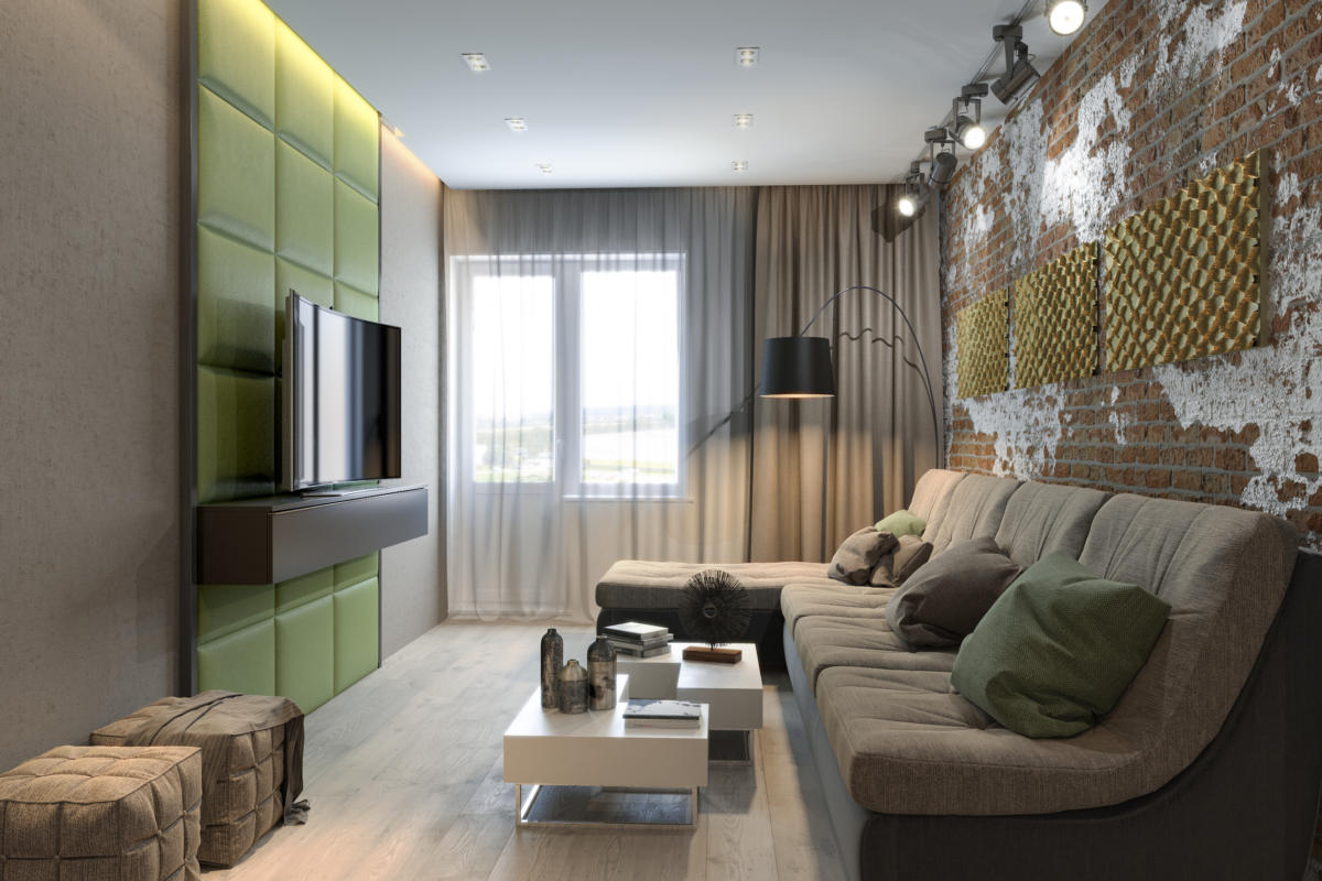
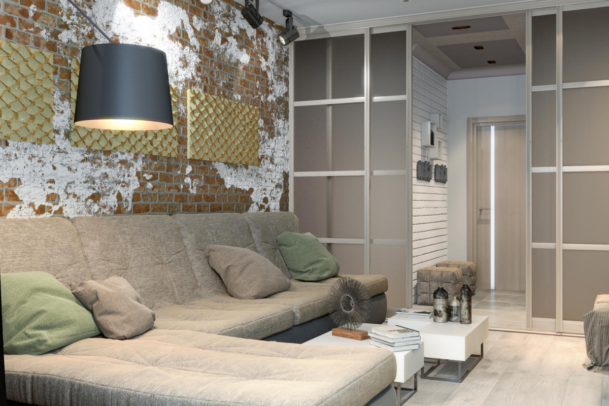
 Living room The living room is decorated in a chillout spirit:A modular sofa bed is located along the entire length of the wall, which can be converted into an additional sleeping place if desired. The coffee table can be disassembled into two separate ones and can also be assembled back into a single module. Leather wall panels created according to the designer's sketches are used as the central composition and soundproofing. The customer loves olive color, so in the living room it plays the role of a bright, but not flashy color accent.
 Since customers are connoisseurs of beauty,A special place has already been allocated above the sofa for a future exhibition, which the owners will be able to compose and change at their own discretion. A track lighting system is provided for backlighting the paintings, which fits organically into the interior of the living room.
 Bedroom To compensate for the linearlayout and low ceiling height (2.6 m), Victoria decided to use two techniques: a “floating” ceiling with LED lighting built into niches and plaster with an unusual pattern that gives the room additional volume and creates an interesting relief. The same character of the lines as on the panels can be seen in the smooth curves of the bed. For the textile decoration of the window, a dense fabric in the color of Iced coffee was chosen, and the tulle consists of two panels for a convenient exit to the balcony.
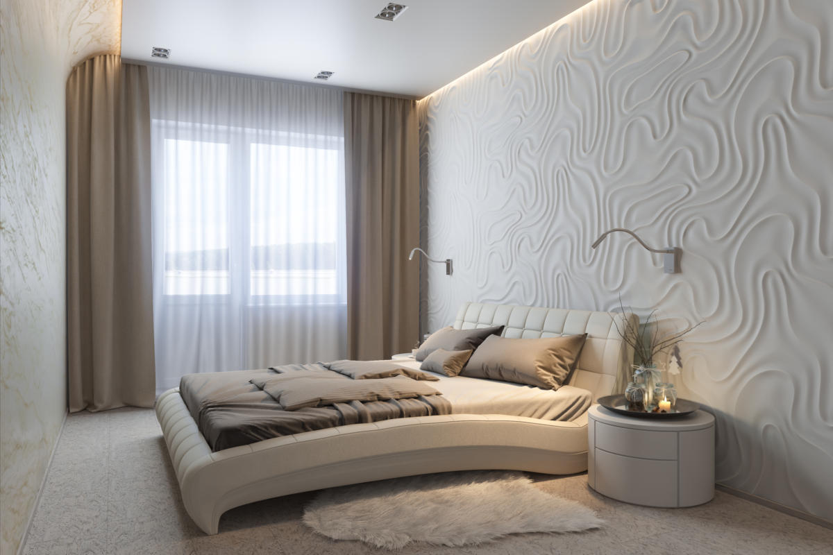
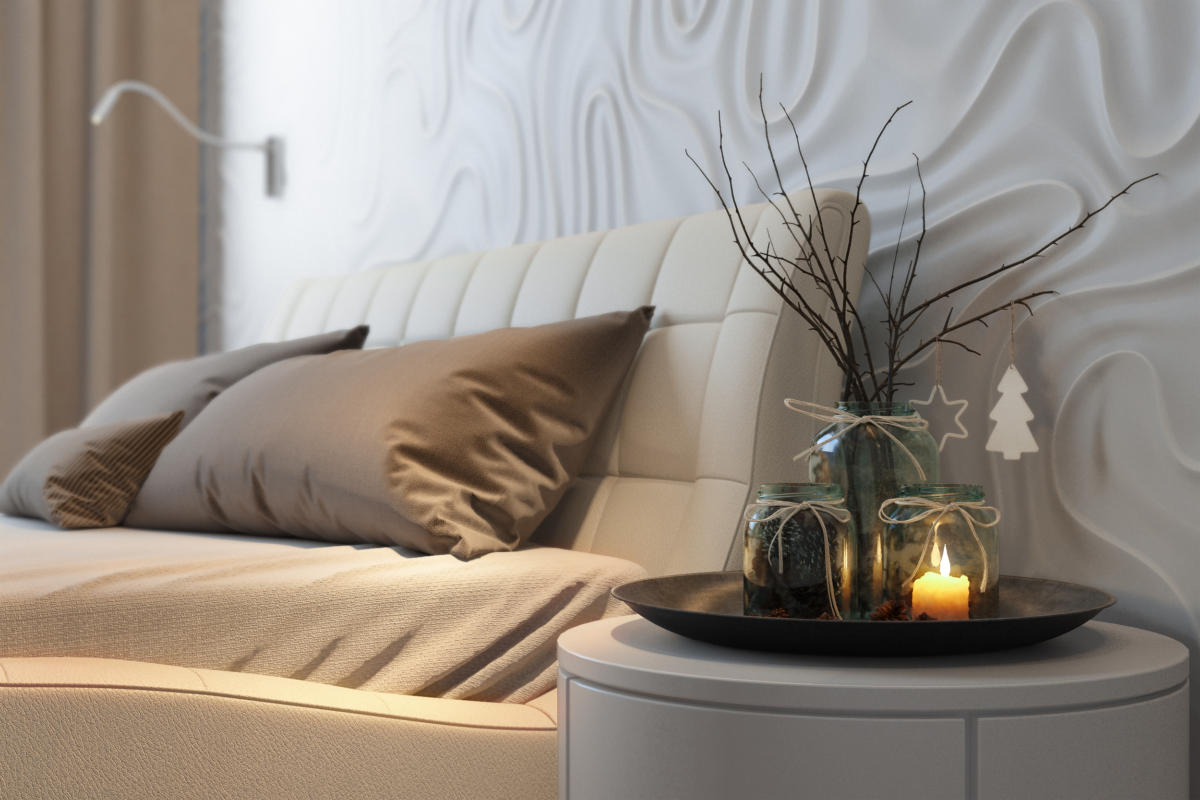 Before going to bed, the owners like to read, and for themFor convenience, the designer placed two flexible sconces with directional light above the headboard. The wardrobe fronts are covered with white glossy panels, and the floor is covered with tinted cork, which has excellent wear-resistant properties and gives the effect of a warm floor. Another innovative material was used to decorate the wall opposite the bed - flexible stone.
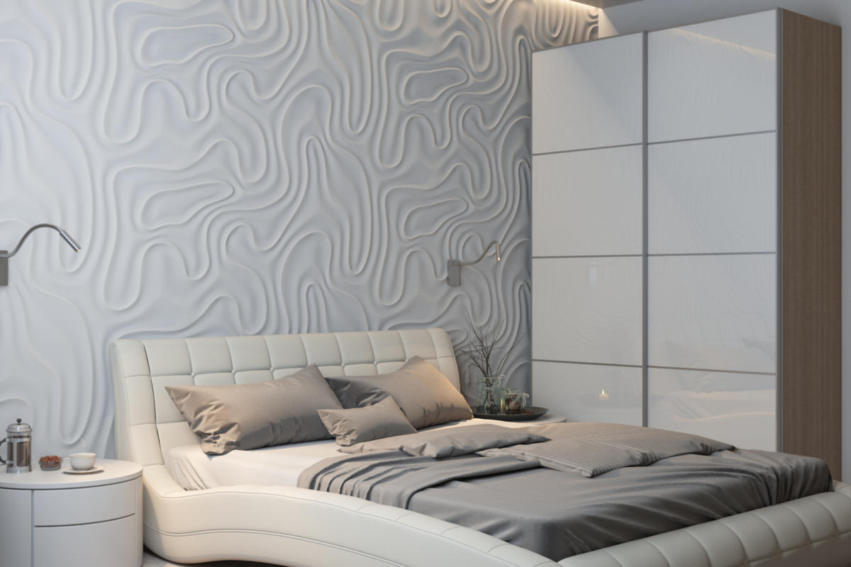 Victoria Pashinskaya, designer:— In the era of modern technology and a frantic pace of life, there is often no time left for people dear to the heart, so it is here that you can find privacy, spend time with each other, read a book, think about life or just lie in silence. Children's The future children's room is currently used as a guest bedroom, but when planning, the designer has already provided space for a crib and a storage system with roomy containers for toys. The interior is designed in a neutral range, thanks to which in the future this room will suit both a boy and a girl. Later, when the room is completely in the possession of the child, it can be given a more playful character with the help of bright accessories.
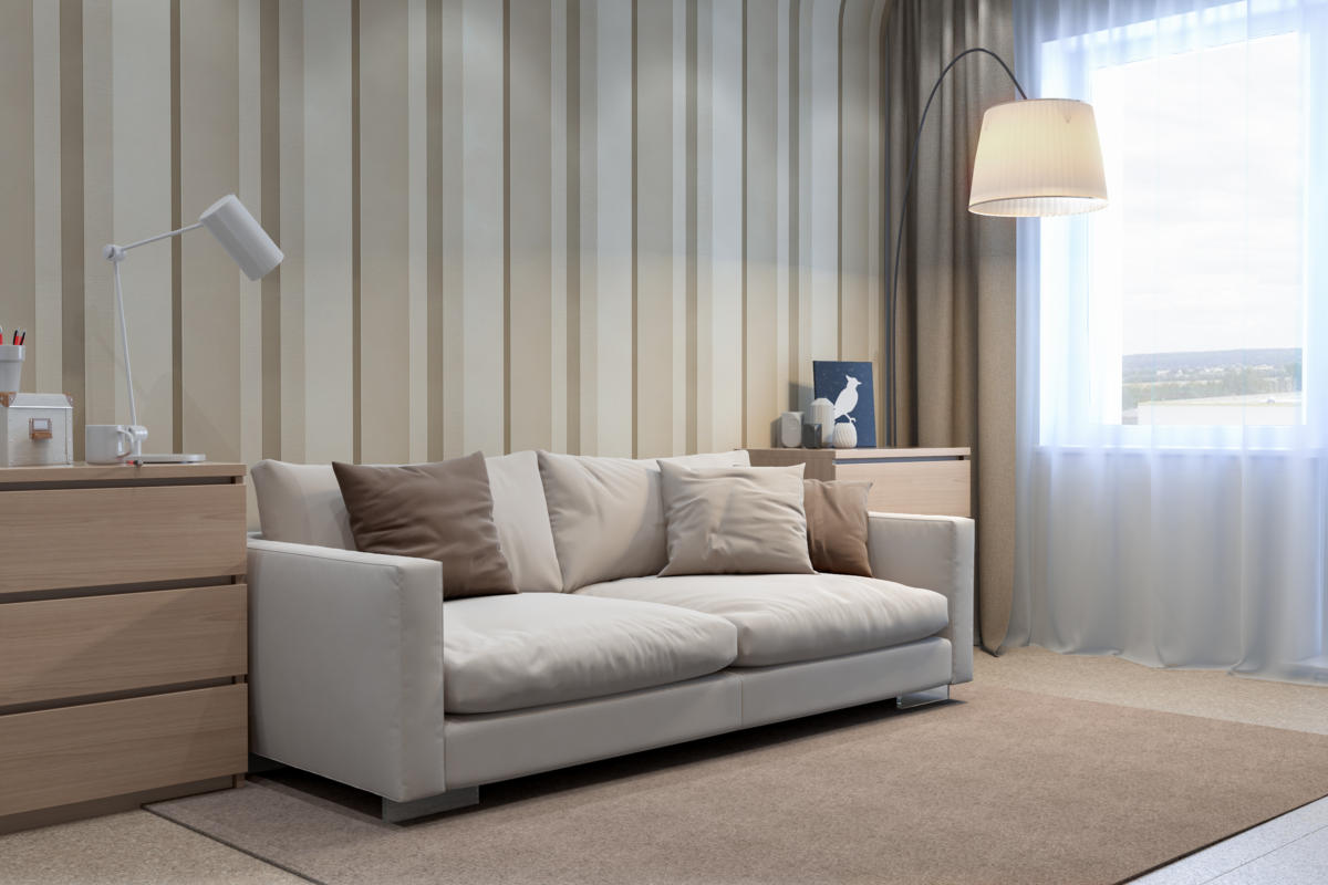 Just like in the bedroom, in the children's-guest roomThere is a rounded corner effect, which is created by striped wallpaper. The smooth transition of coverings from the floor to the walls and from the walls to the ceiling creates the feeling that parts of the interior smoothly flow into each other, and the boundaries are visually blurred.
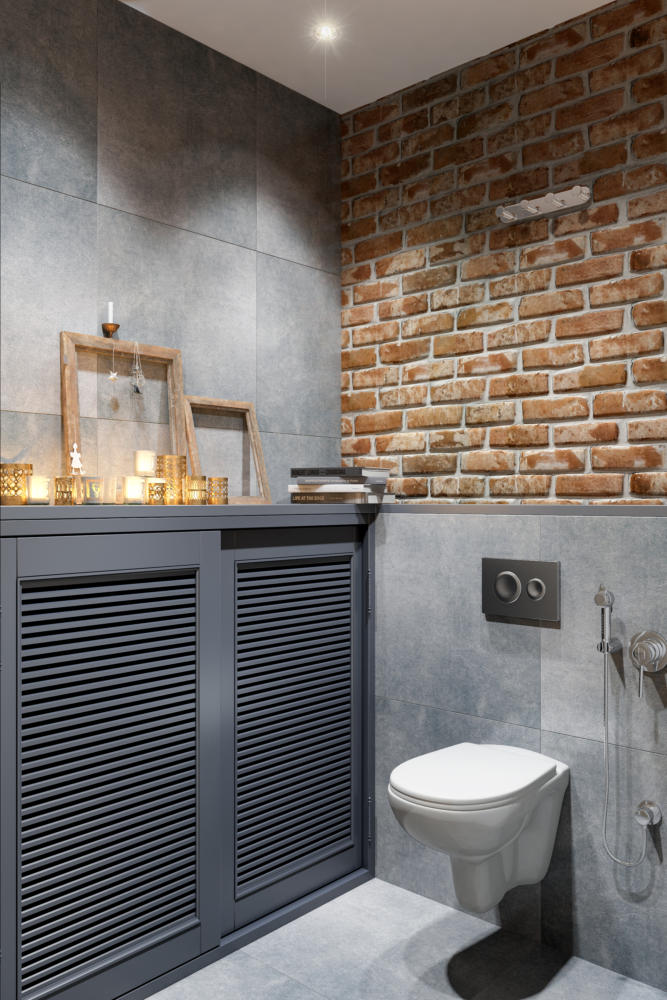
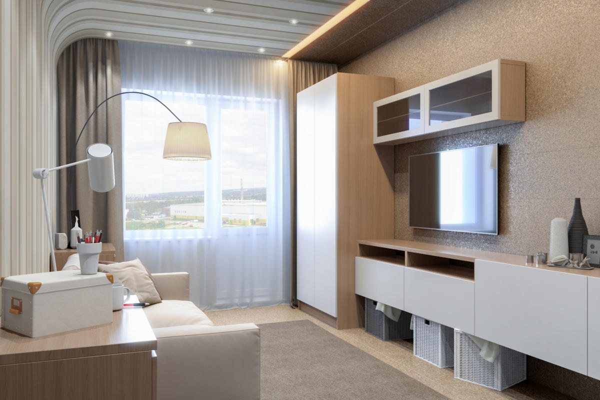 Victoria Pashinskaya, designer:— Each room has several lighting scenarios. We used built-in lamps as the main lighting in this room, and the decorative role is played by LED lighting along the entire furniture composition. Bathrooms In the design of the master bathroom and toilet, we again encounter elements of loft style: aged and concrete-like tiles in the wall decoration. The louvered doors in the toilet are painted graphite, and on a small shelf above them there is cozy decor: candles, wooden frames and books.
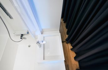
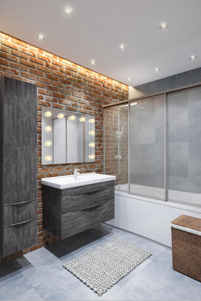
 The same finishes were used in the bathroom, andThe so-called "Hollywood mirror" acts as an unusual element, in front of which it is very convenient to apply makeup. Built-in lamps and LED backlighting were chosen as the main lighting.
 Victoria Pashinskaya, designer:— Even at the first meetings with the clients, it became clear that this is a very emotional, open and active couple. I wanted to create an interior for them that would not only act as a cozy nest, but also have a positive effect on their emotional mood, since people working in such areas need to get a certain release in order to then gain strength and energy. Our interior was born from this idea: airy, comfortable, functionally rich and very light, where you can relax as much as possible due to the presence of smooth shapes and a well-chosen color scheme. The following were used in this interior: Corridor:
- the cabinet is made to order according to the sketches of the designer;
- poufs - Hoff (Russia), model "Ruby";
- hanger - Umbra (Canada);
- recessed luminaire - SLV (Germany);
- brick tile - White Hills (Russia);
- porcelain stoneware - Kerama Marazzi (Russia);
- flooring in the hall - Vinilam (Russia);
- plinth - Orac Decor (Belgium).
Kitchen:
- Extraction - Krona (Russia);
- oven with microwave function - Electrolux (Sweden);
- electric cooktop - Electrolux (Sweden);
- table - "Vista" (Russia);
- The chair is made to order according to the sketches of the designer;
- doors - "Sophia" (Russia);
- porcelain stoneware for the apron - Kerama Marazzi (Russia);
- tile for brick - Benestica (Spain);
- flooring - Vinilam (Russia).
Living room:
- modular sofa bed - "Montreal" (Russia);
- wall panels are made to order according to the designer’s sketches;
- grey wall shelf - IKEA (Sweden), model "BESTÅ BURS";
- a coffee table - Mebeluka (Russia);
- floor lamp - «ОГОГО Обстановочка!» (Russia), model Apex Black;
- track light - SLV (Germany);
- recessed luminaire - SLV (Germany);
- pouf - Hoff (Russia), model "PF-1";
- paintings by artist Susanna Shap (USA)
- quartz-vinyl laminate -Vinilam (Russia).
Bedroom:
- bed - "Furniture of Russia" (Russia), model Nuvola 1;
- bedside table - ESF (Russia);
- cabinet - IKEA (Sweden);
- recessed luminaire - Arte Lamp (Italy);
- bedside lamp - Carpyen (Spain);
- wall 3D panels - Artpole (Russia), model Foggy;
- flexible stone - Gliga Stone (Belarus);
- Cork floors - Wicanders (Portugal).
Children's:
- Wallpaper - Khroma (Belgium);
- floor lamp - «ОГОГО Обстановочка!» (Russia), model Fabric;
- recessed luminaire - SLV (Germany);
- sofa - "Karizma" (Russia);
- wardrobe — IKEA (Sweden)
- flooring - Allied Cork (Portugal).
Bathroom and toilet:
- shower stand - Nautico (China);
- bathroom furniture - Aquanet (Russia);
- dressing mirror - Juergen (Ukraine);
- towel warmer - Sunerja (Russia);
- sliding doors-blinds made to order according to the designer's sketches;
- wall hung toilet - Jika (Czech Republic);
- hygienic shower - Grohe (Germany);
- holder for toilet paper - Grohe (Germany);
- decorative-facing brick - White Hills (Russia);
- porcelain stoneware - Kerama Marazzi (Russia).
