Is it possible to change geometry with design?an elongated kitchen? How to decorate a small room in a fashionable style typical of large rooms with high ceilings? The answers to these questions are hidden in the interior of an unusual loft-style kitchen. What to do if your interior design fantasies go beyond the real living conditions? Break stereotypes! This is exactly what designer Evgenia Lykasova did. A small loft-style kitchen? Nothing is impossible! The main thing is to create the space that the customers dreamed of. Evgenia Lykasova, architect Graduated from the Gomel State Art School named after A.K. Glebov, specializing in painting, and the Belarusian National Technical University, specializing in architecture. Works in the architectural studio MJM archdesign. Evgenia Lykasova's next clients turned out to be the owners of a modest apartment with a standard, one might even say, unsuccessful layout. However, carried away by fashionable modern trends, they wanted to live in a stylish space decorated with brick and metal. So, the main wish of the customers was the following: to create an interior that would resemble a loft in its style as much as possible. The most problematic room was the kitchen. It could not boast of large dimensions, and the geometry of the room definitely could not be called optimal. The inconvenience of using the initially elongated space was aggravated by the illiterate arrangement of furniture (along one wall), which was present in the basic interior. At the start of the work, this room resembled a narrow corridor rather than a functional kitchen.

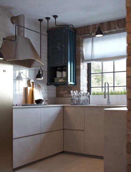
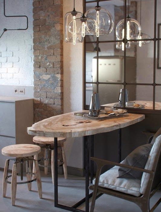
 The designer's main task was to createstylish, ergonomic and comfortable space. Therefore, most of the techniques used by the author of the project were aimed at the actual and visual change of the geometry of the space. Thanks to the U-shaped arrangement, all the kitchen furniture was placed on one half of the room. The second half now serves as a dining area. A small table, conveniently placed in the corner, can easily "serve" four people at once. This arrangement of furniture made the kitchen seem less narrow.


 Zoning in the kitchen is carried out not onlywith the help of furniture, but also by means of color. The dark blue wall behind the table clearly marks the dining area. The color of the brickwork also plays an important role. Dark brick was used to decorate the far wall (with the window), and white brick was used to decorate the long walls. In combination with the dark blue wall, the effect of compressing the room is achieved. This is another trick that allows you to deceive the mind and make it believe that the kitchen is not narrow and elongated, but moderately rectangular. The mirror above the table also works for the common good, “pushing back” part of the wall and finally taking us away from the association with the corridor. Our opinion: - An interesting detail: the decorative meaning of a narrow strip of dark brick on one of the long walls is not immediately obvious. At first, you might think that it simply echoes the masonry along the perimeter of the window. However, in fact, this strip is another tool for dividing the kitchen into dining and functional areas.
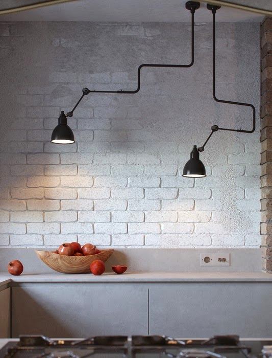
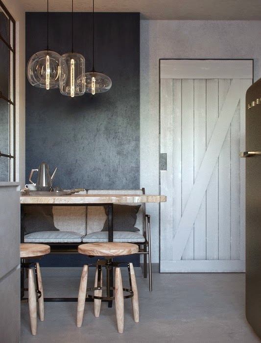
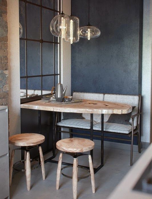
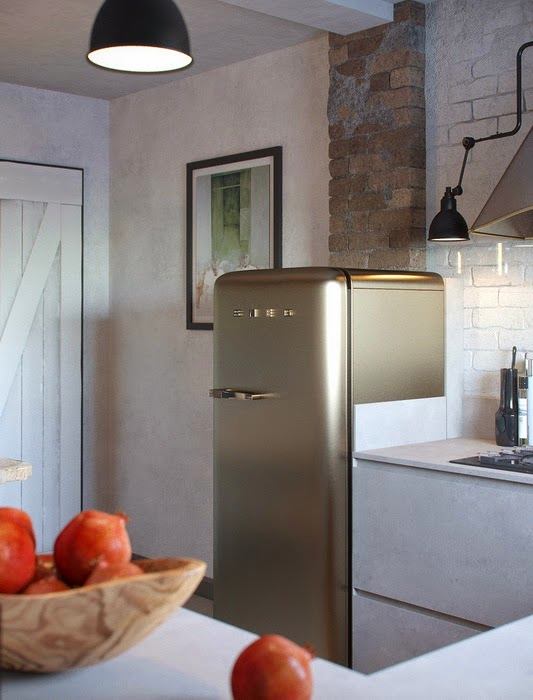
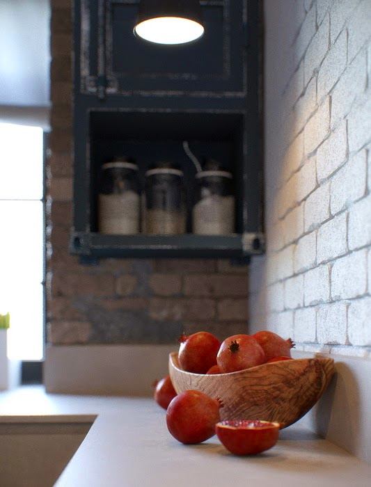
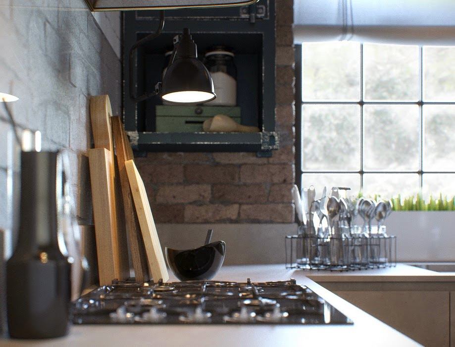
 The loft style is typical in thisthe room is achieved not only by using brick. Pay attention to the details: a barn door, lamps on movable metal mounts, decorative lamps in transparent shades, unusually atmospheric drawer shelves and, of course, a fashionable retro SMEG refrigerator - and a small loft-style kitchen is decorated in compliance with all the characteristic features of the style. Our opinion - A particularly successful solution, in our opinion, seems to be a kitchen apron made of tempered transparent glass. This mandatory functional element is almost invisible, and therefore does not dissonate with the original interior concept. mjmarchdesign.blogspot.ru
Kitchen in loft style: interior decoration of a small room
