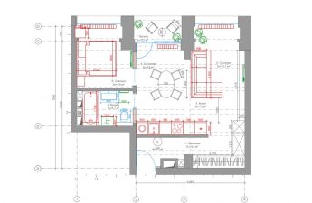
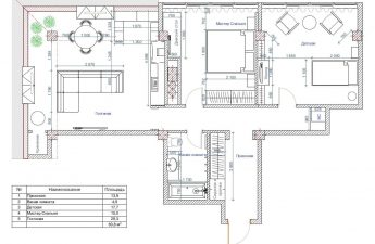
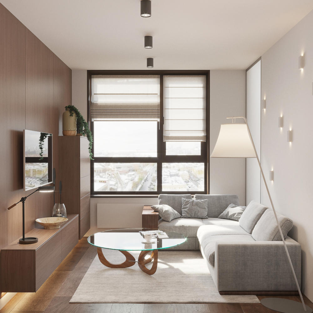
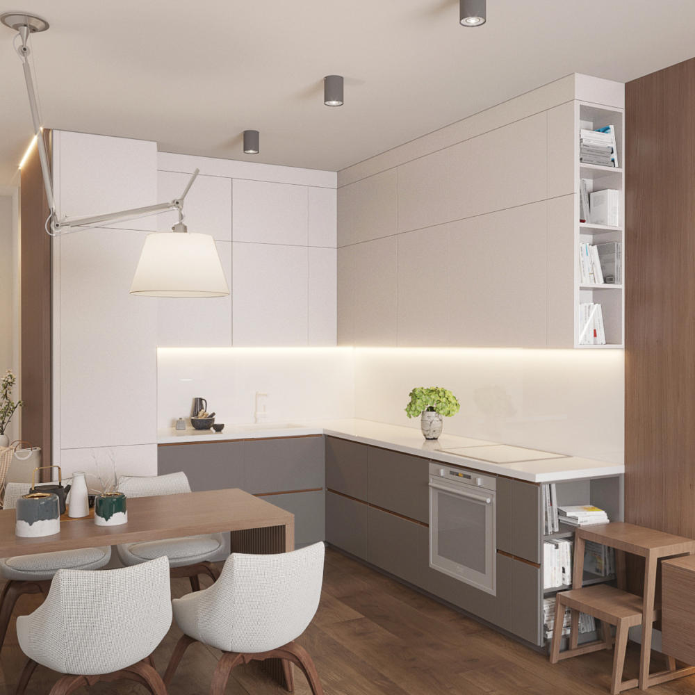
If you only visit the apartment occasionally, thenThe interior should match this lifestyle. We show you a great example of an apartment-hotel This apartment with an area of just under fifty square meters is located in the Filigrad residential complex and belongs to an elderly couple. The spouses permanently live in Kemerovo, and only occasionally come to Moscow to visit their children and grandchildren. Therefore, the design studio "Tochka Dizayna" was faced with the task of creating a comfortable and practical interior where there would be nothing superfluous. Let's see what solution the designers found. Related articles Stepan Bugayev, art director of the design studio "Tochka Dizayna" Currently, he is developing the design studio "Tochka Dizayna". In addition to creating private interiors, he collaborates with leading Russian developers. He is a teacher at the HSE School of Design, and teaches his own course "Interior Design. Rules for Creating a Successful Project". He gives open lectures on interior design and writes articles for leading interior magazines and portals. In the past, she was a co-founder of the Pobeda Dizayna studio. She is one of the top 100 best designers, according to AD magazine. Polina Shevtsova, interior designer Graduated from RUDN University with a degree in Social and Differential Psychology and RANEPA with a degree in Environmental Design. She works as an interior designer at the Tochka Dizayna design bureau. She believes that not only the customer, but also the apartment space itself and its location can help in creating a future interior. The layout of the apartment was initially open, so it was decided not to move the zones, they only slightly expanded the bathroom, and converted the loggia attached to the bedroom into a recreation area. The main task was to create one large space for the kitchen and living room, where the owners spend a lot of time, and an isolated bedroom. Since the apartment was not originally conceived as a permanent place of residence, the specialists used the secrets of designers who design hotels. We tried to make the interior as light and universal as possible, choosing a minimalist style with a large number of natural finishing materials and a restrained color scheme. The interior also has its own features, for example, a matte glass insert in the wall separating the living room and bedroom. Thanks to it, the light spreads freely throughout the space. And in addition to the main lighting, hidden backlights are hidden in each room. The living room and kitchen were combined, as desired.customers. The room has several lighting scenarios: a night light under the nightstand, decorative lighting behind the back of the sofa, basic lighting on the ceiling, a cozy floor lamp with directional light. The designers tried not to clutter the central part of the room, so they chose a light transparent Cattelan Italia table with a streamlined shape and thin legs. The sofa folds out and turns into an additional sleeping place. The kitchen set turned out to be large and roomy, but it does not look bulky, thanks to the light shades and handleless system.
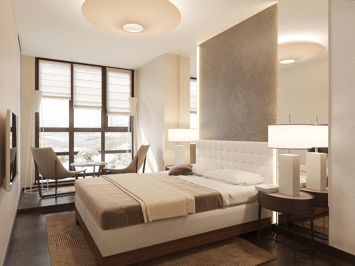
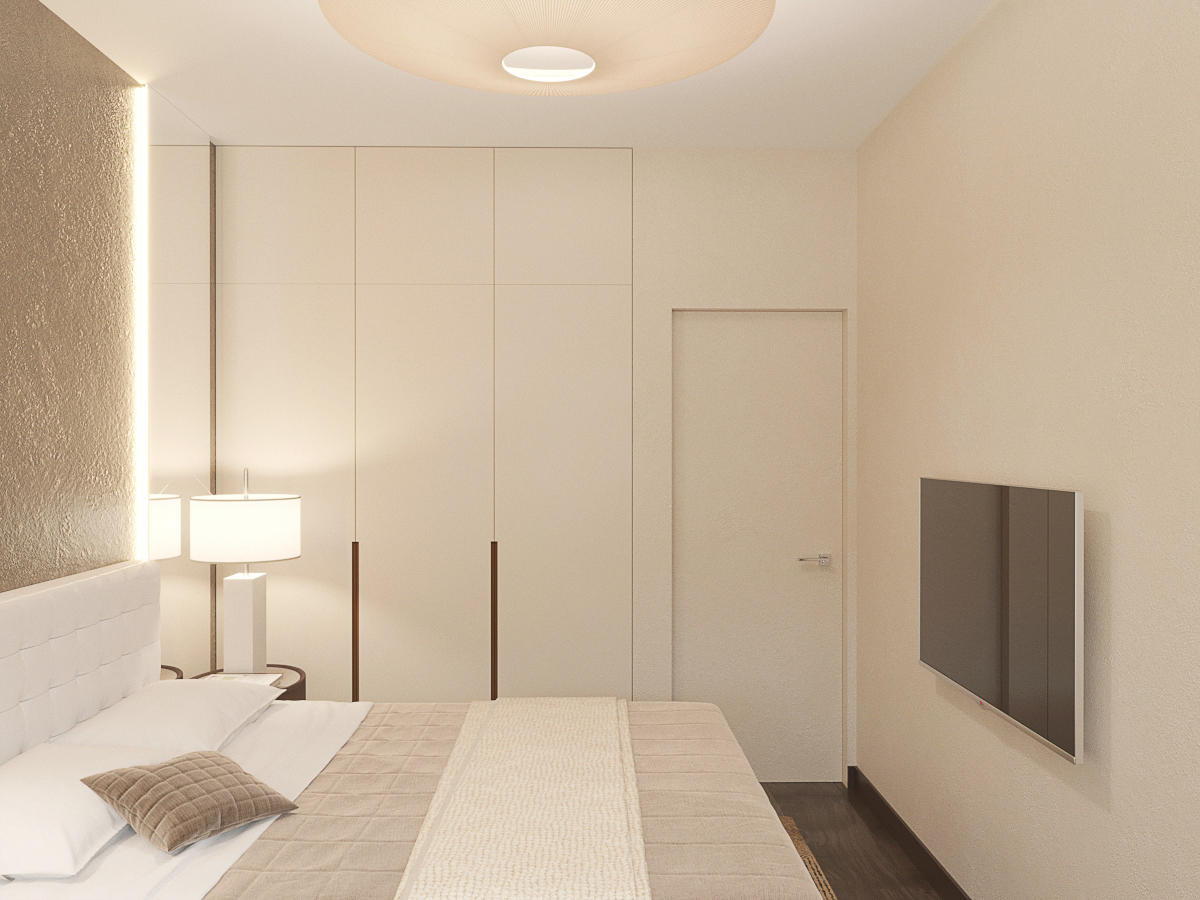
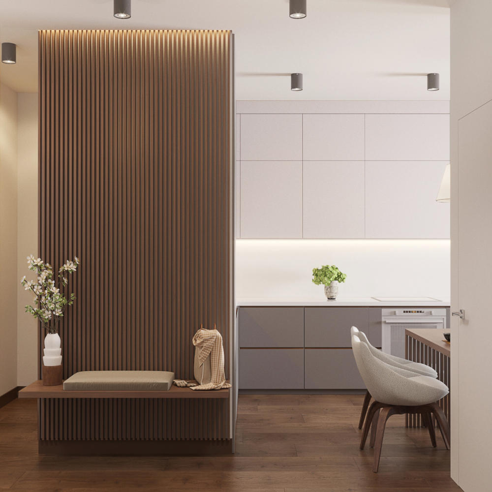
 In the bedroom, the designers used texturedplaster with lighting behind the headboard. It has adjustable lighting, which allows you to use it as a night light. Mirrors are symmetrically located behind the bedside tables from floor to ceiling: they visually expand the rather narrow room. At the request of the customer, a small podium with a seating area was built on the site of the former loggia, and a convector was placed in the floor. Built-in wardrobes from floor to ceiling are made in the color of the wall, do not attract attention to themselves and do not make the room cramped. In addition to the wardrobes in the bedroom, the apartment has another storage space - a large two-meter dressing room in the hallway, on the other side of which is the kitchen.
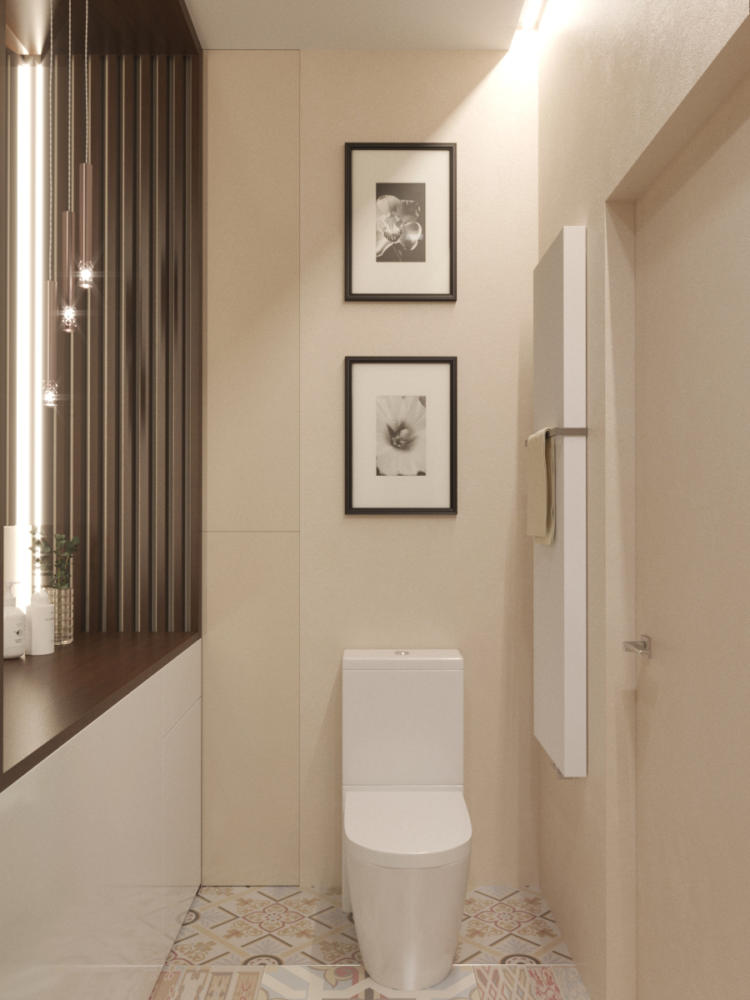
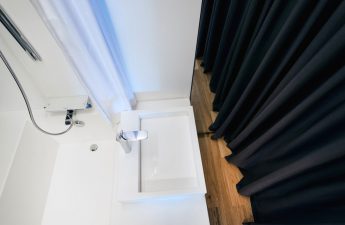
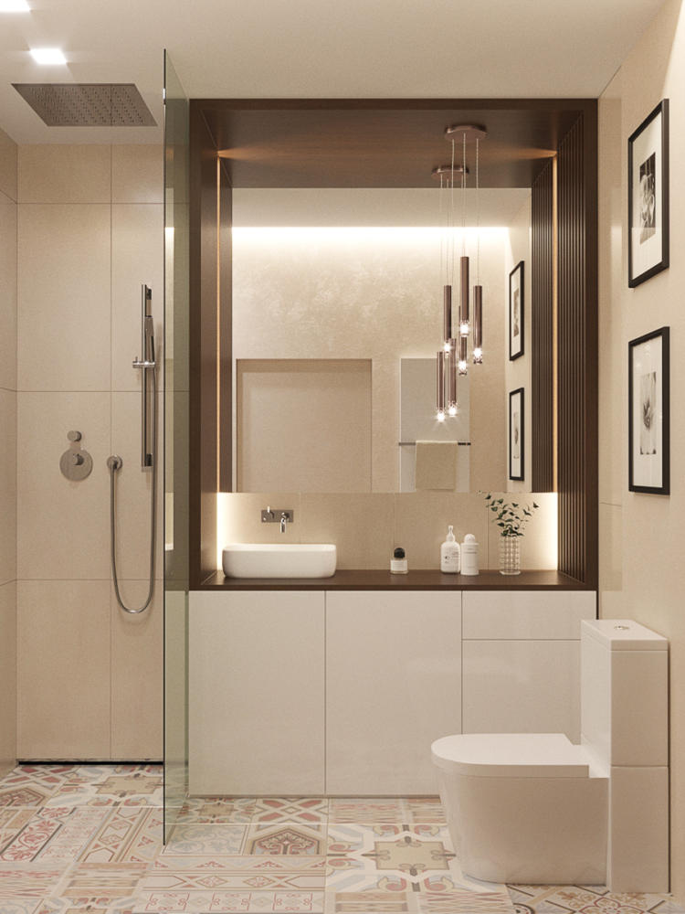
 Since the customers did not need a bathtub,The bathroom has a spacious shower without doors: water does not spill out thanks to partitions. And the drain was installed not in the floor, but right in the corner by the wall, and due to the 2 cm difference, a slope was made towards it and thresholds were avoided. In addition to the hand shower, there is a tropical shower, so despite the lack of a bathtub, the owners are guaranteed to enjoy water procedures. Related articles

Minimalism in the interior of a Moscow kopeck piece with an area of 50 squares
