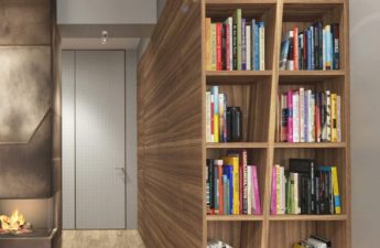
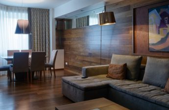
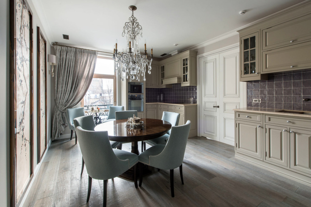
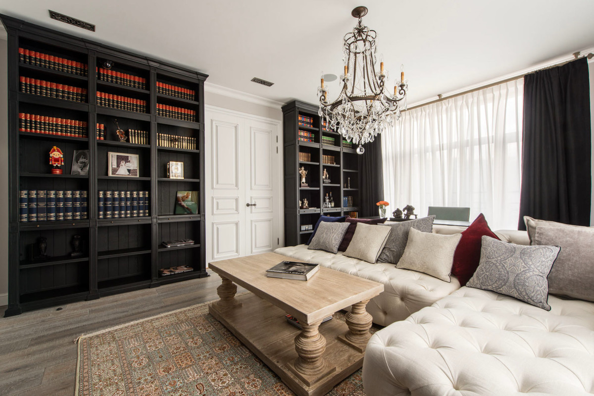
How to create a sophisticated modern interior fora large family in a limited space? The ideal apartment in the center of Moscow for an exemplary couple with three children - in our article today This apartment was created for an exemplary family - a married couple and three children (six months, three years, 12 years). Everything here is focused on family needs: a large living room, a cozy kitchen-dining room, sunny and comfortable children's rooms. The head of the family is a co-owner of a company that is one of the leaders in the IT market. Not far from the house is his huge office with two work rooms. But if you still need to solve some urgent issues at home and use the computer, for this purpose, a small work area with the necessary library is allocated in the living room. The issues of decorating the apartment were taken on by the wife, who, of course, has excellent taste and a sense of beauty. She entrusted the arrangement of her family hearth to designer Victoria Kiorsak, who believes that beauty heals the world every second. Victoria Kiorsak, designer Founder of Victoria Kiorsak Interior Design and official representative of Silver Dragon Interiors in Russia. For 11 years, she has been creating sophisticated and elegant interiors. Her portfolio includes projects for restaurants, offices, country residences, beauty salons and jewelry showrooms. art-techs.ru Victoria believes that a person coming home should be surrounded by beauty, then it is easier and more pleasant for him to live. It is good when the designer and the client are on the same wavelength and understand each other perfectly. This apartment is an urban family "residence", from where you can make cultural "forays" into the center of the capital. The owners have a country house in the near Moscow region as their main home. Victoria Kiorsak, designer: - Since the family is large, it was necessary to fit four bedrooms, a large hall, three bathrooms, a full separate wardrobe in the master bedroom, a kitchen with a comfortable dining area, a living room with a work area, as well as a special block for placing the server rack of the "smart home" in the most efficient way in a very limited space. One of the main requirements of the client was pastel colors and muted colors. All the furniture and textiles are a little worn, like antiques. At the same time, the designer used a number of bright accents. Thus, a painted sink, colored crystal handles on the furniture and elegant handles made of blackened silver on the doors appeared in the interior. An unusual combination of wooden elements andmosaics, lacquered wood surfaces, silver silk panels - all this plays magnificently in different lighting. And creates the right atmosphere, corresponding to the mood of the owners.
 Functionality and comfort have become prioritiesin the design of the apartment. In a limited area, it was necessary to place rooms for each family member and common areas of the hall, living room and kitchen-dining room as efficiently as possible - so that everyone has enough space. A special block for placing a "smart home" rack and convenient storage spaces help to accomplish this task. The master bedroom has a very spacious dressing room with a large mirror built into the door from the inside. Large storage systems in the hallway, in the children's rooms - convenient and functional cabinets. Each bathroom has a place to store cosmetics and other necessary household items.
 Mirrored cabinets in bathrooms outsidelook like regular mirrors, but when they open, you can see spacious shelves for cosmetics and other small items inside. Convenient built-in shelves are provided in showers and near the bathtub.
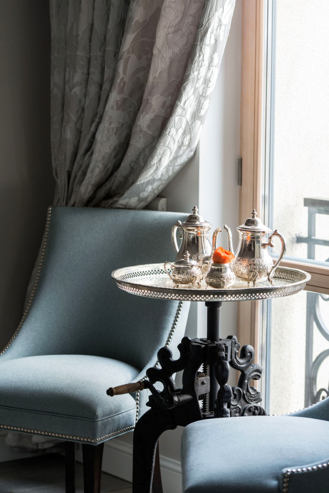
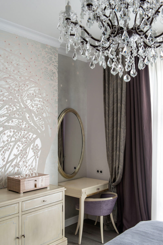
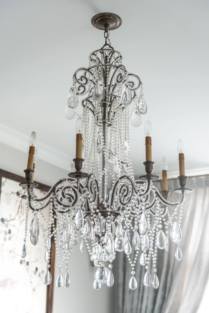
 Victoria Kiorsak, designer:— The concept of “comfort” also includes the aesthetics of the place. Everything should not only be convenient, but also pleasing to the eye. For example, when the sun hits the crystal chandeliers through the huge panoramic windows, the entire room is filled with thousands of sunbeams. The light plays amazingly beautifully on the crystal facets and walls. The space seems to glow.


Furniture
- Porta Romana
- Barbara Barry
- Ralph Lauren
- Lillian August
- Baker
- Restoration Hardware
- Loxley
- Visual Comfort
- Plumbing - Kohler
Victoria Kiorsak, designer:— The style chosen was modern. Not to be confused with minimalism, as is often done! All furniture is made of solid wood, even custom-made items, which were produced according to the designer’s individual drawings. I chose “aged” or antique furniture.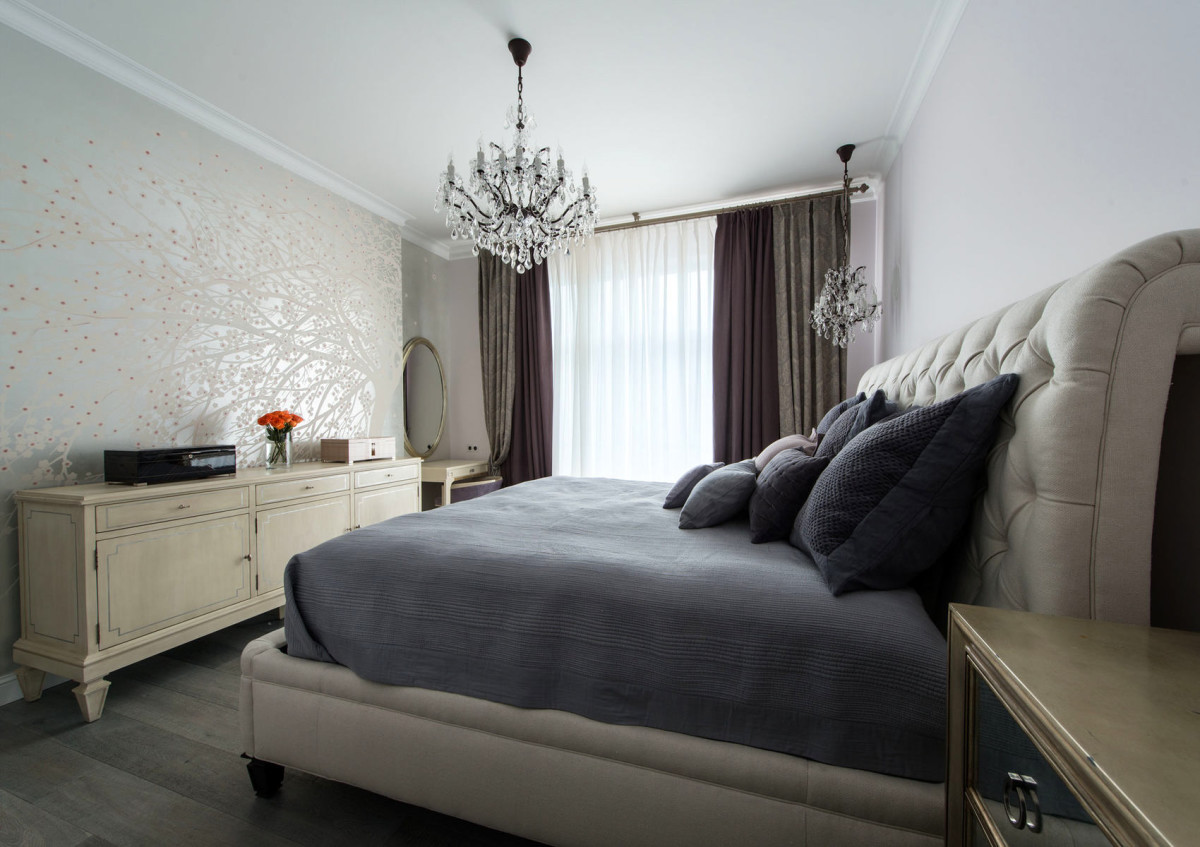
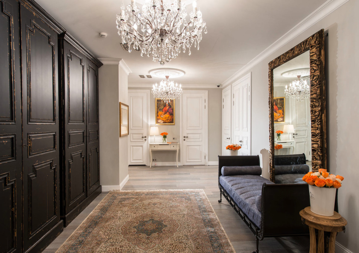
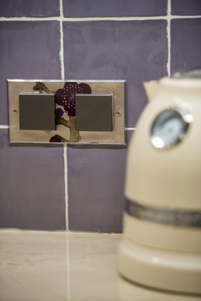
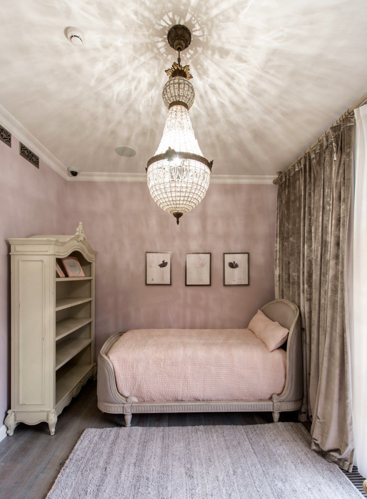 Any interior is always “made” by details,which we come into contact with constantly. Therefore, it is important that they are as thoughtful as possible. For example, light switches with silk panel inserts or painted decorative sinks. Remember how many times a day we turn on and off the light or wash our hands.
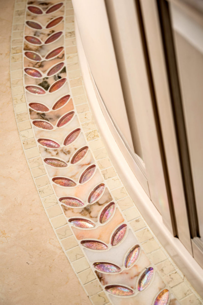
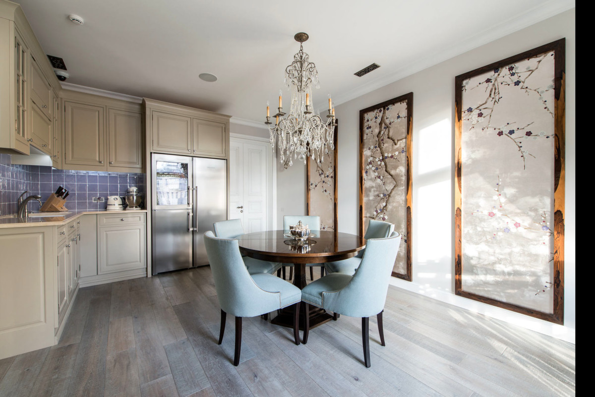
 Victoria Kiorsak, designer:— I am pleased with the unusual solution with the panels in the dining area. Framing the silver silk panels in lacquered frames was a bold experiment, but it absolutely paid off. I really like the floor in the guest bathroom: the tinted oak flooring goes wonderfully with the Sicis mosaic edge.
