A modern home is cozy, beautiful and verylight. And it will be comfortable for both a child and an adult, because the materials used in the renovation are completely natural and environmentally friendly. One of the main conditions set by the customer for the authors of this project was the use of natural materials in the work. Some of the decor was also provided by the owners of the house. Probably, this is what inspired the authors to design a house that one wants to call a Russian chalet. Design studio BOTTEGADESIGN
— Design studio BOTTEGADESIGN began its existence more than 7 years ago. During this time, we have brought to life projects of houses, apartments and offices.
BOTTEGADESIGN is a close-knit teamprofessionals, with a share of perfectionism and boundless love for interior design. "Do what you love. Love what you do" - for us this is not just a quote, it is our motto! bottegadesign.ru
— During the work on the object, it was redesignedfacade of the house. The materials used were natural: wood and stone. This issue especially worried the customers even at the stage of coordinating the first sketches - the naturalness and environmental friendliness of the materials - this was the main condition of our work.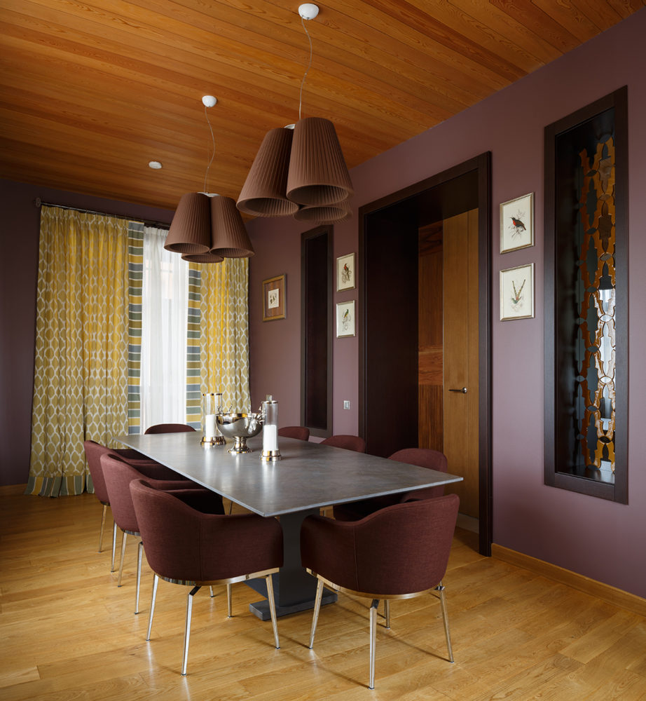
The unique feature of the architecture of this housebecame its design. The vertical layout has a non-standard arrangement of floors: the floors are staggered, thus forming half floors (intermediate, or middle floor). Due to this, the living room on the first floor has a height of two floors.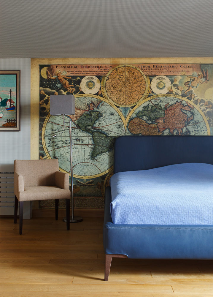
The maximum ceiling height remains the sameincluding the absence of complex structures. Correct geometry and proportions became the basis for the house layout. The main conceptual solution of the house is a combination of a gray palette and natural shades of wood.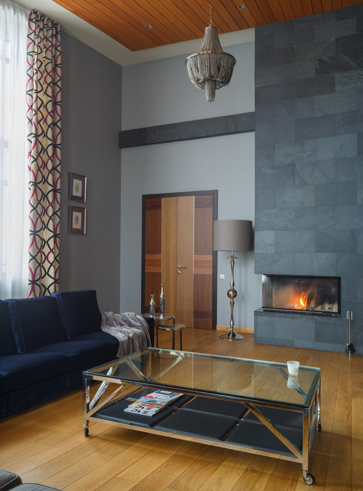 Part of the customers’ family collection was used as decorative design – paintings, animal skins and some other elements were brought by the family from their travels.
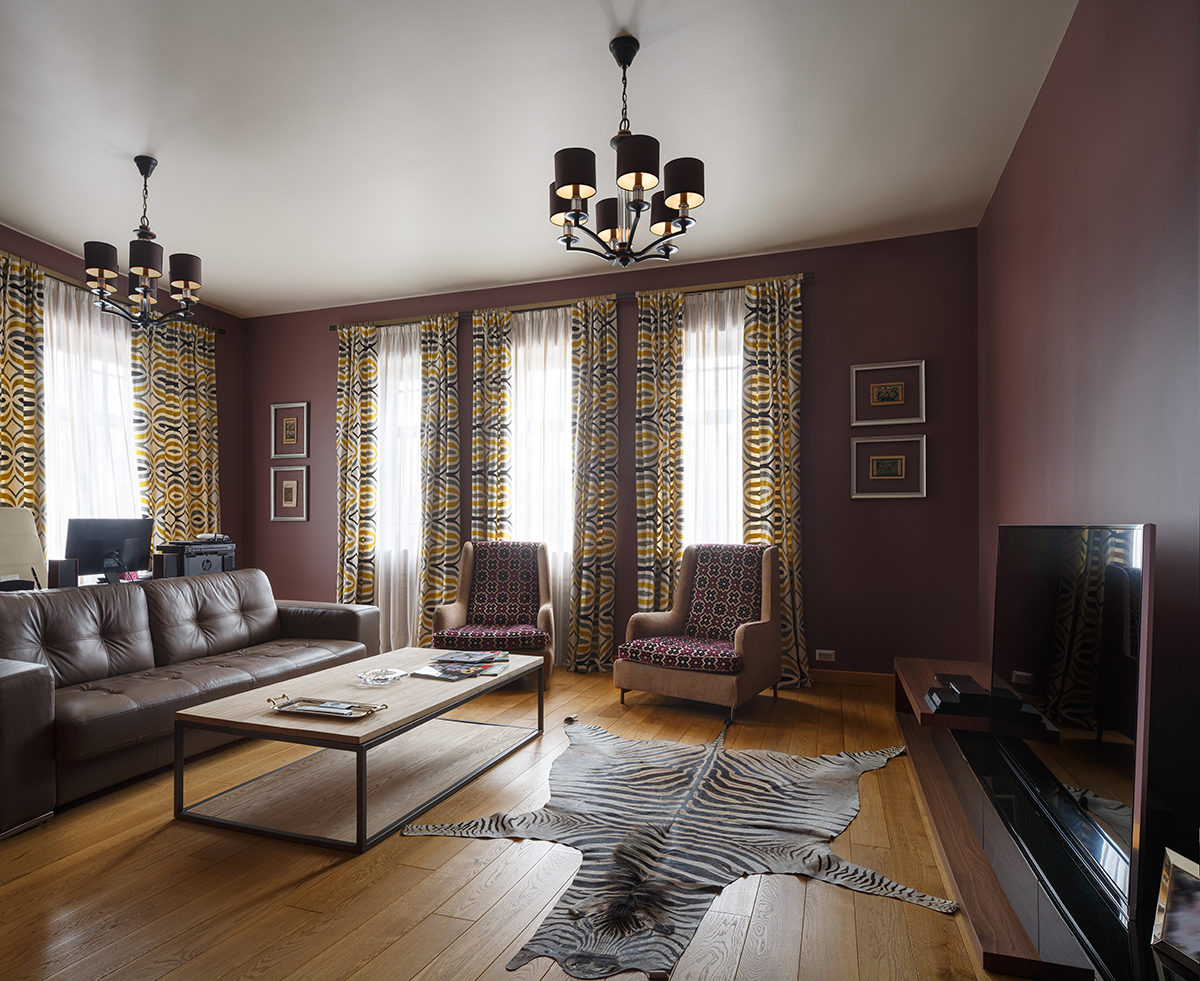
 Living room
In the living room the fireplace is finished with natural slate.The box on the ceiling is covered with natural larch board. The furniture upholstery and textiles are made of natural fabrics that do not cause allergies. The high ceiling creates an effect of airiness and lightness, and massive chandeliers made of chains fit perfectly into the overall style of the room.
The following were used for this room:
- sofas - Meridiani factory;
- coffee table - Eichholtz factory;
- Lighting - Eichholtz factory, Gallo factory;
- doors - Ghizzi & Benatti Stone;
- curtains — Lorca, Casamanse;
- coffee table — Lambert Duetto.
The entire parental unit, located on the fourth (attic) floor of the house, is separated from the rest of the space. It has its own bathroom and dressing room.
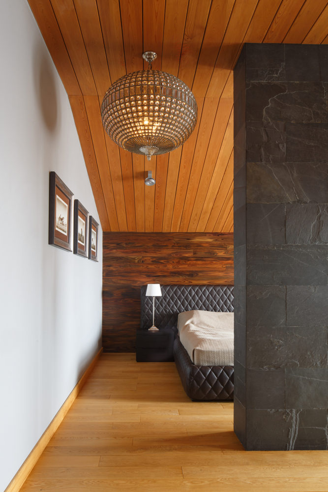
The master bedroom has a complex geometryceiling, due to the roof structure. The ceiling is covered with natural larch board. The wall behind the headboard is finished with natural rosewood board.
The remaining walls are painted grey. The two columns in the centre of the room are load-bearing and therefore could not be dismantled or moved, as the further layout of the room depended on them.
It was decided to fill the space between the columnsand lined with massive slabs of natural slate. This allowed us to visually separate the bed area from the rest of the space and create space for the TV.
This room uses:
- beds - factories Meridiani, Tuyo (Diamond decor);
- light - factories Eichholtz, Gallo;
- armchair - Meridiani factory;
- console - Porada factory;
- Curtains - the Casamance factory.
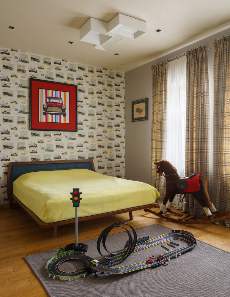
The bedroom for a boy also representsa separate block on the fourth floor and has its own bathroom. On the wall in the headboard area there is a wallpaper panel with images of maps. The walls are covered with paper wallpaper with a houndstooth print that goes onto the ceiling. On the floor there is a solid oak floorboard.
This room uses:
- wallpaper - Aura Memories factory;
- light - Vibia factory (Spain);
- bed - Desiree, Zanette factory;
- Curtains - Baumann, Colefax factory.
The third floor is entirely dedicated to children's rooms for a boy and a girl. The following are used here:
- bed - Milonga, factory Ditre Italia;
- Floor lamp - factory Zonca;
- Chair - factory Poliform;
- Table - Poliform factory;
- panel - Destinations, factory Mr Perswall;
- wallpaper - York, Ronald Redding Houndstooth factory;
- Curtains - factory Casamanse.
The special feature of this room is its largenumber of windows. It was not easy to find the most advantageous option for the arrangement of furniture, especially the bed. Textiles helped solve the problem. Blackout curtains seem to cover the missing piers.
The girl's nursery is predominantly designed in blue. The quilted curtain bando repeats the style of the headboard.
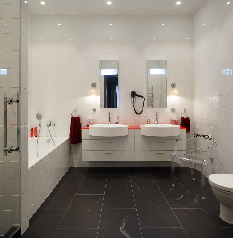
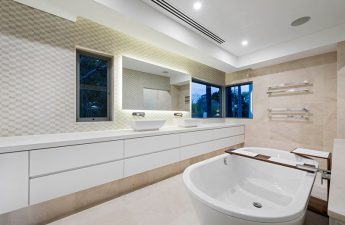
Shared bathroom - hog tiles laid vertically in a staggered pattern, red glass countertop. The floor is made of porcelain tiles that replicate the texture of the stone.
This room uses:
- Beds - factory Milano Bedding, Dorsey Bed;
- wardrobe - Falma Italia factory;
- Armchair - factory Wesley Hall;
- A desk - the Porada factory;
- wallpaper - Jubilee, Thibaut factory;
- Light - Elstead Lighting factory;
- Coffee table - Lambert Duetto factory;
- curtains - factories Mark Alexander and Pierre Frey.

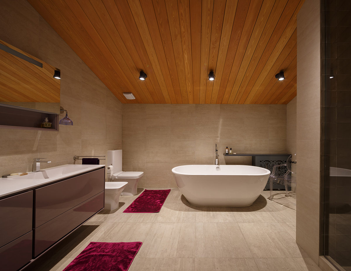
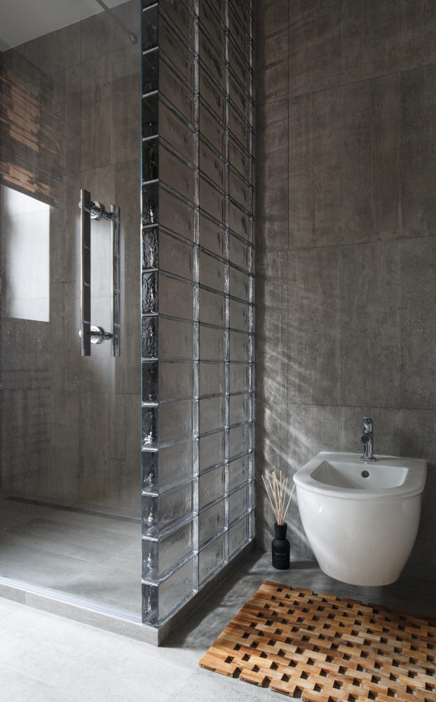
 The recreation room on the ground floor was originallywas a garage. It was decided to rebuild and insulate the space, making it a full-fledged living area. In the bathroom, the shower wall is made of glass brick. This allowed not to block the natural light from the window and achieve a beautiful effect. Staircase hall
The walls here are finished with natural slate,sawn in three different sizes. The natural relief of the stone and the dynamic layout are emphasized by the staircase lighting. The construction I-beam is not a structural element, it is only a design idea, an integral part of the loft style.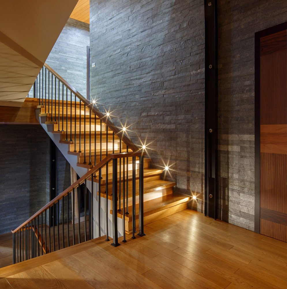 Dining room
Before the redevelopment, this was an open part of the house.During the design, a number of changes were made, in particular, the light openings were expanded, the premises were fully insulated, and the space was transformed into a living area.
The customers did not want to completely isolatedining room space from the kitchen. Thus, two niches with glass were created relative to the door. The designer did not want to see the glass without decor, so ceramic tiles were glued to it, forming a pattern. The walls are painted a deep eggplant color. The massive tabletop of the dining table is made of natural granite.
The following were used in the premises:
- dining table - Monaco, Cattelan Italia factory;
- Chairs - factory Cattelan Italia;
- Light - factory Modo Luce.
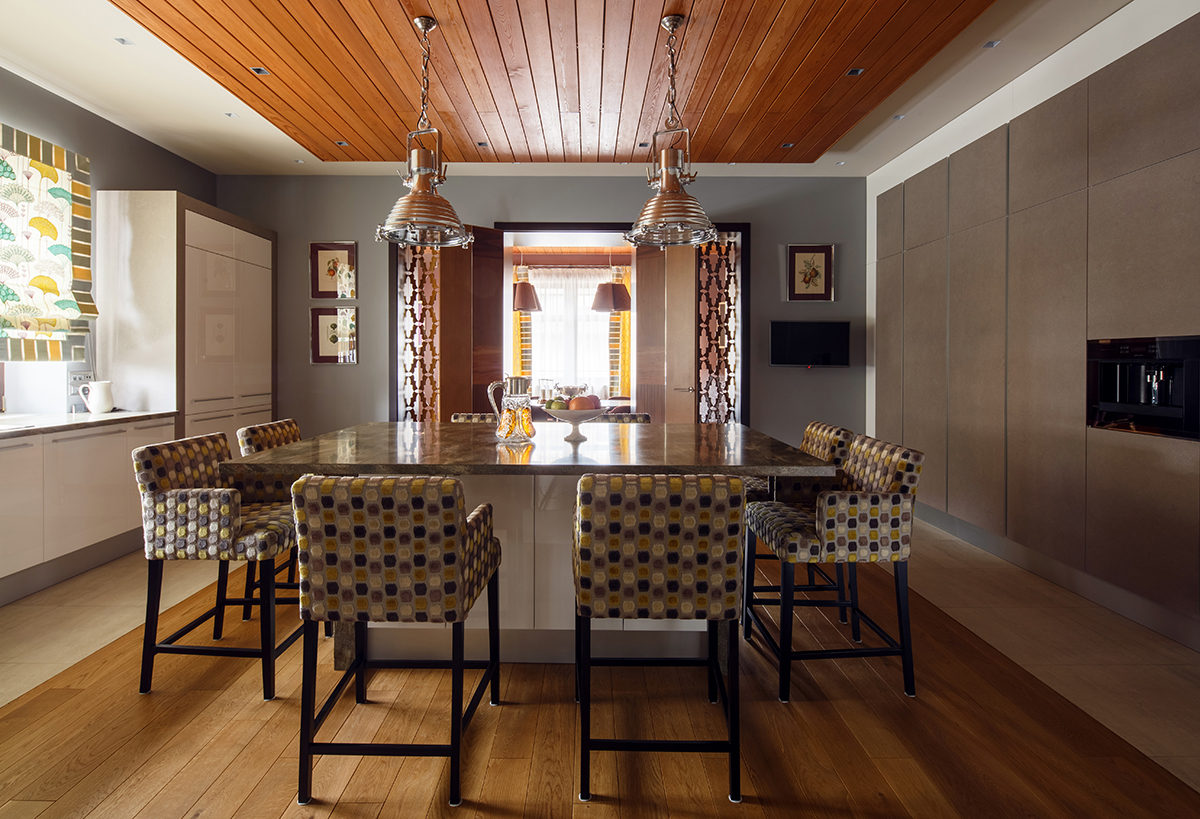
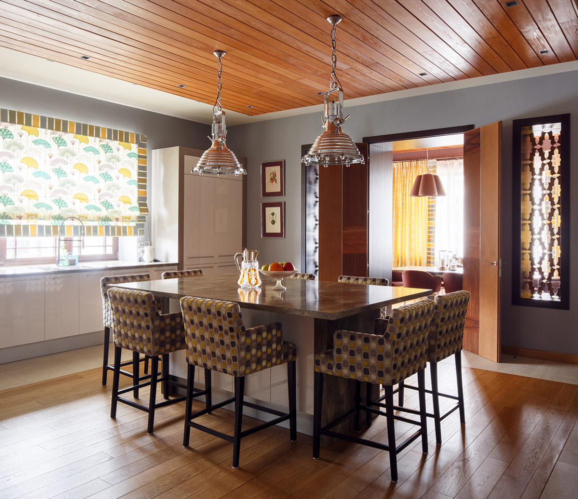
As a floor covering in the work areaPorcelain tiles were used, while the island part of the kitchen floor was covered with solid oak floorboards. In this way, a compromise was found between the functionality of the tiles in the work area and the comfort in the kitchen island area. The kitchen facades are designed according to the inversion principle: on the left (at the entrance) the facades are white gloss with a gray frame, on the right - gray with a white frame. The material of the gray kitchen facade is natural stone.
Used here:
- Chairs - Home Spirit factory;
- Kitchen furniture - Arrital factory;
- Light - Eichholtz factory.
