Is it possible to build an interior using"Delicious" colors? Experts and professionals definitely answer - yes! Especially since this is not just an original and fashionable find, but a new and very juicy trend. In our article - tips for use It has long been known that color has a strong impact on the psycho-emotional state of a person, as well as on physiological processes. Therefore, it is not surprising that with the help of various shades you can set a truly unique atmosphere that will promote either concentration or relaxation. And if you use naturally delicious colors? We interviewed talented designers who were happy to share their opinions on this matter.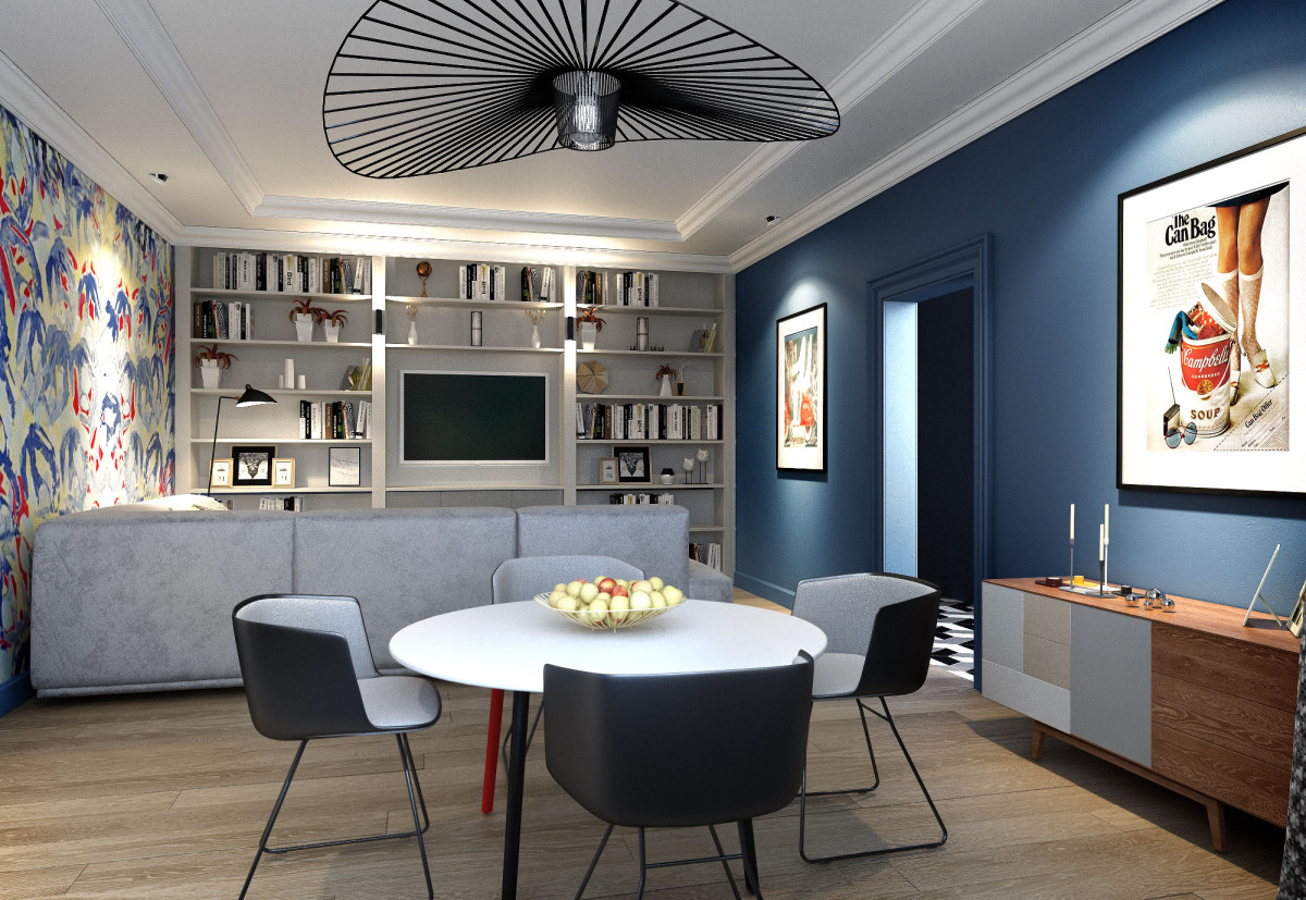 Interior Studio 25 Fuchsia Marina Putilovskaya— a popular Moscow designer. Marina calls herself an "interior artist." She is the head of an architectural bureau that designs private and public interiors. Her clients include public, cultural, and political figures such as Wiener, Tabakov, Novikov, and many others. Premium Italian brands such as Jumbo Collection, Mechini, Boiserie Italia, and Riva produce furniture based on Marina Putilovskaya's designs. Marina Putilovskaya, designer: — Every time we tell our customers that the interior can be of any color — the main thing is that it reflects a person's inner mood. A huge palette of shades gives us the opportunity to create any feeling in our interior, from joyful sunny beige to gray and radical black tones. And in this range of colors, such an outrageous color as fuchsia stands out completely separately! putilovskaya.ru
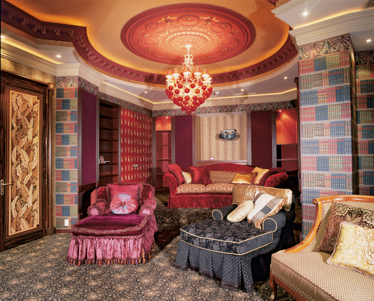 Marina Putilovskaya's interior is already in itselfany red is a color of active attention-grabbing. But fuchsia is a color of the highest shock value, a color of a certain impudence in the interior, and to some extent of impudent self-confidence, bordering on bad taste! But nevertheless, fuchsia is a color of salvation. From ordinariness, from grayness and melancholy, and in combination with green, blue, sunny yellow and white - it is even a color of joy and spring, an active mood, expectation of something new and very good! That is why it is often used where it is necessary to introduce an active color, so that the interior moves away from the standard and sparkles with new colors. Marina Putilovskaya, designer: - I often see this color in gray and white interiors - as an accent - in pillows, trim, wall details and accessories. It is introduced drop by drop, as a cure for boredom. Sometimes I see it in combination with black or white - and it already reminds me of the interiors of movie stars, striving for shock value and public attention. The main thing is to always remember the purpose of the interior, stay on the wave of the customer's mood and not fall into kitsch in all its splendor. Once we recommended it for the renovation of our favorite salon "Aktsenty", and in combination with gold! putilovskaya.ru
 Interior by Marina Putilovskaya Citrus Designerinteriors Vitalia Romanovskaya does not single out one favorite style. Each time, inspired by a new project, she completely immerses herself in the theme, creating a unique interior that meets the client's needs. The same applies to colors. Vitalia Romanovskaya, designer: - If you live, for example, in Moscow or St. Petersburg, where there are many more cloudy days than sunny ones, then orange (or orange) color is just salvation! It will "warm up" a darkened cool interior, add optimism, light and comfort. vitadizign.com
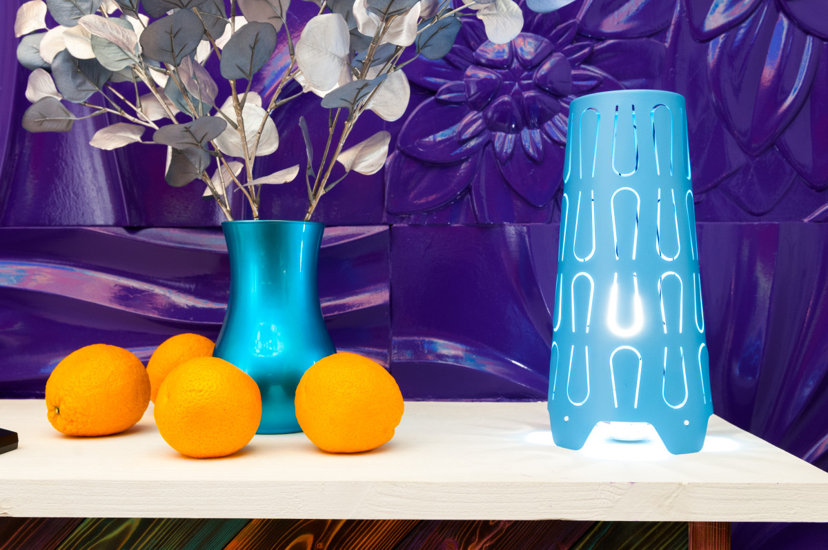 Interior by Vitalia Romanovskaya
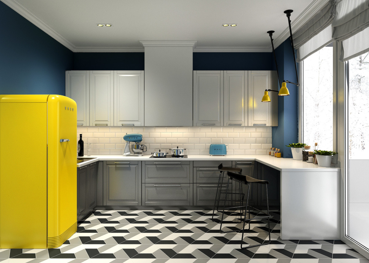
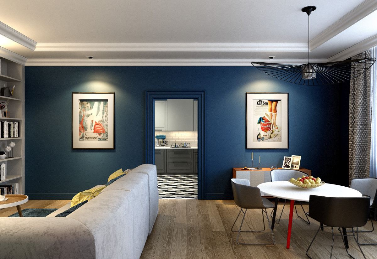
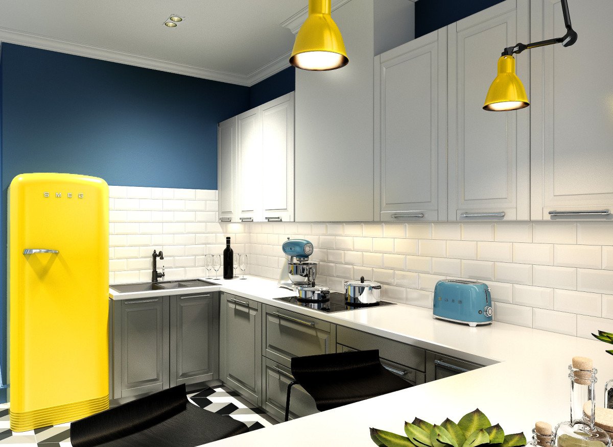
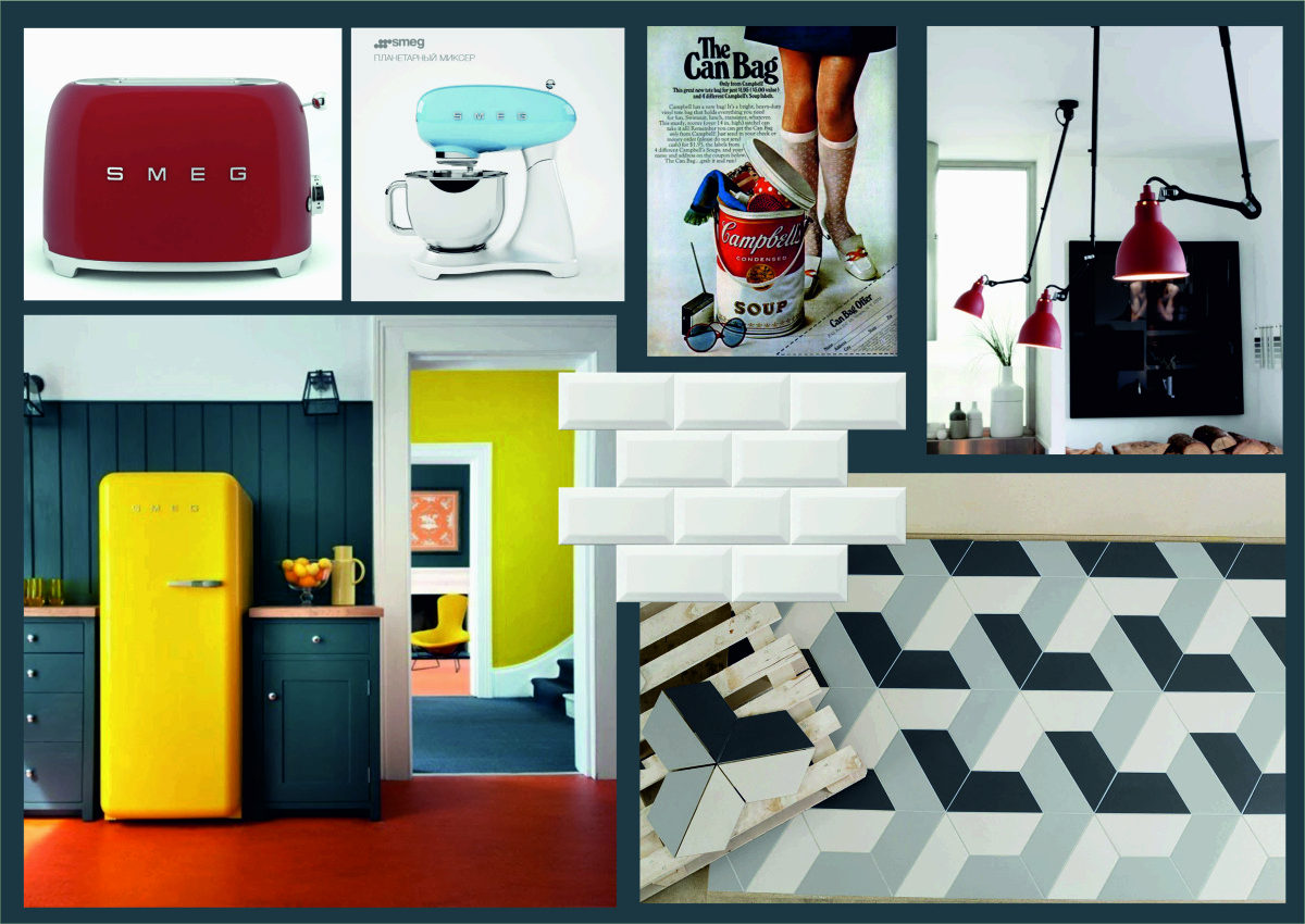
 Interior by Vitaliy Romanovskaya Project by Studio25 is an apartment that started with a lemon refrigerator from the Italian company Smeg. The clients wanted yellow because this color makes you hungry and naturally beckons you to open the door. In the process of working with designers Anastasia Tuganova and Yaroslav Ryazhsky, the refrigerator found itself an interesting company. In the living room, the rich blue walls were decorated with posters. To accompany the bright colors, the designers added floor tiles with an aggressive pattern. And the colorful geometry gave the space visual volume. Anastasia Tuganova, designer: - We were asked to add depth to the color, to make it bright, tasty, simple and functional. The main thing in the process of work was to find the line beyond which the interior would resemble a "kindergarten". wearestudio25.ru
 Interior Studio 25
 Interior Studio 25
 Interior Studio 25
 Interior Studio 25
 Interior Studio 25
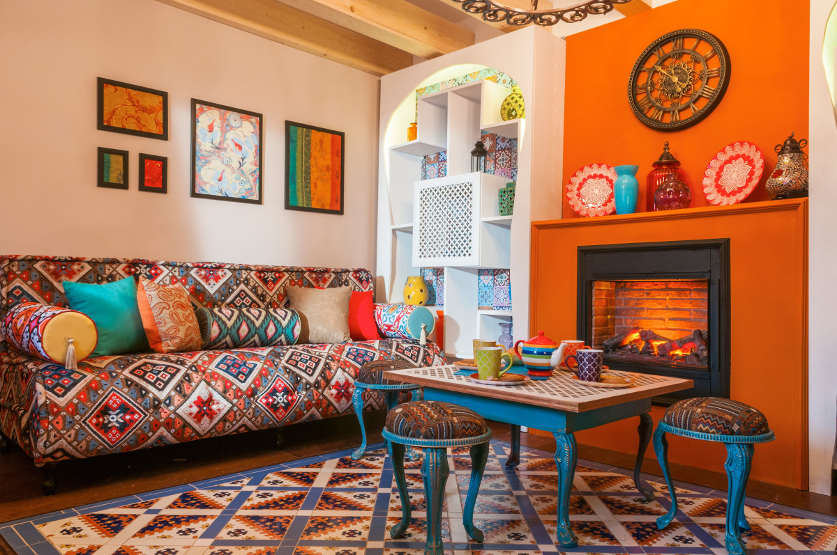
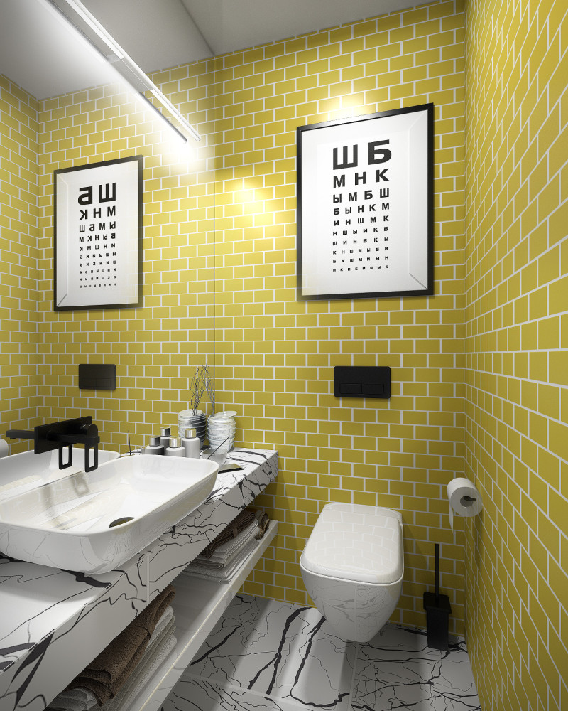 Interior Studio 25 Orange is the warmestcolor in the palette, its intensity can be reduced, but it will never become cold. It is best to use it in the interior as an accent: when highlighting some important area, its status and visual appeal immediately increase. Vitalia Romanovskaya, designer: - It should be taken into account that this color attracts attention, so other colors will fade against its background. If you like this color, but you are afraid to overdo it - opt for bright pillows, curtains. Orange loves to coexist with various wood textures, forming a very harmonious union. vitadizign.com
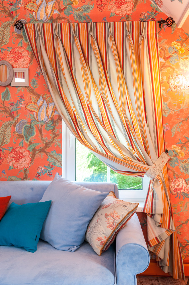
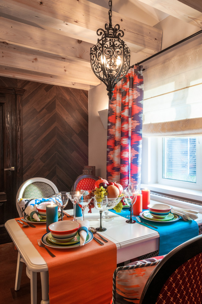 Eggplant For the creative and imaginativeFor individuals who are constantly looking for inspiration, the eggplant color will come in handy. Previously, this shade was a privilege of the aristocracy - the color of power and status. Now, by varying its saturation, you can decorate any room from the bedroom of a little "princess" to the living room. It goes well with warm colors - yellow, orange or pink. And sometimes it is even used for medicinal purposes - for relaxation.
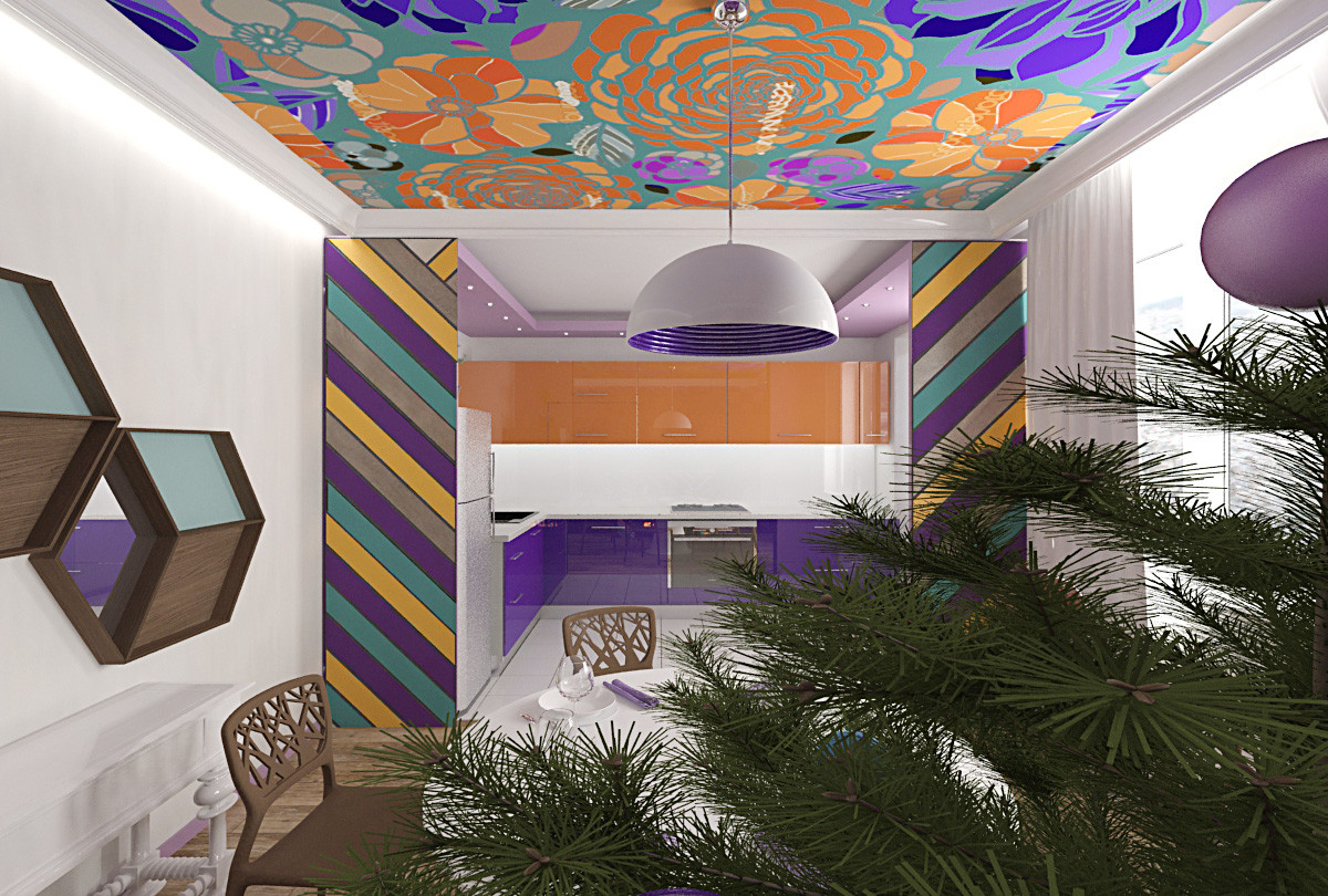
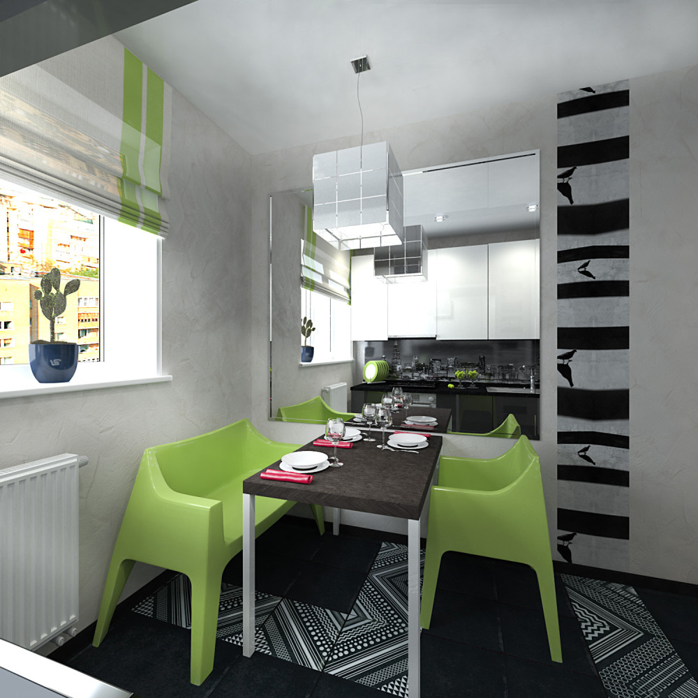
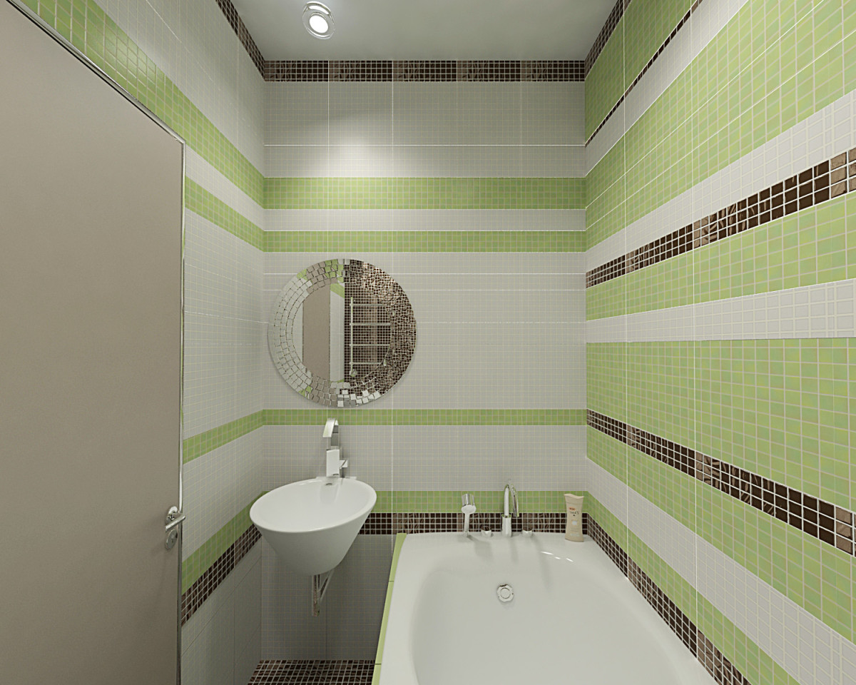
 Apple The color "green apple" will add tointerior of freshness and lightness, because it embodies youth and a decisive readiness for any achievements. This is always a win-win option in a modern interior or an eco-style interior. Apple color will fit perfectly into a black and white palette, as well as into an interior with a lot of wood texture. Psychologically, a person feels more protected and closer to nature in such a space.

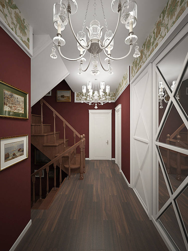
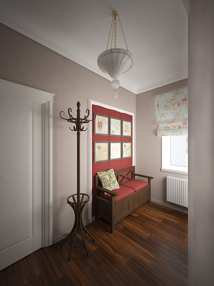
 Wine If you want to emphasize the owner's status,its aristocracy and imposingness, often use this shade. It should not be abused, especially in recreation rooms, where you can get by with wine-colored upholstered furniture and accessories. Because the wine color is a relative of red, and the latter, as is known, disposes to excitement and passion. But, for example, in formal reception rooms and in corridor rooms, this shade will look quite appropriate.
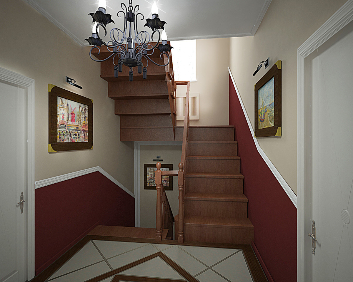
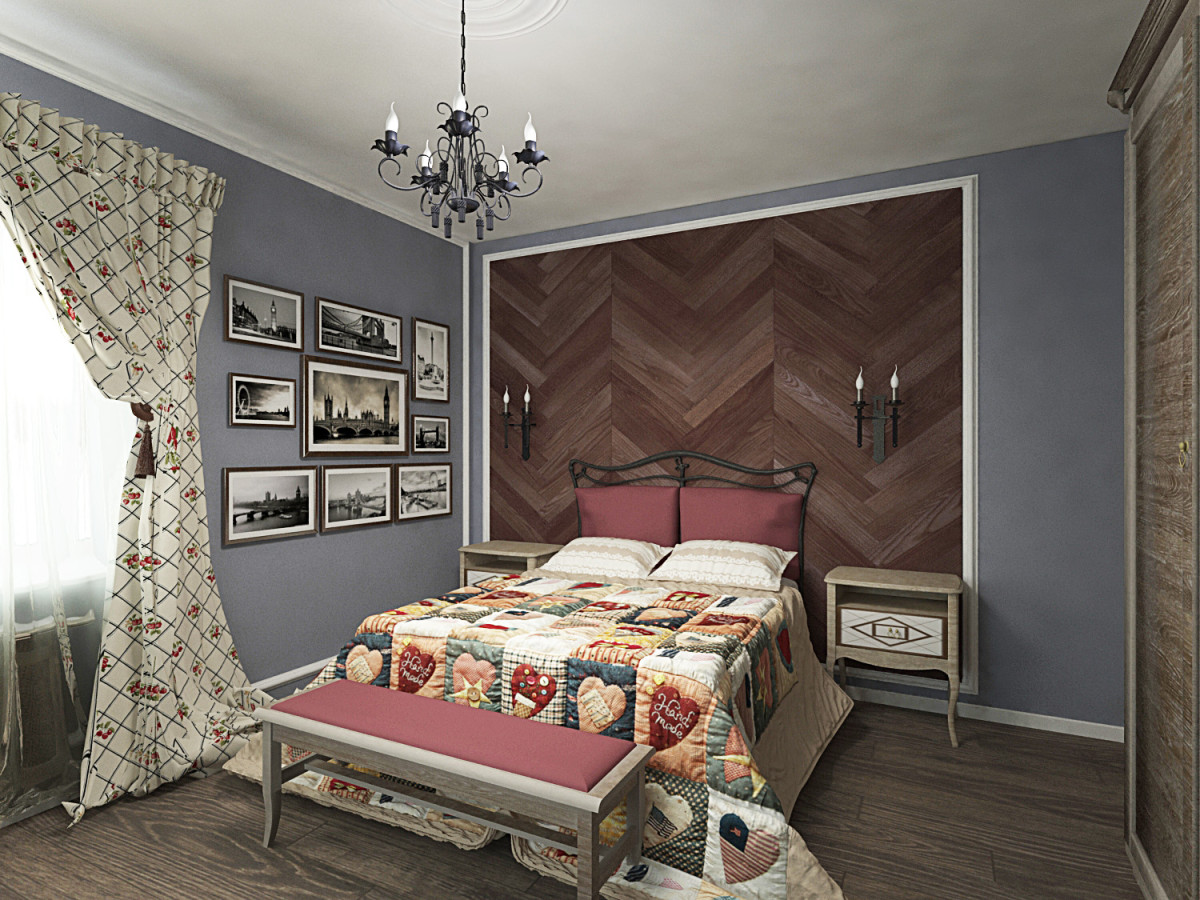
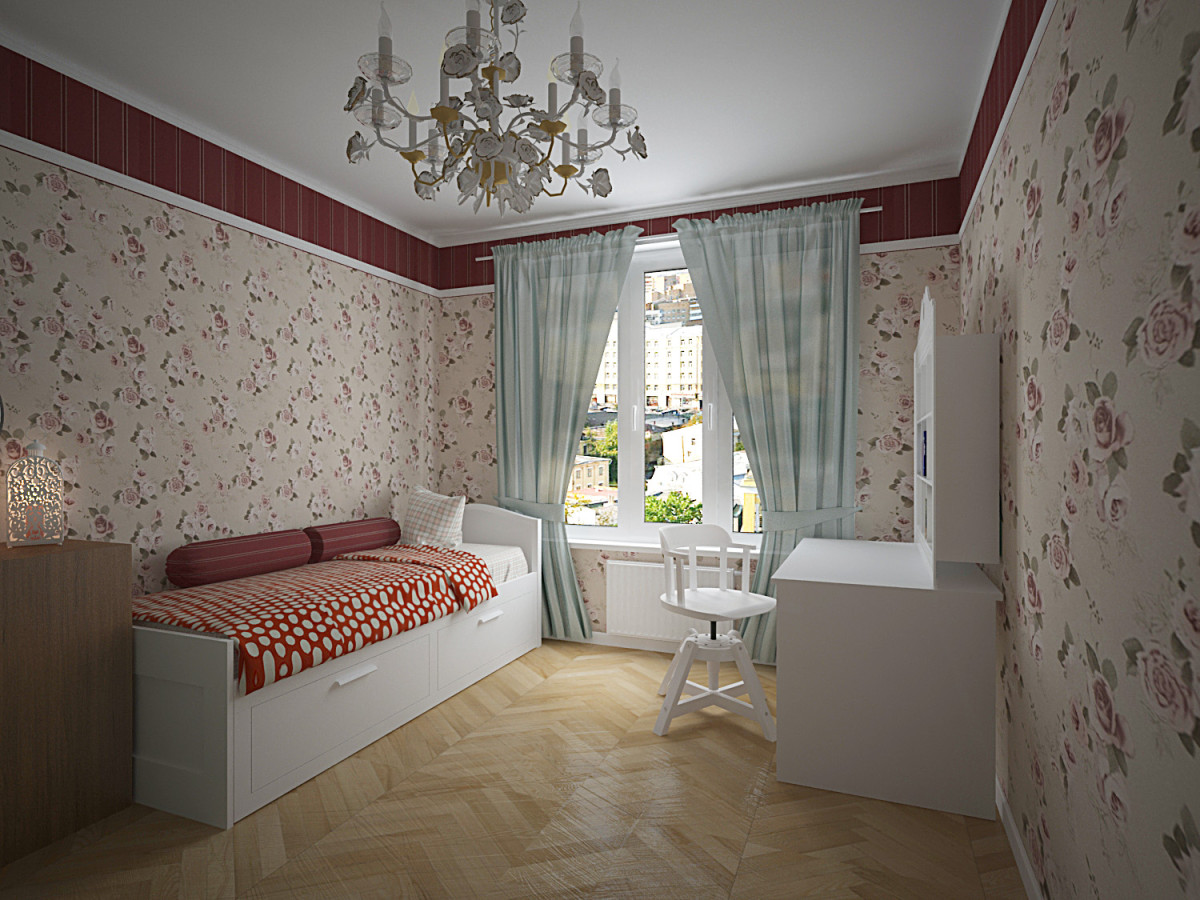 The most fashionable color of 2015.Although it has been used since ancient times to add luxury and gloss to the interior. Combinations such as wine color with gray-blue, white and cream are suitable. Vitalia Romanovskaya, designer
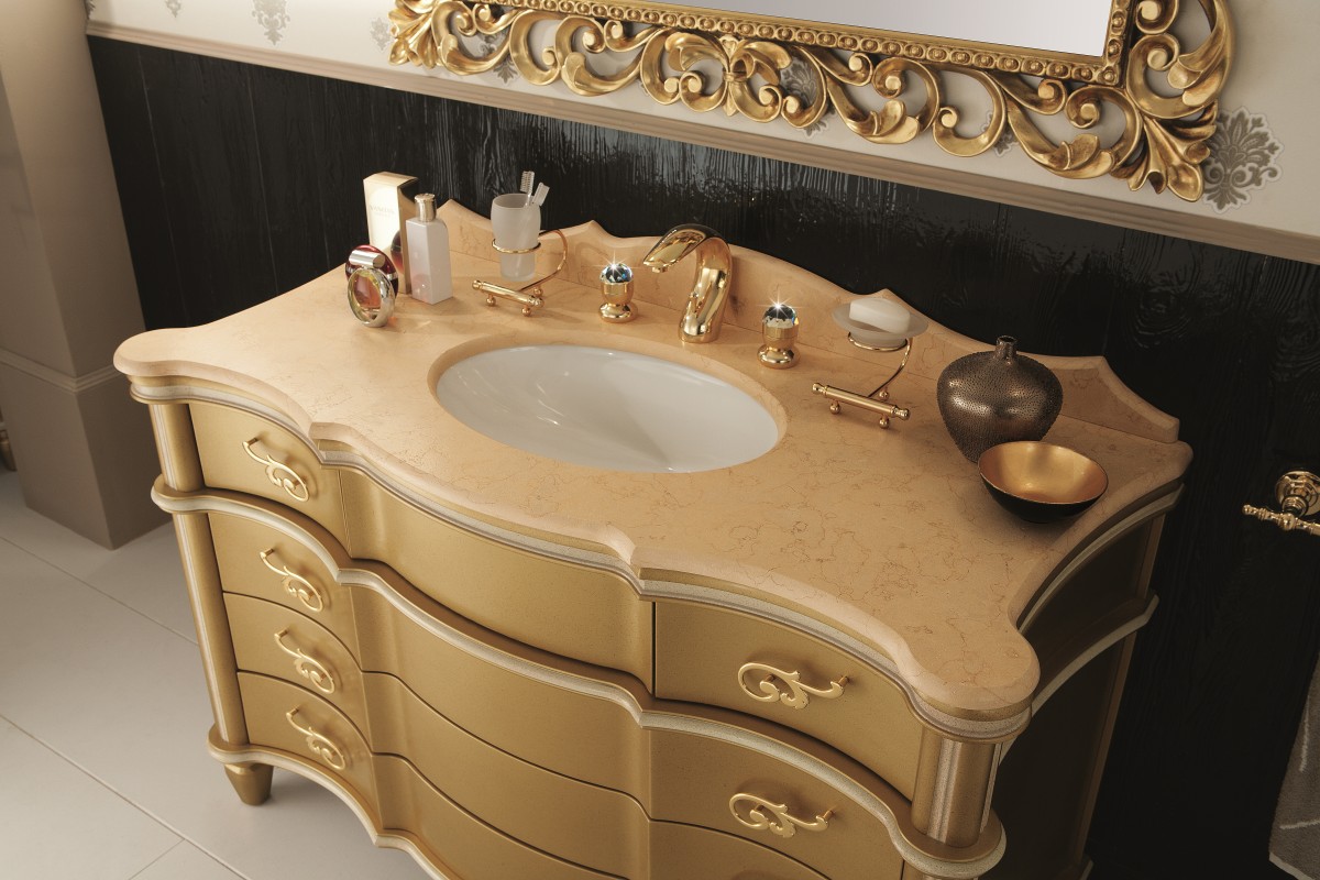
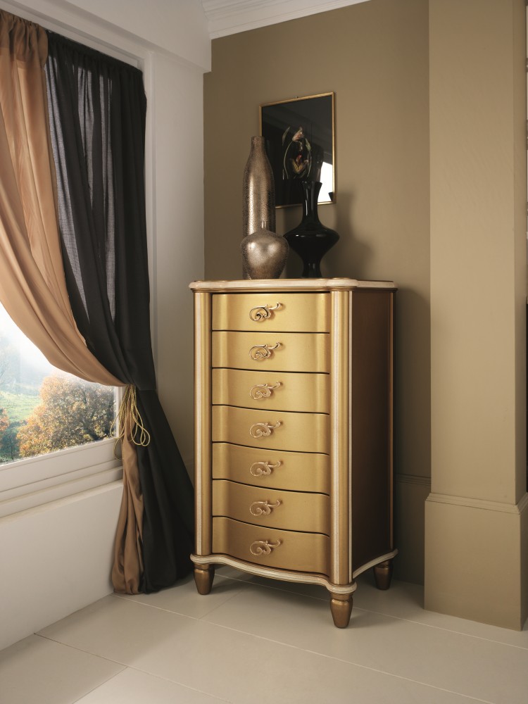
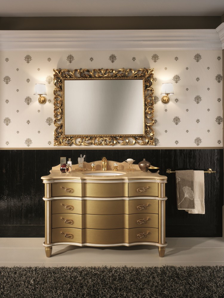
 Toffee A beautiful and warm caramel colorfor a classic bathroom, the Tiffany collection from the Italian brand Bagno Piu offers. The bathroom is the place where we are alone with ourselves and perceive our surroundings more sensitively, so toffee shades will allow you to relax properly. The positive mood that arises here will largely determine how the day will turn out or how calm the night will be.
 Bagno Piu
 Bagno Piu
 Bagno Piu
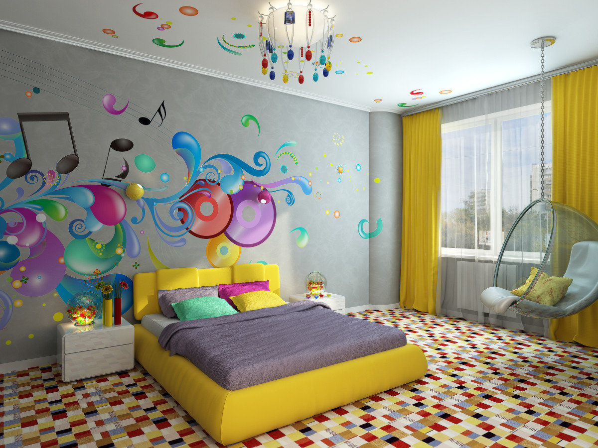
 Bagno Piu Candies Why Limit Yourself to Onethe color of deliciousness, if you can create an entire interior using only delicious shades of caramels and sweets of all possible colors? This is what the heads of the Elle design studio Anna Kireenkova and Oksana Lutsenko thought and created a truly uniquely bright entourage for the young creative couple of musicians. Anna Kireenkova, designer: - Their main wish was a bright, juicy, "caramel" interior. And we created a "sweet" atmosphere for an equally bright, creative life!
 Elle design studio
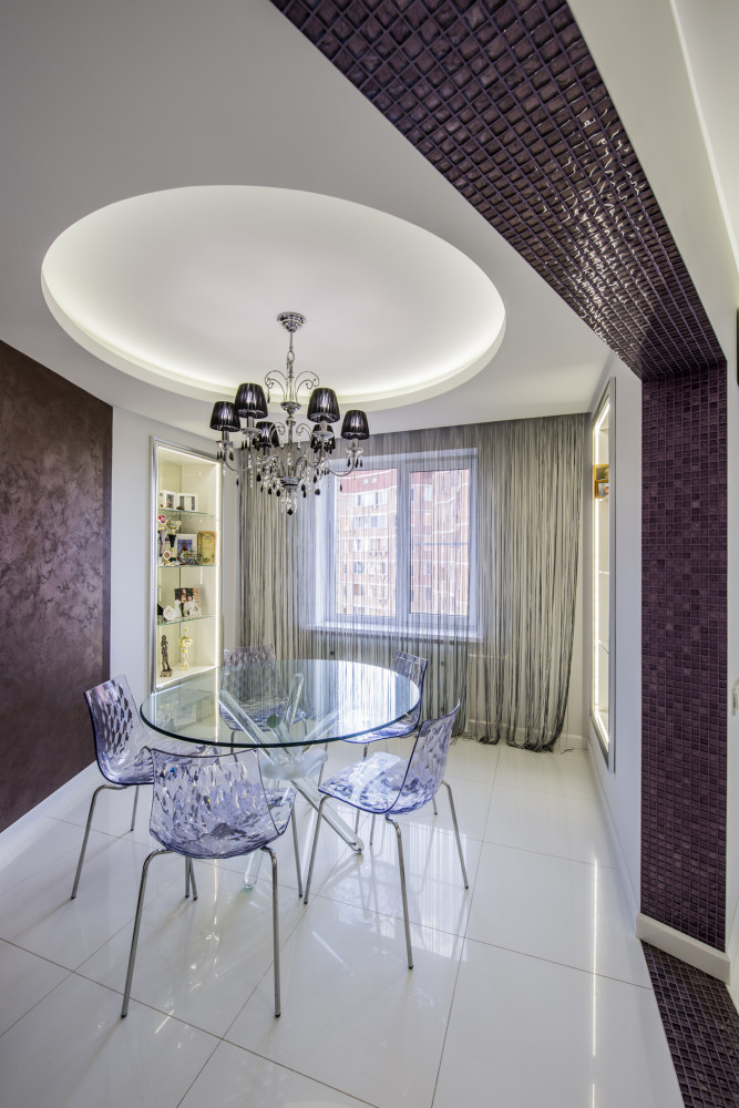
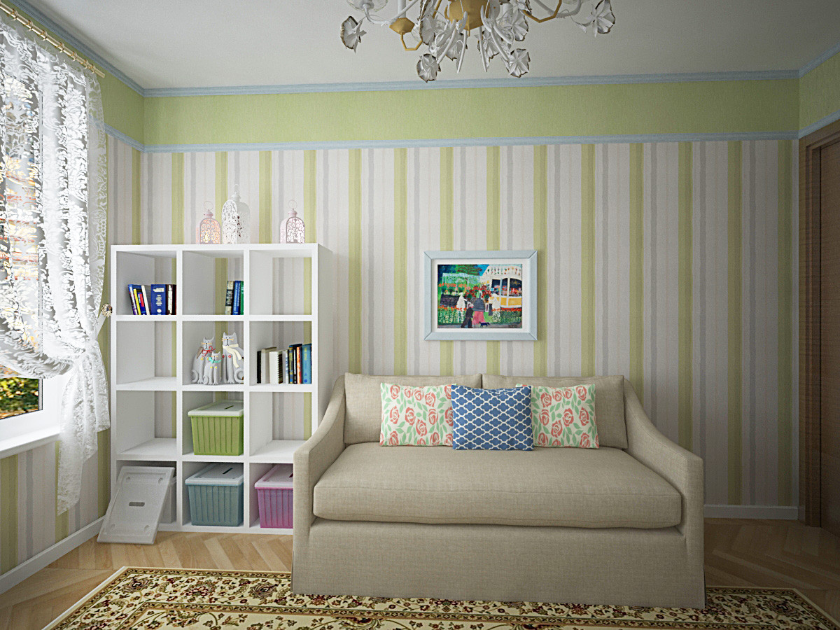
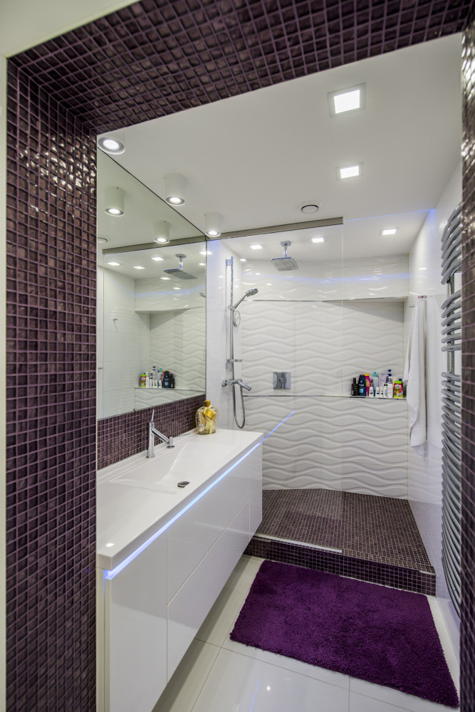
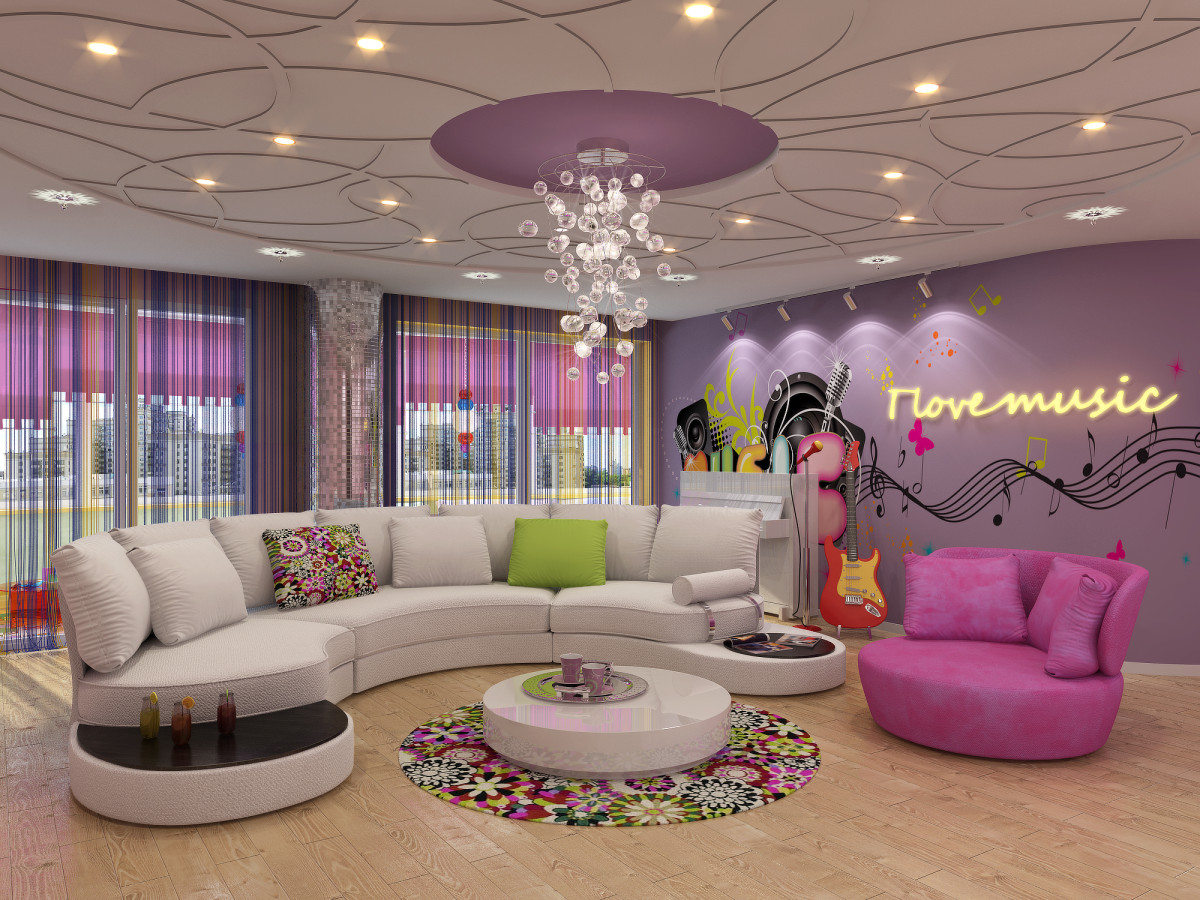 Elle design studio Blueberry and rainbow MainThe client of the Luxer design studio wanted to create an apartment interior in white. But at the same time, they wanted to add some bright accents to the interior (walls, decor, textiles, furniture). So, in one of the children's rooms, bright striped wallpaper appeared, reminiscent of a rainbow. Nikolay Ovcharov, designer: - The owner of this apartment is a civil aviation pilot, an airliner commander. The client travels a lot around the world, often visiting the United States, where he got many ideas for interior design. For example, so that the interior, originally decorated in white, would not look faceless, I added a blueberry-colored glass mosaic, which would resemble a stylized air trail from an airplane.
 Luxurious design
 Luxurious design
 Luxurious design
 Luxurious design
 Luxurious design
 Luxurious design
New trend: delicious colors in the interior - etk-fashion.com
