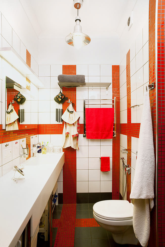
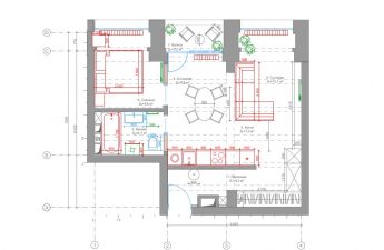
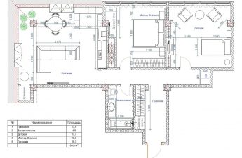
This very small apartment has much moreopportunities than in some country houses. How did the architect manage to do it? We'll tell you now This apartment is 47 meters, has two rooms - a living room and a nursery, two owners - a mother and a teenage daughter, two main colors - red and gray. This "pairing" only played into the hands of the interior, a rather small apartment turned out to be restrained, but not at all boring. Anna Medleva, architect Member of the Union of Architects of Russia. Laureate and diploma winner of Russian and international competitions in architecture. Exhibited her works at Salone del Mobile. The general brain in the PB "Architectural Policy", the ADM group of companies. The primary task set before the architect was to maximize the expansion of space. It turned out to be not so easy to accomplish. One third of the total area of the apartment was allocated to the corridor, the kitchen space was a tiny five-meter corner, and the living room was shaped like a narrow carriage. A separate important issue is the creation of a full-fledged children's room for a child, isolated from irritants and provided with everything necessary for study and rest.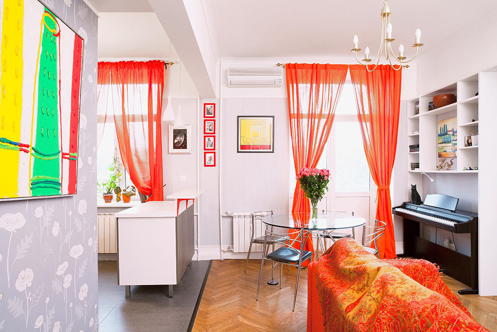 The zoning process itself began with the demolition of the wall separating the kitchen and living room and forming that very corridor. The result of the first transformations was a large, bright room.
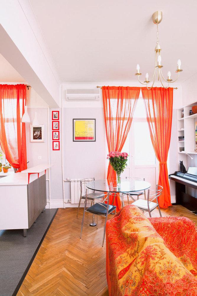 All the life of the house is concentrated here -a large fold-out sofa that can accommodate a large group of people, a dining table for noisy get-togethers, a piano for cultural recreation, and a real woman’s happiness – a dressing room.

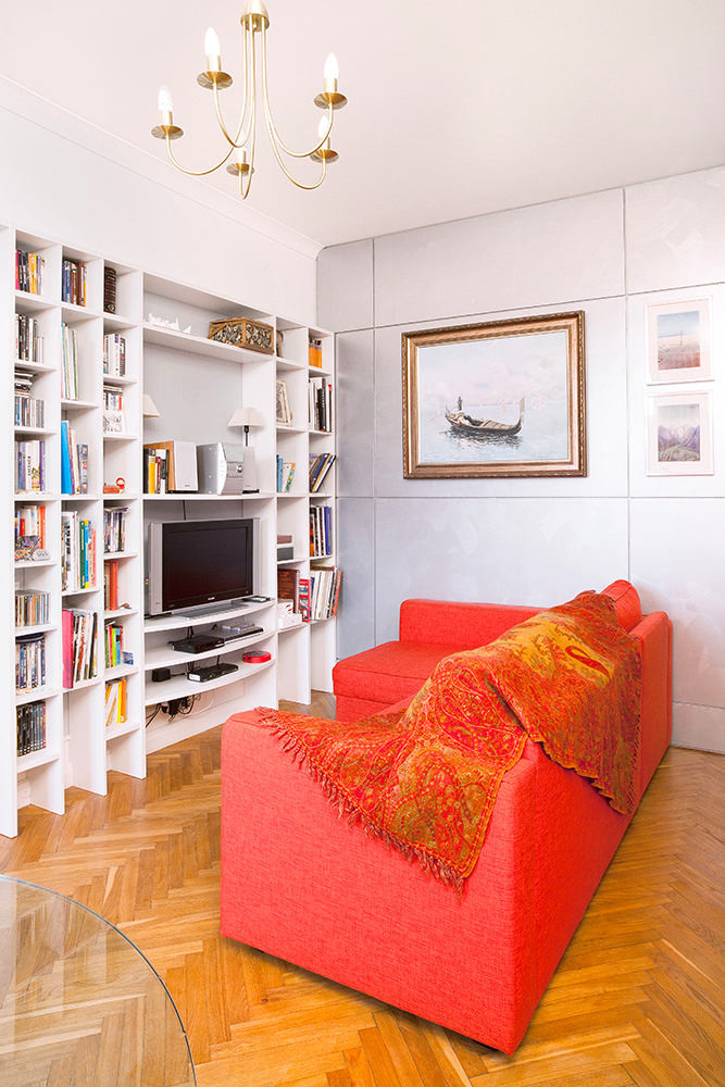
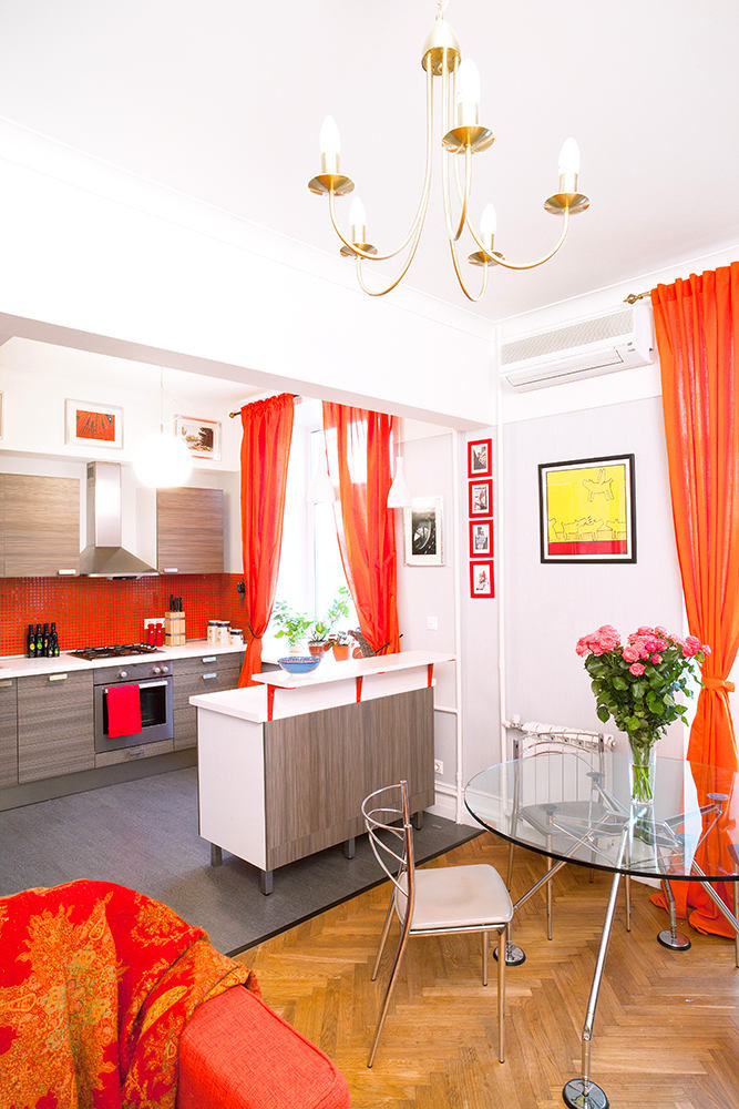
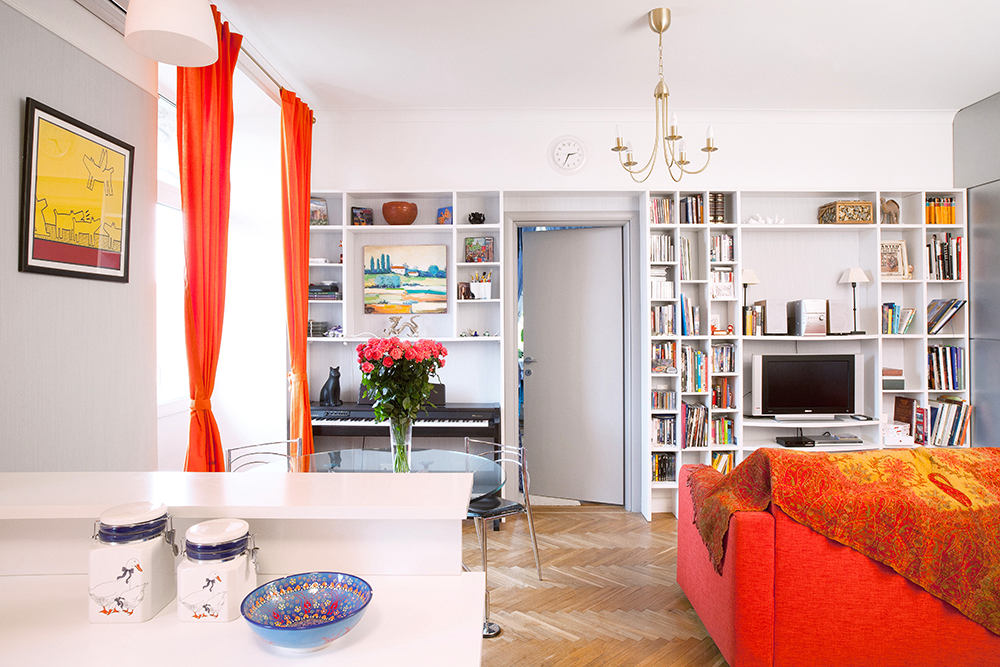 Instead of the usual beds for sleeping areasThe architect decided to give preference to mobile folding sofas. In order to free up as much space as possible, the author of the project used built-in shelving as additional storage systems. And, of course, a round dining table - for a hospitable family it is simply necessary.
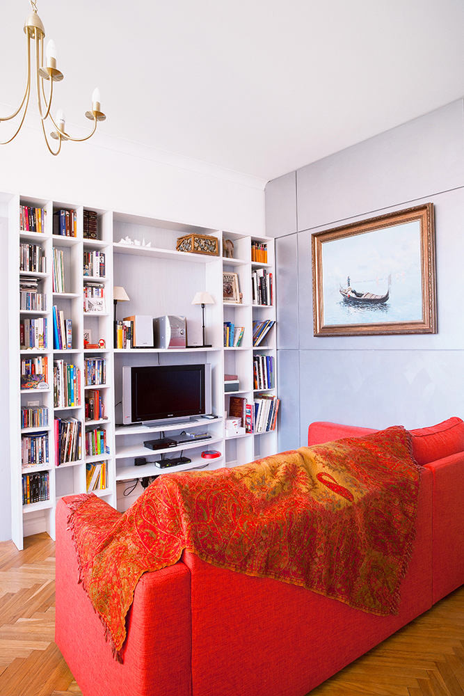
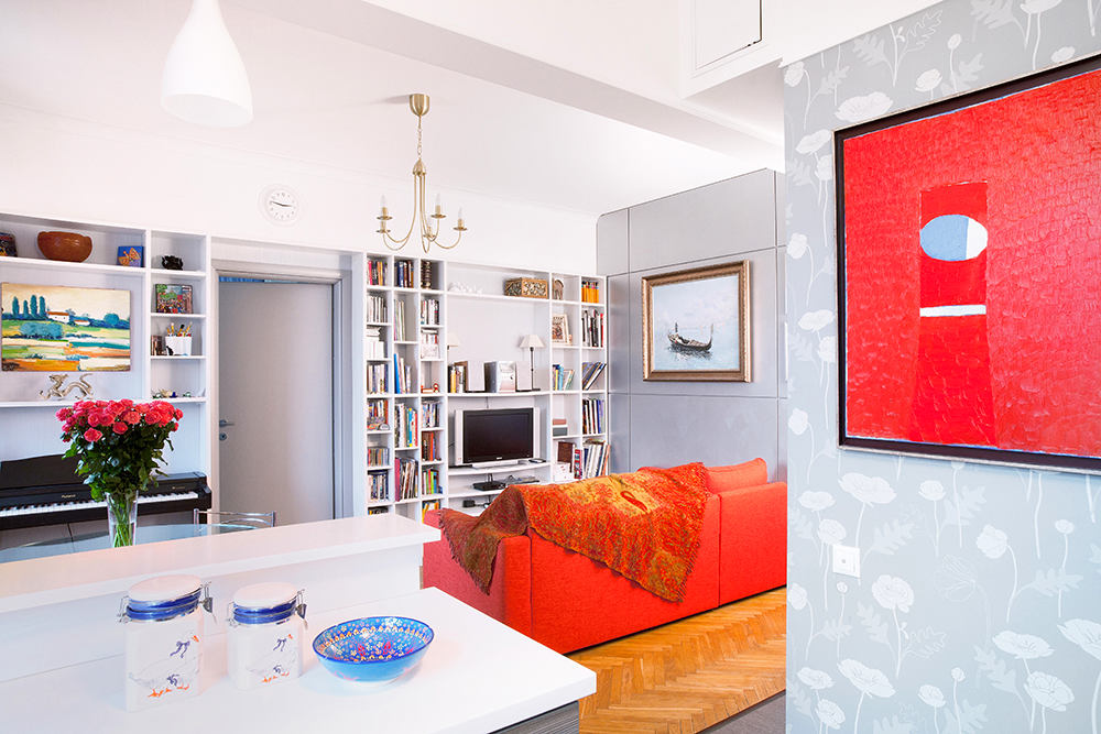 Kitchen - a budget model from a very famousSwedish manufacturer. The facade was deliberately chosen to be calm and not to attract attention. The main accents of the interior are concentrated on color spots, textures and accessories.
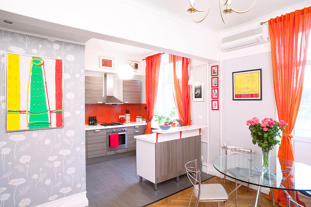
 As for the choice of color scheme, forThe living room walls were painted in a neutral gray shade to highlight the bright sofa, curtains and paintings. The little hostess chose the palette for the children's room herself.

 Architect Anna Medleva shared some advice with all those inspired by this bright and light interior:
How to place a kitchen, a dining room, a living room and a nursery for 47 meters: a bright apartment in Moscow
