What to do if the apartment is a gift foryoung girl, and her parents really love the classic interior? We will tell you how to combine classics and originality using the example of this Moscow project. The customers of the apartment project on Novy Arbat in Moscow created it as a gift for their daughter. The parents themselves prefer strict classics, but it was decided to make a more free and original space for the young girl. In addition, the apartment was quite dark due to the small number of windows, so another important task was to solve the problem of lack of sunlight. This project was entrusted to designers Anton and Marina Fruktov, because they always work logically and competently in an eclectic style, mixing architectural styles in projects. In addition, the customers were not working with the founders of the Design in a Cube studio for the first time. Marina and Anton Fruktov Graduates of the Moscow State University of Art and Industry named after S. G. Stroganova, founders of the studio "Design in a cube", regular participants of the TV projects "Apartment Question" and "Dachny Otvet", authors of many publications in interior media - "Salon-interior", "Interior + design", "Architectural digest"; winners of design competitions. design3.ru
Design concept
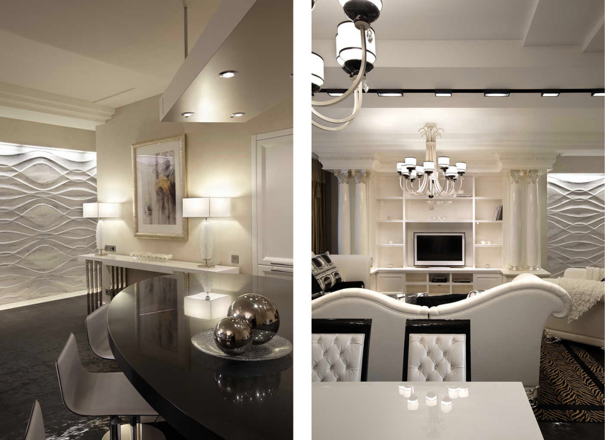
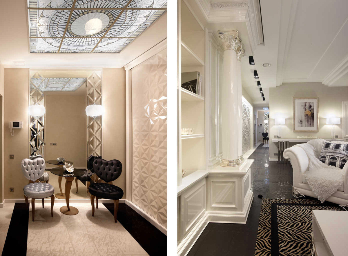
The eclecticism of the interior of this projectis a combination of classic architectural forms, bold color solutions and delicate shades. An interesting fact is that the future owner of the apartment did not know about the project, and all decisions were made by her parents, who completely trusted the taste and experience of the team of the Design in a Cube studio. Due to the fact that the windows in the apartment are only in the end parts and there is a lack of light, the designers suggested using an abundance of white in the interior.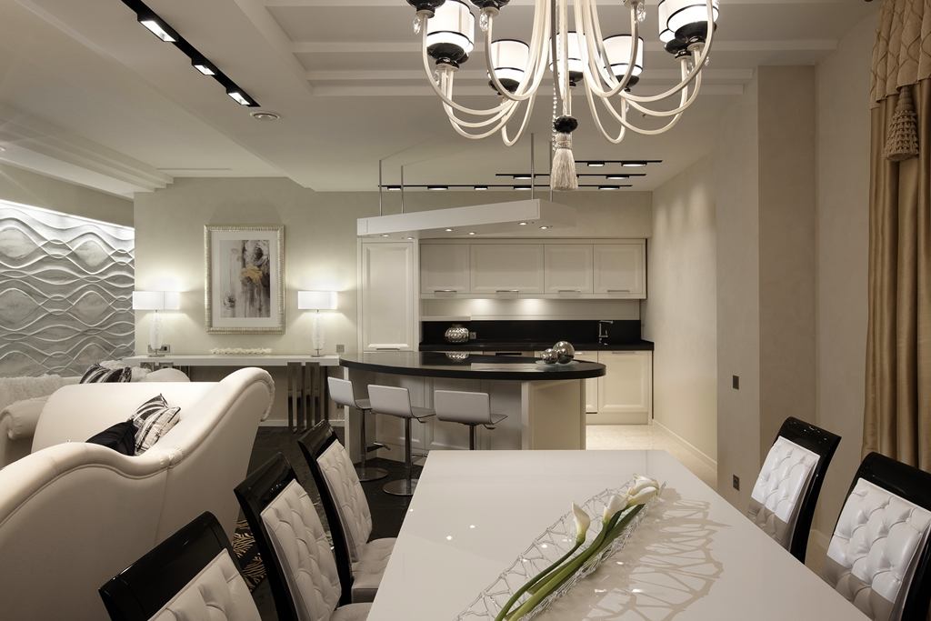

Planning solutions
Architects proposed dividing the spaceapartments into two zones - private and public. The larger of them housed the living room and dining room, the smaller - the bedroom, study and master bathroom. This zoning was caused not only by the functional convenience of the rooms' arrangement, but also by the low lighting of the apartment, where the windows were located only in the end walls. As a result, the darkest room in the center of the apartment was given over to the dressing room.
Finishing and decor
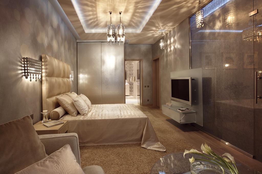
The laconicism of the interior color scheme waswas caused by the need to lighten and expand a rather dark space. The private areas — the bedroom and the study — are done in a soft golden-olive color scheme. The original lighting effect is created by the shadows cast by the Simga Elle Due chandeliers. The study is separated from the bedroom by a translucent glass partition with a moire effect. The wall of the master bathroom is finished with tiles with a mirror pattern. An interesting decorative solution for the bathroom was the volumetric Naxos partition.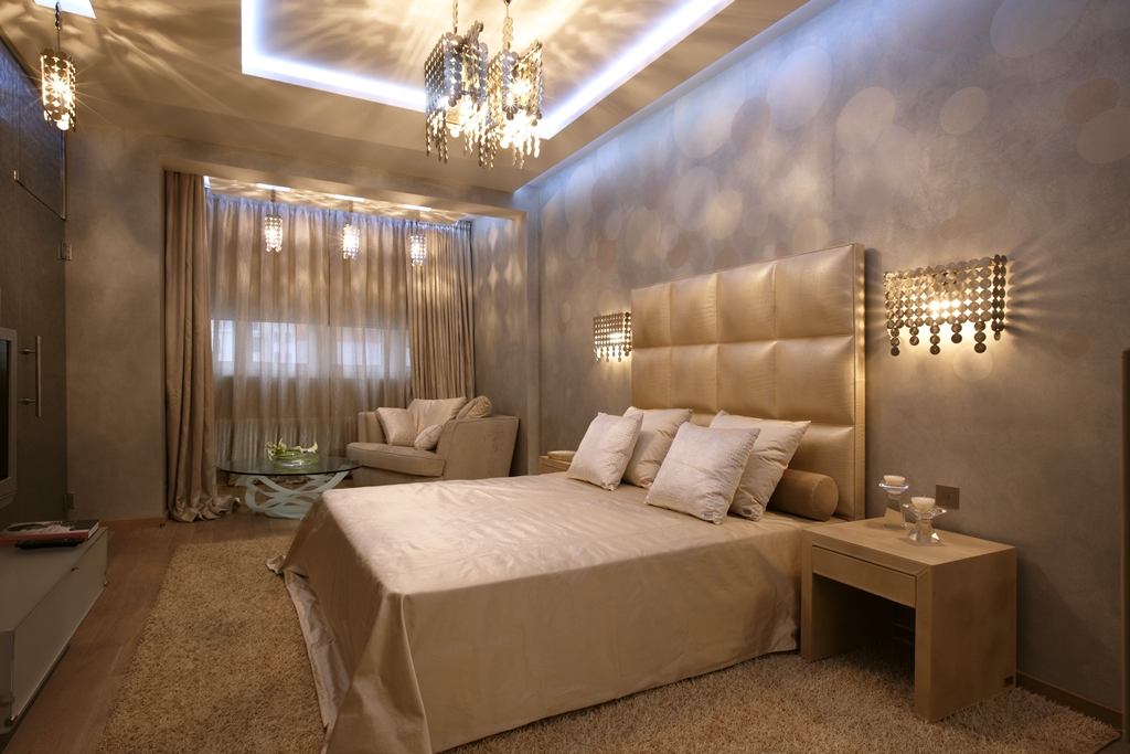

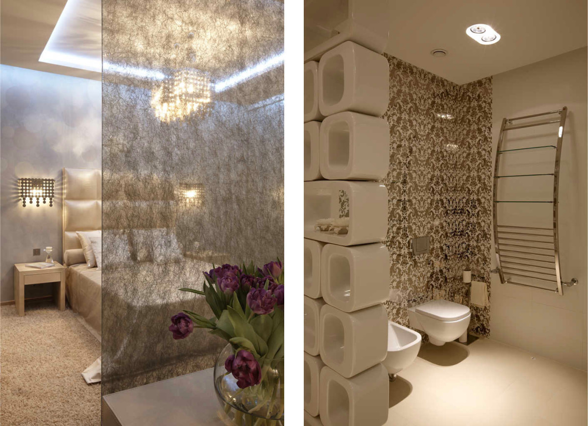
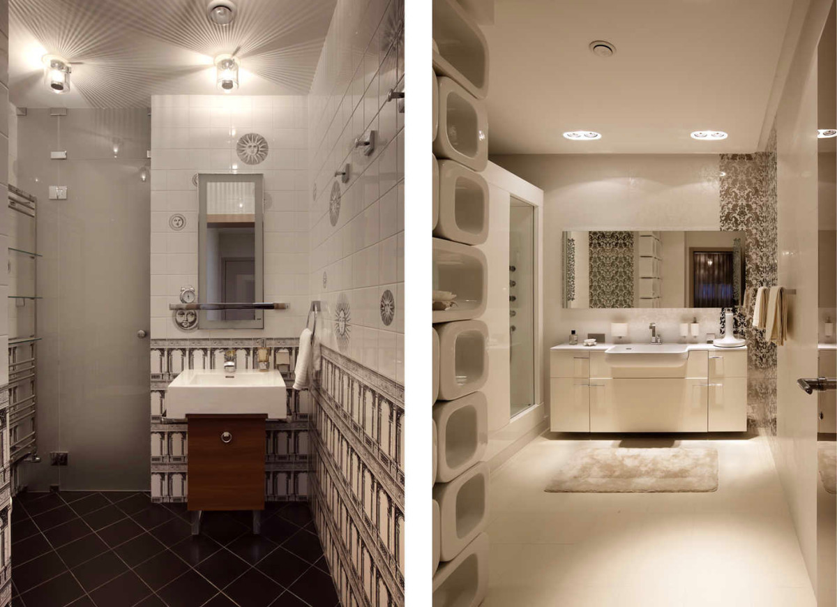 Anton and Marina Fruktov, designers:— Accessories like Corinthian columns, architectural prints on textiles and original stained glass bring an atmosphere of sophistication to the interior, typical of classical interiors. www.design3.ru As a result, this project, created in black and white shades and filled with glaring and glowing details, does not seem oversaturated at all. The laconicism of color solutions and well-thought-out layouts made it possible to create a harmonious and fashionable interior for a young girl. design3.ru
