To paint or not to paint the walls red?To whom will this color be useful and even desirable, and which of us should refrain from using red in the interior? Look for answers to these and other questions in our new material. Perhaps no color causes so much controversy regarding its use in the interior. Someone thinks red is too flashy, someone speaks of its excessive intensity, some even blame this shade for creating an “unhealthy” atmosphere in space. We found four interior designers who, for one reason or another, included red in their designs, and we only asked them one question - why. Here's what they told us. Natalia Chuzhova and Olga Shapovalova, decorators:
- What did Alisa think when she got into the looking-glass? How space is refracted, how many facets, colors and shades there are in it, how much life and many reflections of it itself. The space that surrounds us, whether it be an office or a house, is also a reflection of ourselves, our tastes and needs. It should be comfortable, functional and, of course, beautiful. It is into this atmosphere that a person enters, opening the red door of the Manders store. Restraint in everything except color. On it the accent is made.
The furniture is rich in lilac and red colors, shades of blue and gray in combination with a light floor. English aristocratism is especially for connoisseurs of art, especially modern art.
The mirror ceiling expands the space andthe consciousness of visitors. I want to consider myself in the color spots of reflections, in which also neat shelves with the assortment of goods are also visible.
Drowning in comfortable chairs, you can calmly and relaxed devote your time to choice or conversation.
The most convenient for visitors and functional for the staff - this is exactly the shop Manders. 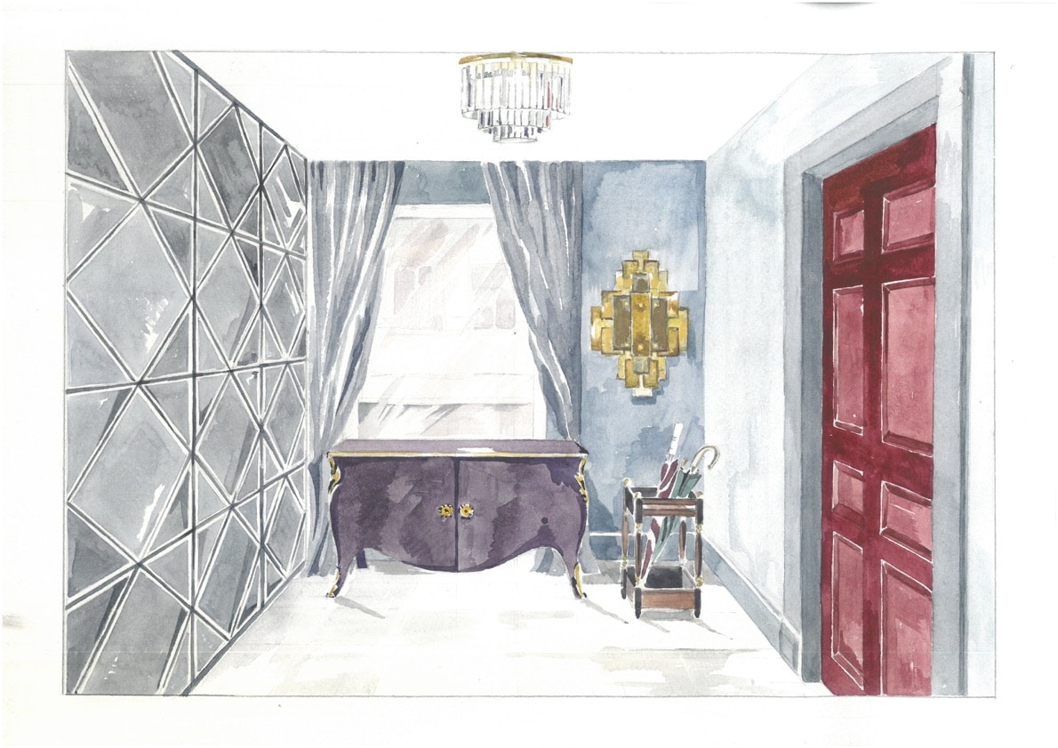 Design by Natalya Chuzhova and Olga Shapovalova
 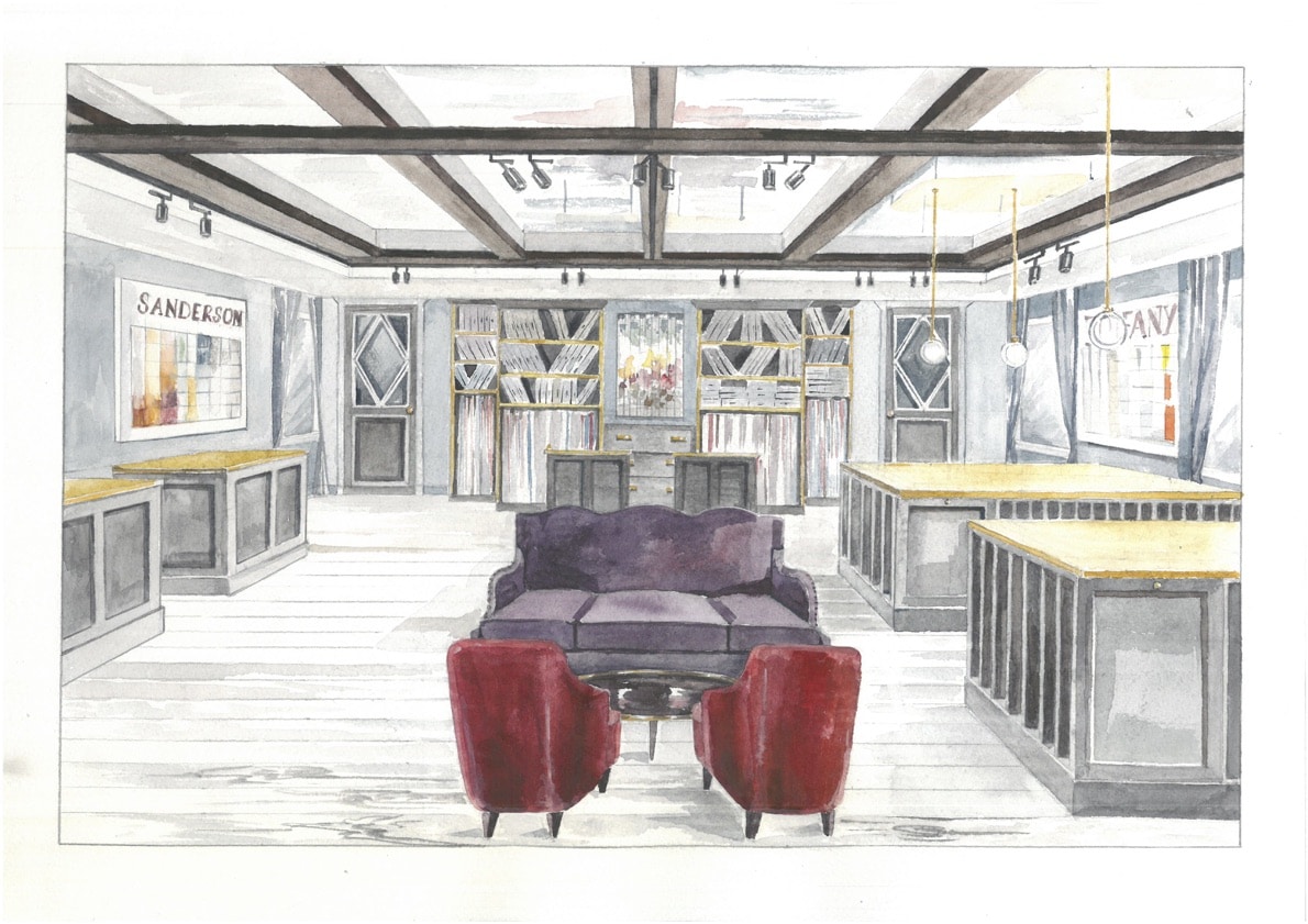 Designed by Natalia Chuzhova and Olga Shapovalova Olga Shapovalova prepared tips for using red in the interior. Living room
One of the most suitable colors. I recommend using a burgundy or crimson shade. A correctly selected red item - a sofa or a chandelier - will bring an atmosphere of luxury to the room. Kitchen
Red color improves mood, promotesdigestion and stimulates appetite. Please note that this color visually reduces the space, try not to use it in small rooms, but place, for example, accents on tiles, textiles or dishes. Bedroom
The impact of red on the human psyche is very large. If the bedroom is your place of relaxation, then opt for a lampshade or red pillows. Children
In the children's room to use red color must be extremely delicate, so as not to exhaust the nervous system of the child. Limited with accessories of this color.  Kirill Lopatinsky, interior designer:
- Below in the pictures is a presentationpodium for the new fragrance Cierge de Lune ("Moonlight") by the American brand Aedes de Venustas. The perfume contains a component called “flower of the queen of the night”. It was this ingredient that became the starting point for the main idea of the catwalk. facebook.com/kirill.lopatinsky 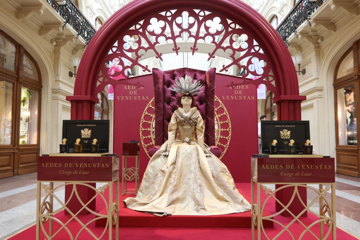 Design by Kirill Lopatinsky Kirill Lopatinsky, interior designer:
- The first thing that was born in my mind duringwork on the project, this is the Victorian image of Elizabeth II from the film "Elizabeth, the golden age." However, the Victorian style, despite its inherent luxury and monumentality, is itself quite gray. And the image of the Queen of the moonlight should be saturated and attractive, a bright spot on the line of GUM. I prepared three options for installation - gray, gold and red. The most spectacular was the latter, and it was realized.
Regarding the use of red in residentialinteriors, in my opinion, this shade is too exciting for the dominant position in the palette and should be used in a more metered version, in accents. facebook.com/kirill.lopatinsky 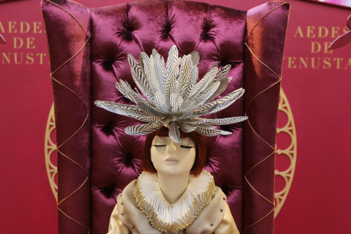 Design by Cyril Lopatinsky
 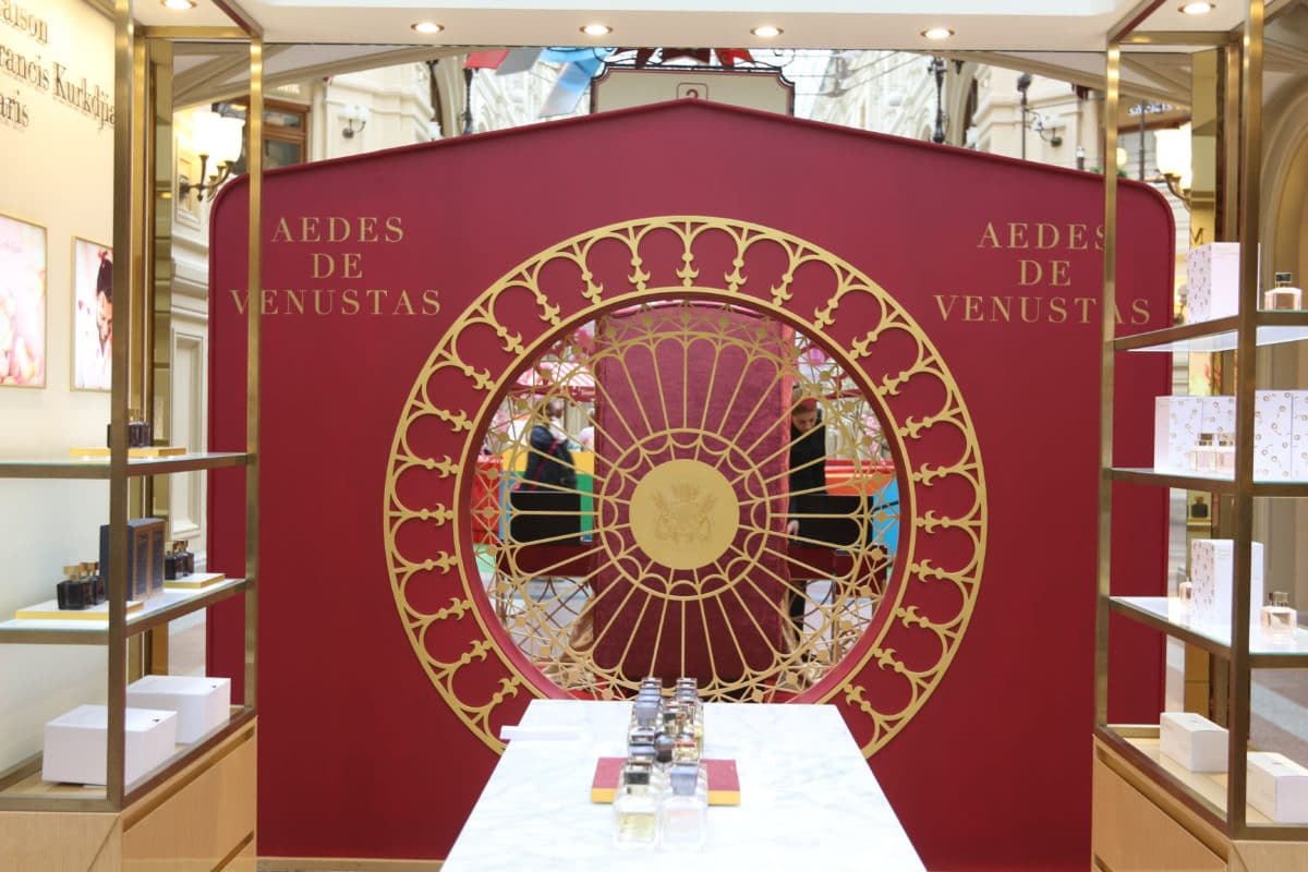 Design by Cyril Lopatinsky Olga Agapova, interior designer:
- This project (below in the pictures) was created forprograms "Fazenda". The heroine and, accordingly, the mistress of the house dreamed of a red wall, which would charge her with energy and inspire her to new achievements, but her husband was not at all inclined towards red, preferring white to all colors. The task was not easy - it was necessary to reconcile the diametrically opposite tastes of two people closest to each other. We did create a red wall, and not even one. We also made an almost white floor, ceiling and most of the furniture. We delimited the "zones of influence" with dark objects, at the same time collecting them into a common composition. designzhilya.rf  Design by Olga Agapova, Photo by Ekaterina Fedorovskaya, "Fazenda" Channel One
  Design by Olga Agapova, Photo by Ekaterina Fedorovskaya, "Fazenda" Channel One
 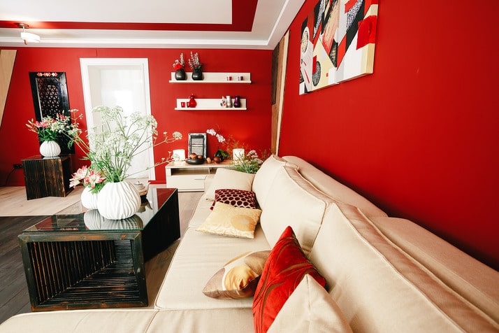 Design by Olga Agapova, Photo by Ekaterina Fedorovskaya, "Fazenda" Channel One
 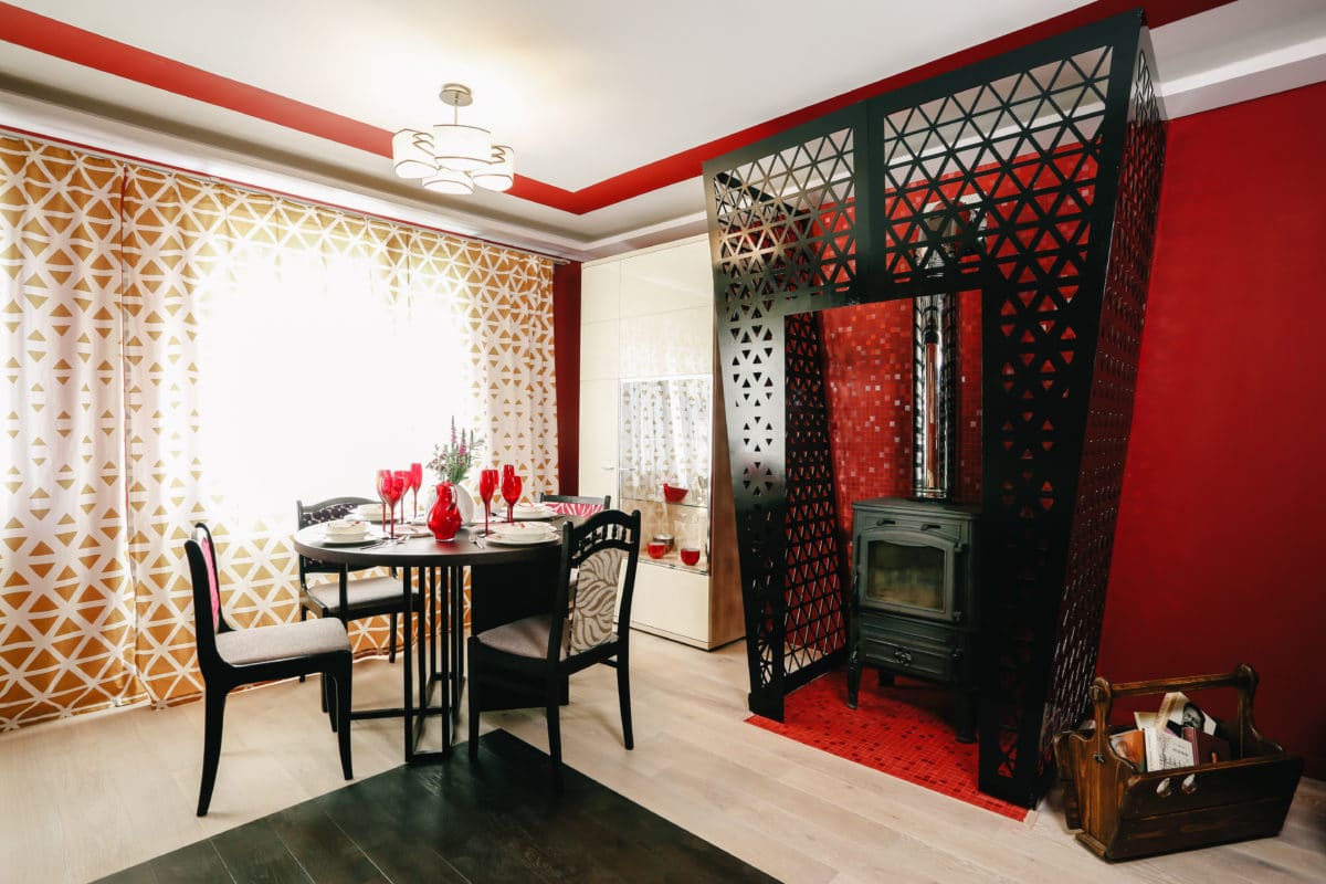 Design Olga Agapova, Photo Ekaterina Fedorovskaya, Fazenda First Channel Olga Agapova, Interior Designer:
- In my opinion, the living space is redthe color is best used in public areas. Yet this color is very energetic and stimulating. In the dining room, for example, red will whet the appetite, that is, for those who try to limit themselves in food, I would not recommend red. Red needs an energetic "owner", this color makes you move and does not allow you to sit still. A melancholic in a red interior will never take root. However, for a person who lacks energy, red can be a medicine. In any case, when choosing this color, you should focus solely on the owner, his abilities and needs. designzhilya.rf  Design by Olga Agapova, Photo by Ekaterina Fedorovskaya, "Fazenda" Channel One
  Design by Olga Agapova, Photo by Ekaterina Fedorovskaya, "Fazenda" Channel One
 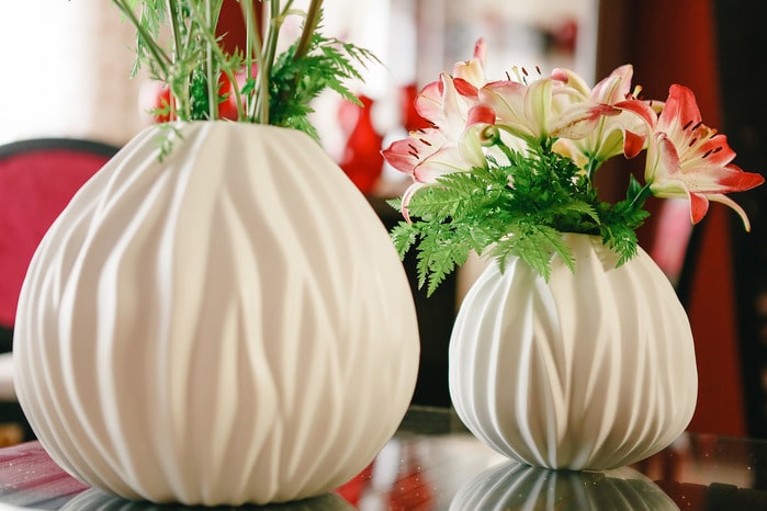 Design by Olga Agapova, Photo by Ekaterina Fedorovskaya, "Fazenda" Channel One
 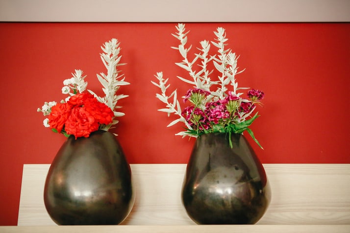 Design by Olga Agapova, Photo by Ekaterina Fedorovskaya, "Fazenda" Channel One
  Design by Olga Agapova, Photo by Ekaterina Fedorovskaya, "Fazenda" Channel One


