In this collection you will see the interiors created bynot only on the "fertile soil" of the modern free lay-out, but also in standard apartments and even in low-rise buildings. Over the past year, we have become acquainted with a variety of interiors of very different style and price orientation. The most interesting of them we gathered in today's selection of the best interiors in 2014.
1. Light treshka for a young family
Designer Natalya Komova had a serious timesweat over it - in order to embody all that was conceived, it was necessary to bring the heating to the balcony and attach it to the living quarters, make an opening in the load-bearing wall and even paste wallpaper in the bathroom. However, with all the non-standard and even originality of many, many ideas (which is only a Scottish cage in the toilet), the interior turned out to be quite traditional and even classic, and the best part is that many of the techniques can be quite useful for our standard city apartments. ... 
2. Apartment for young bankers
This is home to a young couple of bankers, and althoughthe building has already celebrated its centenary for 15 years, the architect Dina Salakhova had to re-lay the brickwork in the living room from loft bricks brought straight from the northern capital. An office is also equipped in the apartment building, and it is designed in such a way that in the future it could be easily converted into a nursery. As for the issue of storage systems, which is always and everywhere topical, here it is solved in two stages - the wardrobes are hidden in the bedroom and living room, but only a very attentive reader will find them. 
3. What men want
This one is for a young and active bacheloroddly enough, it was designed by two quivering girls - Elizaveta Pyshneva and Yulia Tyuryakova. In contrast to the well-established opinion about the male interior, this one, although it is quite ascetic in places, turned out to be the most curious. Firstly, there are a lot of storage systems here - do you think only women can have a lot of things? - and they are located in such a way that not every guest can find them the first time. Secondly, the monochrome color scheme is effectively complemented by red accents. And most importantly, anyone in this interior will discover something new and quite applicable in their own home. Pay special attention to the kitchen and hallway. 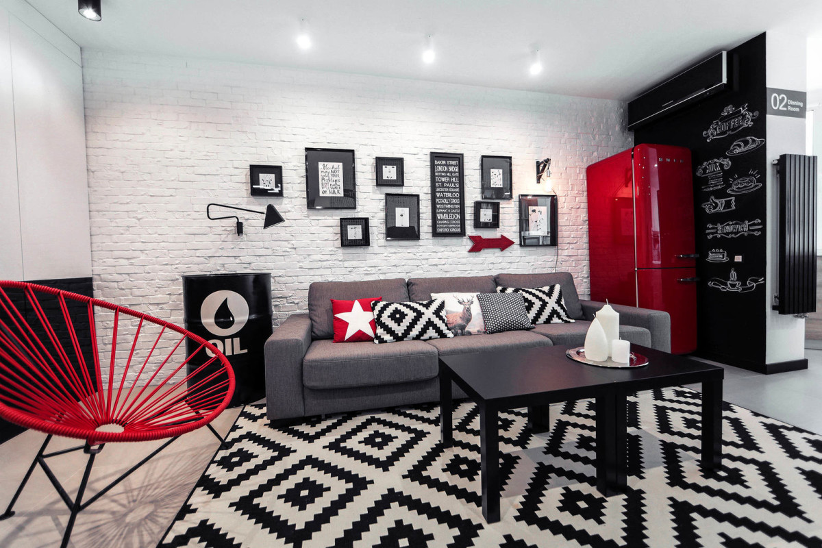
4. Cozy winter mini loft for a dreamy girl
Like the previous one, this one was created for oneowner, only this time the girl was the owner. However, the similarity of the apartments does not end there. This interior is made in the same monochrome manner, but there is much more white here, and due to this, bright spots of red look less aggressive. As a result, the general mood here is much softer, calmer and more voluminous. This was achieved through competent work with light and accents. Separately, it should be noted that the author of this interior was not a professional designer, but a passionate admirer of it - blogger Melina Divani. 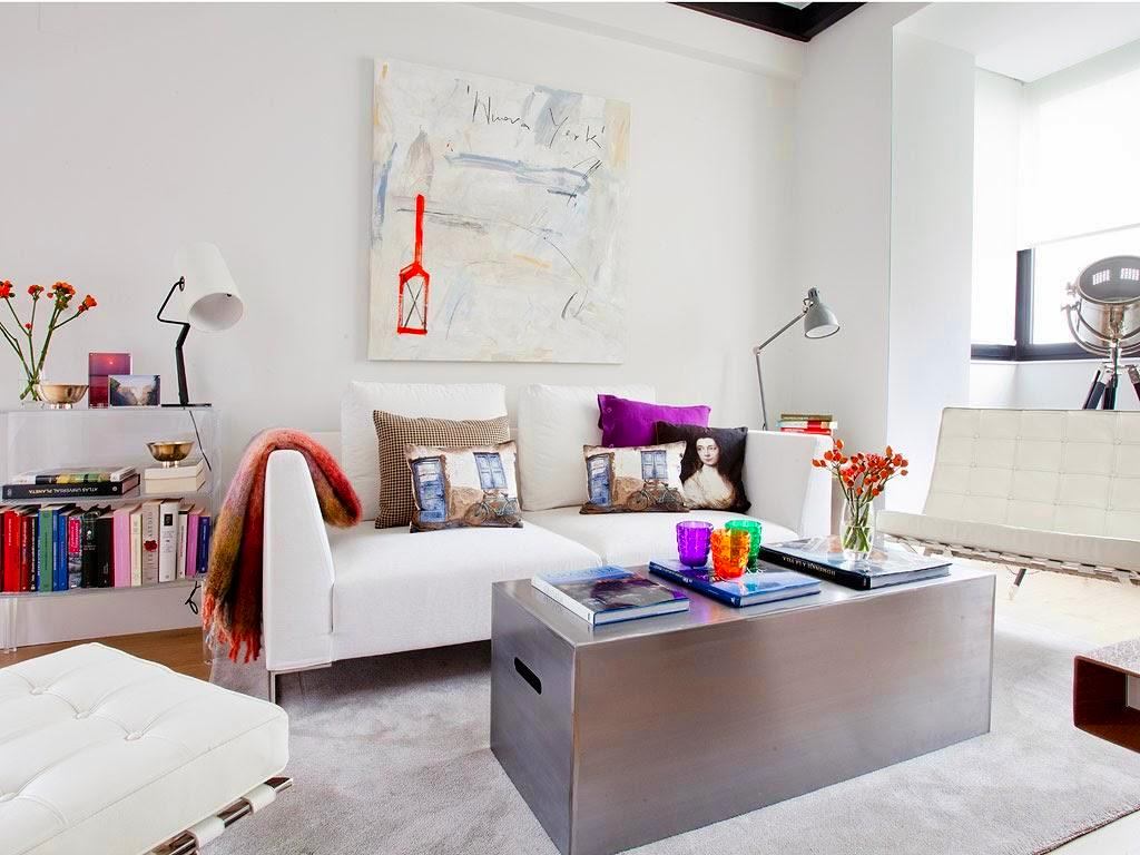
5. Modern apartment overlooking the Dnieper
In this architectural workshop SVOYA studiothe author's style is clearly felt and, as a result, great attention to detail. As in their other projects, the architects focused on natural materials and flawlessly "played out" the part with simple geometric shapes. The interior turned out to be moderately minimalistic, modern, architectural and surprisingly cozy. The only pity is that its main highlight - gorgeous views of the Dnieper - remained behind the scenes. 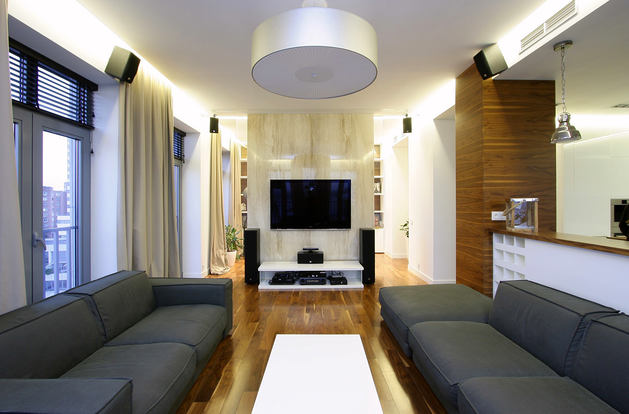
6. Flat out of time
Mysterious style of intelligent eclecticismis revealed in this in all its glory. Designers Inna Tejoeva and Zina Broyan have combined several styles, times and trends under the roof of a modern new building. We must pay tribute - the authors came across a fertile material: all load-bearing walls were located around the perimeter of the apartment, allowing the imagination to soar almost unhindered. 
7. Two-level apartment with an attic
What does a child need to develop comprehensively?The architects from the Ruetemple workshop answered unequivocally: freedom. And they created for a family with two children, not constrained by partitions and walls, dazzlingly light and. There is a lot of light and little furniture, which means that the games can be very diverse. And as the guys will develop imagination, we are afraid to even think. A separate plus of this apartment is the ability to change the atmosphere with a slight movement of the hand, simply by placing a few accents. 
8. Luxurious penthouse in Moscow
You can fall in love with this one just by looking out the window -an absolutely dizzying view of park Moscow opens from here. However, Geometrix Design executives also managed to create a beautiful frame for him. Light, light and truly luxurious interior, created primarily for relaxation and enjoyment of life. A striking detail is the kitchen merging with the wall. This model is created in such a way as not to attract attention, and as if it performs an exclusively decorative function. However, it is also very practical, which, by the way, can be said about many details of this interior. 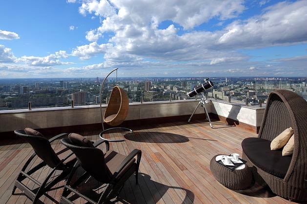
9. Monochrome Romance in the New Riga
In this, designer Lena Inashvili managed to embodymy old dream is to add a pink tint to the palette. Taking into account that the house turned out to be half classic, the author's ability to organically fit such controversial shades into a monochrome environment can be safely ranked among superpowers. As for the second stylistic half of the interior, it was decided to execute it in a modern direction. The result is a home classic enough to hold your back and welcome guests of any level, and modern enough not to forget about the 21st century outside the windows. 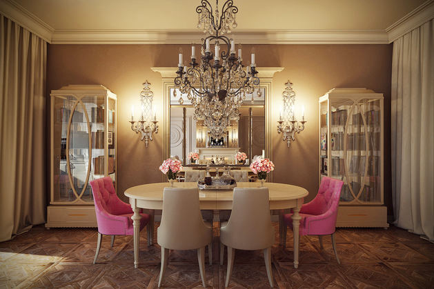
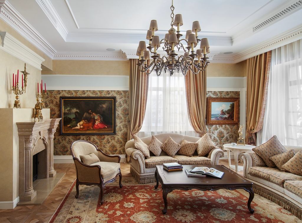
10. The house in Pavlovskaya Sloboda
An unexpected symbiosis of classics and FrenchProvence in this conquered our editorial board with warmth and some kind of extraordinary sincerity. The house, designed by the designers Marina and Anton Fruktov, was being prepared for people of the "old school", their children had already grown up, and in life, finally, a period of stability and contemplation began. The classic in itself was quite an obvious decision, but the pine trees outside the windows and the light character of the customers prompted the authors to rework the heavyweight style a little, adding a little sandy shades, soft shapes and Provence nostalgia to it. It turned out exceptionally great!