Spring has come, and your bedroom is still in winter attire? It's time for a change! Let's look at color trends and options for their application in the realities of the bedroom
The bedroom is the most intimate place in any home.That's why you need to approach its design with special care. Today we'll look at several color schemes taking into account this season's trends. So that you don't have to run around construction stores looking for the right shade, we've selected all the colors from the new paint palette.
Gray has forever won our love as a shademultifaceted, calm and at the same time very stylish. There are only three shades of gray here. The most saturated one is used in the upholstery of the bed, the walls are decorated a little cooler and lighter. Note that the authors emphasized the walls with a very simple but effective method of diamond-shaped ornament. The third and lightest shade is used in the design of the chair, part of which can be seen to the left of the bed.
Fans of more active palettes will appreciate the option withdeep blue and several shades of turquoise. Oddly enough, you really do sleep very well in a blue bedroom. This color can envelop and calm. Shades with a touch of green on the headboard and in small details help to soften the transition from rich blue to pure white on the walls.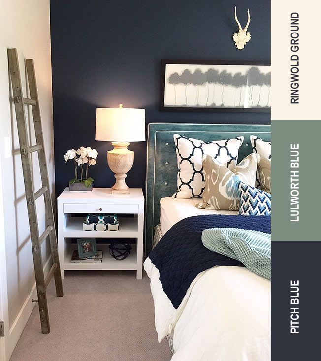
Here we see a combination of several at onceThis season's hottest shades, one of which is the vibrant canary yellow Buttercup, which was named one of the Pantone Color Institute's shades of the year. In this bedroom, yellow is used as an accent and does a great job of breaking up and livening up the blue-gray palette of the bedroom.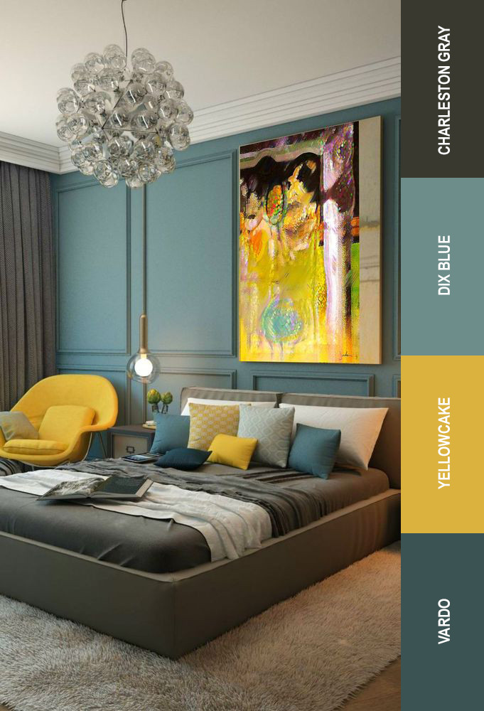
The authors of this bedroom decided to use twoThe main shades of this year are rose quartz and serenity in a lighter, "whitened" version. Here we also see the use of metallized surfaces and very high-quality photo wallpaper in the color of textiles.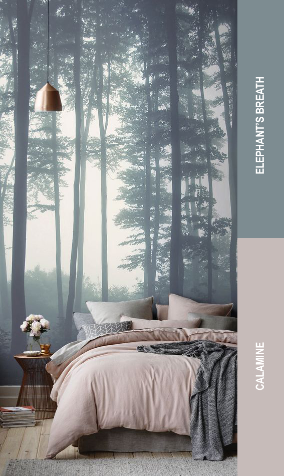
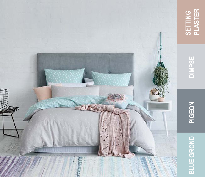
Again, several shades of gray, but here they arelook completely different. Transparent blue and diluted pink together with slightly bluish walls create a light, peaceful atmosphere in which a feeling of freshness is acutely felt. We would recommend such a design for a bedroom in the spring-summer period. That is, you can start looking for textiles now.