Bored with traditional color combinations?Are you finally ready for color experiments and want to bring your palette to life in a non-trivial way? In this article, we have collected 7 color combinations for every taste that will definitely inspire you. There are a number of classics that can be found in interiors of any budget and style. They are tested, safe, versatile, and this is their indisputable advantage. But sometimes everyone wants something new (especially if you've been looking at the same beige sofa for the fifth year now), and here new, fresh and unusual color combinations come to the rescue. We spoke with the professionals and picked seven combinations that are definitely worth trying at home. 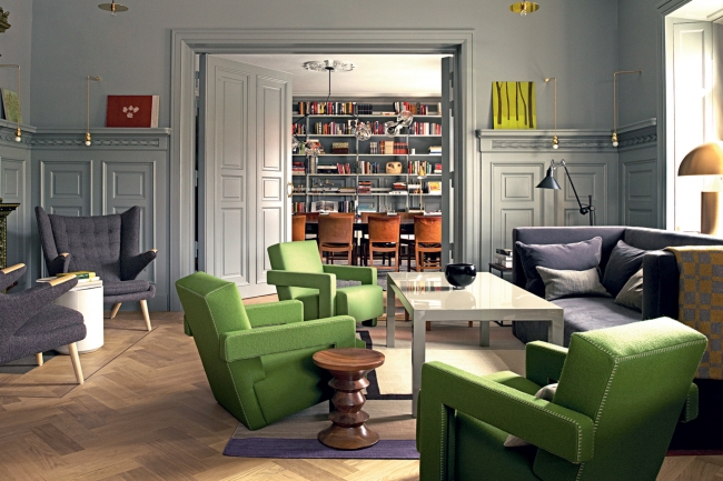 Blue + red Tandem of red and bluerarely seen in the interior: because of the stereotypes about the incongruity of cold and warm colors, "ice and fire" are simply afraid to mix in the same room. In fact, if you choose the right shades, the risk is almost always justified. In addition, it is not necessary to mix these colors in equal proportions: you can use a neutral blue as a background, and use a cool shade of red for accents.
 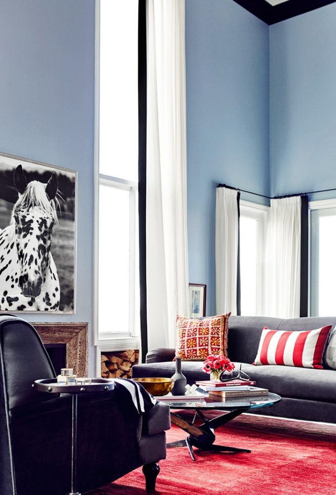 Oksana Tsymbalova, designer:- Blue and red are not the most popular, but very effective combination. It is rarely used due to the stereotype that warm (red) and cold (blue) colors should not be combined. But if you want to apply such traditional styles as country, retro, nautical and others in your home, the combination of blue and red will “calm down” the interior and make it unusual. Tip: when using blue and red for accessories, choose them from the same palette: equally light / dark, muted / glowing, bright / pale, rough / delicate, etc. www.artdomsun.com Lime + blue Bright and lime shade - a fresh, dynamic and truly summer combination that will fill the room with colors even on cloudy days. So that such a rich color pair does not get tired, we recommend using it locally, diluting it with white and any light pastel tones.
  Anton Elistratov, Manders:- Blue, like blue, is the richest of colors and historically the most expensive to manufacture. In painting, the color blue was used to depict the clothes of royalty, dignitaries and religious figures and still has a touch of luxury and hypnotic charm. The combination with lime dispels the myth that blue is an extremely cold color. In fact, he has a very rich range of tones: from rich indigo to calm linen shades. For example, the English brand Little Greene has a whole palette of Blue colors. The palette also includes a unique limited edition Ultra Blue shade whose pigment paint is hand-mixed at the Little Greene factory. Gray + Black + White There is nothing more classic than black and white, so what does it do in our selection? Oddly enough, it is often considered too officious and cold for living quarters. That is why we propose to dilute the black and white range and add volume to the interior using shades of gray. To some, such a palette may seem boring, but European interiors every time convincingly prove that this is not so. Various textures, interesting decor and live plants will revive the monochrome range.
 ![]() Oksana Tsymbalova, designer:- In his famous book The Art of Color, which has become a desktop for designers all over the world, Johannes Itten wrote that “the eye and the brain need a medium gray, otherwise, in its absence, they lose their calmness”, and “medium gray corresponds to a state of balance, necessary for our vision. " That is why we so often use gray in interior design - it brings harmony and comfort into our life. Gray blends perfectly with white and black to create a neutral monochrome interior. This combination is widely used in Scandinavian interiors or in the style of minimalism, where balance and tranquility are valued above all else. To give the monochrome interior "liveliness", I advise you to combine it with natural textures: wood, rattan, stone, sea pebbles, fur, natural fabrics. Gray + emerald The main advantage of the gray color is its nobility with general neutrality. You can paint all the walls in it or choose only one gray item, it will look gorgeous in any case. But green can emphasize elegance and add depth to the palette, especially its rich emerald hue. Use it as accents on a gray background and combine it with cool metals, mirrored surfaces and a contrasting black and white ensemble.
Oksana Tsymbalova, designer:- In his famous book The Art of Color, which has become a desktop for designers all over the world, Johannes Itten wrote that “the eye and the brain need a medium gray, otherwise, in its absence, they lose their calmness”, and “medium gray corresponds to a state of balance, necessary for our vision. " That is why we so often use gray in interior design - it brings harmony and comfort into our life. Gray blends perfectly with white and black to create a neutral monochrome interior. This combination is widely used in Scandinavian interiors or in the style of minimalism, where balance and tranquility are valued above all else. To give the monochrome interior "liveliness", I advise you to combine it with natural textures: wood, rattan, stone, sea pebbles, fur, natural fabrics. Gray + emerald The main advantage of the gray color is its nobility with general neutrality. You can paint all the walls in it or choose only one gray item, it will look gorgeous in any case. But green can emphasize elegance and add depth to the palette, especially its rich emerald hue. Use it as accents on a gray background and combine it with cool metals, mirrored surfaces and a contrasting black and white ensemble. 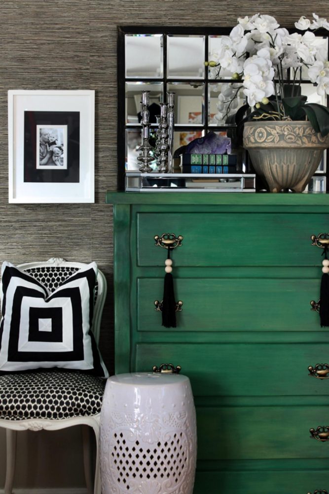 Burgundy + shades of white Few can resistbefore the color of burgundy, but also few dare to introduce it into the interior, especially in large volumes. However, if you balance this active color with white, gray or pastel shades of white, you get a very feminine, unusual and slightly mysterious combination, from which your eyes will not get tired. Stepan Bugaev, interior designer: - Light colors add light and space to the room. They do an excellent job of playing the role of the main color in any room and any style. White and its derivatives will serve as an excellent canvas on which, with the help of bright furniture and decor, you can create a unique picture of your interior. In addition, white goes well with any other color. With its help, you can decorate a bright interior using fairly simple decorating techniques.
 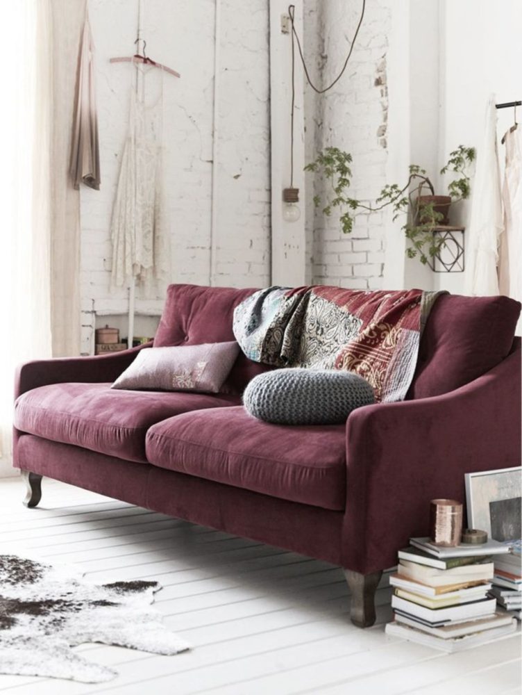 Cobalt + Turquoise Combination of severalshades of the same color will surprise no one for a long time, but what if we are talking about active and bright colors? Not everyone will dare to combine turquoise and cobalt in one interior: both shades are self-sufficient and very rich. However, you should not be afraid of them: if you are not a fan of bright colors, you can use cobalt and turquoise either as small accents or in a muted version. It is definitely worth diluting this combination with an airy and refreshing white color. Anna Chevereva, designer: - A combination suitable for any room, if you are a lover of emotional, rich interiors. Looks good in a combination of ornaments and textures, as well as with gold and brass. If you want to use this combination for a nursery or bedroom, you should soften its saturation and dilute it with neutral colors - white or beige. www.zi-design.ru
 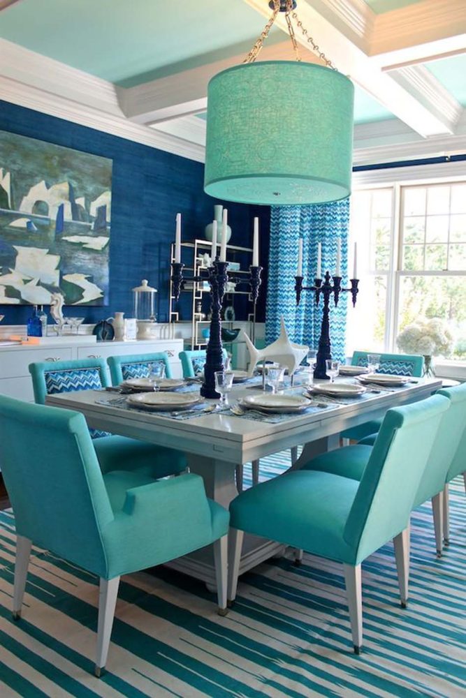 Chartreuse + lavender Chartreuse - yellow-greena color that gets its name from the French liqueur of the same name. It is unique in that it is best recognized by brain receptors and, due to this, is the most noticeable shade for humans. In the interior, chartreuse, which psychologists use as a soothing color, is perfect for private rooms, and with lavender it forms an interesting and cozy combination, reminiscent of Provencal fields.
 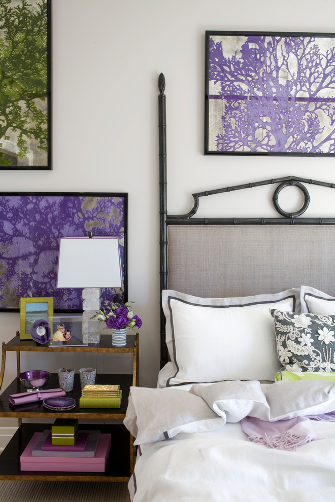 Anton Elistratov, Manders: - Famous English paints Farrow & Ball are known not only for their quality, but also for amazing combinations of colors, as well as their names. So, in the jubilee collection, dedicated to the 70th anniversary of the company, you can find a combination of blue-green (Vardo) and blue-gray (Inchyra Blue) colors. The Gypsy wardo is a special kind of residential carriages on wheels, the decoration of which was considered the most important aspect of the culture of this people. A saturated blue-green color blends well with red and dark gray hues. A vintage blue-gray shade of Inchyra Blue owes its name to the village of Inchayra, where it was first used in a classic house in the era of King George, so that the colors of the interior are in harmony with Scotland's changing weather.
7 unexpected color combinations that you want to try - etk-fashion.com


