What color to choose for the living room is a questiondifficult and responsible. Which is better - neutral colors, unobtrusive but boring, or bright but annoying? Is there an option that will suit any room and any owner? We have found for you as many as 5 ideas of color combinations, which are impossible to miss. If behind closed bedroom doors you can practice the combination of colors as you like, as long as you like it, then for the most "public" space you want to find an option that would suit everyone and make an impression the most profitable. We are not suggesting that certain ideas should be blindly copied, but there are at least five areas of color design that should be considered more closely. Our opinion: - Blue shades in the interior are chosen by people who see the living room as an island of peace. Red and orange are active extroverts who love crowded parties. Green is the choice of practical people who prefer to spend their free time on self-development. Purple is for the brave and determined, trying to be different from others. Dark and gray tones appeal to organized perfectionists who have every detail in their place, and white is a suitable option for the fickle and open natures.
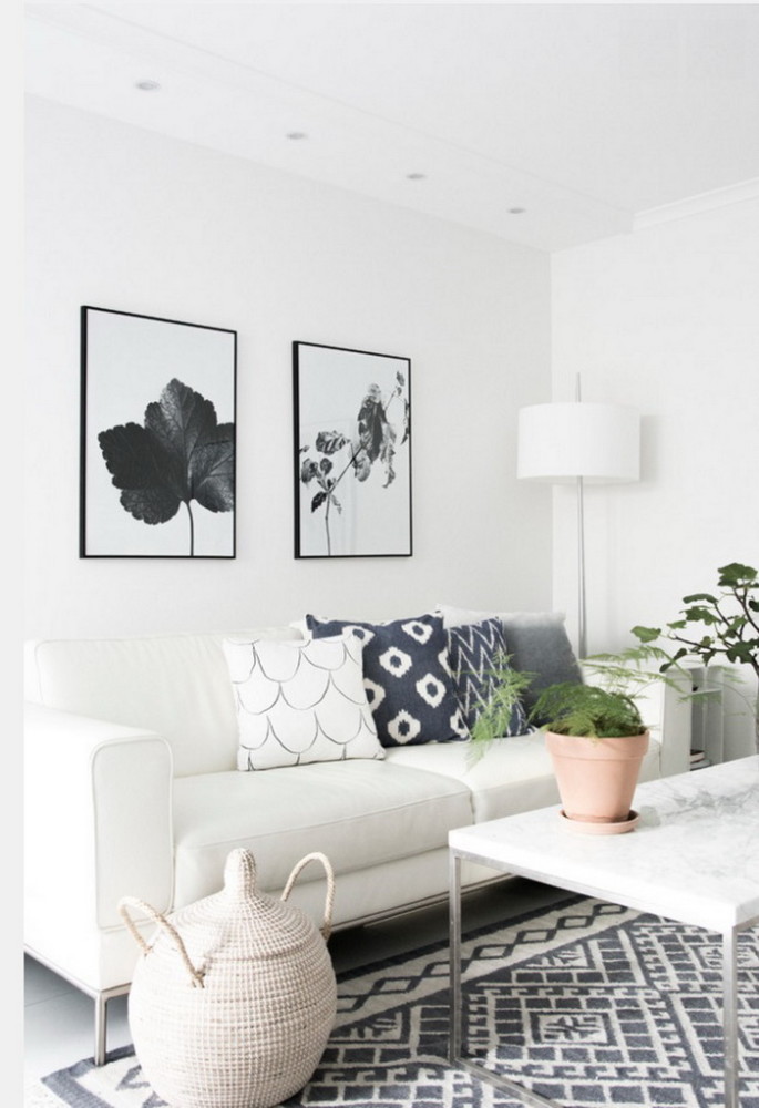
Black and white: timeless classics
in this color scheme harmoniously supporteach other. White walls - a maximum of light and an excellent background for any furniture and decor. Dark floor or black parts in textiles - "grounding" of the interior and points that attract attention, do not allow unnecessary sterility of the living room. It is not for nothing that this combination is the eternal version of the evening suit, and uniforms, that is, clothes in those situations where unnecessary details are unacceptable. Do not consider the idea old-fashioned - you just have to look at the fashionable and Scandinavian interiors to understand that it is very popular. The third participant of this palette successfully acts as a soft gray, adding coziness. 


Blue and green: gentle pastel colors
Imagine the tones of sea glass -shades of blue and green diluted with sea water and sanded with sand. Their combination instantly creates a feeling of freshness, tenderness, adds air. After all, this is a natural harmony of the colors of the sky and the sea, watching the play of shades of which is an endless pleasure. The psychology of color says that such tones are soothing and soothing - just what you need for a living room. Inga Azhgirey, interior designer: - The color of the living room should be chosen based on both purely personal preferences and the functionality of the room - how much time you spend here and how you do it. For a small room, bright and fresh colors are preferred. The room will give a spaciousness, a sense of lightness, for example, fresh mint and sky blue shades. facebook.com/inga.azhgirei 


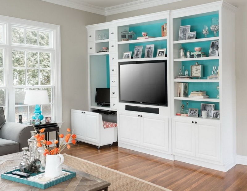
Gray background and bright accents
The whole room, designed in neutral colors -a dull sight, let's be honest. But bright color spots on a discreet background are a very attractive idea that won't make your guests bored. We suggest thinking about - its shades can be warm and cold, dark and light, moreover, while remaining unobtrusive, it enhances the qualities of the paints that are nearby. Complement with yellow or red - very impressive, bright and not trivial. Marina Sargsyan, interior designer: - For me, shades of gray are a universal background for the living room, against such a background turquoise, lavender “play”, both cold shades of yellow and warm look great, depending on your preferences. Against a gray background, any color of furniture will look deeper: so, white will show all the purity of this color, and, suppose, the oak will take away the "grayness" and become incredibly noble. sarkisyan-marina.arxip.com 


Blue and brown: nobility and once again nobility
Blue and brown - a combination that seemed to come down frompages of historical novels about the life of aristocrats. A magnificent tree and blue walls resemble the interiors of yachts and marine liners. A soft and warm shade of chocolate and cinnamon will soften the possible coldness of blue. Are you afraid that it will turn out to be too dark? Nothing prevents to dilute the colors. Gentle blue and beige - no less subtle scheme that evokes in memory the blueness of the spring sky in the forest and the texture of the tree bark. 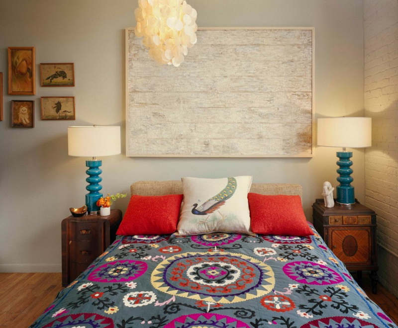


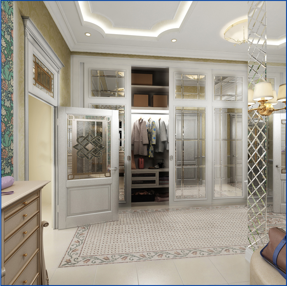
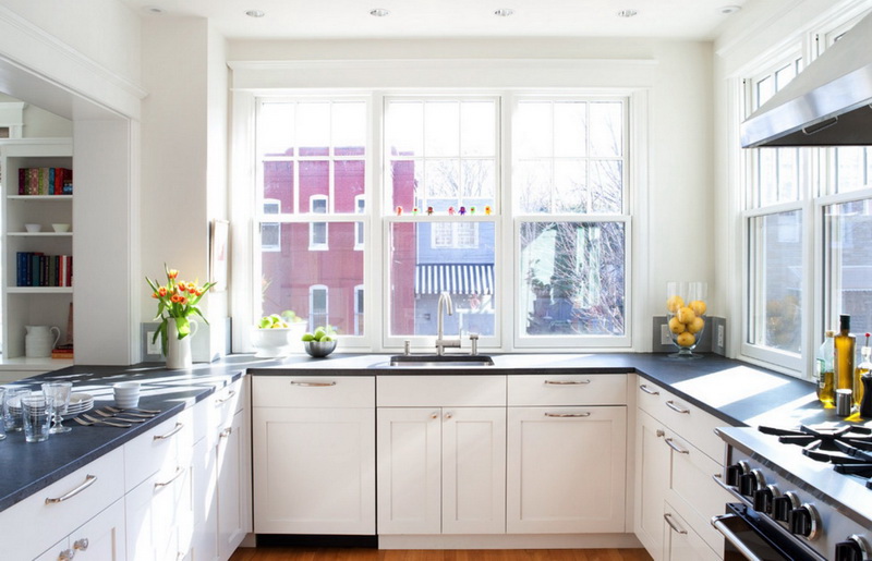
Maximum neutrality: shades of beige
Beige color is a recognized classic and, probably,the most popular choice in the world when decorating a living room. By the way, it has many shades and halftones that are easy to combine, it does not irritate, creates a feeling of softness and visually increases the space. And in order not to be too boring, combine it with orange, turquoise or black details. And be sure to provide multi-level lighting - so the color will become more voluminous and interesting. 

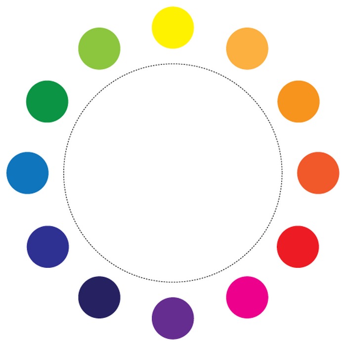
 Our opinion:- By and large, there are only a few ways to optimally match colors depending on their position in the color wheel. Related schemes involve a combination of tones that are side by side: blue and purple, yellow and orange - this is an elegant and understated option. Complementary schemes combine shades that are opposite each other: blue and red, yellow and purple. This is a contrasting, bright option - on large areas it is better to use muted, diluted shades of primary colors. Finally, tricolor harmony uses colors that are equidistant from each other: blue, yellow and red for example. This is a strong and dynamic solution, so it is important to observe, perhaps using one of the tones as a background and the other two as accents.