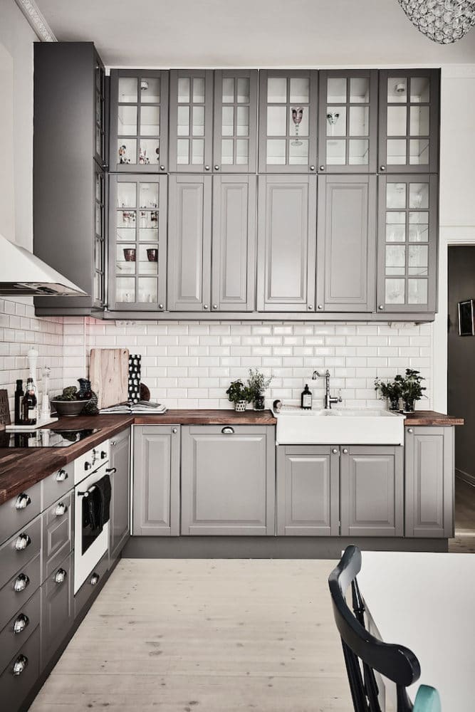
Deep colours, pronounced textures andPostmodernism — we tell you about these and other hot trends of the coming autumn, which you should definitely try at home Summer has flown by really unnoticed: it seems like June has only just begun, but a new autumn season is already on the threshold. An interior update, even a small one, will help to cope with the approaching series of rains, cold and gray (in the literal sense) weekdays. In this material, we have collected 8 of the brightest trends of the coming season: from fashionable shades to entire stylistic directions. There is plenty to choose from! Warm gray Autumn is inevitable rains, slush and grayness, and few people want to bring it into their home. However, gray can boast not only elegance and nobility, but also a wealth of shades. That is why in the fall of 2016 it remains at the peak of popularity, but designers recommend using warm shades that will create a feeling of coziness, and not induce melancholy. Mother-of-pearl, gray, green tea, quartz, light telegrey, protective - and the list is not limited to these warm variations of gray.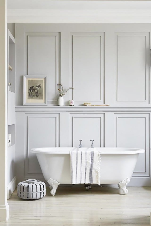
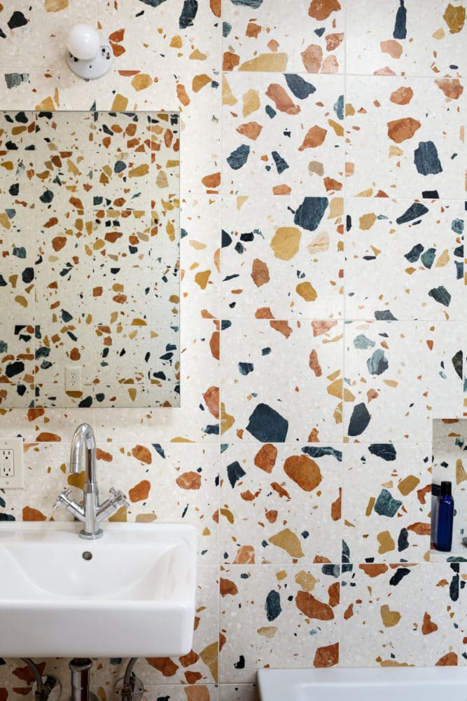
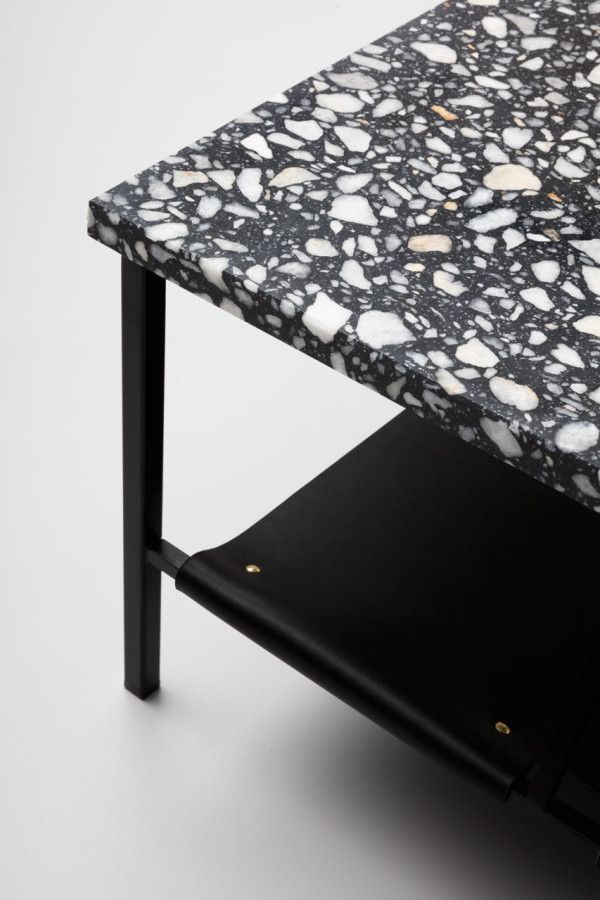
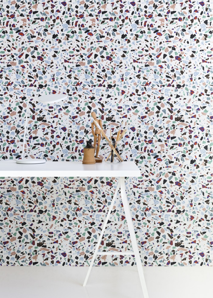
 Terrazzo Technique Terrazzo is an ancient techniqueItalian technique of making seamless mosaic floors from natural materials, and its history goes back to Ancient Greece and Rome. Today, terrazzo floors can be found in luxurious villas, prestigious hotels and elite establishments. The question arises: what does this have to do with trends? The answer is simple: the beauty of natural mosaics is increasingly attracting designers, and now at exhibitions and in stores you can find tiles, wallpaper and even carpets that imitate the surface of terrazzo. The latter will be an excellent solution for those who are fascinated by surfaces made in this technique, but do not have the opportunity to use them in their pure form in their interior.
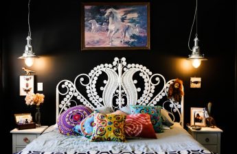
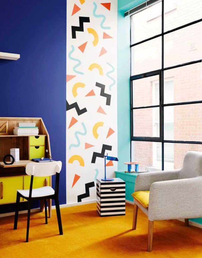
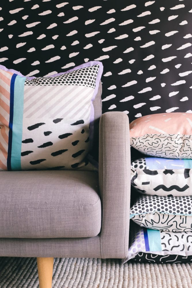
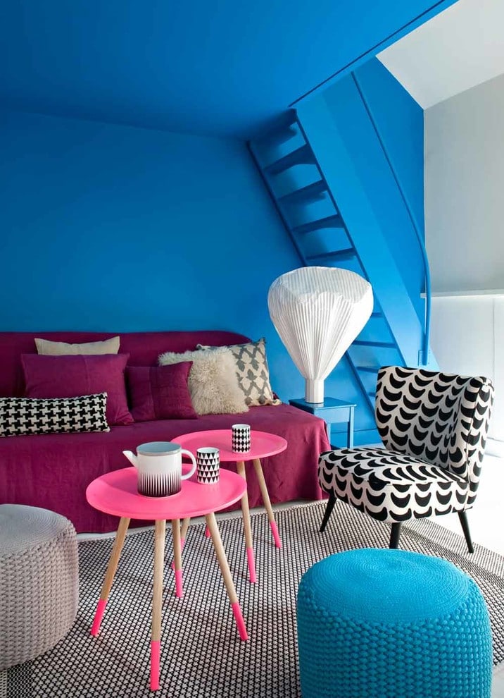
 Memphis Style Have you ever heard ofthe postmodernist designers group "Memphis"? Even if not, you probably saw it: bright colors, bizarre shapes, memorable patterns - and all this is mixed in sometimes crazy proportions. For a residential interior, this style may seem too bold, but what, if not a riot of colors and a variety of unusual prints, will disperse the autumn grayness? In addition, the exhibitions of 2016 only confirm the growing popularity of postmodernism in general and this style in particular.
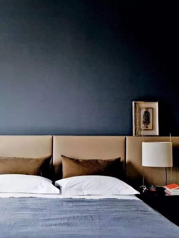
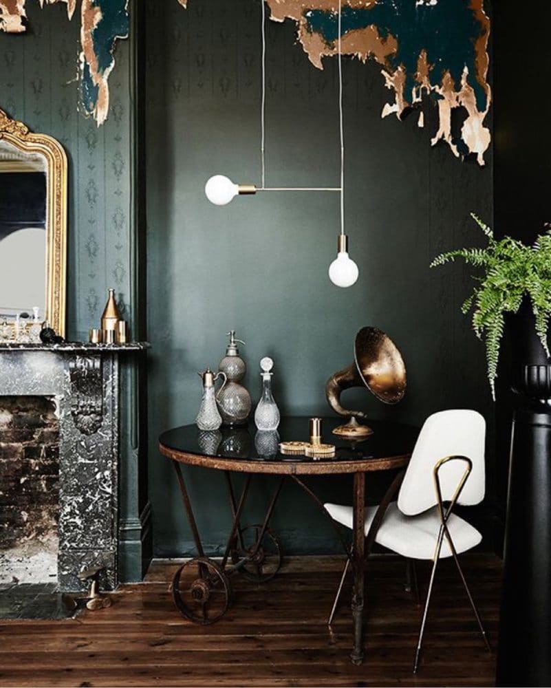
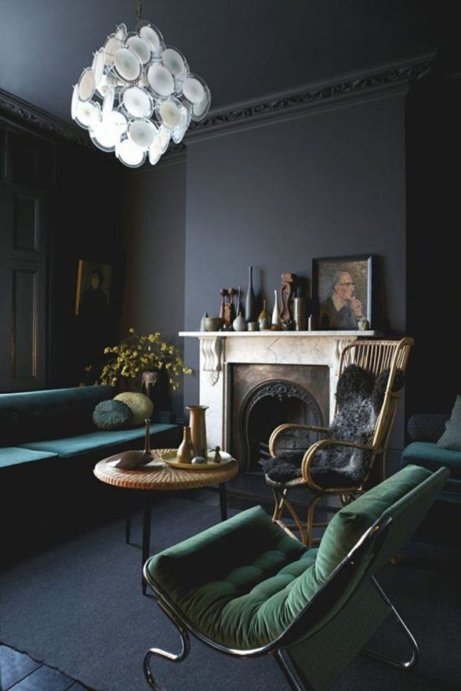
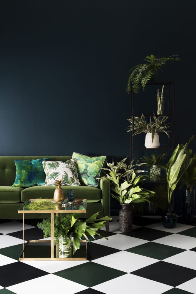
 Color of bottle glass Color of bottle glassGlass is a deep dark shade of green with a blue or gray undertone. It looks incredibly stylish and elegant, so you can safely experiment with it not only in clothes. It looks equally good both as a finish, if you like dark, mysterious and slightly mystical interiors, and as an accent. Bottle green can be combined with brown, black, white, pistachio, shades of red, as well as with its closest neighbors - light or dark gray or calm blue.
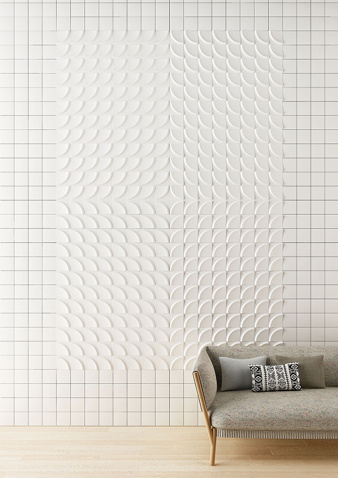
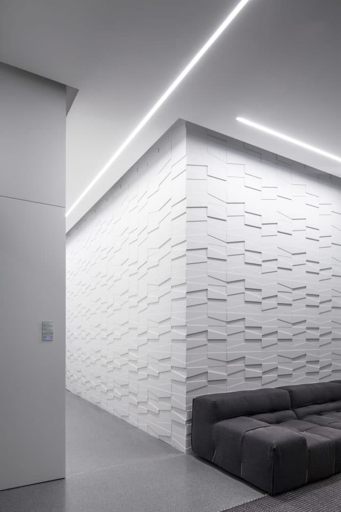
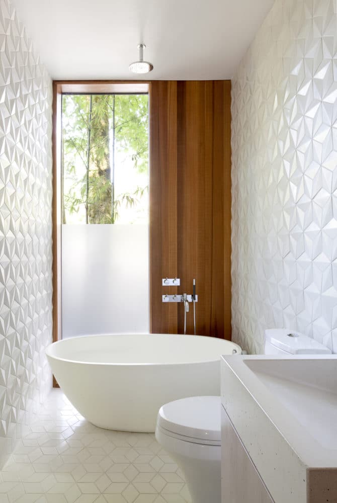
 White relief walls Wall are usedhave been in Russian interiors for a long time, but they are only now becoming a confident trend. The list of their advantages is truly impressive: they are reliable, durable, environmentally friendly, and most importantly, still original and eye-catching. This season, simple but effective white walls with relief are at the peak of popularity: 3D panels are ideal for living rooms, and for the bathroom or kitchen, you can choose tiles with a 3D effect.
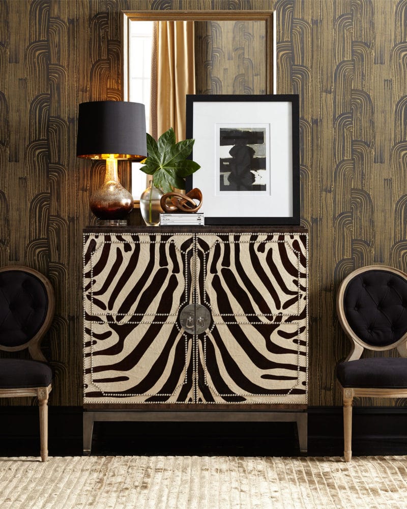
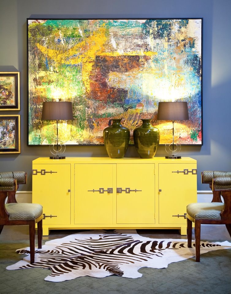
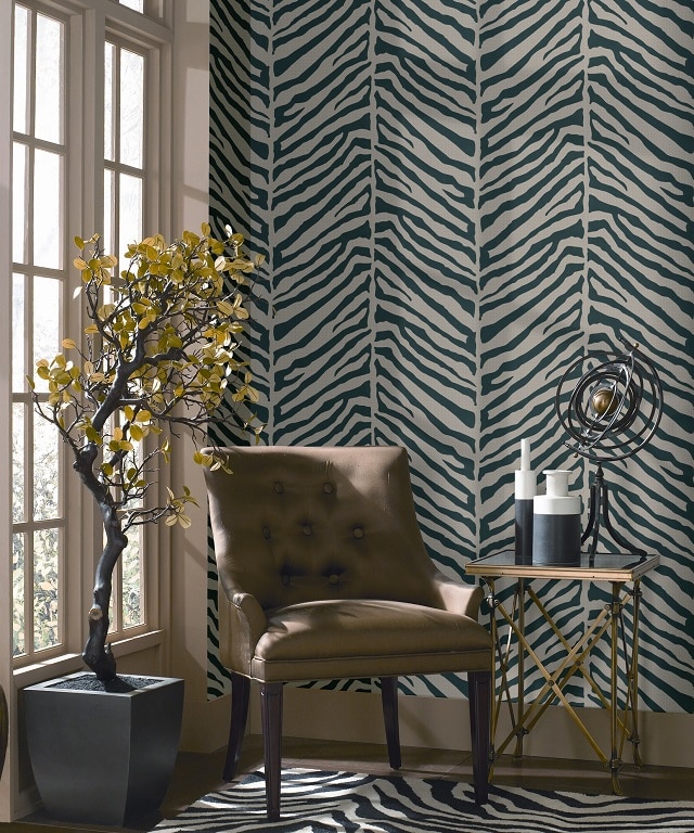
 Animal print Yes, leopard print,Zebra, tiger and other animalistic patterns have been in fashion for decades, stoically resisting the labels hung on them: "tasteless", "garish", "vulgar". Recently we have leopard print, but of course, the patterned fauna is not limited to it. Jaguar, tiger, zebra, lynx - you can safely use any prints in the interior, but remember that you quickly get tired of animalistic ornaments. Based on this, you can go two ways: use the print locally (bed linen, a small piece of furniture or decor, a decorative pillow, a bedspread) or choose a stylized neutral option - this is suitable even for finishing, for example, an accent wall.
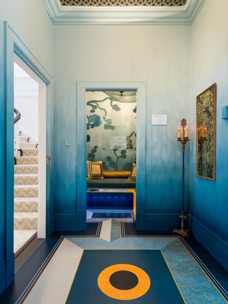
 Gradient coloring Gradient, ombre,degrade - this technique has many names, but one essence: a surface painted in this way looks very fashionable and unusual. The transition from dark to light shade of one color is a great way to make a single-color finish more unusual. You can also start with something smaller: for example, buy a set of bed linen with an ombre effect or hang a lamp in the kitchen painted with a gradient.
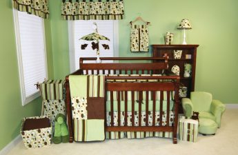
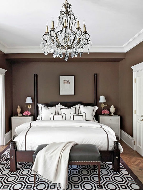
 Chocolate shade What we all want so muchrainy and chilly autumn evenings? That's right — chocolate, and preferably hot! But you don't have to limit yourself to a delicious dessert: deep chocolate shades of brown are no less popular this cold season than bottle glass and warm gray. Choose a tone to your liking and use it as a background or accent. For walls, a single-color paint of a slightly cool chocolate color is best, but for textiles, you can choose the warmest, coziest and most delicious shades.


8 main trends in interior design in 2016
