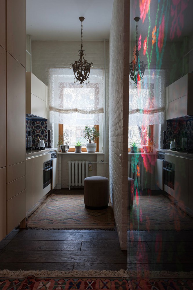
If you find the rustic style too simple andtoo rustic for a city apartment, then this interior will make you change your mind. And the story about how to transform a communal apartment will generally inspire you to feats. Some consider the rustic style to be the lot of country houses. Allegedly, the presence of rough natural materials makes the interior too simple and rustic. But the owner of this Moscow apartment and the owner of the interior studio MariLux Marina Alchieva holds a different opinion. Being Greek by origin, she has always loved the traditional Mediterranean small stone houses painted white, simple terracotta and ceramics covered with bright glaze, warm wood and cozy homespun textiles. She decided to capture all these familiar and beloved images in the interior of her new apartment. For help in furnishing the apartment, Marina turned to the architect and her good friend Mikhail Dautov, who masterfully transformed the former communal apartment from the forties on Pirogovka into a cozy apartment in the rustic style, where the "roughness" and elegance, modernity and tradition are harmoniously combined. Mikhail Dautov, architect Mikhail is a famous Moscow architect. In 1995, he graduated from the Moscow Architectural Institute, completed an internship at the architecture school of the University of Geneva, worked for 5 years as a designer at the Transaero airline, after which he decided to go into private practice. For more than 15 years, he has been successfully designing residential and public interiors (restaurant and trattoria Pane & Olio, restaurant Kolbasoff, restaurant Borgo, coffee shop and pastry shop Le Gato, restaurant Baba Marta and others). Many of these interiors have been repeatedly published in leading interior design magazines. The former communal apartment attracted the owner with its location, view from the window and high ceilings. Unfortunately, the condition of the premises was quite deplorable: pieces of lath hung from the walls and ceiling, the ceilings, floors and windowsills had completely fallen into disrepair, the original stucco molding in the Stalinist Empire style was almost completely destroyed. There was a lot of work to do, but the end result promised complete satisfaction. In agreement with the owner, the architect decided on minimal redevelopment. Two rooms were combined into a large living room-dining room with two windows, part of the long corridor was converted into a guest bathroom, the passage between the two adjacent rooms - into a dressing room. The communal kitchen was divided into a large bathroom with a window, which the owner dreamed of so much, and a small, but cozy and functional kitchenette. Its high apron was laid with Tunisian tiles with a traditional tulip-shaped pattern, and because of the unevenness of the wall, the white Corian countertop was placed deeper than usual (75 cm), which made the cooking process especially convenient. The partition separating the bathroom from the kitchen is also unusual: to make the wall look "native", old bricks from the Soviet era were used for its construction.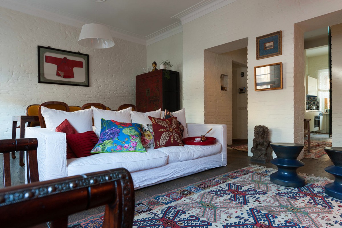
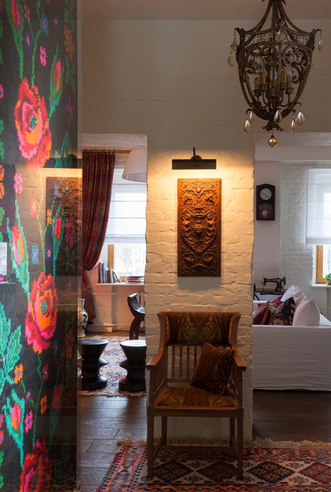
 Bringing to life the khoyaika's love for adobewhite houses, Mikhail Dautov left exposed brick on most of the walls, which were covered with white paint, and the floor in the bathroom was laid with natural terracotta, which has to be waxed once a year. In addition to coziness and pleasant memories, the white color of the walls helped to advantageously shade bright objects and accessories. Thus, a large panel was hung on the wall in the hallway, behind the glass of which is a contrasting black and red Ukrainian carpet woven by the owner's grandmother. The grandmother was generally a great needlewoman, and in memory of her, a Singer sewing machine and a panel of several spindles under glass are present in the apartment as an art object (they decorate one of the walls in the living room).
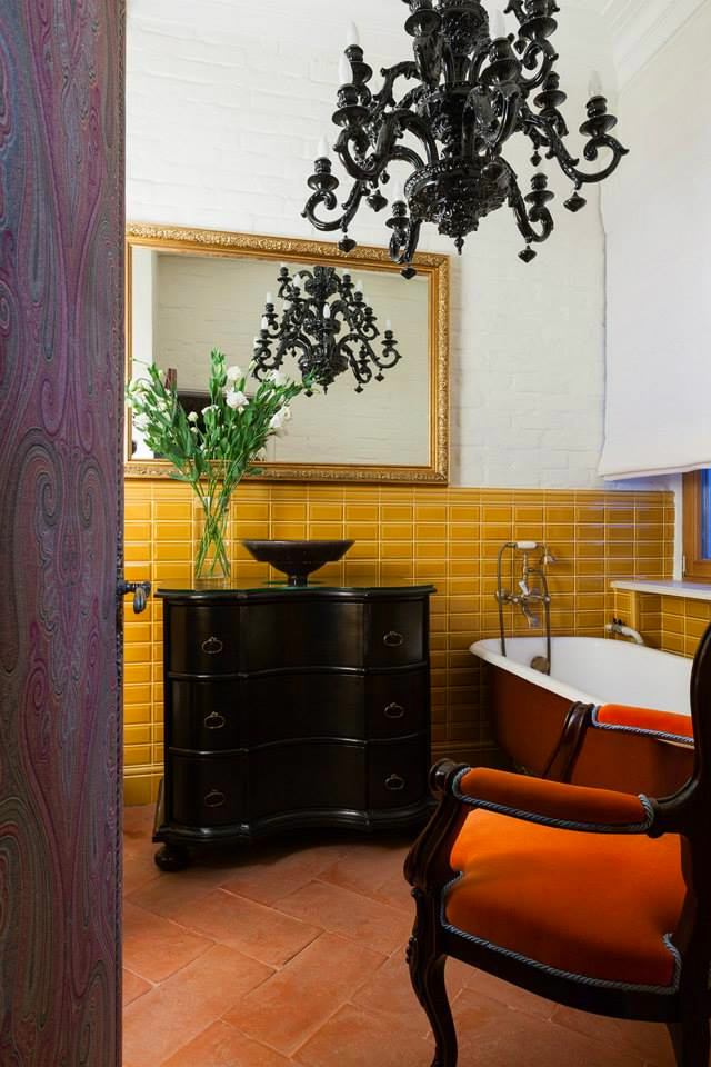
 To recreate the atmosphere of an old house,The original stucco cornices were restored on the ceiling, and the floor was laid with English brooch parquet boards (3 cm thick and 22 cm wide) made from oak sleepers. The interior is given a special flavor by the handmade Uzbek carpets lying on the floor in the living room and hallway, an antique cast-iron clawfoot bathtub, and many antique accessories and interior items. Thus, on one of the walls of the living room hangs a ritual shawl under glass, which the architect brought especially for this interior from the island of Sulawesi, where the local population wears such shawls for especially important ceremonies. The wall in the corridor is decorated with a wooden panel with rich carvings - a fragment of antique furniture.
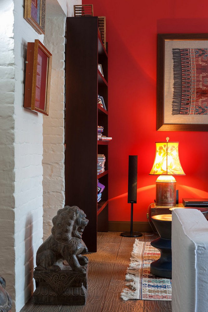

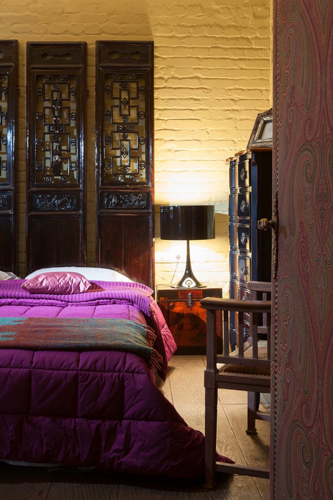
 Marina Alchieva, owner of an interior design studioMariLux: — I really love things with history. Each of them carries a part of the soul of its previous owners. When things that have outlived their era get into a new interior, they bring with them a piece of something alive, but almost forgotten. They create that unique aura that makes the house special. That is why there is so much antique furniture and accessories in my apartment. Together with Mikhail, we scoured antique shops and flea markets, waiting for weeks for new shipments to arrive in order to find items that match the spirit, time and place. Perhaps our most successful foray was a visit to an exhibition of museum furniture from Beijing, which was held in 2008 at TSUM. After it ended, the organizers sold off exhibits that were not of particular value to the museum. This is how a wardrobe with traditional Chinese painting, stone dog-lions, a black lacquer screen that became a headboard, antique chests that are now used as bedside tables, a panel with a Chinese children's shirt under glass appeared in the house. All these things with more than a century of history harmoniously fit into the interior and became bright art objects. marilux.ru A bright spot of color in the living-dining room was the wall opposite the sofa. Its color is very unusual, translated from Italian it means "tomatoes dried in the sun" (pomodori seccati al sole). An antique Dutch bench in the Art Nouveau style made of dark oak with a tiled tabletop stands against the wall as a TV stand. On either side of the TV are vintage Chinese lamps. A sofa in a snow-white linen cover serves as a visual divider between the dining and living areas - another dream of the hostess. The dining table and chairs are also antique (19th century), the latter having been restored in the MariLux workshop.
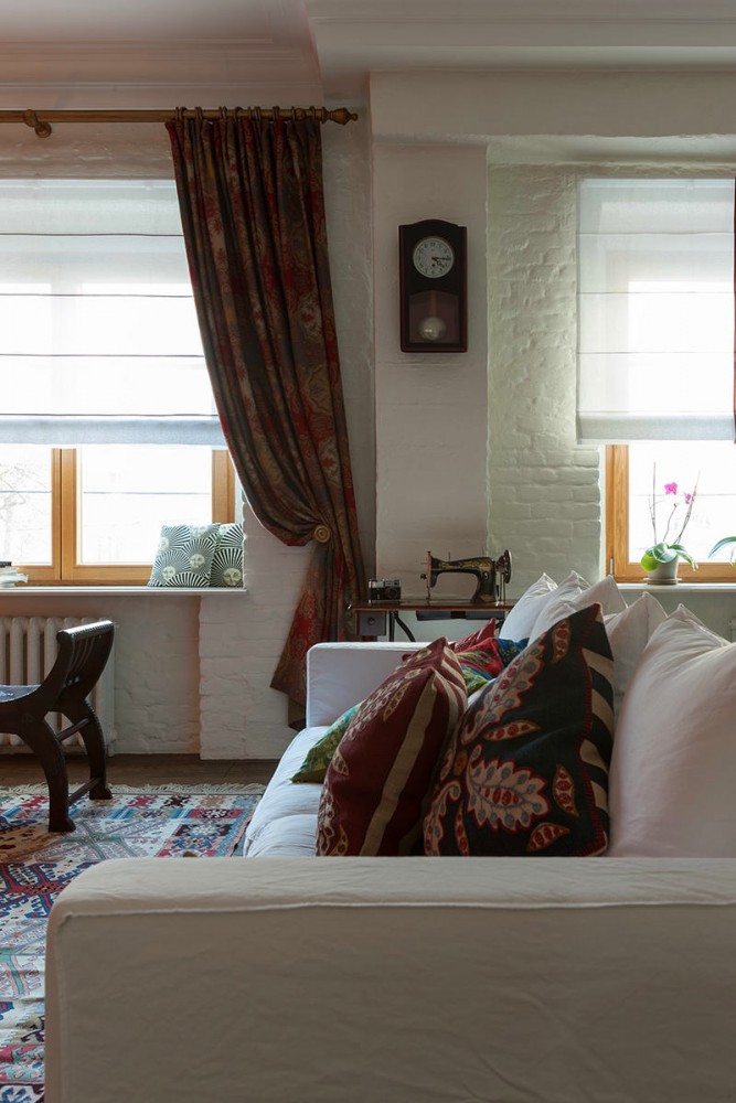

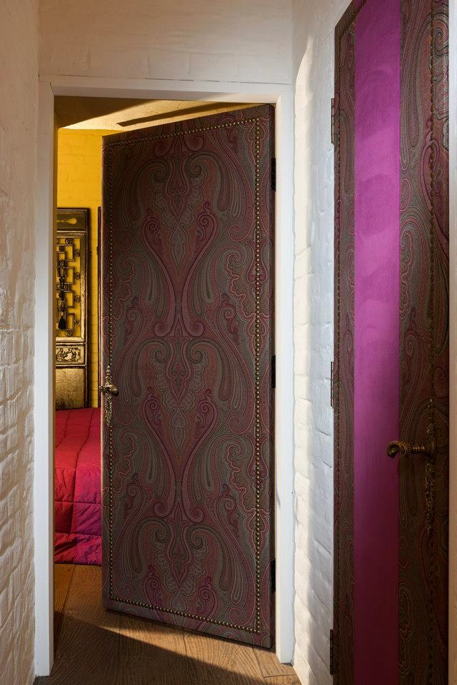
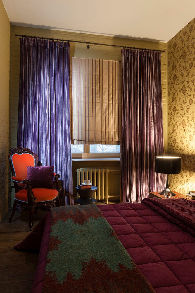 In the decorative design of the apartment, the hostesstook the most direct part. She personally selected all the textiles and developed the design of the curtains, which were sewn in her interior studio MariLux, where some of the antique furniture was also restored. It was Marina who came up with the idea of decorating interior doors with Etro fabrics. The design was drawn by the architect, and the owner's workshop also did the upholstery. Marina Alchieva, owner of the interior studio MariLux: - I have always loved experimenting with textiles, which is probably why I opened my workshop, where we help people make their dreams come true. If you want to give a new look to your favorite but aged furniture - please, make mind-blowing doors, covering them with fabric to match, for example, the sofa - and we can do that. Even if you just decided to slightly update your interior, we will be happy to sew new curtains and pillows, re-upholster boring lampshades, change cornices, and select wallpaper to suit your mood. I also love Roman blinds, so I have them on every window in my apartment. Sometimes on their own, and sometimes in the company of luxurious curtains. For example, in the bedroom, a striped silk Roman blind (creating wonderful shading) is adjacent to heavy velvet curtains that create a feeling of softness and coziness, and if you draw them, there is also a pleasant twilight. The Roman blind in the living room is also the result of my fantasies: natural linen and wild silk. It turned out not very practical, but very impressive! My special pride is the lace panel in the kitchen. It is woven from cotton on old looms in Scotland. When the sun's rays break through it, the play of light and shadow is mesmerizing! marilux.ru
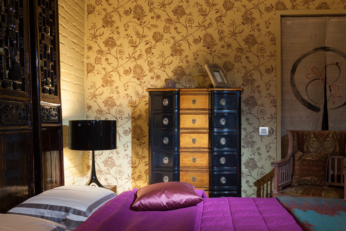

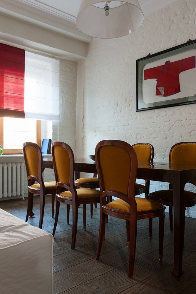
 Despite the presence of rough surfaces,An abundance of wood and vintage items, the interior turned out to be very light and elegant. Against the background of such furniture, the minimalist Flos lamps and the smooth white surfaces of the modern Binova kitchen look organic.
Repair in the former communal apartment: the story of the mistress of the apartment
