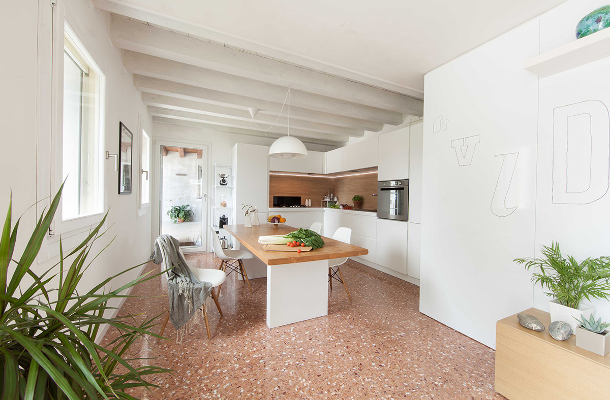
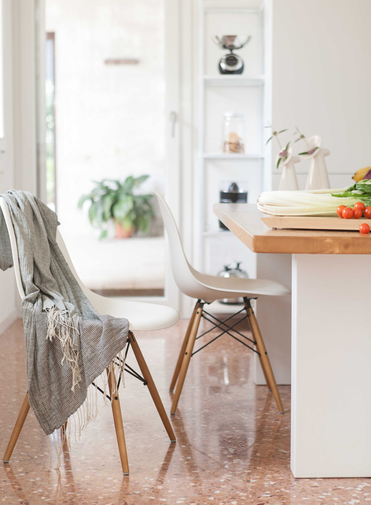
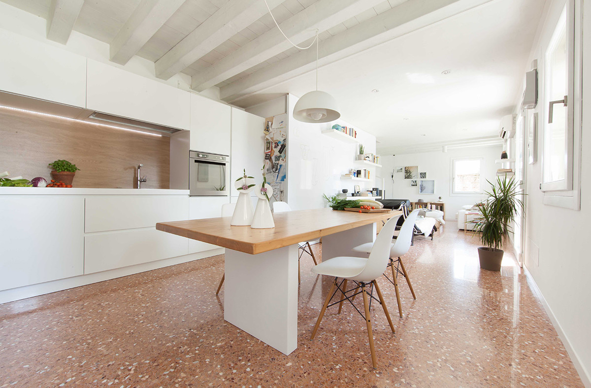
Two colors, ceiling as a zoning element,A wooden apron and a very controversial choice of flooring — this undoubtedly interesting interior can teach you a lot. It’s always like this — you find a good idea, show it to a specialist and get a detailed critical review in return. The editors of Roomble found a very nice, as it seemed to us, house among the works of the Italian studio Make That. There was something wrong with it, but we didn’t understand what exactly. The architect who took on the task of commenting on this interior laid everything out on the shelves and answered in detail the most important question of all fans and critics of the Scandinavian style — why some white interiors seem like hospital wards. Mito Melitonyan, architect: — I was born into a family of architects, and I was lucky enough to be the 12th. After the 9th grade, I entered the MKAMS (architectural technical school) and for a very long time I couldn’t understand what they wanted from me. The taste for the profession came after the 3rd year, when we were sent on industrial practice. I then got to the architect Boris Uborevich-Borovsky, whom my father and I met by chance at one of the architectural exhibitions. My first salary set the direction of my work and, in fact, predetermined my fate. I began working in my profession with enthusiasm and continue to do so to this day. I do not predict how things will turn out in the future, but now I do what I can do best. For 4 years I was mainly engaged in large urban development projects, thanks to which I learned to think structurally, then I preferred to work independently. During my independent work, I came to the conclusion that in architecture and design, the object itself is secondary, what is important is communication with the environment in which you are designing, or the person for whom you are creating the object. This is, in fact, a formed life position that applies not only to architecture: I do not work with an object, I work with people. melitonyan.com In this example, the impression of the apartment was spoiled by the floor. The very strange pinkish-brown texture creates the feeling that you are looking at a public space rather than a residential apartment. White is not a panacea, you need to know how to work with it. If the authors had given preference to, for example, shiplap as a floor covering in this room, the interior would have created a favorable feeling. If we talk directly about the roots of the problem, it is the uneven texture, it has nothing to cling to in the interior. Therefore, what should have become a highlight turned into a major drawback.
 The kitchen itself is good - large laconic forms. Very interesting trick with a wooden apron. Even if it is imitation tiles, it still looks great.
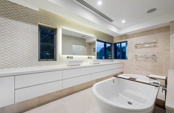
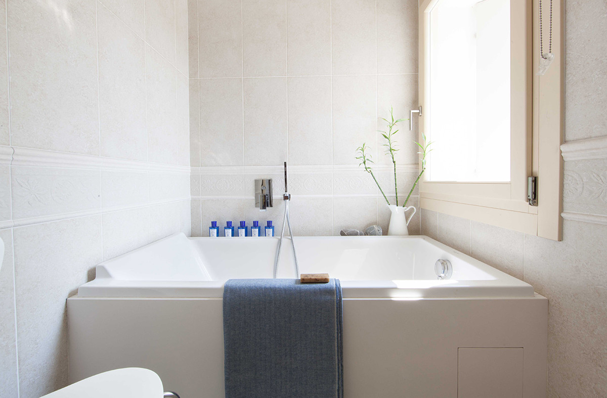
 But the bath didn't convince me.On the one hand, it's a beautiful solution: the sides of the bowl are about five centimeters away from the wall. It looks great, but in terms of operation, it's not the best option - these cracks will regularly accumulate what we don't like to scrub off, and if at first there's enough enthusiasm for regular cleaning, then over the years the housewife will start to "forget" about this inconvenient place, which means expect mold, plaque and other "joys". Another point is the window. It can only be opened from inside the bathroom itself, ideally the hinges should be on the other side, and the window should open onto the bathroom wall.
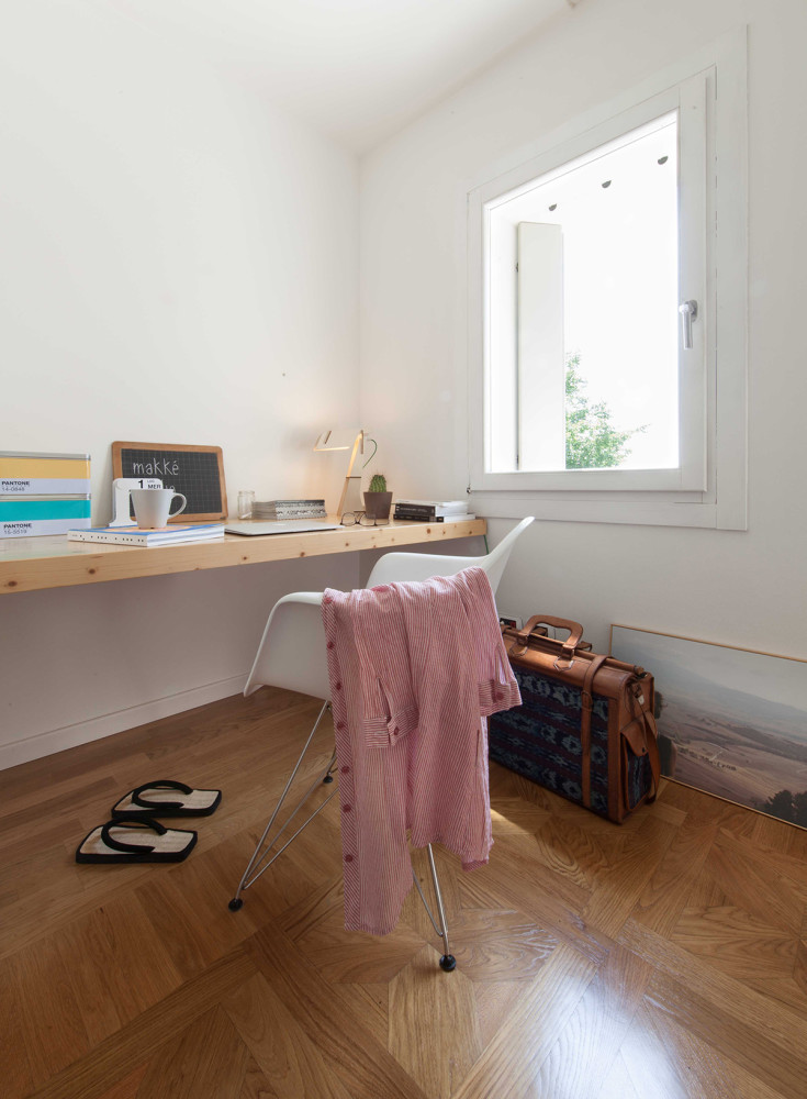
 What I like is the palette - there are two main colors in this apartment: white and brown. They go together perfectly.
 I like zoning by texture, or rather, ceiling materials. In the kitchen - beams, in the living room - plasterboard and beams again. Soft, almost imperceptible, but very noticeable transition.
 Among the downsides, I would also mention the failurefilling the space - here and there there are obvious voids and they are very noticeable, even ficus trees do not help. The incorrectly chosen coffee table near the sofa wants to be replaced with a more massive one.
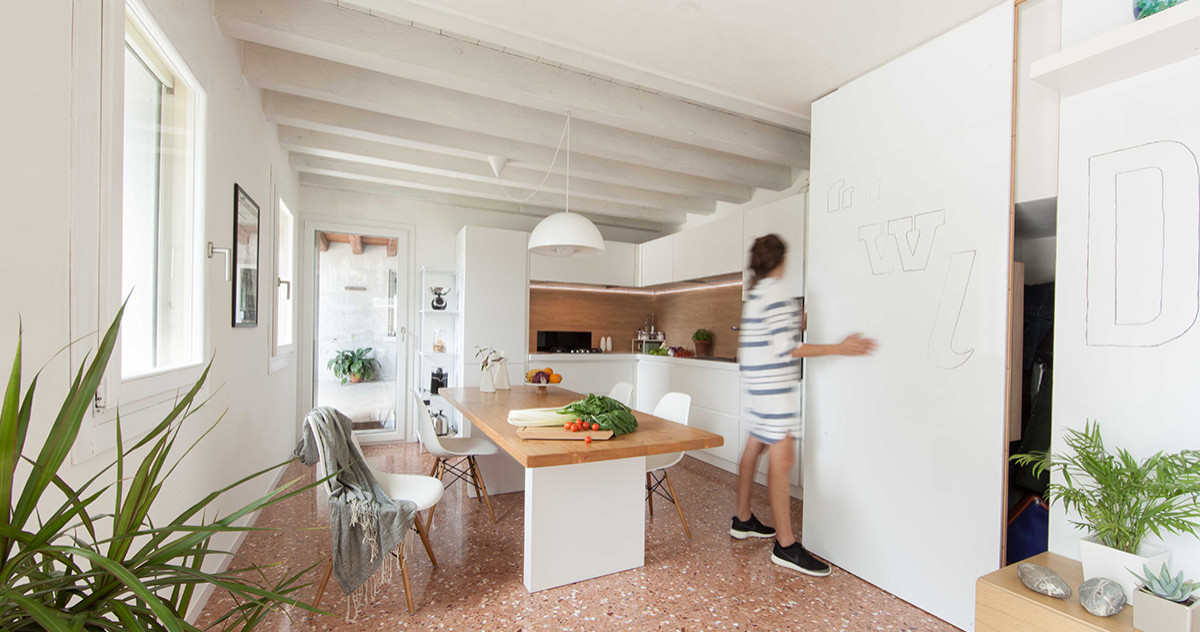 The lighting in this interior follows someits own logic, understandable only to the authors. Only the ceiling lamp above the dining table is in place. However, despite all these shortcomings, the interior as a whole would have turned out 100% if the authors had chosen a different floor. It is because of it that you pay attention to all the shortcomings that have become so clearly visible.
A beautiful white interior where the "hospital" floor almost ruined everything – etk-fashion.com
