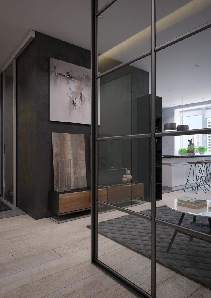
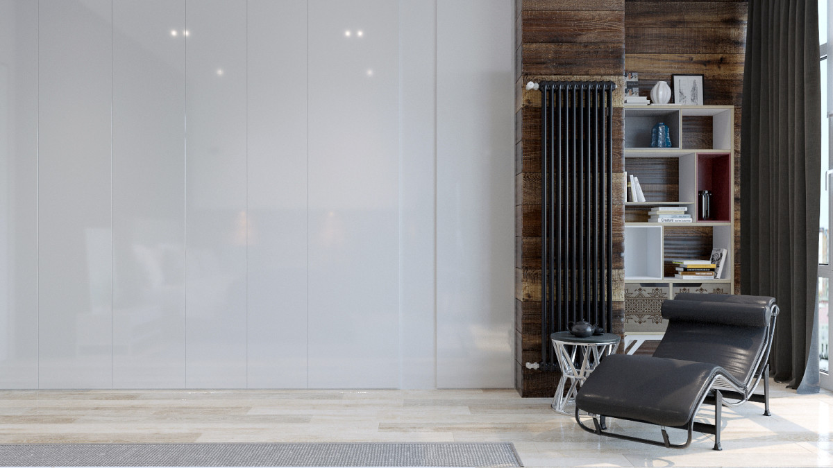
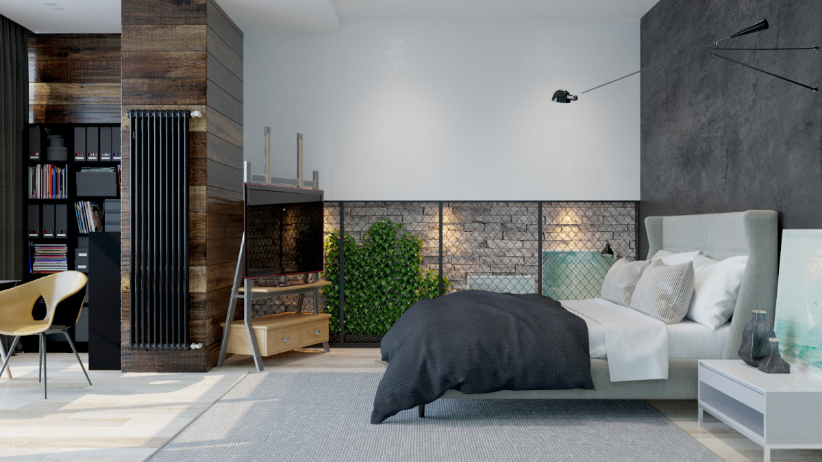
Can a harsh "concrete" interior be cozy?How to find the golden mean between brutality and softness? Can brick give a feeling of spaciousness? We are looking for answers to these questions together with designer Pavel Alekseev. “Soft brutalism” is what Pavel Alekseev himself calls this ambitious project. Shades of black and gray, wood, concrete, brick… It seems that the apartment was created for a confirmed bachelor or a lover of industrial aesthetics. You will be surprised to learn that this design was developed for a married couple with a child. Yes, yes! That is why the interior combines strict lines and soft textures, the cold texture of concrete and warm color accents. An atmosphere suitable for work, scope for creativity and a stylish appearance - all this is organically combined in a brutal, but cozy apartment in Kazan. Pavel Alekseev, designer Pavel is a designer, architect and former head of a construction company. In 2012, he graduated from KSUACE and began working directly in interior design and private home design. Pavel has completed more than one bold project, and he defines his professional goal as follows: to emphasize individuality and style with the help of the interior. Customers' wishes The owners of the apartment are a married couple. He holds a management position, she takes care of the child and devotes time to her creativity. Creating interior dolls, various crafts, interior design and 3D programs for its creation - this is just a small list of her hobbies. Regarding the future design of the apartment, the spouses' opinions almost completely coincided, so when developing the concept, Pavel Alekseev relied mainly on the tastes of the customer. , brick, concrete and wood are her main passions. At the same time, the main wish was to achieve true harmony and make the apartment not just brutal, but also cozy and spacious. Approximate renovation time is 4-5 months. Redevelopment The designer was lucky with the layout, as well as with the coincidence of tastes of both clients. The apartment is in a new building, and there are practically no load-bearing walls. Thus, it was possible to do practically anything with the space, and this is, without a doubt, a big plus. As a result, practically no significant changes were made to the layout, except for combining the kitchen with the living room and dining room and expanding one of the bathrooms.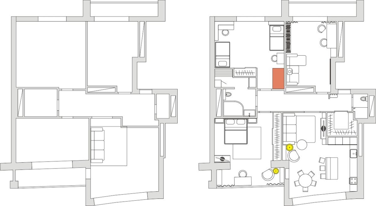 Bedroom The project is currently in progressThe project is in the implementation stage and only three rooms are ready: an office, a living room and a bedroom. The interior of each is ambiguous and bold. The bedroom turned out to be more gentle and calm due to the light floor, cozy textiles, a soft headboard and a light wall. A large graphite panel behind the bed, similar to freshly laid asphalt, creates the necessary contrast and continues the idea of the brutality of the apartment.
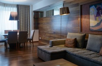
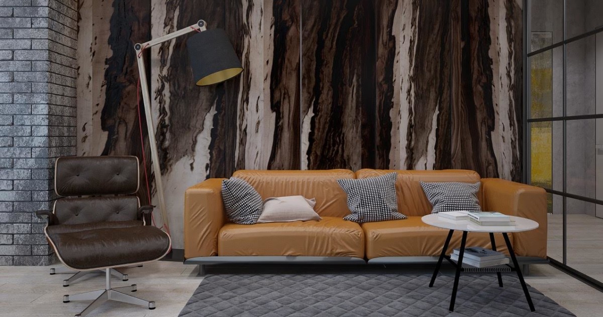
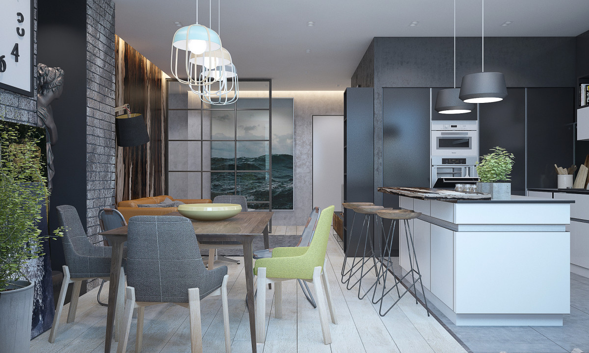
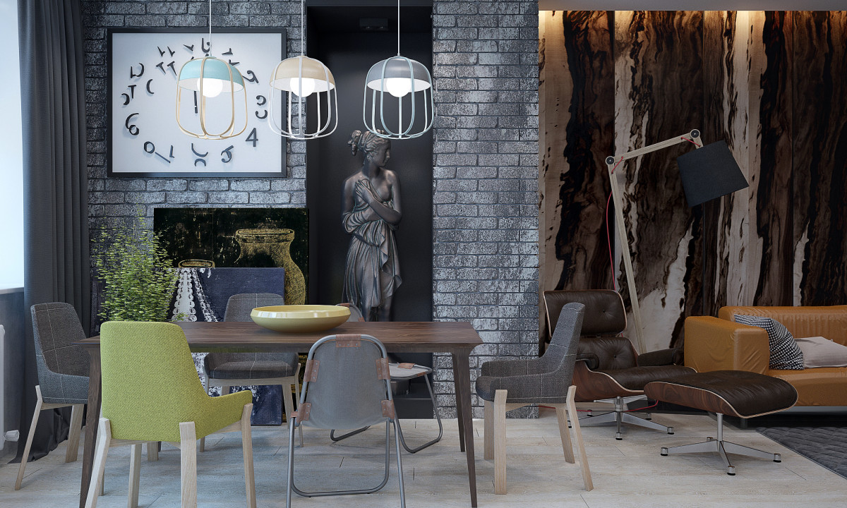
 Living room + dining room Unlike the quiet onebedrooms, this room (or rather, two combined ones) is more spectacular and rich in terms of color and texture. The gray color beloved by the hostess is diluted here with warm shades: green and ocher, which echo each other in the furniture, decor and finishing. The recreation area is visually separated from the dining room by a panel behind the sofa and a carpet. The budget for the living room is about 1,200,000 rubles.
 Cabinet According to the color scheme, the cabinet is largerresembles a bedroom: the same light and calm in terms of color. Despite the comfortable soft sofa and the absence of harsh brick textures, it is easy to concentrate here: neither the laconic decor nor the bright spot in the form of a red chest of drawers under the projector distract attention. Pavel provided plenty of storage space, so the owners of the apartment will easily find a place for books, documents, papers, disks and everything they need for work.

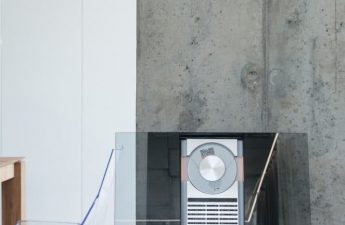
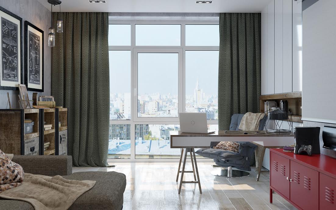 Colors and textures Around color and texturesthe entire project was built. The owner's favorite gray, concrete and brick are the fundamental elements of the design. At the same time, they are skillfully diluted with warm colors and bright contrasting elements: for example, rich yellow dishes in the kitchen or a decorative dish on the dining table. The wood contrasts with the transparent glass and echoes the texture of the panels made of exotic veneer, and the cold concrete is balanced by soft fabrics and a calm color scheme. Wide ones give a lot of natural light, and in the dark, thanks to the deep gray color and its shades, the boundaries of objects are erased and volume appears.
 Furniture Furniture - to a minimum.Nothing superfluous, but enough of everything. In the bedroom there is a bed, a TV on a comfortable stand, bedside tables, a couch, a couple of shelves and a workplace for the head of the family. Each item has a laconic but elegant form; strict straight lines flow into smooth curves and back. In the living room, there is furniture for each zone: a comfortable sofa, an armchair with a footrest and a TV in the relaxation area and a large dining table with unusual chairs in the dining area. The kitchen set fits organically into the space and does not take up a single extra centimeter of usable space, and the island can be used not only for cooking, but also as a bar counter, at which it is pleasant to drink a cup of coffee or have a snack. Almost all the furniture is made to order according to an individual design.
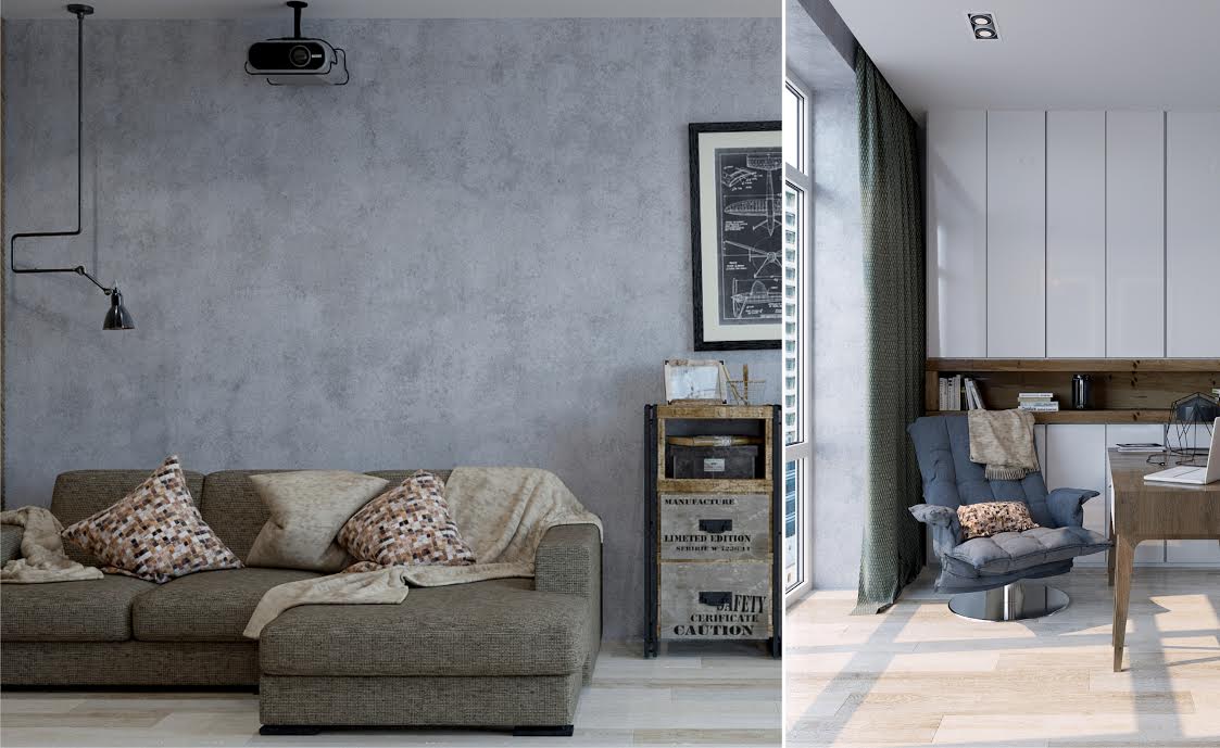
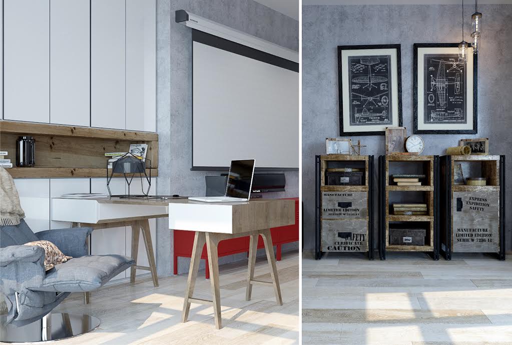
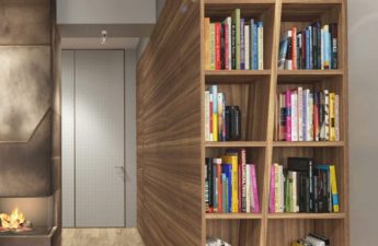
 Storage Storage space in this firstThere is surprisingly much in the minimalist setting. The bedroom has comfortable two-tiered bedside tables, drawers in the TV stand, and full-size shelves hidden in a niche that will hold all the necessary little things and materials for work. The living room also has storage space: two spacious drawers under the TV, a two-tiered coffee table, and a convenient shelf.
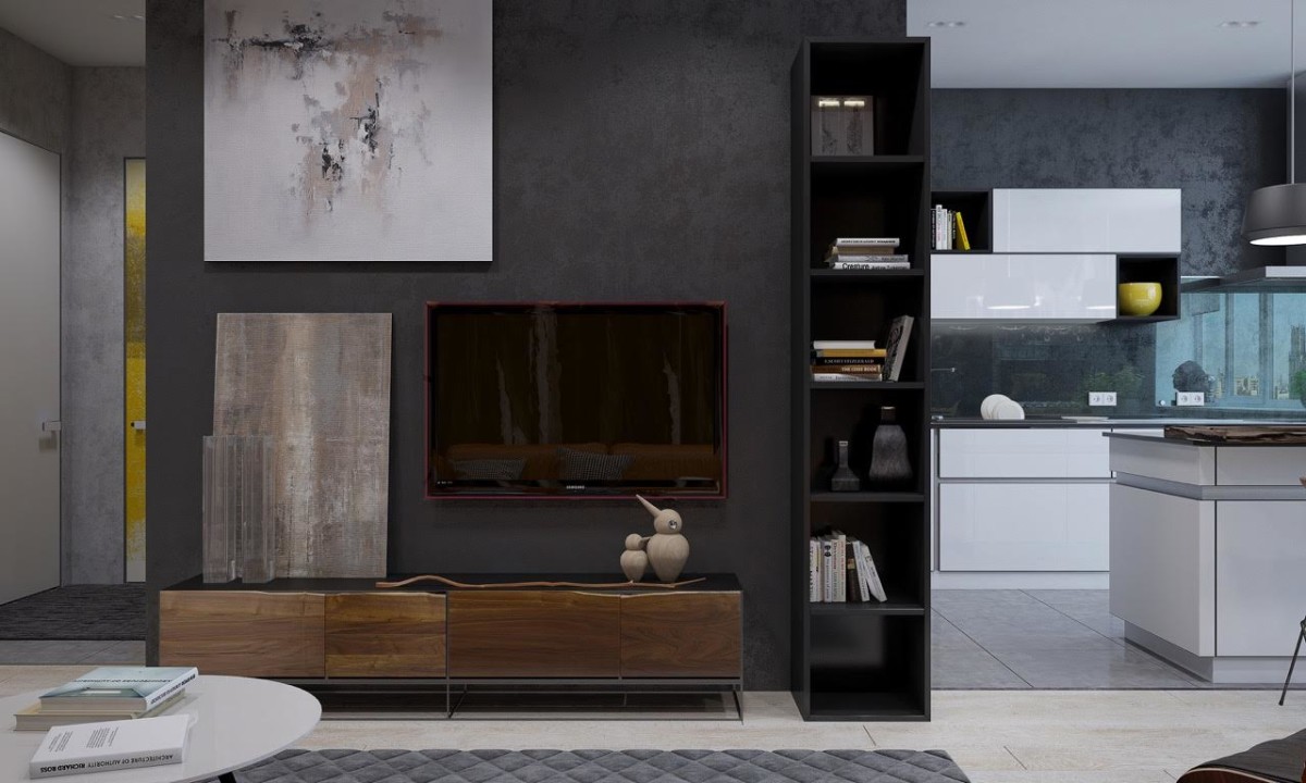
 Decorative elements of decor, as well as furniture,a little. No frills, every detail is in place, restrained, aims to emphasize the owner's status. At the same time, the decorative elements are very diverse: there are unusual clocks, abstract paintings, living plants, a large sea canvas, and a classical statue in an avant-garde dark color peeking out from a niche. The textiles in both rooms are neutral but functional: the sofa cushions create harmonious color combinations with other interior elements, and protect from both bright sunlight and prying eyes.
 Pavel Alekseev, designer:— The main idea was to create an ergonomic, functional and stylish space. Without deliberate brutality, to maintain a certain balance between it and comfort. And I believe that specifically for these customers and in this project we managed to find that golden mean.
Black walls and white kitchen: brutal coziness in a two-room apartment in Kazan – etk-fashion.com
