The interior of this apartment started with the Sovietcartoon and a collection of hares, and thanks to the painstaking work of the designer, it turned into a modern, stylish and, most importantly, cozy space for living. How? We tell you in this article The owner of this apartment is a young woman. She works a lot, loves to travel and generally leads an active lifestyle. She imagined the future interior as one to which she would like to return in the evenings and where she could take a break from the bustle of the city and be alone with herself, wrapped in a blanket with a cup of delicious tea in her hands. For help in implementing her ideas, the owner of the apartment turned to designer Oksana Yakunina, and we show what they got in the end. Oksana Yakunina, designer Graduate of the Academic School of Design in 2004. Since then, she has developed as a professional, first in the team of a design bureau, then in her private practice. Collaboration with foreign colleagues — Ralph Johnson, Scott Brown and Studio Bello Dias — allowed me to expand my professional skills and create interiors in a European style, and the experience of living in London and India, Europe and Asia — helped me understand that interior design is, first and foremost, about expression, inner freedom and freedom of self-expression. +7 916 6794528, [email protected] General concept The concept of this interior began with the hares that the owner of the apartment collects: the analogy came by itself, thanks to the old Soviet cartoon “A Bag of Apples”. According to the plot, a kind hare went into the forest to pick apples and please his family, but along the way he treated all the forest animals to fruit and returned home empty-handed. But as soon as he crossed the threshold, it turned out that his grateful friends brought him a lot of other food supplies in return. Both the designer and the client unanimously wanted to transfer the inner warmth and atmosphere of this cartoon into the interior.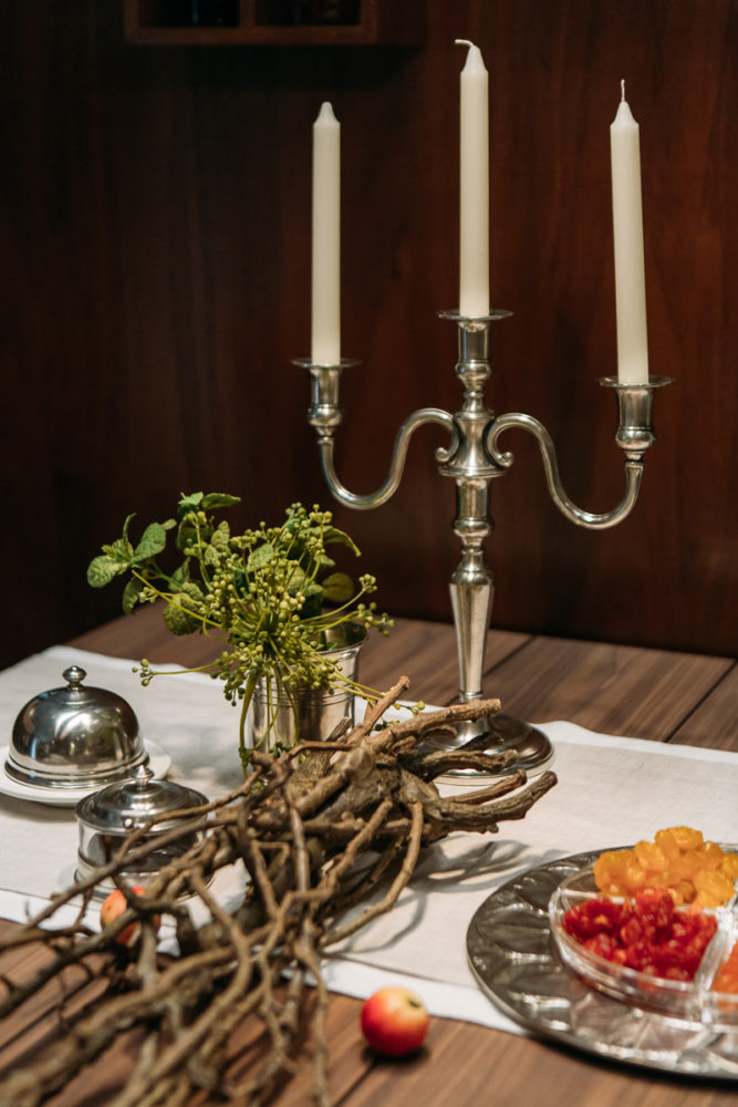
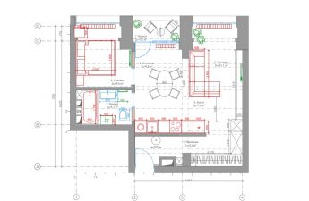
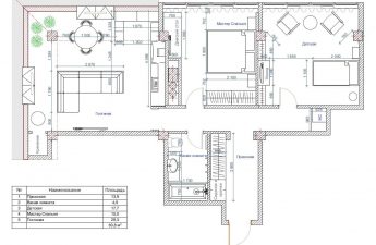
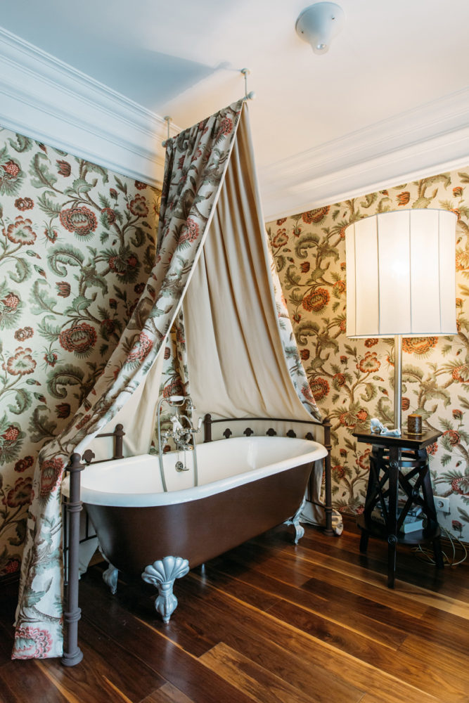
 Oksana Yakunina, designer:— The owner of the apartment took an active creative part in the design, selection of materials, furniture and decor, so she can safely be called a co-author of the project. The result speaks for itself: the apartment turned out to be cozy and stylish, as if they had lived in it for several years. Layout The apartment is located in a house built in 1983: there is not a single load-bearing wall, which opened up unlimited possibilities for redevelopment and even dismantling all the walls. The first thing we did was get rid of the internal corridors: thanks to the savings in square meters in the apartment, we were able to arrange a laundry room and implement an unusual solution - to install a bathtub in the living room. There were no problems with approval: the bathtub is located in the place of the former corridor. Otherwise, the layout was made traditional for modern interiors: the living room and kitchen were combined into an open space, and the private areas (bedroom, wardrobe, study) were located in the far part of the apartment.
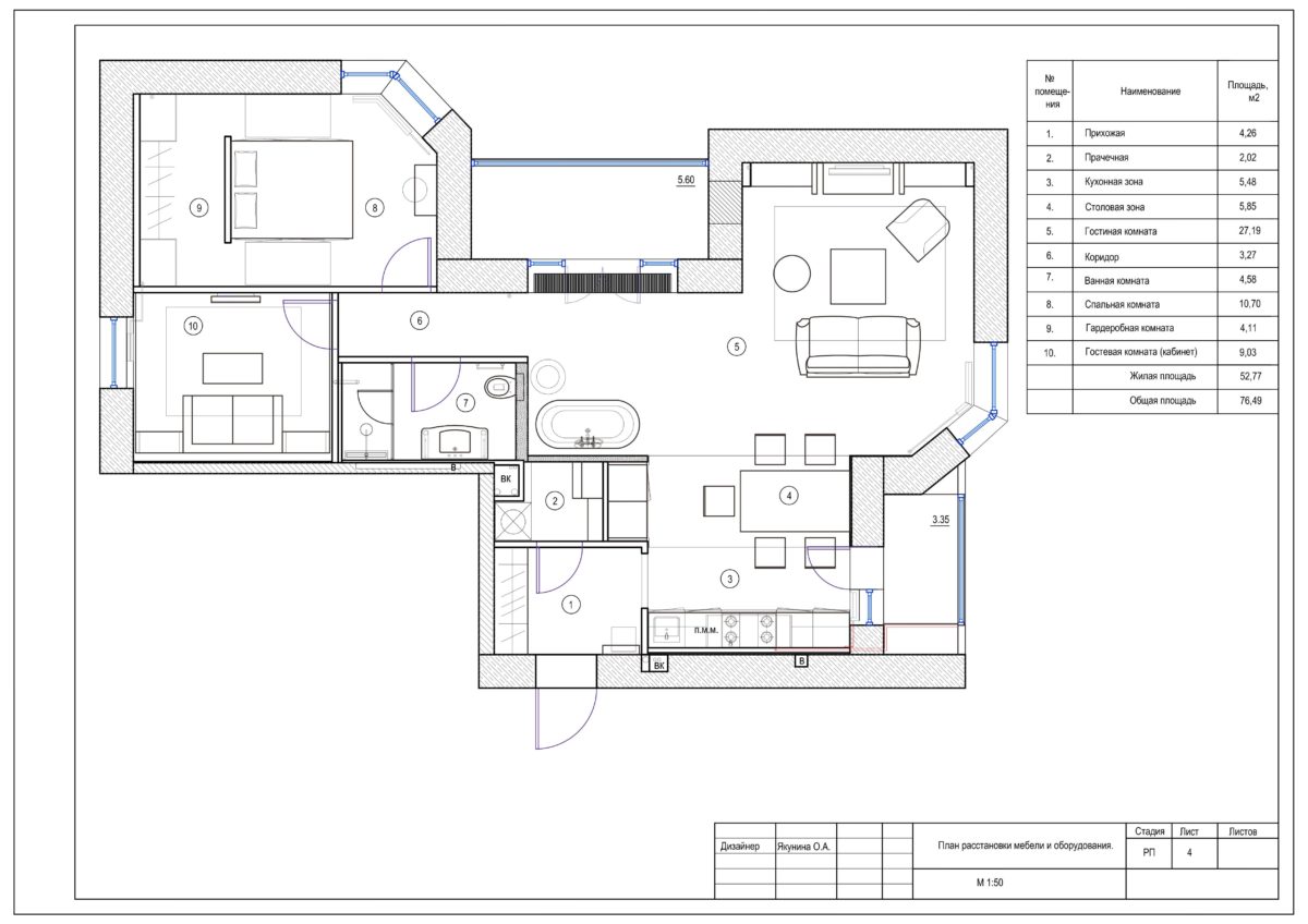 Oksana Yakunina, designer:— One of the design features of the house is a load-bearing beam that runs along the ceiling. It was important to hide it or play it up in the interior. To do this, I decided to use an original wooden ceiling structure with lighting that extends to the walls and zones the space in the dining area.
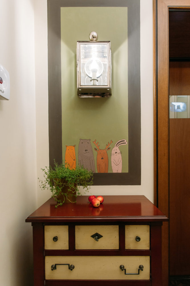
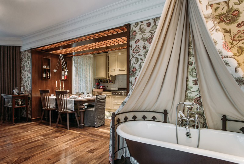 Hallway Selected interior conceptis realized already at the entrance to the apartment: in the hallway, the owner is greeted by a wall painting depicting animals, referring to the plot of the cartoon. The theme is continued by natural finishing materials and decor on the chest of drawers: apples and plants.
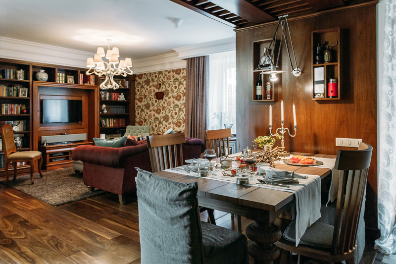
 Living room, kitchen and dining room Kitchen, dining room andThe living room is united into a common open space by the original wooden structure of the dining area, which at the same time successfully plays up the supporting beam. The kitchen and living room area are also united by a dining group from the Italian factory Gervasoni - the table and chairs are designed by Paola Navone and represent a modern interpretation of the classic style.
 Oksana Yakunina, designer:— We took the kitchen furniture from the L’Ottocento factory. We chose it for the ergonomics and functionality of the products, as well as for the possibility of making a non-standard configuration. The customer loves to cook, so for her convenience, a special mixer was provided, which allows pouring water into a saucepan without using the sink, and a multi-burner stove.
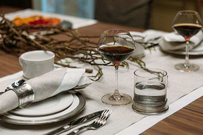
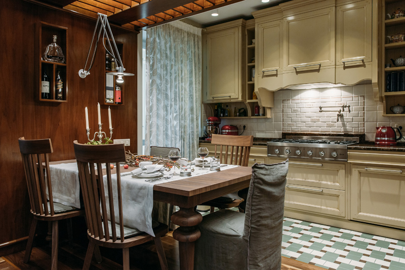 As in , the overall concept of the interior is supported by the decor: in the dining area, this is the dining table setting with runners and napkins made of natural linen and dried fruits.
 In addition to the standard seating area, the living rooma large library from L’ottocento was placed, to which pilasters were additionally made according to the designer’s sketch, stylistically supporting the composition. Upholstered furniture was ordered from the English manufacturer John Sankey, but in order to obtain more expressive surfaces, it was decided to cover it with textiles from Rubelli and Marvic. The final chord in the living room design was a luxurious chandelier from Jacco Maris with intricately curved horns.
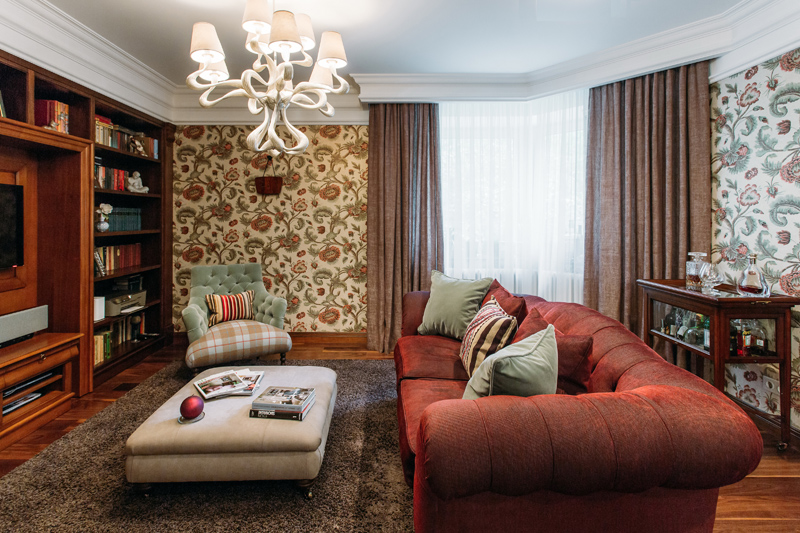 Oksana Yakunina, designer:— For the decoration of the living room area, we chose wallpaper with a large floral print from the American brand Document. It is also present on the companion fabric for the bath canopy. By the way, the owner herself suggested installing it in the living room: it turned out to be a kind of unusual art object. And in order not to overload the room with patterns, we chose neutral textiles from the Dutch factory Kobe for the curtains, which united the entire interior of the living room in color.
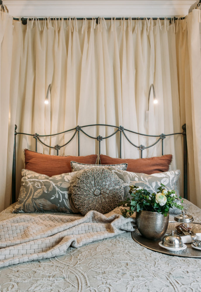
 Bedroom The room in which thebedroom, functionally divided into two parts: the sleeping and resting area itself and the dressing room. The zoning tool is a partition, which at the same time serves as a headboard and is an element of decor. The cornice for this design was brought from Italy, and then a forged bed was made for it according to Oksana's sketch.
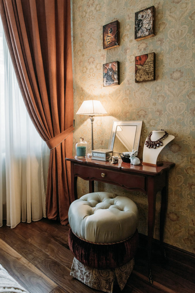
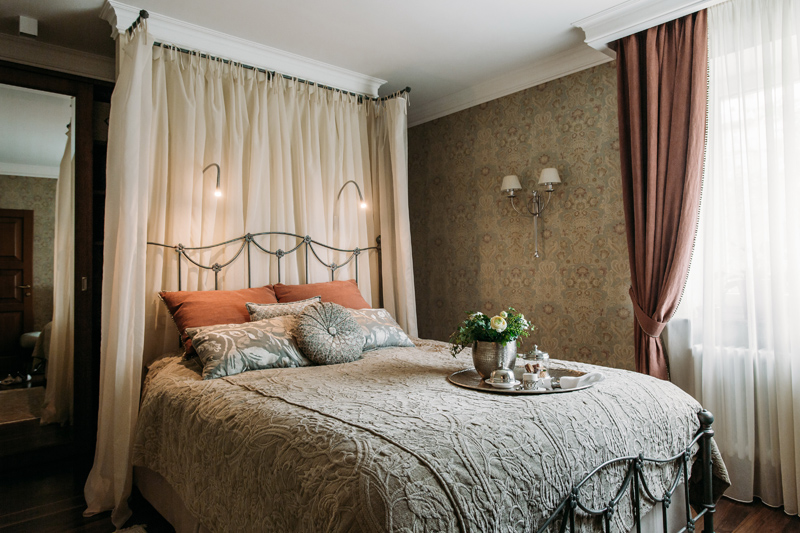 As for the color scheme, the bedroom wasIt was decided to decorate the room in a warmer and calmer palette, so American Wallquest wallpaper was used to decorate the walls. Decorative tiles from Sid Dickens above the dressing table complement the interior.
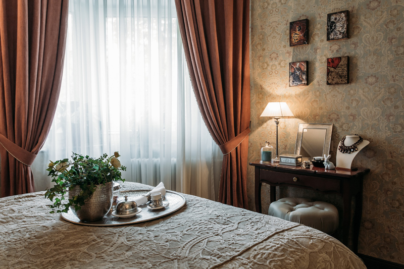 Oksana Yakunina, designer:— One of the customer’s wishes was not to use ceiling lighting, but to opt for a scenario of secondary, subdued light. To achieve this, sconces were placed above the bed and on the walls, and they were complemented by a lamp on the dressing table.
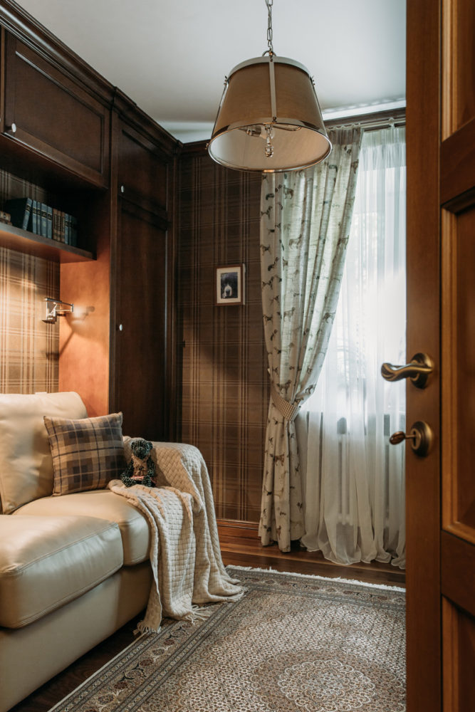
We ordered the wardrobe kit fromItalian factory Tessarolo. A well-thought-out storage system with pull-out and open drawers up to the ceiling allows you to conveniently place the necessary things, and the noble shade of wood echoes the floor finish. Mirrors from floor to ceiling in the outer sections of the dressing room unite the rooms and visually expand the space.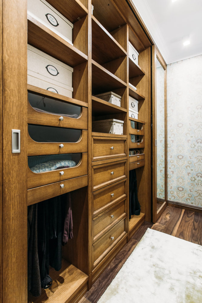 Guest room Since the customer has verymany books, it was decided to combine the guest room with the office and organize in it another small library, designed according to the designer’s sketches, with a comfortable reading corner.
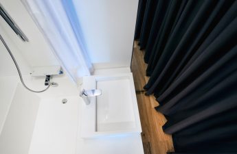
 Bathroom The interior of the bathroom wasIt was decided to make it cozy and consistent in the style of lightweight classics, so it was decorated in contrasting dark brown and white using La Diva and Devon & Devon tiles. And since the style of this brand's plumbing involves the use of classic details, a mirror decorated with a sconce of the same brand was made according to Oksana's sketch. Decorative wall shelves and an elegant Italian Baga chandelier also appeared in the bathroom.
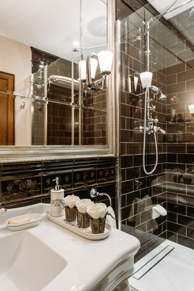 Oksana Yakunina, designer:— Thanks to the rather large area of the bathroom, we were able to organize a very comfortable shower, install a classic washbasin and a Devon & Devon toilet. There was also room for wall shelves. The following were used in this interior:
Hallway:
- closet - Tessarolo (Italy);
- fixtures (sconces, chandelier) - Vaughan (England);
- chest of drawers - Grange (France);
- floor - Metlakh tile (France);
- cuisine — L’ottocento (Italy);
- apron - Original Style (England);
- ceiling lights - Delta Light (Italy);
- tulle - Paisley (England).
Dining room:
- table and chairs - Gervasoni (Italy);
- floor - parquet Panaget Otello (France), American walnut;
- decorative panel with shelves - L’ottocento (Italy);
- the ceiling is made of a file of walnut according to the sketches of the designer;
- sconces over the dining table -Modular (Italy);
- Lamp bill in a wooden construction - Delta Light (Italy).
Living room:
- sofa - John Sankey (England);
- upholstery fabric - Rubelli (Italy);
- pillows - Sacho (Germany), Marvic (England);
- armchair - John Sankey (England);
- upholstery fabric - Marvic (England), Rubelli (Italy);
- pillows - Sacho (Germany);
- pouf - John Sankey (England);
- chair — FABER (Italy);
- shelving - L'ottocento (Italy);
- bath - Devon & Devon (Italy);
- Chandelier - Jacco Maris (Holland);
- Overhead lights -AV Mazzega (Italy);
- floor lamp - factory Chelini (Italy);
- carpet - factory JAB (Germany);
- wallpaper and canopy for the bath - Document Wallpapers, Document (USA); curtains - Kobe factory (Holland);
- decorative pilasters (shelving) are made according to the designer's sketch;
- The forged bathroom fence was made according to the designer’s sketch by the company B28studio.
Bedroom:
- the bed was made according to the designer’s sketch by the company B28studio;
- the pouf is made according to the designer's sketch;
- console - FABER (Italy);
- bra - Baga (Italy);
- table lamp - Baga (Italy);
- sconces over the bed - Contardi (Italy);
- Overhead lights in the dressing room - Delta Light (Italy);
- dressing room - Tessarolo (Italy);
- decorative wall tiles - Sid Dickens (USA);
- wallpaper - Wallquest, Piccolo (USA);
- curtains, bedspread, pillows - Lizzo (Spain);
- finishing drapes and pillows - Houles (France).
Cabinet:
- sofa - Saxon (England);
- the library is made according to the sketches of the designer;
- chandelier - Vaughan (England);
- bra - Marset (Spain);
- plaid - KENZO (Italy);
- wallpaper - ProSpero, Regents Park (USA);
- curtains - Voyage (England).
Bathroom:
- plumbing - Devon & Devon (Italy);
- furniture — Devon & Devon (Italy);
- tiles - La Diva (Italy);
- glass partition in the shower compartment - Duka (Italy);
- chandelier-Baga (Italy);
- sconce -Devon & Devon (Italy);
- wall shelves - Devon & Devon (Italy).
Decor for the photo shoot was provided by Happy Collections.
