How to increase the usable area of an apartment while maintainingall functional features? Why can't a classic interior be spoiled by bright and flashy accents? Answers and advice from a specialist Young people usually choose modern styles for their interiors, but this couple opted for the classics. Designer Natalia Komova managed not to cross the line between pomposity and coziness, and at the same time gave the apartment an extraordinary brightness and freshness. An electric piano in the future children's room, wallpaper in the bathroom, a Scottish plaid in the toilet, a flashy sofa in the living room - this interior really doesn't look boring. In addition to the harmonious design, the designer was able to make part of the non-residential area functional, for example, expand the kitchen and bedroom by adding balconies. Natalia Komova, interior designer Works on creating private and public interiors in Moscow.
Customers' dreams
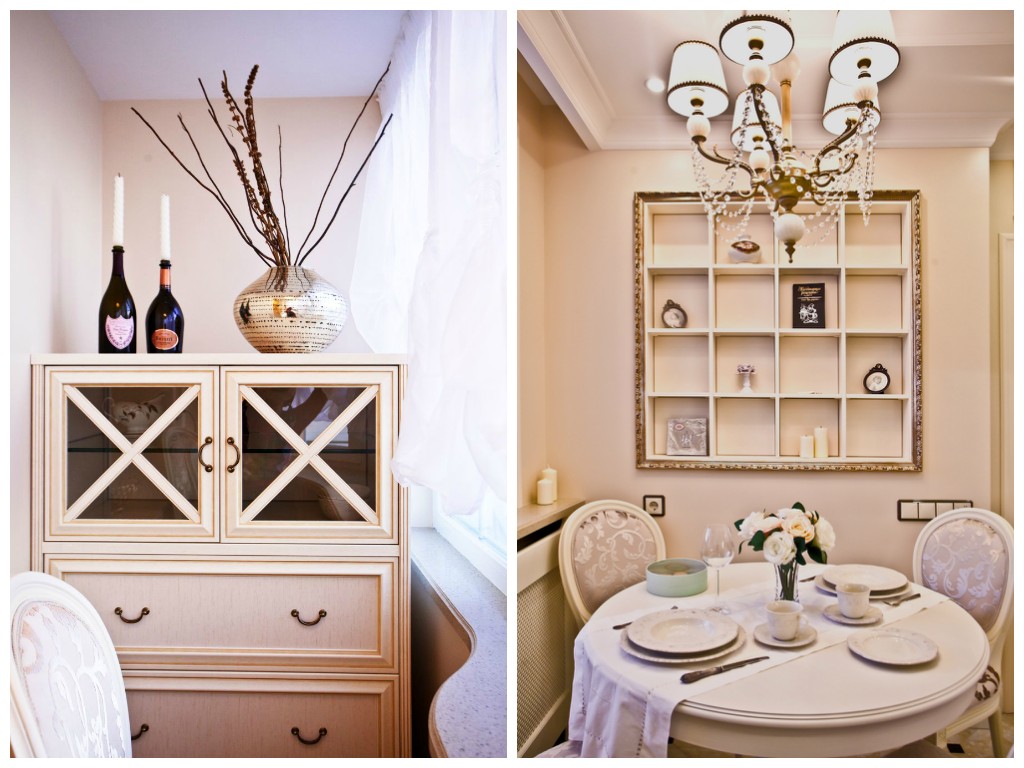
The clients were a young married couple who decided to fill their home with a light, airy atmosphere of warmth and comfort, keeping the entire interior in light colors and a soft traditional style.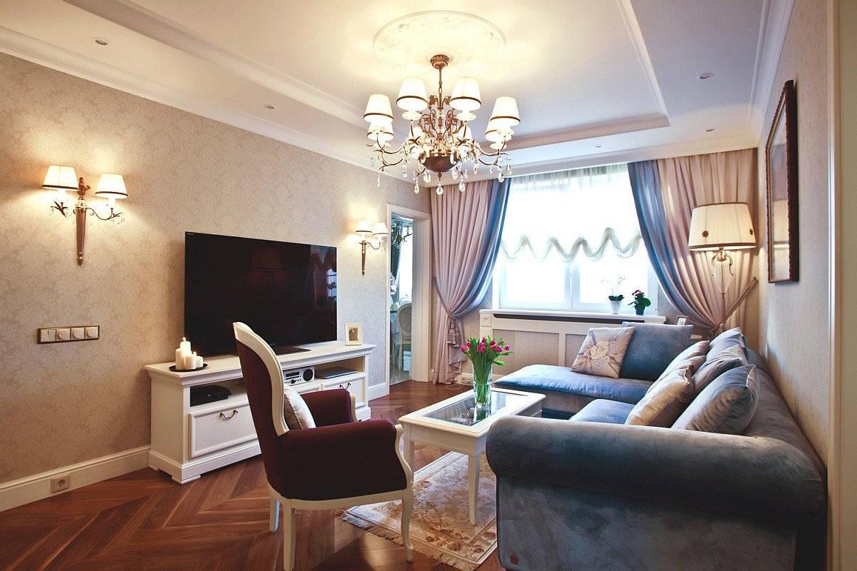

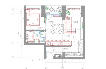
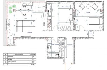
Layout features
It was decided to optimize a littlestandard layout, reducing the useless area of the corridor and increasing the area of the bathrooms and living rooms. Thus, on 88 square meters it was possible to place:
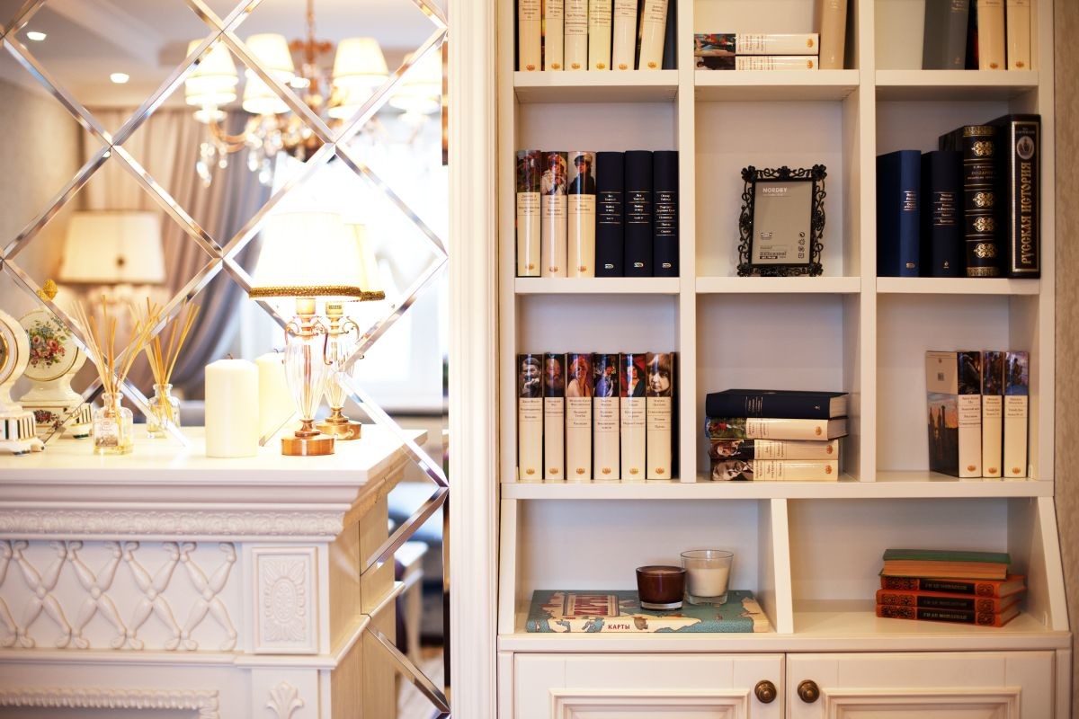
- A spacious entrance hall with a fireplace and built-in library;
- a fairly large bedroom with a dressing room, a work area and a dressing table - this room was enlarged by adding a balcony to it;
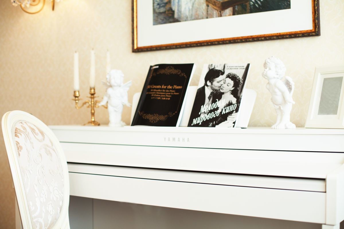
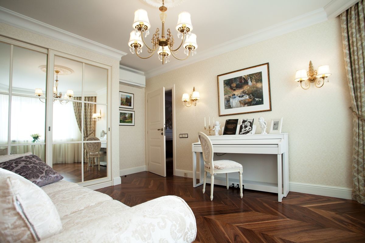
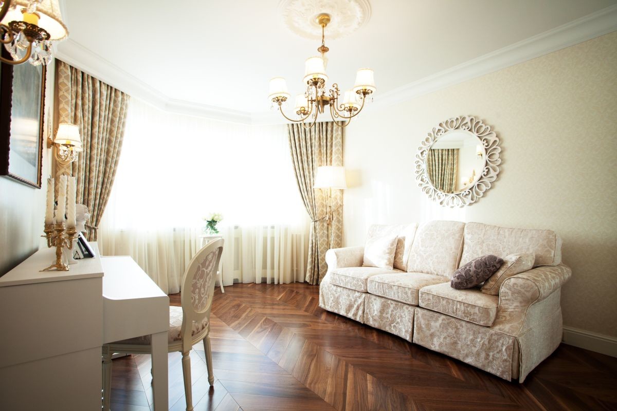
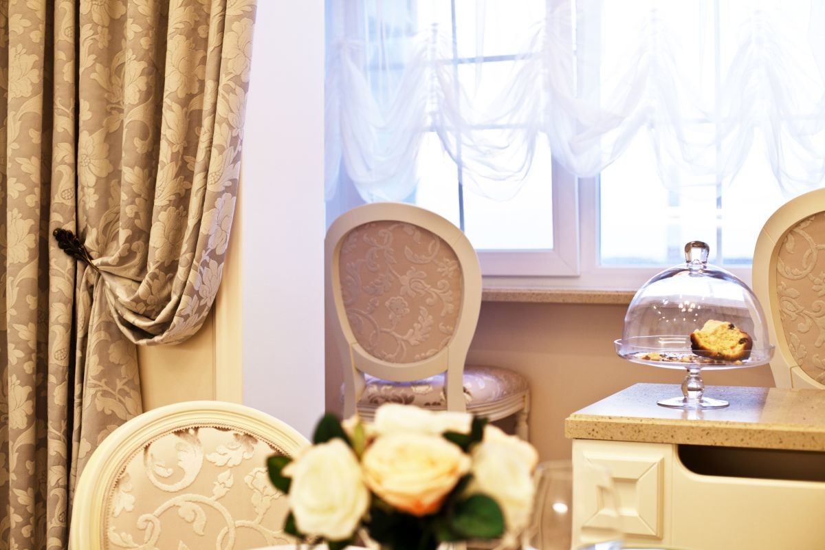
- a future children's room with an electric piano and a fold-out sofa;
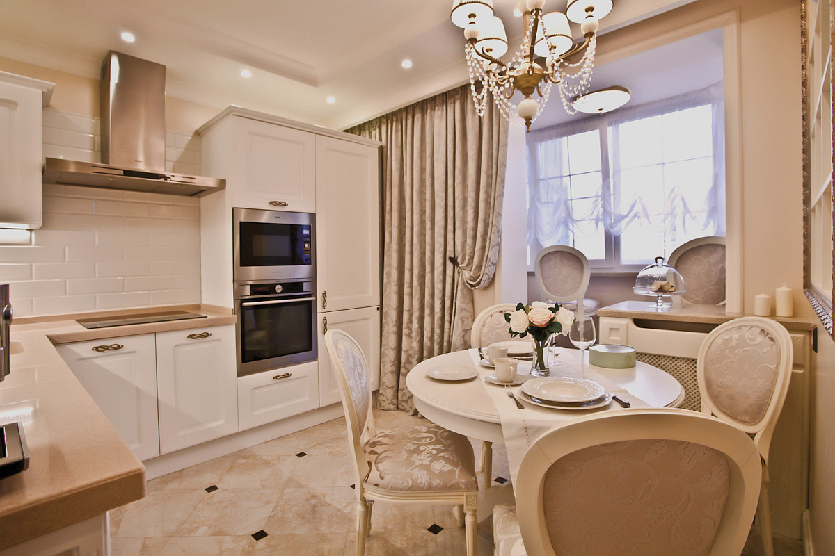
- a spacious kitchen with a round table, a bar counter and sufficient storage space (again, due to the addition of another balcony);
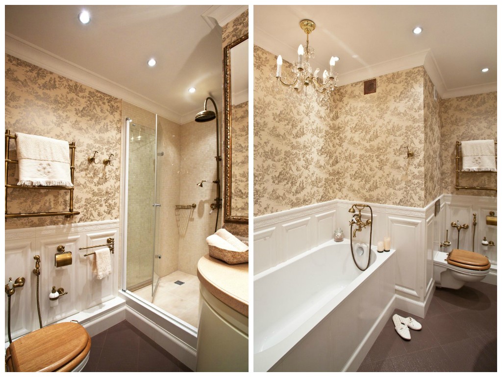
- two bathrooms and a hall.
Natalia Komova, interior designer:— Adding the balconies did not cause any particular difficulties, because we did not put the heating radiators there, but installed a warm electric floor. But in order to organize the passage to the kitchen from the living room, we had to make an opening in the load-bearing wall, observing a number of technical requirements and subsequently spending some resources on coordinating the entire project. But it seems to have been worth it!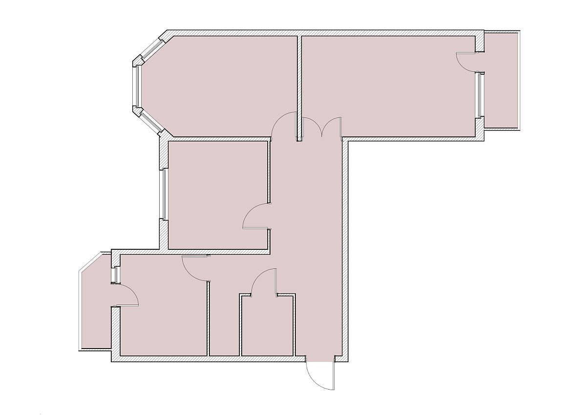

Color and lighting solution
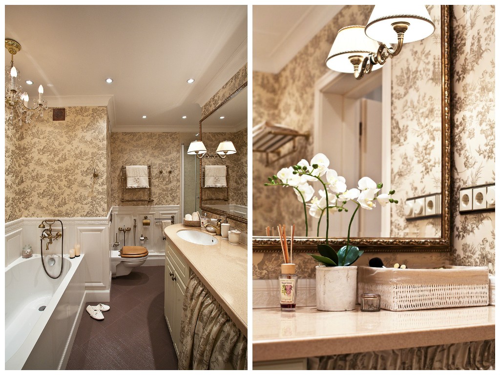
The interior of the entire apartment is kept in light,pastel colors, and only in the living room there are a few noticeable color accents. This is a sky-blue sofa and a beetroot-colored armchair, diluting the general background of white built-in furniture and light wallpaper. And another colorful interior can be seen in the guest bathroom. Here, the contrasting Scottish check of the wallpaper sets a more strict tone, but still, due to the white ceramic wall panels, harmoniously blends into the overall mood.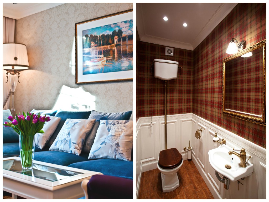


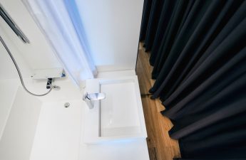
An object worthy of attention
The large bathroom deserves special attention.For this room, we used delicate moisture-resistant wallpaper with a romantic print. The chandelier above the bathtub has a brightness control function. Pay attention to the large mirror, which visually enlarges the bathroom several times. The curtain covering the washing machine is made of fabric from the same collection as the wallpaper. All this creates a magical enveloping atmosphere of bliss and relaxation.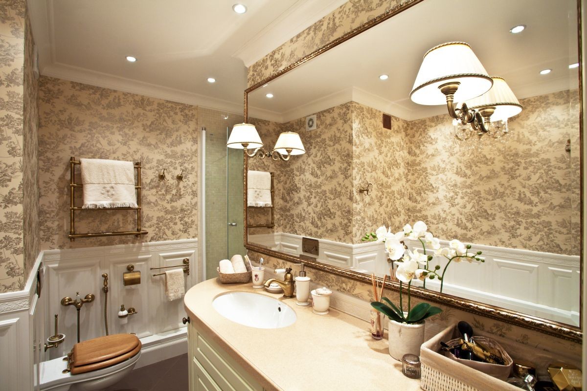
Materials, finishes and brands:
- wallpaper, lighting, stucco, textiles - "Ampir Decor";
- furniture (mainly Italy) - Selva;
- kitchen - Stosa Cucine (Italy);
- built-in furniture (wardrobes, library, dressing room, wardrobe on the balcony) — Mr. Doors;
- doors — Landoor;
- paintings - Claude Monet, print on canvas.
Designer's Tips
Natalia Komova, interior designer:— The clients of this project are young guys, so it was important for us not to make the interior too classical. To do this, we used some techniques that helped us to refrain from excesses and at the same time complete the task with an eye to the future.
Tip #1: Choose the right parquet
For the floor, we chose the "French herringbone". Unlike the traditional "herringbone", here the parquet is "cut" at 45 degrees and laid end to end, which looks better.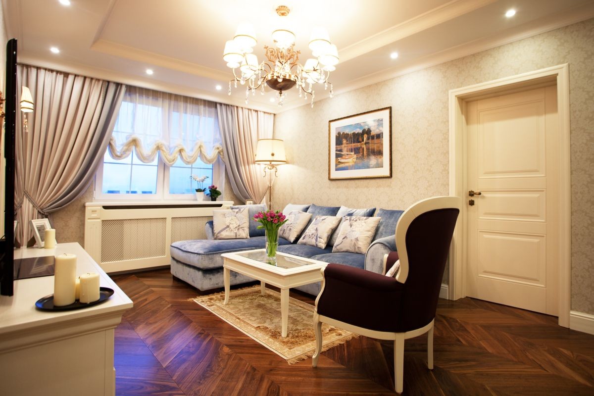
Tip #2: Get Rid of the Carpet
In the living room, we ditched the traditional large rug for a runner just a little larger than the coffee table on it—a small touch that makes the space feel noticeably lighter.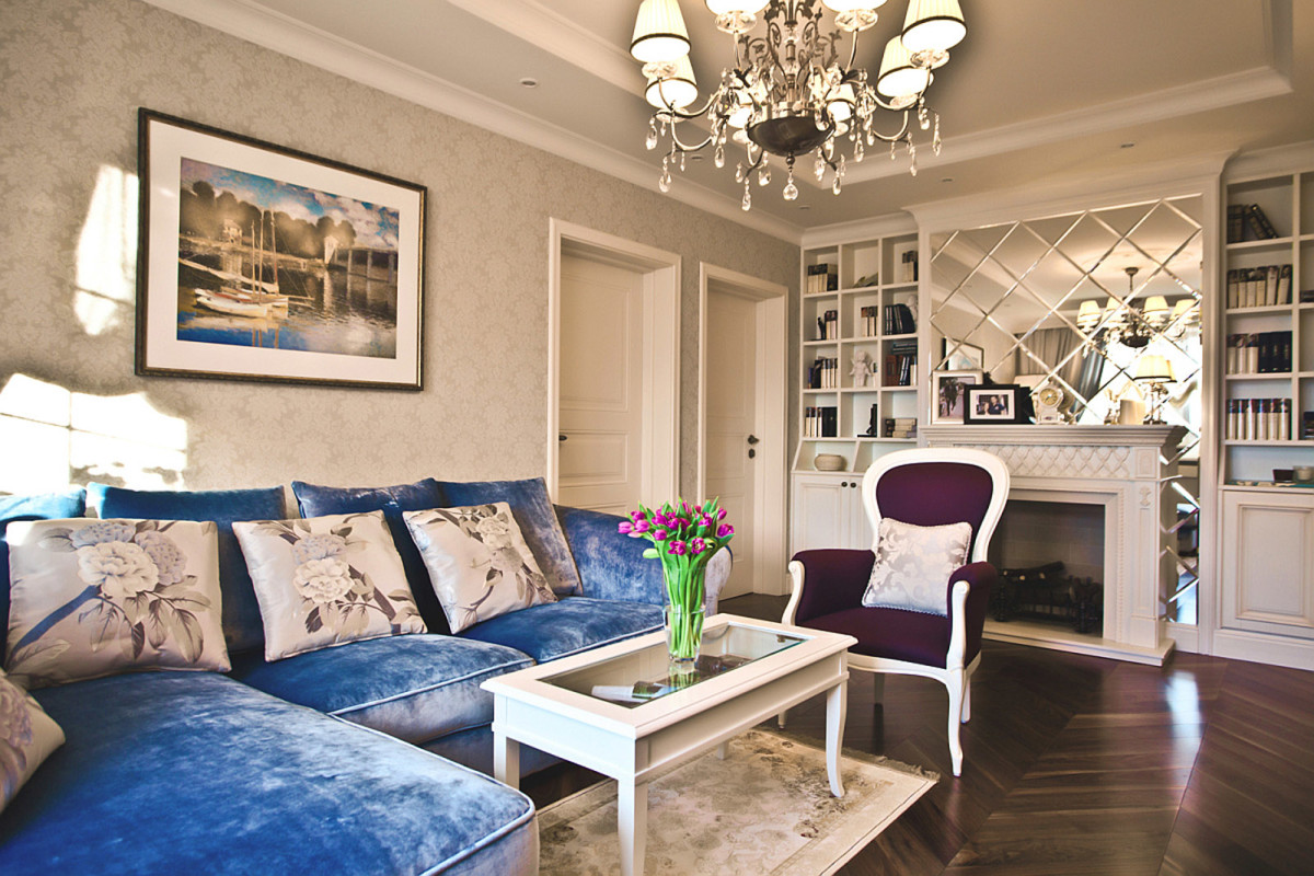
Tip #3: Add a Touch of Modern Style
In the kitchen, with its rather classic facades, we installed modern chrome-plated household appliances, taking us back to the present day.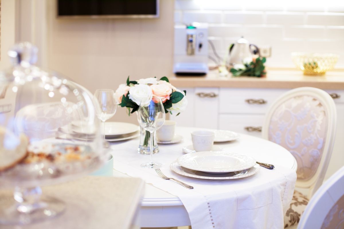
Tip #4: Create a cozy atmosphere
Almost all the fittings are aged bronze, which also helps to create coziness, while, for example, gold would only weigh down the interior.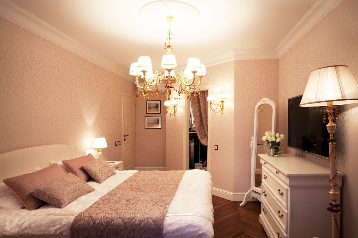
Tip #5: Think about the children!
The possibility of quick transformation is providedrooms with a piano into a nursery. When the young couple becomes happy parents, they will save a lot of time and money on arranging a room for their baby. When remodeling an apartment now, think about the future!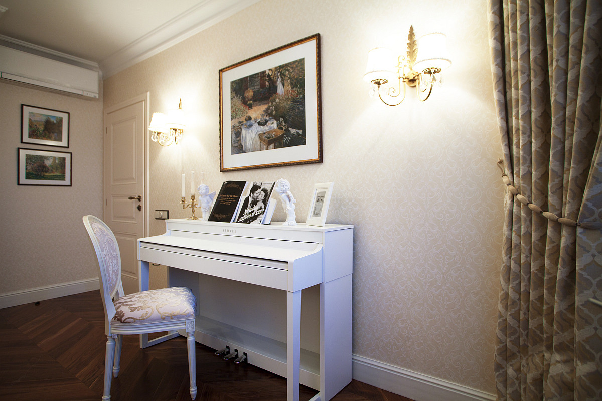 photos provided by Natalia Komova