How young people see office spaces in the futuredesigners? What new, and most importantly, fresh, can they offer? We have come across some works by graduates of the Modern School of Design, and we will be happy to reveal their projects
First, it's worth telling a little about the company itself.a school that produces certified specialists in various design areas. Modern School of Design Modern School of Design is a private educational institution of additional professional education that trains specialists in various design areas. During the training, students are given visits to production facilities and showrooms, and master classes are held by representatives of leading specialized companies. About 200 graduates graduate from the school annually. They are given the opportunity to find employment; for this purpose, representatives of companies from various business areas are invited to open defenses of diploma projects. Upon completion of the programs, graduates are issued a diploma of professional retraining (of the established form). designstudy.ru
The students themselves completed the project visualizations,which, of course, don't look like those that are hard to distinguish from the photo. But we are evaluating their work and ideas, right? Let's put ourselves in the shoes of the examination committee members.
The office project by Elena Gordienko was created for the GermanLieca, a company that produces photographic equipment. The task is as follows: a free-plan room with an area of 161 square meters, located on the tenth floor of an office building. The room has two utility shafts and four supporting columns that need to be harmoniously integrated into the layout and interior. From these initial conditions, it is necessary to create a functional, comfortable and ergonomic space. Layout and design
Based on the technical specifications, the drawn outthe open-plan space needed to be divided into zones. For this purpose, partitions made of plasterboard and plastic were used. The space took the form of an office and was divided as follows:
- hall;
- work zone;
- director's office;
- negotiation;
- kitchen;
- a bathroom.
Hall
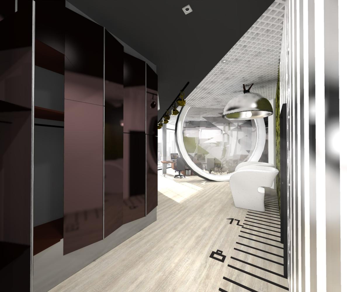
If you open the door, you won't have any problemsdoubt that you have come to the office of Lieca. The huge lenses, in which the light, refracting, is scattered around, have a practical purpose, being partitions. The aperture scale on the floor stretches along the hall, smoothly passing into the work area.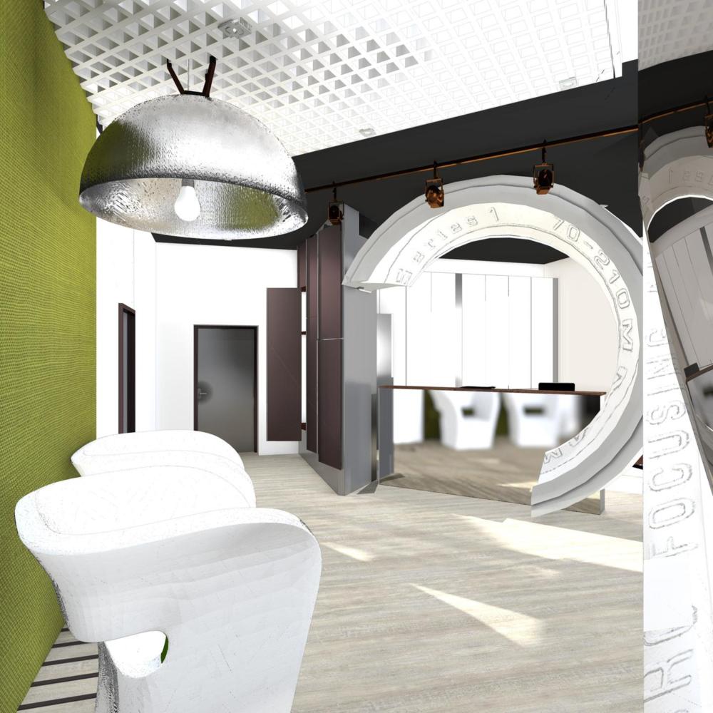
 Work area
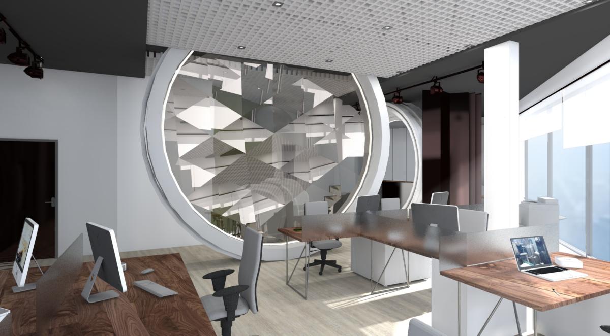
The main part of the office is occupied by the work area.space. Its location was determined by panoramic windows, allowing employees to work in natural light for most of the day. Wooden tables fit perfectly into the interior. It is believed that natural materials and textures promote active brain activity.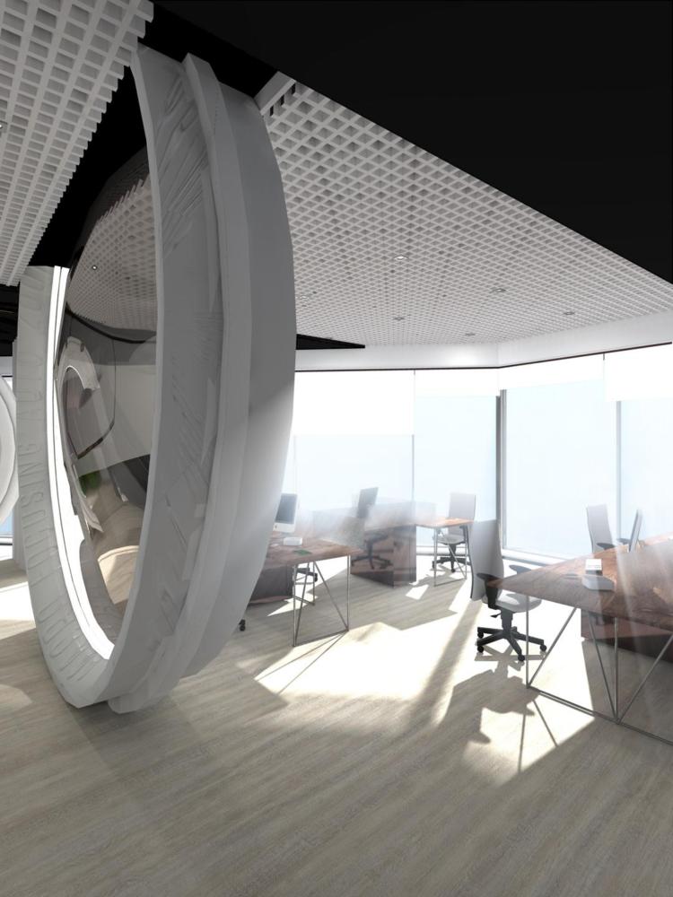
 Cabinet
The director's office is separated from the common area.tinted glass and is as laconic as the work area. However, the boss must have some advantages, and this is a small lawn right on the work desk. Of course, you can’t walk here barefoot, but if you run your palm over it, you will definitely get a pleasant tactile sensation. Isn’t it lovely?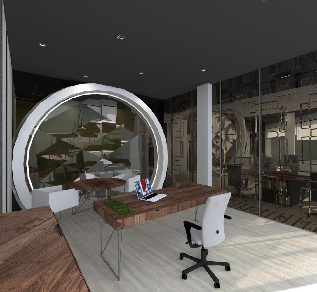 Bathroom and kitchen
A reminder that the company has a long history in the photographic equipment market are the wooden tripods that were once used for cameras under the sinks.
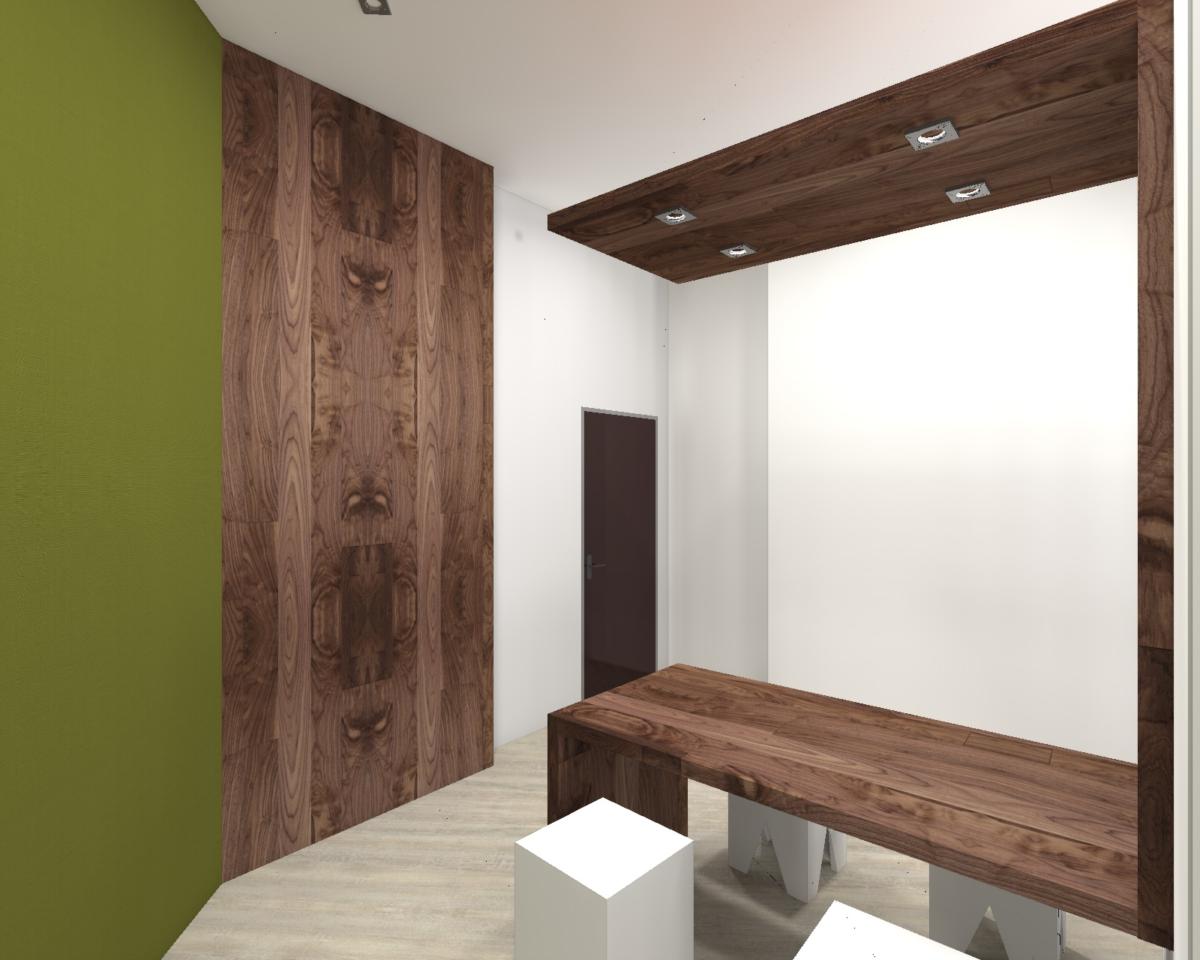
The kitchen, as well as other areas of the office, uses wood finishing materials. There are small square stools on both sides of the table.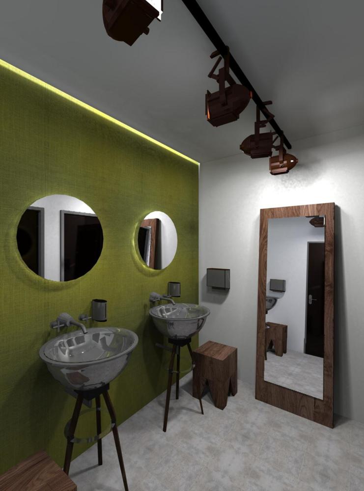
 Lighting
Several types of lighting are used in the office.Track lights provide brightness in the work area and reception area. Diffused light is created by multiple built-in lights, and a pendant chandelier in the waiting area adds extra coziness.
