Studio apartment without a bedroom, but with a goodidea, stylish execution and the “right” black color. The editors also liked the concrete ceiling and yellow sockets. In a word, viewing is a must. An apartment without a bedroom or even a sleeping place is, to put it mildly, a rare occurrence, and therefore extremely interesting. This project was created for negotiations and short rest during business trips. However, despite the rather meager functional requirements, the interior turned out to be stylish, restrained and very interesting. Igor Nevestenko, architect:
— I started gaining design experience back infirst years of university, which allowed me to get a job in a design organization without waiting for a diploma. I have mastered the process of organizing design work, from a sketch to passing a state examination. After six months of experience in a management position, I decided to open my own company. Since 2014, my whole life has been connected only with design! During my work, a huge number of projects were completed in different cities of Russia.
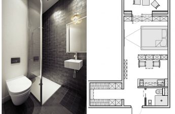
Initially the apartment was vacantlayout, but with such a small area it was not particularly noticeable. The customer wanted to organize a working studio apartment for negotiations and short-term rest during business trips. The lack of a sleeping place is compensated by the customer's desire to purchase a neighboring apartment in the future in order to combine it with the existing one. Among the redevelopment solutions, one can note the transfer of a wall in the hallway due to the reduction of the bathroom. All the customer's wishes were successfully implemented.
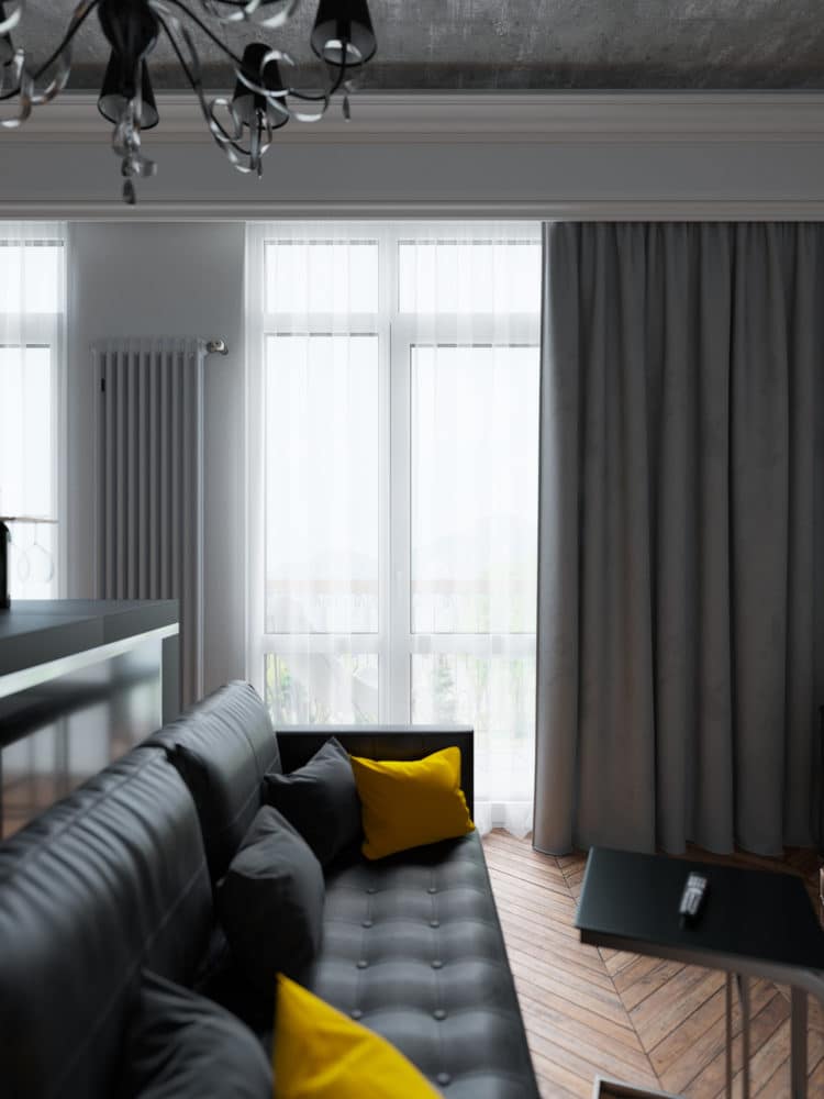
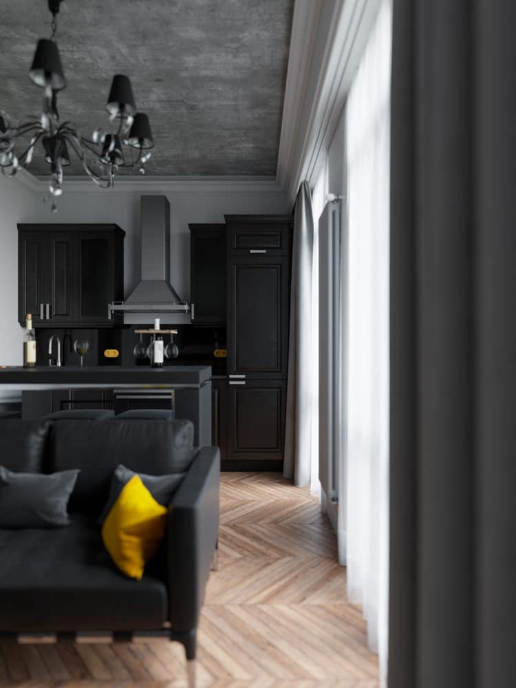
The interior color schemes are monochromeshade, which allowed to create a classic interior with the inclusion of bright accents to create a special mood. In terms of lighting, classic lamps from Maytoni were selected, they fit perfectly into the black and white color scheme of this project.
The project includes interior items thatwere made to order in private workshops. The wardrobe and bar counter were designed specifically for this object. Furniture sketches were agreed with the customer, so everyone was happy with the result.

The kitchen set was designed by IKEA. This model was manufactured on time, which confirms the company's reputation as a quality manufacturer.


In the living room area, a leather sofa from the Cassina factory has found its place, which goes perfectly with the TV stand.
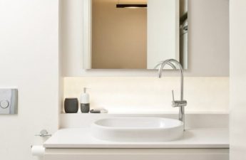
The bathroom was designed in a modest manner, meeting only the necessary functional requirements of this room.
The hallway has a common outline with the living room, such a planning solution allowed us to set the rhythm for the entire interior.

The wall decoration is presented individuallyMDF panels with carved elements from the ID Panel company, such a solution allowed to reduce the time of repair and installation works on the site and to obtain an excellent result at the end.
The hardest part of this project was organizingfunctional areas in such a small area. The most important thing was to create an interior with the necessary composition of furniture items, which would combine classic and modern solutions. The best result was to convey the symmetry of structures and decorative elements, which is so important in classic rooms. Well-chosen furniture gave a modern stylish touch to this project.

