A striking project proving that the designer's impeccable taste, coupled with the customer's trust, can work wonders.
The rooms in this project are strung together one after another.another, forming an interior route thought out to the millimeter. Coherence, harmony of different spaces - this is what is always in the interiors of the Bakharevs' bureau. And this is not a simple way of repeating techniques. Textiles, paints, wallpaper, textures, joinery - decorative elements set the leitmotif here, forming a complete image. Architectural bureau "Bakharev and Partners" Nikita and Maria Bakharev are the founders and architects of the bureau "Bakharev and Partners". Both were born in Moscow and studied at the Moscow Architectural Institute, in 2003 they opened their own studio. Today, "Bakharev and Partners" is a full-cycle architectural bureau that designs objects, completely resolves issues of furniture and materials supply, erects objects of any complexity with its own construction company, working on a "turnkey" basis. In the bureau's voluminous portfolio, you can find both conservative and eclectic objects with thoughtful decor and an exclusively functional environment. www.baharev.ru
The architectural bureau "Bakharev and Partners" is doingturnkey projects, thinking through everything, right down to the door handles, and completely filling the interior with decor. Art director of the company Maria Bakhareva admits that she worked on the project with great pleasure, even despite the relatively modest, by the standards of the bureau, footage - only 130 meters.
Project of an apartment in a modern building locatedat the beginning of Pokrovsky Boulevard, was designed for a family - parents and a teenage son. The customers had great confidence in the architects, so the main wishes were limited to practical, rather than aesthetic components of the project.
When developing the interior concept, it was decided to introduce spectacular, but harmonized accents into a modern, neutral canvas.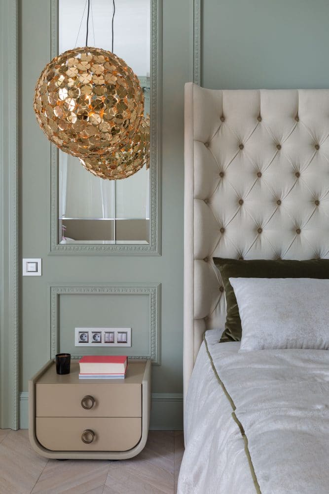
In any interior (whatever it may be)stylistic affiliation) for any person there should be something interesting - something to look at, something to be interested in - that's why I like to work with textures, visual images, mix everything up, because even a laconic interior should not be too smooth. Maria Bakhareva, architect

Since the apartment space is small,The architects tried to expand it as much as possible, but in the living room the utility lines did not allow moving the partition separating the living room and the hall, so it was lined with mirrors. This effective technique allowed it to be “dissolved” in the interior as much as possible.
The task of expanding space is also subject to the choicecabinet furniture that created a neutral background environment: a Bulthaup kitchen with minimalist facades, a neutral Besana library and a geometric Alivar shelving unit - all in formal white.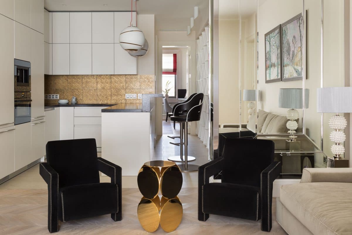
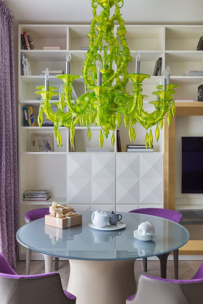
The result is a strong and simple architectural base, against which picturesque and rich details work perfectly, for example, the light green Barovier & Toso chandelier.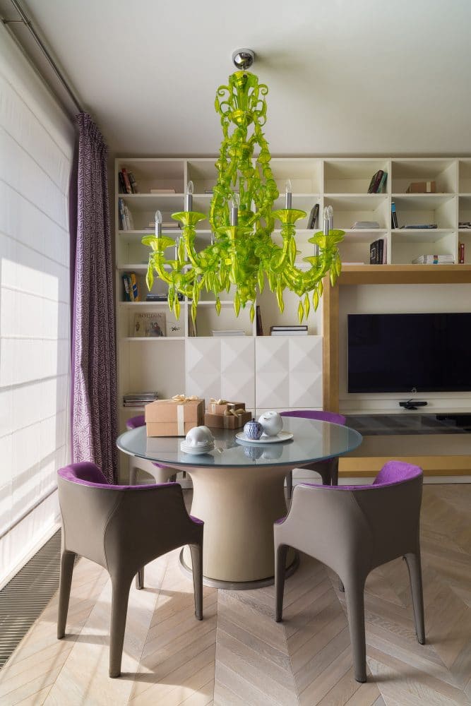
Textures are responsible for rhythm and accents - on the apronIn the kitchen, a very intricate gilded marble, Petra Antiqua, echoes the gold details of the library and the sprawling gilded frame of the mirror in the hall; these accents work in contrast to the surrounding neutral canvas.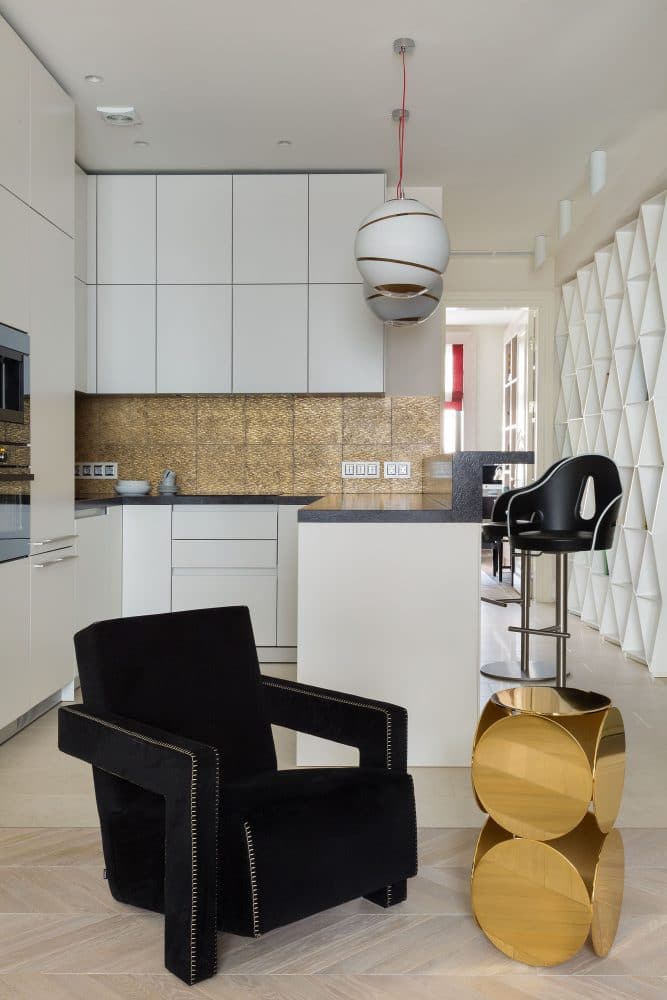

Both bathrooms are made according to the same principle - inThe guest bathroom features concrete-textured porcelain tiles and neutral white fixtures; however, the mirror in a sprawling gold frame takes the perception of the interior into a completely different direction.
It's a similar story with the master bathroom:modern, laconic sanitary ware by Antonio Lupi and Villeroy & Boch, neutral porcelain stoneware, but with textured round gold inserts that give the space an elevated mood and make it interesting.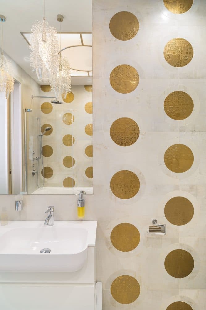

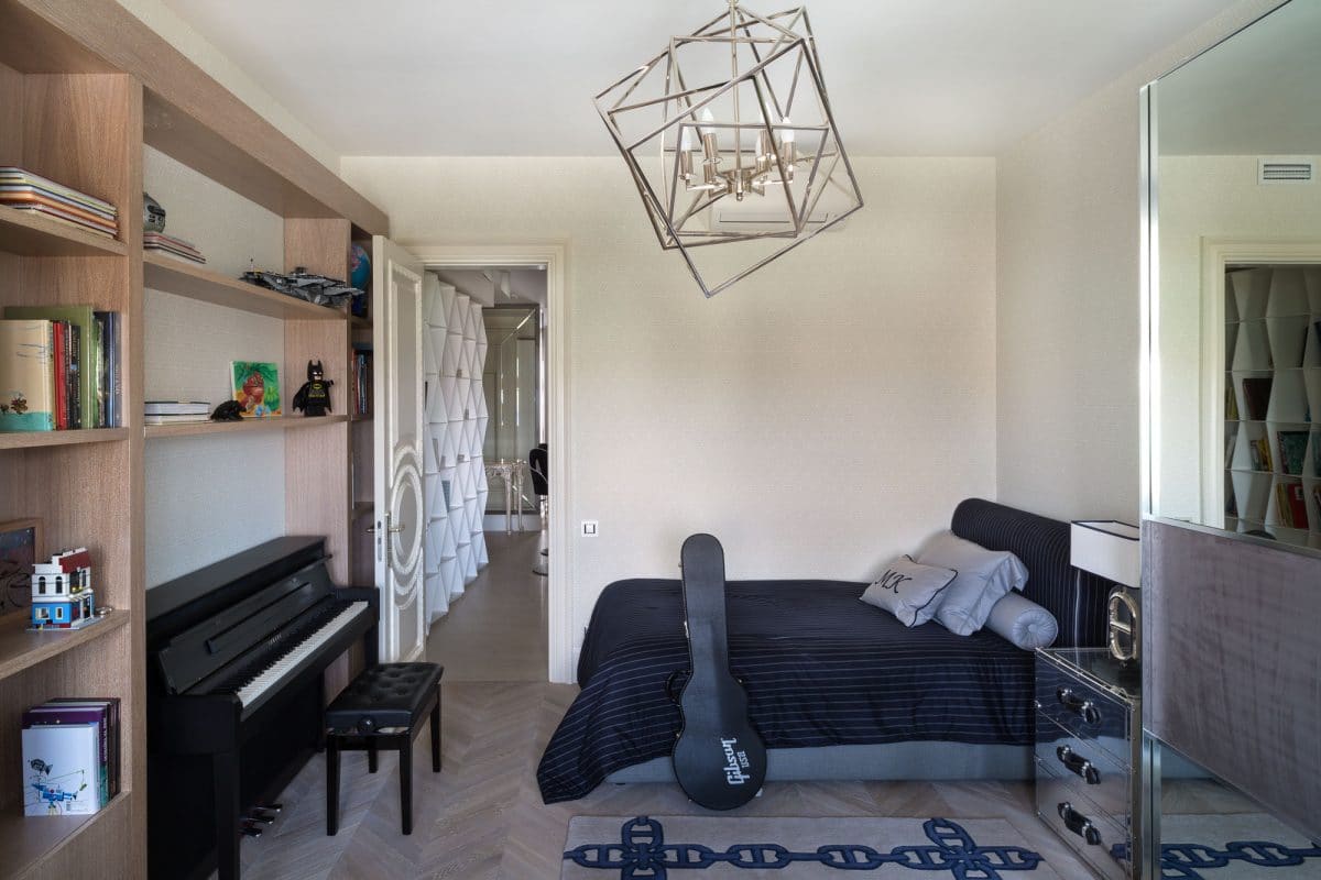
The idea was to create a modern, neutralthe interior to introduce spectacular accents; and naturally, since the apartment is small, we sought to effectively use every centimeter. Despite the fact that the project is unusual for us, I enjoyed working with him: firstly, there were great customers with whom we had a complete mutual understanding - the task was clearly set, and we immediately did what they liked; secondly, I believe that all the solutions were ideally selected for a project of such size and location - the style set in the apartment is very close to me, so this work was exclusively a joy. Maria Bakhareva, architect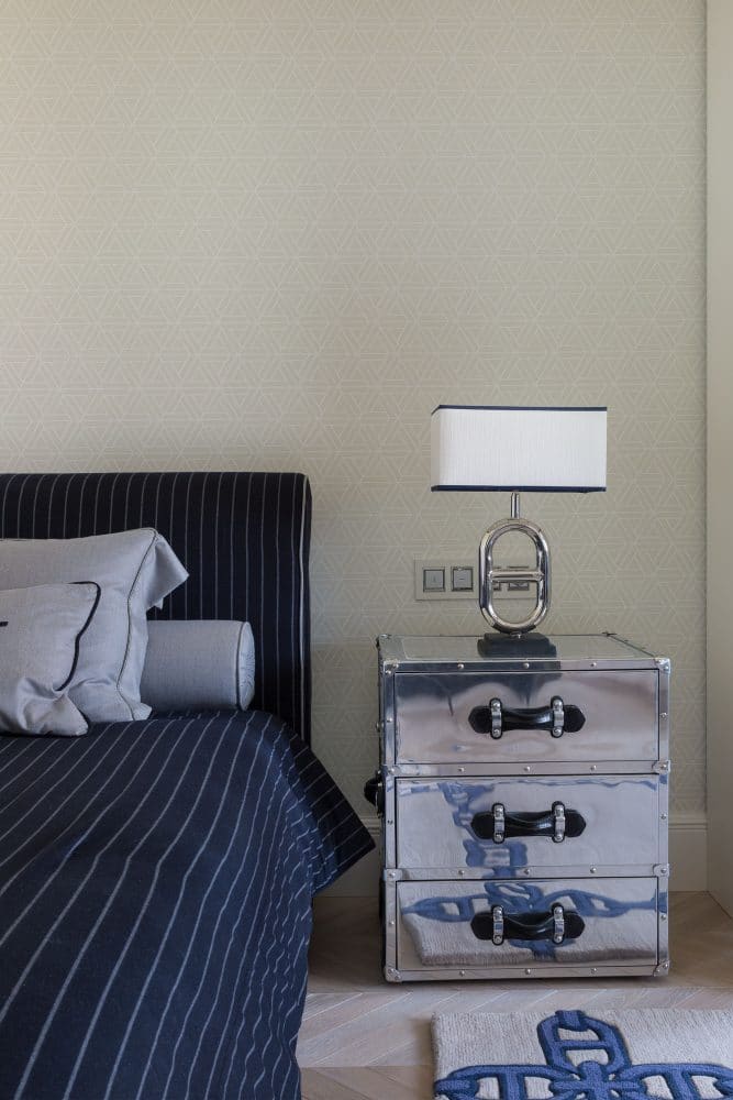
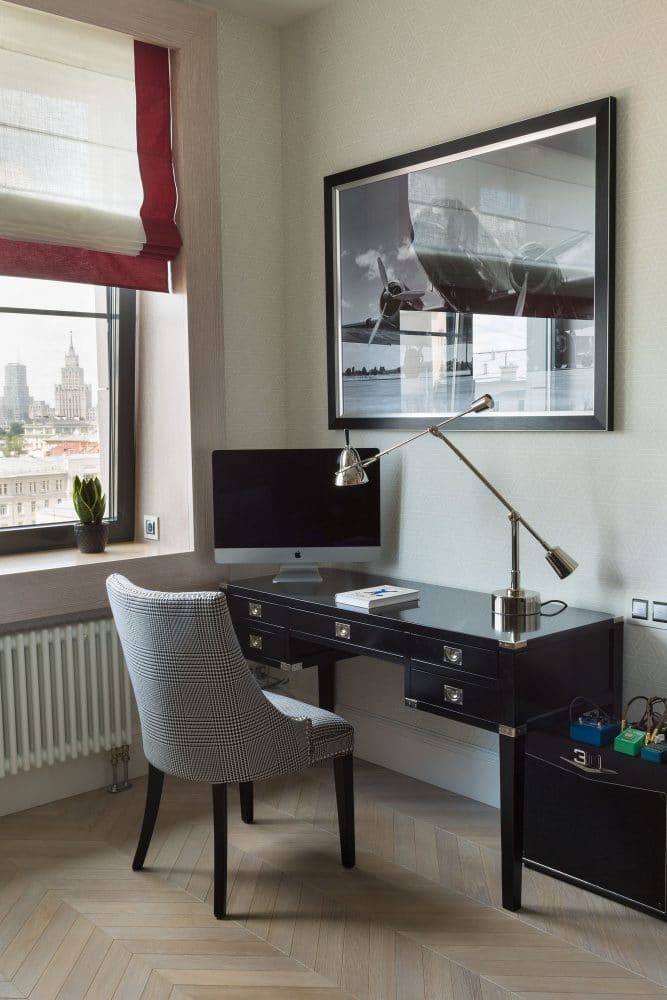
The master bedroom is separate and therefore differentdesign - a calm olive color was chosen as a background, which is used to paint the walls and plaster cornice, which is responsible for the “classic” mood in this room, it works in contrast with the modern Meridiani bed, simple bedside tables and wardrobe.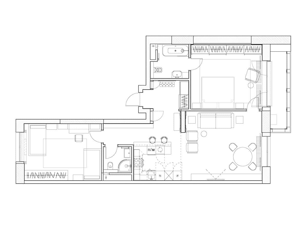 Photography: Kirill Ovchinnikov. Production and styling: Vadim Kostyrin.
