This interior was created under the inspiration ofworks by the famous decorator Kelly Wearstler. A golden ceiling in the bathroom, lots of black and a style recognizable to all design lovers. This is enough to get interested. But there is also a crazy redevelopment: two rooms were turned into three
We are for courage and bright solutions! This project pleased the entire editorial team, first of all, with the clients' readiness for bright, original ideas. Tatyana Aryutova, designer-decorator
In 2001-2002 she studied interior design in design workshops.
In 2015 and 2016, she attended two courses on coloristics at the Details school-studio.
In 2015, she completed an advanced training course for practicing designers.
Throughout the year, she attends thematic exhibitions, master classes, and listens to lectures.
He studies a lot, because he believes that only by studying can one be aware of the latest and future trends. By the way, the Roomble portal is one of the sources of new and useful information.
"For me, design is my whole life. Even my outside interests are to some extent connected with interior design and decor."
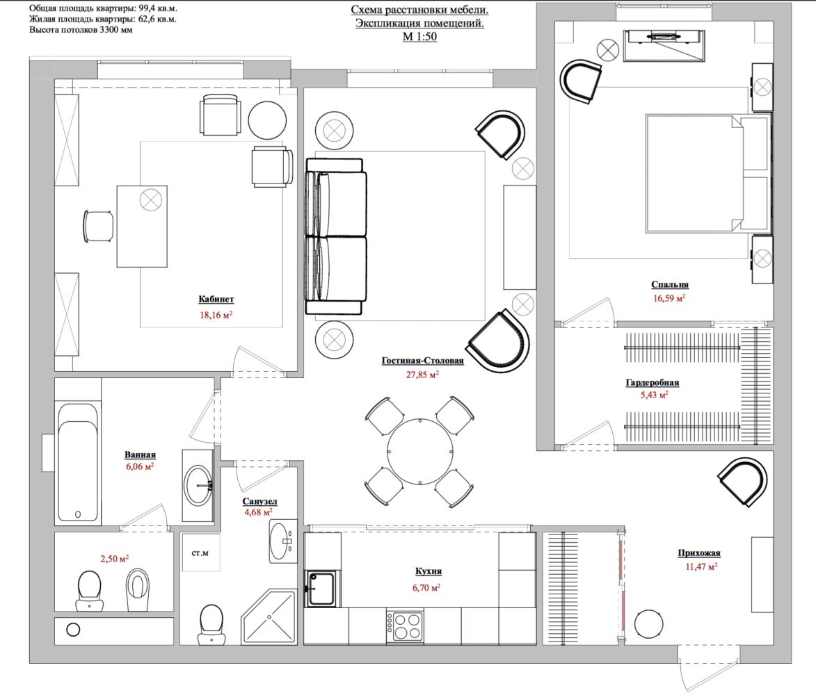
This apartment was originally planned astwo-room. Two spacious rooms, a 20 square meter kitchen, a large hallway. The customers permanently live in another city, and they bought this apartment so that when they come to Moscow, they can stay not in a hotel, but on their own territory. It is more comfortable for them.
The owners didn't plan to cook much, sodecided to make the kitchen smaller, move it to the hallway and close it off from the living room with a sliding partition. They planned an office in place of the kitchen, since customers come to Moscow primarily for work-related matters.
The dining area was placed between the living room and kitchen area, closed by a glass partition Rimadesio.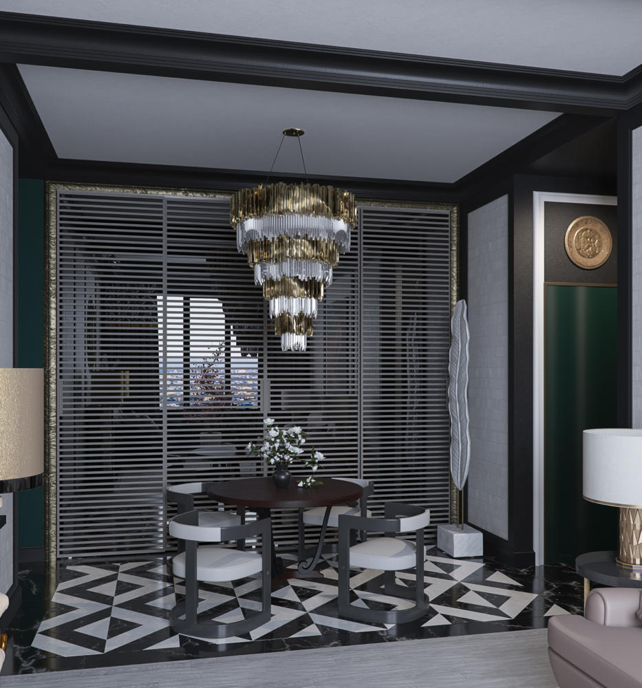
The corridor was originally very large.Therefore, in addition to the kitchen, it was possible to place two spacious bathrooms here. One is large, with a bathtub and a partitioned toilet and bidet, the second - with a shower cabin and a washing machine.
Customers don't like wardrobes in rooms,Therefore, the designer was given the task of placing spacious dressing rooms. One dressing room is located at the entrance to the apartment. The second large one turned out to be a walk-through one, through which you can get to the master bedroom. This move gives two significant advantages: the rejection of unnecessary corridors and additional soundproofing of the bedroom.
The clients did not want to use bright colours,leaned towards noble muted shades. Black became the unifying color scheme of the apartment, but not in large volumes, but in measured doses in details.
The main colours are grey, muted yellow, gold, noble green, black and a little pink.
The lighting was planned to be multi-level, that is,Each room has a main light source and several additional ones that can be turned on depending on your mood or when needed. For example, a reading lamp near the armchair, a chandelier above the dining table.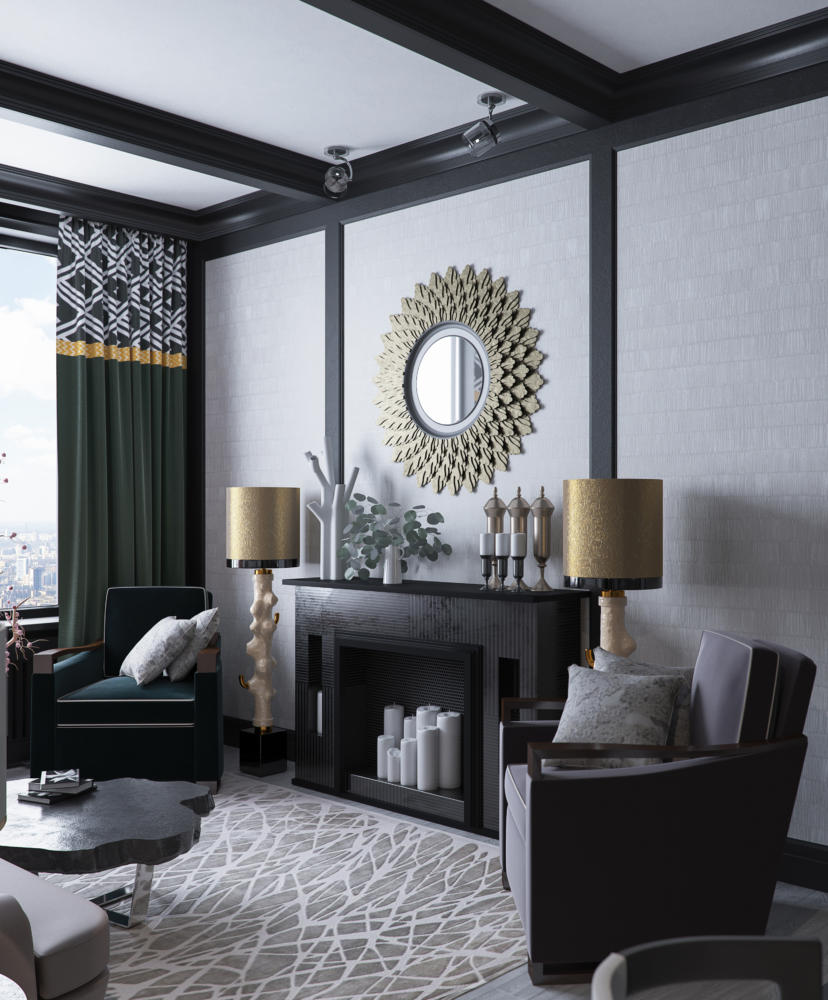
The bed and bedside tables in the bedroom are planned to be made to order at one of the Russian factories.
Chandelier - John Richard. The design of the entire bedroom began with this chandelier. It was seen by chance and they decided that the interior would be built around it.
Table lamp - Fine Art Lamps, model 737810, it differs in style from the chandelier, but they are united by a plant theme and metal.
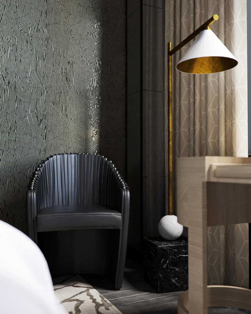
The floor lamp replacing the table lamp at the vanity is Kelly Wearstler, model Cleo Floor Lamp.
Dressing table - Dolce Vita, model Turri DV153.
Chair - Nella Vetrina, model Sharpei.
Rug - The Rug Company, Tracery Rug, Kelly Wearstler.
Wallpaper used in the project was not found (designthere is — Avant wallpapers from Kelly Wearstler, but the required color is not available), the designer plans to take the drawing, correct it and order it from the Moscow Wallpaper Factory.
Two decorative columns on either side of the window are framed by an aged mirror.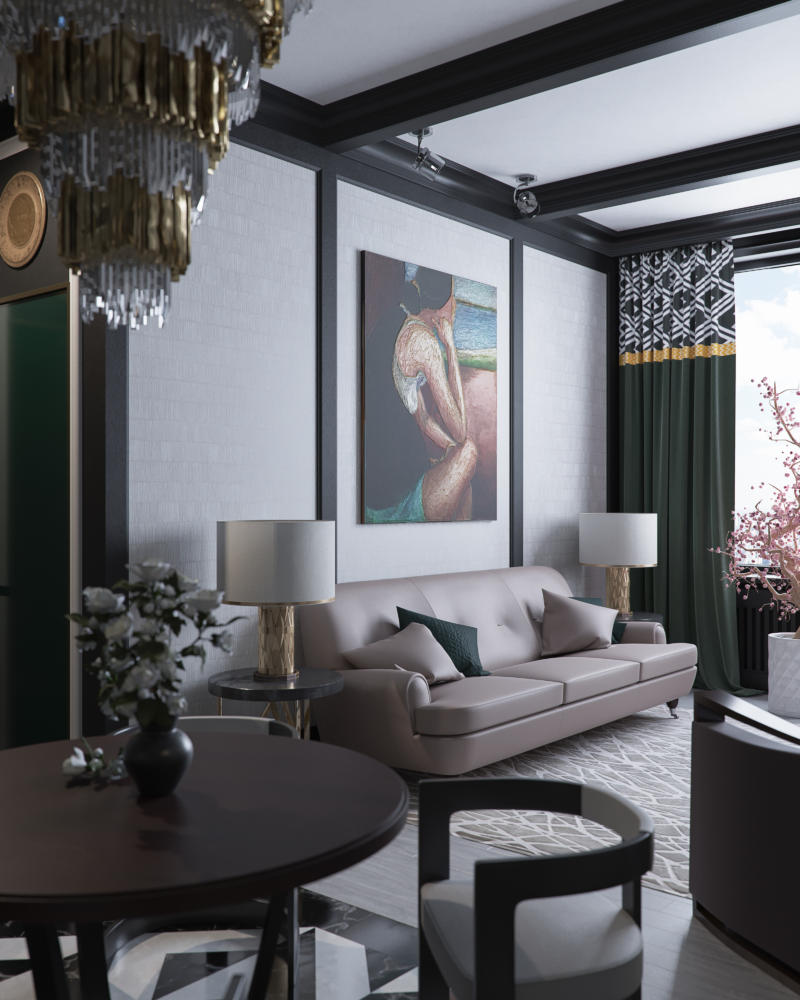
Sofa - Poltrona Frau, model Novecento.
Coffee table — Bizzotto Sidney, art.112.
The dining table chair is Zuma by Kelly Wearstler.The designer admits that she has been actively following the work of American designer Kelly Wearstler lately. Tatyana likes everything that Kelly creates: interiors, furniture, decorative items, textiles. The author of the project is always pleased to use the items she created in her projects.
The Christopher Guy dining table, model Christopher Guy Navour, is another designer whose interior pieces the project designer admires.
The decorative items of these two creative designers are harmoniously combined.
Chandelier over the table — Luxxu Empire. Don't be afraid of large chandeliers in small spaces. If their placement is thoughtful and justified, they will decorate the interior and make it special.
Armchairs - Donghia, Club Chairs. Two identical armchairs in two different colors. The color scheme of the living room is based on the combination of these colors.
The designer was looking for white wallpaper with a barely visible texture. Many options were looked at, but Belgian wallpaper Khroma (Akina collection, article AKI 302) was the perfect choice.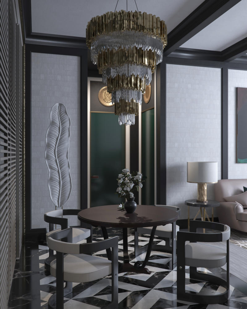
Wall moldings, decorative beams, baseboards and cornices will be ordered from a carpentry workshop.
The painting in the living room is Carolyn Young, Somewhere Out There, Circa 2000. However, there is no certainty yet that this is the one that will be purchased.
Between the living room and dining room areas, there are tables in a nichethree interior doors (glossy, ends finished with brass frame, custom made in carpentry workshop). Two of them lead to bathrooms, the third to the study. Each door leaf is 2.3 meters high, which was increased by white door frames and medallions above each door. The medallions have images of Lenin, Marx and Engels. The choice of heroes for the medallions is not connected with the political views of the customers, they just approached the choice of decor with humor.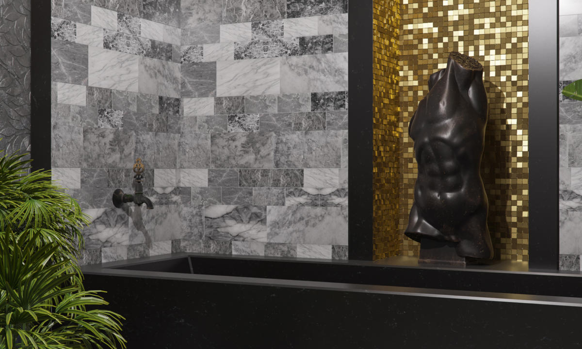
Chandelier in the bathroom - Hans Harald Rath.
Heated towel rail - Traditional Bathrooms Handtuchwarmer.
Jacqueline Vine Stone Mosaic is planned to be used on the walls next to the marble in the form of intertwined leaves.
The main accent of the bathroom is the sculpture around itwhich the entire interior is built. The sculpture by Chelini, Art.241 Statua torso, is taken as a basis. The sculpture is smaller than needed, so the designer will look for an alternative of a suitable size or order the work from a local sculptor.
Mosaic - gold Bisazza Mosaico / Colors / OroBis. The designer decided that the black sculpture would look advantageous against the background of the gold mosaic. The gold mosaic from the niche "moved" to the ceiling to balance the active black details of the interior.
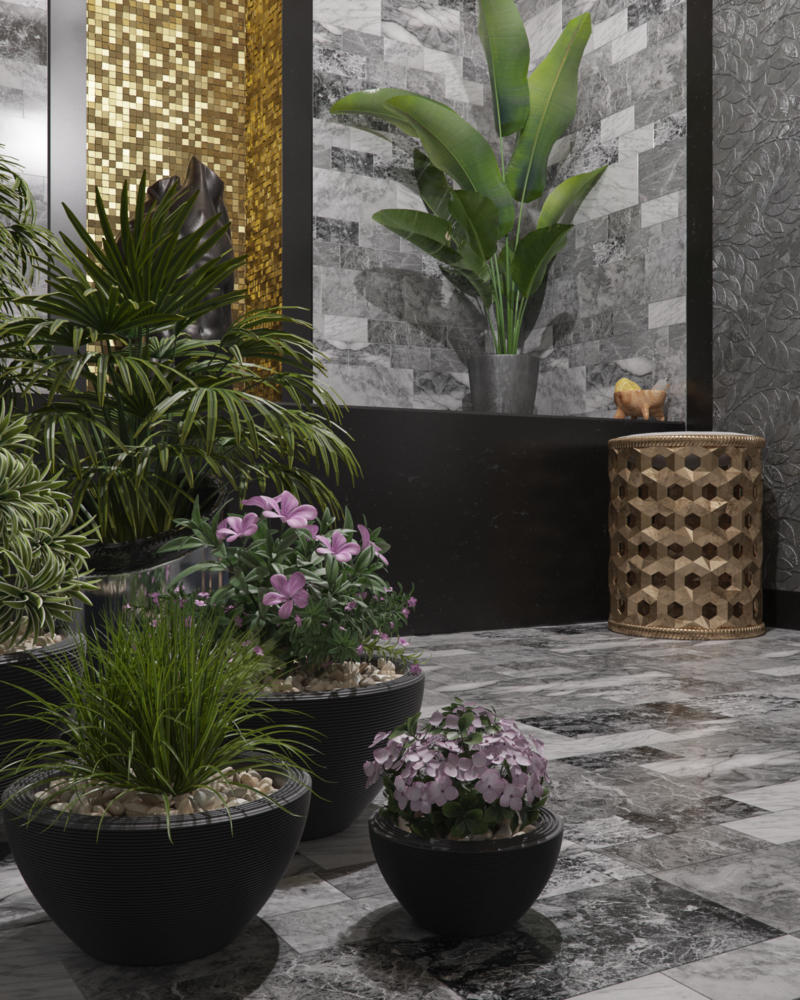
Plants decorate and enliven a strict interior.