What to do if you dream of a red apartment?Is it worth the risk and how to handle this color correctly? Designer Artemy Saranin, who recently created an interior for an apartment for a lover of bold decisions and red, one of the most controversial colors, knows the answers to these questions. It symbolizes danger and passion, sin and happiness, and many other contrasting concepts. Psychologists are still arguing about the impact this color has on the psyche and emotional state of a person, but they agree on one thing: red is active and sometimes aggressive. What should a designer do if the customer wants an all-red apartment? In one of his latest projects, Artemy Saranin faced exactly this requirement and today he shares his experience with us. Artemy Saranin, designer Born and raised in Perm. From the age of 5, he was interested in interiors, drew and received an art education, graduated from the Moscow Academy of Painting. Work experience - more than 15 years, during this time he has implemented more than 100 projects in various cities of Russia. Today, he specializes in the HoReCa segment (hotel and restaurant business: restaurants, cafes, clubs and other public places). Works as a designer at Allartsdesign studio. Finalist of the international PinWin competition. allarts-design.com About the clients More precisely, about the clients. This apartment was created for a girl working in the retail sector and her teenage daughter. The initial task was to somehow decorate it, since this room is traditionally considered a kind of "calling card" for guests and therefore requires a special approach. However, after receiving the keys and looking at the other rooms, the designer decided: everything needs to be done. The expectations from the release were fully realized: after 4.5 months of renovation, a spacious, light and moderately bright red apartment was born.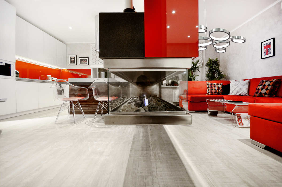
 Artemy Saranin, designer:— The client insisted on red throughout the apartment, so I tried to tone it down as much as possible: I used red accents as the dominant color and diluted it with light tones. The client’s daughter immediately said that she didn’t need red. Layout The apartment is located in a new residential complex and was delivered without finishing. The designer received a standard layout, like many other apartments. It was not possible to change anything radically because of the load-bearing walls, but that was not required. To implement the plan, we needed a spacious living room with a kitchen, a bedroom, and a nursery, which were already included in the developer’s layout.
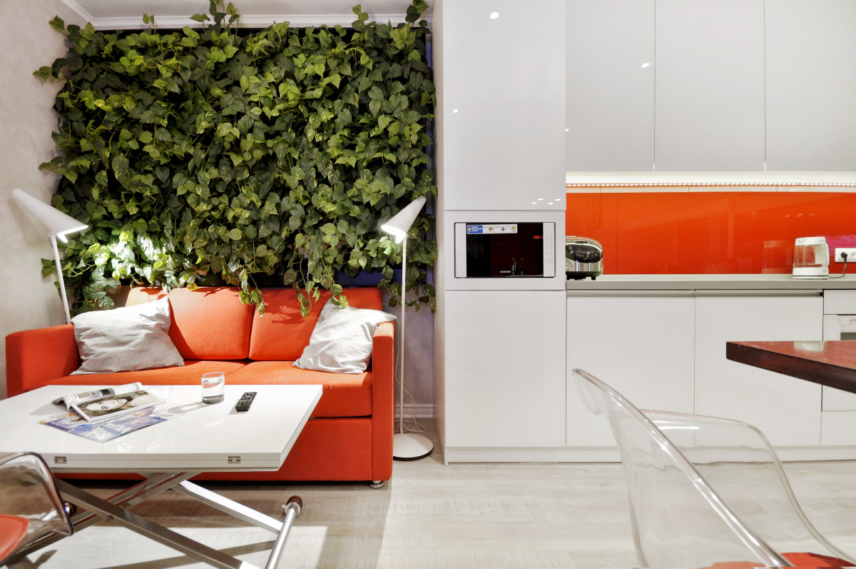
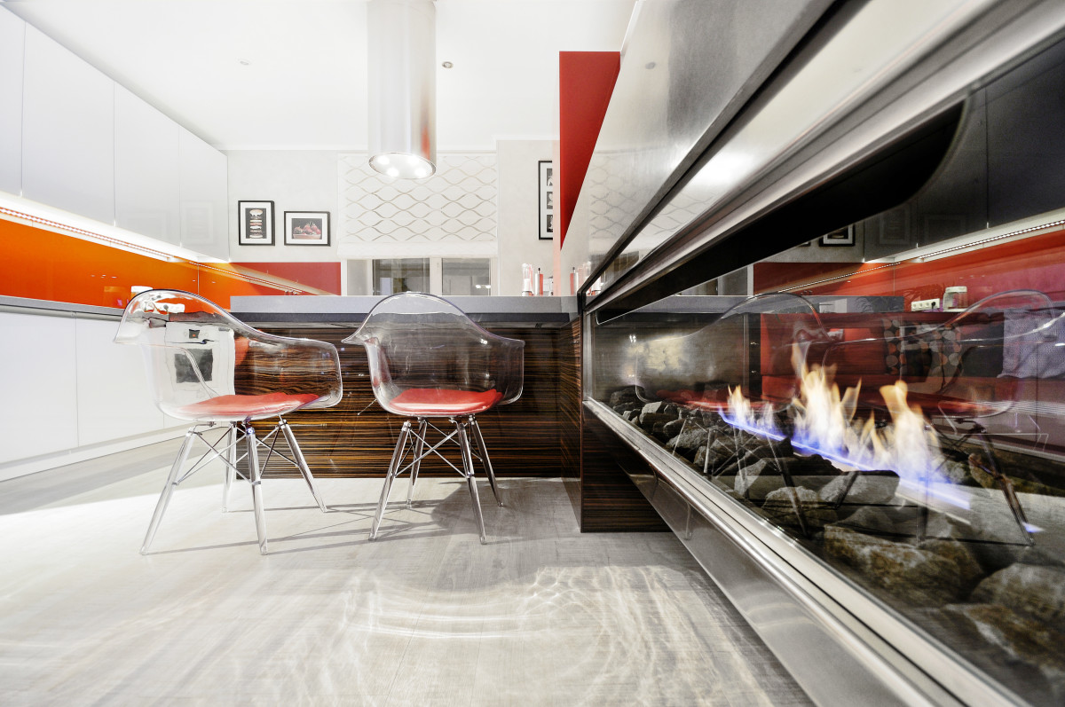
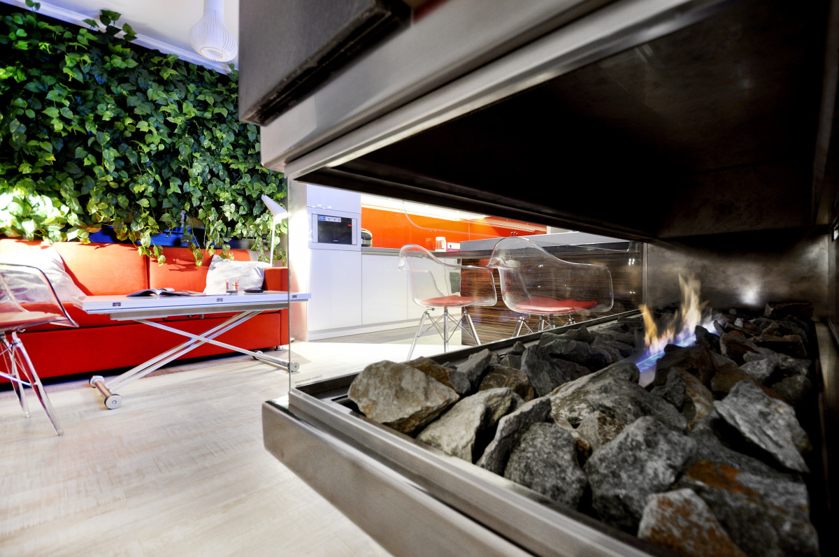
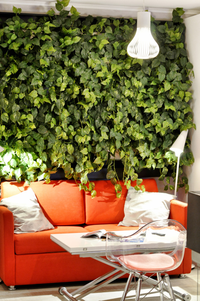
 Living room + kitchen Since the project started withliving room, it became the central element of the entire interior. The main idea is in a special design that divides the room into three parts. The uniqueness of the layout is that the fireplace is not near the wall, but “in the air”, also located in the center, another part of the living room is occupied by a dining table with a hob. Among the bright elements are a red sofa, a red kitchen apron and a wall with lush greenery.
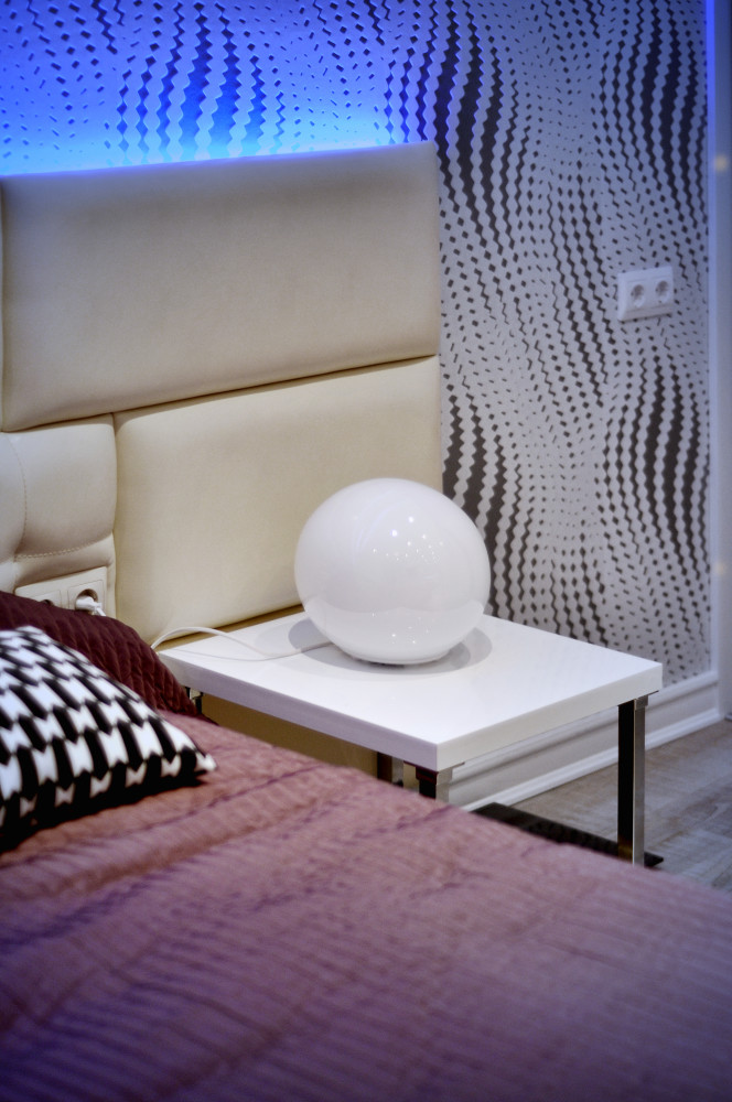
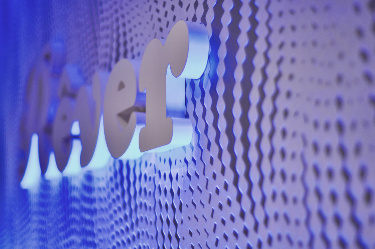
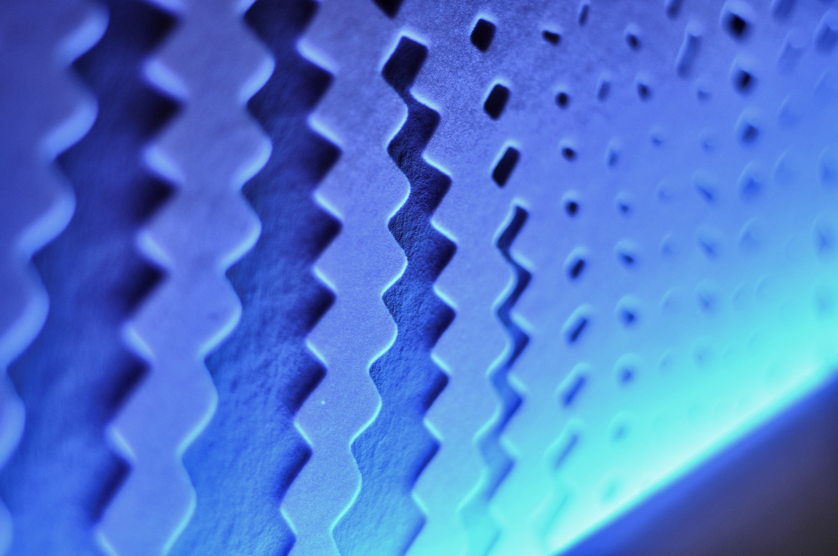
 Master bedroom Quite a large areaThe layout of the room allowed for a full-fledged dressing room to be placed in the bedroom. Three-dimensional letters on textured wallpaper appeared above the headboard, illuminated from below. The result was a gentle soft light, and for contrast, the designer chose a beautiful feather chandelier.

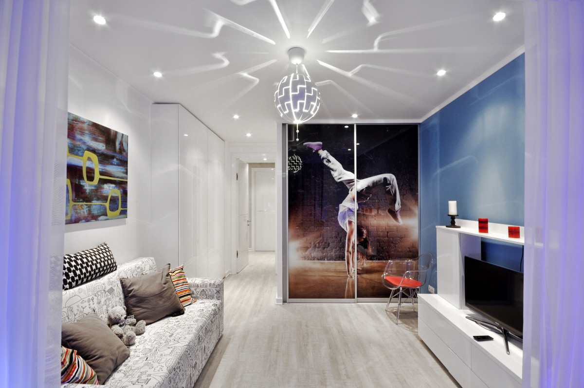
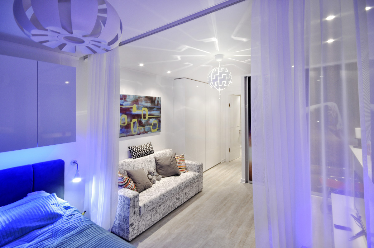
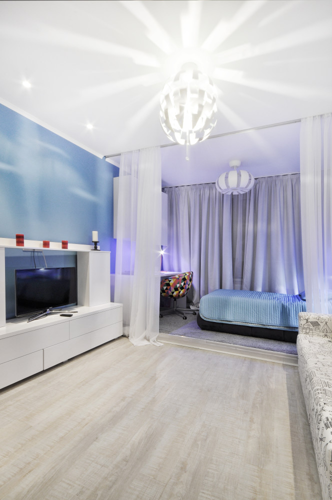
 Children's In the children's room it's pretty standarda set for a teenager's room: a bed, a desk with a comfortable chair, a wardrobe, a dressing table, a sofa. An interesting and very useful solution was invented for the sleeping and working areas: they are on a podium that can be quickly curtained off and there is no need to urgently tidy up when friends unexpectedly come to visit. In the center of the room is a sofa and a TV. As for the color scheme, there are no hints of the customer's favorite red: the palette is very calm, fresh, one wall is painted blue. The interior of the children's room turned out to be quite independent and unlike the other rooms.
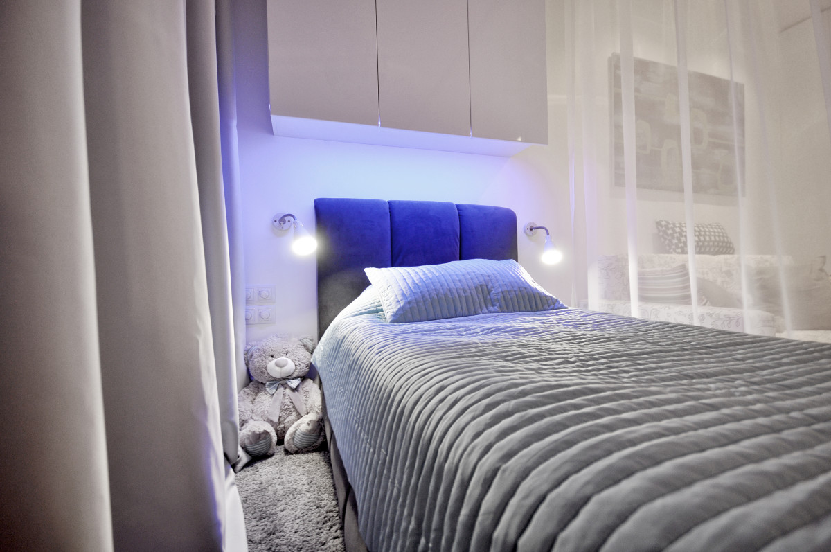
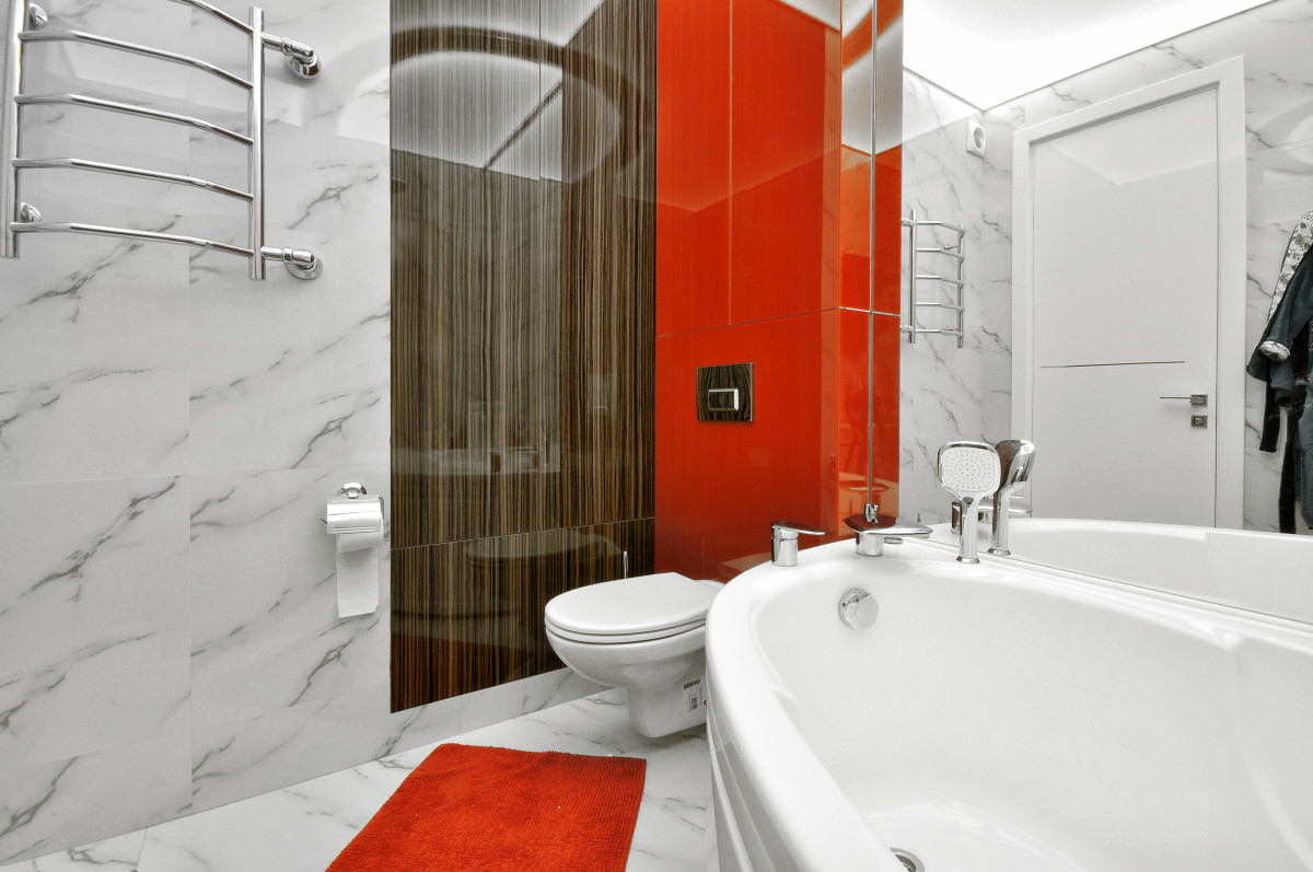
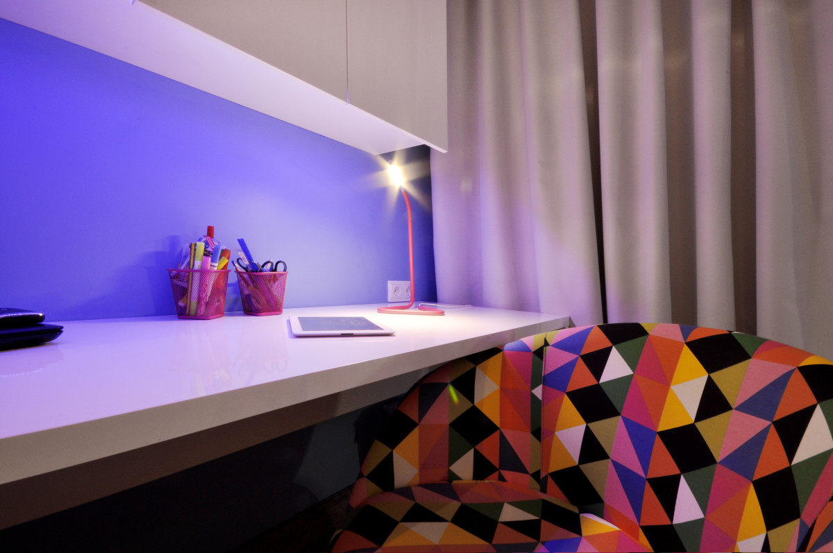 Bathroom In the bathroom we meeta familiar set: rich red color spots in contrast with white. The floor and walls are finished in marble, and the red part of the wall is continued by a bright bath mat.
 Color scheme The design of this apartment is likethis is the case when the color scheme almost entirely depends on the customer's tastes. Initially, the designer was tasked with creating a total red look: red clothes, red furniture, red walls. Now, looking at the completed project, many say that there was too much red, but for the customer it was not even enough.
 Artemy Saranin, designer:— I think I managed to find a compromise of one color. Add brown, white, black. I replaced the brightness of one color with high contrast. Materials The furniture was assembled all over Russia: the cabinet furniture was made in Perm, the fireplace was originally supposed to be purchased, but due to the crisis, this idea had to be abandoned. In order not to lose the concept, the designer decided to redesign everything himself and make the fireplace in Perm: weld the frame, calculate heat emission, thermal protection, ventilation, bio-burner, glazing, access to fuel supply and other details.
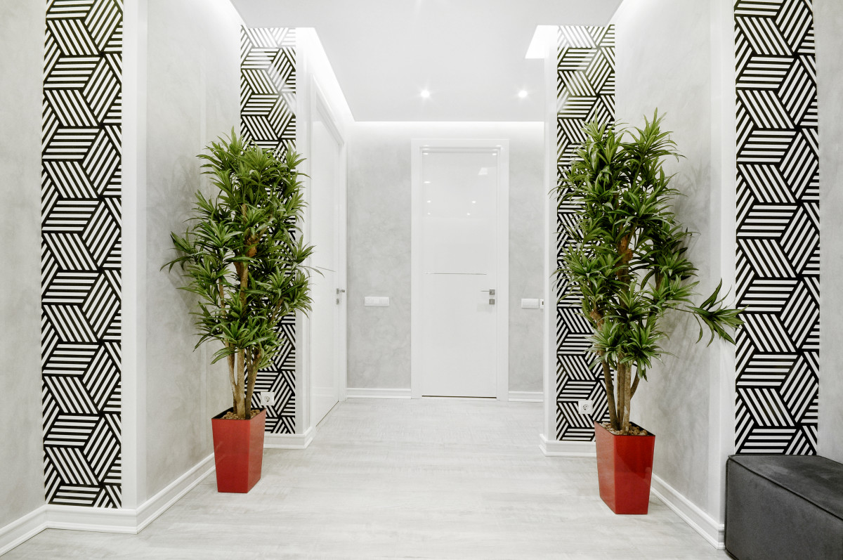
 Vinyl flooring was chosen for the floor.In this project, a perimeter frame with double offset planks was used. The walls of the living room and hallway are made in decorative painting with semi-covering materials. In the bedroom, there are three-dimensional wallpapers. The ceilings are stretch, white and matte, made of plasterboard with painting.
 The complete reconstruction – design, supply of materials, finishing works – took 4.5 months.
Fantastic apartment in Perm, the editors see this for the first time – etk-fashion.com
