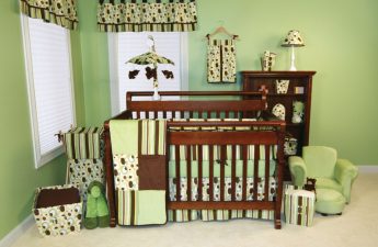
Every piece of furniture, except for the actual one, hasand also visual weight, which affects the perception of the room. Read about how to make the environment “weightless” in our article One of the main secrets of designers is the ability to make the interior “weightless”, which, in turn, allows you to visually expand it, create space where, in theory, it should not be. So, what are the ways to make the interior light?
Dimensions
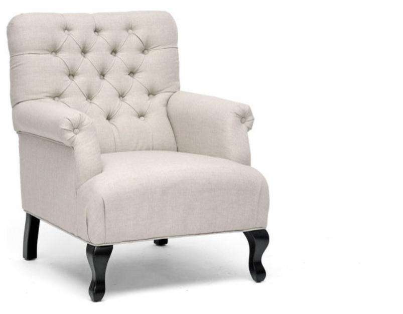
Large upholstered furniture always looks heavier than small furniture. To make the room lighter, it should be replaced with more compact models of simple shapes.


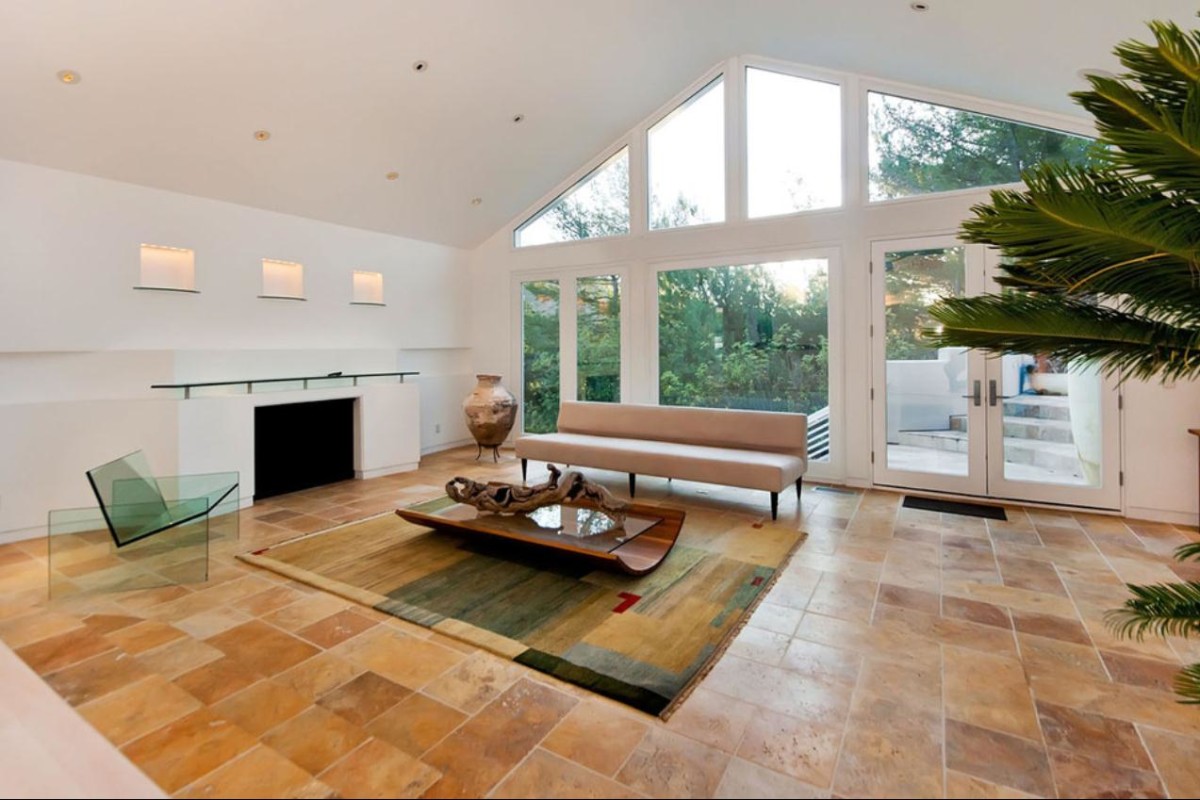
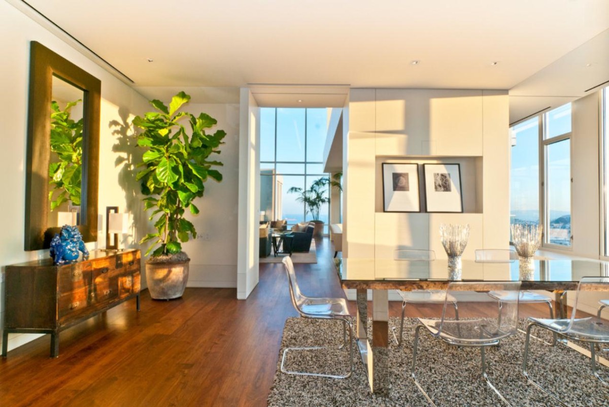
Visual weight of furniture and room sizeThe furnishings will be perceived differently depending on what furniture items are used in its design. Furniture of unusual shapes, as well as designer furniture, will attract a lot of attention and visually narrow the room. Minimalistic serial models, on the contrary, will “dissolve” in space, thereby increasing the amount of air and lightening the interior. But it is worth considering that in large rooms such faceless furniture can get lost and make the interior neutral, faded. Bright accents in the decor of walls, lamps or textiles will help to bring life back to the furnishings.
Furniture shapeSquare, correctgeometric shapes visually give the impression of being lighter than rounded and asymmetrical ones. Another factor that influences visual weight is whether the furniture has legs. Items with high, thin supports look much airier and lighter than furniture with a massive base, completely devoid of legs or covered with long covers. Even a large sofa, under which it is easy to look, seems to be floating in the air, and a small, elegant chair with a long cover looks very massive. The best option for lightening the interior would be to choose furniture on legs and without long covers.
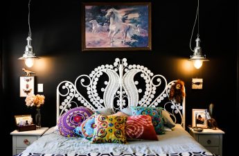
Texture of the materialLarge intricate printsinstantly focus the eye on themselves, thus making the furnishings heavier. For an interior that lacks lightness, upholstery made of plain fabric in neutral shades with a smooth, textured texture is more suitable. For example, a small armchair upholstered in tapestry will seem much heavier than a voluminous sofa with white cotton upholstery. The absence of ornaments and textures is most relevant for decorating small rooms.
Warm tones make the environment heavier, cold ones –lighten This statement can be called the golden rule, most often used in interior design. For example, a table on long legs with a flowing yellow tablecloth will make a more massive impression than a large sofa with light green upholstery. Saturated shades attract maximum attention, and this makes them visually much heavier. And, conversely, a reflective color looks lighter. This applies to both glossy and matte surfaces. The former are more striking due to reflections, while the latter make a more neutral, calm impression.
Striped Interiors For Small SpacesThe best are considered to be vertical and horizontal stripes. Diagonal ones visually enlarge and weigh down objects. And most importantly: bright lighting adds weight to all interior items. In small spaces filled with large furniture, diffused light will be most suitable.
Comments
comments

