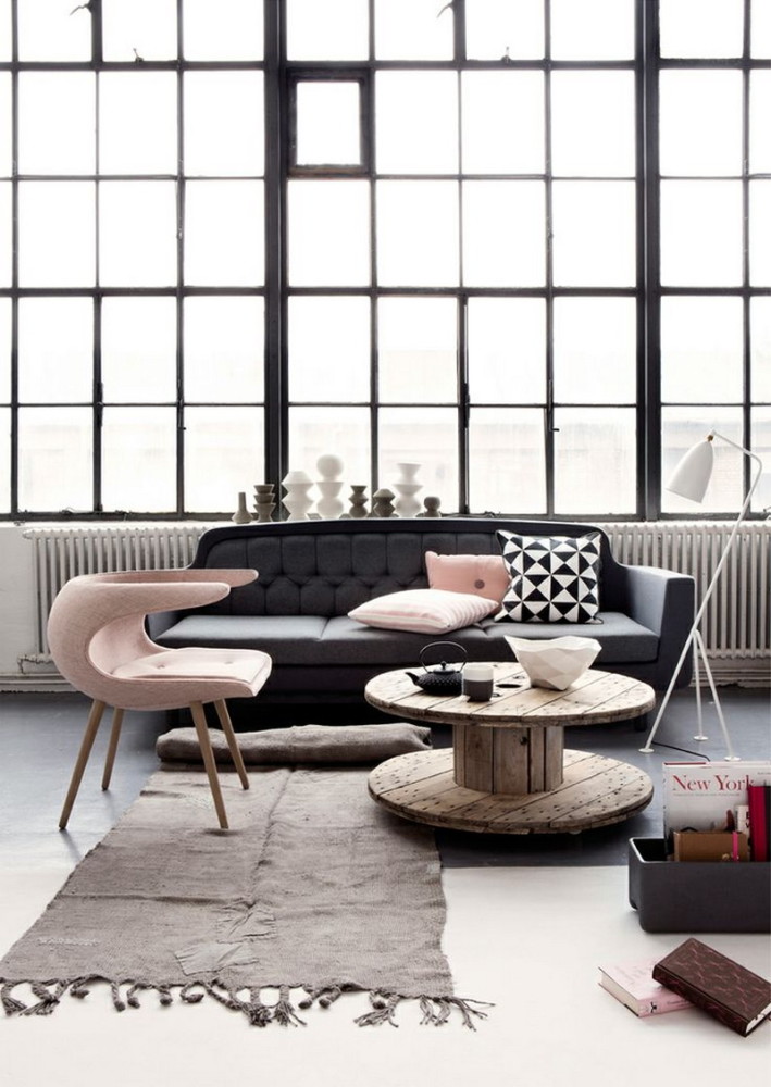
When you hear the words "pink in the interior", thenYou probably imagine a little girl's room or a Barbie doll's house, but this is not the only option. This color has a complex character - the growing popularity of its muted, delicate, powdery shades promises even more opportunities for interesting and bold design solutions. Probably, no other color has such an unambiguous reputation. We are gradually getting used to unexpected combinations in the living room, blue and, but we still perceive pink exclusively as a color for girls playing princesses and infantile glamorous young ladies. As if in response to such fame, amazing complex shades have quickly come into fashion - muted, as if covered in dust. Such do not lose their romance and freshness, but look so interesting next to brutal gray and noble dark tones that they will not scare off even the most inveterate macho. Pink has brilliant prospects in design - it's time to learn all its secrets. Pink Accents Start getting used to pink gradually — accents, pillows, bright spots of color on a neutral background. How about curtains made of fabric in a delicate pinkish-peach shade? The sun's rays passing through them present your complexion in an extremely favorable light — it is known that pink rejuvenates and smooths out imperfections. Inga Azhgirey, interior designer: — As a designer, I highly approve of the move away from pink, which only suits a Barbie doll, to shades with names like "rose ash" or "dead salmon". This color allows you to bring softness, coziness, chic to the interior — it all depends on the scale of its use. It is better not to paint all the walls, but to make a clear accent in one room and place several spots of color in others. It will suit a house in any style, for example, it will soften the excessive graphic nature of Scandinavian design. Experiment with different color saturation in accessories to start. It will be interesting. Or start small - posters, pillows, bouquets of pink roses or peonies. inga-art.ru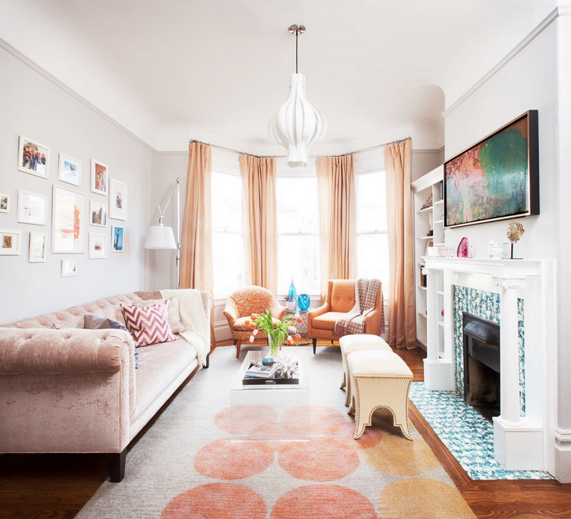
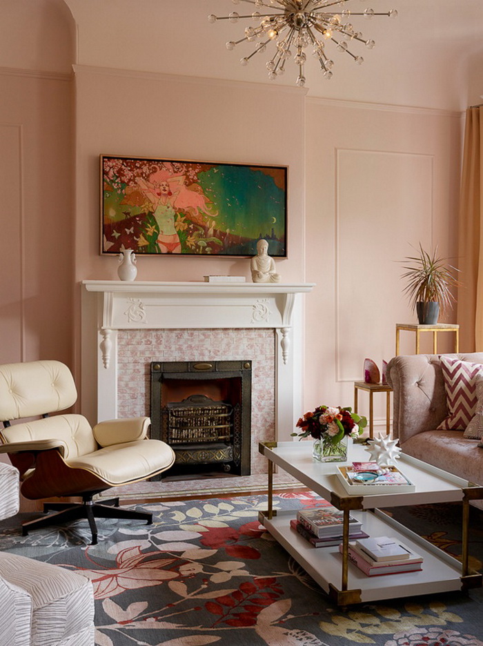
 Painting the walls Now be bolder - try itpaint a wall or even part of it pink. The light in the room will immediately become softer and warmer. This is the color for people who need harmony, peace, a slower pace of life and optimism. And there are many of them.
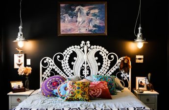
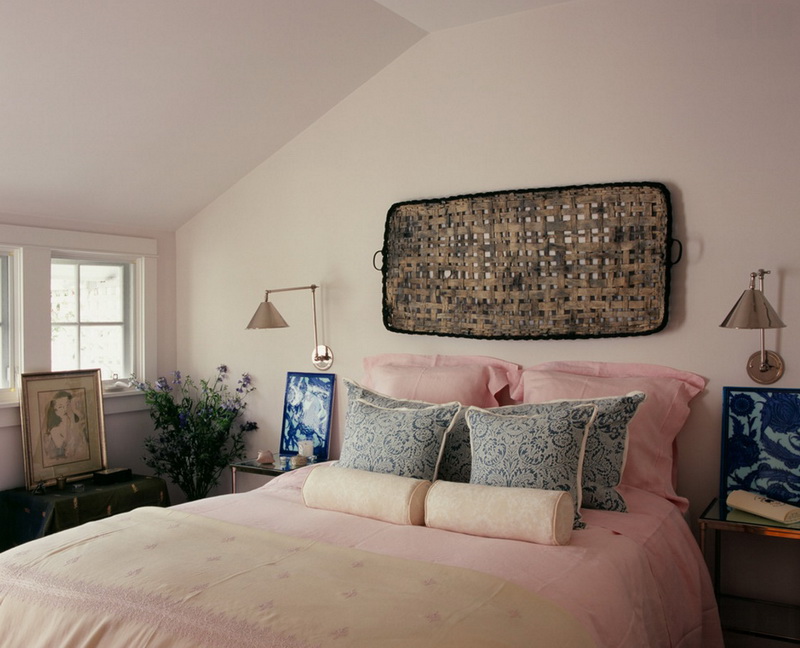
 Pink Dreams Powdery Pink - Goodbedroom shade. Calm enough to help you fall asleep easily. Close to energetic red - promotes a gentle but confident awakening. Start with bed linen that combines rose color with gray or blue elements.
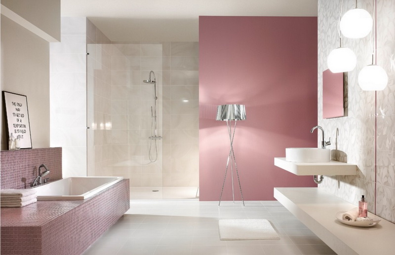
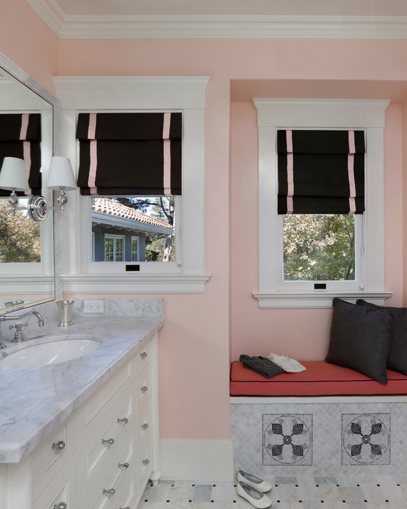
 Just keep calm:pink in the bathroom Pink has a calming effect - it is not for nothing that it is used in the design of the walls of clinics and even the locker rooms of sports teams. Use it in the design of the bathroom to feel like you are in a spa. But do not overdo it with brightness and combine it with other tones.
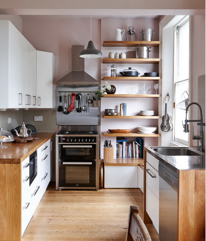
 Kitchen in pink tones:cream and cakes Pink in the kitchen will remind you of confectionery, cakes and cookies. By the way, it also increases appetite, so be careful. Fortunately, the kitchen design almost always includes textures of steel and wood - in household appliances and the dining table, for example. And this is exactly what is needed to balance the naive romance with earthy tones.
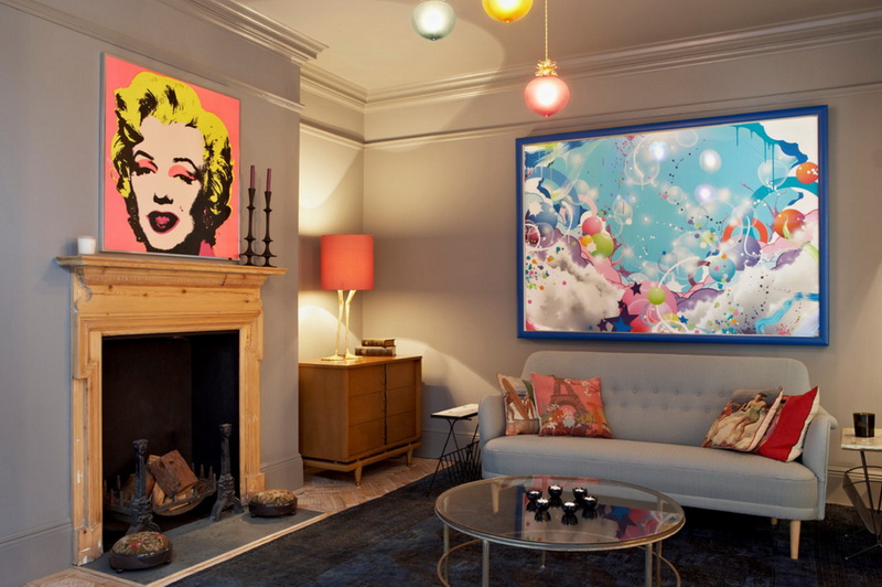
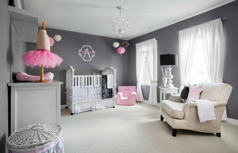
 Tina Gurevich, interior designer:— Cherry blossom, magnolia, cotton, sweet pea, almond, biscuit, meringue, antique lace, pink sunset… These are all the names of shades of pink. Do you feel how the space is filled with refined aromas, bliss, purity and tender dreams? All these feelings will arise in your home if you decide to use the above-mentioned colors. It is important to remember that when creating such refined and elegant interiors, much attention will have to be paid to textures, patterns, lighting. Do not be afraid to combine coarse linen and cotton fabrics, perhaps even with an imitation of a faded pattern, with delicate silk and velvety textures framed with antique lace or braid. Flowers look great in interiors of this color scheme. Low vases with bunches of peonies or French roses will create an atmosphere of freshness and romance in the house. decor-ti.ru Pink in its pure form will forever make your apartment a doll's house. But in combinations, its complex character is magnificently revealed. To muffle its "sweetness" - powder and dilute the color, add neutral colors and natural tones and textures. Pink and gray: flowers and steel An excellent color combination for those who consider pink. In such a combination, everything is harmonious - gray makes the "neighbor" brighter and more interesting, and itself becomes warmer. Such a palette will make the nursery calmer, and turn the living room into a real art gallery.
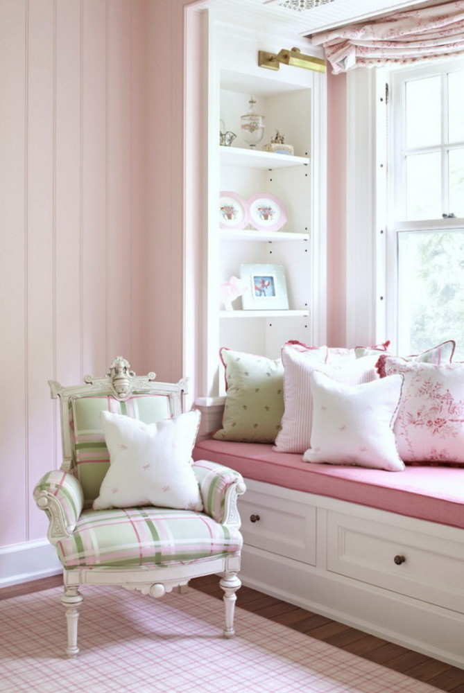
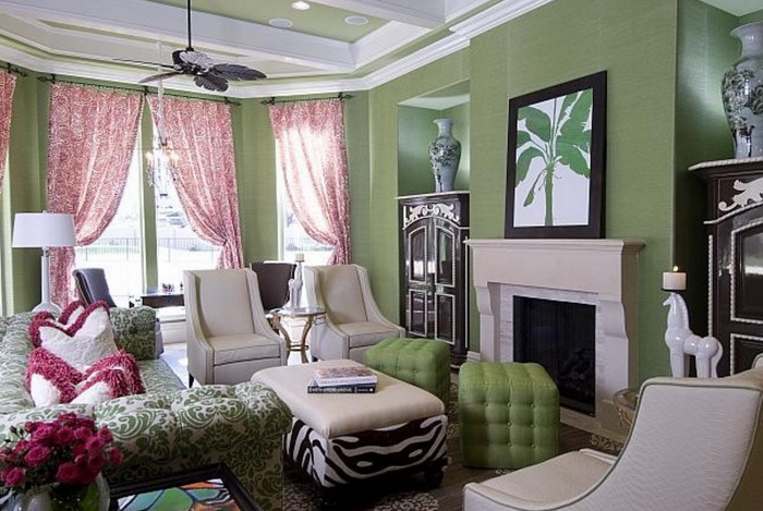
 Pink and green:Daisy in the Garden This combination doesn't have the best reputation, but if you think about it, it comes straight from nature: pink flower, green stem. The main thing is to choose muted, soft and similar in temperature shades. The effect of freshness, lightness and youth is guaranteed.
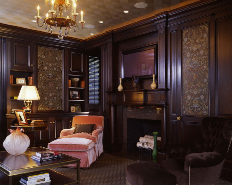
 Pink and brown:marshmallow with cocoa The combination just oozes nobility. Wood and silk, expensive leather and the shade of the dawn sky. Both tones are soft - emphasize it with rough, velvety textures.
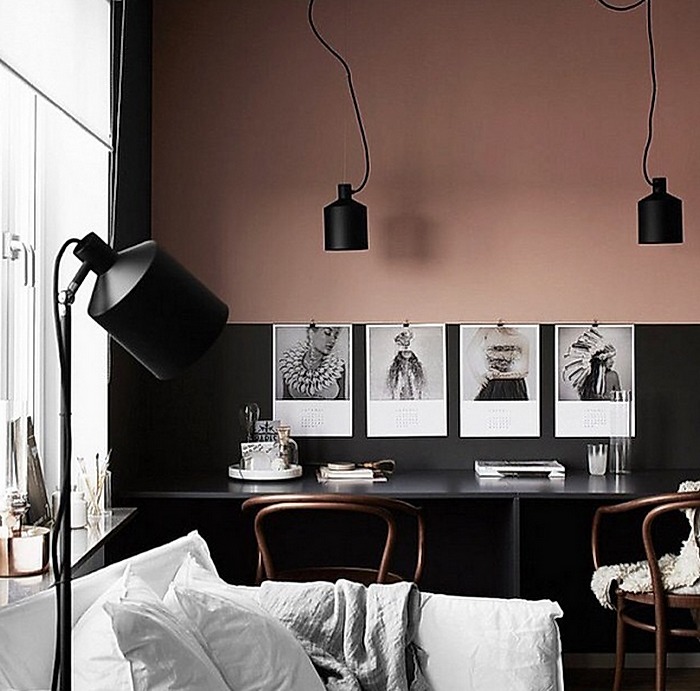
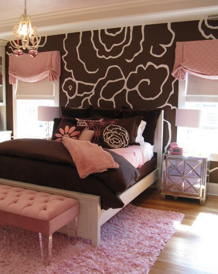 Pink and black:strong feelings Pink is loved by open and emotional people, black - by closed and cautious. Their combination produces an explosive effect. But if you dilute the palette with white, gray and other neutral colors and carefully observe all the proportions, you will get a bright and sensual interior. It is not for nothing that the pink and black palette is so popular with lingerie manufacturers.
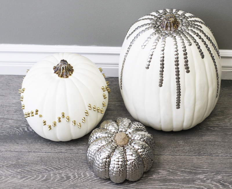
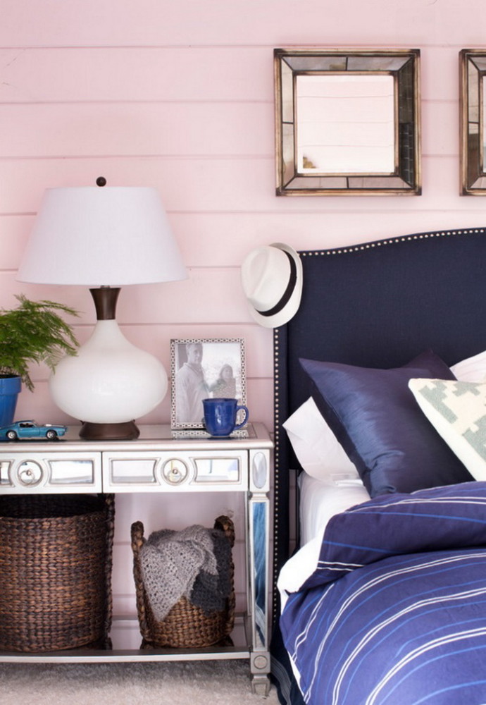
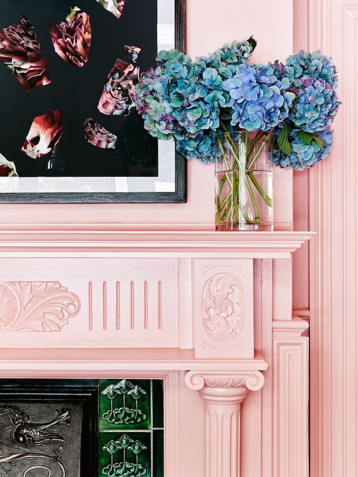
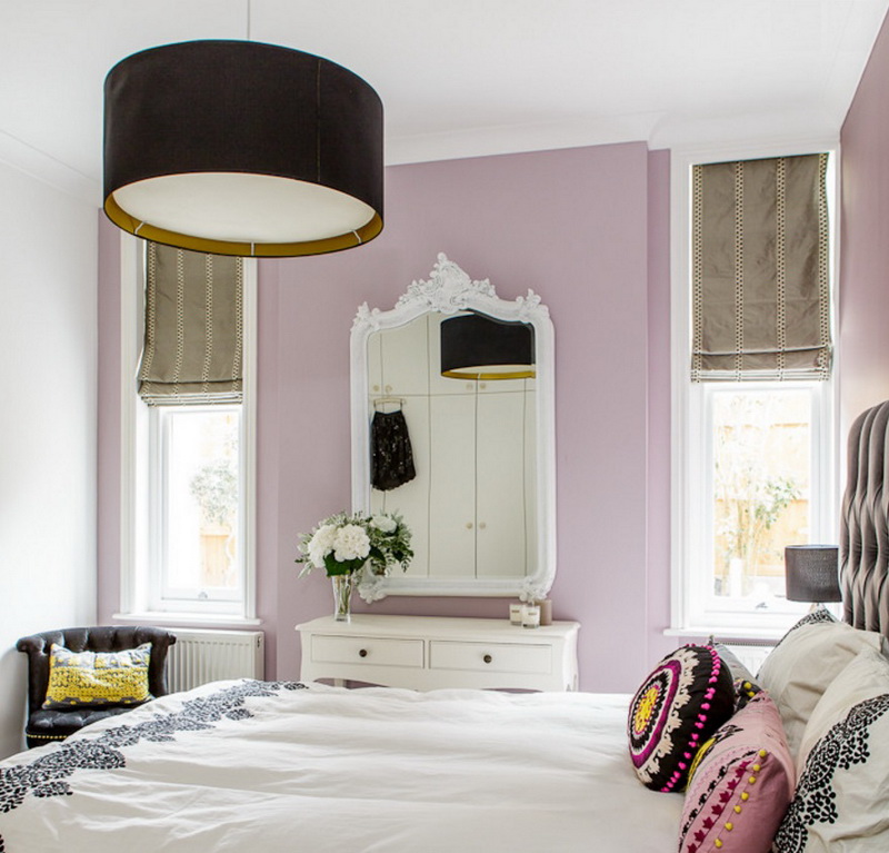 Pink and blue:sea pearl Pink is for girls and princesses, blue is for boys and sailors. What if you mix them in the interior? It's bold, but it can be very impressive. Choose noble shades of the sea depths and delicate pearl pink or warm coral tones.
 Inga Azhgirey, interior designer:— There are a few more noteworthy combinations. Powdery pink and marble are in perfect harmony. With Bianco Carrara, a light-gray rock with dark-gray veins, it takes the spotlight and emphasizes the neutrality and purity of the stone. This palette is perfectly complemented by swamp green and matte gold, as well as the color of unpainted pine. And the combination with brown Indian marble Bidasar is very rich and bright. The palette is pink + black + graphite gray + copper. A very interesting option for those who love bold decisions. Personally, it reminds me of bright postcards from childhood. And even better than black, swamp green and dark blue items with a polished, shiny surface go with pink. Pink is a color that awakens the imagination. inga-art.ru


How to Use Pink in Interior Design: Palettes and Ideas – etk-fashion.com
