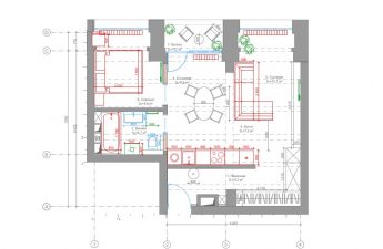
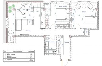
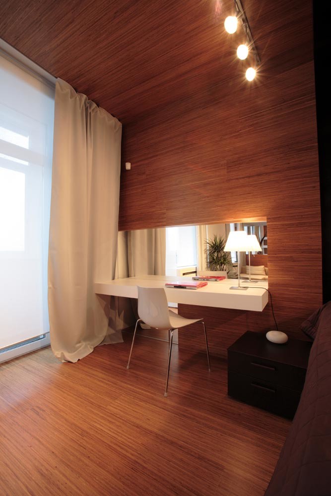
Эта стильная квартира площадью 69 кв. м построена в Москве российскими архитекторами. Здесь нет ни одной лишней детали. И вы никогда не угадаете год ее создания. Потому что она «вечно модная» Студия, в которую трансформировалась маленькая двухкомнатная квартира, представляет собой цельный, почти скульптурный объем без единой лишней детали. Перед нами полифункциональный пространственный объект, созданный по бескомпромиссным законам конструктивистской архитектуры. Арсений Борисенко, Петр Зайцев, архитекторы: «В процессе работы над этим проектом мы встречались с хозяйкой всего трижды (причем третий раз – уже при сдаче объекта) и оформили все фактически на свой вкус. Мы оказались предоставлены самим себе, что редко бывает. Поверхности, не облицованные деревом, окрашены в белый цвет. Все пространство квартиры условно разделено на три объемные зоны, сложно взаимодействующие между собой. Освещение предполагает три сценария. Кроме традиционного яркого верхнего освещения предусмотрена и мягкая ночная подсветка: неоновые лампы встроены в потолочные короба, закрывающие бетонные ригели. Предусмотрена и локальная подсветка: торшеры и настольные лампы. Окна закрыты плотными светлыми шторами – такими же, как те, что закрывают гардеробный шкаф. Балкон площадью 2,2 кв. м был остеклен, в нем сделано новое напольное покрытие (керамогранитная плитка, как и в части студии). Кровать, барная стойка и стулья изготовлены по нашим эскизам. Эта мебель весьма функциональна. Например, барная стойка прячет в себе мини-бар. В данном проекте впечатление цельности и гармоничности достигнуто за счет умелого подбора цветовых решений, минимизации предметов обстановки и создания специально для этого интерьера предметов мебели». «Много дерева и современный дизайн» – на основании этой краткой формулировки молодой хозяйки квартиры архитекторы Арсений Борисенко и Петр Зайцев (архитектурное бюро za bor) создали проект, воплощенный затем в реальность без каких-либо дополнительных вмешательств со стороны заказчицы. Современность концепции выражена в просторной, студийной планировке, интересной работе с объемами и отказе от мелочного украшательства. Дерево доминирует в отделке в двух ипостасях. Это золотистый дуб и почти черный венге. Живая текстура и взаимный контраст этого тандема подчеркивают выразительность скупых линий и широких плоскостей, создают ощущение тактильного удовольствия и природной теплоты. Укрупненные пластические формы, объединившие мебель с вертикальными и горизонтальными плоскостями, сбивают масштаб, в сочетании с зеркалами создают перспективную игру, но вместе с тем привязаны к четким функциям. Поскольку внутренних перегородок между зонами больше нет (в отдельные помещения выделены только санузел и входной тамбур), роль зонирующих элементов выполняют мебель и приемы отделки. Границы между функциональными локусами заданы конструктивными деталями дома – резко выступающими потолочными ригелями (50 см) в простенках между окнами. К ним тяготеют два основных зонирующих предмета мебели: объемная барная стойка, замыкающая зону кухни-столовой за диваном, и кровать-подиум, спинка-перегородка которой отделяет зону сна от гостиной. Репрезентативные зоны расположены возле окон: расчет сделан не только на хорошую инсоляцию, но и на первоочередное попадание в поле зрения. Так, прямо напротив входной двери в студию находится гостиная с удобным низким диваном. Несколько шагов вперед дают возможность увидеть все три окна и боковые зоны: прямоугольный обеденный стол слева и туалетный навесной столик (с длинным зеркалом над ним), располагающийся справа. Рабочая зона кухни и стеллаж для хранения вещей тактично скрываются в глубине: шкаф – за длинным занавесом вдоль стены квартиры справа; кухонный фронт, расположенный в линию, – в нише за выступом перегородки слева. Таким образом, основной акцент восприятия пространства сделан на отдыхе и обстановке, рассчитанной на неспешное созерцание. 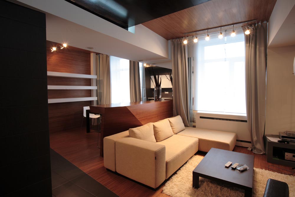
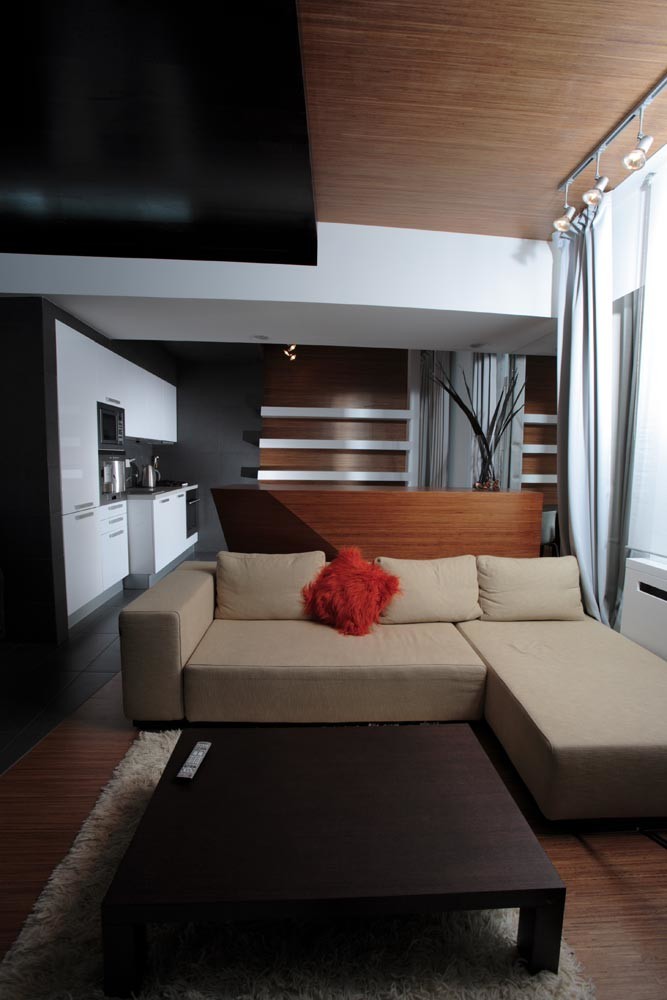 Although following orthogonal forms would beIn this case, it is quite justified (the outer walls of the apartment are a clear rectangle with a side ratio of 1:1.5), the architects decided to overcome statics and "cut" the interior floor diagonally at an angle of about 12 degrees. On one side of it there are recreation areas, the floor of which is finished with golden parquet boards, as if the sun's rays always brightly illuminated this part of the apartment. And on the other side, closer to the entrance, the floor is faced with anthracite-colored porcelain tiles, which also has a practical meaning. The diagonal begins in the middle of the end wall closing the kitchen-dining room and rests against the back of the bed, turned to it at a right angle (the angle between the diagonal and the podium is slightly different from a straight line; the amendment was made by the authors taking into account the peculiarities of visual perception). The location of the podium follows the diagonal movement to the headboard. The latter is a wide plane going to the ceiling, and is turned at an angle in relation to the load-bearing wall. All surfaces of the structure are covered with the same material (wenge parquet board), and the partition between the headboard and the shelving unit, covered with a curtain, is covered with a solid mirror up to the ceiling. Thus, a volumetric portal-deception appears in the depth of the room, and the diagonal “path” leading to it creates the impression of greater distances and depths of space than in reality, even without taking into account the depth of the “looking glass”. Two more mirror panels (one is the only door of the shelving unit, the second covers the partition between the windows of the dining room and the living room above the bar counter) “push” the boundaries of the studio in two other directions.
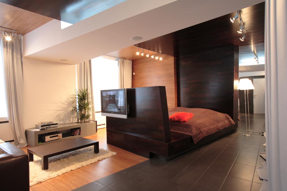 The end panels are designed in the same colours as the floor.walls: near the windows they are finished with the same golden board; near the kitchen and above the bed – with wenge parquet board. On the ceiling the play of colored planes is more complicated. Massive crossbars are sewn into wide boxes made of plasterboard. The ceilings between them on the window side are finished with light wood. And the “dark side” of the ceiling is lowered in steps (for this purpose a structure was built, which was covered with wenge board) and seems to be cut through by white ceiling “beams”. Thus, the interior space is made up of two parts, dynamically combined with each other. As a result, an illusion of movement, “work” of the structures appears, and the technique of color juxtaposition sets a new perception of volumes and the interior as a whole. Volumetric structures on the ceilings made it possible to hide wires, build in an acoustic system and lighting above the bar counter. The apartment is illuminated by several bus systems attached along the window, closet, in the area of color boundaries. The integrity of the presented interior demonstrates the advantages of the architectural approach to designing even a small space. It is this approach that allowed us to achieve a truly artistic synthesis in solving practical and artistic problems.
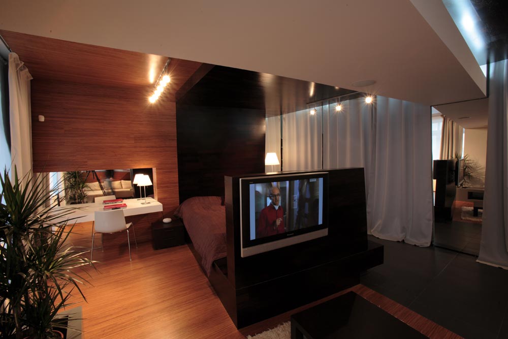
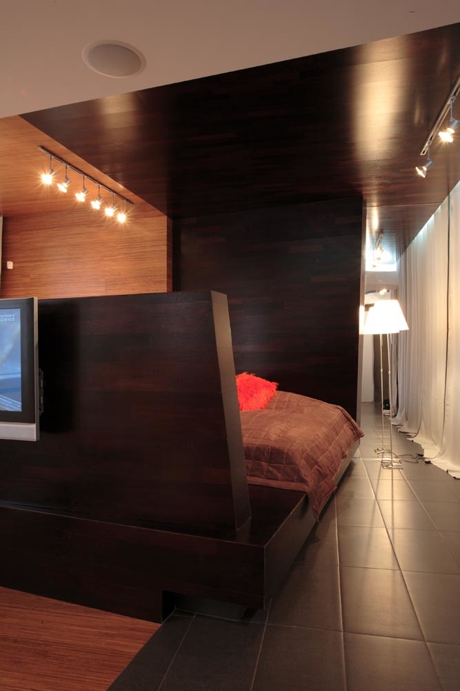
 "Ship bed (volume furniture in the apartmentsmall area) – isn’t it an unjustified cluttering of space? ”- such a question once seemed purely rhetorical, since the answer to it seemed obvious: such a step in a small apartment is unacceptable. In this case, a careful selection of details, minimization of their forms allowed the architects not only to include an impressive volume of the podium bed in the overall composition, but also to make it an accent element of the entire composition. It is based on a metal frame covered with wenge parquet board. The size of the podium is 2x3 m, but due to its small height (35 cm) and a tone close to the floor tiles, it does not look bulky. The high (1.6 m) back of the footboard plays a zoning role, and also serves as a panel to which LCD TVs are attached from the side of the living room and the bed itself. At the same time, due to the rotation of the bed and a slight bevel, it does not look massive. The headboard, which flows into the wall and then into the ceiling, is a technique that allows the real size of the object to be obscured, as if to dissolve it, and at the same time to mark the boundaries of the sleeping area. Thus, without side walls and a canopy, the bed is perceived as a separate architectural volume, and not as a banal plane.
Petr Zaitsev Architects — Arseniy Borisenko, Petr Zaitsev Architectural bureau za bor ul. Sharikopodshipnikovskaya 38/1, Moscow, Russia +7 495 922 90 60
