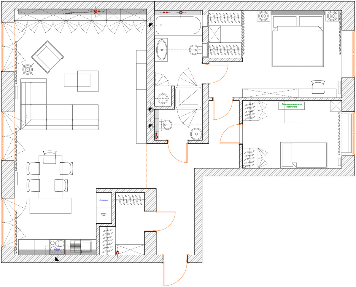
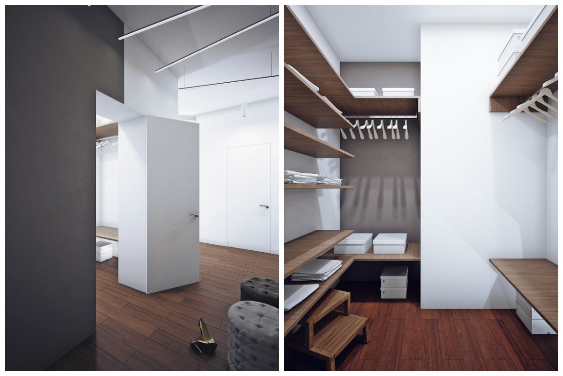
Today we have chosen a light and bright project for the weeka dynamic apartment in Novosibirsk, inspired by the interior of an Austrian hotel Already at the first glance at the layout of the apartment, Alina Puzhak, the author of the project, immediately understood that it was impossible to do without tearing down the walls and optimizing the space (in the bathroom area, for example, there were many non-functional nooks). As a result, a geometrically correct bathroom and toilet area was obtained, and there was room for a dressing room in the bedroom. Alina Puzhak, architect Graduated from the Novosibirsk State Academy of Architecture and Arts. "I believe that function and form should go hand in hand when it comes to the interior. The place where a person lives, works, develops, influences many processes. Therefore, it is important to make it as comfortable, beautiful and functional as possible," says Alina.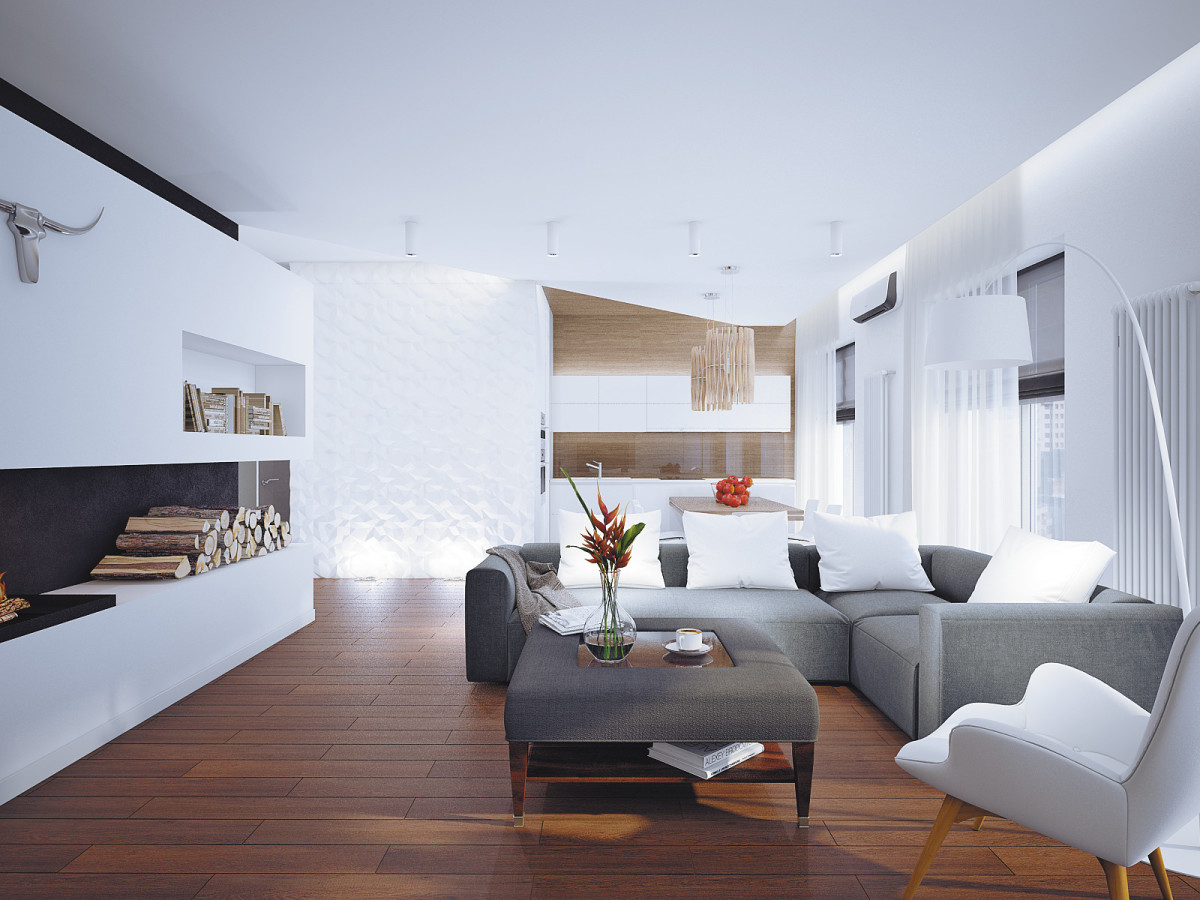
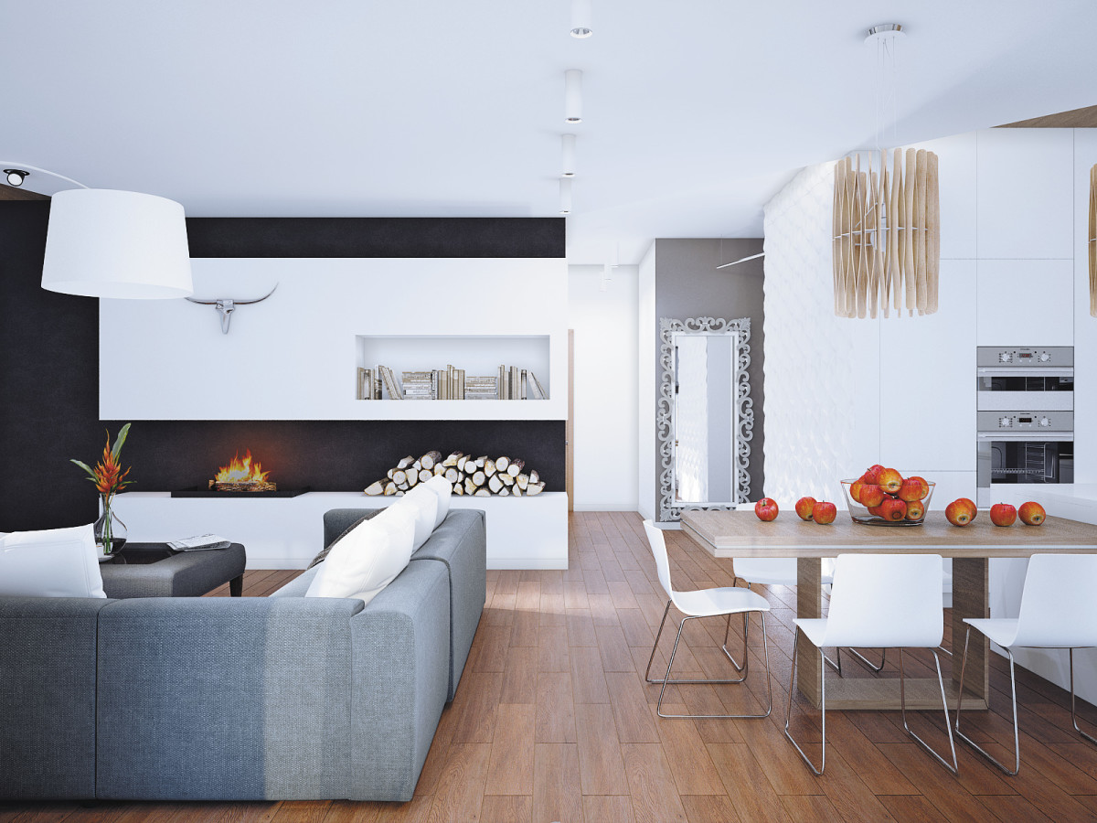 When choosing the overall interior concept, the authorThe project was based on the pictures that the clients showed. It was a hotel in Austria. The architect was faced with the task of taking the atmosphere of a mountain chalet and transferring it to a modern urban environment in which a whole family could live. Therefore, in the color scheme and choice of materials, Alina adhered to natural shades and textures, only slightly diluting them with bright accents.
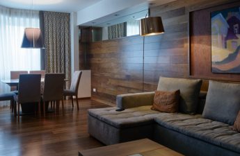
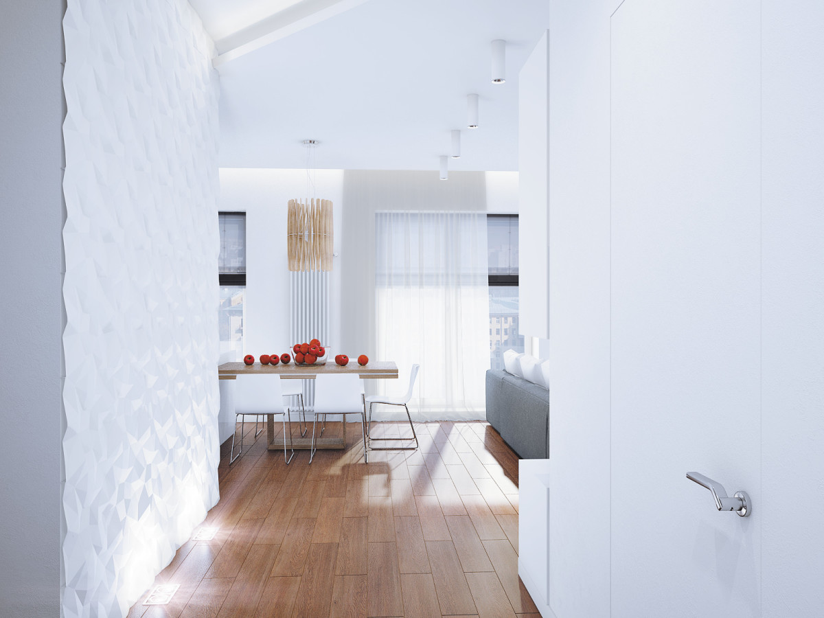
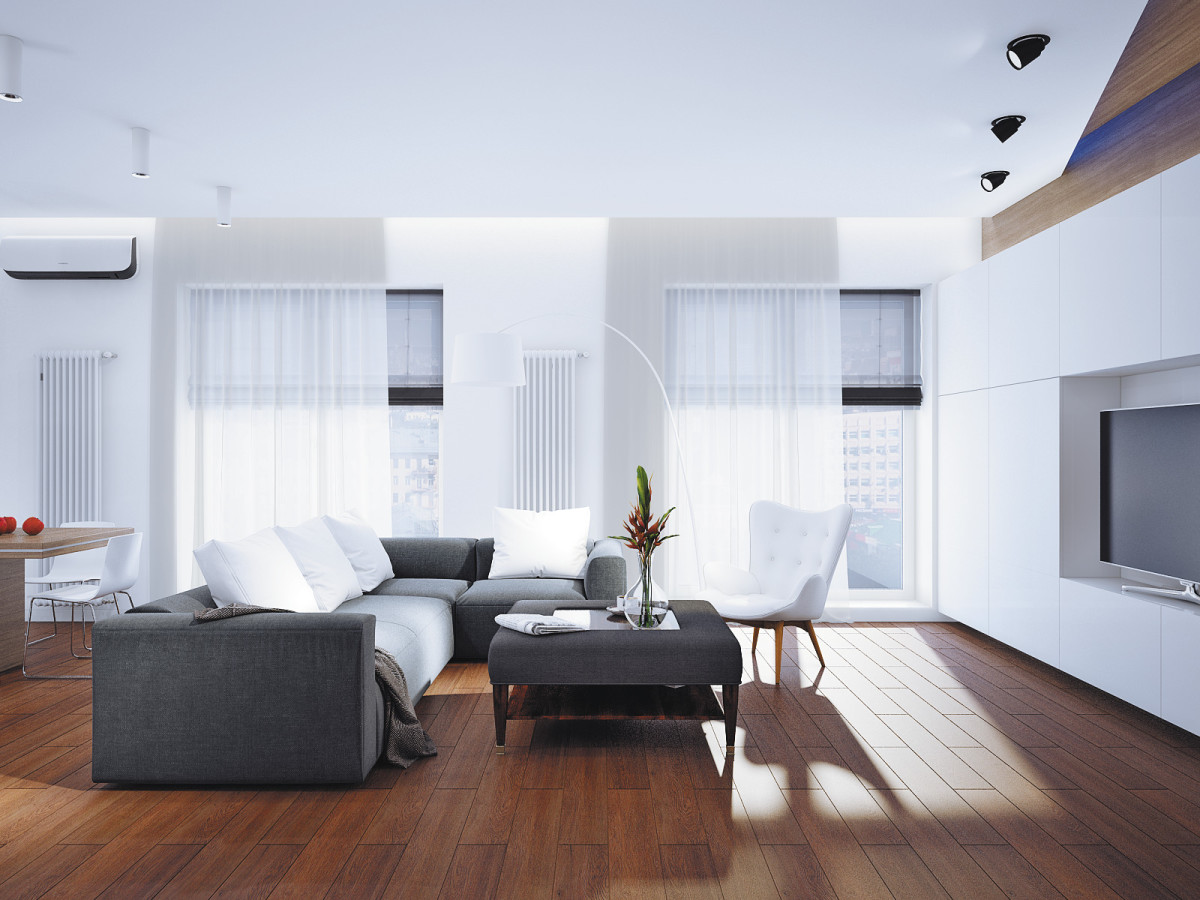 Since the kitchen-dining-living room area is large, there are many groups of light that will visually divide the space depending on the needs of the family.
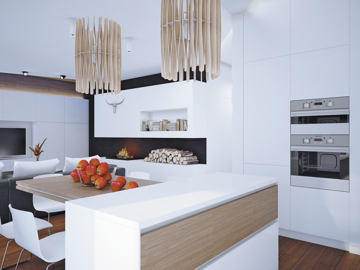 The asymmetrical ceiling is illuminated and seems tohovers in the air. A group of overhead lights separates the dining room from the living room. For a cozier atmosphere, wooden Fabbian lamps were hung above the dining table, and a floor lamp was placed near the sofa. There is no chandelier in the center of the room, and thanks to this, the space does not seem flat.
 The kitchen is non-standard.In the apron area and above, the wall is finished with PVC panels "under the tree", which go to the ceiling. The apron itself is glass. All this (as well as the island with a dining table and a spacious storage system) will be made to order from one manufacturer. The large structure in the fireplace area is made of plasterboard.
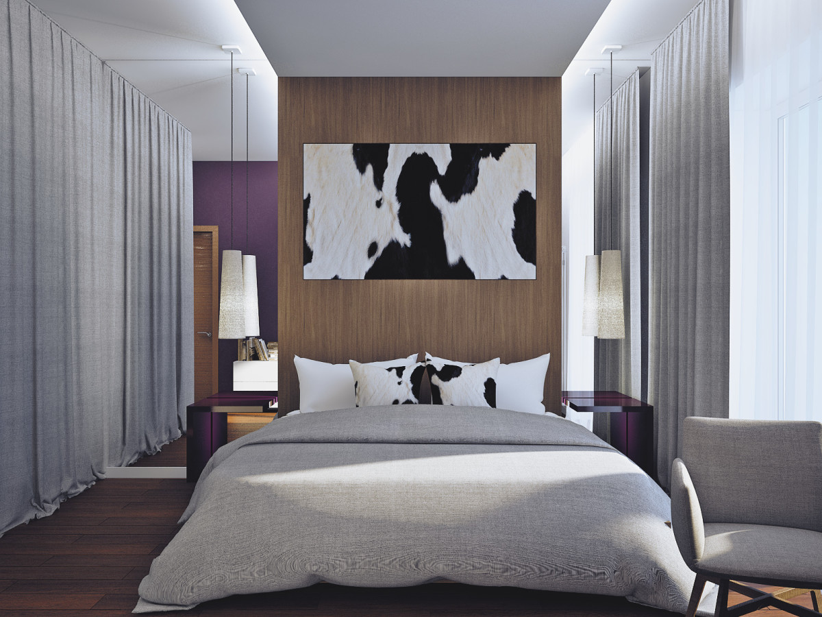
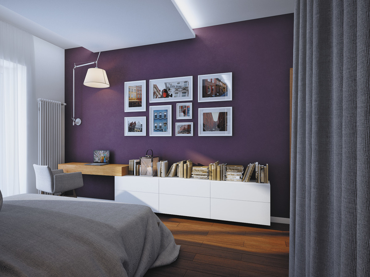
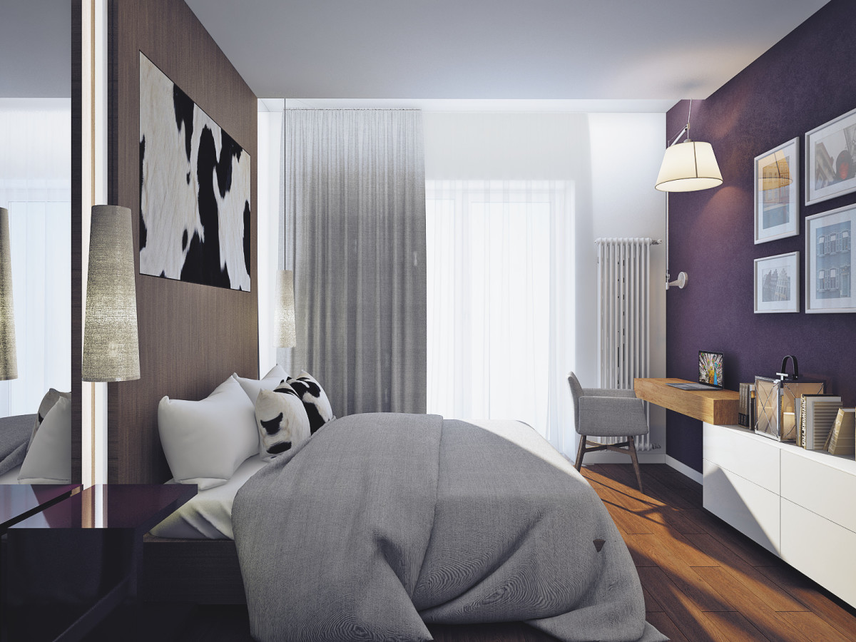
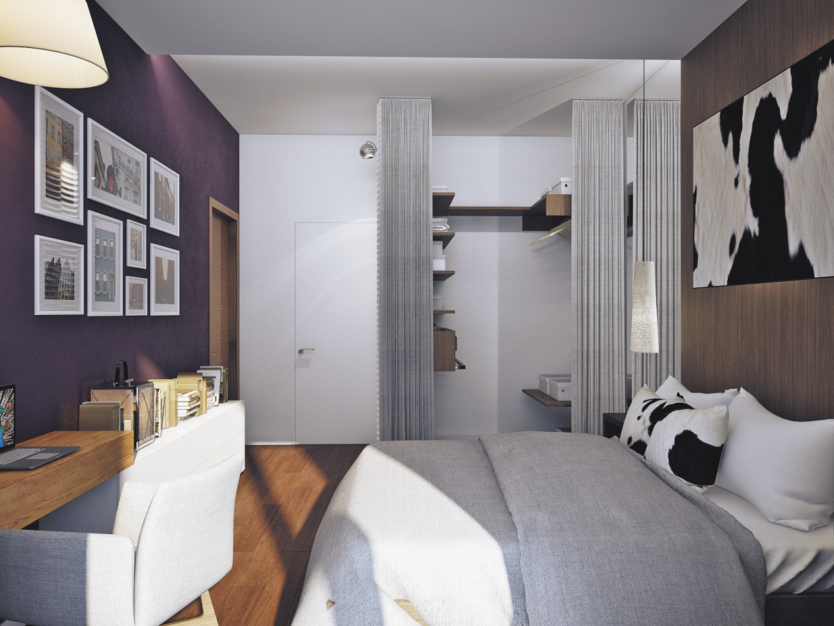
 Alina Puzhak, architect:"In the bedroom, the bed area is highlighted with light. Above the mobile bedside tables are large pendants for comfortable reading and a huge sconce from Artemide in the work area. The only bright spot here is the deep blueberry-colored wall opposite the bed. It was decided not to fence off the dressing area with massive doors and partitions, but to curtain it with a curtain. The result is a kind of symmetry, the center of which is the bed and the decorative cow skin above it. This wall is finished with parquet boards."
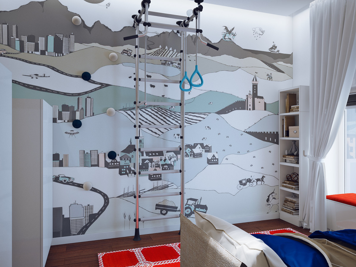
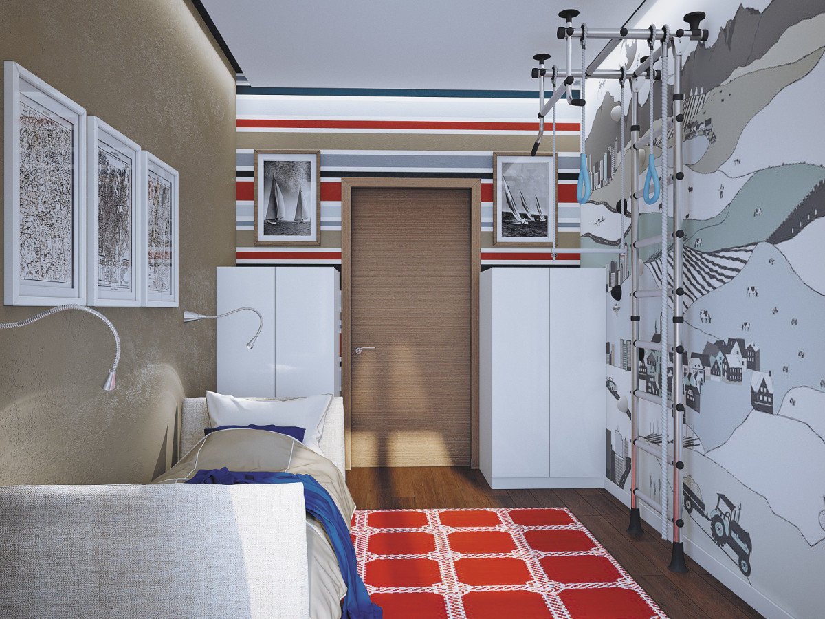
 The nursery turned out bright, but with the samenatural shades, as the whole apartment. The author of the project added red: it charges with positive. Here, as in the living room, there is no ceiling chandelier. It is replaced by an LED strip located along the perimeter of the ceiling.
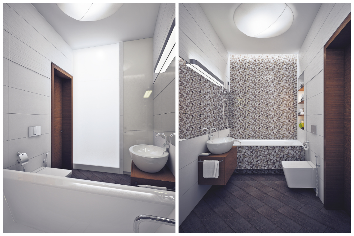
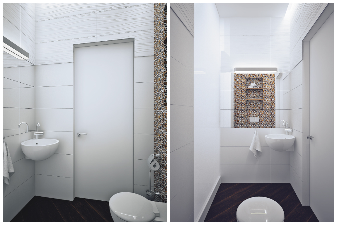
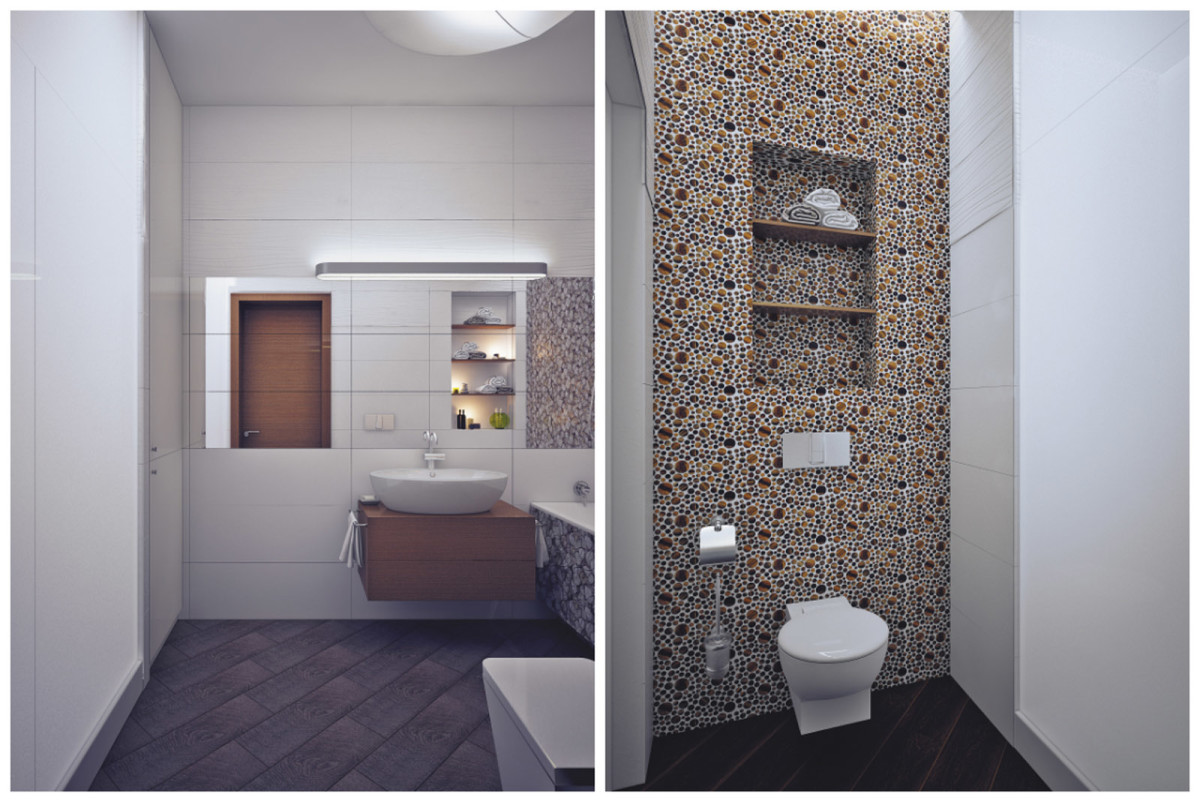
 The bathroom and toilet are the fruit of a joint effortactive brain activity of the author of the project and the customer. The question of where to place the shower took up a lot of time, and there were 2 options to choose from: in the bathroom or in the guest toilet. In the end, they made a shower in the middle, with 2 exits - into the bathroom and into the toilet. This is a non-trivial solution, but quite logical.
 The tiles were selected by the customers in advance.This is a voluminous and very beautiful Porcelanosa Oxo Line and Marmi China. And the decor with leaves above the bathtub is Porcelanosa Oxo Garden Gris. In the bathroom there is also Porcelanosa, mosaic tiles from the Firenze collection in Ambar color.
 The lighting solution here is quite simple:LED strips illuminate the volume of tiles above the bathtub and the walls in the bathroom. And overhead ceiling and wall lamps carry out their usual functional load.
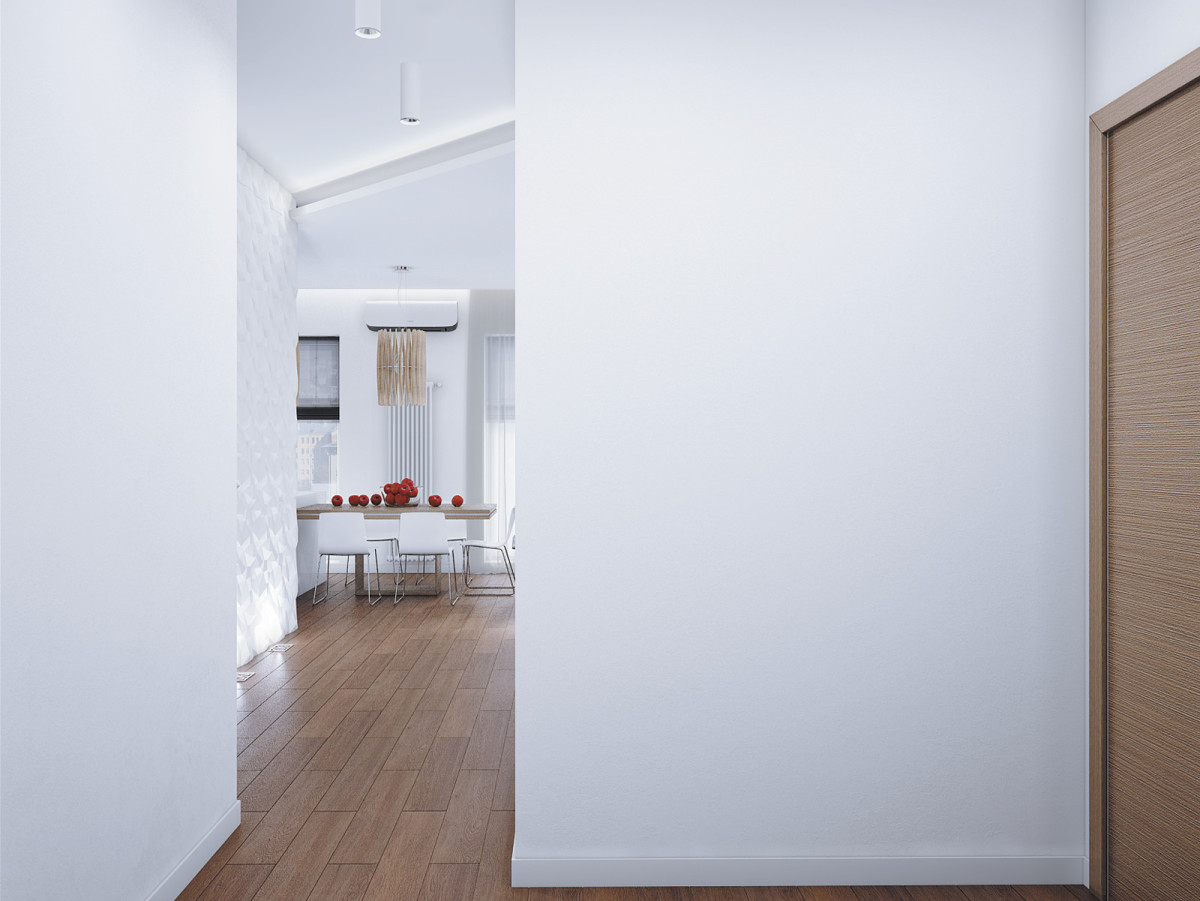 In the decoration of the entire apartment it was decideduse paint, as the walls are monolithic and generally smooth. And only for the children's room were photo wallpapers by Mr Perswall and myVillage taken. On the "secondary" walls in the living room and bedroom, 3D panels were used. In the living room, they are illuminated by recessed lamps from below, and in the bedroom - by a spotlight from above. This technique effectively emphasizes their relief and turns an ordinary wall into an art object.
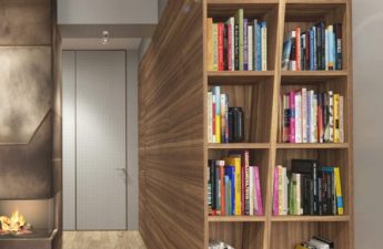
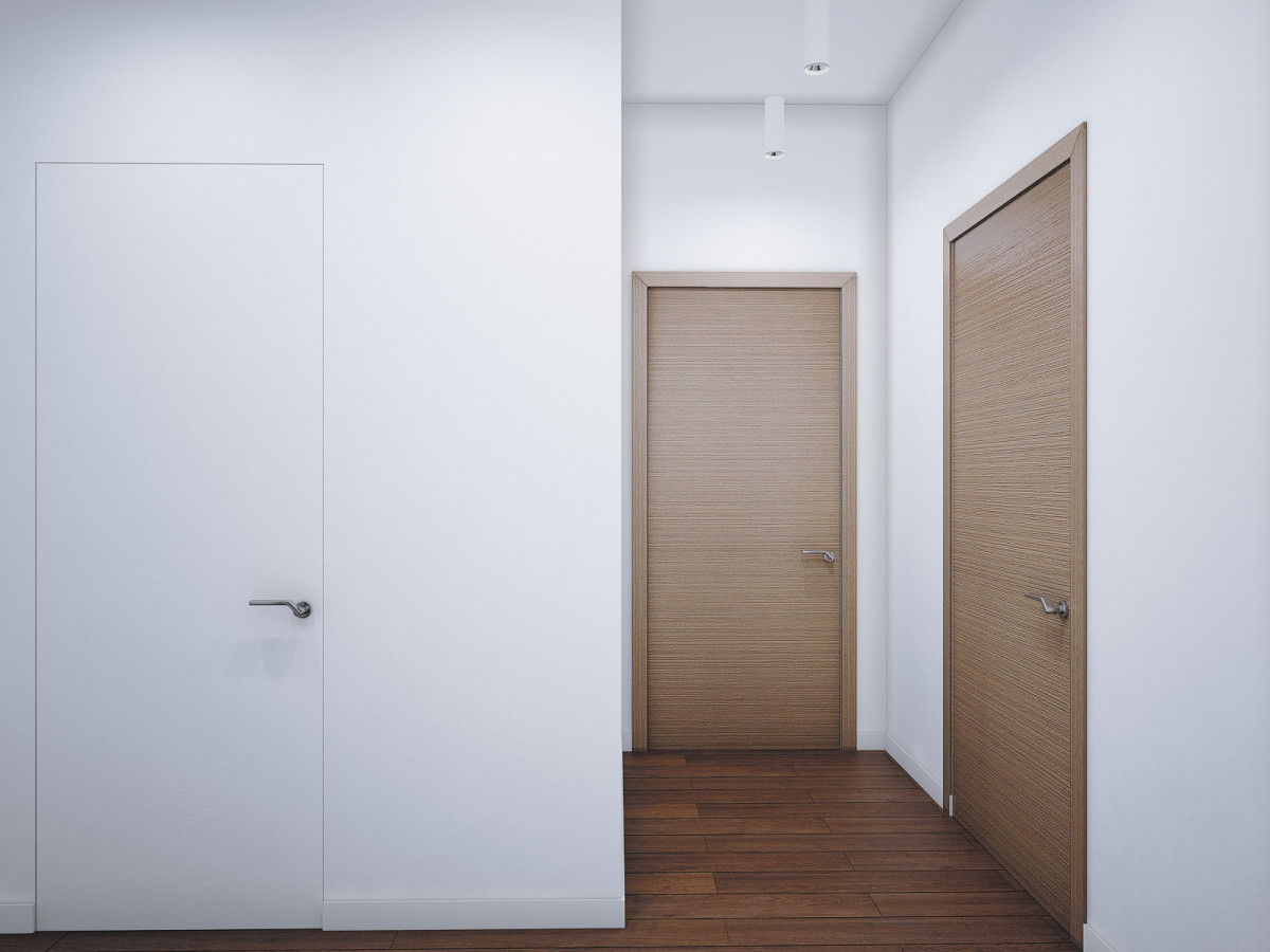
 Another problem arose during the redevelopment process.the problem is how to “hide” the door from the guest bathroom, which looks directly at the entrance door and catches the eye. The designer decided to use invisible doors for this. The customer chose Union doors. The author of the project also used them to “hide” the entrance to the bathroom in the bedroom and in the hallway. The advantage of invisible doors is that they can be covered with the same material as the rest of the walls. This solves many aesthetic problems and opens up a new field for creativity. Thus, the walls in the hallway are painted “mirror-like”. This technique visually breaks the space, and the hallway ceases to be a boring box. This is also facilitated by the rhythmically, but not parallel, hanging lamps CENTRSVET.RU.
 Alina Puzhak, architect:"The best thing about this project is the trust of the customers. We have a comfortable, smart union. We have solved and continue to solve many issues in the course of work. Now the project is in the implementation stage."

Project of the week: bright minimalism in Novosibirsk
