As if from a gloomy three-room apartment, where there is a catastrophic lack ofenough daylight, to create an airy, interesting and bright space? Today we will introduce you to the apartment of a young couple and tell you how their home was filled with light. Our heroes today are a young couple, very positive and cheerful. They are young, in love and cannot imagine life without constant movement. Their main passion is cycling. When they bought this apartment, they were faced with the fact that there was very little daylight, and the space was so closed that it was depressing for them and prevented them from moving around the apartment dynamically. Then the guys decided to turn to the Mooseberry Design Group design studio for help, which specializes in open spaces. Not long ago, we introduced you to their work — . Denis Garbuzyuk and Nika Los, designers of the Mooseberry design group studio. We have already written about the studio's work, you can get acquainted with them and learn more about the designers . facebook.com/mooseberry.design
Layout features
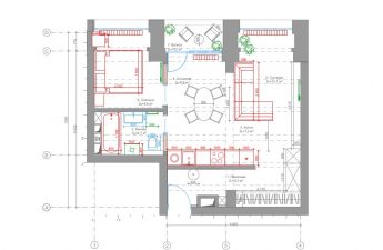
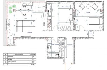
Having started working on the project, the designersThe studio immediately realized that they couldn’t do without a global redevelopment. They got a three-room apartment with separate bathrooms and a long corridor that was dark. To solve the problem with the lighting in the corridor, the designers got rid of the door to the living room, instead widening the passage. The wall between the small and large corridors was also eliminated, which let more air into the space. The toilet and the bathroom were combined, resulting in a laundry room. The square meters of the bedroom had to be sacrificed a little to get a flat kitchen space. The only thing the designers left unchanged was the balcony. Denis Garbuzyuk and Nika Los, designers at the Mooseberry design group studio: - There are many interesting details in this interior. Probably the biggest plus and our personal achievement was the redevelopment. Thanks to it, the apartment became lighter and more spacious. We really like the open layout that we got. At the same time, there is some privacy. The bedroom is quite far from the entrance, the work area is also separate, which allows you to work at any convenient time and not disturb other family members.

Balcony instead of an office
And why didn’t they touch the balcony?It turns out that this was one of the customers' wishes. Since the owner of the apartment works in the IT field, he has to work very concentratedly. It was important for him that the workplace was isolated from the rest of the apartment and that nothing distracted him from programming. Therefore, they decided to arrange the office on the balcony, having insulated it beforehand.
Red refrigerator
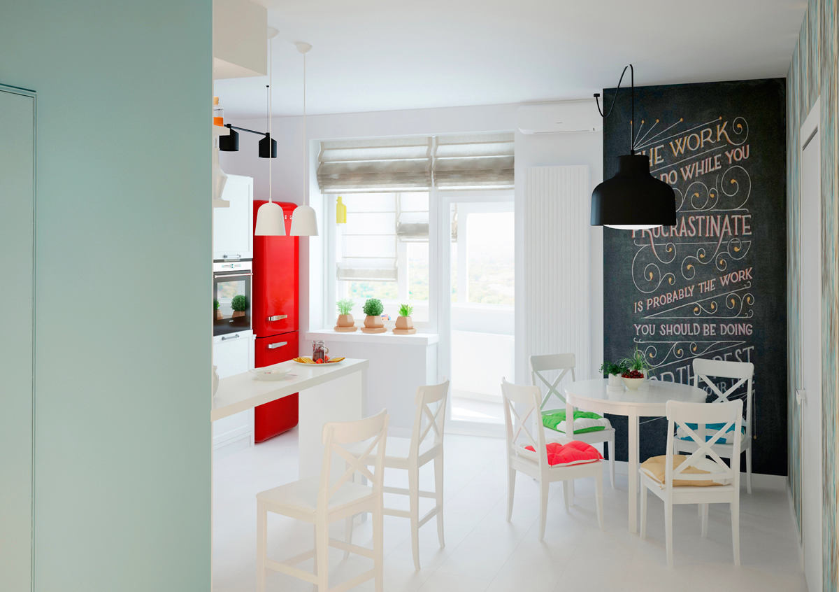
But the owner's dream was redretro refrigerator, which became the main art object of the kitchen space. The kitchen itself, like the space of the entire apartment, is done in white tones. The kitchen apron was diluted with tiles of a soft raspberry shade. Denis Garbuzyuk and Nika Los, designers of the Mooseberry design group studio: - The main accent in the kitchen was the red retro refrigerator. Based on this, the furniture was selected in neutral shades so as not to distract attention from it.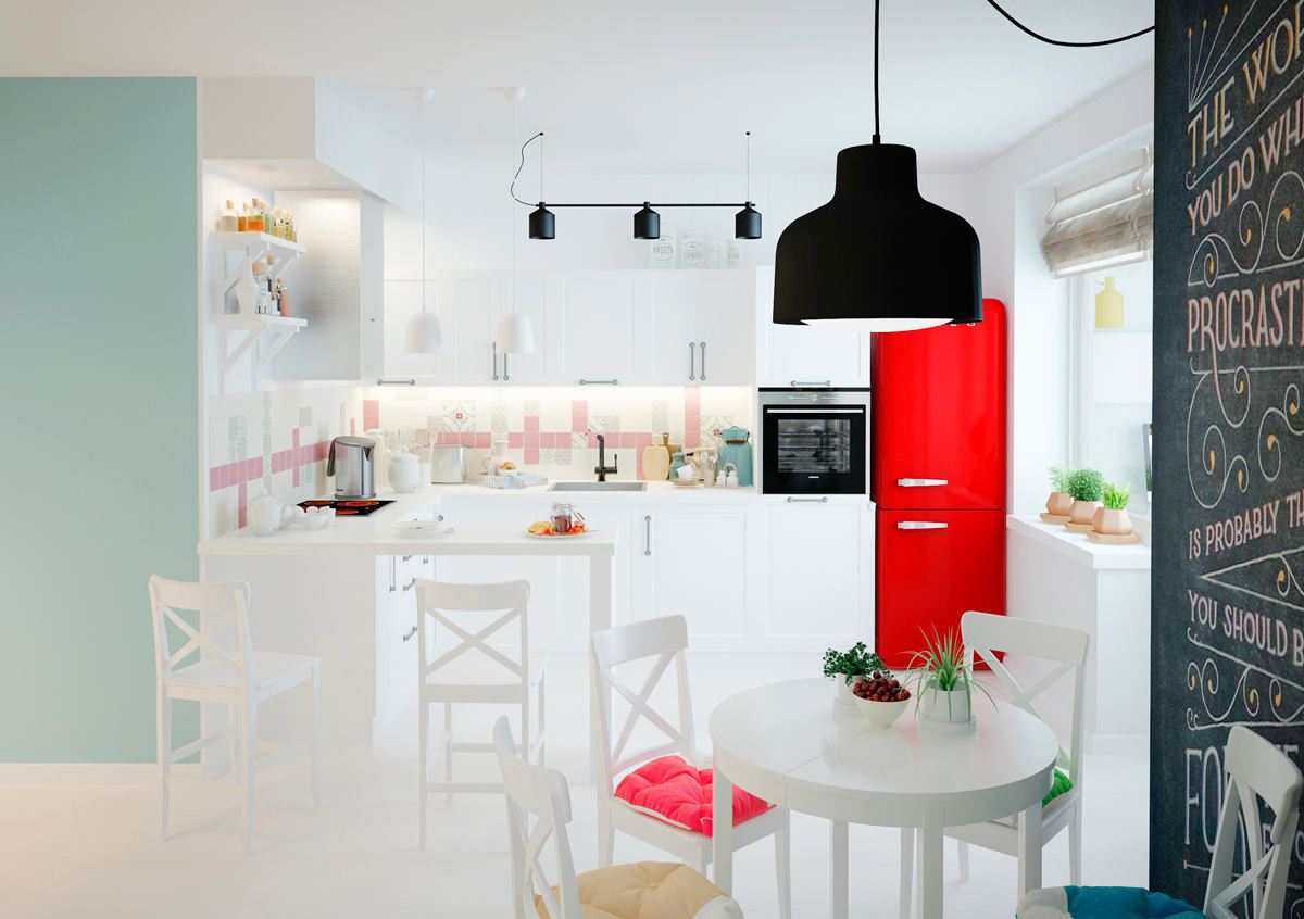
Bicycles on the walls
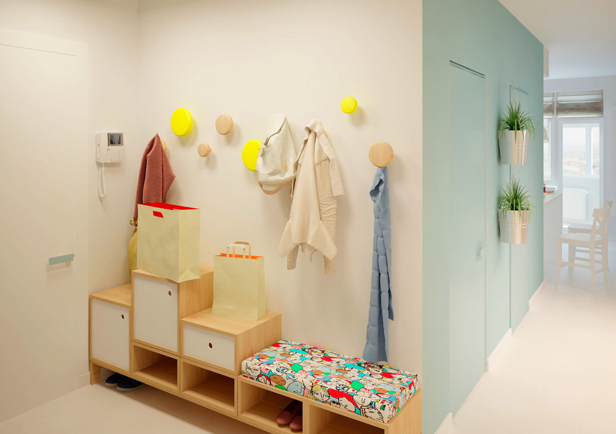
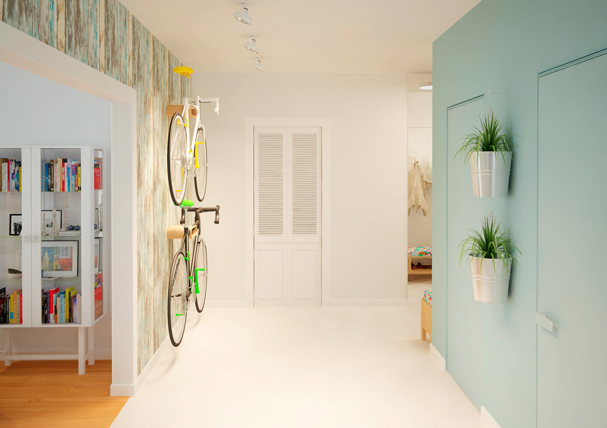
Since the owners of the apartment are crazy about cycling,then the main question they asked themselves from the very beginning was where to hide the mountain bikes. But the designers quickly came up with a stylish, practical and bold solution - not to hide the iron horses, but to put them on display for everyone to see. To do this, they were attached to brackets right in the hallway. So, when entering the apartment, the first thing guests see is two ultra-fashionable mountain bikes.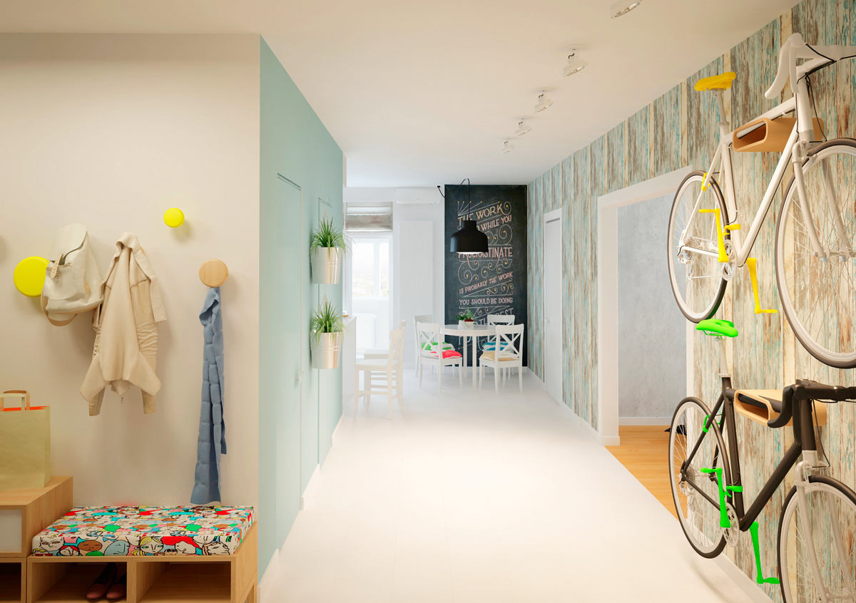
Color scheme: calm, but not boring
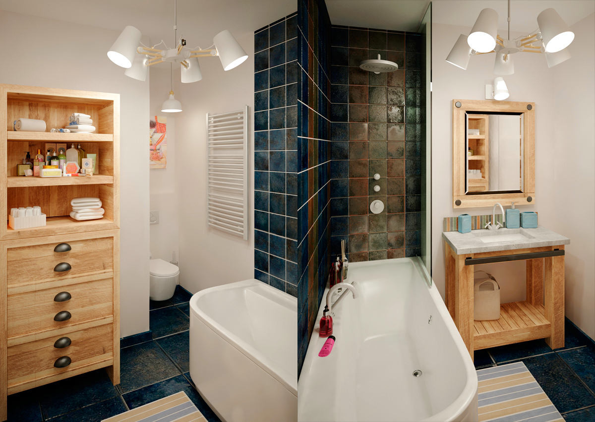
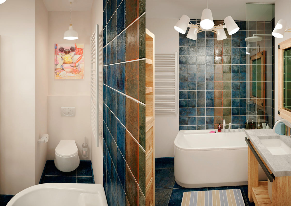
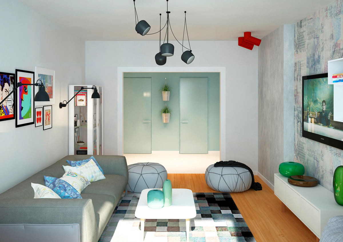
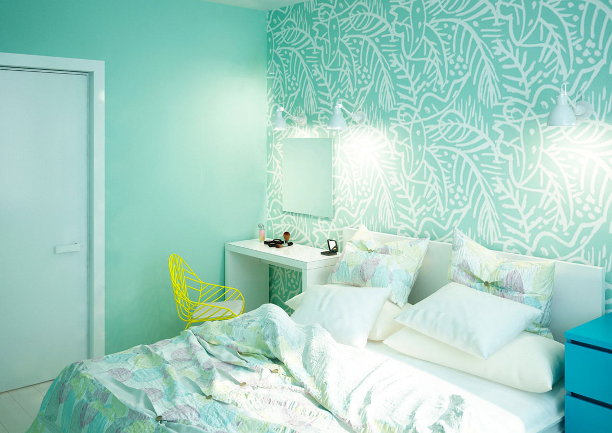
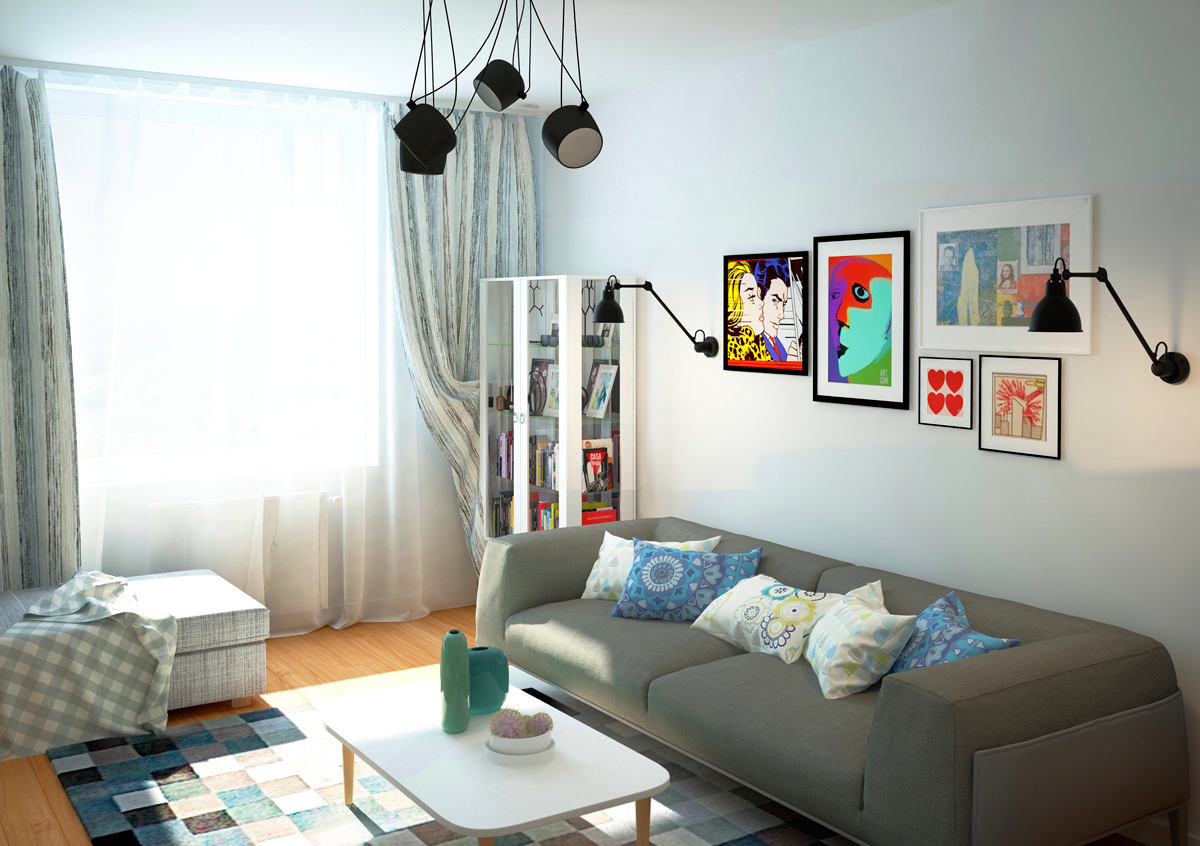
Vintage boards are a popular theme today andwidely used in interior design. The owners of the apartment also wanted to see these in their hallway. In order not to “steal” centimeters of space and not spoil the walls with paneling, they decided to use a more budget option - vinyl wallpaper with a board texture. Moreover, they were ideal for the idea with bicycles - not all wallpapers can withstand mechanical impacts when removing or attaching vehicles. These “boards” set the main tone of the apartment. Denis Garbuzyuk and Nika Los, designers of the Mooseberry design group studio: - Opposite the wall with the “boards”, we decided to make a sky-blue wall and doors in it in the same tone. In the living room, we left concrete pylons and “supported” them by placing a panel between them that resembles a worn-out wall of an old apartment. The guys really liked the color scheme in the hallway-kitchen, so they decided to use something similar in the bedroom, diluting it with light furniture and bright accents. It turned out calm and not boring. The bathroom is the only place where the guys clearly knew what kind of finish they wanted to see it in, namely: tiles saturated with different colors with accent inserts, and they “clung” to this concept.


Materials, brands and finishes
Kitchen:
- Made to order from local producers - Paspolini.
Living room:
- furniture - IKEA (This, by the way, was one of the customers’ wishes - to fill the space as much as possible with furniture and decor from this brand);
- panels (wallpaper) - Trestintas;
- parquet - WitexUA board.
Bedroom
- furniture - IKEA;
- decorative shelves on the wall were planned to be sold to local craftsmen;
- wallpaper - Trestintas brand;
- parquet - WitexUA board.
Bathroom:
- furniture - made to order;
- plumbing fixtures - Ravak brand;
- tiles — Imola Ceramica.
Other rooms:
- on the balcony (office) - furniture from IKEA;
- In the hallway there is custom-made furniture.
Wallpaper, paint, textiles:
- the walls are painted with Sadolin paint;
- Wallpaper - from the Sadolin-Id.com salon.
Floors, doors:
- The entire corridor and kitchen - ceramic tiles Vives;
- further around the apartment - WitexUA parquet board;
- Wardrobe, laundry and balcony - ceramic tiles factory Vives.
Tips for arranging such an interior from Mooseberry Design Group
visualizations provided by Mooseberry Design Group
