Sometimes it's hard to imagine how muchdesign changes the interior. Today we will show you 3 different options for arranging the same two-room apartment. The article will be useful to anyone planning to do repairs The owner of the apartment is an intelligent woman leading an active lifestyle. The bold proposals of the architects that arose during the design development process were supported by the customer. Sometimes the contrast of different stylistic strokes and techniques was discouraging. As a result, the combination of seemingly elements resulted in an interesting and unusual presentation of the interior. Stepan Bugaev, interior designer Graduated from Moscow Institute of Physics and Technology with a master's degree in physics and from the Higher School of Economics with a master's degree in business informatics. Has his own design studio, under his leadership more than 500 design projects have been implemented. Included in the top 100 best designers, according to the leading interior publication AD. He is a teacher at the HSE School of Design, teaches his own course "Interior Design. Rules for Creating a Successful Project." Gives open lectures on interior design and writes articles for leading interior design magazines and portals. General idea of the projects The owner of the apartment is a stylish, modern woman, open to new ideas - in general, she prefers a calm classic style without the use of frills, curls, moldings and gold; smooth furniture without candelabra; subdued lighting. The customer's wishes for the interior were as follows:
- A single space kitchen, living room and dining room,
- The organization of a zone for reading books,
- organization
- Comfortable bathroom.
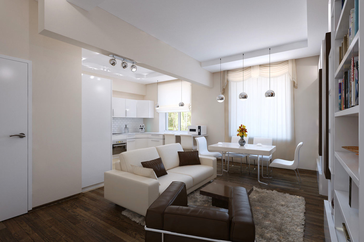
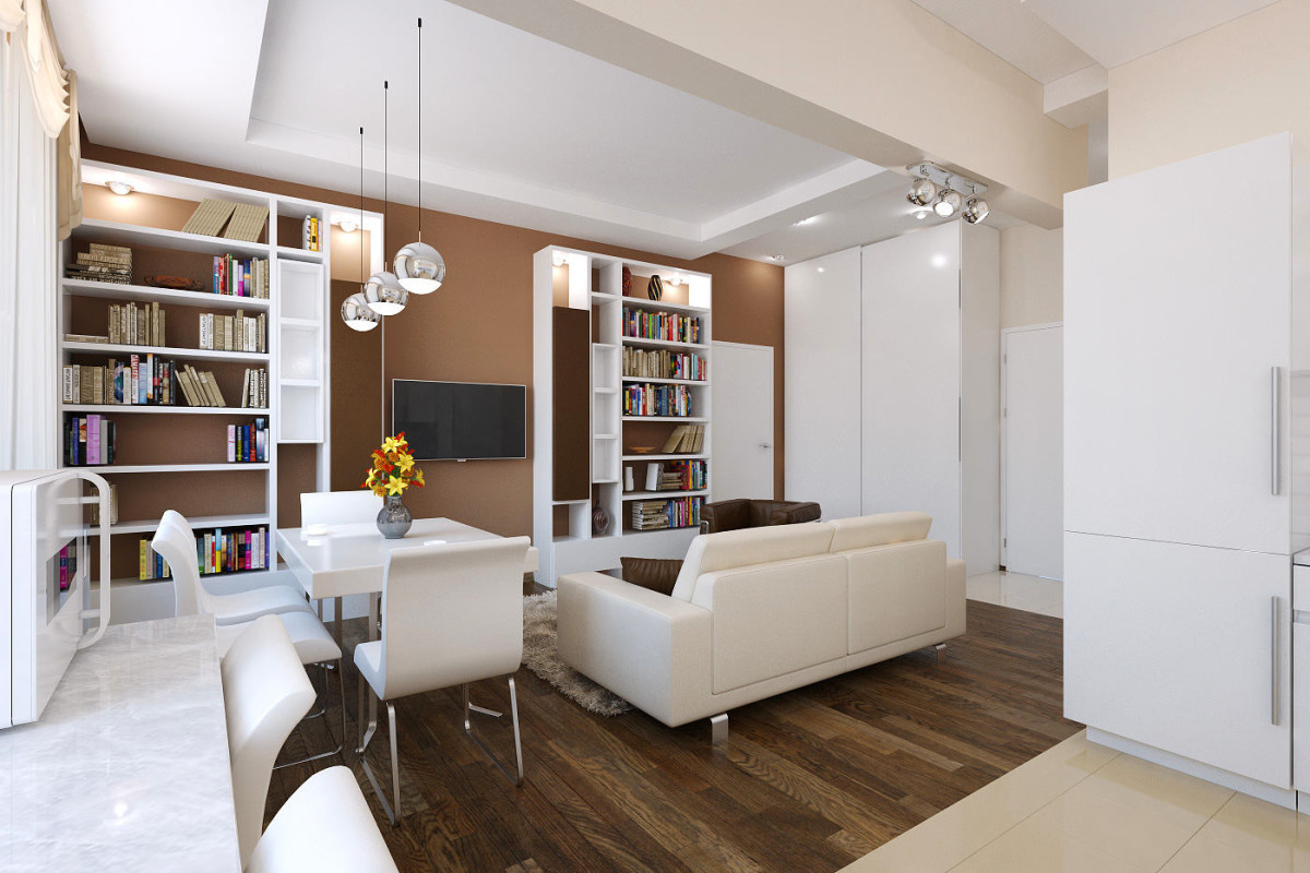
Initially standard layoutthe apartment did not meet the desired requirements. Therefore, various redevelopment options were made taking into account the division of the space into bedroom, living-dining room, kitchen and bathroom zones. Even several interior design options for one room can be diametrically opposed in their execution. Sometimes such a wide amplitude in the spectrum of design possibilities is necessary so that you can compare and choose what you like. In all three projects, designer furniture and accessories became the center of the interior composition.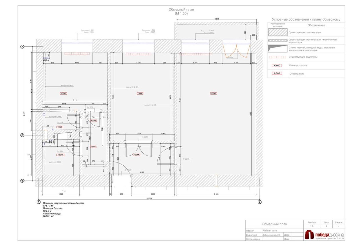 1.Design project "Three chocolates" The main task is to make an interior from a small apartment that combines two zones: a place for meeting with family and friends and a secluded space for relaxation and peace.
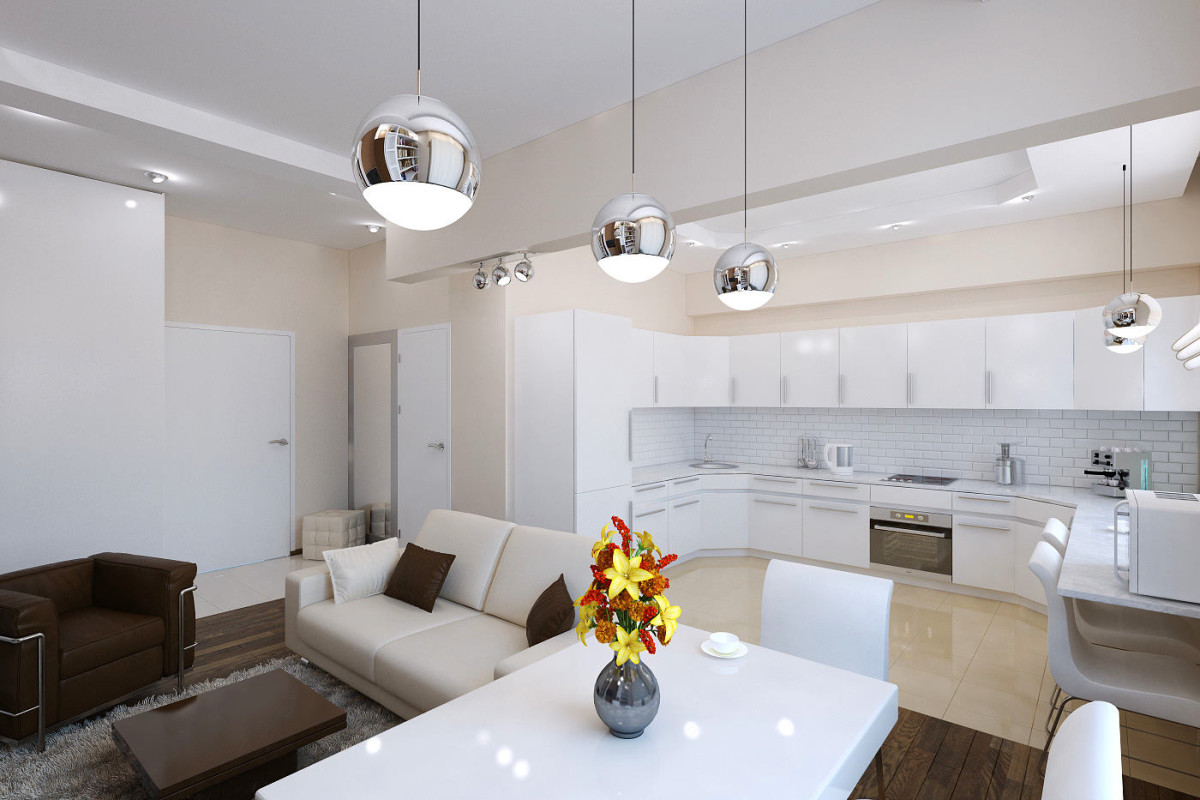
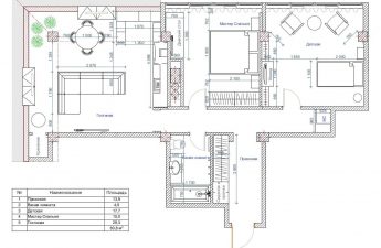
 2.Design project "Tea Rose" The apartment project is made using shades of tea rose and pastel white tones. During the redevelopment process, a large bathroom was created, combined with a toilet, a living room, combined with a kitchen, and the hallway is separated only by a rack.
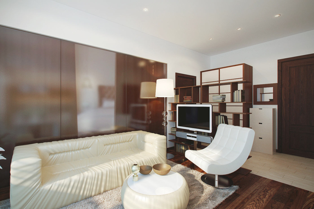
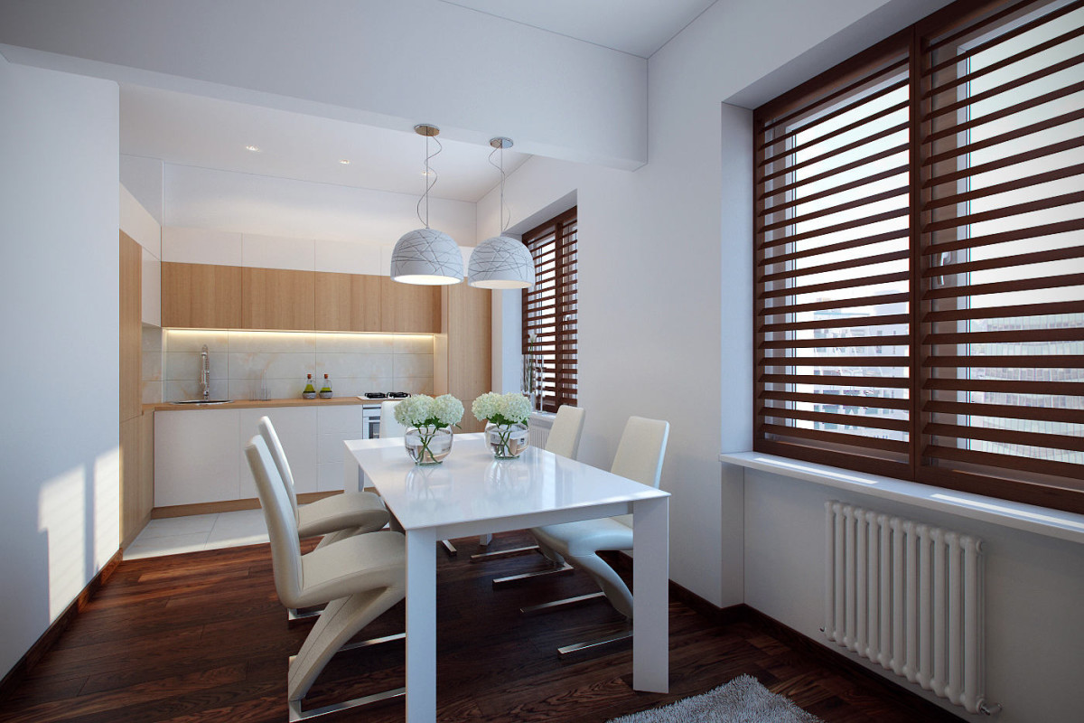
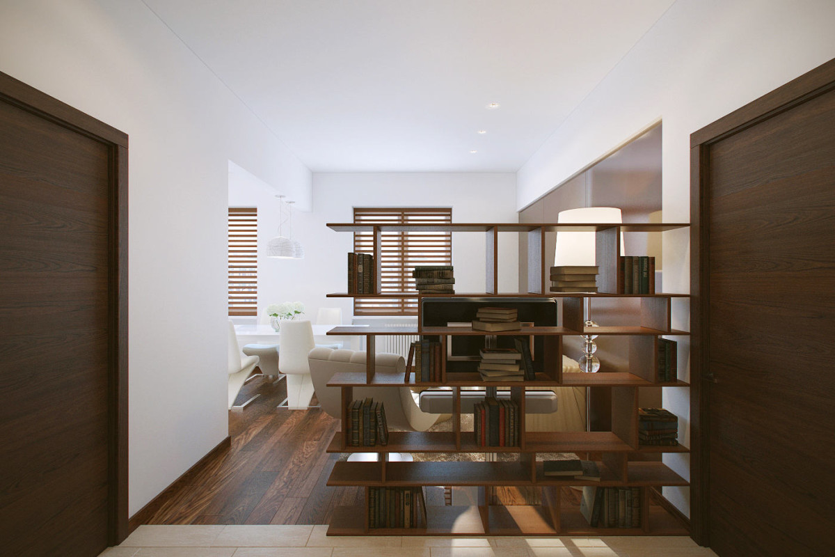
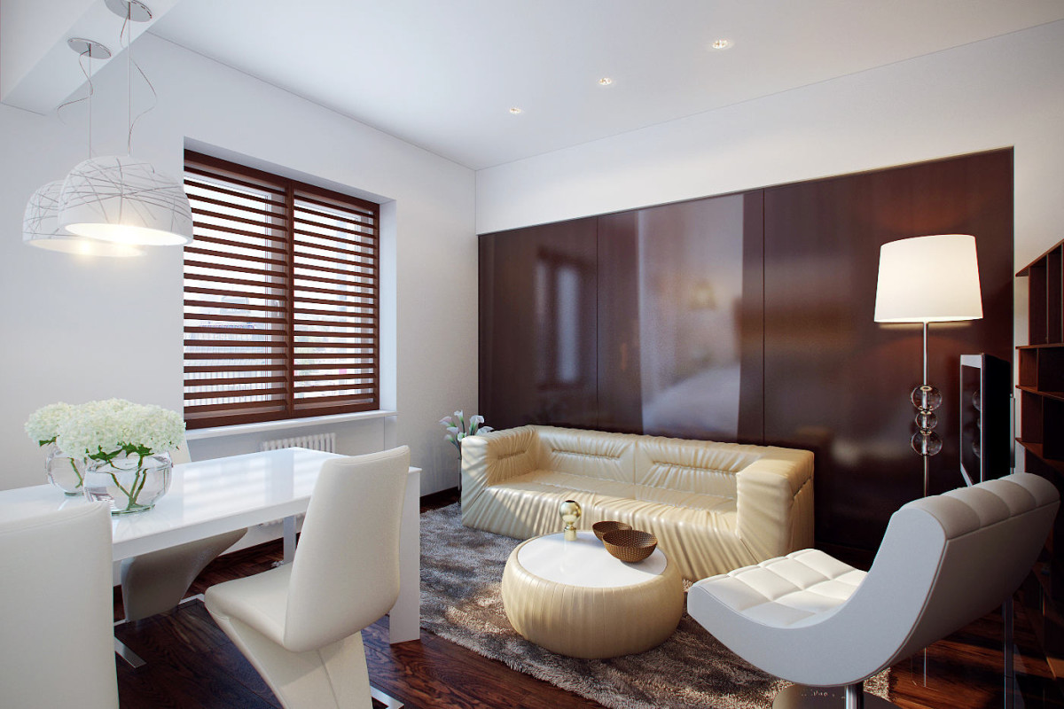

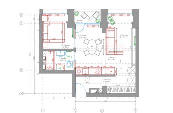
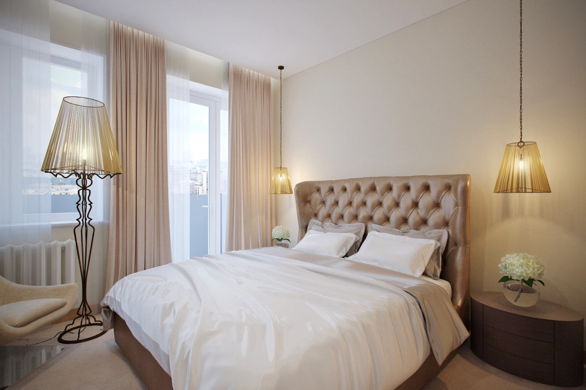 3.Design project "Oxymoron" This option, which was ultimately chosen for implementation, is a combination of various design elements and decoration of the premises. Thus, individual zones of the apartment differ in style: the bedroom is decorated in soft pastel colors, and the common area is in contrasting colors and a mixture of high-tech and loft styles, which are emphasized by brickwork on the walls and finishing of the beam with metal plates. A classic element of ceiling decor is also added - a ceiling dome that forms a niche where an unusually shaped Vistosi lamp is located, which is a kind of leading link in the interior. It was necessary to take into account the space for a small hallway, which was achieved by using partitions located at different levels relative to each other.
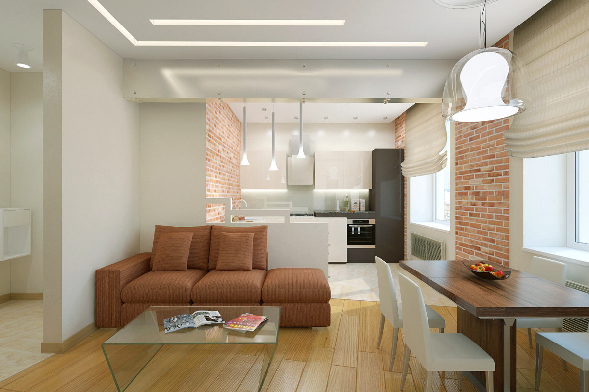

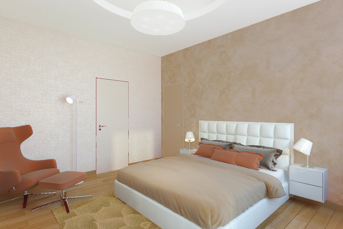
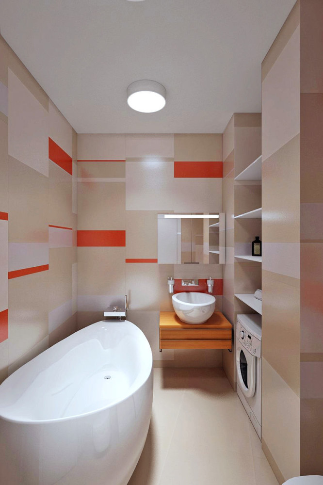
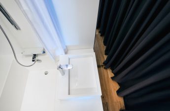
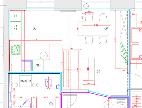
Redevelopment For redevelopment of premisesit was necessary to dismantle the walls in the entire apartment, after which the beams protruding 50 cm from the ceiling slab remained, they needed to be decorated. By dividing the space into two zones, the designers received a spacious living room-dining room and an equally spacious bedroom. In the small bathroom, it was originally planned to place a bathtub, toilet and sink. But in the process of developing the project, it was decided to replace the bathtub with a to increase the space of the room, also to save space, a flow-through water heater, washing machine and dryer were decided to be placed in the resulting niche between the plumbing pipes. In general, the process of implementing the design project took about a year.
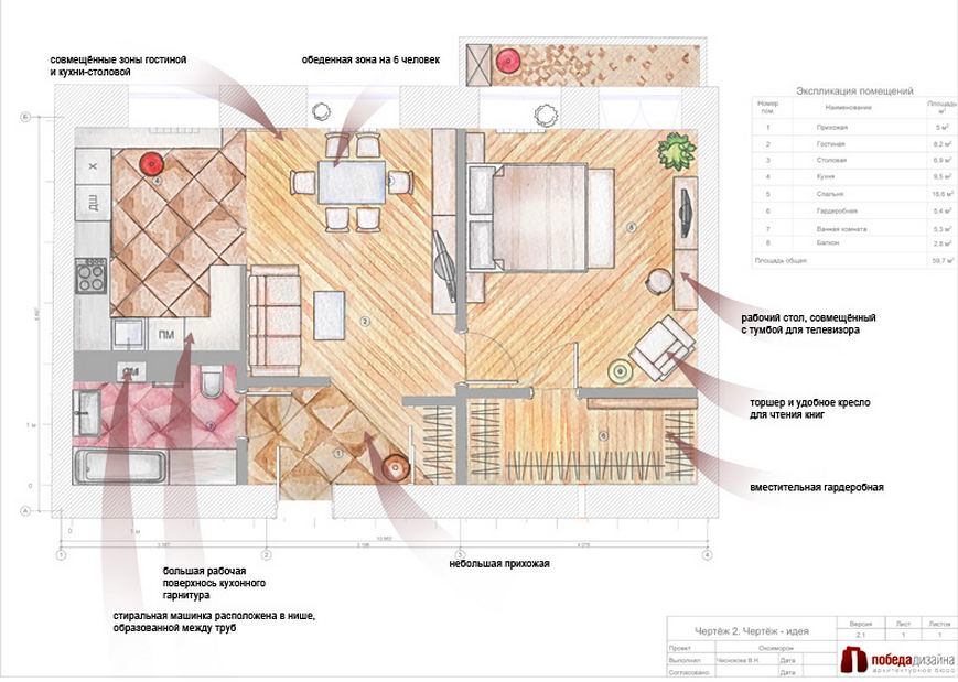
 Materials, brands and finishes in this projectSpecial attention was paid to the selection of lighting equipment and original ceiling lamps. Time-tested brands Vistosi, Fabbian, Vibia were chosen. Kitchen-living room:
- Modular sofa bed - Pianca,
- Kitchen - Leicht,
- Lamp - Vistosi Naranza,
- Built-in lighting system - Panzeri,
- Doors - Chameleon,
- Floor tiles - Aparici Reaction Beige,
- A massive board - "Doussia"
- Ceiling dome - Orac Luxxus.
Bedroom:
- Bed - Ninfea from Ingenia Casa,
- Bedside lamps - Melampo tavolo,
- Armchair - Vitra,
- Furniture composition - Mr. Doors.
Bathroom:
- plumbing - Aveo, Villeroy & Boch,
- Moisture resistant lighting - Vibia,
- Wall tiles - La Faenza.
Stepan Bugaev's advice on decorating an apartment:
