If the phrase "small bathroom"makes you feel doomed and disappointed — this article is for you! We will prove with a real example that regardless of the area, the bathroom can be functional, original and beautiful Unfortunately, almost all typical apartments are, to put it mildly, not very large. And if you do not carry out any radical redevelopment, then you need to either put up with the cramped space, or take this issue seriously and try to use every millimeter of your bathroom correctly. And to make it clearer how to do this, here is a visual Moscow example from designer Sophie Mu — with her help it turned out incredibly stylish, spacious and functional. Sophie Mu, designer Has been engaged in interior design for seven years, most of which she devoted to small apartments. She likes to work with space and zoning, create new scenarios and layouts. Sophie is a rationalist, she prefers functionality to excessive decoration, but loves those made with a sparkle and mood. She has a higher education in the field of architectural environment design. sofimu.com Our main characters, for whom this bathroom was made, are a young married couple. These are people who are passionate about music, traveling, they are inspired by nature and bright colors of life. From the first minutes of meeting, it was clear that they are very creative and extraordinary individuals. The apartment is located in a typical multi-story building of the P-3 series, but it immediately became clear that they need an interior that is completely non-standard. There were many wishes for the bathroom, based primarily on its functions: shower, bath, washing machine, sink, storage. And this had to be implemented in a completely . Sofi Mu, designer: - A very important point for the bathroom was the presence of a large mirror. It is located on the left wall and visually noticeably expands the space. With it, the room ceased to be cramped and began to be perceived easily. sofimu.com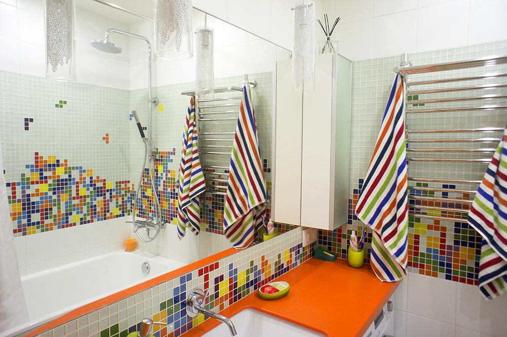
 The area of the bathroom is 2.8 square meters.In the original version, the bathtub stood opposite the entrance, and there was a sink by the left wall. The designer decided to completely change the entire block. After the pipes were re-routed and the existing waterproofing was improved, the bathtub with a shower stand (tropical shower + hand shower) stood along the right wall, and the sink and washing machine were placed by the left. Moreover, the sink is sewn under the countertop and rests on brackets so that the 45-centimeter-deep washing machine could stand in the corner.
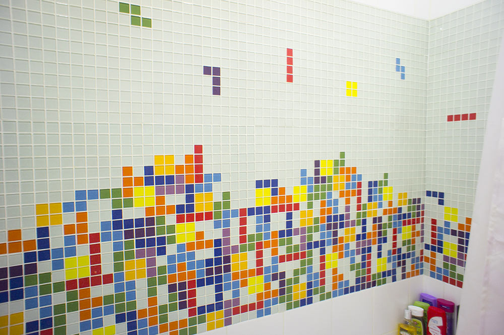
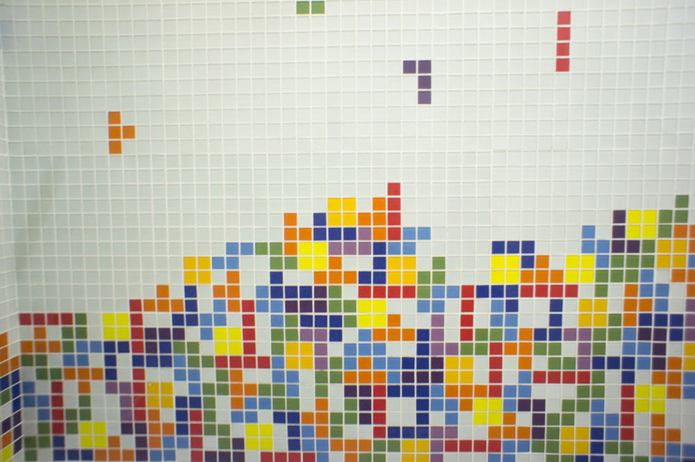
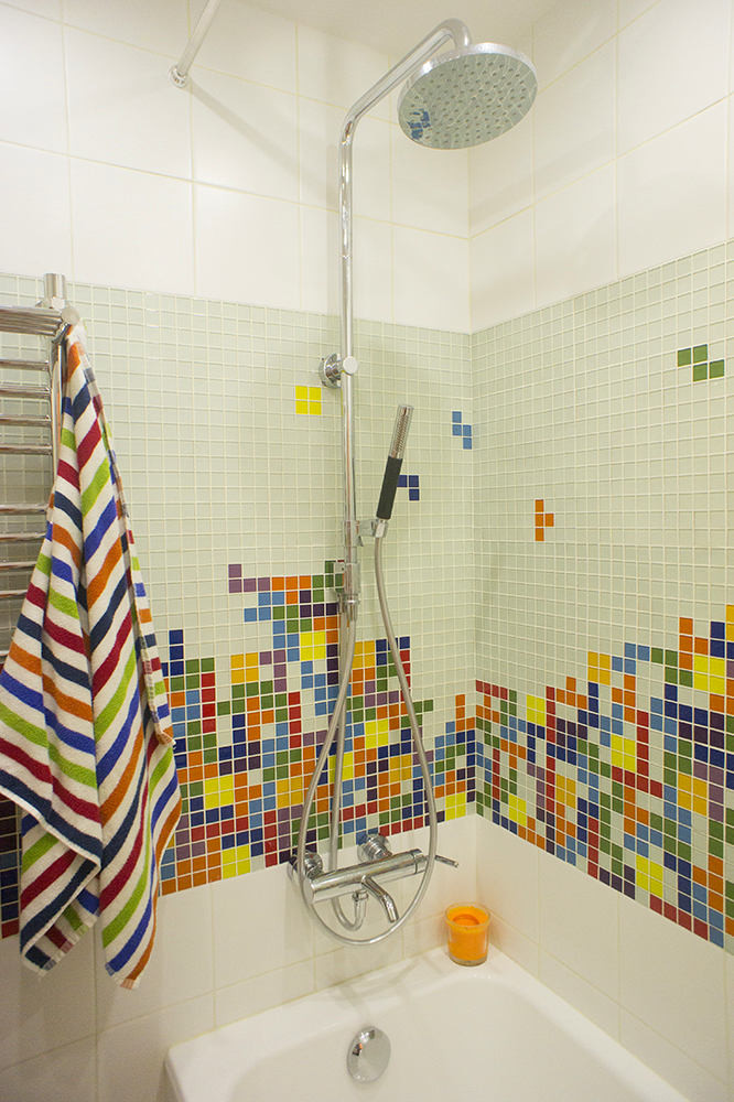 The main task in the project was to make it lightand a bright room. In order for this small space not to seem cramped, white tiles of an economical Russian brand were used. But you must admit, a simple white bathroom is so boring, especially for young people! That's why Sophie Mu decided that there was no way to do without some interesting idea. She suggested to the customers the theme of Tetris figures falling on a white background. It must be said that they liked this idea, and what's most interesting is that they took on its implementation themselves! Sophie Mu, designer: - It was a heroic epic, during which the guys drew a picture on cubes, recreated it from mosaic pieces on a grid, then stuck it on masking tape, signed each element and closely monitored that the tiler laid everything as needed. Only thanks to their titanic efforts was it possible to implement this complex idea. And the main thing in all this is that the Tetris panel became not just a design idea, but a whole adventure for the inhabitants of the house. Everything ended well and it looks like you want a new figure to fall as soon as possible - or better yet, a stripe (did everyone play Tetris as a child?). sofimu.com
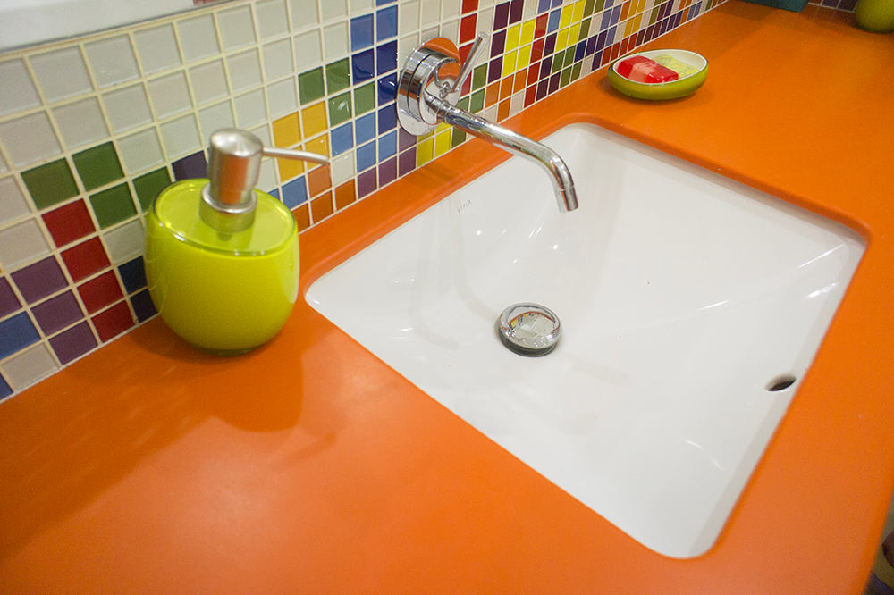
 The tabletop here is like the finishing touch.pictures: bright and cheerful. It charges you with positive energy while washing, especially in the morning before work. It has a tricky bend, and it appeared because the distance at the entrance is less than the required depth for installation. Therefore, the craftsmen who made the custom countertop made the radial bevel soft enough not to interfere with the passage. By the way, the mixer tap was chosen as a wall-mounted type, which is the best option in such a situation.
 Sophie Mu, designer:— I would like to point out that the true enthusiasts of this space are the customers themselves. They picked up the bright image, carefully and gradually selected every detail of the accessories. Towels, soap dispenser and even a candle: there is nothing superfluous here and everything is very much in theme. I cannot deny myself the pleasure of once again praising this approach, because it is so important to continue the designer's ideas in the further original life of the space. sofimu.com all photos provided by Sofi Mu
How to equip a small bathroom: an example from Moscow
