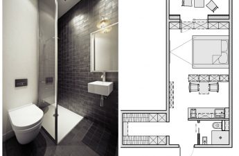
You need to make repairs in the atticnon-standard layout? What tricks and techniques should be used to create a cozy and functional space? We decided to consider this using the example of a small apartment from Barcelona. Given the design features, it is difficult to renovate an attic. But with the right approach, the result will exceed your expectations. Attics are increasingly being used as living space. Here is a real example of an apartment located in the attic, and its area is only 20 square meters. It is located in the center of Barcelona (Spain). You can’t really go wild in such a small space, especially when you need to include all the functions necessary for a full life. But when a professional takes on the matter, then everything is possible. Let's see how designer Anthony Chevallier coped with this task.
Color: expands boundaries and adds mood
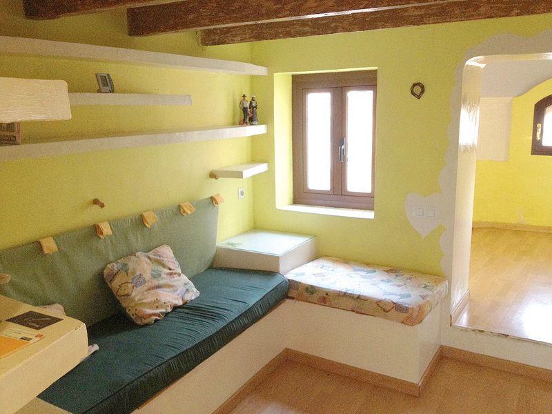
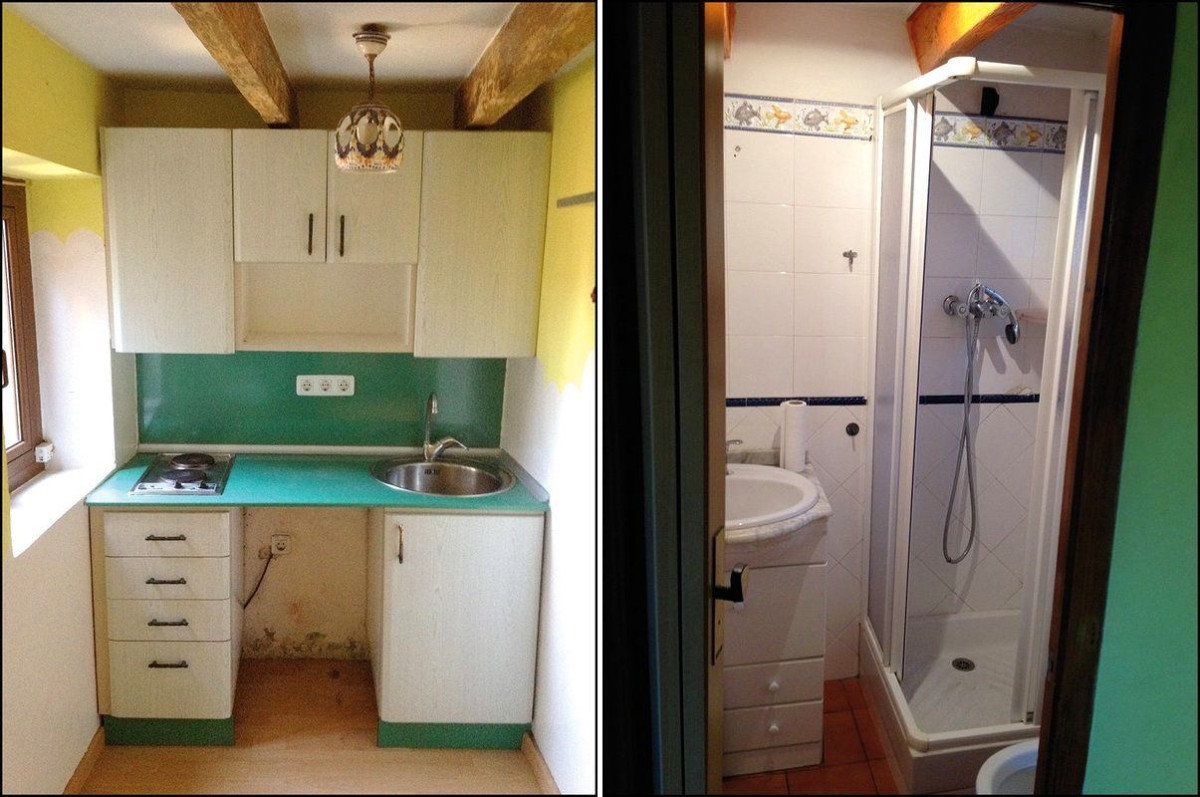
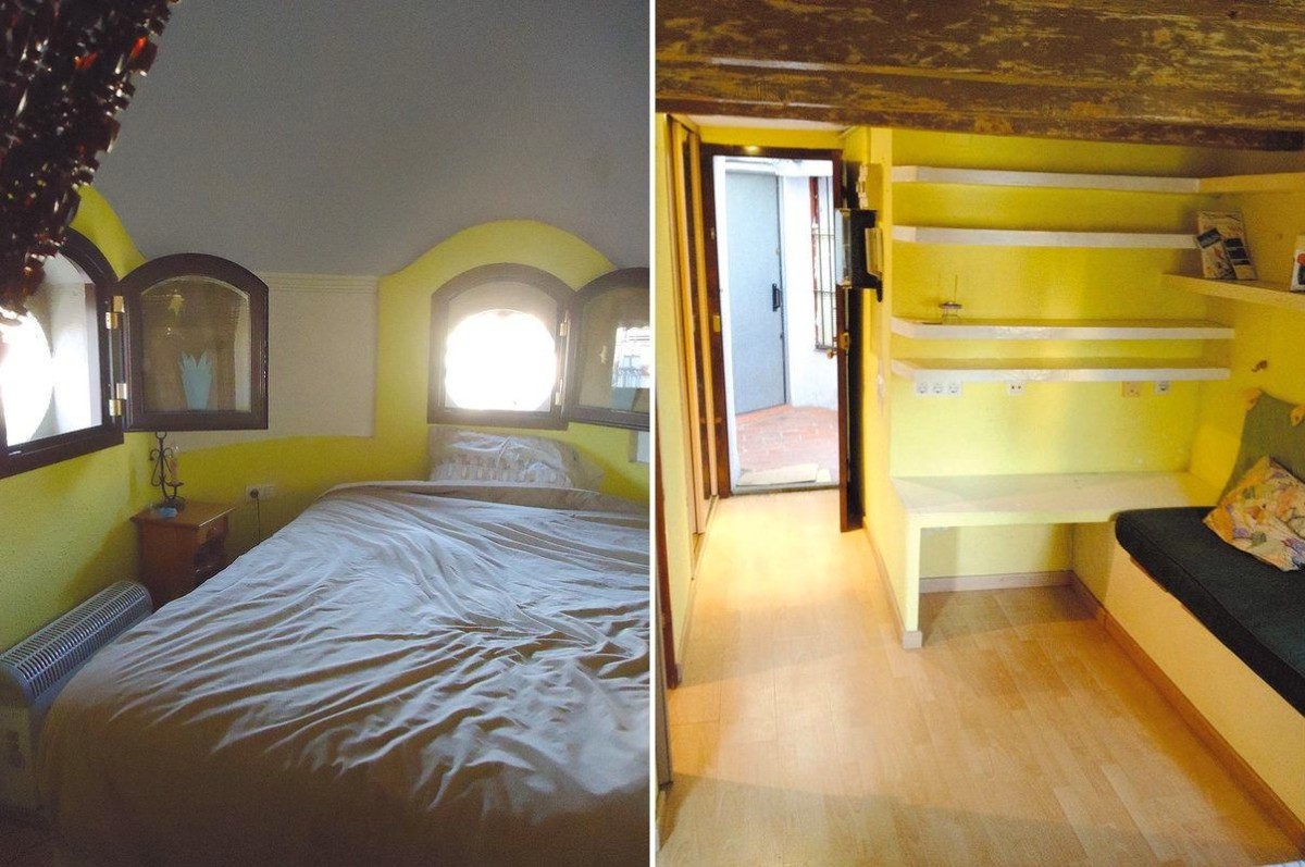
When choosing a color for such a non-standardIt was important to maintain a cheerful mood in the room. This is especially true when a young student lives there (as we assume). The main color in the apartment before the renovation was yellow. It is often used in the attic. It invigorates, has a positive effect on intellectual thinking and improves mood. But since the space includes several functions (work and rest), it was necessary to find a golden mean. So, the designer chose a light color for the walls and ceiling as a base. And added yellow as an accent. The effect of sunlight was achieved. In the bedroom, they did not use this technique so that the room would set you up for relaxation. Our opinion: - Light, without visual boundaries, the color of the walls, ceiling, furniture visually increases the space, so it is ideal for an attic with a non-standard design.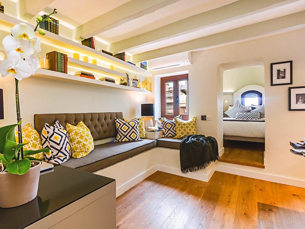
How to add expressiveness
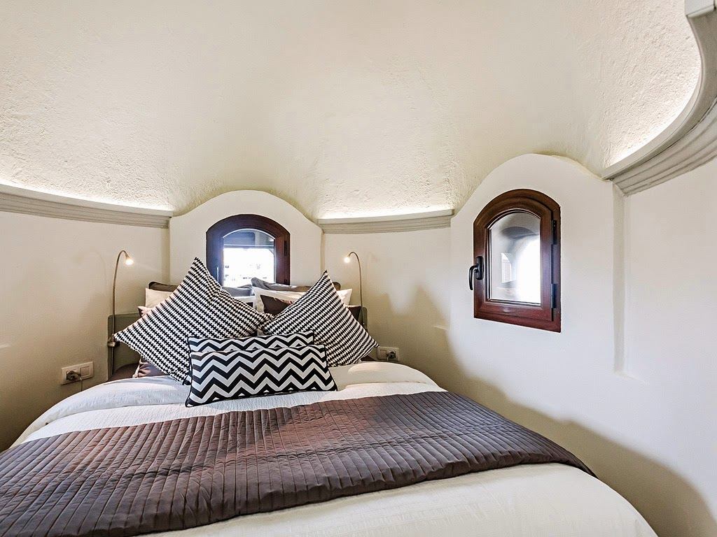
To make the apartment look expressive, AnthonyChevalier used several effective techniques. He made accents with color and light. Moreover, the impression of airiness was achieved thanks to the backlighting. In the bedroom, it is hidden under the ceiling, diffused lighting sets the mood for rest. In the living room, the backlighting is brighter and gives expressiveness to the objects on the shelves, enhances the sunny mood. In the kitchen, it is even brighter and serves as an additional source of lighting. Decorative pillows, covers on furniture also match well in color and create a cheerful mood in the apartment.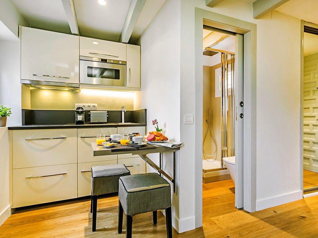

Transformation of objects
Functionality in small spaces is worth itin the first place. The mini-kitchen in the attic becomes a little larger when the table is folded. Its surface is specially selected in a light gray range so that it does not stand out too much. The table is small in size, but in case someone comes to visit the student, it is quite possible to accommodate two people here.
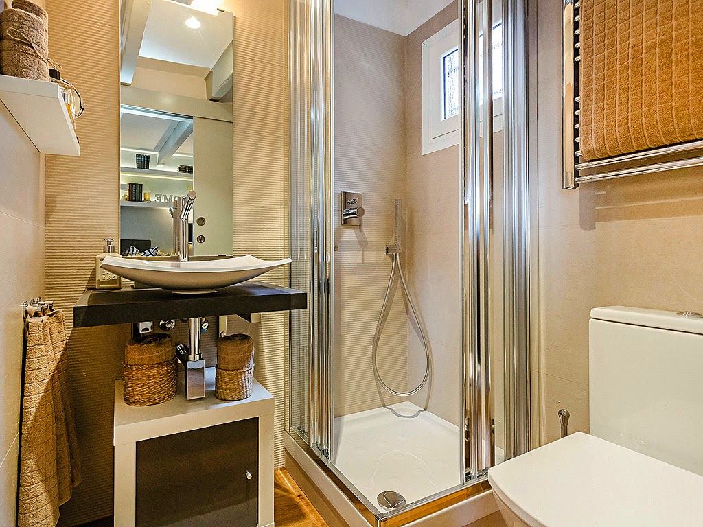
Change of scenery
The renovation was done with the future in mind.Therefore, the covers on the chairs, the mattresses on the benches, the decorative pillows and the items on the shelves are easy to change. Moreover, the designer made an excellent background, and painted the beams in a light color. This is a big advantage.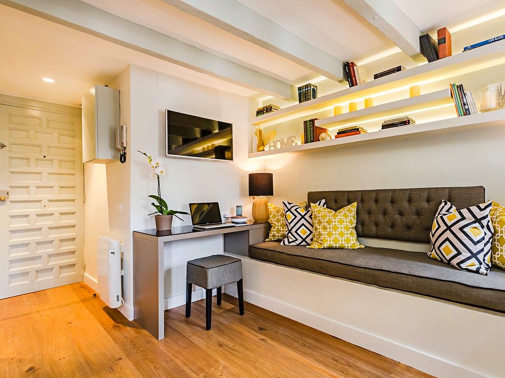
Beams - into action
As you know, students usually have a lot of books,that need to be stored somewhere. Since the room is small, instead of bookcases on the walls there are open shelves. And the beams on the ceiling were used as a dividing wall. Since they are in the same color, it creates the impression of a continuation of the shelves.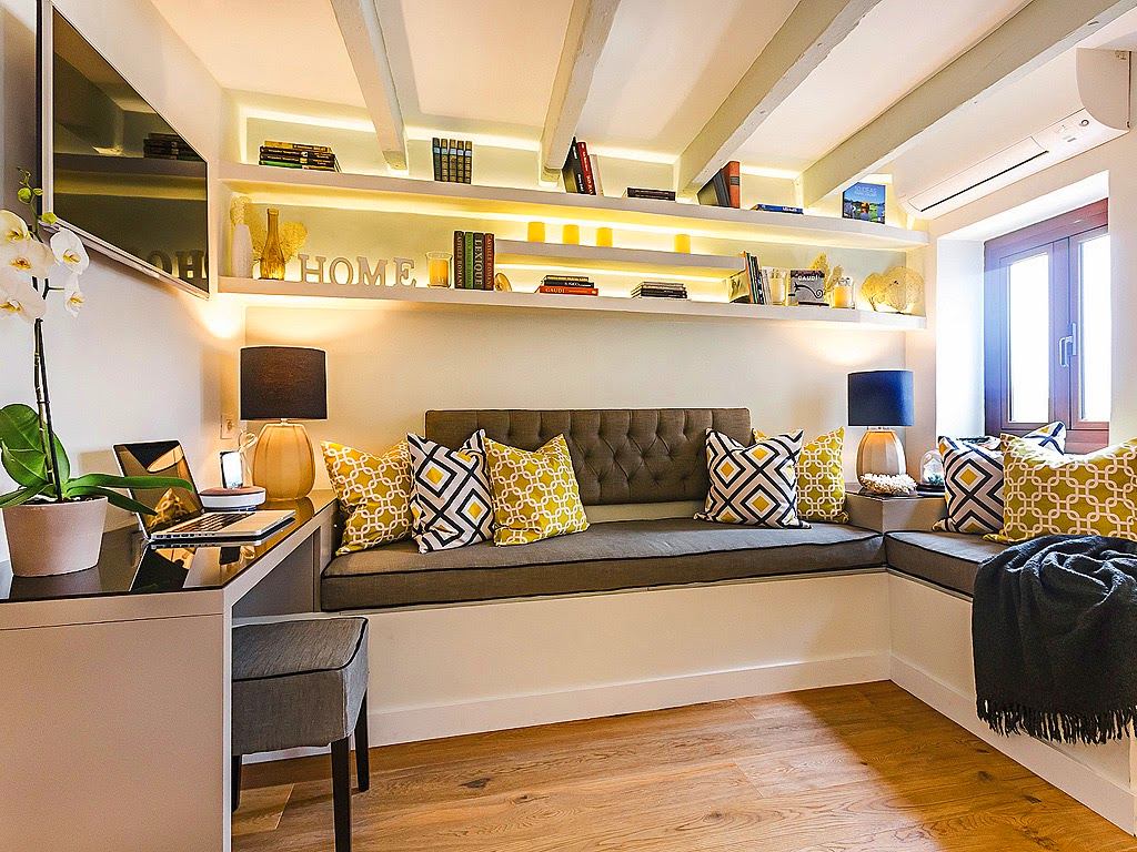
 le-departement.com
