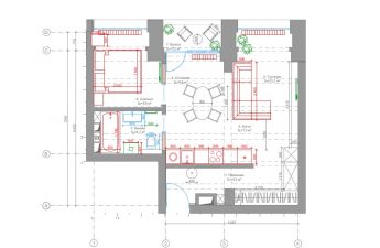
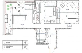
With the help of competent redevelopment and painstakingworks of architects an apartment in a Stalin-era building built in the 1950s has been transformed into a modern, comfortable and stylish living space for a young family The owners of this three-room apartment are a young couple, both of whom work in the financial sector. They approached the architectural bureau with a request to create a calm space with a complex neutral shade of the walls and warm color accents. As a background shade, the architects chose the popular pearl gray, and decided to dilute it with various variations of red and pink. Architectural bureau KYD BURO KYD BURO is four architects and designers: Pavel Kobets, Andrey Yankovsky, Dmitry Dubrovsky and Stanislav Klyatsky. Each of them has not only a serious specialized education, but also extensive experience in designing and implementing residential and public interiors both in Russia and abroad. They consider their advantages to be healthy perfectionism, extensive experience and a wide geography of projects. www.kydburo.com Layout The architecture of the Stalinist building in which the apartment is located influenced the design features and layout: the bureau team had to work with high ceilings, large windows, a long corridor and a load-bearing wall between the living room and the rest of the rooms. Along the latter, an enfilade-type corridor was formed, from which one can get to the bedroom, study, bathroom and kitchen. Taking into account the wishes of the clients, the architects left the rooms isolated from each other, and moved the main dining group into , placing a small table for breakfast in the kitchen.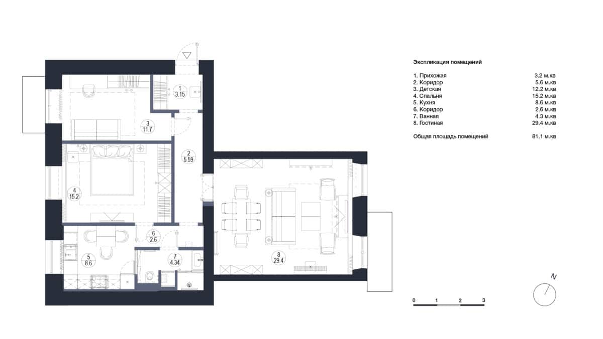 Hallway A wardrobe was placed in a small hallwaywith two clothes rails at the top and pull-out shoe drawers at the bottom. The facade was illuminated with two directional light fixtures to emphasize its texture. A lantern was hung in the center of the hallway, which overlooks the enfilade of the corridor. The same lamp is located opposite - at the entrance to the bathroom. An electrical panel is hidden behind a hanging mirror in a frame, and a white and red bench is the only bright spot in this area.
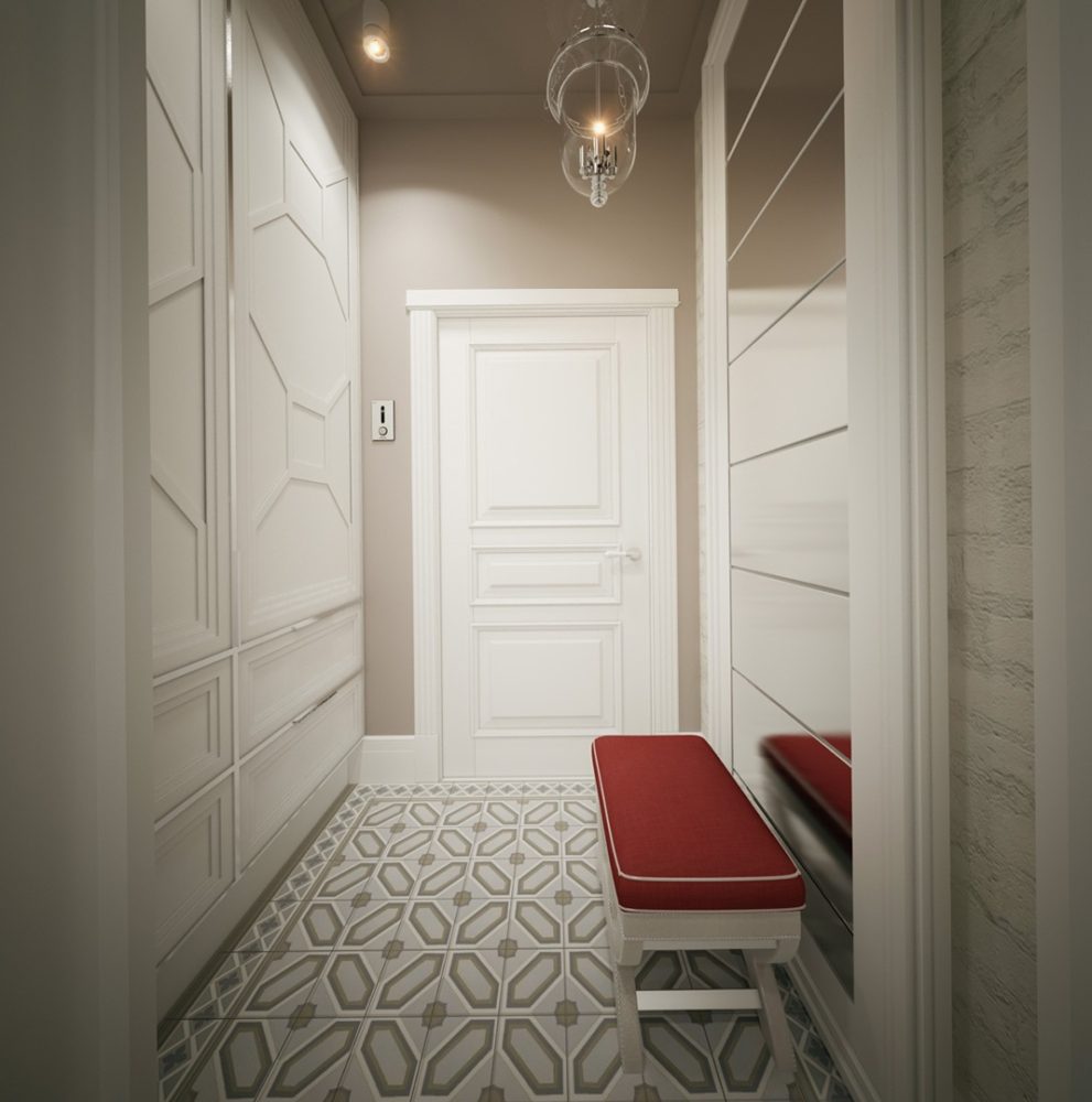
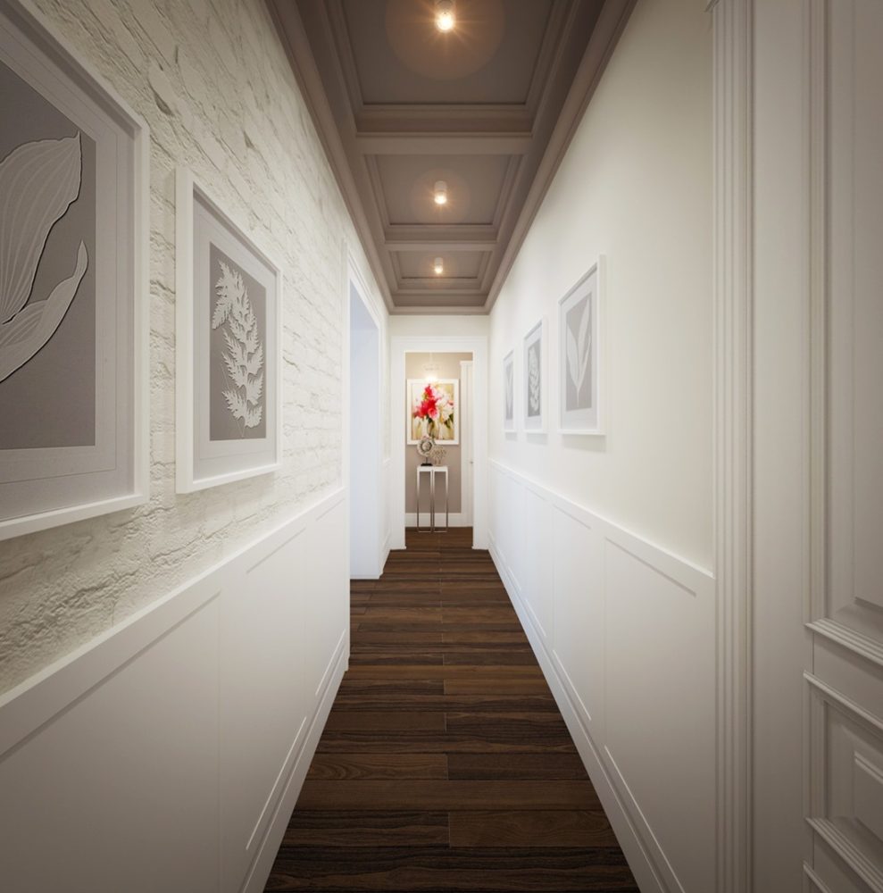
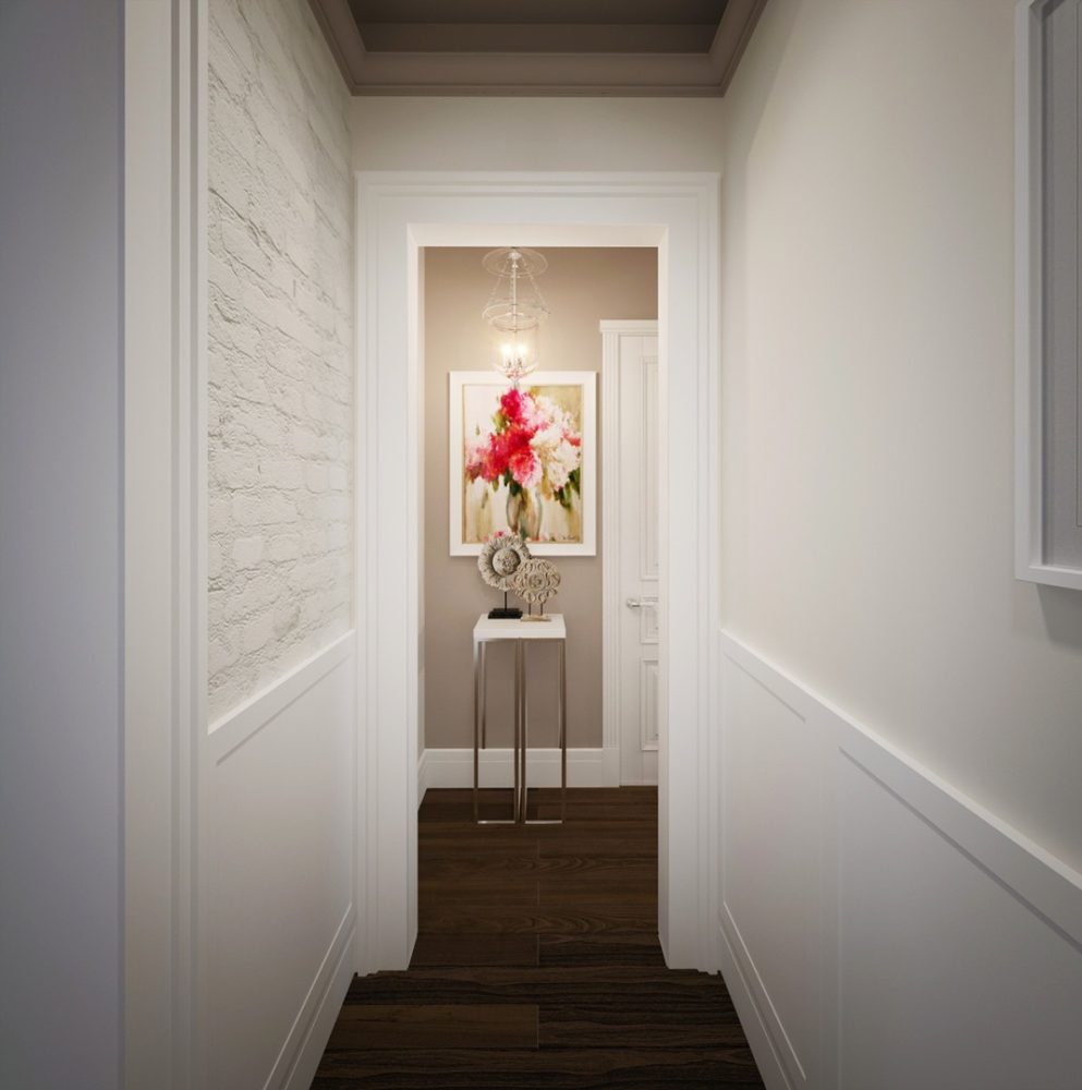
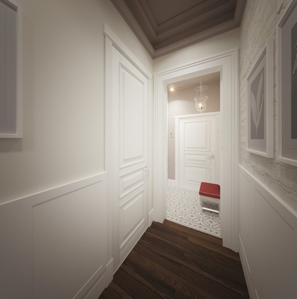 Architectural bureau KYD BURO:— Visually, we highlighted the hallway area with a floor covering — a “carpet” made of cement tiles. The same tiles, but in a different color scheme, are duplicated in the kitchen and consistently connect the space of the apartment. The pattern of the built-in wardrobe façade repeats the pattern of the floor “carpet”, only on a larger scale. Hallway Due to the design features of the house, the hallway turned out to be elongated and required visual techniques to reduce its length and height. To do this, the architects used coffered ceilings and boiserie on the walls and painted it in a fairly dense chocolate shade to visually reduce the height of the room. It was also decided to preserve the original brickwork in this area and place photographs against it.
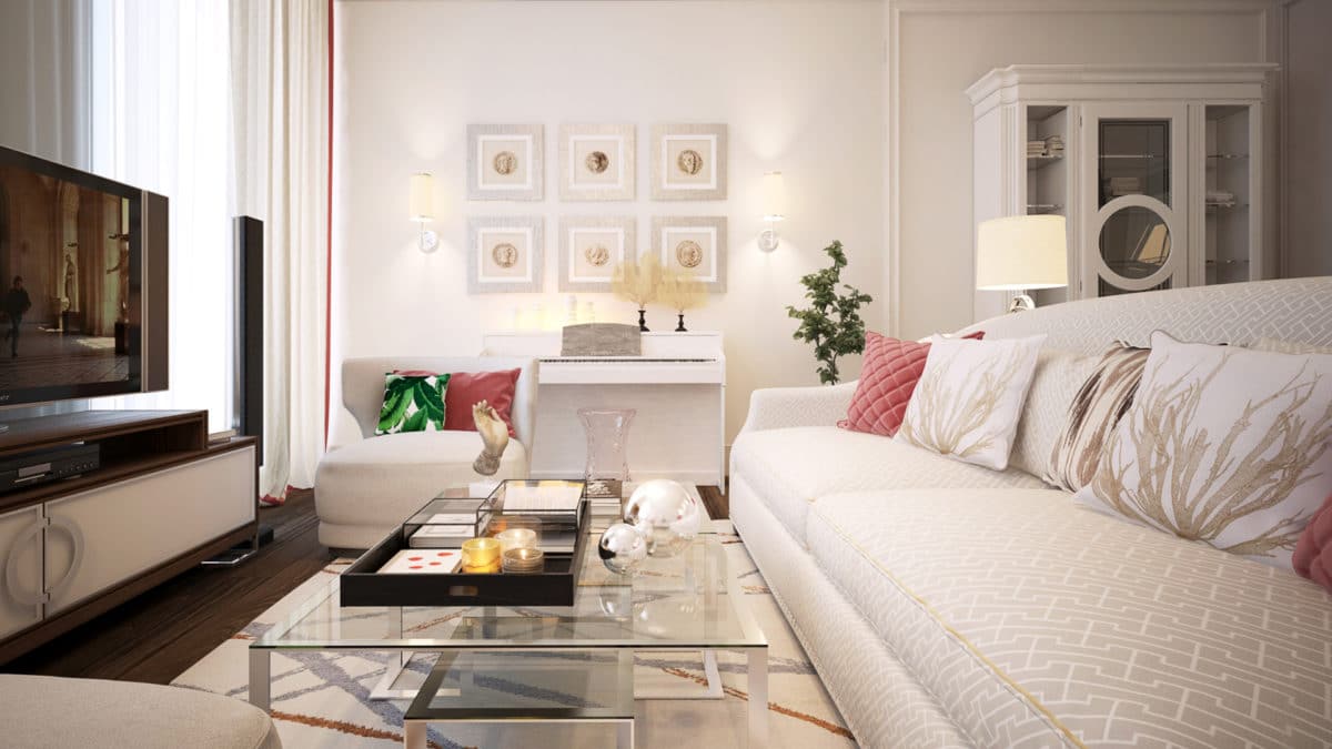
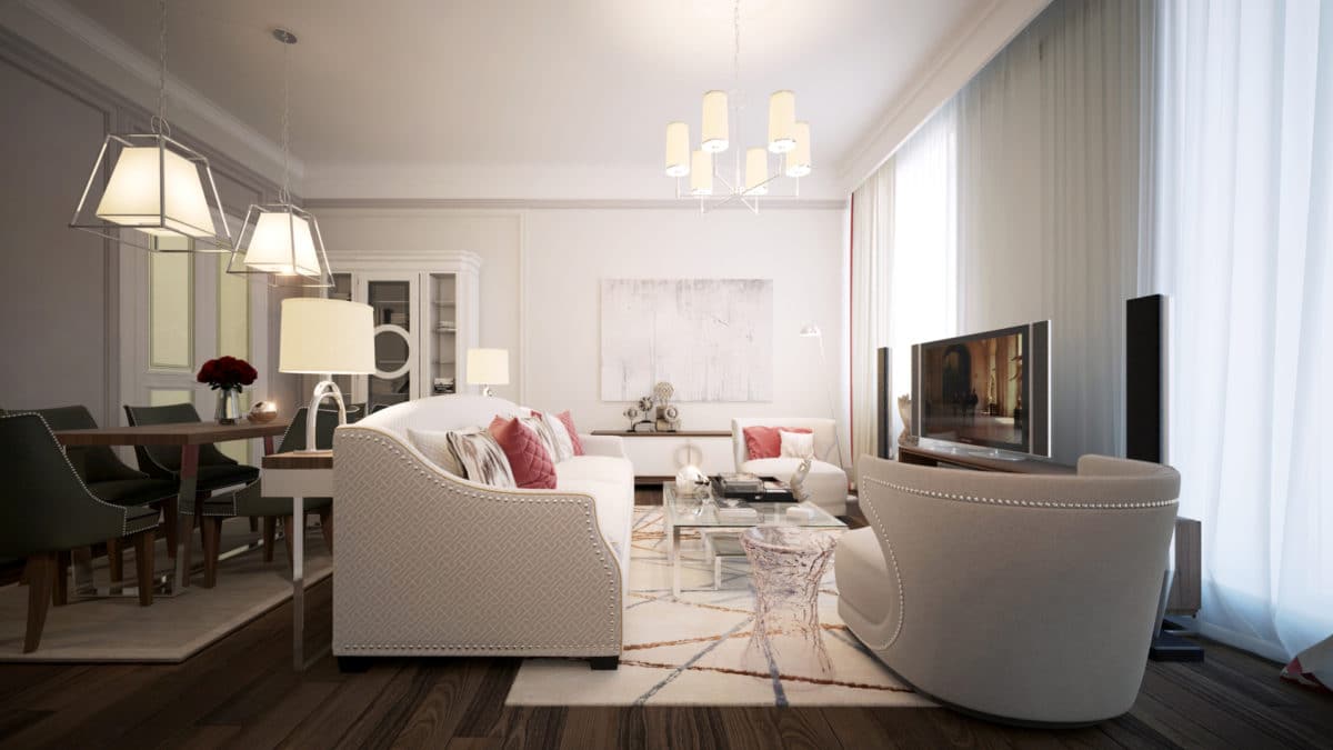
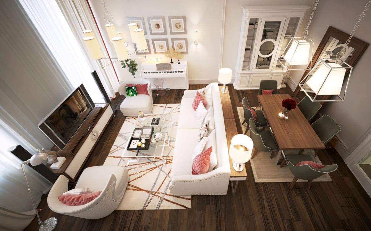
 Living-dining room Public spaceis conditionally divided into two functional zones: a dining room and a living room, which are delimited by a console with table lamps located behind the sofa. An additional zoning tool is the framing on the walls. The dining area is represented by a dining table with seating for six people, a console with drawers, which is used to store cutlery and serving, and two symmetrical sideboards. In the recreation area there is a light sofa group with a transparent coffee table, and opposite, between two windows, there is a chest of drawers with media equipment. The interior of the living room is done in light pearl shades with splashes of pink and bright green.
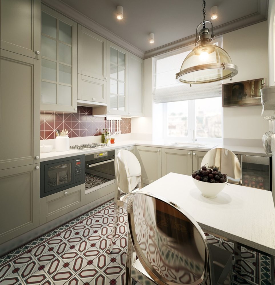
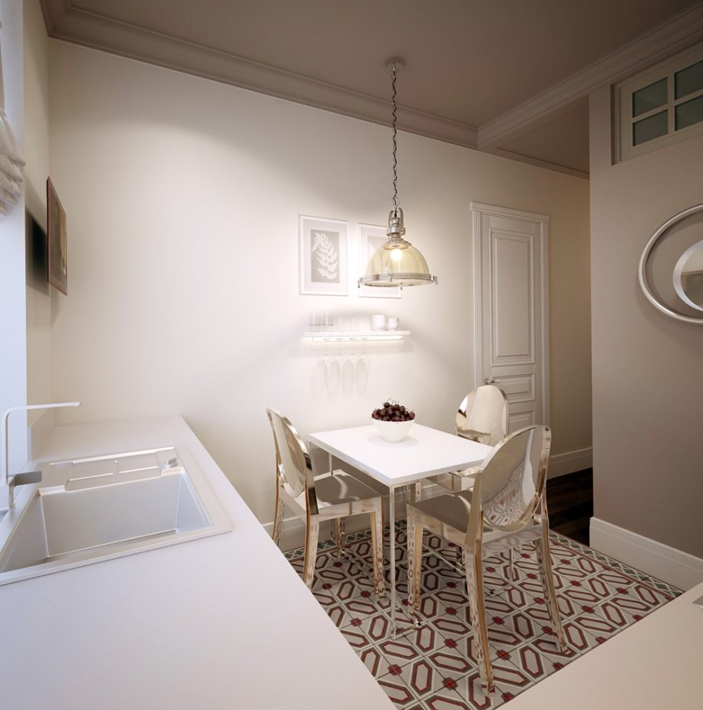
 Kitchen The kitchen was decorated in the American spirit:A light L-shaped kitchen unit from floor to ceiling, a sink under the window and a countertop that continues the window sill, in which a grill for convection and radiator inspection is installed. To the right of the sink is a dishwasher, and even further to the right is a small single-temperature wine cabinet. The apron is made of hand-glazed tiles of individual manufacture, and the kitchen countertop is slightly extended onto it for practical reasons. Opposite the kitchen unit is a small dining group with an illuminated stand for glasses.
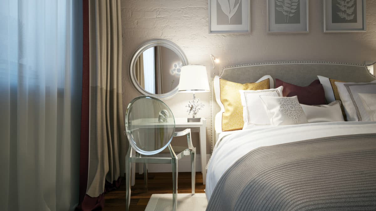
 Bedroom Since the bedroom is a roomintimate and designed for relaxation, the architects chose a more “dense” and deeper color scheme for it than for the other rooms. The bed was made an accent and decorated with imitation plastered brick, which echoes the original masonry in the hallway. Against its background, there is a bedside table from the St. Petersburg company Rooma Design and a companion dressing table. A chest of drawers with a TV above it and a decorative light installation on the right were installed against the opposite wall.
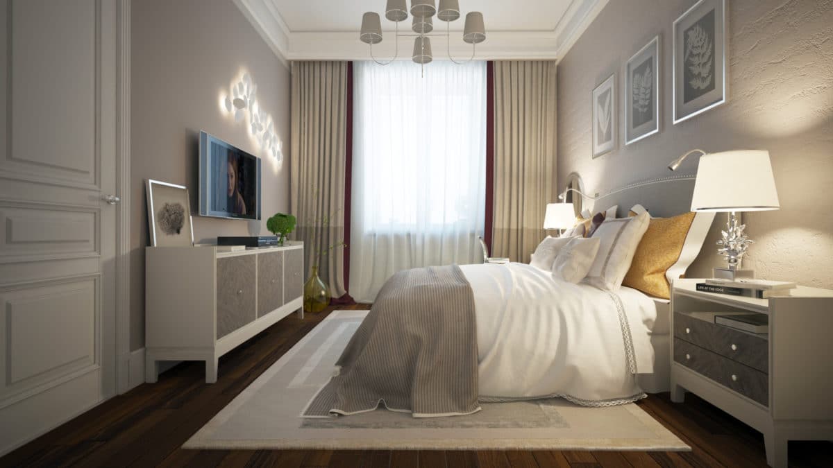 The bedside lamps were chosen to contrast withbrick texture, and a sconce for reading was built into the space of the bed's "ears". All the lamps in the bedroom have a three-position switch, thanks to which each family member can turn off any of them with a key on their side.
 Architectural bureau KYD BURO:— There were no particular difficulties during the design process. They arose rather at the implementation stage when searching for suppliers and contractors for the production of cabinet and free-standing furniture. Thus, the wardrobe with a coplanar opening system planned for the hallway began to open like an accordion during the process, and due to the high cost of fittings, the wardrobe with the same system in the bedroom turned into a swing one.
 This interior featured: Hallway:
- cement tiles - Mosaico del Sur (Spain).
Living-dining room:
- soft furniture, chests of drawers, coffee table - production group "More style" (Russia);
- fixtures - Hudson Valley (USA), Visual Comfort (USA), Ralph Lauren (USA);
- carpets - The Rug Company (Great Britain);
- textiles - Texterior (Russia).
Kitchen:
- furniture is made to order according to sketches of designers;
- chairs - Kartell (Italy);
- the dining table was made to order according to the designers’ sketches;
- lamp above the table - Hudson Valley (USA);
- cement slabs - Mosaico del Sur (Spain).
Bedroom:
- bed - Rooma Design (Russia);
- bedside tables, dressing table and chest of drawers - Rooma Design (Russia);
- bedside lamps - Zara Home (Spain);
- Chair - Kartell (Italy);
- chandelier - Visual Comfort (USA);
- The light installation was made to order according to the designers’ sketches.
