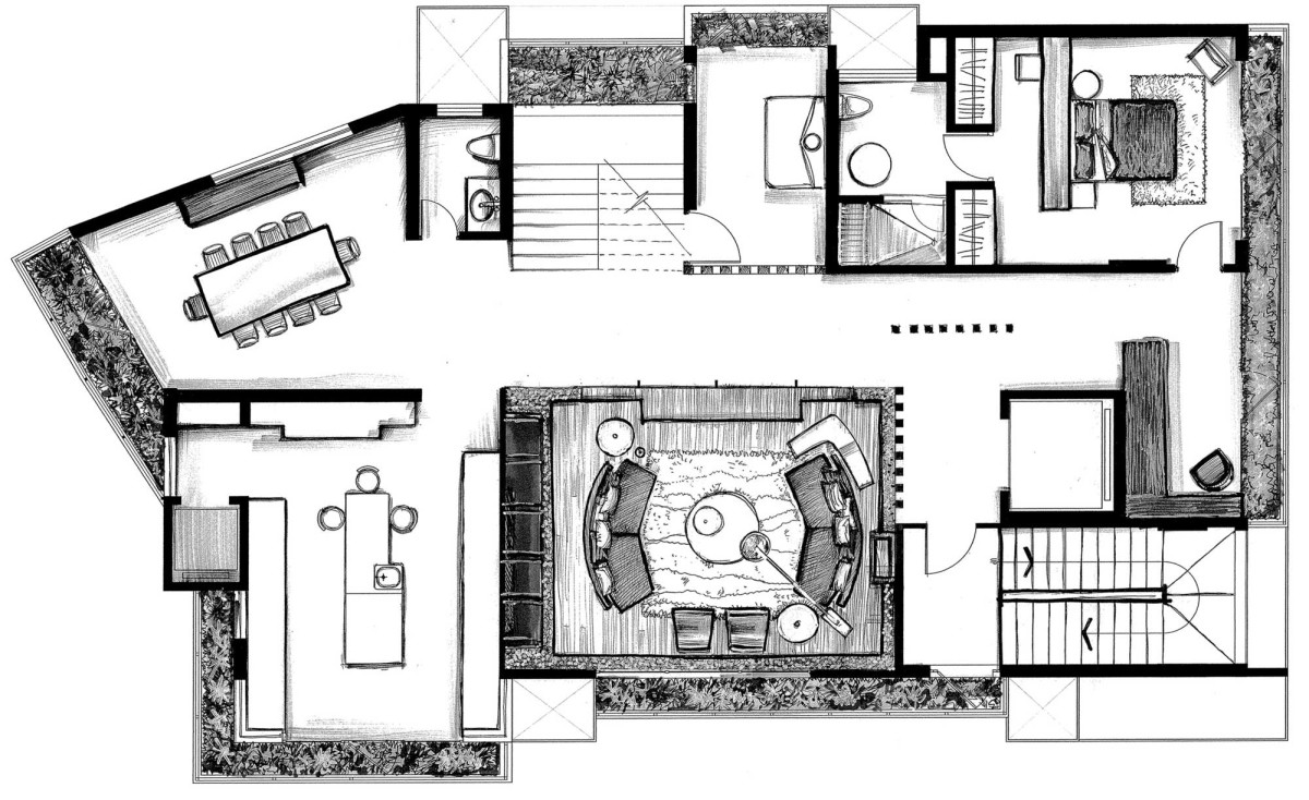
This Indian House Is So Coolstaircase, which all Western blogs wrote about. Why did the design made in gray colors turn out not boring, but multifaceted and very interesting? Read about it in our article today. Pay attention to the gray color, which many people find boring and uninteresting. Despite everything, it is considered universal. All over the world, designers use gray colors in interiors and create unique projects. How do they do it? Let's see what an interesting house looks like inside, the interior of which is dominated by gray colors. Its area is 580 square meters. It is located in India (Mumbai, Maharashtra). This is a new work by the Mexican design studio Arquitectura en Movimiento Workshop. This project was created for a large family, taking into account the hot climate in this area. But the design of the house is far from traditional Indian style.
Worthy companions of the gray
Gray is a neutral color, so it is easy to combine.with other shades. It brings coolness, calmness to the interior, makes it comfortable and restrained. To prevent the decor from looking boring, it needs worthy companions-accents. This applies not only to color, but also to texture, textiles, light, unusual architecture. The interior of this house looks elegant, cool and very interesting. The color scheme is well chosen and contrasting elements are highlighted. Our opinion: - If you want to create a restrained, comfortable and calm atmosphere with an aristocratic bias in the interior, combine gray with muted soft shades such as creamy milk, beige, white.
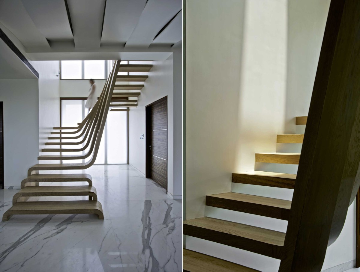
The undulating staircase is the center of the house
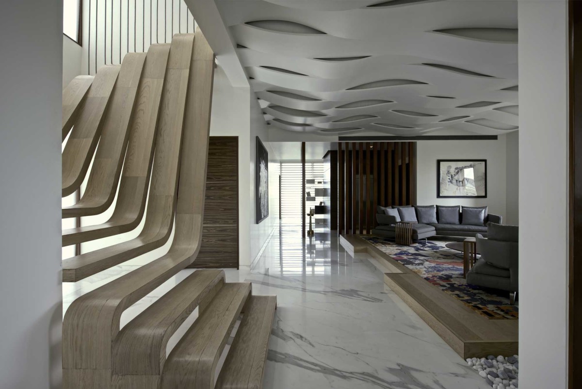
As the main contrasting detail in the housean unusual wavy staircase stands out. It is made of walnut and goes well with the gray color. Its unusual shape immediately attracts attention. The house is designed in such a way that the staircase is visible from different angles. Accordingly, it is the main "heroine" of the interior. It is interesting that wood is present throughout the house and also goes well with the staircase. These are all kinds of partitions with lighting, pieces of furniture. There is even a separate room where the walls and ceiling are covered with wood. All lines, including blinds and the architecture itself, work for the integrity of the space and emphasize the central importance of the staircase in the interior. A big plus of the room are the spacious glass windows located next to the flight of stairs. Natural lighting is reflected on the marble floor and favorably emphasizes the original design without additional partitions and railings. By the way, if the owners want to read in the daylight, the staircase will also come in handy for this. You can very comfortably sit on it with a book! Our opinion: - To make a grey interior look calm, the most suitable color is walnut wood, which we can see in the example of this interior.


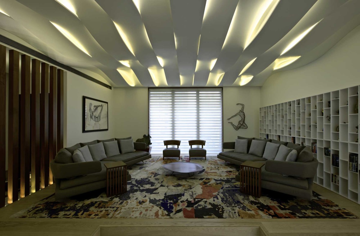
Light through the ceiling
The original ceiling looks in contrastspacious living room. It is also made in the form of waves. It creates the effect of blinds, through which the light seems to break through. The shape of the ceiling echoes the outlines of the stairs, supporting the overall style. In general, the room looks calm and cool. This is also facilitated by the light background of the walls, an inconspicuous picture and dark gray furniture. The carpet on the floor serves as a unifying link of the entire space. Our opinion: - To make the room look more spacious, it is better to make the ceiling and walls light. Pastel shades and light gray tones are perfect. And to make the space visually smaller, use dark gray colors. An important rule for using gray: if the walls are dark, then choose lighter furniture, and vice versa.
How to dilute a grey interior?
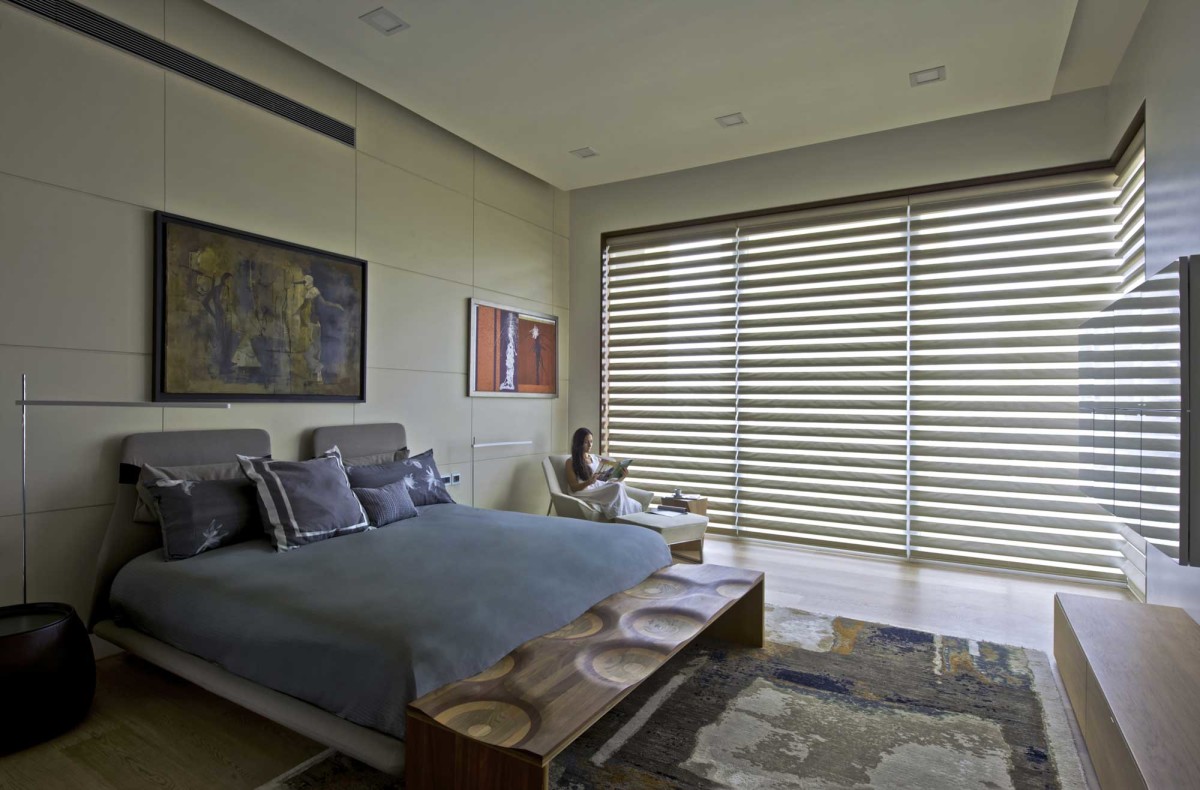
Monochrome design to avoid gloomIt is better to dilute the effect with bright details. Let's see how it was done in the interior of the house. In the living room, the carpet acts as such an element. Although its coloring is colorful, the colors are muted. In one of the bedrooms, the wall is painted black and divided into squares. In another bedroom, the wall is lighter, but a black voluminous decorative element was placed on it, which matches other objects in the room. The decorators diluted the gray color with purple accents in the form of a chair, rug and painting. In the third bedroom, the accent elements are the paintings on the wall, decorative pillows. Also in this role is a table with an original surface design. The study is decorated with a large painting, the frame of which matches the color of the furniture. The image on it has accent, discreet elements.


Gray loves light
To prevent the interior from looking dull, it shouldadditional light sources should be present. Especially if blinds are used in the room. There are many different lighting fixtures in the house, and not only on the ceiling. They can be seen on bedside tables, walls and even on the floor. Chrome lampshades are especially effective in combination with the interior. I would also like to note the dining room with amazing ceiling lamps in the form of mercury drops. They look very original in themselves. But the effect is enhanced by reflections from the floor, table and window.