What should be the interior of a young person's dreams?a successful man? The designers had to try hard to take into account all the customer's requirements, but the result is worth it The larger the area, the more difficult it is to furnish, but that makes it more interesting. The designers managed to implement many bold ideas and create an interior that fully meets the customer's requests. How it was, says designer Stepan Bugaev. Related articles Stepan Bugaev, interior designer Graduated from Moscow Institute of Physics and Technology with a master's degree in physics and from the Higher School of Economics with a master's degree in business informatics. Has his own design studio, under his leadership more than 500 design projects have been implemented. Included in the top 100 best designers, according to the leading interior publication AD. He is a teacher at the HSE School of Design, teaches his own course "Interior Design. Rules for Creating a Successful Project." He gives open lectures on interior design and writes articles for leading interior magazines and portals. — The owner of the apartment is a young man, lives alone. He had long wanted to realize his dream and create a stylish bachelor apartment conducive to work and meetings with friends. The interior had to be bold, brutal and demonstrate the owner's passion for motorsports. At the same time, it was necessary to preserve the feeling of spaciousness. The result was a project that we called "Deep Blue Sea".
 Customer's wishes and readiness toexperiments inspired us to create an extravagant environment with the latest fashion trends. The basis was made up of emphasized graphic forms and cool shades. We relied on minimalism, gravitating towards open spaces and simplicity of planning. The client liked this approach. We proposed a number of very bold design solutions using extravagant interior items and spectacular accent lighting. The combination of clear geometry and rounded, soft forms creates a special tension. The color scheme turned out to be restrained, but not banal: from white and gray to graphite and black, with additional light blue, often in metallic execution. Related articles
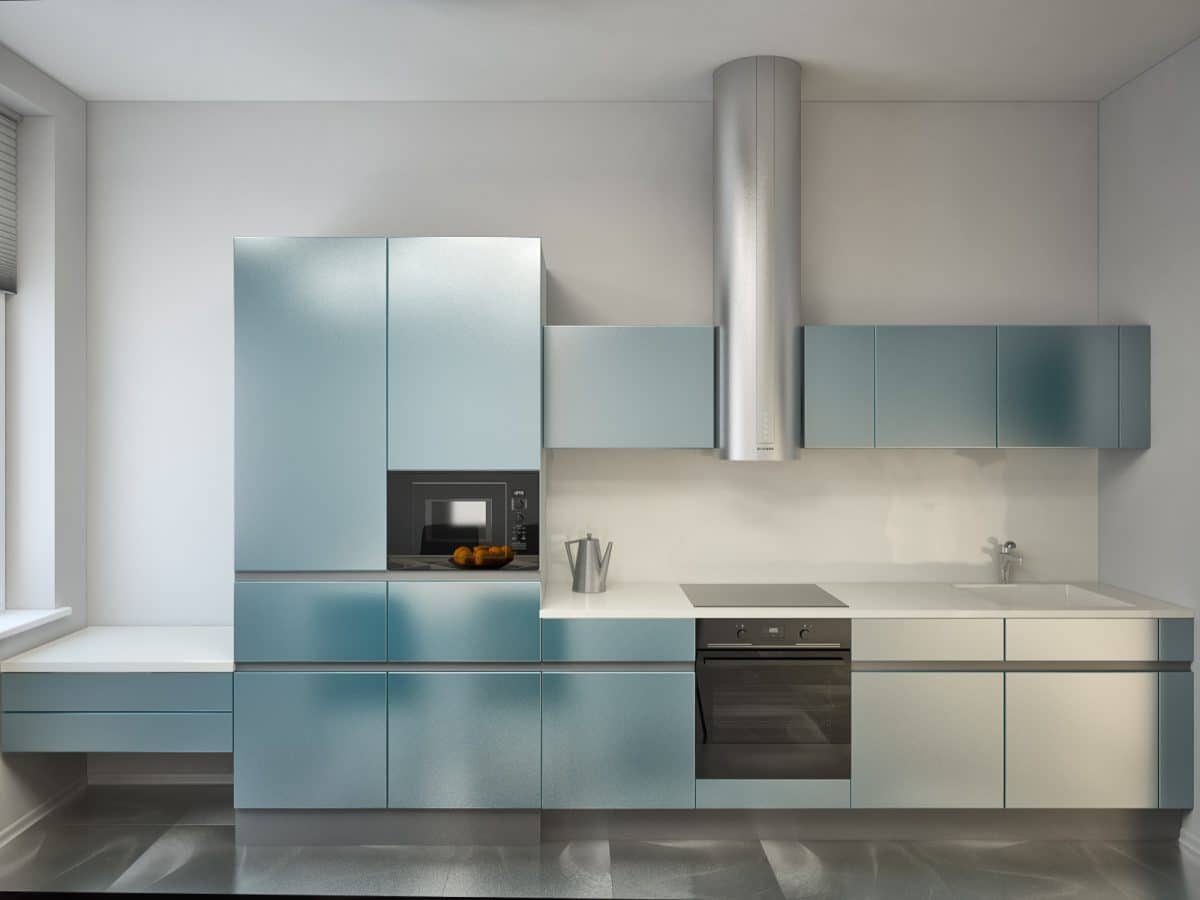
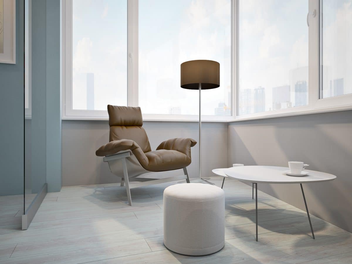
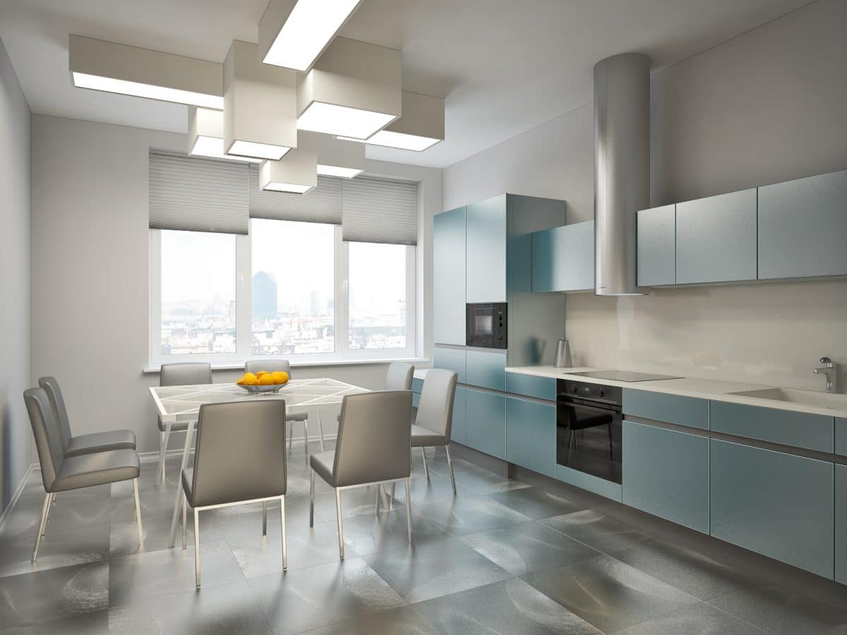
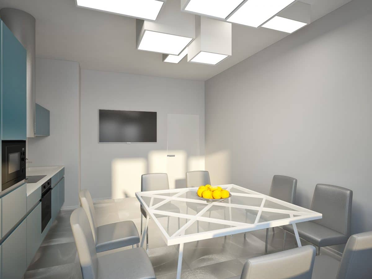
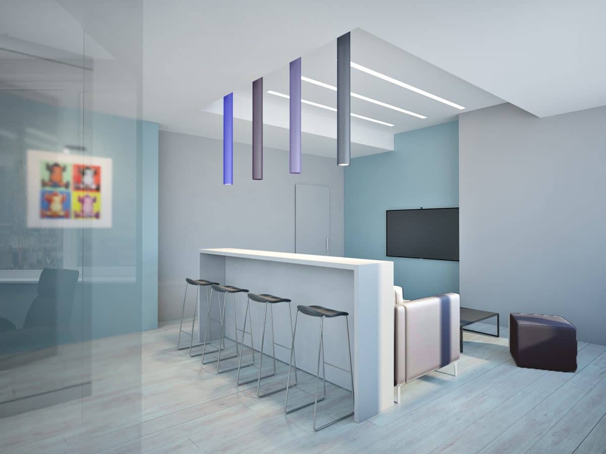
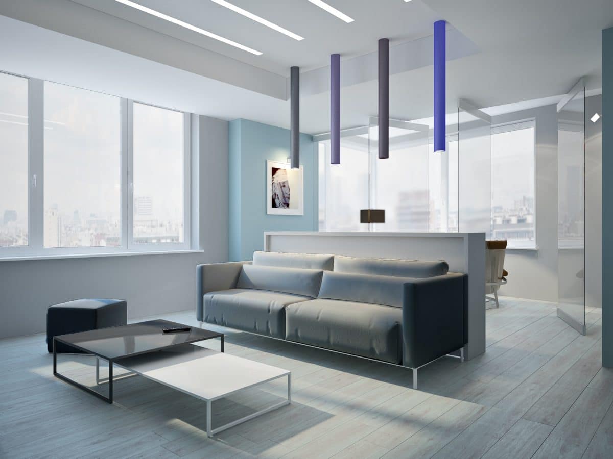 At the center of the layout is a common area that uniteskitchen and living room. The design of the kitchen area is based on a subtle play of shades, from white to graphite. The clear geometry of the kitchen set is supported by a lamp consisting of an array of cubes, a table with a transparent tabletop and a cross of planks. And the soft outlines of the chairs smooth out the overall sharpness. The center of the living room is the bar counter, accented by a row of lamps in the shades of the night sky. It also separates the living room from the kitchen area. An interesting detail is the collection of car models built into the glass tabletop - a hobby of the owner of the house. The common space includes a balcony separated by rotating transparent partitions. Living room:
- sofa — Meta Design;
- tables — Bonaldo;
- lamps — Martini Light.
Kitchen:
- dining group — Bontempi;
- kitchen — Stosa;
- light — Vibia.
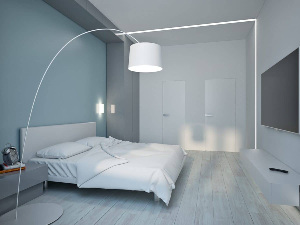
 Harmonious bedroom without active colorscontrasts invites to rest. The main rhythm here is set by built-in linear lamps that emphasize the center of the room. A single furniture set of a wardrobe, cabinets and hanging shelves imitates a wall, creating a niche around the head of the bed. The abundance of rectangular shapes is harmoniously complemented by a simple floor lamp with an arched leg. And the classic window framing with a combination of thick curtains and tulle creates a feeling of coziness. Bedroom:
- bed — Meta Design;
- floor lamp — Foscarini.
Related articles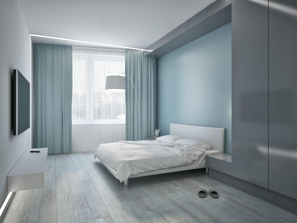
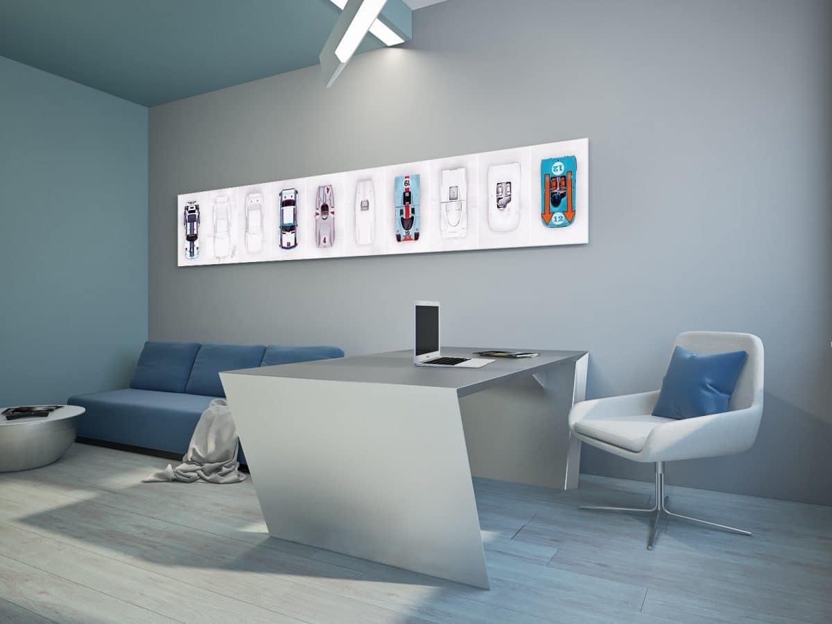
 The owner's office is designed to impress.Deep blue colors and light metallic are complemented by an active poster on the wall. A massive metal table — by an industrial lamp. The visual accumulation of corners gives the interior a special sharpness, and roller blinds instead of curtains make the interior more strict. All this is balanced by the smooth outlines of the work chair and upholstered furniture. Study:
- table - Cattelan Italia;
- sofa — Meta Design;
- armchair — Mids.

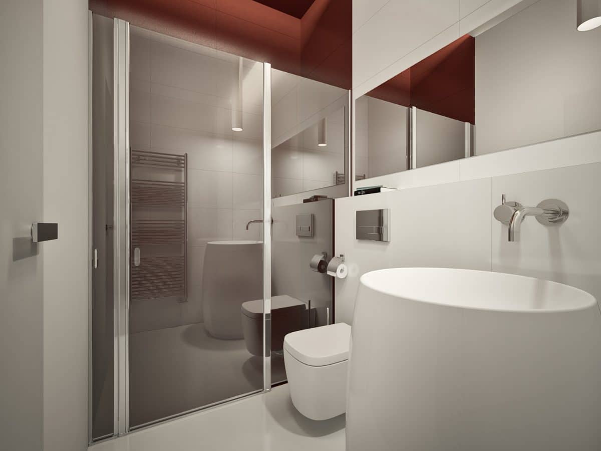
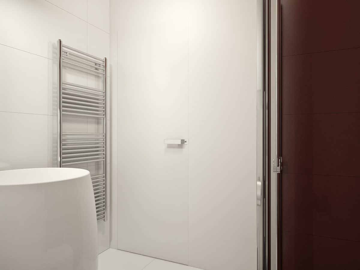
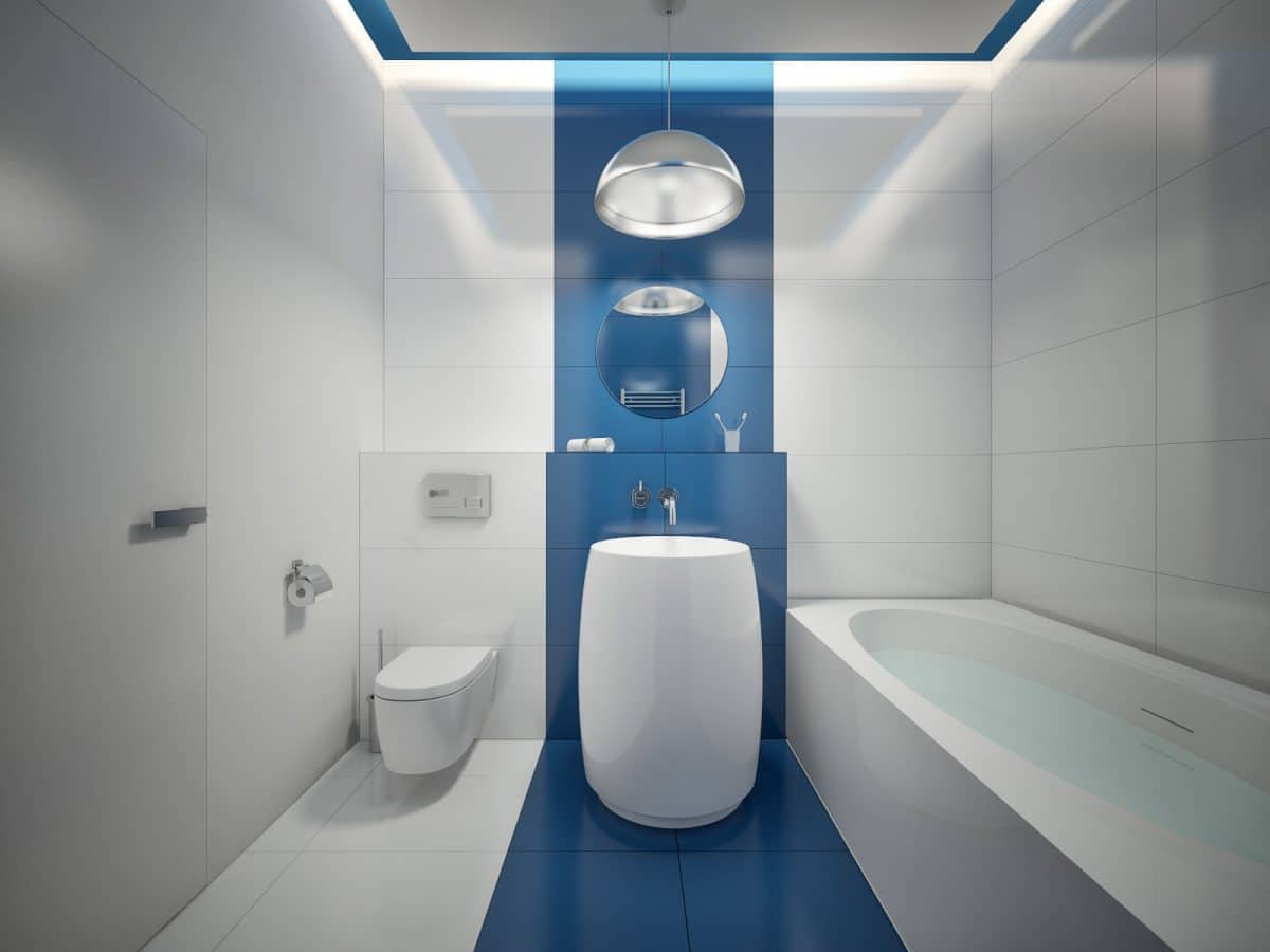
 The bathroom design is also interesting,unified style, but in contrasting colors. The customer wanted to see a deep blue color in his bathroom. It is used to highlight the central area with a sink and mirror. Straight lines, emphasizing the geometry of the room, contrast with the rounded shapes of the functional elements. The guest bathroom is also distinguished by a contrast of shapes, but the shower is highlighted in a rich wine color. Bathrooms:
- plumbing — Duravit.
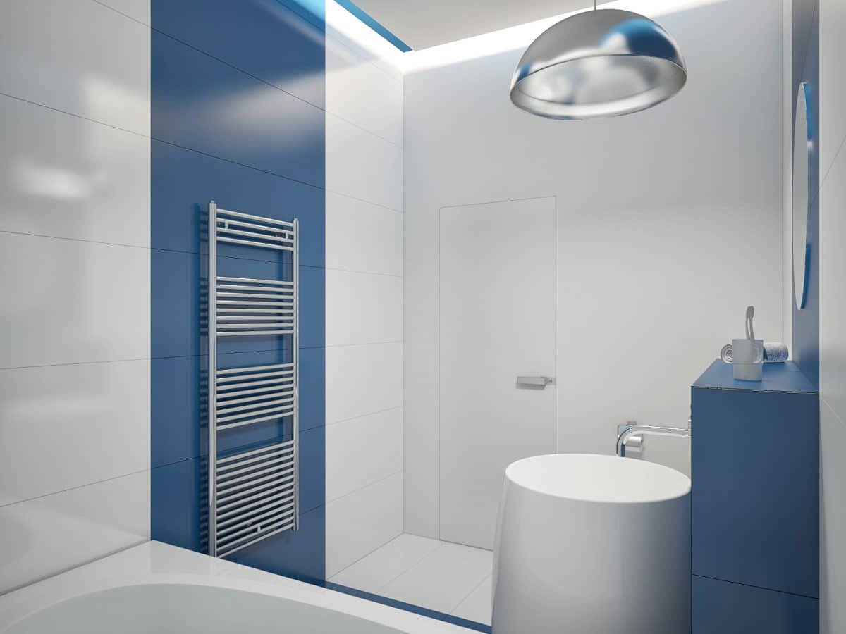
 Overall, the interior has a distinct"masculine" character due to the predominance of rectangular shapes, monochrome colors and elements of industrial style. The designers effectively presented the owner's passion for automobiles, using them as decor. And the role of accents is played by skillfully placed lamps. Related articles